Search Divi Plus Documentation
Search for answers or browse our knowledge base.
Explore Divi Plus's Live Demo
Timeline Slider
How to add the Timeline Slider module to your page and explains every setting in its Content, Design and Advanced tabs. This module shows your history, milestones or steps as a slider with a timeline. Visitors click a marker (a year, icon or number) to show that item with its image, badge, title and description. For more details, view the demo.
Note: The Timeline Slider module works with Divi 5 only. If you don’t see it in the module list, go to Divi Extended → Divi Plus → General → Modules, turn on Timeline Slider and save.
How to add the module
- Open your page in the Divi Visual Builder.
- Click the (+) icon inside a row to add a new module.
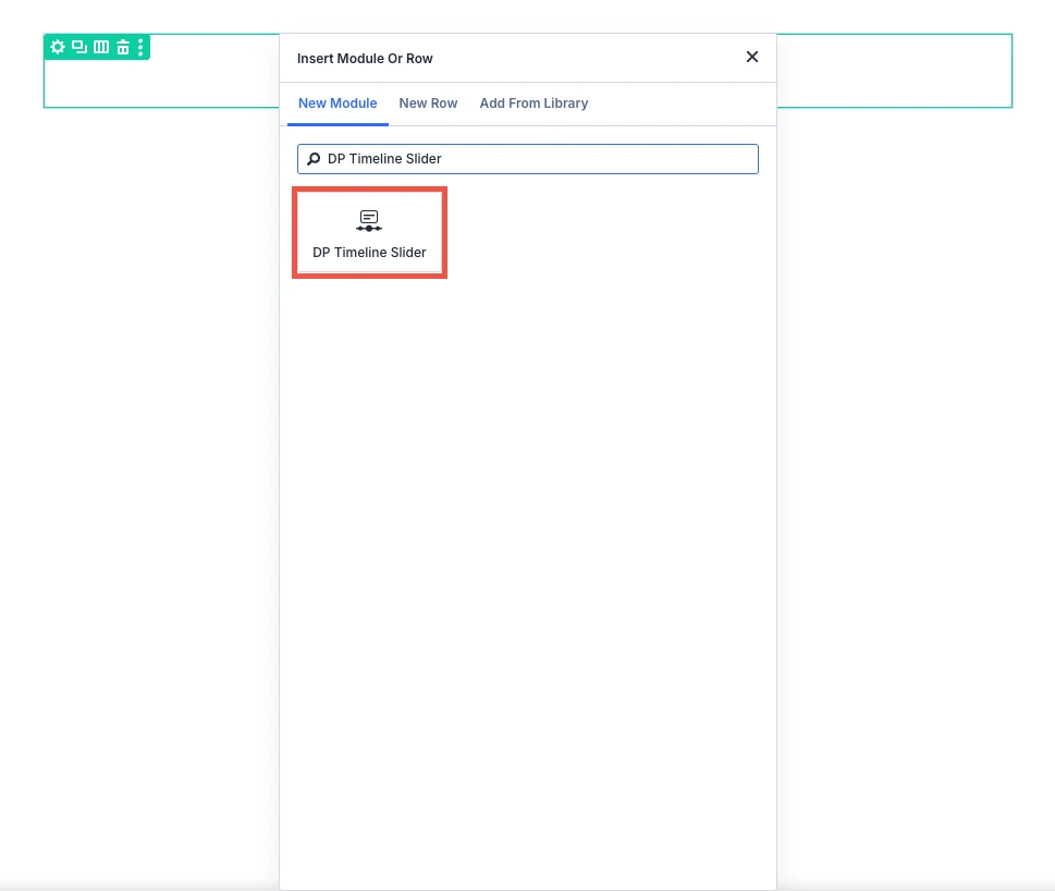
- Search for DP Timeline Slider in the module search box.
- Click the module to insert it. Its settings open on the right.
Content tab
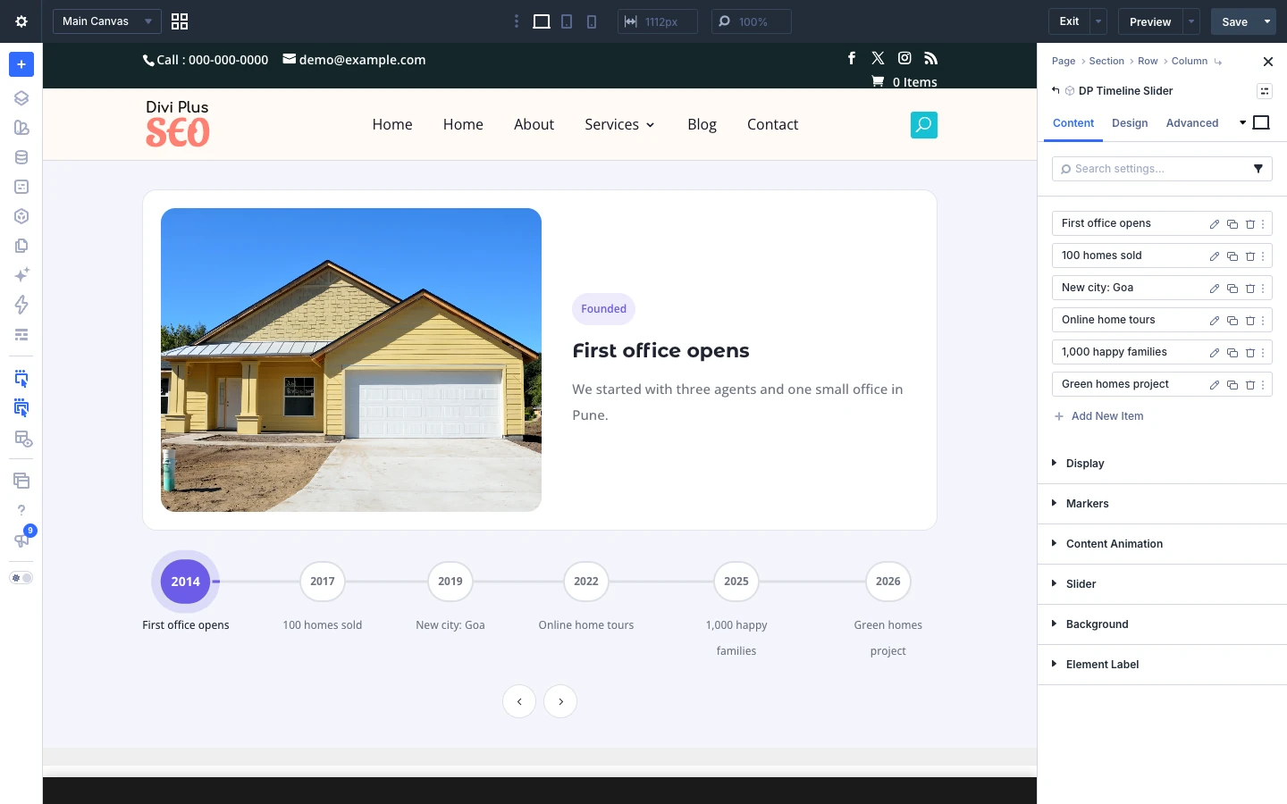
The Content tab of the main module holds the timeline items and the settings for the whole timeline: the layout, the markers, the content animation and the slider.
Content tab: Display
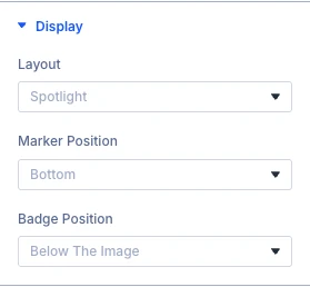
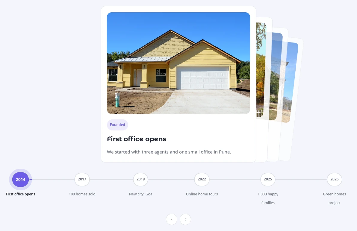
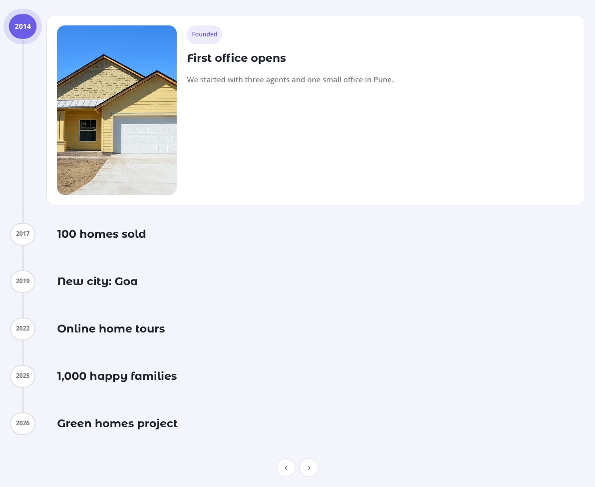
- Layout: Here you can choose the layout of the timeline. Options: Spotlight, Deck and Expanding rail (vertical).
- Marker position: Here you can choose whether the markers are placed below or above the content. Options: Bottom and Top.
- Badge position: Here you can choose where the badge is placed. A badge only appears on items where you have entered a badge text. Options: Below the image, On image · top left, On image · top right, On image · bottom left and On image · bottom right.
Content tab: Markers
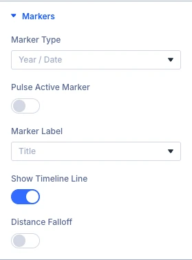
- Marker type: Here you can choose what the markers on the timeline show. Each item can override this with its own marker type. Options: Year / date, Icon, Number, Image thumbnail, Dot only and Diamond dot.
- Pulse active marker: Here you can choose whether or not the active marker sends out a soft pulse ring.
- Marker label: Here you can choose the text displayed next to each marker. Options: Title, Year / date, Badge text and None.
- Show timeline line: Here you can choose whether or not to display the line (and progress fill) that connects the markers.
- Distance falloff: Here you can choose whether or not markers shrink and fade the further they are from the active one.
Content tab: Content animation
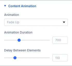
- Animation: Here you can choose the animation used when an item becomes active. Each element (image, badge, title, text, button) animates on its own. Options: Fade up, Blur in, Slide from left, Slide from right, Drop down, Zoom in, Elastic pop, Tilt rise, Flip up, Skew slide, Wipe reveal, Curtain reveal and None.
- Animation duration: Here you can set the duration of each element animation, in milliseconds.
- Delay between elements: Here you can set the delay between one element starting and the next, in milliseconds.
Content tab: Slider
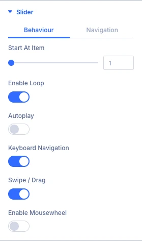
- Start at item: Here you can choose which item is active when the page loads (1 is the first item).
- Enable loop: Here you can choose whether or not the timeline returns to the first item after the last one.
- Autoplay: Here you can choose whether or not the timeline moves to the next item automatically.
- Keyboard navigation: Here you can choose whether or not the arrow keys move the timeline.
- Swipe / drag: Here you can choose whether or not swiping or dragging moves the timeline.
- Enable mousewheel: Here you can choose whether or not the mousewheel moves the timeline while the pointer is over it. This prevents the page from scrolling there.
Content tab: Slider navigation
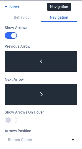
- Show arrows: Here you can choose whether or not to display previous and next arrows.
- Previous arrow: Here you can select the icon to be used for the previous item navigation.
- Next arrow: Here you can select the icon to be used for the next item navigation.
- Show arrows on hover: Choose whether or not the previous and next arrows should be visible only on hover. On touch devices they stay visible.
- Arrows position: Here you can choose where the arrows are displayed. Options: Inside, Outside, Top left, Top right, Top center, Bottom left, Bottom right and Bottom center.
Timeline item settings
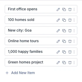
Each step of the timeline is a separate item. Click + Add New Item to add one, or click the gear icon next to an item to edit it. Drag the items to change their order.
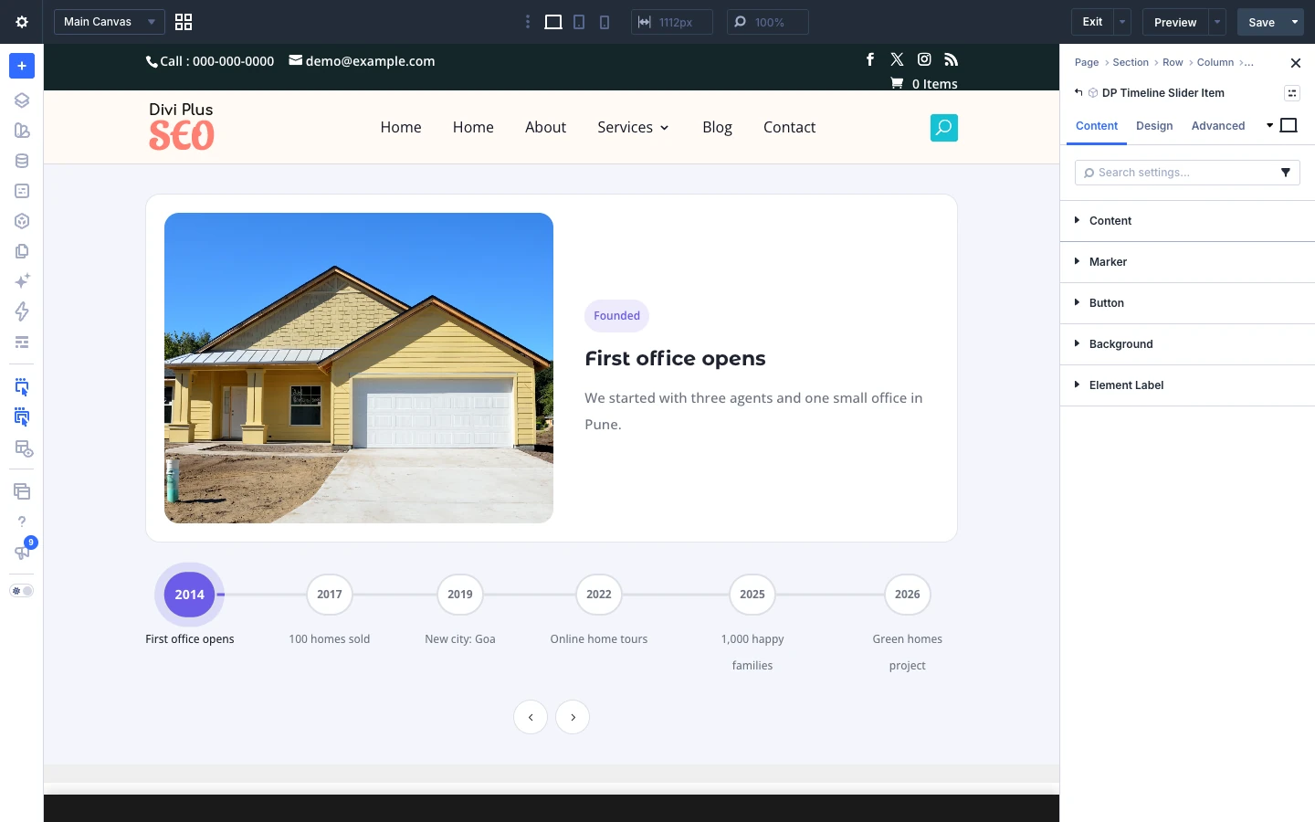
Item tab: Content
- Year / date: Here you can input the year or date of this item (e.g. 2024). It is shown in the marker and can be used as the marker label.
- Title: Here you can input the title of this item.
- Description: Here you can input the description of this item.
- Badge text: Here you can input a short badge text (e.g. Launch, Milestone). Leave empty for no badge.
- Image: Here you can upload the image for this item. It is also used for the marker when the marker type is Image Thumbnail.
- Image alt text: Here you can input the text to be used for the image as HTML ALT text.
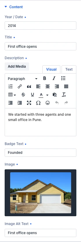
Item tab: Marker
- Marker type: Here you can choose what the marker of this item shows. By default it follows the marker type of the timeline. Options: Same as timeline, Year / date, Icon, Number, Image thumbnail, Dot only and Diamond dot.
- Marker icon: Here you can choose the icon displayed in the marker when its type is Icon.
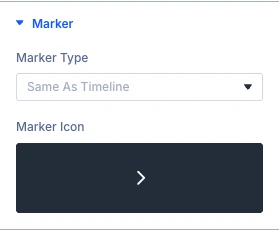
Item tab: Button
- Show button: Here you can choose whether or not to show the button.
Item tab: Background
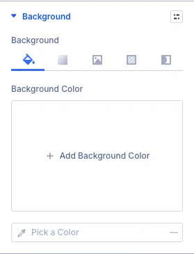
- Background: Adjust the background style of this element by customizing the background color, gradient, image, video, pattern and mask.
- Background color
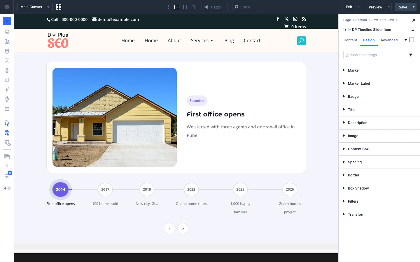
Each item also has its own Design tab, so you can style one item differently from the rest: marker, marker label, badge, title, description, image and content box, plus the standard Divi spacing, border, box shadow, filters and transform settings.
The Link, Background and Meta groups are the standard Divi options.
Design tab
The Design tab styles the timeline line, markers, marker labels, image, badge, title, description, content box, item box, button and arrows.
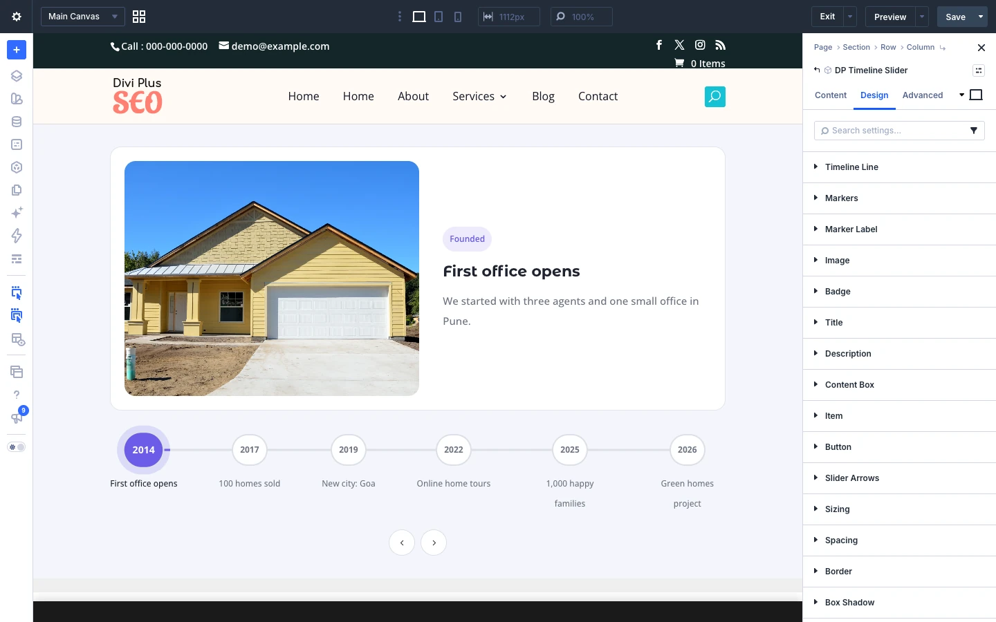
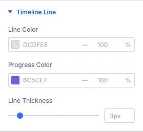
Design tab: Timeline line
- Line color: Here you can define the color of the timeline line.
- Progress color: Here you can define the color of the line that fills up to the active item.
- Line thickness: Move the slider or input the value to increase or decrease the thickness of the line.
Design tab: Markers
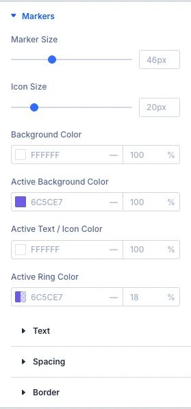
- Marker size: Move the slider or input the value to increase or decrease the minimum width and height of the markers.
- Icon size: Here you can choose the size of the icon inside icon markers.
- Background color: Here you can define the background color of the markers.
- Active background color: Here you can define the background color of the active marker.
- Active text / icon color: Here you can define the text and icon color of the active marker.
- Active ring color: Here you can define the color of the glow ring around the active marker.
Design tab: Marker label
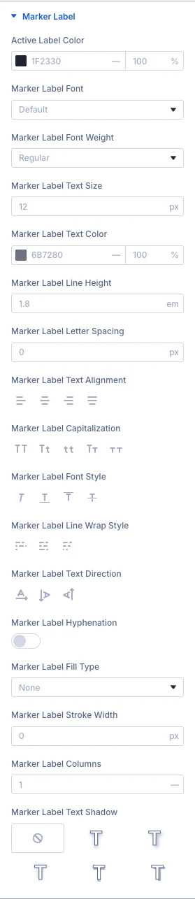
- Active label color: Here you can define the color of the label of the active marker.
Use the standard Divi text settings (font, weight, size, color, line height, letter spacing, alignment and more) to style the marker label.
Design tab: Image
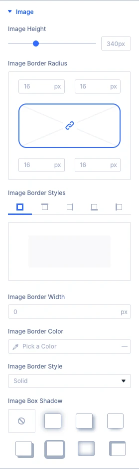
- Image height: Move the slider or input the value to increase or decrease the height of the images.
- Image border radius: Here you can control the corner radius of this element. Enable the link icon to control all four corners at once, or disable to define custom values for each.
Use the standard Divi border and box shadow settings to style the image.
Design tab: Badge
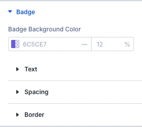
- Badge background color: Here you can select the background color of the badge.
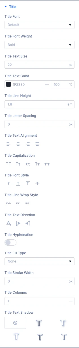
Design tab: Title
Use the standard Divi text settings (font, weight, size, color, line height, letter spacing, alignment and more) to style the title.
Design tab: Description
Use the standard Divi text settings (font, weight, size, color, line height, letter spacing, alignment and more) to style the description.

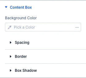
Design tab: Content box
- Background color: Here you can select background color for the content box that holds the badge, title, description and button.
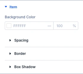
Design tab: Item
- Background color: Here you can select background color for the item card (image and text).
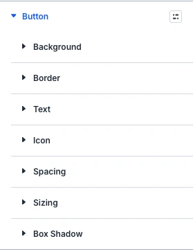
Design tab: Button
Use the standard Divi button settings (text, background, border, font, icon and spacing) to style the button.
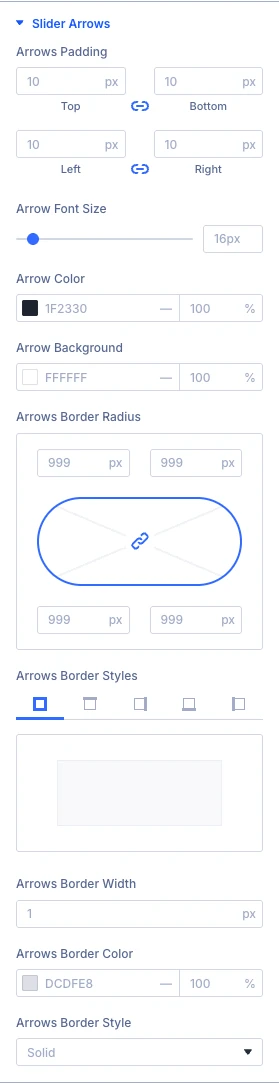
Design tab: Slider arrows
- Arrow font size: Here you can choose the arrow font size.
- Arrow color: Here you can define color for the arrow.
- Arrow background: Here you can define the background color of the arrow.
- Arrows border radius: Here you can control the corner radius of this element. Enable the link icon to control all four corners at once, or disable to define custom values for each.
Use the standard Divi spacing and border settings to style the slider arrows.
The Sizing, Spacing, Border, Box shadow, Filters, Transform and Animation groups are the standard Divi design options.
Advanced tab
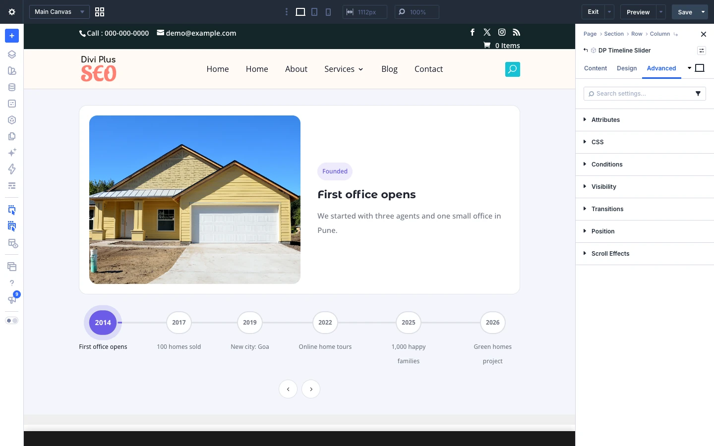
The Advanced tab has the standard Divi options: CSS ID and classes, custom CSS, attributes, conditions, visibility, transitions, position and scroll effects.