
Featured On
Fully Compatible with Divi 5
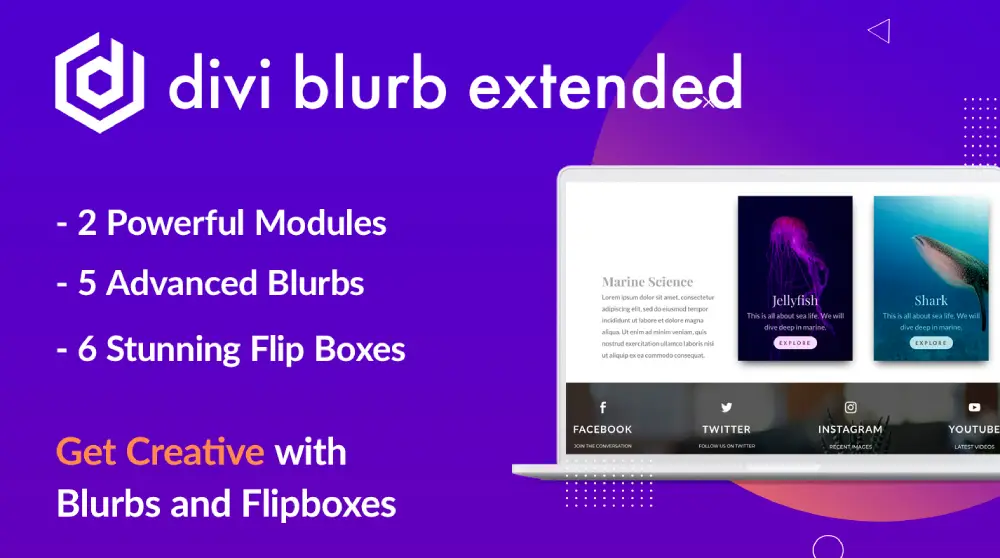
Supercharge Your Divi Blurb Module With Divi Blurb Extended and Advanced Flip Box
Blurb module in Divi allows creating beautiful sections using icon, image and text. Divi Blurb Extended is an enhanced version of Divi Blurb which comes with Advanced Flip Box module and a number of design elements that can be used to create nice page sections in Divi and Extra theme.
The main features of Divi Blurb Extended are read more button inside Divi blurb, on-hover color and background change, seven built-in layouts, icon position on the right.
Advanced Flip Box gives the ability to create Divi flip boxes with extra animation effects- like directional and animation flip- and multiple Divi flip box styling options. There are Six advanced flip box layouts in Divi Blurb Extended.
The plugin has many options for customizing the blurbs and to give any Divi, Extra or Divi Builder based page a beautiful look. Divi Blurb Extended plugin is compatible with new Divi 4 and earlier versions of Divi; Extra and Divi Builder Plugin.

Compatible with Divi 5
Read More Button
Advanced Flip Box Module
Multiple Icon Shapes
Multiple Blurb Layouts
Friendly Support
Advanced Divi Blurb Module
Divi Blurb Extended is an enhanced form of Divi blurb with added features and functionalities. It is fully compatible with both Divi Classic and Visual Builder and can be used on any website running on Divi 4, Extra theme, and earlier versions of Divi theme.
Just like other Divi plugins and module it also works with the Divi builder plugin and can be used on any website which uses that plugin.
The added features make Divi Blurb Extended a powerful module for creating sections in Divi theme.
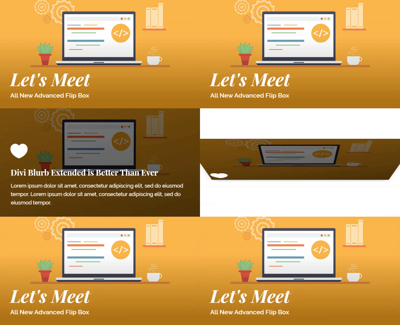
All New Advanced Flip Box Module
With all-new Advanced Flip Box, create exciting Divi flipboxes that are unique, future-ready, and better than most Divi plugins for blurbs.
Advanced Flip Box has multiple layouts that are designed to enhance the beauty of the Divi blurb. Advanced Flip Box’s features can help you style flip boxes with attractive animations. Directional flip boxes and animated flip boxes. You can style flip boxes to flip in multiple directions: Top, Bottom, Left, and Right. As well as give interactive animation effects: Fade, Zoom In, and Zoom Out. Customize Divi flipbox background with color, gradient, or image.
Advanced unique features to suit your profession and needs, whether it’s simplicity or styling, it’s good for anything.
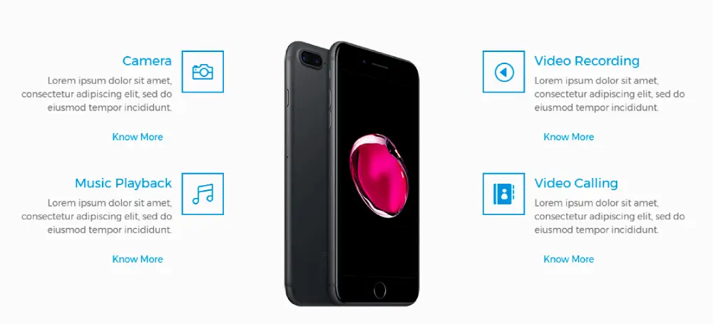
Seven blurb layouts for Divi
Pick a layout in the module’s Layout setting and the same title, text, icon or image and read more button rearrange themselves: Classic, Flipbox, Easebox, Borderbox, Image Card, and, new in 3.1.0, Split Card and Panel Card. The first five work in Divi 4 and Divi 5. Split Card and Panel Card are built for Divi 5. Every layout is on the demo site with the settings used to build it.
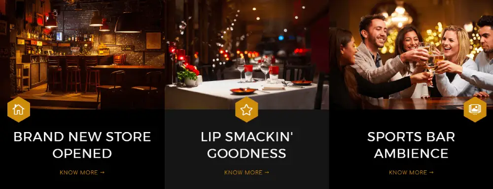
Split Card: a blurb with the image on one side and the text on the other
Split Card divides the blurb in two. The card image fills one half, the title, text and button sit in the other, and Image Side decides whether the picture goes on the left or the right, so two cards in a row can face each other. Image Width runs from 10 to 90 percent of the card (50 by default) and takes different values for desktop, tablet and phone; on phones the image moves above the content. A badge sits on the image’s top left corner, a label goes above the title, and an icon or a small image can stand above the title too, inside the text half. Use it for a service with a photo, an event with a date badge, a room with a price, or an offer with a discount in the badge. Divi 5.
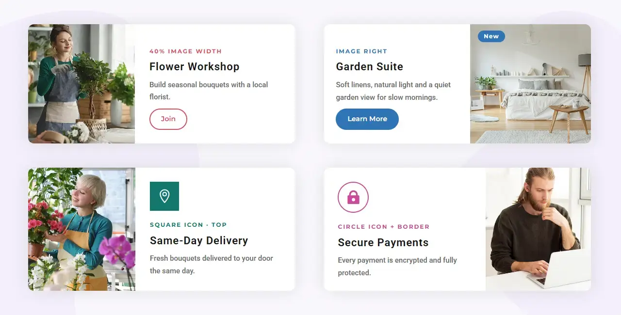
Panel Card: a content panel that overlaps the image
Panel Card stacks a photo on top and floats a content panel over its lower edge. Three settings shape it, each with its own desktop, tablet and phone value: Image Height from 80 to 800 px (260 by default), Content Overlap, how far the panel climbs onto the image, from 0 to 300 px (60 by default), and Content Side Spacing, the gap between the panel and the card’s sides, from 0 to 200 px (24 by default). Set the overlap and the spacing to 0 and it becomes a plain stacked card. The panel has its own padding, border, corner radius and box shadow, the image has its own border, and the content background color fills the panel. The badge sits on the photo, the label and an optional icon or small image go above the title inside the panel. Divi 5.
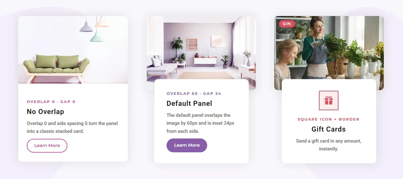
A label above the title and a badge on the card
Every layout gets two new text fields in the Content tab. Label is a short line that appears above the title, in capitals by default, for a category or a price unit such as “Hotel, per night”. Badge is a short number or word, “New”, “-20%” or “4.9”, that renders as a small block with its own background, border and font settings; on Split Card and Panel Card it sits on the image, on the other layouts it stands above the title. Leave either field empty and nothing is shown.
Nine Divi blurb hover effects, one setting each
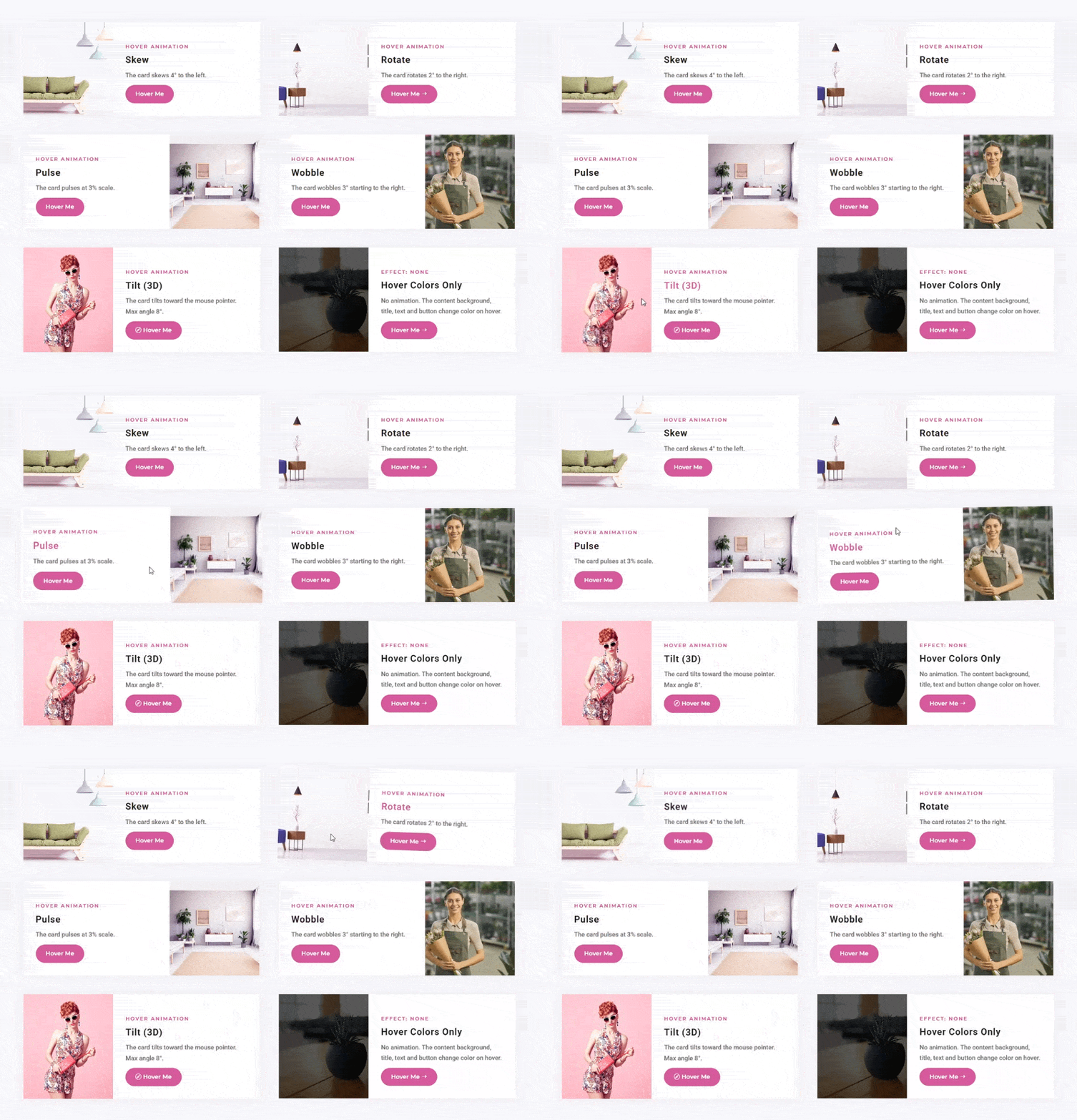
The Hover Animation group plays an effect on the whole blurb when the pointer rests on it: Grow, Shrink, Float, Skew, Rotate, Pulse, Bounce, Wobble and Tilt (3D). Each one has a single Level control that fits it: Grow, Shrink and Pulse scale the card by 1 to 50 percent (8 by default), Float and Bounce lift it 1 to 60 px (10 by default), Skew, Rotate and Wobble turn it 1 to 45 degrees (6 by default) toward the Direction you pick, left or right, and Tilt follows the mouse up to a Tilt Angle of 1 to 30 degrees (10 by default). Speed sets how long the move takes, 0.1 to 3 seconds (0.4 by default). Flipbox and Easebox keep their own hover behavior, so the group does not apply to them. Divi 5.
An animated shape behind the blurb content
The Background Animation group draws a shape in one corner of the blurb and moves it. Drift, Breathe and Ripple run all the time; Expand and Wash play on hover and fill the whole card. Pick the Corner (top left, top right, bottom left, bottom right), the Size from 10 to 500 px or a percentage of the blurb’s width (160 px by default), a Horizontal and a Vertical Offset from -550 to 550, where a negative value pushes the shape past the edge, and the Speed of one cycle from 0.2 to 20 seconds (2 by default). The looping effects choose from 15 shapes: Circle, Ring, Dots, Dots (Large), Dots (Fading), Dots (Square Patch), Diagonal Lines, Grid, Rounded Square, Diamond, Triangle, Hexagon, Star, Blob and Plus, each turnable from -180 to 180 degrees. The shape takes a solid color or a gradient; the default is a light blue at 20 percent. On Panel Card the shape lives inside the floating panel so the photo stays clear. Flipbox has two faces, so it sits this one out. Divi 5.
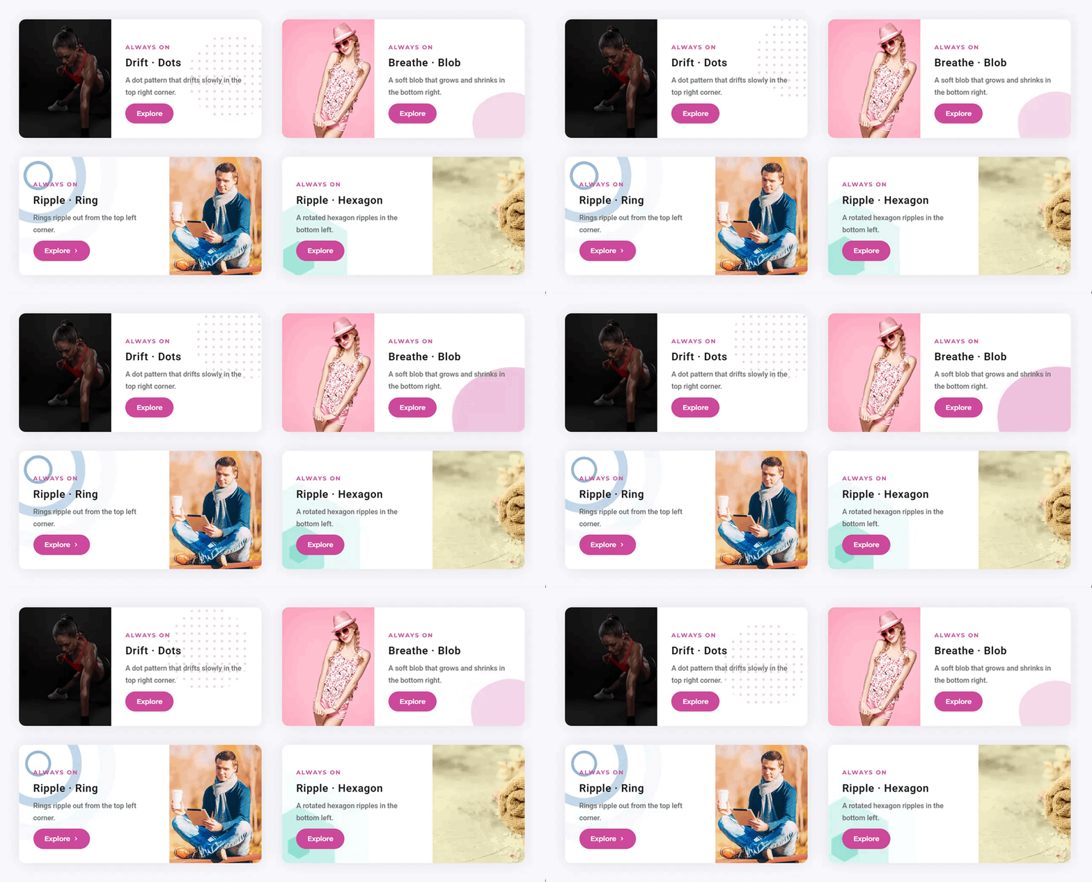
6 Stunning Divi Flipbox Layouts
Divi Flipbox layout available in the plugin adds the missing feature of Divi blurb module hover effects. The Flipbox layout can be used to create separate front and flip-view. It is achieved with the new Divi blurb module with an option to select a custom color or image for the background of front and flip-view.
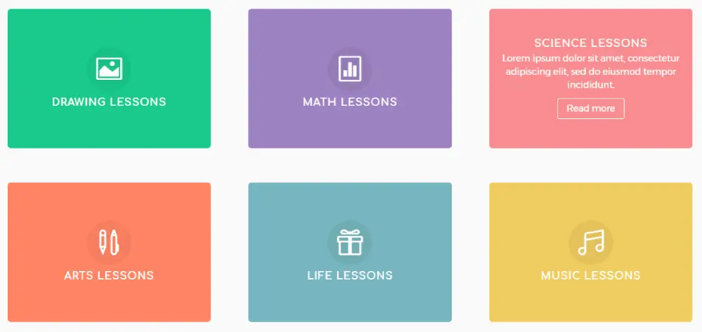
Divi Blurb With Button
A read more button in the Divi blurb will make creating sections using Divi blurb easy by eliminating the need of an additional button module.
Divi Blurb Extended has an inbuilt read more button available in each layout. This makes creating a section using Divi blurb easier and quicker.
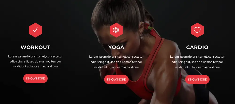
Blurb Icon Position on Right
Divi Blurb Extended has new icons position where an icon can now be placed on the right side in addition to the default top and left. This gives freedom to create a section with beautifully positioned elements.

New Icon Shapes
Two new icon shapes in Divi blurb – Circle and Hexagon. These two are in addition to the standard circular Divi blurb icon. These new icon shapes can be applied with images at the same time which is currently not possible with the default Divi blurb which support either an image or icon in a single blurb.

Ready to Use Free Section Blocks
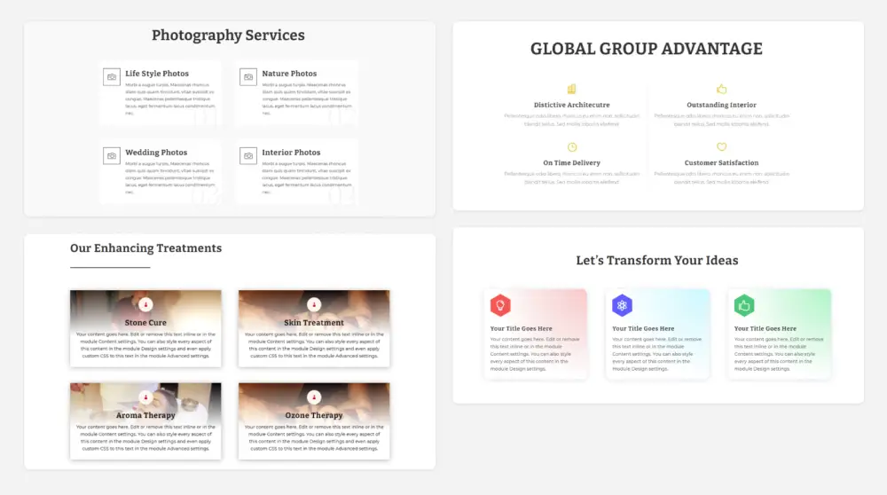
Divi Blurb Hover Effects
Flipbox and Easebox layouts available in the plugin comes with elegant hover effects. Flipbox has property for custom front and flip-view whereas Easebox is a nicely animated layout which shows the Divi blurb read more button with a smooth animation after hover.
Background Image or Color for Front and Flip-View
Get more out of the Divi blurb by applying custom color on the front and back views.
Imagine the creativity you could achieve with the option to select either an image or solid color for the Divi blurb hover effect.
Rob McMille (verified owner) –
Excellent product, works seamlessly with Divi within the Visual Builder. Love the multiple options that add selected movement to the webpage!
Joan Margau (verified owner) –
Divi Blurb Extended is one of the best plugins I’ve used. Works perfectly with Divi and the Divi Visual Builder. Recently it was updated to add a flip style which creates a subtle effect as the mouse hovers over the icon and the image flips to the back side of the blurb! I also love how you can style the icon with more than just a circle, you can use a hexagon, and a square, so the icons look sharp and different. The other feature I like is being able to add a button inside the Blurb. All in all this plugin is on all my websites and my clients!
Scott MacDonald –
Currently, have this installed on several sites. Worth every penny, very easy installation and looks great. It’s now one of my favorite divi plugins.
Debbie Rozer (verified owner) –
Works perfect with divi.
You get great premade examples with it you can tweak easily. But also without those examples it is easy to use.
What is missed was the option to align buttons on the desktop layout between multiple blurb extended. The support team is great and helped me out.
Mirco Stockhausen –
Really great product and extremely fast and friendly service – it couldn’t be better!