
Search Divi Plus Documentation
Search for answers or browse our knowledge base.
Explore Divi Plus's Live Demo
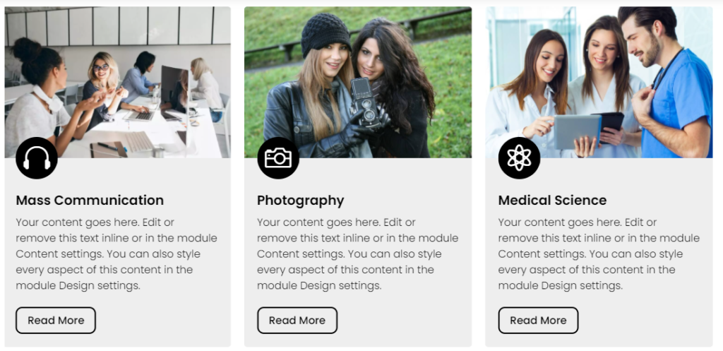
Image Card Carousel
With Divi Plus Image Card Carousel you can quickly add beautiful images on the slider with a button, content, and an icon & also can styling every element which makes it more attractive.
How to add module on page
Once Divi Plus is activated, it adds several modules to the Divi builder. To add a module on the page, use the following steps:
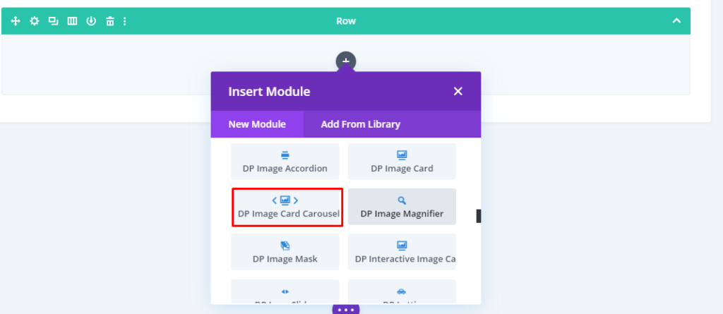
- Create/Edit a Page/Post that uses Divi builder.
- Create/Edit a row.
- Click on Add New Module option; choose the DP Image Card Carousel module.
Global Content Tab
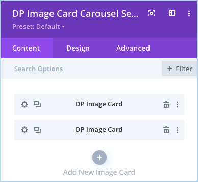
- Insert Image Card Carousel Items: In the Content tab >> click Add New Image Card. And you can also add the image using the dynamic content feature.
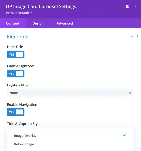
Elements
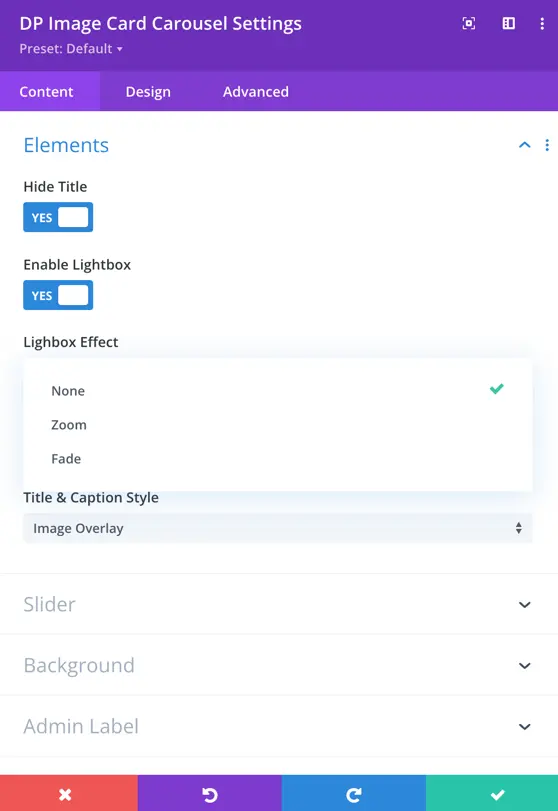
Hide Title
- Set to “Yes” to hide the title of the element.
Enable Lightbox
- Set to “Yes” to enable the Lightbox feature, allowing images to open in a popup.
Lightbox Effect
- Choose how the Lightbox effect appears:
- None – No effect applied.
- Zoom – The image smoothly enlarges when opened.
- Fade – The image appears with a fading effect.
Enable Navigation
- Set to “Yes” to enable navigation within the Lightbox, allowing users to browse multiple images.
Title and Caption Style
- Customize how the title and caption appear within the module.
Image Overlay
Below Image
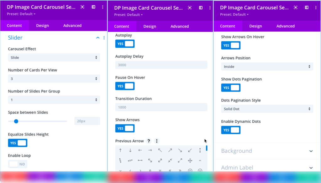
Slider
- How to change Image Card Carousel Effects: Go to the Slider >> Carousel Effect >> Slide / Cube / Coverflow / Flip.
- Select Number of Image Cards Per Slide: Go to the Slider >> Number of Cards Per View >> select any number from 1 to 15.
- How to apply a loop on the Image Card Carousel: Go to the Slider >> Enable Loop >> Yes.
- Disable Carousel Autoplay: In the Slider settings >> check >> Autoplay >> NO.
- Set Carousel Autoplay Delay: Input the value in the Autoplay Delay field of the Slider settings.
- How to disable carousel pause on hover: Go to the Slider >> Pause On Hover >> NO.
- Set carousel transition-duration: Go to the Slider >> Transition Duration >> input the value.
- How to display arrows on Image Card Carousel: Go to the Slider settings >> Show Arrows >> YES.
- Select the arrow style for the previous and next slide navigation: Go to the Slider settings >> for Previous Arrow & Next Arrow >> choose the icon.
- Control the equalize slides height control: Go to the Slider settings >> Equalize Slides Height >> YES
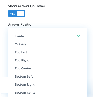
- Disable Carousel Arrows on Hover: Go to the Slider settings >> Show Arrows On Hover >> NO.
- Arrows Position: Using this setting you can choose arrows position from given 8 options.
-
- How to display pagination: Go to the Slider >> Show Dots Pagination >> YES.
- Change the pagination style: Go to the Slider >> Dots Pagination Style >> select Solid Dot / Transparent Dot / Stretched Dot / Line / Rounded Line / Squared Dot.
- Enable Dynamic Dots: Using this setting you can turn on and off the dynamic pagination of the slider.
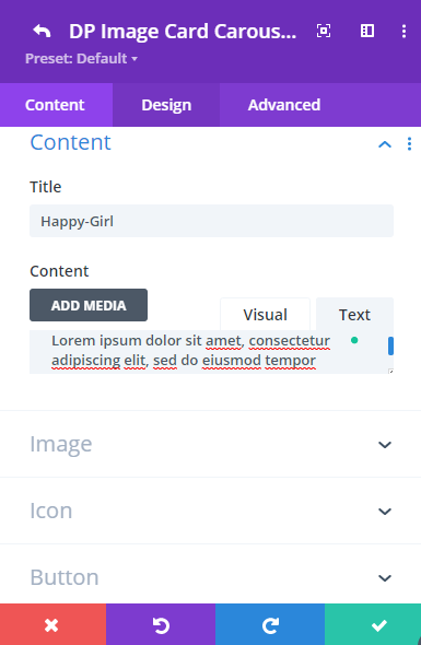
Content customization for individual Image Card Carousel Item
The following steps need to be performed in the Content tab of an individual Image Card Carousel Item’s settings.
- Input Image Card Title: Go to the Content >> Title >> input the title’s text.
- How to Add Image for the Image Card Carousel: Go to the Image >> Image >> Add Image.
- Select Icon for the Image Card: Go to the Icon >> Icon >> select any according to the requirements.
- How to display Button on the Carousel: Go to the Button >> Show Button >> YES.
- URL: Here you can input the URL that you want to open when the user clicks on the Read More Button. You can also fetch dynamically URL for the button.
- How to add a link to the Image Card: Go to the Link settings >> Module Link URL >> input the linking URL >> Module Link Target >> select either In The Same Window / In The New Tab.
- Adjust Image Card’s Content background: Go to the Background settings >> Content Background >> adjust background with Color, Gradient, or Image.
Design settings of an individual Image Card Carousel Item
he following steps need to be performed in the Design tab of an individual Image Card Carousel Item’s settings.
- Change text alignment: Go to the Design tab >> Text >> Text Alignment >> select alignment option as required.
- Change text theme: Go to the Text >> Text Color >> select either Dark or Light.
- Style title text and content: Go to the Title & Content settings >> select TItle / Content >> apply text customizations as needed.
- How to change icon alignment, size, and color: Go to the Icon settings >> use Icon Alignment / Icon Font Size / Icon Color >> to change alignment / size / color.
- How to apply shape and shape background color to the icon: Go to the Icon >> Style Icon >> YES. Use Shape >> to choose shape as Circle / Square / Hexagon. Use Shape Background >> to change the shape background with color.
- How to change Button alignment: Go to the Button settings >> Button Alignment >> choose alignment as required.
- How to apply custom styling to the button: Go to Button >> Use Custom Styles For Button >> YES. Here, you can change button text size, color; button background, icon position, and more.
Global Design Customization for the Image Card Carousel
- Change Text Alignment Globally: Go to the Design tab >> Text >> Text Alignment >> choose required alignment option. (Applicable only if text alignment isn’t chosen in the individual settings.)
- Apply Text Shadow: Go to the Design tab >> Text >> Text Shadow >> choose required shadow option.
- Style title text and content globally: Go to the Title & Content settings >> select Title / Content >> apply text customizations as needed. (Applicable only if title text & content aren’t customized in the individual settings.)
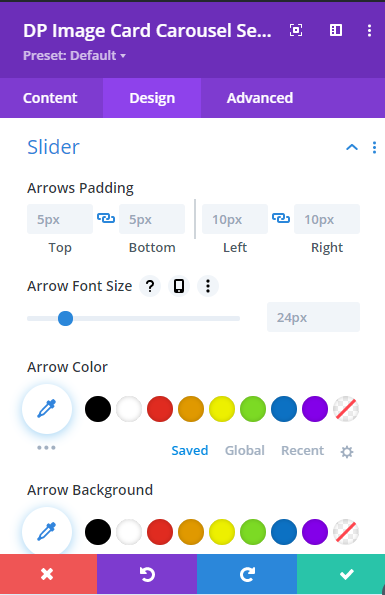
- Change slider arrow size: Go to the Slider >> Arrow Font Size >> move the slider or input the value.
- How to change the slider arrow’s color: Go to the Slider >> Arrow Color >> choose any color.
- Apply different colors to slider dots: Go to the Slider >> Active Dot Pagination Color / Inactive Dot Pagination Color >> choose any appropriate color.
- Adds extra space to the inside of the element: Go to the Spacing >> Slider Container Padding This setting increases the distance between the edge of the element and its inner contents.