
Search Divi Plus Documentation
Search for answers or browse our knowledge base.
Explore Divi Plus's Live Demo
Motion Elements Extension
How to turn on the Motion Elements extension and explains every setting. This extension adds floating images, icons and shapes to a section, row, column or Divi Plus module. Each element moves in its own loop (up and down, side to side, orbit, spin and more), and can also move with the mouse pointer and with page scroll. For more details, view the demo.
Note: This extension works with Divi 5 only.
How to turn on this extension
- In your WordPress dashboard, go to Divi Extended → Divi Plus.
- Open the Extensions tab and then Motion Elements.
- In Enable motion elements for, turn on the parts of the builder where you want to use it: Sections, Rows, Columns and/or Modules.
- Save the settings.
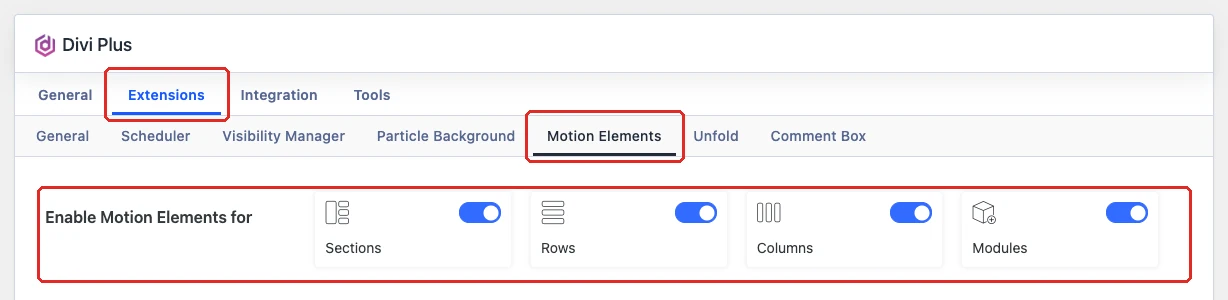
Note: With Modules turned on, the settings show on Divi Plus modules. Sections, rows and columns are the standard Divi ones.
Where to find the settings
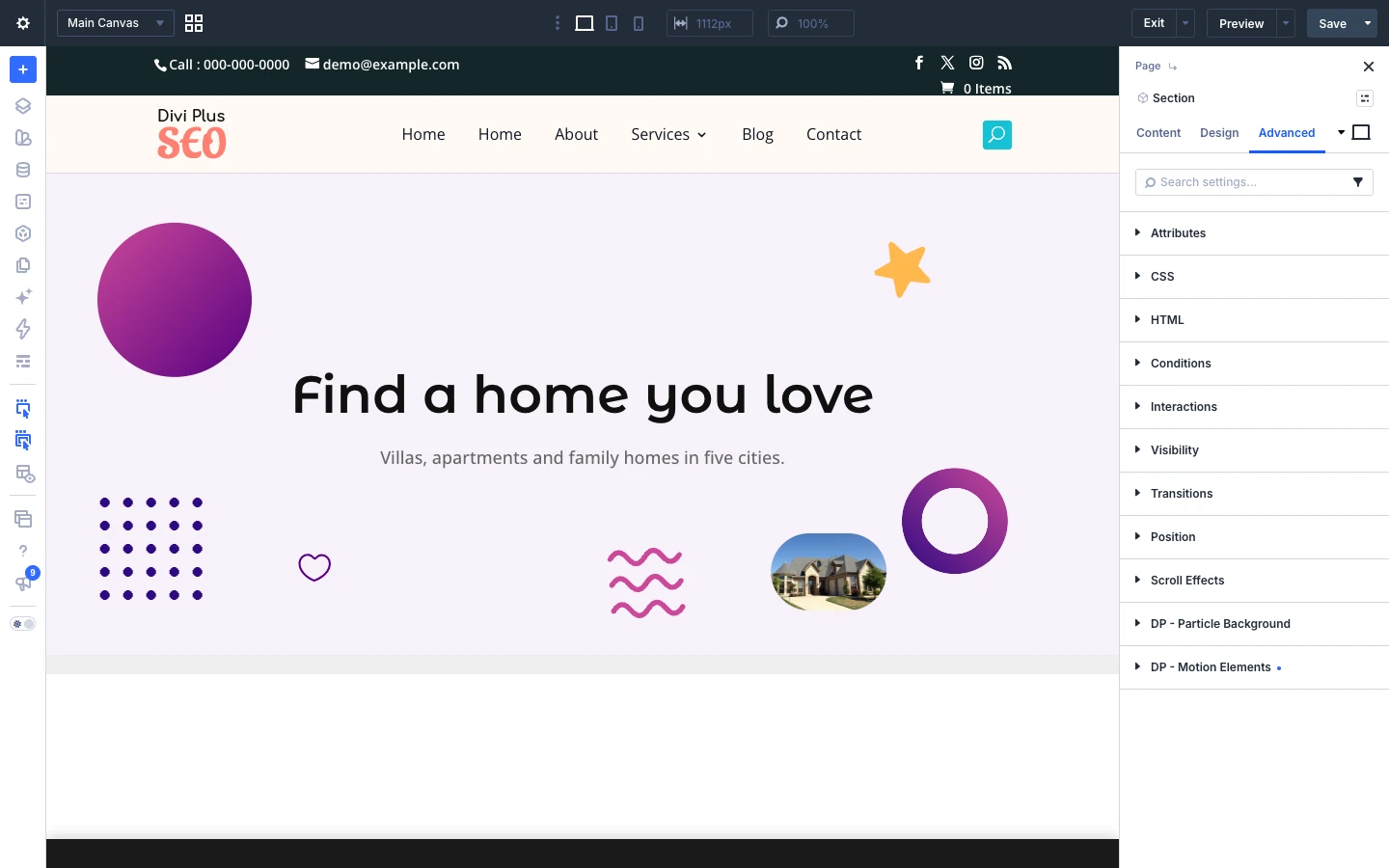
Open the settings of a section, row, column or Divi Plus module, go to the Advanced tab and open the DP – Motion Elements group.
Motion elements settings
- Enable motion elements: Here you can choose whether to float decorative images, icons and shapes over this element.
- Elements: Here you can add the images, icons and shapes that float over this element. You can add up to 30.
- Disable motion on: Here you can choose the devices where the elements should not be shown. Options: Phone, Tablet and Desktop.
- Enable cursor parallax: Here you can choose whether the elements shift as the mouse pointer moves over this element. Each element moves by its own depth.
- Cursor parallax strength: Here you can set the furthest an element at full depth moves with the pointer. Shows when enable cursor parallax is turned on.
- Enable scroll parallax: Here you can choose whether the elements drift up and down as the page scrolls. Each element moves by its own depth.
- Scroll parallax strength: Here you can set how far an element at full depth travels while this element passes through the screen. Shows when enable scroll parallax is turned on.
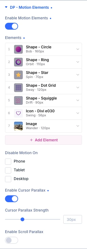
A new section starts with five sample shapes. Click + Add element to add more, the arrow on an element to open its settings, the copy icon to duplicate it and the trash icon to delete it. Drag an element by its number to change the order.
Element settings: Content
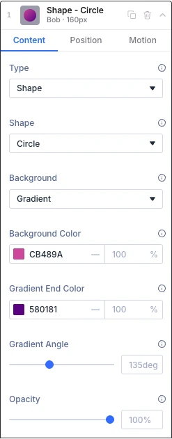
Each element has three tabs: Content, Position and Motion. The Content tab sets what the element shows.
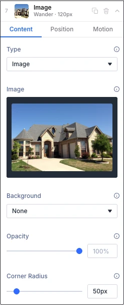
- Type: Here you can choose what this element shows. Options: Image, Icon and Shape.
- Image: Here you can upload the image. A transparent PNG, WebP or SVG blends in best. Shows when type is Image.
- Icon: Here you can choose the icon. Shows when type is Icon.
- Icon color: Here you can choose the color of the icon. Shows when type is Icon.
- Shape: Here you can choose the shape. It is filled with the background below. Options: Circle, Ring, Blob, Triangle, Square, Star, Diamond, Hexagon, Heart, Plus, Burst, Dot grid and Squiggle. Shows when type is Shape.
- Background: Here you can fill the element with a solid color or a gradient. Options: None, Color and Gradient.
- Background color: Here you can choose the background color, or the first color of the gradient. Shows when background is Color or Gradient.
- Gradient end color: Here you can choose the last color of the gradient. Shows when background is Gradient.
- Gradient angle: Here you can set the direction of the gradient. Shows when background is Gradient.
- Opacity: Here you can make the element lighter. 100% is fully visible.
- Corner radius: Here you can round the corners of the image. A large value makes it a circle. Shows when type is Image.
Element settings: Position
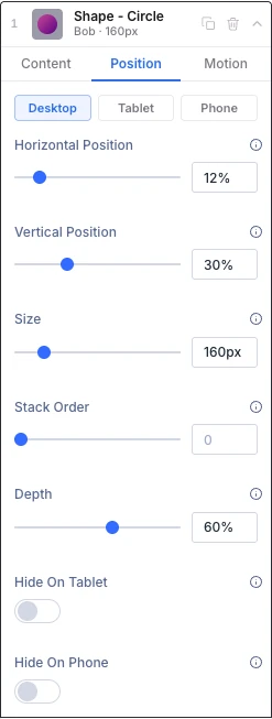
The Position tab sets where the element sits and how big it is. Use the Desktop, Tablet and Phone buttons to set a different position and size for each device. Tablet follows desktop, and phone follows tablet, until you change them.
- Horizontal position: Here you can set where the center of the element sits across the width of this element. 0% is the left edge.
- Vertical position: Here you can set where the center of the element sits down the height of this element. 0% is the top edge.
- Size: Here you can set the width. The height follows the shape of the image, icon or shape.
- Stack order: Here you can choose whether the element sits behind the content (0) or in front of it (above 0). A higher number sits in front of a lower one.
- Depth: Here you can set how strongly the element reacts to the cursor and scroll parallax. Higher is nearer to the viewer.
- Hide on tablet: Here you can hide only this element on tablet.
- Hide on phone: Here you can hide only this element on phone.
Element settings: Motion
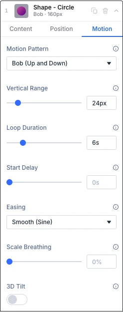
The Motion tab sets how the element moves in a loop.
- Motion pattern: Here you can choose how the element moves in a continuous loop. Options: None, Bob (up and down), Sway (side to side), Wander (figure eight), Orbit (circle), Swing (rotate back and forth), Pendulum (swing from the top), Spin (continuous rotation), Zigzag (sharp turns), Drift (slow and unsynced) and Elastic pop (springy bounce).
- Vertical range: Here you can set how far the element travels up and down. Shows when motion pattern is one of: Bob (up and down), Wander (figure eight), Orbit (circle), Zigzag (sharp turns), Drift (slow and unsynced) and Elastic pop (springy bounce).
- Horizontal range: Here you can set how far the element travels left and right. Shows when motion pattern is one of: Sway (side to side), Wander (figure eight), Orbit (circle), Zigzag (sharp turns) and Drift (slow and unsynced).
- Swing angle: Here you can set how far the element rotates to each side. Shows when motion pattern is one of: Swing (rotate back and forth) and Pendulum (swing from the top).
- Loop duration: Here you can set how long one full loop takes.
- Start delay: Here you can set a delay before the motion starts.
- Easing: Here you can choose how the movement speeds up and slows down. It applies to the up and down, side to side, figure eight, orbit, swing and pendulum patterns. Options: Smooth (sine), Linear and Ease in out.
- Scale breathing: Here you can make the element grow and shrink gently as it moves. 0% turns it off.
- 3D tilt: Here you can let the element lean in 3D as it moves, instead of sliding flat.
- Tilt forward and back: Here you can set how far the element leans forward and back. Shows when 3D tilt is turned on.
- Tilt left and right: Here you can set how far the element leans to each side. Shows when 3D tilt is turned on.
Note: Visitors who turn on reduce motion in their device settings see the elements without the motion.