
Search Divi Plus Documentation
Search for answers or browse our knowledge base.
Explore Divi Plus's Live Demo
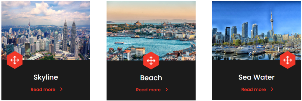
Image Card
Using the Image Card module you can easily add a beautiful image card with extra information like title, content, customized read more button, and an icon on the webpage. Moreover, can create Divi blurb layouts using an image and icon together.
How to add module on page
To create beautiful Image Cards on your website using the Divi Plus Image Card module, follow the below steps:
Once Divi Plus is activated, it adds several modules to the Divi builder. To add a module on the page, use the following steps:
- Create/Edit a Page/Post that uses Divi builder.
- Create/Edit a row.
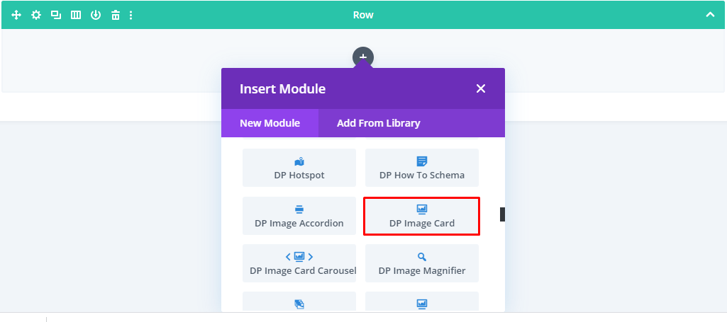
- Click on Add New Module option; choose the DP Image Card module.
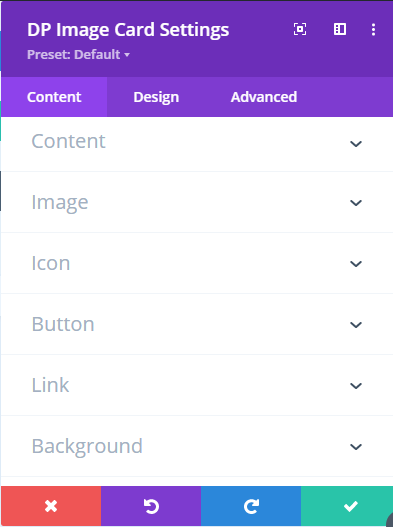
Content Tab
How to set Title & Content for the Image Card
Go to the Content >> Title / Content >> input the text accordingly.
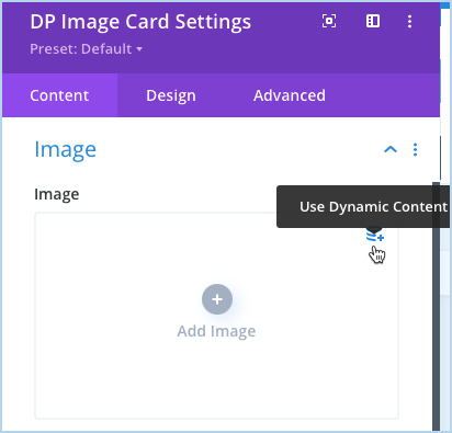
Add image to the Image Card
Go to the Image settings >> Image >> add the image. And you can also add the image using the dynamic content feature.
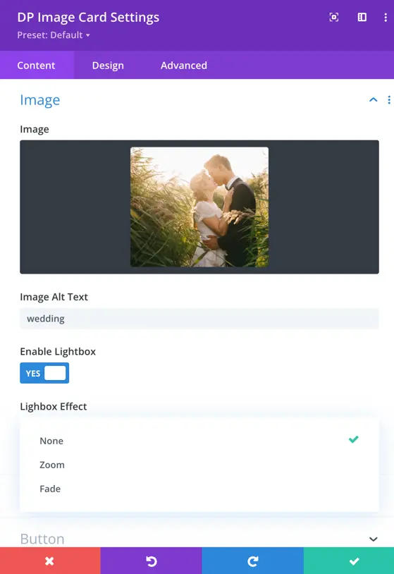
How to insert alt text for the image:
Go to the Image >> Image Alt Text >> input the image’s Alt Text.
Enable Lightbox: Set this to “Yes” to activate the Lightbox feature. Once enabled, you will get the Lightbox Effect options, which include:
Fade – The image appears with a fading effect.
None – No effect applied.
Zoom – The image smoothly enlarges when opened.
How to display an icon:
Go to the Icon settings >> Icon >> select an icon.
How to display a button on the image card:
Go to the Button settings >> Show Button >> YES. It will open further options using which you can add the button text, link.
URL:
Here you can input the URL that you want to open when the user clicks on the Read More Button. You can also fetch dynamically URL for the button.
How to open the button link in a new tab:
Go to the Button >> Link Target >> In The New Tab.
- Adjust image card content background: Go to the Background settings >> Content Background >> customize the background with Color, Gradient, or Image.
Design Customizations
Once customized the image card’s content, move to the Design tab to further improve its look.
- How to change text alignment: Go to the Text settings >> Text Alignment >> change alignment as required.
- How to change text theme: Text >> Text Color >> select Dark / Light.
- Style title text and content: Go to the Title & Content settings >> select TItle / Content >> apply text customizations as needed.
- How to change icon alignment, size, and color: Go to the Icon settings >> use Icon Alignment / Icon Font Size / Icon Color >> to change alignment / size / color.
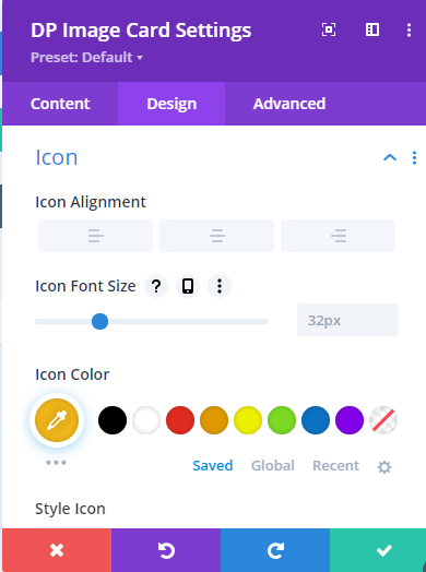
- How to apply shape and shape background color to the icon: Go to the Icon >> Style Icon >> YES. Use Shape >> to choose shape as Circle / Square / Hexagon. Use Shape Background >> to change shape background with color.
- How to change Button alignment: Go to the Button settings >> Button Alignment >> choose alignment as required.
- How to apply custom styling to the button: Go to Button >> Use Custom Styles For Button >> YES.