
Search Divi Plus Documentation
Search for answers or browse our knowledge base.
Explore Divi Plus's Live Demo
-
Getting Started
-
Modules
- Accordion Slider
- Advanced Carousel
- Advanced Counter
- Advanced Table
- Advanced Tooltip
- Ajax Live Search
- Alert Box
- Audio Player
- Background Switcher
- Bar Chart
- Bar Counter
- Before After Image Slider
- Blog
- Blog Categories
- Blog Slider
- Blog Timeline
- Breadcrumbs
- Business Hours
- Button
- Comparison List
- Content Toggle
- Coupon
- Divi Tilt Image
- Dropdown Button
- Facebook Comments
- Facebook Embedded Post
- Facebook Embedded Video
- Facebook Like
- Facebook Page
- Facebook Share
- Fancy Heading
- Fancy Text
- FAQPage Schema
- Filterable CPT Grid
- Filterable Gallery
- Flip Box
- Floating Images
- Form Styler
- Gravity Forms Styler
- Hero Slider
- Horizontal Scrolling Card
- Horizontal Scrolling Portfolio
- Horizontal Scrolling Posts
- Hover List
- How To Schema
- Image Accordion
- Image Card
- Image Card Carousel
- Image Card Ticker
- Image Hotspot
- Image Hover Effect
- Image Magnifier
- Image Mask
- Image Stack
- Instagram Feed
- Instagram Feed Carousel
- Interactive Circle
- Interactive Image Card
- List
- Logo Slider
- Lottie
- Marquee Text
- Masonry Gallery
- Modal Popup
- Mystery Image
- Paypal Button Guide
- Pie Chart
- Portfolio Grid
- Portfolio Slider
- Posts Ticker
- Price List
- Progress Bar
- Promotion Bar
- Rotating Text
- Scroll Image
- Scroll Stack Cards
- Scroll Text
- Scrolling SVG
- Scrolling Zoom Gallery
- Separator
- Shuffle Text
- Split Image
- Star Rating Module
- Sticky Video
- Stripe Button
- SVG Animator
- Table of Contents
- Tabs
- Team Grid
- Team Slider
- Testimonial Grid
- Testimonial Slider
- Text Animator
- Text Highlighter
- Text Hover Effects
- Text with Media
- Timeline
- Timeline Slider
- Twitter Embedded Tweet
- Twitter Follow Button
- Twitter Timeline
- Twitter Tweet Button
- Vertical Image Slider
- Video Mask
- Wavy Gallery
- Woo Product Gallery
- Woo Products Accordion
- Woo Products Categories
- WooCommerce Brands Carousel
- WooCommerce Product Categories Carousel
- WooCommerce Products
- WooCommerce Products Carousel
- Show all articles ( 97 ) Collapse Articles
-
Extensions
-
Tools
-
Divi Plus Child Themes
- Divi Plus prebuilt websites
- How can I change the colors and styles across site when using a Divi Plus child theme?
- How to import Divi Plus child themes
- Import Failed: Server Timeout Importing Posts, Reduce The Batch Size And Try Again
- Missing Divi Plus child themes, starter templates, and sections?
- Setting up menu and footer links in divi plus child themes
- Why am I not seeing the Courses page content in Divi Plus Driving School child theme.
-
Templates
-
FAQs
- 404 error on pages after importing child theme?
- Add border-radius to image hotspot tooltip
- After adding a product to the cart, the button changes to "View Cart." How can I keep the "Add to Cart" button visible instead?
- Align submit button to right in DP Gravity Forms
- Border around product thumbnail in DP Woo Products
- Can I display feeds from multiple Instagram profiles under One account using DP Instagram Feed?
- Category sorting in Divi Plus Team Slider module
- Currency symbol after price in DP WooCommerce Products module
- Currency symbol after the price in DP Price List module
- Difference between the DP Flip box and the Blurb Extended Advanced Flip box?
- Divi visual builder became slow or does not load?
- Does the modal popup module support the "on-exit" trigger work on mobile devices?
- Download Divi Plus modal popup demo page
- DP Blog Slider: Convert arrow slider default background shape into circle
- DP Image Accordion button not appearing on page?
- DP Woo Modules are not viewing?
- DP Woo Product Carousel: Equalize height
- Enable or disable toggle icon in FAQ module
- Equalize height of blog slider posts
- Error: There has been a critical error on the website after activating Divi Plus
- FAQ Page Schema close/open icons not showing properly
- Hero Divi Plus Agency Section block animation is not working
- Hide a specific tooltip in the image hotspot module and only show icon
- Hide the excerpt in the mobile view in DP Blog Post Slider
- How can add space between images in the DP Image Accordion?
- How can align all titles in the Interactive Image Card module when using the Lily effect?
- How can align the title and text below the image in the DP Image Card Carousel module?
- How can avoid the Duplicate field FAQPage error when using multiple FAQ modules on a single page?
- How can crop images or adjust their size in the DP Woo Product Carousel module?
- How can enable comment support in the Divi Plus team member custom post type?
- How can I download layouts, themes, and section blocks after activating Divi Plus?
- How can I increase the tooltip width in the DP Hotspot module?
- How can restrict the ability to toggle modules on and off for specific user roles, such as editors.
- How can word "title" be removed from the DP Image Card Carousel?
- How to add a floating image in a circle?
- How to add line break in content on the pop-up in DP team grid.
- How to add live search feature to your Divi menu using Divi Plus
- How to add overlay color in DP WooCommerce Product image on hover
- How to adjust frame width in layout 2 in the woo product category module?
- How to align add to cart button in DP Woo Product?
- How to align add to cart button in DP Woo Products Carousel?
- How to align buttons bottom inside DP image card carousel?
- How to align icon left to question in DP FAQPage Schema module.
- How to align the "Read More" button in the DP Blog Slider
- How to align the button to the bottom in DP image card
- How to center align text in the Advanced Table module using CSS
- How to change "dipl-team-member" slug from URL in DP team member
- How to change arrow color in before-after slider module?
- How to change color of clear search icon in DP Ajax Search?
- How to change the color and style of divider in the price list
- How to change the default direction of the timeline items when using the alternate layout?
- How to change the moving direction in Divi Image Card Carousel
- How to change the moving direction in logo slider
- How to change the Question heading level in FAQPage Schema?
- How to change title font style in blog slider.
- How to close FAQ Schema toggle
- How to create a smooth linear slider in carousel modules?
- How to customize the mobile menu when the header is applied from the Divi Theme Builder?
- How to disable hyperlinks in the Blog Timeline Module
- How to disable modal pop-up on mobile and tablet?
- How to disable particles background on mobile?
- How to display blurry images in high quality
- How to display particle background in header?
- How to display title and caption on overlay in DP masonry gallery
- How to displays all team photos with uniform dimensions in DP Team Grid module?
- How to enable only selected modules in Divi Plus plugin
- How to enable the functionality of clickable URLs defined in tooltips in DP Hotspot?
- How to export and import the Divi Plus static module with all content and styling?
- How to fix DP Button module's border color issue?
- How to give a smooth transition in DP Image Card Carousel
- How to give a smooth transition in DP Logo slider
- How to hide post title in DP Blog Slider
- How to hide team member image in DP Team grid module?
- How to increase author image size in DP testimonial?
- How to increase the size of search result box in divi plus ajax search
- How to insert contact form in modal popup?
- How to link the filterable category in the DP Team Grid Module to its respective category page?
- How to make DP Testimonial slider vertical center
- How to make the content responsive in Interactive image card module: Lily Effect?
- How to make the Divi Plus Image Card Carousel images of same height?
- How to make the height fixed for all flip boxes in a row
- How to make the trigger button for the DP Modal popup full width?
- How to Open a Modal Popup from the Divi Pricing Table Button
- How To Order Posts by Menu in DP Team Slider
- How to remove an extra white space in DP Interactive Image Card module?
- How to remove post category from breadcrumb while using DP Breadcrumb
- How to remove the feature image zoom on hover effect in DP team grid
- How to remove the search field border in Ajax Search?
- How to replace the website icon with a WhatsApp icon in the DP Team Grid module?
- How to set border on active titles only in DP Tabs
- How to set the alignment of the Hotspot image in the DP Hotspot module?
- How to show two tabs in a single row on a mobile and four tabs in a row on a tablet in DP Tabs ?
- Image Magnifier not showing lense?
- Is it possible to add CSS ID and Class to individual buttons or cards in the Image Card Carousel?
- Is the DP Modal content picked by Google for SEO
- Is there a developer version of Divi Plus available for testing?
- Link team members to their single page
- Logo slider not working?
- Make page scrollable in Divi Plus Modal
- Make the DP Team Slider responsive
- Menu items and category ordering/sorting
- Missing items in the Divi Plus download
- Modal heading font customization for the specific device
- Modal popup ignores trigger delay?
- No Results Found! on Woo Modules?
- Set image position in the Floating Images module
- Setting a background hover style on button
- Show before-after slider label all the time
- Slider is not working
- Text alignment top in DP Blog slider layout 1
- Text styling on the last item in DP Breadcrumb
- To change title and content position in the DP interactive image card effect roxy
- To make title center and remove extra white space in effect oscar
- To show the cursor pointer on image DP team grid when on click trigger is a link
- Trigger modal from a link inside hotspot marker tooltip content
- Using Divi Plus with Polylang and multi-lingual plugins
- Visual Builder won’t finish loading when Divi Plus is activated
- What is the difference between various image sizes masonry gallery
- What steps can be taken to troubleshoot and resolve an error related to the jQuery script in the DP Testimonial plugin?
- Where to download Divi Plus starter templates
- Why am I not seeing the newly added modules from Divi Plus?
- Why are Facebook modules no longer supported for users in the European Region?
- Why is my Instagram feed showing “No Instagram posts found”?
- Why my form is not working inside Modal Popup?
- Why my Instagram Feed may not be displaying?
- Why slider arrows are not visible when the arrow position is set outside in the image card carousel?
- Woo Product Categories: How to equalize column height when category text exceeds?
- Woo Products: Module's content becomes unequal when product text size is differ
- Show all articles ( 113 ) Collapse Articles
-
Developer Documentation
-
Billing
Floating Action Button
Overview
How to turn on the Floating Action Button extension and explains every setting, with screenshots. This Button adds a round button in a corner of every page. When a visitor clicks or hovers over it, it opens a set of action buttons, such as call, email, WhatsApp, a link or scroll to top. Each action button has its own icon, tooltip and colors. For more details, view the demo.
How to turn on button
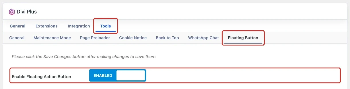
- In your WordPress dashboard, go to Divi Extended → Divi Plus.
- Open the Tools tab and then Floating Button.
- Turn on Enable floating action button.
- Click Save Changes.
Floating button settings
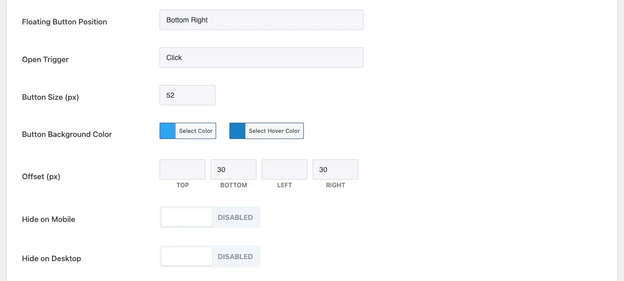
The other settings show only after you turn the extension on. Click Save Changes after you change anything.
- Floating button position: Here you can choose the corner where the button sits. Options: Bottom right and Bottom left.
- Open trigger: Here you can choose how the action buttons open. Options: Click and Hover.
- Button size (px): Here you can set the size of the main button.
- Button background color: Here you can choose the background color of the main button, and a separate color for hover.
- Offset (px): Here you can set the distance of the button from the top, bottom, left and right edges of the screen.
- Hide on mobile: Here you can hide the button on screens narrower than 981px.
- Hide on desktop: Here you can hide the button on screens 981px and wider.
Action buttons
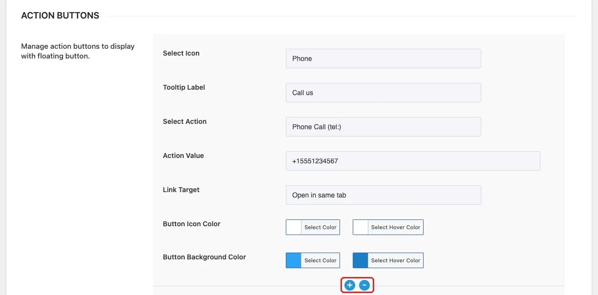
Each action button has its own set of settings. Click the + icon under a button to add a new one, and the − icon to remove it.
- Select icon: Here you can choose the icon of the button. Options: Phone, Email, WhatsApp, Chat / Message, Link, Scroll to top, Map / Location, Calendar, Download, Share and Star / Favourite.
- Tooltip label: Here you can enter the text that shows next to the button on hover, for example “Call us”.
- Select action: Here you can choose what happens on click. Options: External URL, Phone call (tel:), Email (mailto:), WhatsApp and Scroll to top.
- Action value: Here you can enter the value for the selected action: a URL, a phone number, an email address or a WhatsApp number. Scroll to top does not need a value.
- Link target: Here you can choose whether the action opens in the same tab or a new tab.
- Button icon color: Here you can choose the icon color, and a separate color for hover.
- Button background color: Here you can choose the background color of the action button, and a separate color for hover.
Note: For a WhatsApp action, enter the number with the country code and digits only, for example 15551234567.