
Search Divi Plus Documentation
Search for answers or browse our knowledge base.
Explore Divi Plus's Live Demo
Vertical Image Slider
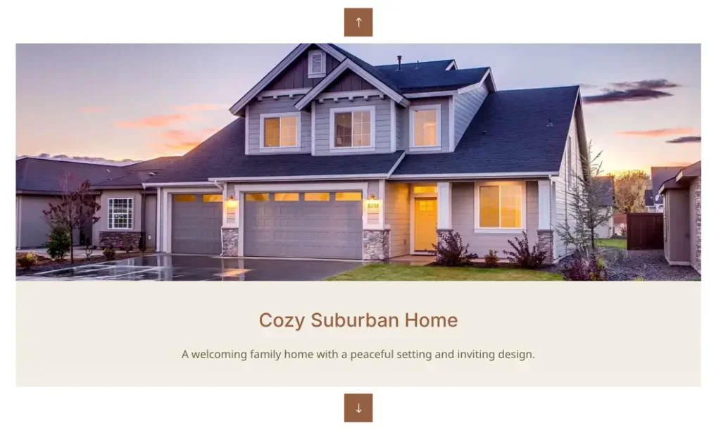
This documentation article guides you through the setup, configuration, and customization of the DP Vertical Image Slider module in Divi Plus. Here, you will learn how to add vertical image carousels to your pages, configure slide directions and playback settings, and customize navigation and styling options using the Divi Builder.
View Live Demo: To see the DP Vertical Image Slider module in action, click here to explore the Divi Plus Vertical Image Slider Demo Page.
Prerequisite
- Make sure Divi Plus plugin is installed and activated on your WordPress website.
- Ensure the Vertical Image Slider module is enabled under Divi Extended > Divi Plus > Modules.
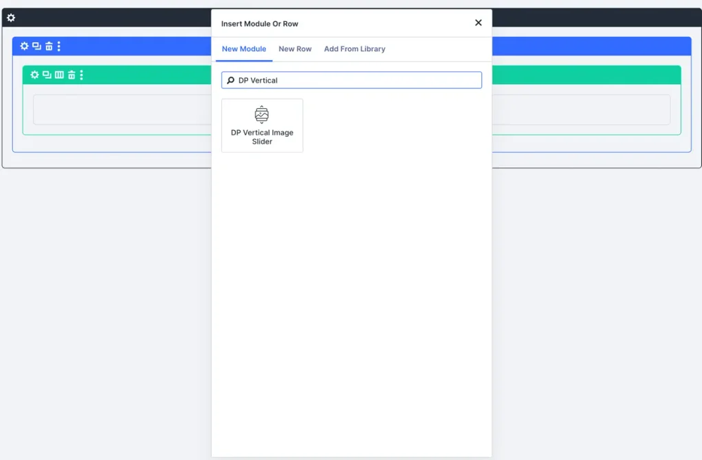
Add module to page
- Open Divi Builder.
- Create or select an existing row.
- Click Add New Module.
- Search for DP Vertical Image Slider and click to insert it.
Add images and content items
Inside the Content tab of the module settings:
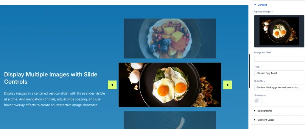
- Click Add New Item (
+button) to add an individual image slide. - In the child item settings:
- Image: Upload or select an image from the WordPress Media Library.
- Title and Caption (Optional): Enter a title and description for the slide image.
- Repeat the process to add multiple image slides to your vertical slider.
Card settings
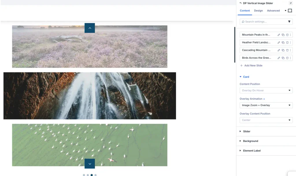
Inside the Content > Card panel, you can customize how the content overlay and entrance animations behave on each slide card:
- Content Position: Defines where and how the slide text content (title, caption, and button) appears relative to the image.
- Overlay On Hover: Displays the content overlay only when the user hovers over the card image.
- Overlay (Always Visible): Keeps the overlay text visible over the image at all times.
- Top / Bottom / Left / Right: Displays the content positioned adjacent to the image.
- Overlay Animation: Specifies the transition animation effect used when the overlay appears on mouse hover (e.g., Slide Up, Fade, Zoom In, or Slide Down).
- Overlay Content Position: Controls the alignment of the text content inside the overlay container (e.g., Center, Top, Bottom, Left, or Right)
Configure slider settings
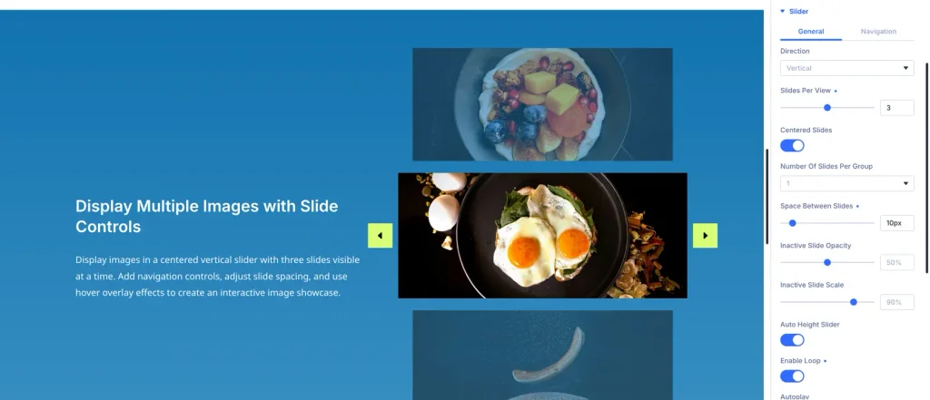
Return to the main module Content tab and open the Slider Settings panel:
- Slide Direction: Choose Vertical or Horizontal.
- Autoplay: Enable to automatically cycle through images without user interaction.
- Autoplay Speed: Set the delay between slides (e.g.,
3000msfor 3 seconds). - Transition Duration: Set the sliding animation speed (e.g.,
600ms). - Loop: Enable infinite looping so the slider seamlessly restarts after the last slide.
- Pause on Hover: Pause the vertical sliding animation when a user hovers over the module.
- Slides Per View: Define how many images are visible at once vertically (e.g.,
1,2, or3). - Space Between Slides: Set spacing in pixels (e.g.,
20px) between adjacent vertical slides.
Configure navigation and arrows
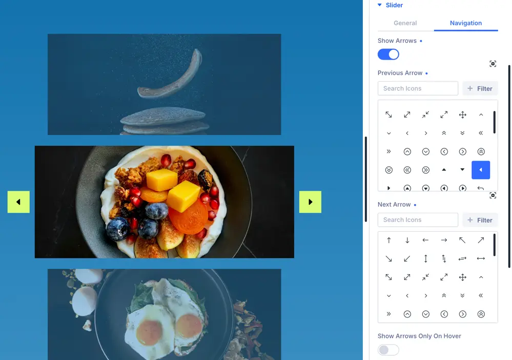
Under Content > Navigation:
- Show Navigation Arrows: Toggle ON/OFF to display top and bottom navigation arrows.
- Show Pagination Dots: Toggle ON/OFF to display vertical dot indicators.
- Arrow Icons: Choose custom arrow icons for previous (up) and next (down) actions.
Customize styling in design tab
Switch to the Design tab to style every element of your Vertical Image Slider:
Image settings
- Image Border and Corner Radius: Add rounded corners (e.g.,
10px) to all slide images. - Box Shadow: Apply shadow effects for a 3D pop-out look.
- Image Filters: Adjust brightness, contrast, saturation, or add a grayscale filter.
Navigation arrows and dots styling
- Arrow Color and Background: Customize arrow icon color, background fill color, and hover effects.
- Arrow Size and Position: Adjust arrow icon size and spacing.
- Pagination Dot Color: Customize default dot color and active dot accent color.
Title and overlay text styling
- Title Font and Size: Choose font family, weight, text alignment, and font size for slide titles.
- Overlay Background: Set overlay background color and opacity when hovering over images.
Sizing and Spacing
- Module Height: Set custom fixed or max-height for the vertical slider container.
- Margin & Padding: Adjust internal padding and external margin for desktop, tablet, and mobile viewports.
Best practices
Equal Aspect Ratio Images: For the cleanest vertical sliding effect, ensure all uploaded images share the same aspect ratio (e.g., 1:1 square or 4:3 ratio).
NOTE
Responsive Optimization: Use Divi’s responsive toggle to adjust Slides Per View and Space Between separately for Mobile and Tablet viewports to ensure seamless display on smaller screens.