Search Divi Plus Documentation
Search for answers or browse our knowledge base.
List
Divi Plus List module is a simple yet powerful tool to help you create and customize lists with text, icons, or images in various layouts.
How to add List module to your webpage
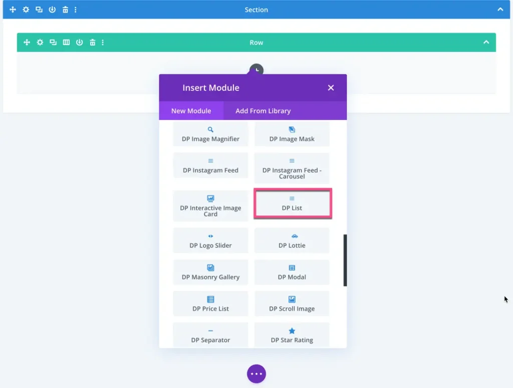
Once Divi Plus is activated, it adds several modules to the Divi builder. To add a module on the page, use the following steps:
- Create/Edit a Page that uses Divi builder.
- Create/Edit a row.
- Click on the Add New Module option; choose the DP List module.
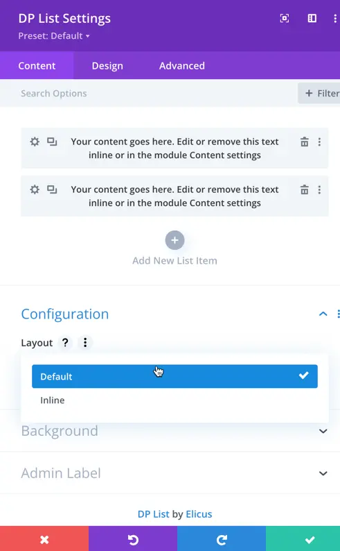
Content Options
Add New List Item: In this section, you can add individual list items and customize their settings.
Configuration
Layout: The DP List module provides two layout options: Default and Inline.
- Default: All the list items are displayed vertically in a list format.
- Inline: List items are displayed horizontally in a row.
DP List Item Setting
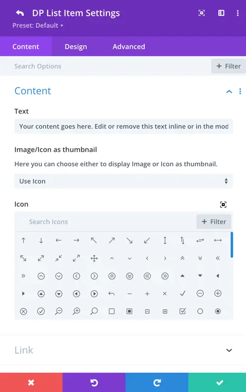
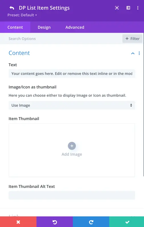
Content
Text: Insert the text here that you want to appear in the list item.
Image/Icon as Thumbnail: Choose between using an image or an icon as the thumbnail for the list item.
- Icon: When selecting an icon, you can choose the specific icon you want to use.
- Item Thumbnail Alt Text: If you opt for an image, you can upload the image and provide alternative text for the image thumbnail.
DP List Item Design Settings
In the DP List Module, the design settings allow you to customize the appearance of list items, including text and icon thumbnails.
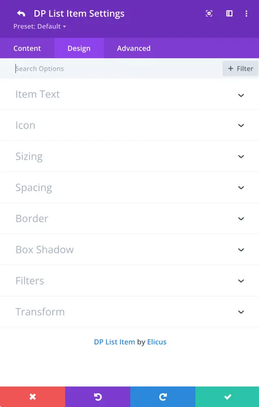
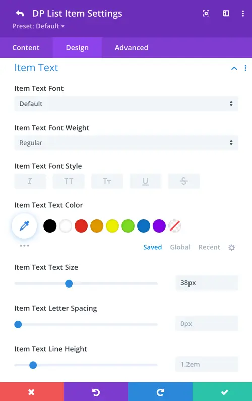
Item Text
- Customize item text font, weight, style, text color, text size, letter spacing, and line height.
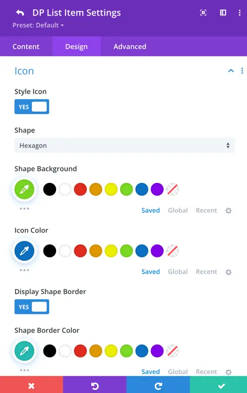
Icon
Toggle the “Style Icon” option to enable additional settings for the icon.
- Adjust shape background, icon color, display shape border, and border color as per your preference.
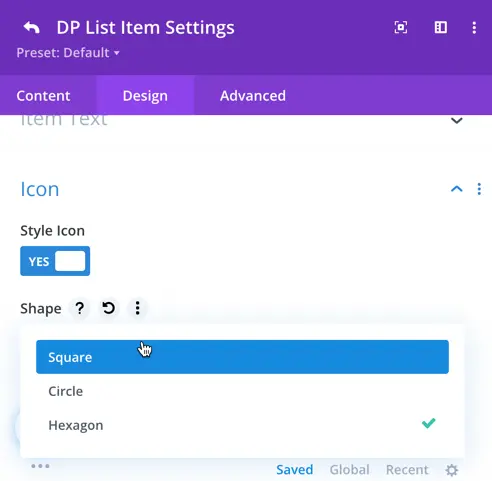
Shape: Choose from different shapes like hexagon, circle, or square for the icon.
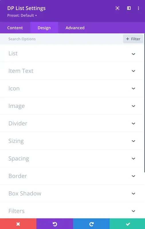
Design Setting
In the Design Panel, you find settings that apply globally to all lists. Customize the design for item text, icon, image, and divider elements here.
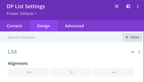
List
Alignment
You can control the alignment of the list by selecting the desired alignment options.
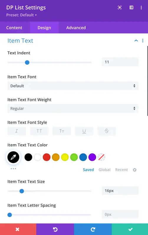
Item Text
In this section, you can control the settings for the list item text. Set the text indent, item text font, item text font weight, style, text color, size, and spacing.
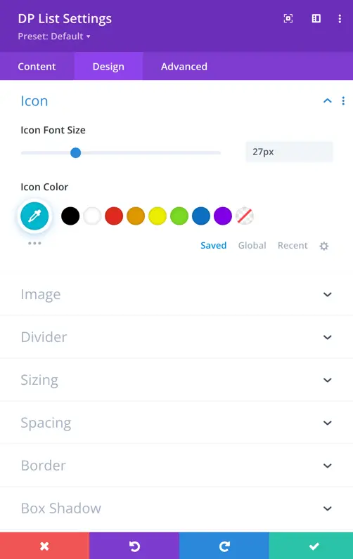
Icon
In the icon setting, you can adjust the icon font size and change the icon color.
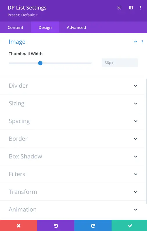
Image
In the image setting, you can set the thumbnail width.
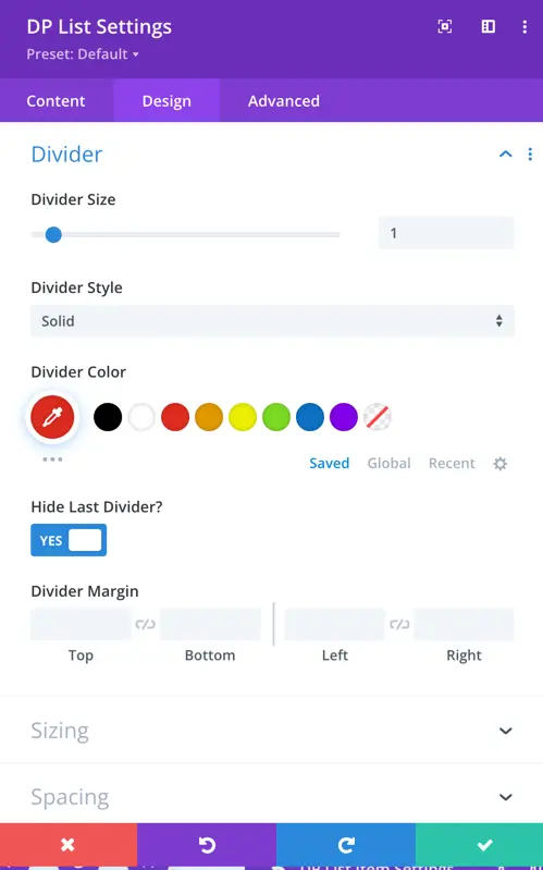
Divider
Using this setting, you can add a divider and choose the divider style, divider color. Additionally, you have the toggle option to hide the last divider.