Search Divi Plus Documentation
Search for answers or browse our knowledge base.
Explore Divi Plus's Live Demo
Filterable CPT Grid
How to add the Filterable CPT Grid module to your page and explains every setting. This module shows posts from any post type (posts, pages, products or a custom post type) in a grid. Visitors can filter the grid with term buttons, or with a search box and taxonomy dropdowns, without reloading the page. For more details, view the demo.
Note: The Filterable CPT Grid module works with Divi 5 only. If you don’t see it in the module list, go to Divi Extended → Divi Plus → General → Modules, turn on Filterable CPT Grid and save.
How to add the module
- Open your page in the Divi Visual Builder.
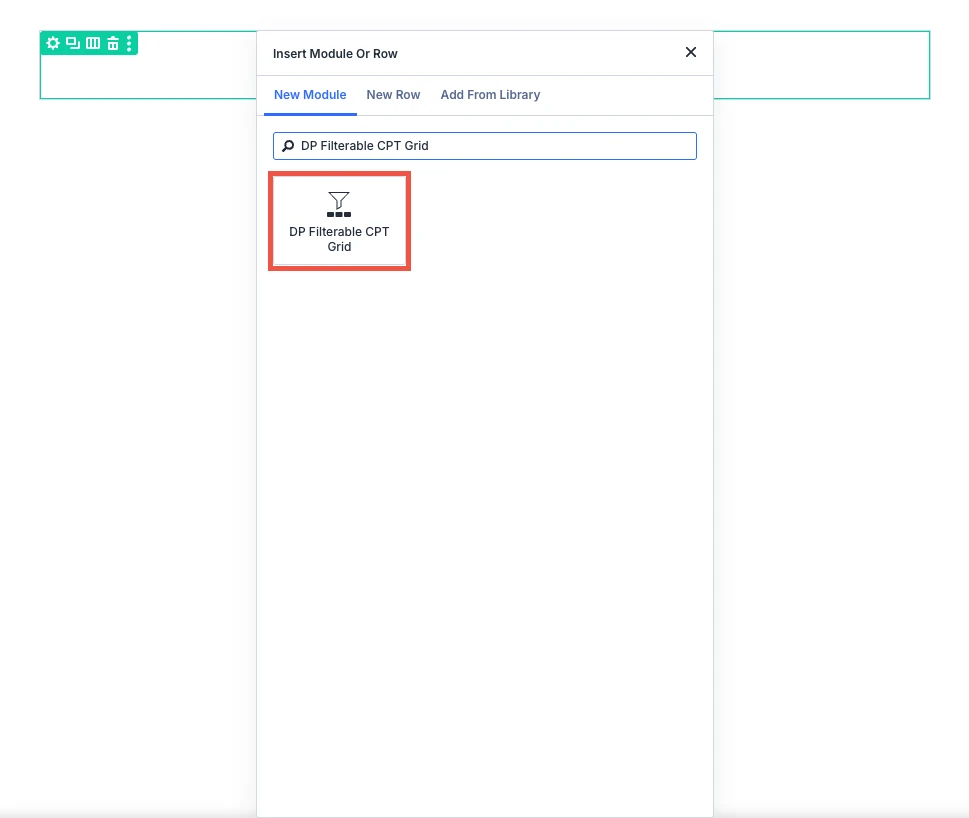
- Click the (+) icon inside a row to add a new module.
- Search for DP Filterable CPT Grid in the module search box.
- Click the module to insert it. Its settings open on the right.
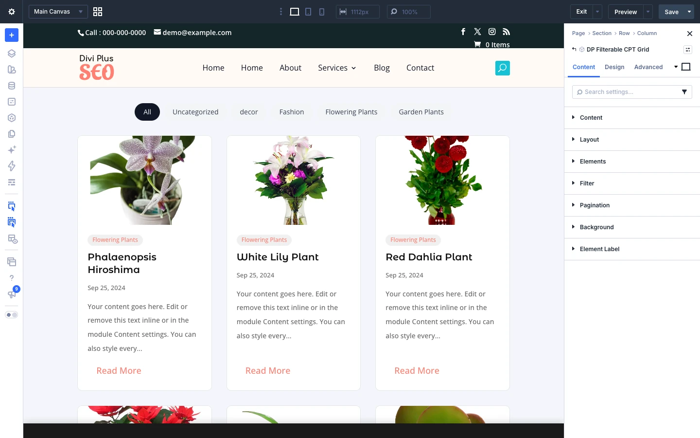
Content tab
The Content tab chooses which posts to show, the layout, the elements on each card, the filter and the pagination.
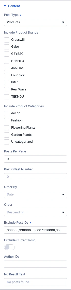
Content tab: Content
- Post type: Here you can choose the post type to display in the grid.
- Include terms: This shows one list for each taxonomy of the chosen post type, for example Include product brands and Include product categories. Choose which terms to show posts from. A parent term includes its child terms.
- Posts per page: Here you can input the number of posts shown at once, from 1 to 100. With pagination this is the number per page.
- Post offset number: Choose how many posts you would like to skip. These posts will not be shown in the grid. The offset does not apply once a visitor filters or searches.
- Order by: Here you can choose how the posts are sorted. Random keeps one order while paging through the grid. Options: Date, Modified date, Title, Menu order, ID, Comment count and Random.
- Order: Here you can choose the order of your results. Options: DESC and ASC.
- Exclude post IDs: Here you can enter the IDs of posts to leave out, separated by commas.
- Exclude current post: Here you can choose whether or not to leave out the post being viewed, for example in a Theme Builder template.
- Author IDs: Here you can enter author IDs, separated by commas, to show only their posts. Leave empty for all authors.
- No result text: Here you can define the text shown when no posts match.
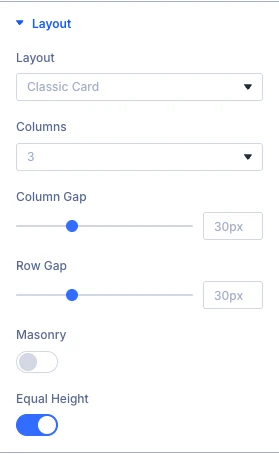
Content tab: Layout
- Layout: Here you can choose the layout of the posts. Options: Classic card, Overlay, Side list and Featured first post.
- Columns: Here you can choose the number of columns.
- Column gap: Increase or decrease the space between columns.
- Row gap: Increase or decrease the space between rows.
- Masonry: Here you can choose whether or not posts of different heights are stacked without gaps.
- Equal height: Here you can choose whether or not posts in a row have the same height, with the buttons lined up at the bottom.
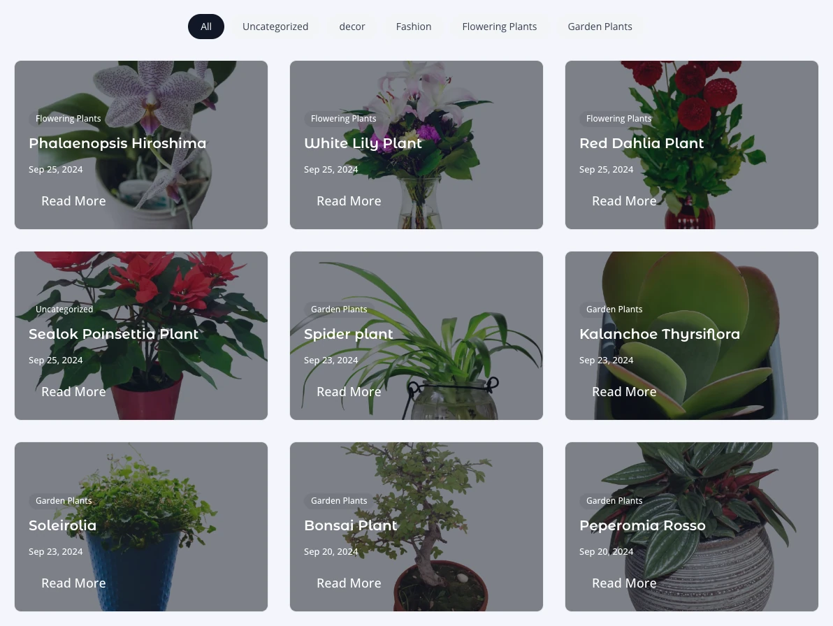
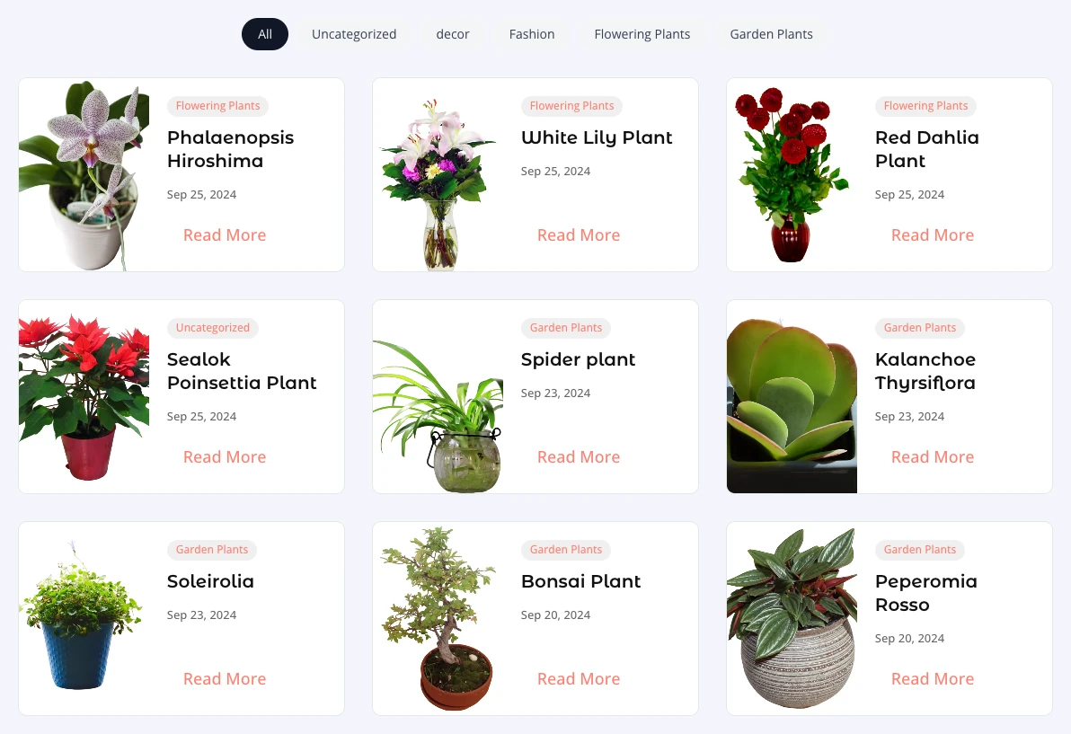
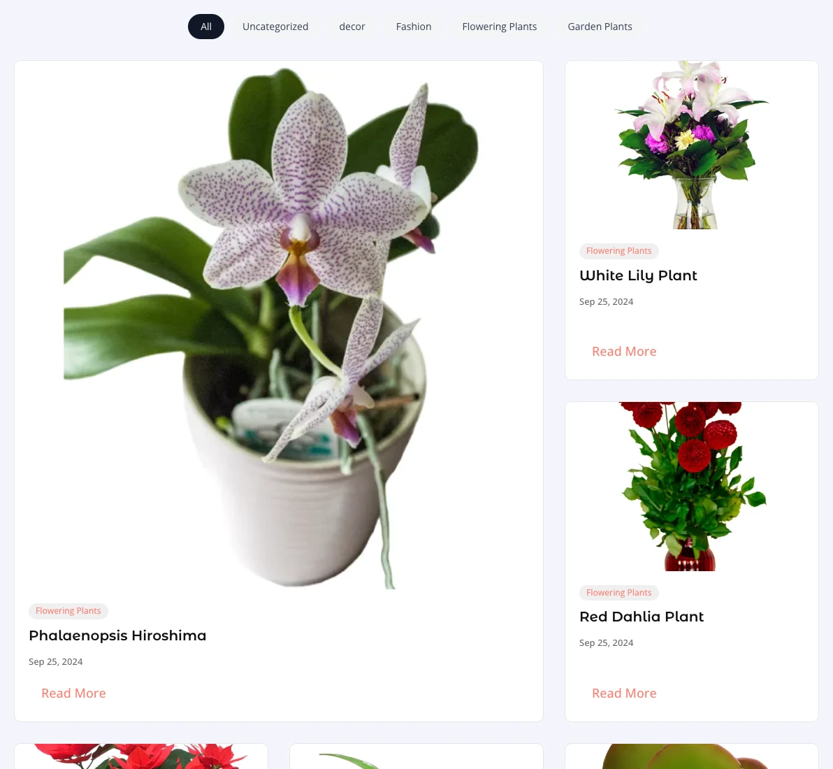
Content tab: Elements
- Show featured image: Here you can choose whether or not to display the featured image. Hide it for a text-only card.
- Image size: Here you can choose the image size loaded. A smaller size loads faster. Options: Thumbnail, Medium, Medium large, Large and Full.
- Lazy load images: Here you can choose whether or not images load only when they come near the screen. Turn it off for a grid at the top of the page.
- Zoom image on hover: Here you can choose whether or not the image zooms in slightly on hover.
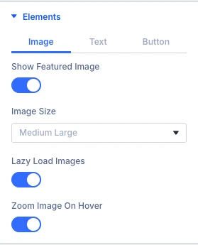
Content tab: Elements text
- Show title: Here you can choose whether or not to display the title.
- Show terms: Here you can choose whether or not to display the terms of each post.
- Terms taxonomy: Here you can choose which taxonomy’s terms are shown on each post.
- Show date: Here you can choose whether or not to display the publish date.
- Date format: Here you can input a PHP date format, such as M j, Y. Leave empty for the site’s date format.
- Show author: Here you can choose whether or not to display the author name.
- Show excerpt: Here you can choose whether or not to display the excerpt.
- Excerpt length: Here you can define the excerpt length in characters. The manual excerpt is shortened to this length too.
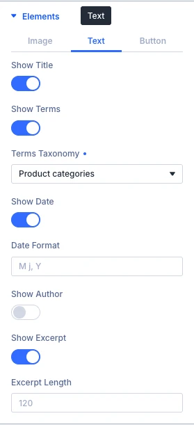
Content tab: Elements button
- Show read more button: Here you can choose whether or not to display the read more button.
- Button text: Here you can input the text of the read more button.
- Button link target: Here you can choose whether or not the button opens the post in a new tab. Options: In the same window and In the new tab.
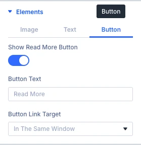
Content tab: Filter
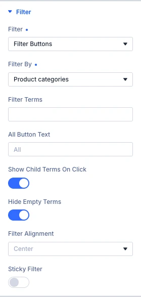
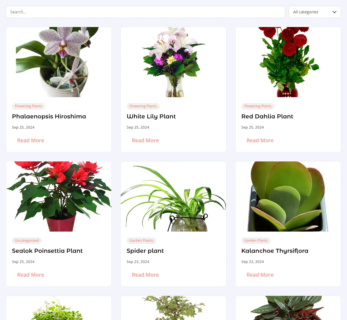
- Filter: Here you can choose how visitors filter the posts: none, a row of term buttons for one taxonomy, or a search form with a search box and a dropdown for each chosen taxonomy. Options: Hide / none, Filter buttons and Search form.
- Filter by: Here you can choose the taxonomy the buttons filter by: categories, tags or any other taxonomy of this post type.
- Filter terms: Here you can enter the slugs of the terms to show as buttons, separated by commas. Slugs stay the same when the design is moved to another site. Leave empty to show every term.
- All button text: Here you can define the text of the button that shows all posts.
- Show child terms on click: Here you can choose whether child terms appear in their own row once their parent is clicked. When off, every term is shown in one row.
- Hide empty terms: Here you can choose whether or not terms without posts are left out of the filter.
- Filter alignment: Here you can choose how the filter is aligned.
- Sticky filter: Here you can choose whether or not the filter stays at the top of the screen while scrolling through the grid. You can set it for each device, for example off on phones.
Content tab: Pagination
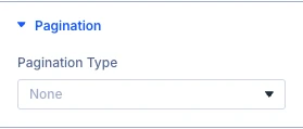
- Pagination type: Here you can choose how more posts are loaded. All types load without reloading the page. Options: None, Numbered, Load more button and Infinite scroll.
The Link, Background and Meta groups are the standard Divi options.
Design tab
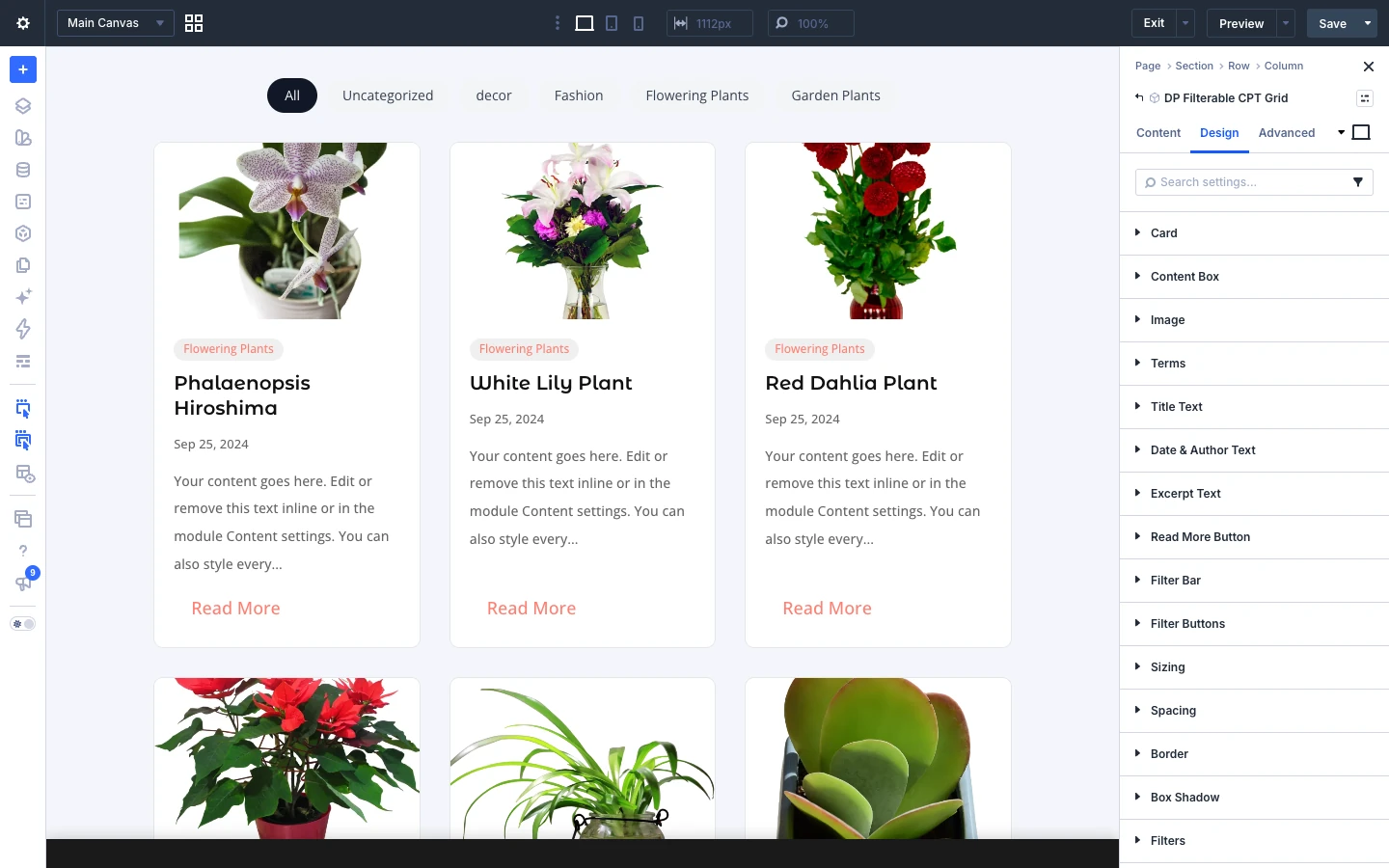
The Design tab styles the card, content box, image, terms, title, date and author, excerpt, read more button and the filter bar and buttons.
Design tab: Card
- Background color: Here you can select the background color of each post card.
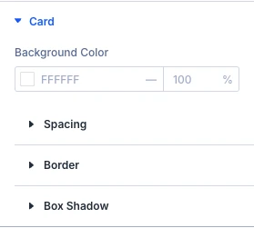
Design tab: Content box
- Background color: Here you can select the background color of the area holding the text and button.
Use the standard Divi spacing settings to style the content box.
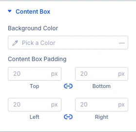
Design tab: Image
- Image ratio: Here you can choose the shape of the image. Original keeps each image’s own proportions.
- Image border radius: Here you can control the corner radius of this element. Enable the link icon to control all four corners at once, or disable to define custom values for each.
Use the standard Divi border and box shadow settings to style the image.
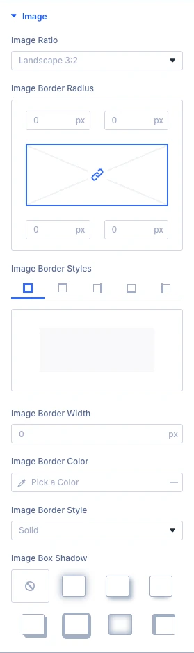
Design tab: Terms
- Background color: Here you can select the background color of the term labels.
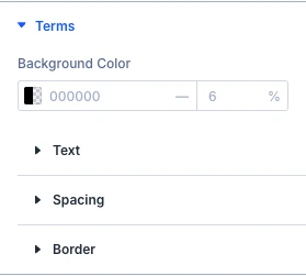
Design tab: Title text
Use the standard Divi text settings (font, weight, size, color, line height, letter spacing, alignment and more) to style the title text.
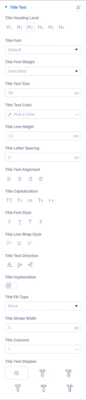
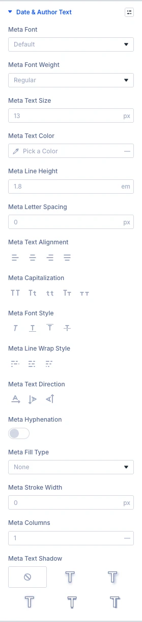
Design tab: Date and author text
Use the standard Divi text settings (font, weight, size, color, line height, letter spacing, alignment and more) to style the date and author text.
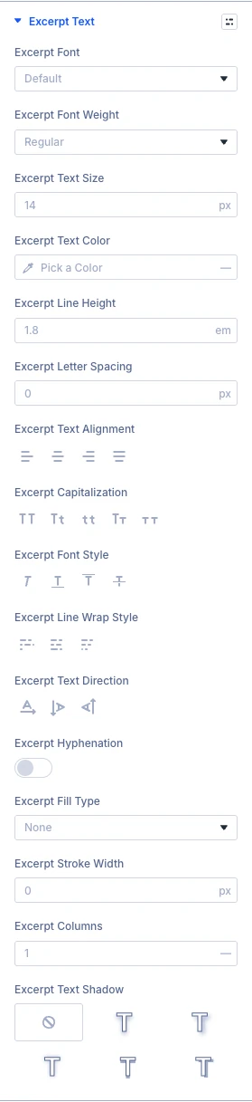
Design tab: Excerpt text
Use the standard Divi text settings (font, weight, size, color, line height, letter spacing, alignment and more) to style the excerpt text.
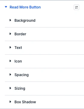
Design tab: Read more button
Use the standard Divi button settings (text, background, border, font, icon and spacing) to style the read more button.
Design tab: Filter bar
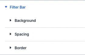
Use the standard Divi background, spacing and border settings to style the bar that holds the filter.
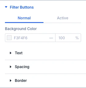
Design tab: Filter buttons
- Background color: Here you can select the background color of the filter buttons.
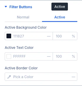
Design tab: Filter buttons active
- Active background color: Here you can select the background color of the selected filter button.
- Active text color: Here you can select the text color of the selected filter button.
- Active border color: Here you can select the border color of the selected filter button. It shows only when the buttons have a border.
The Sizing, Spacing, Border, Box shadow, Filters, Transform and Animation groups are the standard Divi design options.
Advanced tab
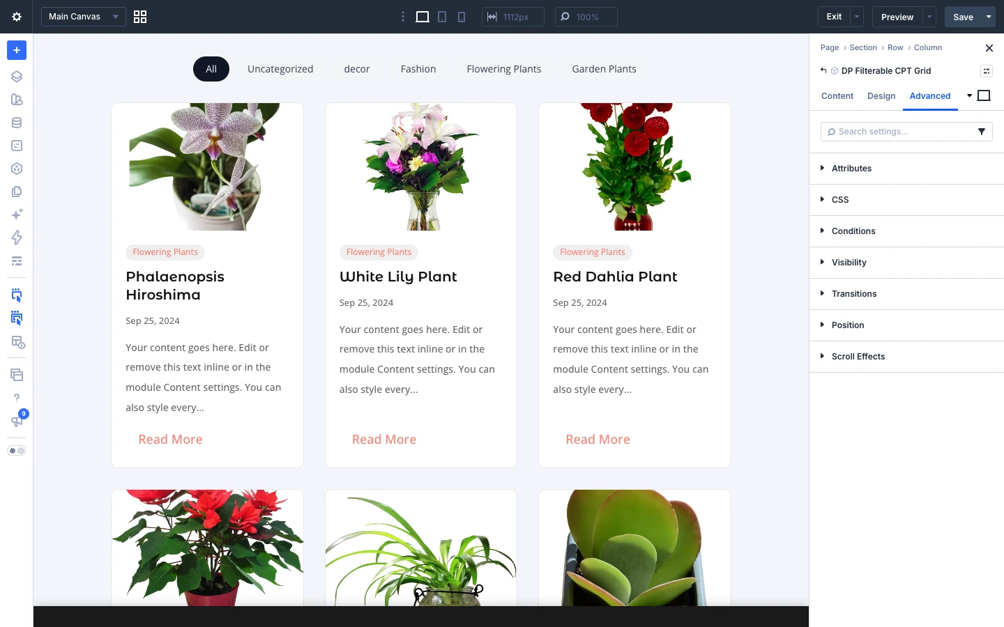
The Advanced tab has the standard Divi options: CSS ID and classes, custom CSS, attributes, conditions, visibility, transitions, position and scroll effects.