Search Divi Plus Documentation
Search for answers or browse our knowledge base.
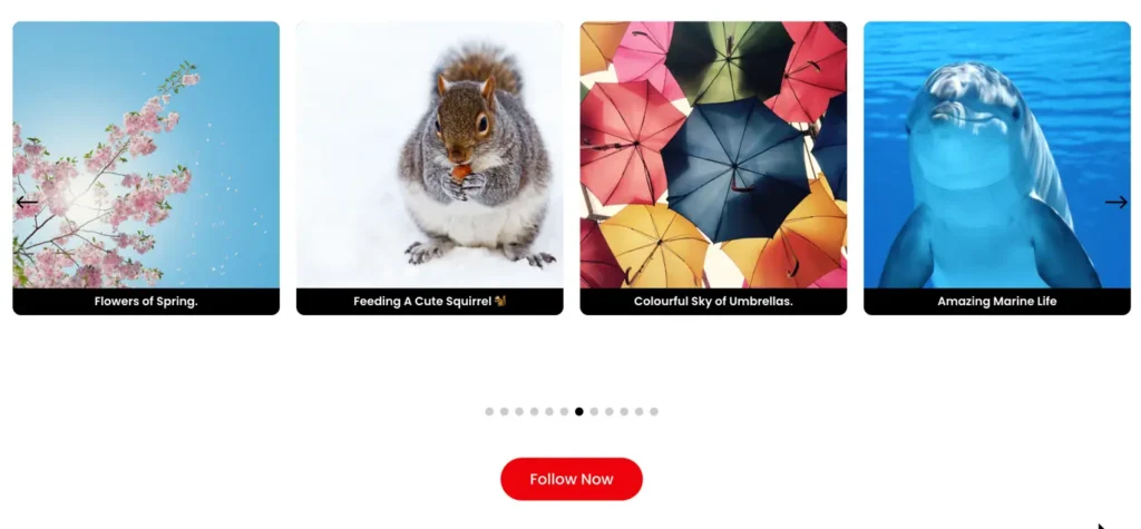
Instagram Feed Carousel
The Divi Plus Instagram Feed Carousel module enables you to display your Instagram feed in a carousel format. It offers customizable settings for slide effects, arrows, pagination dots, and autoplay, allowing you to integrate and style your Instagram feeds on your website.
How to add Instagram Feed Carousel module to your webpage
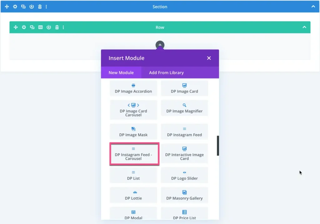
Once Divi Plus is activated, it adds several modules to the Divi builder. To add a module on the page, use the following steps:
- Create/Edit a Page that uses Divi builder.
- Create/Edit a row.
- Click on the Add New Module option; choose the DP Instagram Feed Carousel module.
Content
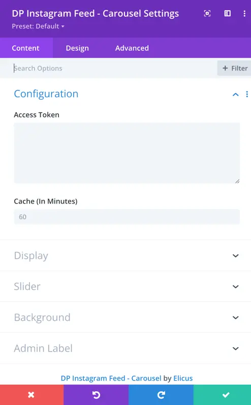
Configuration
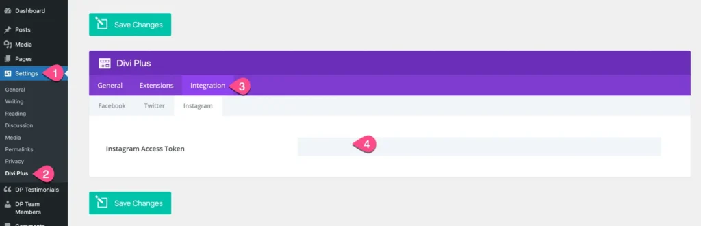
Access Token
Here you can enter the Instagram access token for the Instagram module.
You can use a single access token for all Instagram modules, and it can be saved in the plugin settings page.
Cache
Enter the cache duration in minutes. The module will retrieve data from the cache instead of fetching it from the database during this specified time.
Display
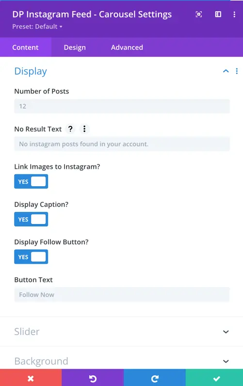
- Number of Posts: Specify the number of Instagram posts to be displayed.
- No Result Text: Define the text to be shown when no Instagram posts are available.
- Link Images to Instagram: Toggle option to link the images directly to their respective Instagram posts.
- Display Caption: Choose whether to display captions for the Instagram posts.
- Display Follow Button: Toggle option to display a follow button for the Instagram feed.
- Button Text: Customize the text for the follow button.
Slider
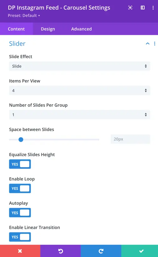
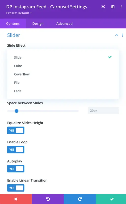
- Slide Effect: Choose from five slide effect options – slide, cube, coverflow, flip, and fade.
- Items per View: Specify the number of Instagram posts to be shown in each slide.
- Number of Sliders per Group: Define the number of sliders to be grouped together.
- Space Between Slides: Adjust the spacing between individual slides.
- Equalize Slides Height: Toggle option to equalize the height of all slides.
- Enable Loop: Toggle option to enable looping through the Instagram feed.
- Enable Linear Transition: Toggle option to use a linear transition effect between slides.
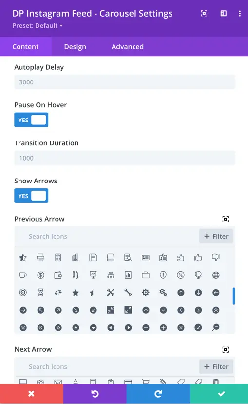
- Autoplay Delay: Sets the time delay between each automatic slide transition during autoplay.
- Pause on Hover: Pauses the slideshow when a user hovers over it.
- Transition Duration: Determines the speed of the slide transition.
- Show Arrows Toggle: Enables or disables the display of navigation arrows.
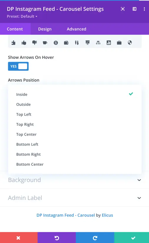
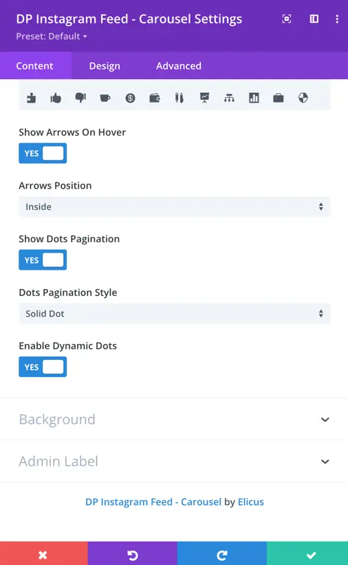
- Show Arrows on Hover Toggle: Controls whether the navigation arrows are visible only when the user hovers over the carousel.
- Arrows Position: Specifies the placement of the navigation arrows – Inside, Outside, Top Left, Top Right, Top Center, Bottom Left, Bottom Right, Bottom Center.
- Show Dots Pagination Toggle: Allows users to show or hide the dots pagination below the carousel.
- Dots Pagination Style: Provides different styles for the dots pagination, allowing customization.
- Enable Dynamic Dots Toggle: Enables or disables dynamic dots.
Design
Caption
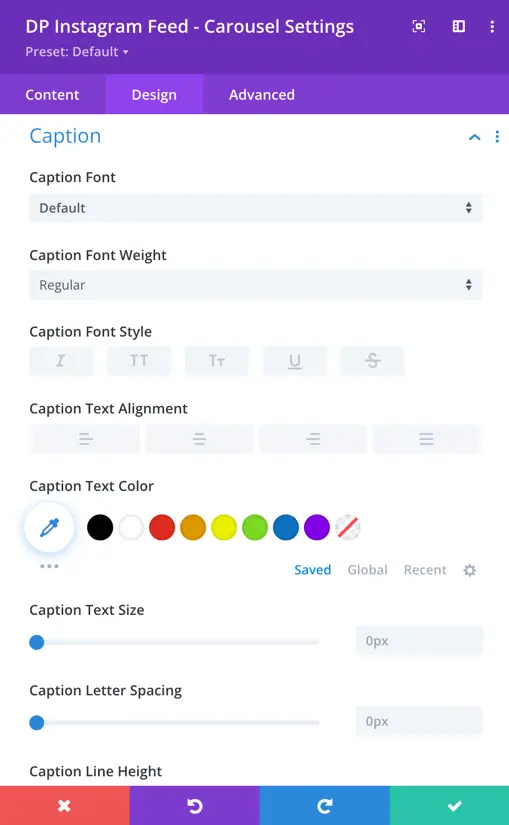
- Caption Font: Set the font for the caption.
- Font Weight: Choose the font weight for the caption.
- Style: Set the style (normal, italic, oblique) for the caption text.
- Text Alignment: Align the caption text (left, center, right).
- Text Color: Choose the color of the caption text.
- Text Size: Set the font size for the caption.
- Letter Spacing: Adjust the spacing between letters in the caption.
- Caption Line Height: Set the line height for the caption text.
- Text Shadow: Apply a shadow to the caption text.
- Margin: Adjust the outer spacing of the caption.
- Padding: Set the inner spacing of the caption.
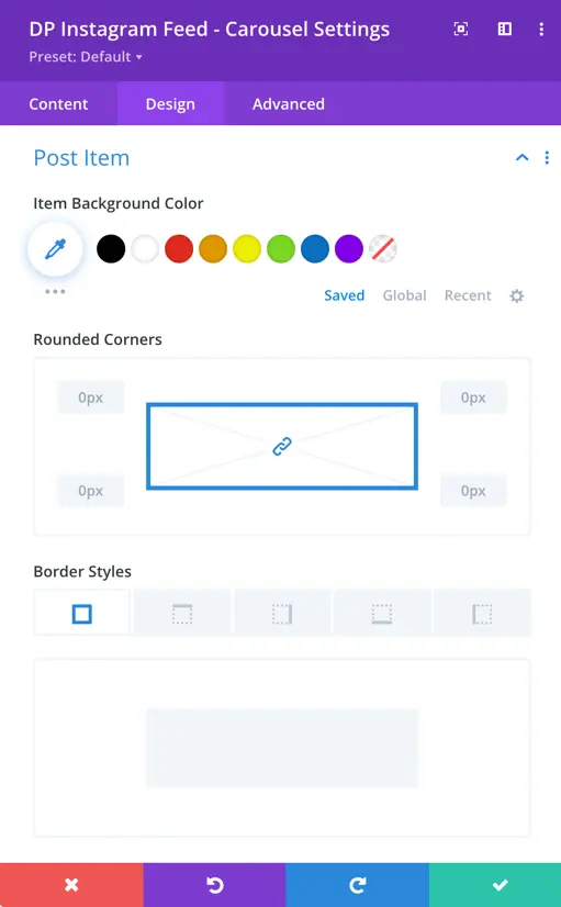
Post Item
- Item Background Color: Choose the background color for the post item.
- Rounded Corners: Adjust the level of rounding for the item corners.
- Border Styles: Choose the style of the item border.
- Border Width: Set the width of the item border.
- Border Color: Choose the color of the item border.
- Border Style: Select the style for the item border.
- Shadow: Apply a shadow effect to the post item.
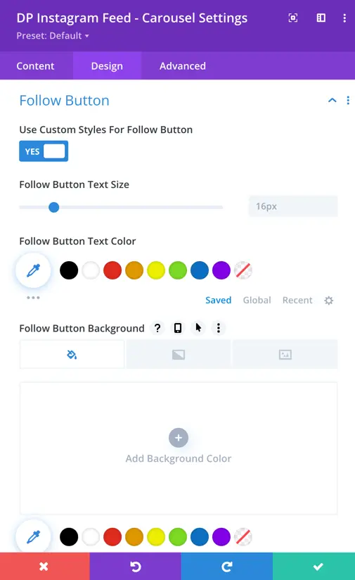
Follow Button
- Use Custom Styles for Follow Button: Toggle option to customize the follow button styles.
- Follow Button Text Size: Adjust the font size of the follow button text.
- Follow Button Text Color: Choose the color for the follow button text.
- Follow Button Background: Set the background color for the follow button.
- Border Width: Define the width of the button border.
- Border Color: Choose the color of the button border.
- Border Radius: Set the radius for the button border corners.
- Spacing: Adjust the spacing around the button.
- Font: Choose the font for the button text.
- Font Weight: Set the font weight for the button text.
- Font Style: Choose the style for the button text.
- Show Follow Button Icon: Toggle option to display the follow button icon.
- Follow Button Icon Color: Choose the color for the follow button icon.
- Icon Placement: Set the placement of the icon relative to the text.
- Show Icon on Hover for Follow: Toggle option to display the icon on hover.
- Text Shadow: Apply a shadow effect to the button text.
- Padding: Adjust the padding of the follow button.
- Margin: Set the margin around the follow button.
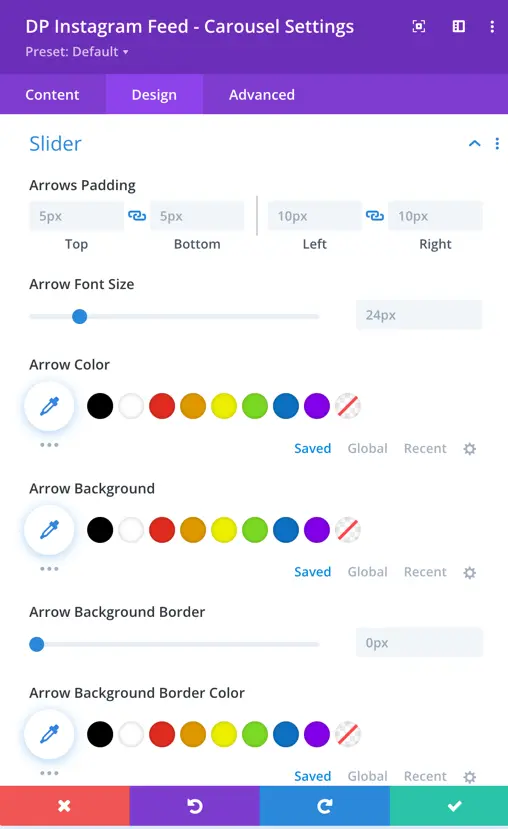
Slider
- Arrow Padding: Adjust the spacing around the arrow, with options for top, bottom, left, and right padding.
- Arrow Font Size: Allows customization of the font size for the arrows.
- Arrow Color: Choose the color for the arrows.
- Arrow Background: Set the background color for the arrows.
- Arrow Background Border: Specify border settings for the arrow background.
- Border Color: Define the color of the arrow background border.