
Search Divi Plus Documentation
Search for answers or browse our knowledge base.
Explore Divi Plus's Live Demo
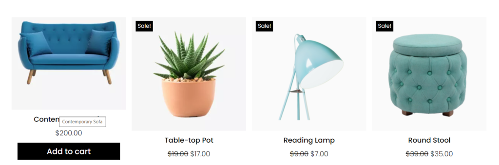
WooCommerce Products
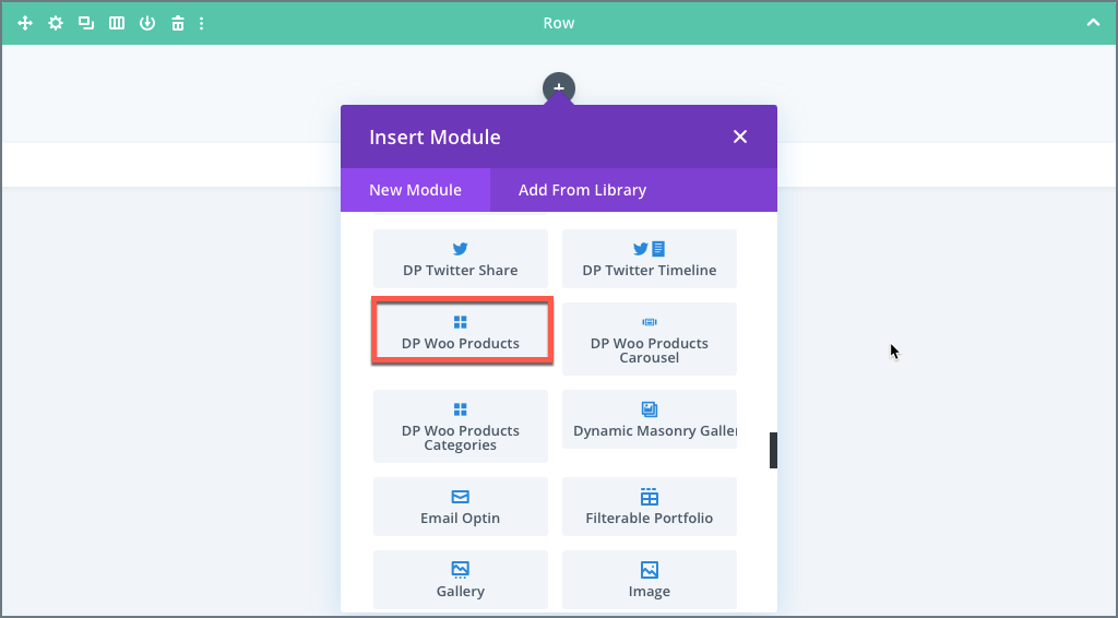
How to add module on page
Once Divi Plus is activated, it adds several modules to the Divi builder. To add the module on the page, use the following steps:
- Create/Edit a Page/Post that uses Divi builder.
- Create/Edit a row.
- Click on Add New Module option; choose the DP Woo Products module.
Content Options
Content
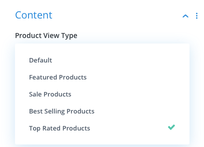
- Product View Type: This setting under the content option allows you to display product according to type of product. It gives 5 options including default.
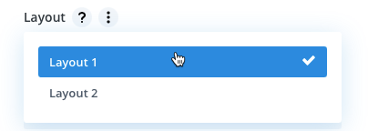
2. Layout: Here you can select a layout type for displaying product from two given options.
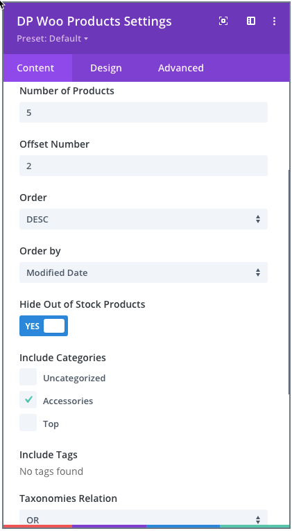
3. Offset Number: Using this setting you can define how many number of products you would like to skip to display.
4. Hide Out of Stock Products: To hide out of stock products set as YES.
5. Include Categories: Tick the checkboxes next to the categories you want to include. (If you leave all categories unchecked, it will display products from all the categories.)
6. Include Tags: Select the tags and product associated with those tags will be display. If you will not select any one it will display all products.
7. Taxonomies Relation: Here you can define relation(OR, AND) between taxonomies.
Display
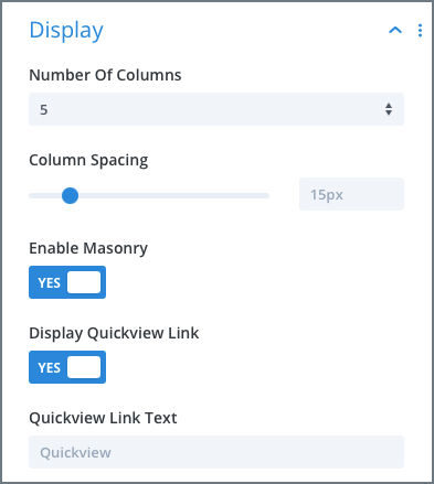
1. Select Number of Columns for WooCommerce Products: Go to the Display settings >> Number Of Columns >> select your preferred number of columns up to 6.
2. Adjust product columns space: Go to the Content tab >> Display settings >> Column Spacing >> move the slider or input the value.
3. How to display products in Masonry Format: Go to the Display settings >> Enable Masonry >> check as YES.
4. Display Quickview Link: To show the quickview link of product set this option as YES.
5. Quickview Link Text: Here you can define the text for Quickview link.
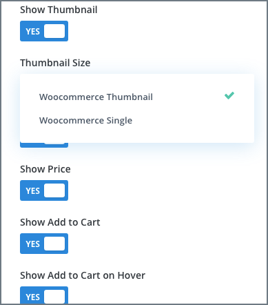
6. Show Thumbnail: Using this you can control thumbnail should be visible or not.
7. Thumbnail Size: Here you can define the size of product image it can be either WooCommerce Thumbnail or WooCommerce Single.
8. Show Star Rating: If you want to show star rating set as YES.
9. Hide Price: Go to the Display settings >> Show Price >> check as NO.
10. Hide Add to Cart: Go to the Display settings >> Show Add to Cart >> check as NO.
11. How to display Add to Cart on Hover: Go to the Display settings >> Show Add to Cart >> check as YES >> Show Add to Cart on Hover >> YES.
12. Simple Product Add to Cart Text: Define Add to Cart button text here for Simple Product.
13. Variable Product Add to Cart Text: Define Add to Cart button text here for Variable Product.
14. Grouped Product Add to Cart Text: Here you can specify Add to Cart button text for Grouped Product.
15. External Product Add to Cart Text: Specify Add to Cart button text for External Product.
16. Out of Stock/Unpurchaseable Add to Cart Text: Write Add to Cart button text for Out of Stock or Unpurchaseable product.
17. Hide Sale Badge: Go to the Display settings >> Show Sale Badge >> check as NO.
18. How to change Sale Badge text into “%” sign: Go to the Display settings >> Badge Text >> Select >> Sale Percentage.
19. How to style products background: Inside the Content tab >> Background >> Product Background >> apply customizations as required.
Pagination
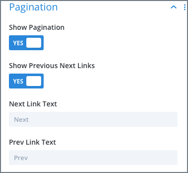
Show Pagination: To show pagination set as YES.
Show Previous Next Link: To show Previous Next link set YES.
Design Options
- How to customize Title text of the products: Go to the Design >> Title >> Apply changes as required.
- How to customize Price text: Go to the Design tab >> Price >> Apply text customizations as required.
- Customize Sale Badge text and background color: Go to the Design tab >> Sale Badge >> Apply customizations as required.
- Customize Add to Cart text and background: Go to the Design tab >> Add to Cart >> Apply customizations as required.
- Customize Star Rating: Go to the Design tab >> Star Rating >> Apply customizations as required.
- Customize Pagination link: Go to the Design tab >> Pagination >> Apply customizations as required.
- Customize Quickview Lightbox: Go to the Design tab >> Quickview Lightbox >> Apply customizations as required.
- Customize Quickview Link: Go to the Design tab >> Quickview Link >> Apply customizations as required.
- Customize Quickview Product Title: Go to the Design tab >> Quickview Product Title >> Apply customizations as required.
- Customize Product Price: Go to the Design tab >> Quickview Product Price >> Apply customizations as required.
- Customize Quickview Product Description: Go to the Design tab >> Quickview Product Description >> Apply customizations as required.
- Customize Quickview Product Quantity: Go to the Design tab >> Quickview Product Quantity >> Apply customizations as required.
- Customize Quickview Add to Cart: Go to the Design tab >> Quickview Add to Cart >> Apply customizations as required.
- Customize Quickview Product Meta: Go to the Design tab >> Quickview Product Meta >> Apply customizations as required.
- Customize Quickview Product Attributes: Go to the Design tab >> Quickview Product Attributes >> Apply customizations as required.
- Customize Loader Icon Text: Go to the Design tab >> Loader>> Apply customizations as required.
- Customize WooCommerce Notice: Go to the Design tab >> WooCommerce Notice >> Apply customizations as required.
- Adjust Product’s Content Padding: Go to the Design tab >> Spacing >> Product Content Padding >> Apply the padding as required.
- Adjust Product’s Image Padding: Go to the Design tab >> Spacing >> Product Image Padding >> Apply the padding as required.
- Add Rounded Corners to Products: Go to the Border settings >> Product Rounded Corners >> Make changes as required.
- Add Borders to Products: Go to the Border settings >> Product Border Styles >> Make the changes as required.
- Add Box Shadow to Products: Go to the Box Shadow settings >> Product Box Shadow >> select any box shadow from available options.