Search Divi Plus Documentation
Search for answers or browse our knowledge base.
Explore Divi Plus's Live Demo
Unfold Extension
Enable Unfold Extension
Before you use the Divi Plus Unfold Extension, make sure you enable it first. The following steps will help you successfully enable the extension and then use it.
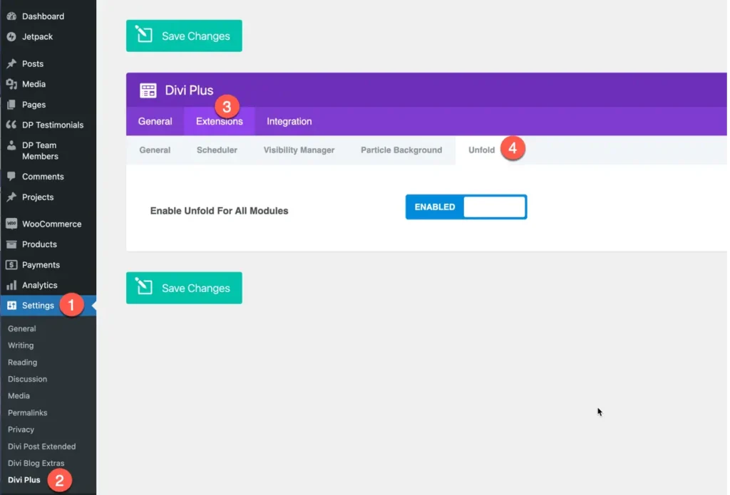
- On your WordPress Dashboard, go to Settings >> Divi Plus.
- Then head over to the Extensions tab >> Unfold.
- Save Changes.
How to use and customize
The Unfold Extension helps keep your page neat by hiding long content until it’s needed. Users can click to show text or other elements, making it easier to read without clutter. It’s great for FAQs, product details, blog summaries, and anywhere you want to save space.
Once you enable the extension in the Divi Plus settings, you will see the settings in each Divi module and Divi Plus module.
Unfold Extension setting in Divi Plus Modules
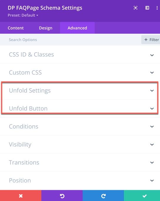
Unfold Extension setting in native Divi Modules
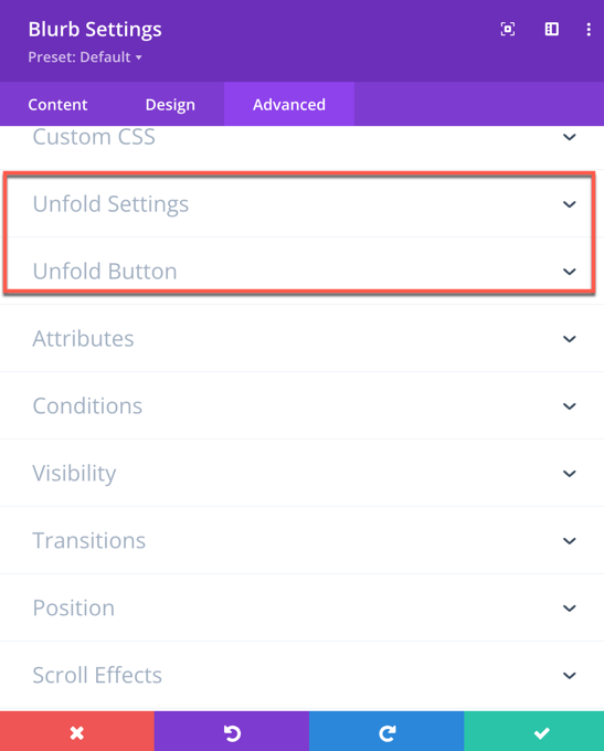
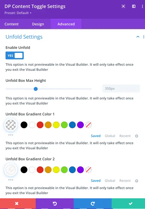
Unfold Settings
Let’s explore the settings and how they work:
Enable Unfold
- Set this to “Yes” to activate the Unfold feature for supported modules.
Unfold Box Max Height
- Defines the maximum height of the content box before the “Unfold” button appears.
- Any content exceeding this height will be hidden until expanded.
Unfold Box Gradient Color 1
- Select the first color for the gradient effect applied to the unfolded content box.
Unfold Box Gradient Color 2
- Select the second color for the gradient effect, creating a smooth transition between colors.
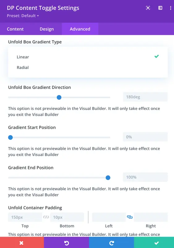
Gradient Type
- Choose how the gradient effect should be applied:
- Linear: A straight transition between colors.
- Radial: A circular transition effect.
Unfold Box Gradient Direction
- Controls the angle or direction of the gradient effect when the Linear gradient type is selected.
Gradient Start Position
- Defines where the gradient starts within the unfold box.
Gradient End Position
- Defines where the gradient effect ends within the unfold box.
Unfold Container Padding
- Adjusts the padding (space inside the container) for the unfold box to manage spacing and layout.
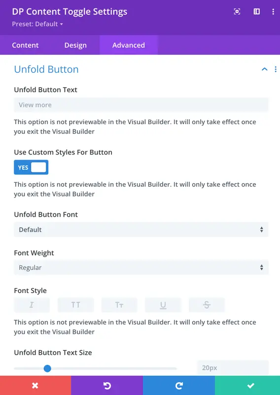
Unfold Button
Unfold Button Text
- Customize the text displayed on the “Unfold” button (e.g., “Read More,” “Show More”).
Use Custom Styles for Button
Set this to “Yes” to enable custom styling options for the button.
Unfold Button Customization
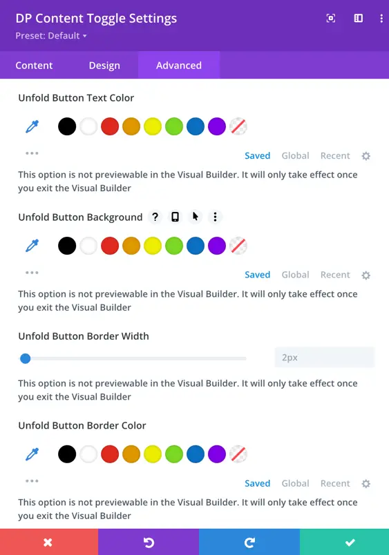
When Use Custom Styles for Button is enabled, you can modify:
- Font: Choose the font family for the button text.
- Font Weight & Style: Adjust the boldness and style (italic, uppercase, etc.).
- Button Text Color: Change the text color of the button.
- Button Background: Set a background color for the button.
- Button Border Color: Choose a border color for the button.
- Button Border Width: Adjust the thickness of the button border.
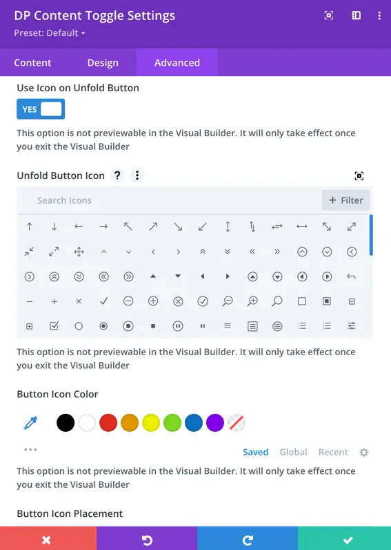
Use Icon on Unfold Button
- Set this to “Yes” to display an icon on the unfold button.
Unfold Button Icon
- Choose an icon to display alongside the button text.
Button Icon Color
- Customize the color of the icon displayed on the unfold button.
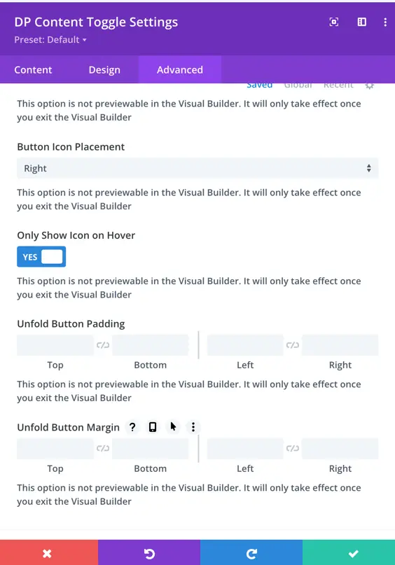
Button Icon Placement
- Choose where the icon appears: Left or Right of the text.
Only Show Icon on Hover
- Set this to “Yes” to hide the icon by default and only show it when the user hovers over the button.
Button Padding
- Adjust the space inside the button for better appearance and readability.
Button Margin
- Modify the space around the button to ensure proper alignment within the layout.