Search Divi Plus Documentation
Search for answers or browse our knowledge base.
Explore Divi Plus's Live Demo
Stripe Button
Easily accept payments on your Divi site with the Stripe Button module from Divi Plus.

Configuring stripe before using the stripe button module
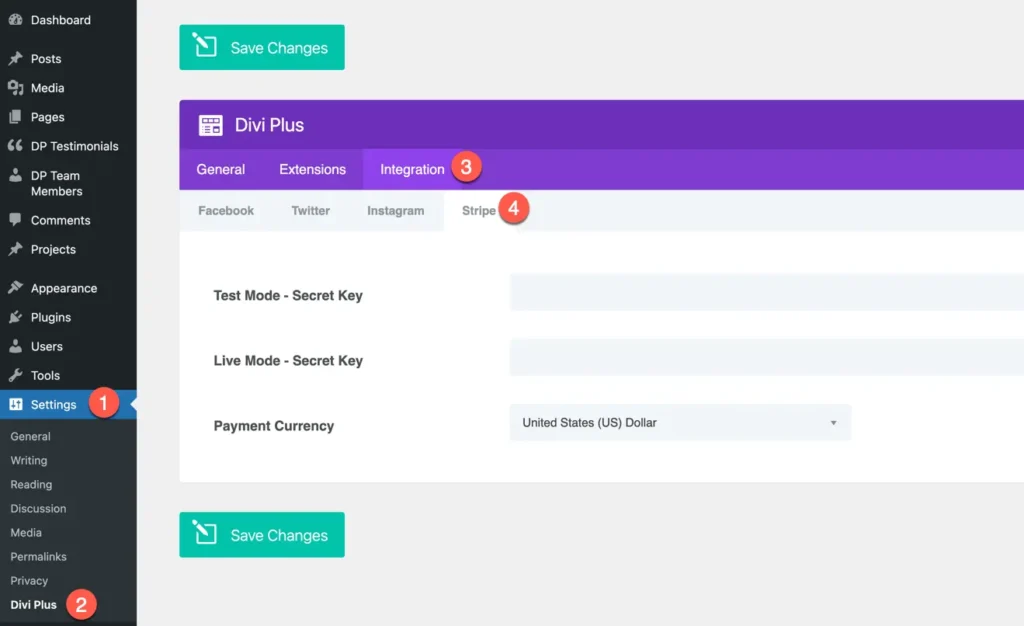
Before using the Stripe Button module, you need to configure the global Stripe settings for your website. To do this, go to:
Dashboard → Settings → Divi Plus → Integration → Stripe
Here, you’ll find the following options:
- Test Mode – Secret Key: Used for testing payments without real transactions. Payments made in this mode won’t charge actual cards and are only for development or testing purposes.
- Live Mode – Secret Key: Used for real transactions when your site is live. Payments made in this mode will be processed through your actual Stripe account.
Additionally, make sure to set the Currency for your transactions to match your business needs.
Add module on page
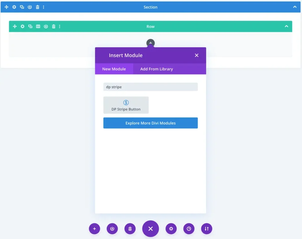
Once you’ve configured the Stripe settings, you can easily add the Stripe Button module to your page.
- Create or Edit a Page/Post using the Divi Builder.
- Add or Edit a Row where you want to place the button.
- Click Add New Module and select DP Stripe Button from the list.
Content
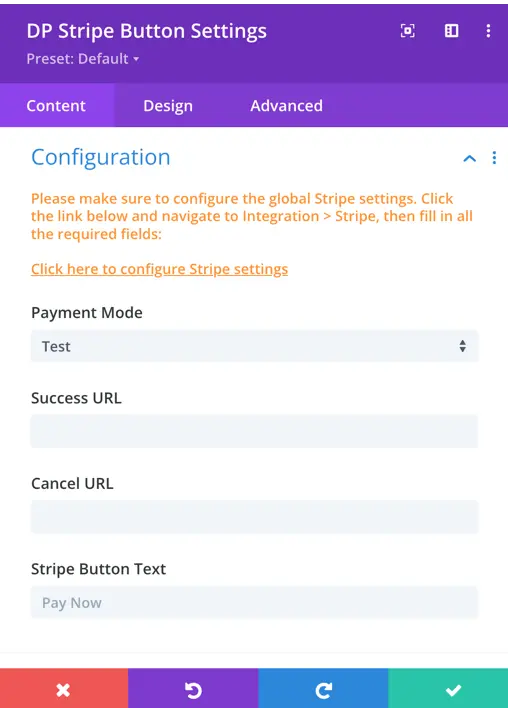
Configuration
- Payment Mode
Choose whether to use Test or Live mode for the payment.- Test Mode – For testing payments (uses the Test Secret Key).
- Live Mode – For real payments (uses the Live Secret Key).
- Success URL
Enter the URL where users will be redirected after a successful payment. - Cancel URL
Enter the URL where users will be redirected if they cancel the payment process. - Stripe Button Text
Set the text that will appear on the payment button (e.g., Buy Now, Pay with Stripe).
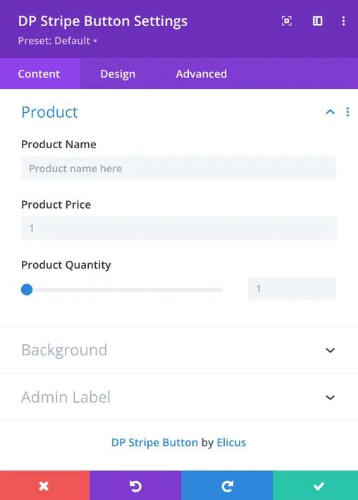
Product settings
Product Name
Enter the name of the product or service you want to sell.
Product Price
Set the price of the product.
Note: Enter only the numeric value (without currency symbol).
Product Quantity
Define the number of units for the product.
Example: Enter 1 for a single product or adjust as needed for multiple quantities.
Style
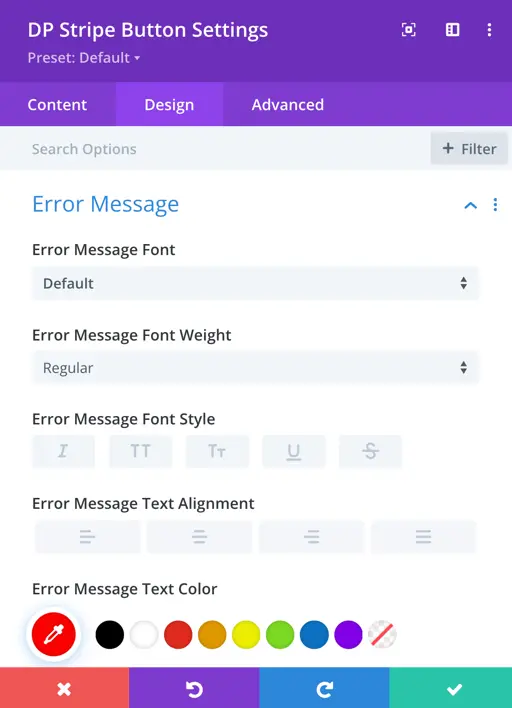
Error message customization
Customize the appearance of the error message displayed if the payment process fails or encounters an issue.
Font: Choose the font family for the error message text.
Font Weight & Style: Adjust the thickness (bold, normal) and style (italic, normal) of the error text.
Text Alignment: Align the text left, center, or right based on your layout preference.
Text Color: Select the color for the error message to match your site’s design.
Text Size: Set the size of the error message text.
Letter Spacing: Control the space between individual letters in the message.
Line Height: Adjust the vertical spacing between lines of text in multi-line error messages for better readability.
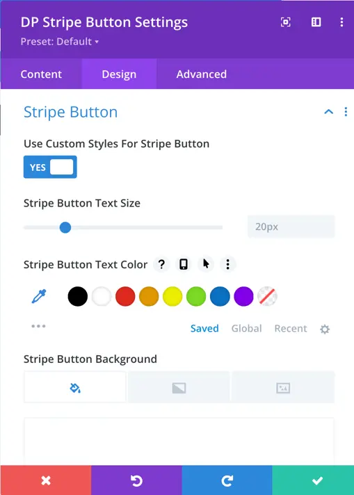
Stripe button styling
- Use Custom Style for Stripe Button
Set this to Yes if you want to enable additional styling options for the Stripe button.
Once enabled, you can customize the following:
Button Text Size: Set the font size of the button text.
Button Text Color: Choose the color of the text on the button.
Button Background Color: Set the background color of the button.
Button Border Color: Choose the color of the button’s border.
Button Border Radius: Adjust the corner roundness of the button.
Letter Spacing: Control the spacing between letters in the button text.
Font Weight & Style: Make the button text bold, normal, italic, etc.
Show Button Icon: Enable or disable an icon on the button.
Button Icon: Select the icon to display on the button.
Icon Placement: Choose where the icon should appear before or after the button text.