Search Divi Plus Documentation
Search for answers or browse our knowledge base.
Explore Divi Plus's Live Demo
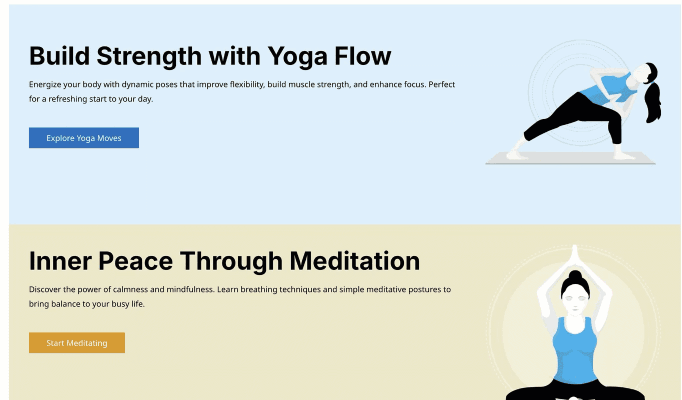
Scroll Stack Cards
Add scroll card effect to your WordPress site with the Scroll Stack Cards module from Divi Plus. Perfect for showcasing features, services, or step-by-step guides in both vertical and horizontal layouts.
How to add module on page
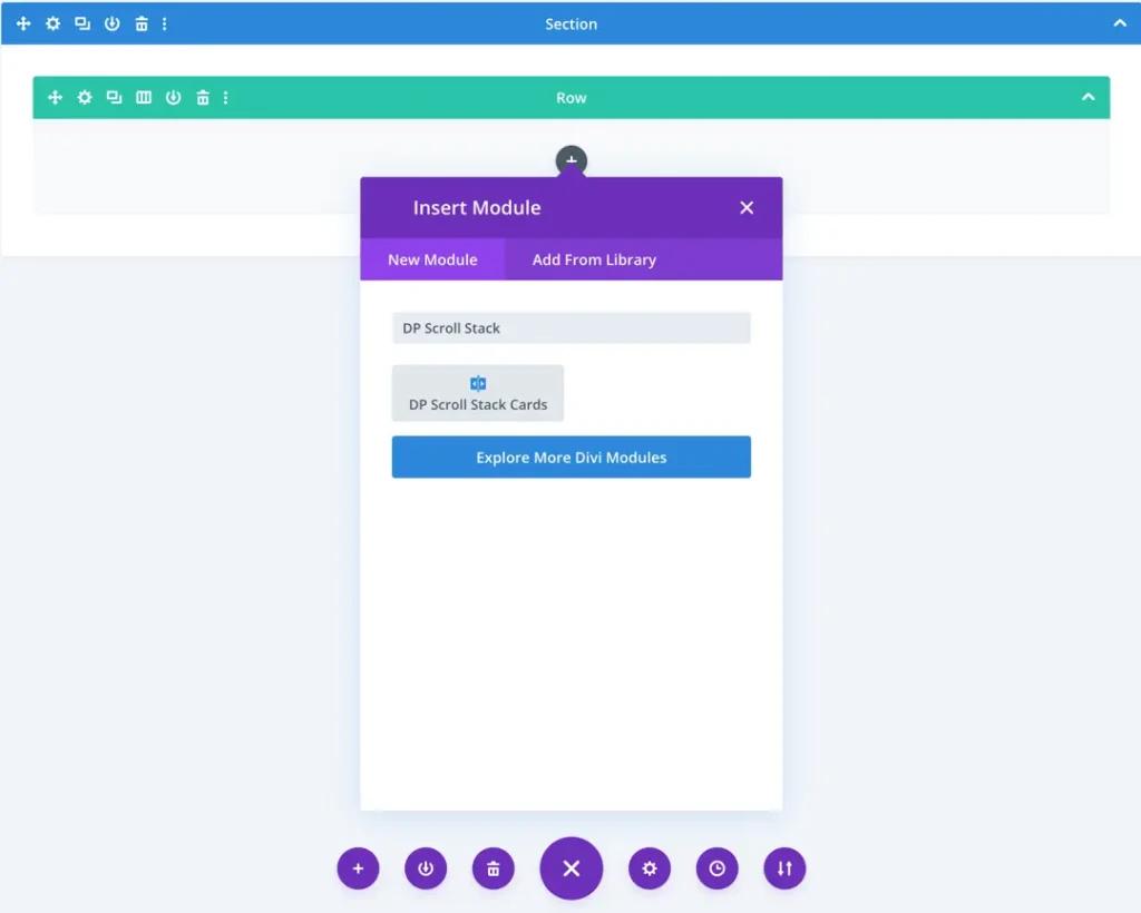
Once Divi Plus is activated, it adds several modules to the Divi builder. To add a module on the page, use the following steps:
- Create/Edit a Page/Post that uses Divi builder.
- Create/Edit a row.
- Click on Add New Module option; choose the DP Scroll Stack Cards
Adding card items
Once you add the Scroll Stack Cards module to the page, you’ll get the option to add Card Items.
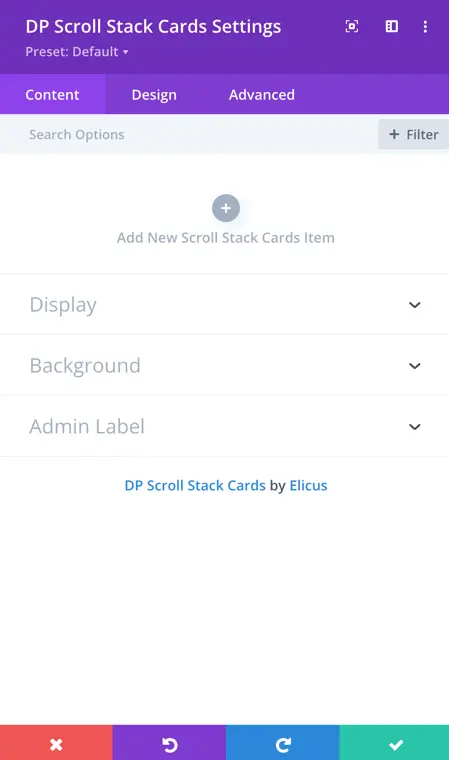
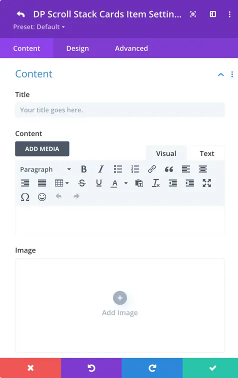
Content setting
For each card, you can configure the following:
Title: Enter the title of the card item.
Content: Add the descriptive content or step details for the card.
Image: Upload or select an image to visually represent the card.
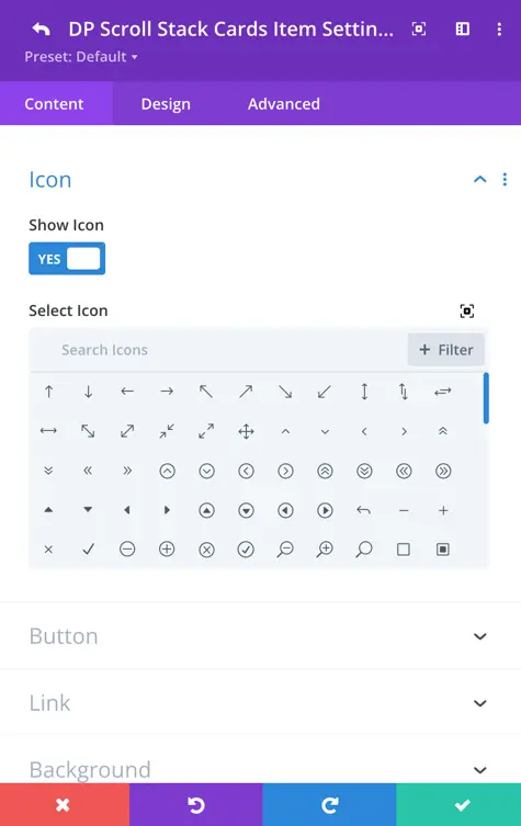
Icon
Icon: Choose an icon to display on the card.
Show Icon: Enable this to Yes if you want the icon to be displayed.
Select Icon: Choose an icon to display along with the button text, if desired.
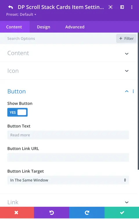
Button
Show Button: Set to Yes to display a button on the card.
Button Text: Enter the text you want to appear on the button.
Card item customization options
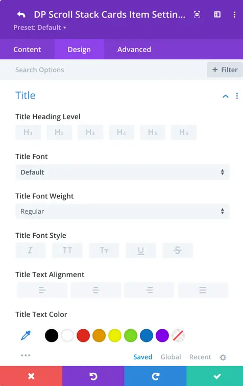
Title customization
You can fully customize the card title with the following settings
Heading Level (H1–H6): Choose the appropriate heading tag for SEO and structure.
Font: Select the desired font family.
Font Weight & Style: Control the thickness (normal, bold) and style (italic, normal) of the text.
Text Alignment: Align the title left, center, or right.
Letter Spacing: Adjust the spacing between individual letters.
Line Height: Control the spacing between lines of text for better readability.
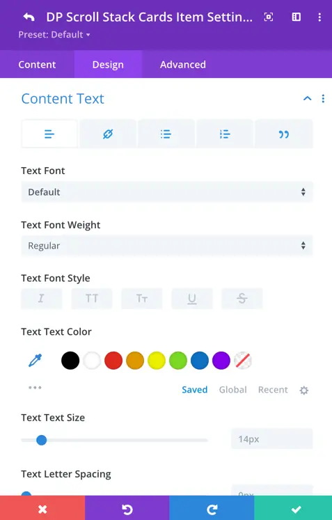
Content text customization
Similar customization options are available for the content text:
- Letter Spacing and Line Height
- Font Family, Weight, and Style
- Alignment (Left, Center, Right)
- Text Color and Size
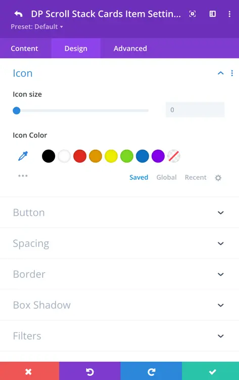
Icon customization
Icon Size: Adjust the size of the icon to suit your layout.
Icon Color: Choose the color of the icon to match your design.
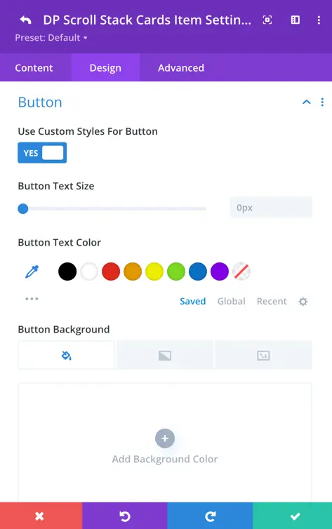
Button customization
Text Color and Background Color: Set the colors to match your site style.
Font Style and Size: Customize the button text for consistency.
Padding and Margin: Fine-tune spacing around the button for a polished look.
Border Radius and Border Color: Control the shape and style of the button’s edges.
Button Icon and Icon Placement: Select an icon and define whether it appears before or after the button text.
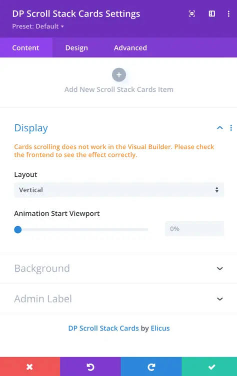
Display settings
- Note: Cards scrolling does not work in the Visual Builder preview. Please check the frontend of the website to see the scrolling animation properly.
Layout
Choose the direction in which the cards will appear as users scroll:
- Vertical: Cards stack one below the other as you scroll down.
- Horizontal: Cards scroll horizontally across the screen.
Animation start viewport
Set the percentage of the viewport height at which the animation starts.
Example: If set to 0%, the animation begins as soon as the section enters the viewport.
Adjust with the slider for earlier or later animation trigger points.