Search Divi Plus Documentation
Search for answers or browse our knowledge base.
Modal Popup
Divi Plus Modal Popup is used to create popups that can be triggered using distinctive elements. It easily creates popups & lightboxes for videos, text, images, and much more.
How to add module on page
Once Divi Plus is activated, it adds several modules to the Divi builder. To add a module on the page, use the following steps:
- Create/Edit a Page/Post that uses Divi builder.
- Create/Edit a row.
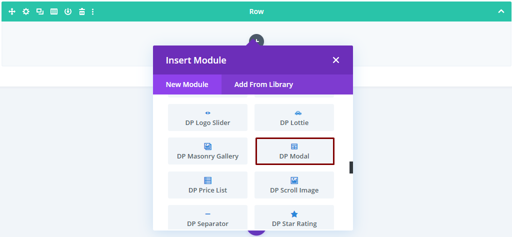
- Click on Add New Module option; choose the DP Modal module.
Content Options
Configuration Setting
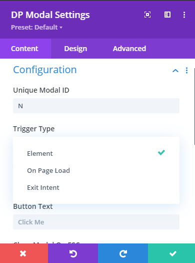
Unique Modal ID
To make the modal work perfectly you must enter a unique id here.
The unique modal ID is like a special code that helps the plugin tell one popup from another in the backend. If you don’t give it a name, it’ll create one for you.
But if you want to choose your own, you can use something like “modal-1,” “modal-2,” and so on. Just remember, don’t put spaces in the name to ensure proper functionality.
Trigger Type
Here you get the option to select modal trigger type. Select any from available options:
- Element
- On-Page Load
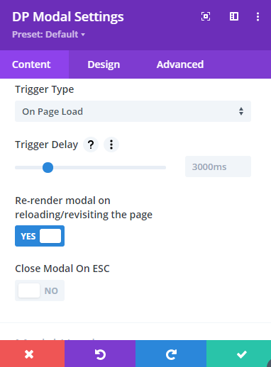
On-Page Load
On page load, the modal popup appears immediately when the page loads to capture the visitor’s attention.
Trigger delay: In this option, you can specify a certain amount of time in microseconds, that the webpage should wait after it has finished loading before displaying the modal popup.
After the delay, the modal popup appears with engaging animations.
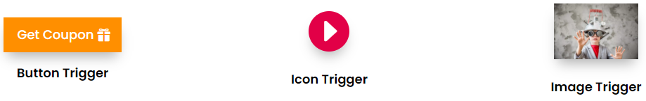
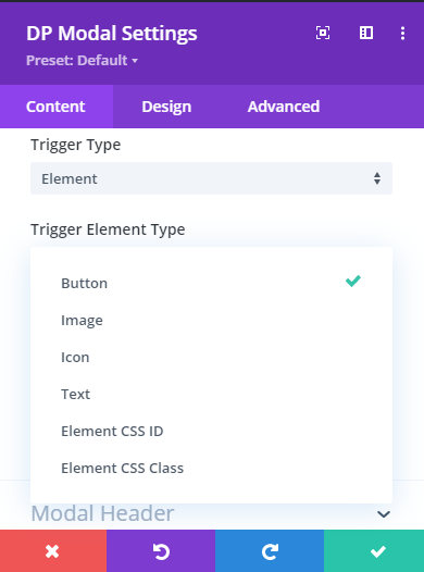
Element
In this, you get further options to select the type of element. Here you get Button, Image, Icon, Text, Element CSS ID, and Element CSS Class as types for the element. Select any according to your needs.
Modal Header
Here you can select whether you want to display the header, title, and close button icon on the modal.
Modal Body
It allows you to choose what type of content you want to display in the modal body. It gives you the option to select Text, Image, Video, and Divi layouts saved in the library as modal content.
Modal Footer
Here you can select whether or not to display the footer on the modal. Plus, under this setting, you can also input text for the close button icon.
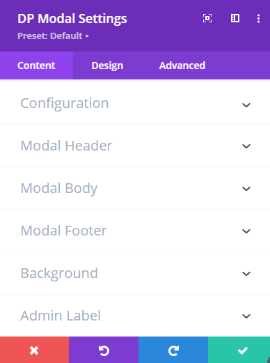
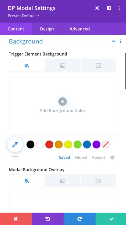
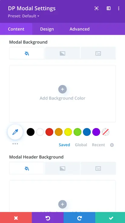
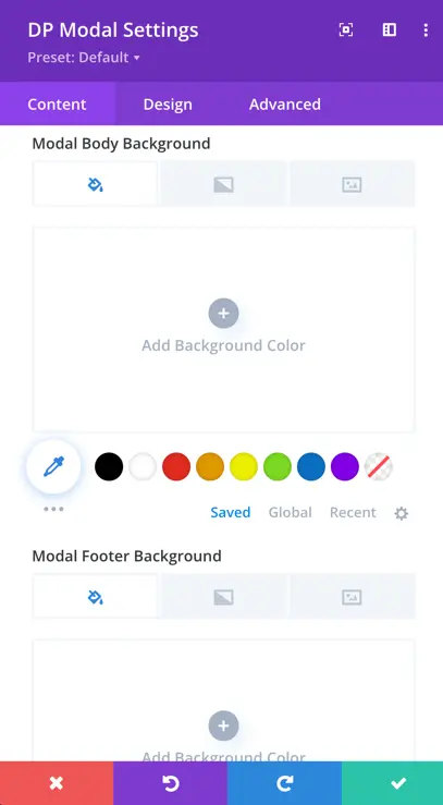
Background
This content tab setting allows you to change the background of the Modal, Trigger Element, Modal Background Overlay, Modal Header, Body, and Footer. It provides you with the option to customize the background with Color, Gradient, and an Image.
Design Options
Alignment
The “Trigger Element Alignment” control determines how your text is positioned or oriented within the module. It specifies whether the text should be aligned to the left, right, or center.
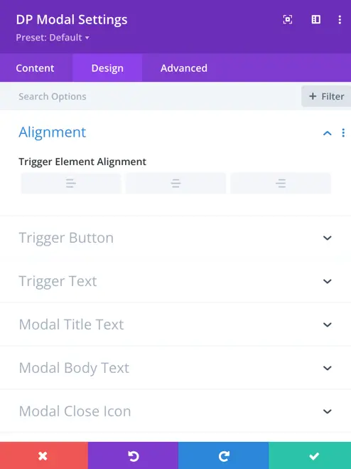
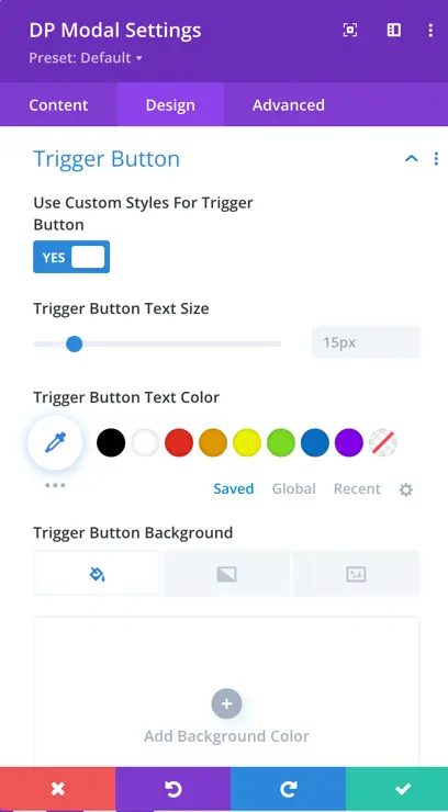
Trigger Button
This particular setting provides you with the option to apply custom styling on the modal trigger button.
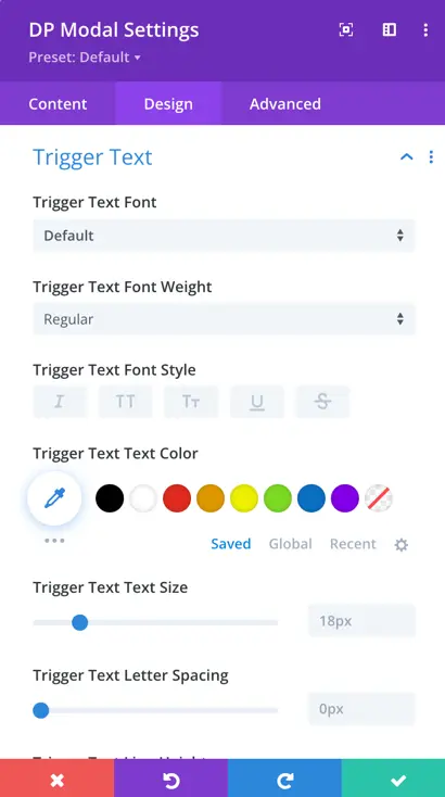
Trigger Text
Here you can apply customization to the appearance of the trigger text.
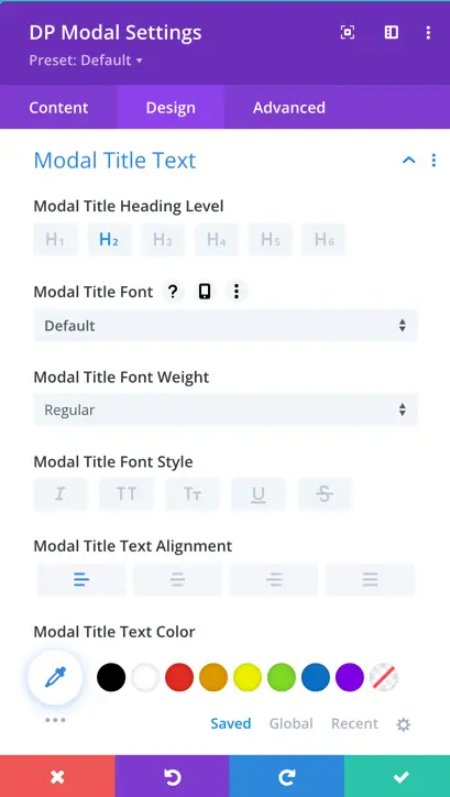
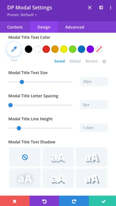
Modal Title Text
In the modal title text settings, you can customize the title’s heading, font, weight, style, alignment, text color, size, letter spacing, shadow, line height, and more.
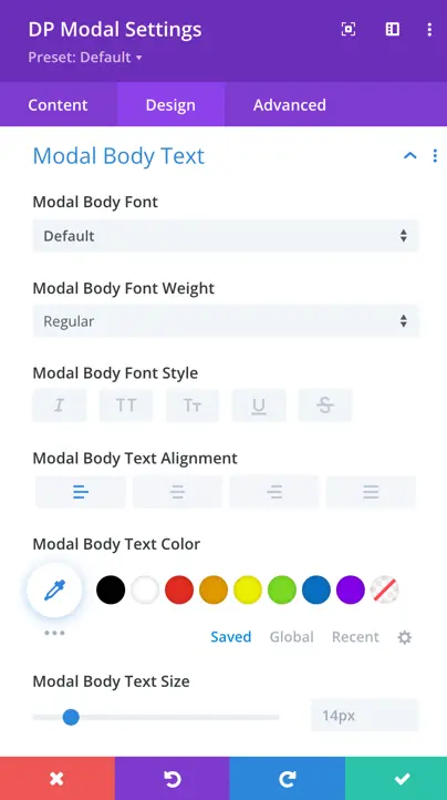
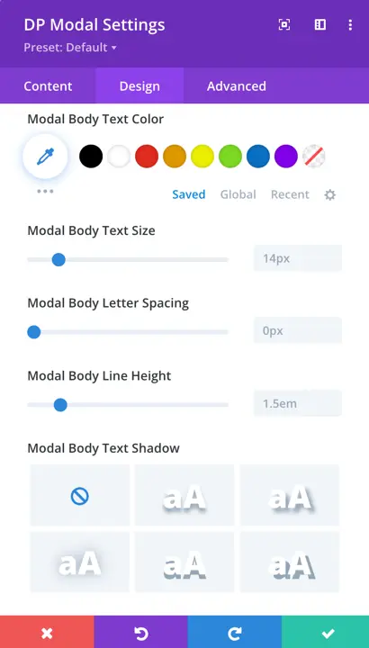
Modal Body Text
In the Modal Body Text settings, you have options to customize the body font, weight, style, alignment, text color, size, text size, letter spacing, line height and more.
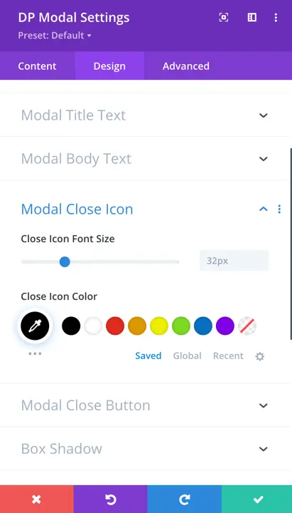
Modal Close Icon
The Modal Close Icon setting allows you to change the size of the close icon and its color.
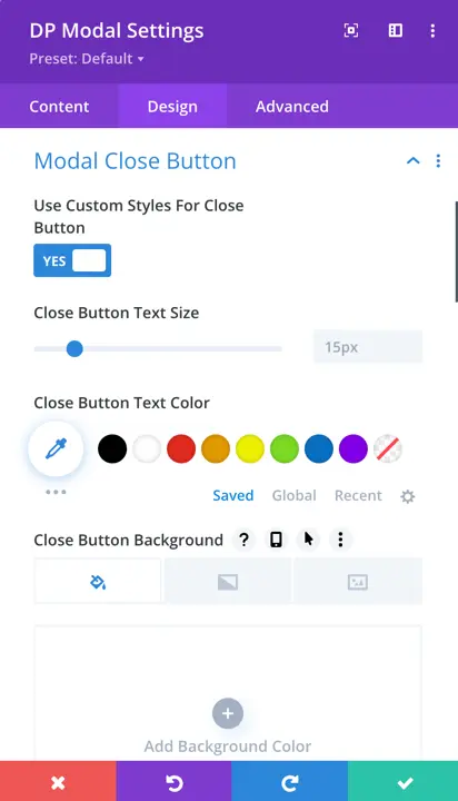
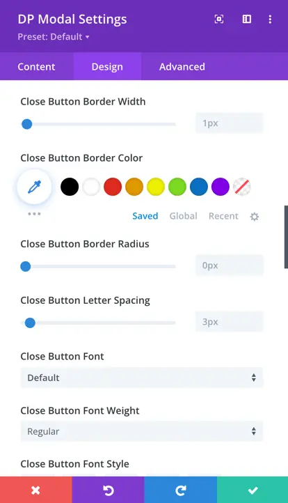
Modal Close Button
This setting allows you to apply custom styling on the close button. Using this setting you can change the font size & color of the close button text. You can also change the background of the close button, and apply other appearance customization.
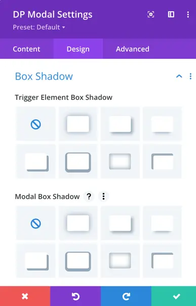
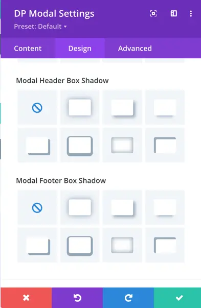
Box Shadow
Just like how you can set shadows in regular Divi modules, we’ve added some shadow settings for modals. You can adjust the shadow for the trigger element, the modal itself, as well as the header and footer section.
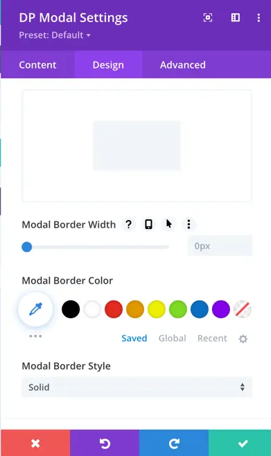
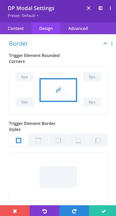
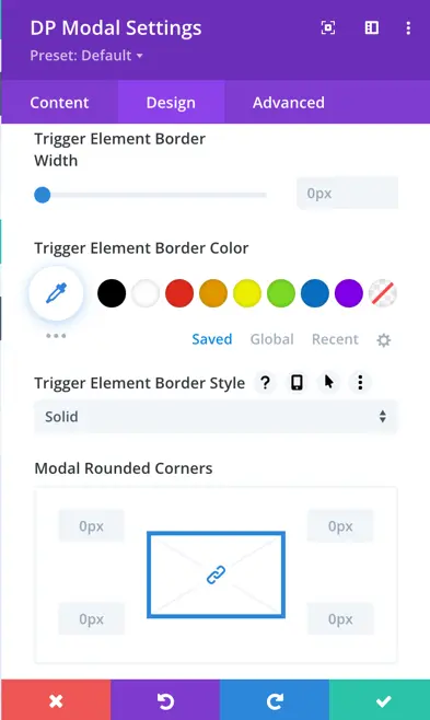
Border
In the “Border” options, you can customize various aspects, including the rounded corners of the trigger element and modal, border styles, border width, color, style options, and many more.
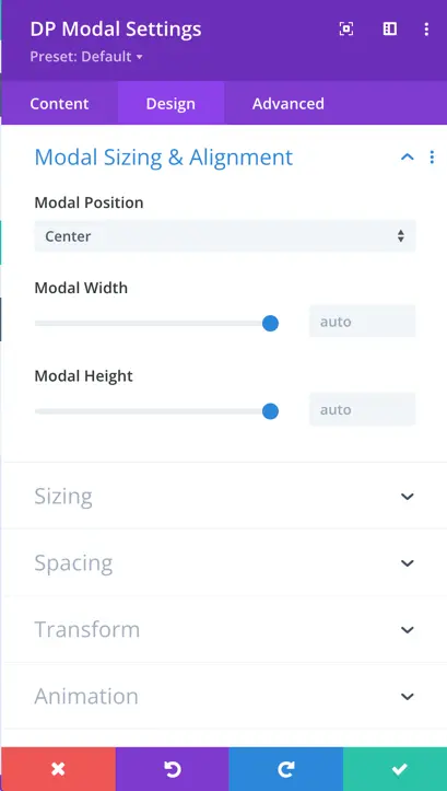
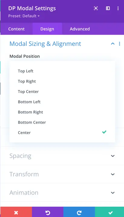
Modal Sizing & Alignment
This particular setting of the modal allows you to place your modal on different locations on the page. Available placement options are Top: Left, Right, Center; Bottom: Left, Right, Center, and Center. Along with these, using this setting, you can also make changes in the modal Width and Height.
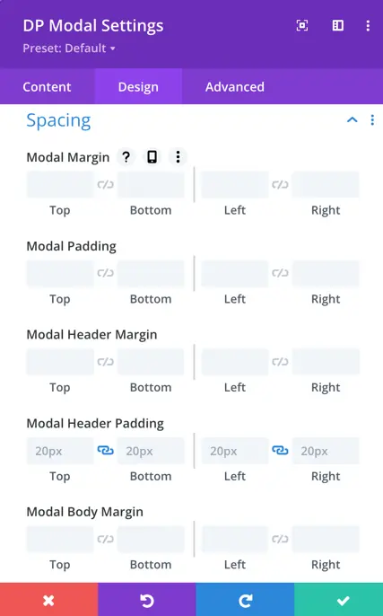
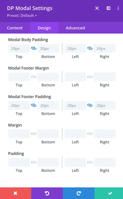
Spacing
Similar to the spacing settings available in native Divi modules, we have incorporated specific settings for modals. These settings include modal margin, padding, header margin, header padding, body margin, body padding, footer margin, and footer padding.
Animation
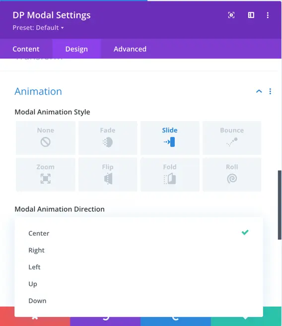
Modal Animation Style
Choose an animation style to enable animations for the modal. Once enabled, you’ll have the option to further customize your chosen animation style.
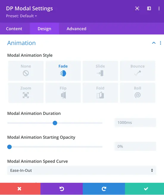
Animation styles available for modal include:
- Fade: The modal smoothly fades in and out, creating a subtle transition effect.
- Slide: The modal slides into view from a specific direction, such as top, bottom, left, or right.
- Bounce: The modal appears with a bouncing motion, giving it a playful and dynamic entrance.
- Zoom: The modal gradually zooms in, making it larger and more prominent on the screen.
- Flip: The modal flips or rotates into view, adding a sense of depth and dimension.
- Fold: The modal unfolds or folds out, creating an intriguing visual effect.
- Roll: The modal rolls into view, adding a unique and engaging animation.
Modal Animation Duration
Modal Animation Duration” means how long it takes for the special effect to finish. It’s like deciding if you want those effects to happen quickly or slowly, depending on what looks best for your website.
Modal Animation Starting Opacity
Modal Animation Starting Opacity is how transparent or not when animation starts to appear with special effects. It’s about whether it’s almost invisible or fully visible at the beginning of the animation.
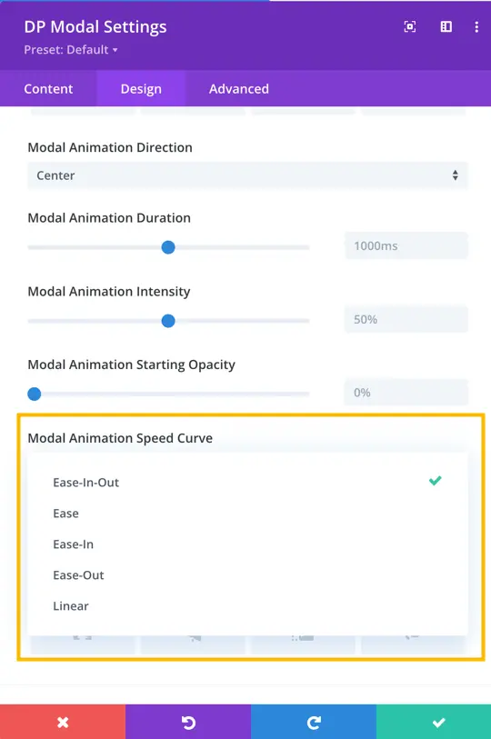
Modal Animation Speed Curve
Modal Animation Speed Curve means how fast or slow the special effects happen. Options are the below:
- Ease In: The animation starts gently and gets faster.
- Ease Out: The animation starts fast and slows down.
- Ease In Out: The animation starts gently, gets faster, and then slows down.
- Linear: The animation moves at a steady, consistent speed throughout.