Search Divi Plus Documentation
Search for answers or browse our knowledge base.
Explore Divi Plus's Live Demo
-
Getting Started
-
Modules
- Advanced Counter
- Advanced Tooltip
- Ajax Live Search
- Accordion Slider
- Alert Box
- Audio Player
- Button
- Bar Counter
- Breadcrumbs
- Background Switcher
- Before After Image Slider
- Blog
- Blog Categories
- Blog Slider
- Blog Timeline
- Business Hours
- Comparison List
- Content Toggle
- Coupon
- Divi Tilt Image
- Dropdown Button
- Floating Images
- Fancy Heading
- Form Styler
- Fancy Text
- FAQPage Schema
- Flip Box
- Facebook Comments
- Filterable Gallery
- Facebook Like
- Facebook Page
- Facebook Share
- Facebook Embedded Post
- Facebook Embedded Video
- Gravity Forms Styler
- Hero Slider
- Horizontal Scrolling Posts
- Hover List
- Horizontal Scrolling Card
- How To Schema
- Image Hotspot
- Image Accordion
- Image Mask
- Image Card
- Image Card Ticker
- Image Stack
- Image Hover Effect
- Image Magnifier
- Image Card Carousel
- Interactive Image Card
- Instagram Feed
- Instagram Feed Carousel
- List
- Lottie
- Logo Slider
- Marquee Text
- Mystery Image
- Masonry Gallery
- Modal Popup
- Price List
- Posts Ticker
- Promotion Bar
- Progress Bar
- Rotating Text
- Star Rating Module
- Scroll Image
- Scroll Text
- Scroll Stack Cards
- Scrolling Zoom Gallery
- Separator
- Stripe Button
- Sticky Video
- Split Image
- Tabs
- Table of Contents
- Text Animator
- Text Highlighter
- Text Hover Effects
- Text with Media
- Timeline
- Team Slider
- Testimonial Slider
- Testimonial Grid
- Twitter Embedded Tweet
- Twitter Follow Button
- Twitter Tweet Button
- Twitter Timeline
- Team Grid
- Wavy Gallery
- Woo Products Accordion
- WooCommerce Products
- Woo Products Categories
- Woo Product Gallery
- WooCommerce Products Carousel
- WooCommerce Brands Carousel
- WooCommerce Product Categories Carousel
- Interactive Circle
- Bar Chart
- Pie Chart
- SVG Animator
- Advanced Table
- Show all articles ( 86 ) Collapse Articles
-
Extensions
-
Divi Plus Child Themes
- Divi Plus prebuilt websites
- How to import Divi Plus child themes
- Import Failed: Server Timeout Importing Posts, Reduce The Batch Size And Try Again
- Missing Divi Plus child themes, starter templates, and sections?
- How can I change the colors and styles across site when using a Divi Plus child theme?
- Setting up menu and footer links in divi plus child themes
- Why am I not seeing the Courses page content in Divi Plus Driving School child theme.
-
Templates
-
FAQs
- How to make the Divi Plus Image Card Carousel images of same height?
- Set image position in the Floating Images module
- Logo slider not working?
- Where to download Divi Plus starter templates
- What is the difference between various image sizes masonry gallery
- Is it possible to add CSS ID and Class to individual buttons or cards in the Image Card Carousel?
- How to add live search feature to your Divi menu using Divi Plus
- How to enable only selected modules in Divi Plus plugin
- Category sorting in Divi Plus Team Slider module
- Modal heading font customization for the specific device
- Missing items in the Divi Plus download
- Currency symbol after the price in DP Price List module
- Link team members to their single page
- How to remove the search field border in Ajax Search?
- DP Image Accordion button not appearing on page?
- Download Divi Plus modal popup demo page
- Add border-radius to image hotspot tooltip
- Equalize height of blog slider posts
- Hide a specific tooltip in the image hotspot module and only show icon
- Setting a background hover style on button
- How to change the color and style of divider in the price list
- Show before-after slider label all the time
- FAQ Page Schema close/open icons not showing properly
- Trigger modal from a link inside hotspot marker tooltip content
- Woo Products: Module's content becomes unequal when product text size is differ
- Modal popup ignores trigger delay?
- How to disable modal pop-up on mobile and tablet?
- How to close FAQ Schema toggle
- Image Magnifier not showing lense?
- How to change the Question heading level in FAQPage Schema?
- Make page scrollable in Divi Plus Modal
- Divi visual builder became slow or does not load?
- 404 error on pages after importing child theme?
- How to disable particles background on mobile?
- How to set border on active titles only in DP Tabs
- How to align buttons bottom inside DP image card carousel?
- DP Blog Slider: Convert arrow slider default background shape into circle
- Currency symbol after price in DP WooCommerce Products module
- Using Divi Plus with Polylang and multi-lingual plugins
- How to add overlay color in DP WooCommerce Product image on hover
- No Results Found! on Woo Modules?
- How to insert contact form in modal popup?
- How to adjust frame width in layout 2 in the woo product category module?
- Enable or disable toggle icon in FAQ module
- Woo Product Categories: How to equalize column height when category text exceeds?
- Error: There has been a critical error on the website after activating Divi Plus
- How to hide post title in DP Blog Slider
- How to display title and caption on overlay in DP masonry gallery
- How to change "dipl-team-member" slug from URL in DP team member
- How to align the button to the bottom in DP image card
- Border around product thumbnail in DP Woo Products
- Hide the excerpt in the mobile view in DP Blog Post Slider
- How to remove post category from breadcrumb while using DP Breadcrumb
- How to add a floating image in a circle?
- Text alignment top in DP Blog slider layout 1
- Text styling on the last item in DP Breadcrumb
- How to show two tabs in a single row on a mobile and four tabs in a row on a tablet in DP Tabs ?
- To change title and content position in the DP interactive image card effect roxy
- Hero Divi Plus Agency Section block animation is not working
- How to remove the feature image zoom on hover effect in DP team grid
- DP Woo Product Carousel: Equalize height
- How to give a smooth transition in DP Logo slider
- How to make DP Testimonial slider vertical center
- How to remove an extra white space in DP Interactive Image Card module?
- To make title center and remove extra white space in effect oscar
- How to increase the size of search result box in divi plus ajax search
- How to display particle background in header?
- To show the cursor pointer on image DP team grid when on click trigger is a link
- Difference between the DP Flip box and the Blurb Extended Advanced Flip box?
- How To Order Posts by Menu in DP Team Slider
- Align submit button to right in DP Gravity Forms
- How to enable the functionality of clickable URLs defined in tooltips in DP Hotspot?
- How can add space between images in the DP Image Accordion?
- Why slider arrows are not visible when the arrow position is set outside in the image card carousel?
- Is the DP Modal content picked by Google for SEO
- How to change title font style in blog slider.
- Why are Facebook modules no longer supported for users in the European Region?
- How to set the alignment of the Hotspot image in the DP Hotspot module?
- How to add line break in content on the pop-up in DP team grid.
- How can I increase the tooltip width in the DP Hotspot module?
- How to align icon left to question in DP FAQPage Schema module.
- How to increase author image size in DP testimonial?
- How to display blurry images in high quality
- How to change color of clear search icon in DP Ajax Search?
- Menu items and category ordering/sorting
- How to make the content responsive in Interactive image card module: Lily Effect?
- How to fix DP Button module's border color issue?
- How to make the trigger button for the DP Modal popup full width?
- How to align add to cart button in DP Woo Product?
- How to change arrow color in before-after slider module?
- How can enable comment support in the Divi Plus team member custom post type?
- Visual Builder won’t finish loading when Divi Plus is activated
- How to displays all team photos with uniform dimensions in DP Team Grid module?
- How to customize the mobile menu when the header is applied from the Divi Theme Builder?
- DP Woo Modules are not viewing?
- What steps can be taken to troubleshoot and resolve an error related to the jQuery script in the DP Testimonial plugin?
- How can word "title" be removed from the DP Image Card Carousel?
- How to change the moving direction in logo slider
- How to hide team member image in DP Team grid module?
- How to give a smooth transition in DP Image Card Carousel
- How can restrict the ability to toggle modules on and off for specific user roles, such as editors.
- How can align the title and text below the image in the DP Image Card Carousel module?
- How can align all titles in the Interactive Image Card module when using the Lily effect?
- How can avoid the Duplicate field FAQPage error when using multiple FAQ modules on a single page?
- How to Open a Modal Popup from the Divi Pricing Table Button
- Can I display feeds from multiple Instagram profiles under One account using DP Instagram Feed?
- How to export and import the Divi Plus static module with all content and styling?
- How to change the default direction of the timeline items when using the alternate layout?
- How to make the height fixed for all flip boxes in a row
- How can crop images or adjust their size in the DP Woo Product Carousel module?
- Slider is not working
- How to align the "Read More" button in the DP Blog Slider
- How to align add to cart button in DP Woo Products Carousel?
- Why my form is not working inside Modal Popup?
- After adding a product to the cart, the button changes to "View Cart." How can I keep the "Add to Cart" button visible instead?
- How to link the filterable category in the DP Team Grid Module to its respective category page?
- Is there a developer version of Divi Plus available for testing?
- How to create a smooth linear slider in carousel modules?
- Why am I not seeing the newly added modules from Divi Plus?
- Does the modal popup module support the "on-exit" trigger work on mobile devices?
- How can I download layouts, themes, and section blocks after activating Divi Plus?
- Why my Instagram Feed may not be displaying?
- How to change the moving direction in Divi Image Card Carousel
- How to replace the website icon with a WhatsApp icon in the DP Team Grid module?
- Why is my Instagram feed showing “No Instagram posts found”?
- How to disable hyperlinks in the Blog Timeline Module
- Show all articles ( 111 ) Collapse Articles
-
Developer Documentation
-
Billing
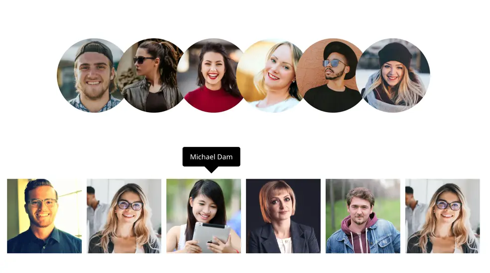
Image Stack
The Divi Plus Image Stack Module lets you display images in a dynamic, stacked layout that expands on hover, with customizable animations and tooltips. It’s perfect for showcasing team members, social icons, or linked images in an engaging and interactive way.
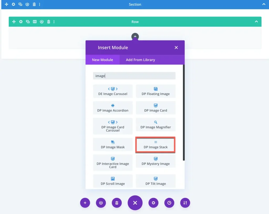
To add a module on the page, use the following steps:
- Create/Edit a Page/Post that uses Divi builder.
- Create/Edit a row.
- Click on Add New Module option; choose the DP Image Stack.
Content options
In the Content tab, you can add and manage images for your image stack. Just click the “Add New Image” button to upload or select images you want to include.
Display settings
Alignment: Choose how the images are aligned left, center, or right.
Image/Icon Size: Adjust the overall size of each image or icon using the slider.
Image/Icon Shrink: Set how much each image/icon should shrink when stacked.
Image/Icon Spacing: Control the space between each image/icon in the stack.
Enable Tooltip: Toggle this option to show or hide a tooltip when hovering over the images/icons.
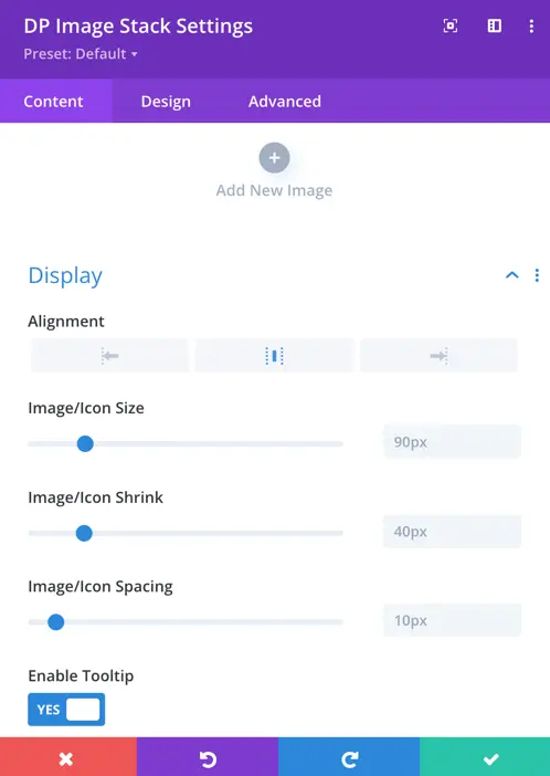
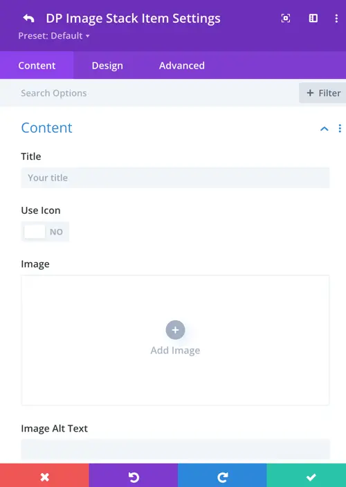
Image stack item settings
Once you add an image to the Image Stack module, each image item comes with its own settings.
Under the Content tab, you can:
Title: Add a custom title for the image or icon. This is helpful for tooltips or accessibility.
Use Icon: Toggle this switch if you prefer to use an icon instead of an image.
Image: Click “Add Image” to upload or choose an image from your media library.
Image Alt Text: Enter alternative text for the image, which improves accessibility and SEO.
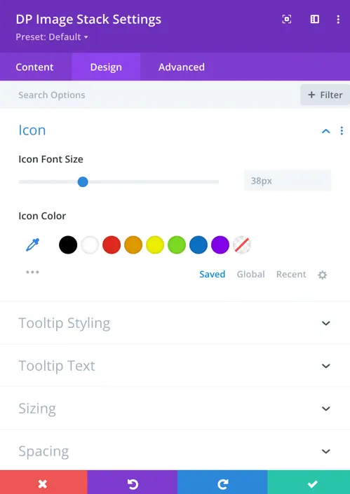
Design settings
If you’re using an icon instead of an image, you can customize how it looks under the Icon section.
Icon Color: Pick a color for the icon from the preset options or use the color picker to choose your own.
Icon Font Size: Use the slider to adjust the size of the icon.
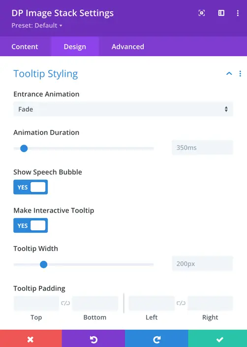
Tooltip styling
In this section, you can customize how the tooltip appears when a user hovers over an image or icon.
Entrance Animation: Choose how the tooltip appears (e.g., fade, slide, etc.).
Animation Duration: Set how quickly the tooltip animation plays (in milliseconds).
Show Speech Bubble: Turn this on to display the tooltip with a speech bubble style.
Make Interactive Tooltip: Enable this if you want users to be able to interact with the tooltip (e.g., click links inside it).
Tooltip Width: Adjust the width of the tooltip using the slider.
Tooltip text
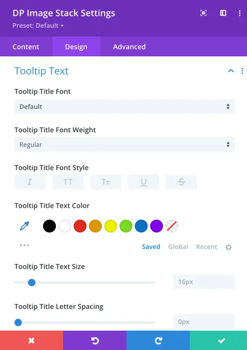
This section allows you to style the text that appears inside your tooltip.
Tooltip Title Font: Choose a font style for your tooltip title.
Tooltip Title Font Weight: Set how bold the tooltip text appears (e.g., light, regular, bold).
Tooltip Title Font Style: Use options to make the text italic, bold, underlined, etc.
Tooltip Title Text Color: Pick a color for the tooltip text from preset options or customize your own.
Tooltip Title Text Size: Adjust the size of the text using the slider.
Tooltip Title Letter Spacing: Add space between each letter to improve readability or design appeal.