Search Divi Plus Documentation
Search for answers or browse our knowledge base.
Explore Divi Plus's Live Demo
Hover List
The DP Hover List Item module allows you to create interactive list elements that reveal rich content on hover. It supports titles, subtitles, descriptions, hover images, icons, and buttons with flexible styling options. Perfect for showcasing features, services, or any information in an engaging and dynamic format.
How to add module on page
Once Divi Plus is activated, it adds several modules to the Divi builder. To add a module on the page, use the following steps:
- Create/Edit a Page/Post that uses Divi builder.
- Create/Edit a row.
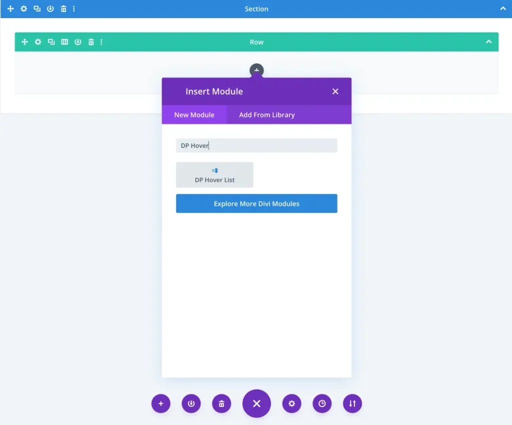
- Click on Add New Module option; choose the DP Hover List module.
Add new item
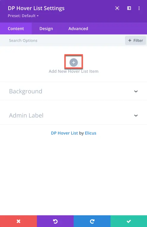
- Add New Hover List Item: Click the plus (+) icon to add a new item to the list. Each item can be independently customized in terms of content and design.
Content configuration
Content
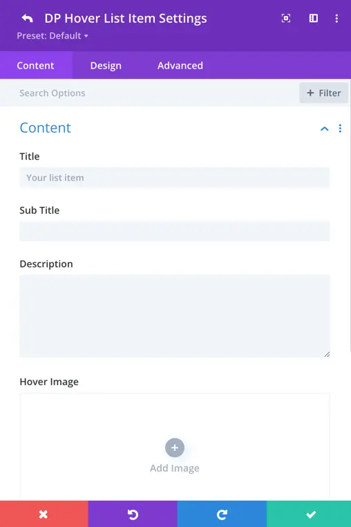
Once you’ve added a list item, you will see Content settings for that particular item:
- Title: Enter the main heading for the list item.
- Subtitle: Optionally, add a subheading.
- Description: Provide additional details or information.
- Hover Image: Upload an image that will appear when the user hovers over the list item.
Display options
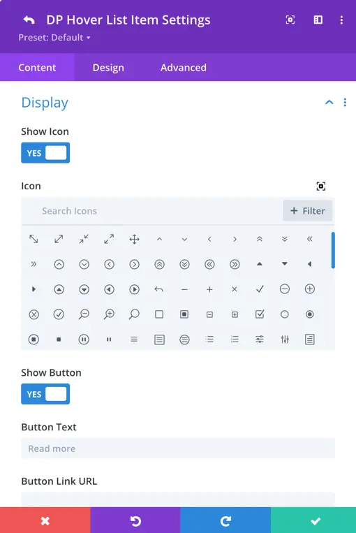
Show Icon: Toggle this ON to display an icon with the list item. You can then choose the icon you want to display.
Show Button: Toggle this ON to include a button in the item. You’ll be able to set:
- Button Text
- Button URL
- Link Target (e.g., open in same tab or new tab)
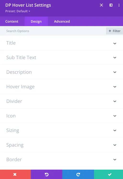
Single item design options
Each list item includes individual design settings to customize its look:
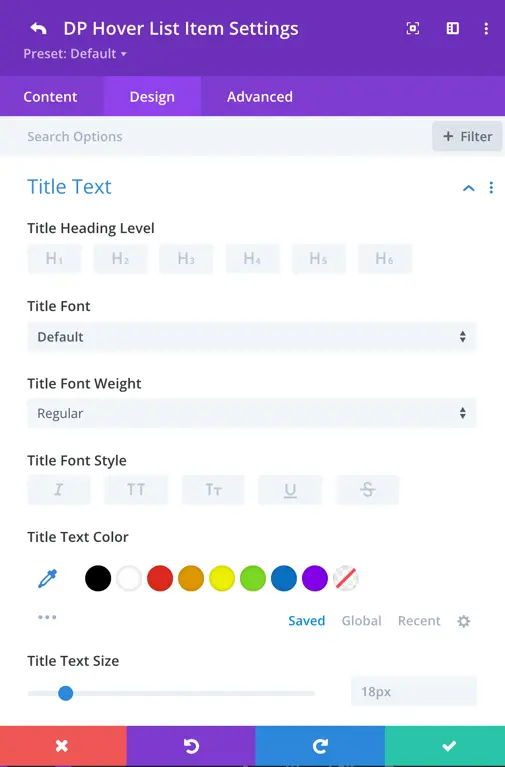
Title Text
- Customize font family, font weight, font style
- Set text size, color, letter spacing, line height
- Apply text shadow for more emphasis
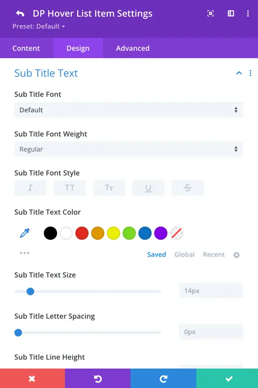
Subtitle Text
- Similar styling options as the title: font, size, weight, color, spacing, etc.
Description Text
- All basic text customization options are available: font, size, spacing, alignment, color
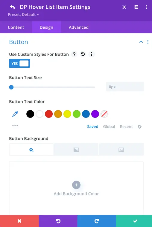
Button
Use Custom Styles for Button:
Enable this option to fully customize the appearance of the button displayed within each list item. Once toggled ON, you’ll gain access to a variety of design controls that allow you to personalize the button’s look and feel to match your design theme.
- Text Size & Color: Set the button label size and choose the font color to ensure readability and consistency with your layout.
- Background Color: Select a solid color or gradient to make the button stand out.
- Border Settings: Adjust the border width, choose the border color, and apply rounded corners using the border radius setting to give the button a soft or sharp edge depending on your preference.
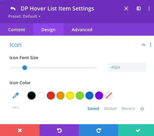
Icon
Icon Styling
Customize the icon that appears in the list item to enhance visual cues or branding.
Icon Color: Choose a color that complements the overall design or theme of your list item.
Icon Font Size: Increase or decrease the icon size for better visual balance.
Global design settings
The Global Design Settings allow you to apply consistent styling across all hover list items, making it easier to maintain uniformity without needing to configure each item individually.
These settings are especially useful when you want a cohesive design throughout your list. However, any design settings applied to individual items will override the global styles.
Text elements
You can customize the typography and color settings globally for all key text elements in your list:
- Font Style & Weight: Choose the font family, style (italic, bold), and font weight for a uniform appearance.
- Text Size: Set consistent font sizes across all items.
- Letter Spacing & Line Height: Fine-tune spacing for improved readability.
- Text & Icon Color: Apply consistent color schemes to the text and icon for brand alignment.
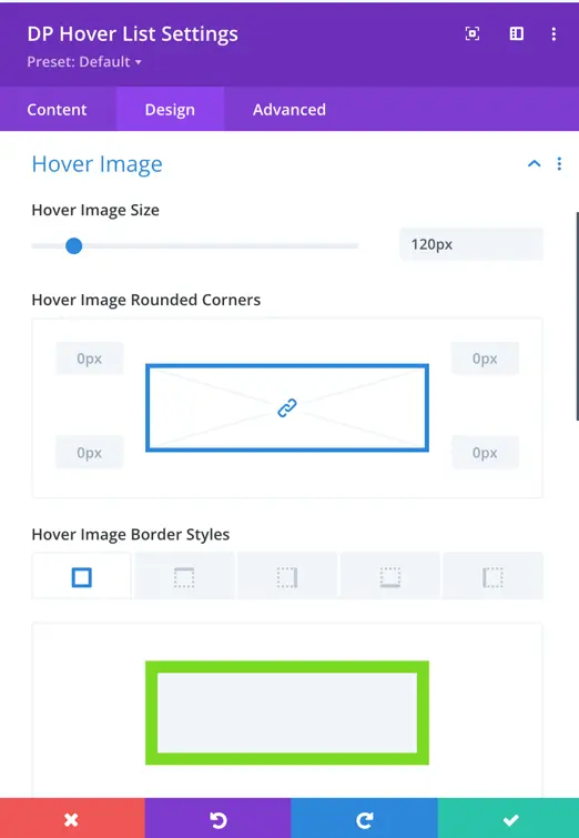
Hover Image
Apply global styling to the images used in hover effects:
- Image Size: Set a default image size for all hover images.
- Rounded Corners: Apply consistent corner radius to soften or square the image edges.
- Border Style: Customize the image borders by defining border width, color, and style (solid, dashed, etc.).
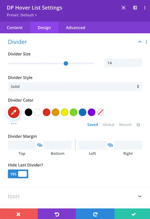
Divider
Control the visual separator between list items globally:
Divider Size: Define the thickness of the divider line.
Style Options: Choose from solid, dashed, dotted, or other available styles.
Color: Match the divider color with your site’s color palette.
Margin Settings: Add spacing around the divider to maintain layout balance.
Hide Last Divider: Enable this option to hide the final divider, offering a cleaner visual finish at the end of the list.