Search Divi Plus Documentation
Search for answers or browse our knowledge base.
Explore Divi Plus's Live Demo
Horizontal Scrolling Card
Divi Horizontal Scrolling Card is a powerful module for the Divi Builder that enables horizontal card scrolling on your website.
Designed for showcasing portfolios, services, team members, and more, it offers smooth interaction and layout flexibility.
This documentation covers setup, layout options, customization, and best practices for using the module effectively.
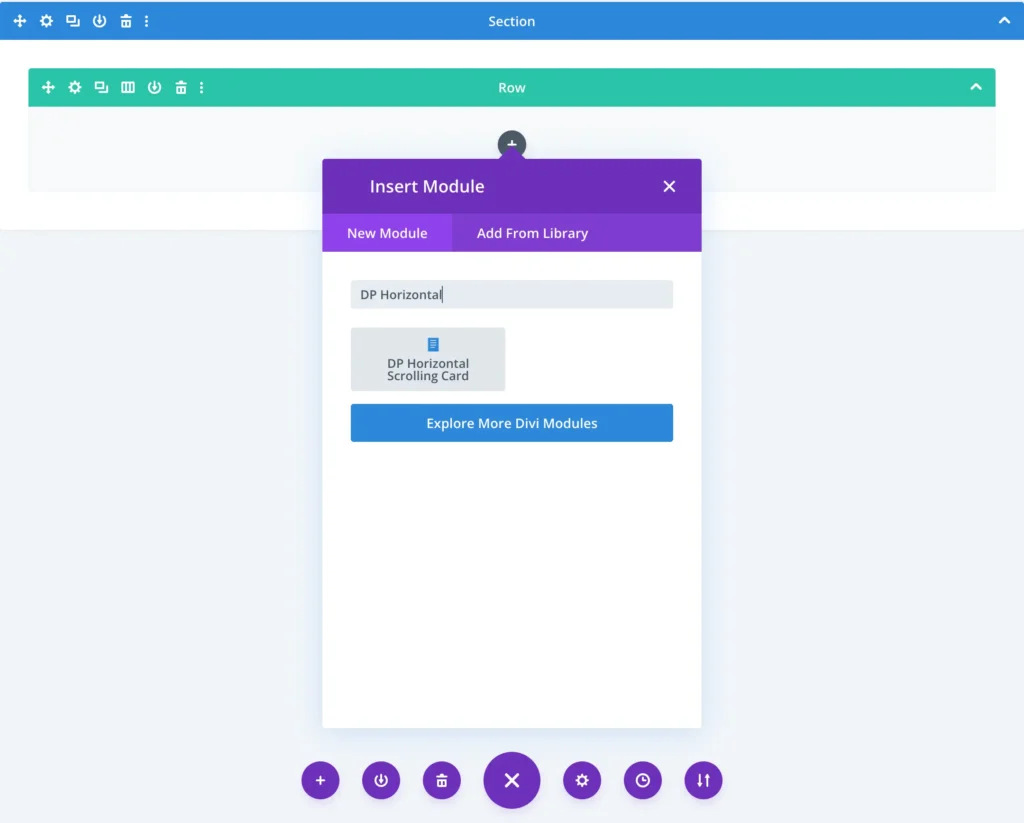
To add a module on the page, use the following steps:
- Create/Edit a Page/Post that uses Divi builder.
- Create/Edit a row.
- Click on Add New Module option; choose the DP Horizontal Scrolling Card.
Content
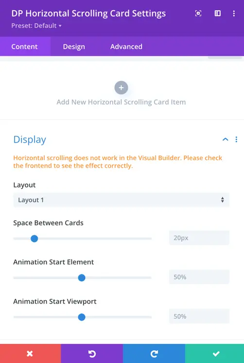
Add new card
After adding the DP Horizontal Scrolling Card module, you will see this screen.
To begin adding cards, click the “+” (Add New Horizontal Scrolling Card Item) button.
This lets you create individual cards with content that will scroll horizontally on your page.
Each card you add can be customized with its own content, design, and settings.
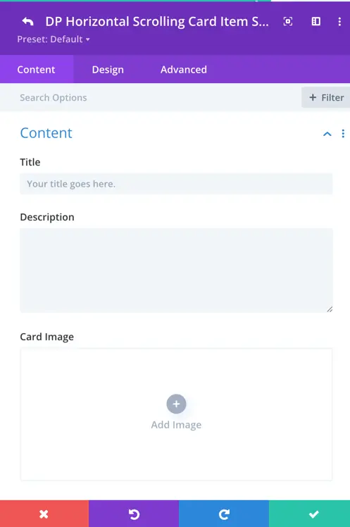
Item settings
Once you click to add a new card, you’ll see the following input fields:
- Title: Enter the heading or name for your card. This will be displayed prominently on the card.
- Description: Add supporting text or details that appear under the title.
- Card Image: Upload or select an image to visually represent the card content. This image appears as the main visual element of the card.
- Tag: You can add a tag for each card to display on card.
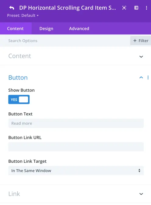
Button settings
Enable a call-to-action button for each card using the options below:
- Show Button: Toggle this to “Yes” if you want to display a button on the card.
- Button Text: Enter the text label that will appear on the button (e.g., Read More).
- Button Link URL: Provide the URL the button should link to when clicked.
- Button Link Target: Choose whether the link opens in the same window or in a new tab.
Use these settings to direct users to another page, post, or any external content from the card.
Style customization options
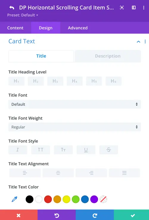
Card text settings
Use these options to style both the Title and Description text of each scrolling card. Switch between the tabs to control the design individually for each.
- Title Heading Level: Select the heading tag (H1–H6) for the card title to suit your page hierarchy.
- Font: Choose the font family for the title or description text.
- Font Weight: Set the thickness of the font (e.g., Light, Regular, Bold).
- Font Style: Enable italic, uppercase, small caps, underline, or strikethrough styles.
- Text Alignment: Align the text to the left, center, right, or justified.
- Text Color: Choose a custom color for the text.
Customize both title and description appearances to maintain visual harmony across your scrolling cards.
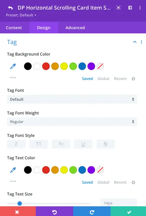
Tag settings
Use these options to style the tag that appears on each card. Tags can be useful for labeling or categorizing content visually.
- Tag Background Color: Choose the background color for the tag.
- Tag Font: Select the font family used in the tag.
- Tag Font Weight: Control the boldness of the tag text (e.g., Light, Regular, Bold).
- Tag Font Style: Apply text styles such as italic, uppercase, small caps, underline, or strikethrough.
- Tag Text Color: Choose the font color for the tag text.
- Tag Text Size: Adjust the size of the tag text using the slider.
These settings help ensure the tag stands out or blends in based on your card’s design requirements.
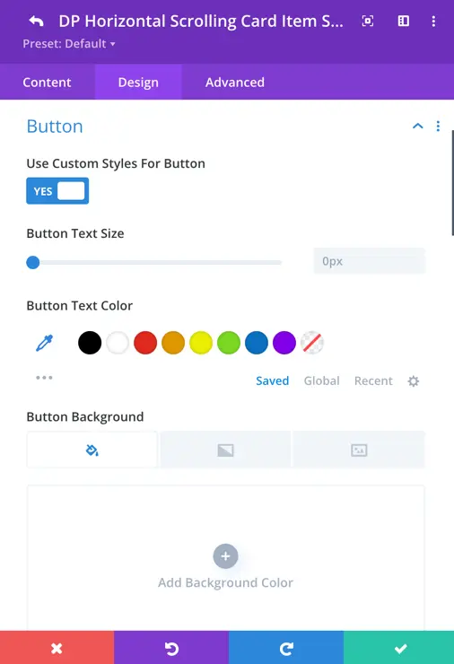
Button settings
These options allow you to fully customize the appearance of the button displayed on the card.
- Use Custom Styles for Button: Enable this toggle to unlock all button customization settings.
- Button Text Size: Adjust the font size of the button label using the slider.
- Button Text Color: Choose the color of the button text.
- Button Background: Set a background for the button. You can use a solid color, gradient, or even an image background.
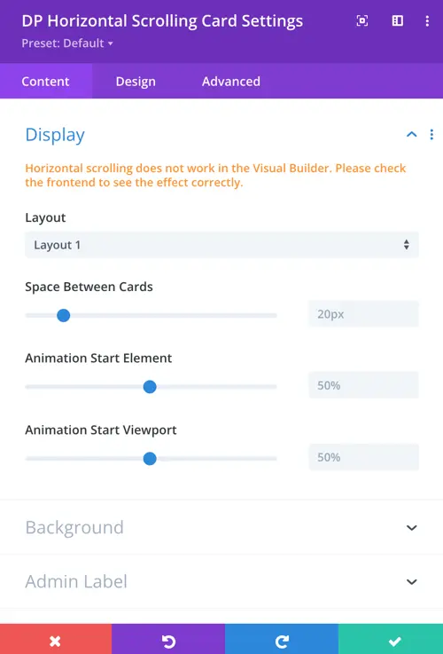
Global display settings
Layout
This defines the overall design style of the scrolling card. Here we have 2 layouts options. Layout 1 and Layout 2.
Space Between Cards
This controls the horizontal spacing between each scrolling card. Higher values increase the gap, lower values bring cards closer together.
Animation Start Element
This determines when the card’s animation begins, based on how much of the card is visible in the viewport. At 50%, animation starts when half of the card enters the visible screen area.
Animation Start Viewport
This defines where in the viewport the animation should trigger, relative to the height of the screen. At 50%, the animation begins when the element reaches the middle of the screen.