Search Divi Plus Documentation
Search for answers or browse our knowledge base.
Explore Divi Plus's Live Demo
Hero Slider
The Divi Plus Hero Slider Module helps you create full-width sliders for your website’s hero section, featuring images or videos, text, and two customizable buttons. With multiple slider effects, flexible alignment, and extensive design options, it’s perfect for promotions and key content highlights.

To add a module on the page, use the following steps:
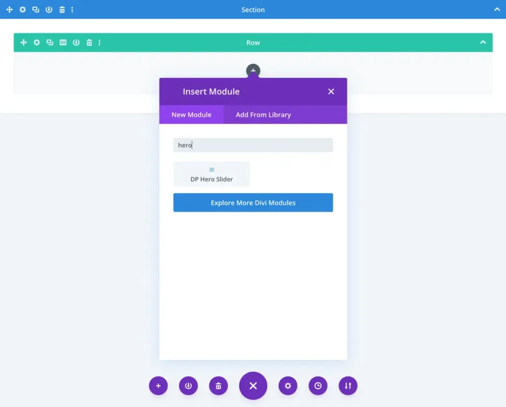
- Create/Edit a Page/Post that uses Divi builder.
- Create/Edit a row.
- Click on Add New Module option; choose the DP Hero Slider.
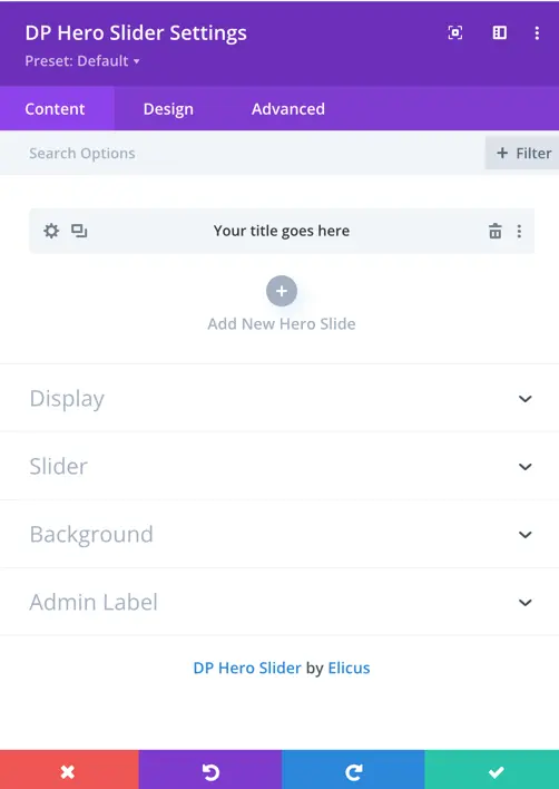
Slide content setup
Once you add a new slide to the DP Hero Slider, you gain access to additional settings specific to that slide.
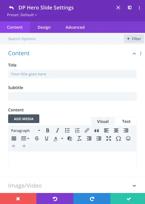
Content settings
This section allows you to define what each slide will display:
Title
Add your main heading here.
Subtitle
Enter supporting text beneath the title. Use this for short descriptions or taglines.
Content
- Add a detailed message using the visual editor.
- You can format your text, insert links, media, lists, and more.
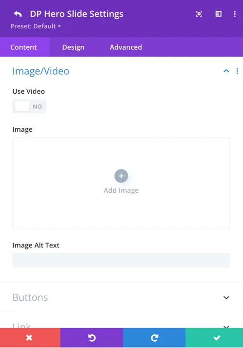
Image/Video setting
This section lets you define the visual background for your slide using either an image or a video.
Use Video
- Toggle this switch ON if you want to set a video background instead of an image.
- Keep it OFF to use a static image.
Image
- Click “Add Image” to upload or choose an image from your media library.
- This image will be shown as the background of the hero slide unless video is enabled.
Image Alt Text
Add a short description of the image for accessibility and SEO.
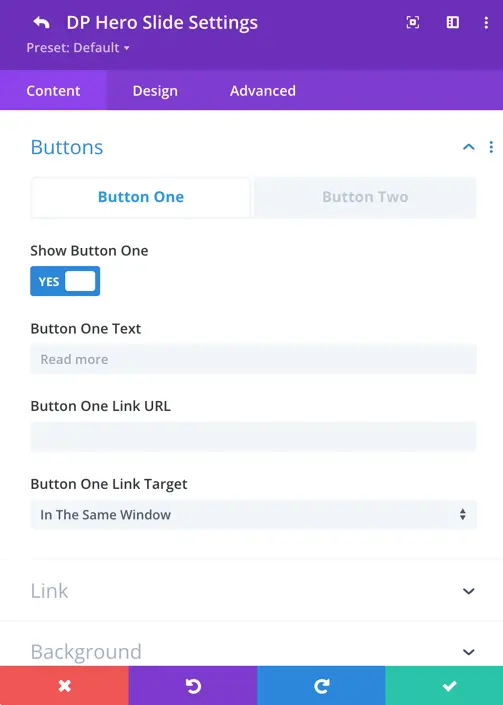
Buttons settings
The Buttons tab allows you to add two call-to-action buttons to your hero slide.
Button One / Button Two Tabs
- Switch between Button One and Button Two using the tabs.
- Each button has its own individual settings.
Show Button One / Two
- Toggle to YES to display the button on your slide.
- Set to NO if you don’t want the button to appear.
Button Text
- Enter the text label that will appear on the button.
Button Link URL
- Paste the URL where users should be taken when they click the button.
Button Link Target
- Choose whether the link opens:
- In The Same Window (replaces the current page), or
- In A New Tab (recommended for external links).
Design tab
Once you’ve added the content in your hero slide, you can customize its appearance by switching to the Design tab.
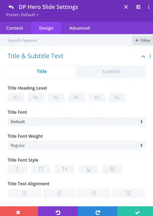
Title & subtitle text
This section lets you adjust how the Title and Subtitle look.
Title / Subtitle tabs
- Switch between Title and Subtitle to style each separately.
Title heading level
- Choose how important the title is in HTML structure:
- Options: H1 to H6
- Example: Use H1 for the main headline.
Title font
- Pick a custom font from the dropdown or leave it on Default to use the site’s default font.
Title font weight
- Set how bold the text appears:
- Options like Regular, Bold, Light, etc.
Title alignment
Align the text to the left, center, right, or justified.
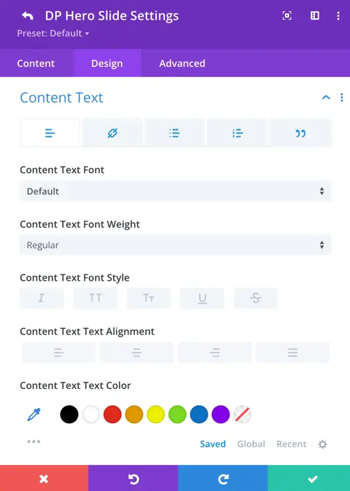
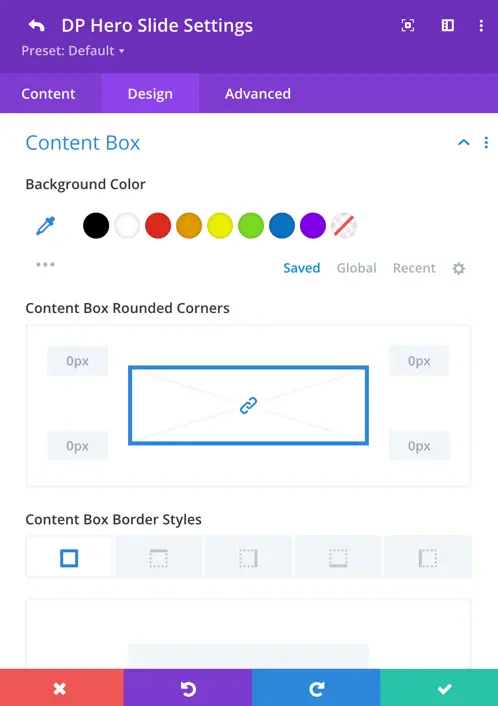
Content styling
This section lets you style the body content inside each hero slide.
Content font
- Choose a font from the list or keep it set to Default to match your site’s main font.
Content font weight
- Adjust how thick or light your text appears:
- Examples: Regular, Bold, Light, etc.
Content alignment
- Choose text alignment:
- Left, Center, Right, or Justify
Content text color
- Pick the text color.
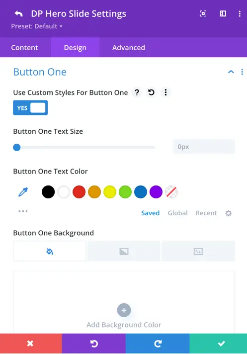
Button customization
- Enable Custom Styles: Toggle this ON to unlock styling options.
- Button Text Size: Adjust the size of the button text using the slider or input.
- Text Color: Pick a color for the button text.
- Background: Choose a solid color, gradient, or image background for your button.
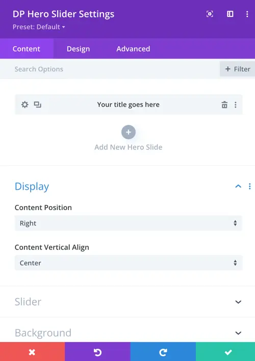
Display setting
The Display section controls the alignment of content within each hero slide.
- Content Position: Determines the horizontal alignment of the content within the slide.
Options include:- Left
- Center
- Right
- Content Vertical Align: Sets the vertical alignment of the content within the slide area.
Options include:- Top
- Center
- Bottom
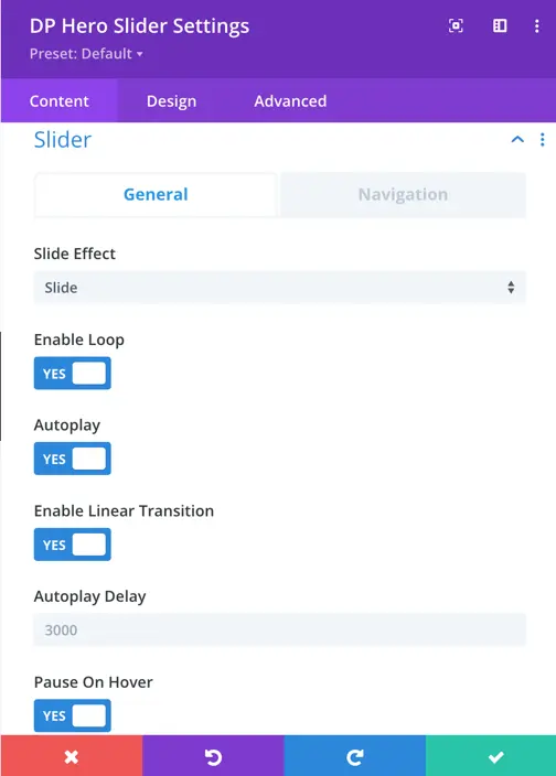
Slider general setting
- Slide Effect: Configured to “Slide,” which determines the transition style between slides in the slider.
- Enable Loop: A toggle option labeled “YES,” currently unchecked, meaning the slider will not loop back to the first slide after reaching the last one. When enabled, it would create a continuous cycle of slides.
- Autoplay: A toggle option if set as No indicating that the slider will not automatically transition between slides.
- Enable Linear Transition: A toggle option labeled “YES,” meaning transitions between slides will use a linear timing function.
- Autoplay Delay: Set to 3000 milliseconds (3 seconds), defining the time interval between automatic slide transitions if Autoplay is enabled.
- Pause On Hover: A toggle option labeled “YES,” meaning the slider will pause when a user hovers over it.
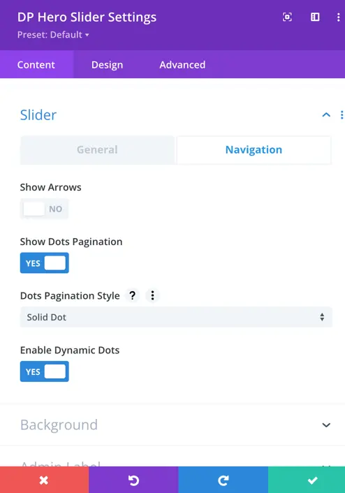
Navigation
Show Arrows: Set as Yes to display arrows.
Show Arrows Only on Hover: Set as Yes if you want the arrows to appear only when hovered over.
Arrows Position: Choose from different positioning options for the arrows.
Show Dots Pagination: Set as Yes if you want to display pagination dots.
Dots Pagination Style: Choose from various pagination styles, including:
- Numbered Dot
- Solid Dot
- Transparent Dot
- Stretched
- Dot Line
- Rounded Line
- Squared Dot