Search Divi Plus Documentation
Search for answers or browse our knowledge base.
Explore Divi Plus's Live Demo
Filterable Gallery
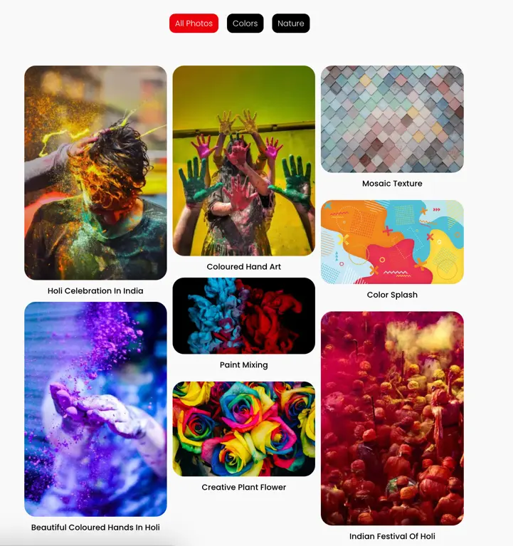
Create captivating image galleries effortlessly using the Divi Plus Filterable Gallery module. Customize categories, image counts, and sorting options for a personalized touch. Enhance your visuals with masonry layouts, spacing adjustments, and engaging overlay effects.
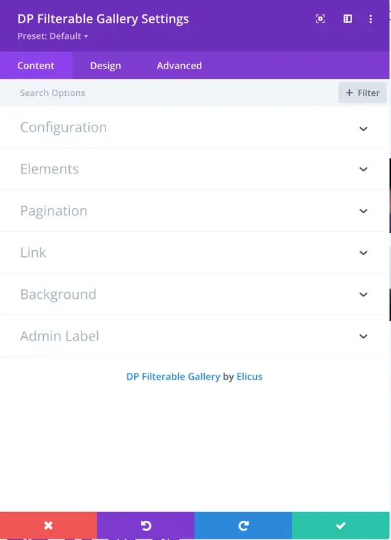
Content
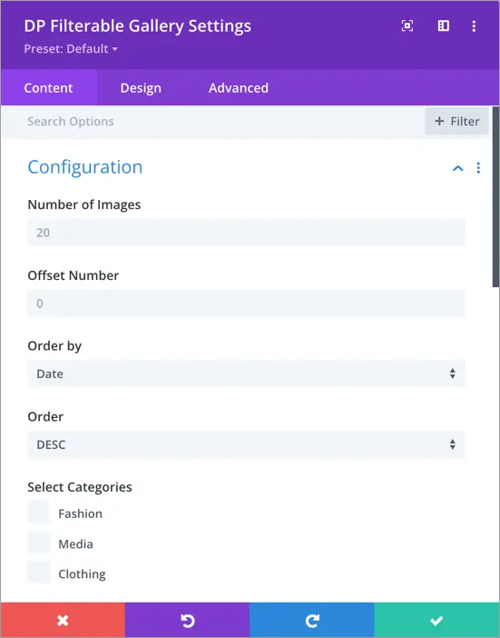
Configuration
Number of Images
In this setting, you can specify the desired number of images to be displayed. If pagination is enabled, this number determines how many images will appear on each page.
Offset Number
This setting allows you to specify the number of images you want to skip or exclude from being displayed in the gallery.
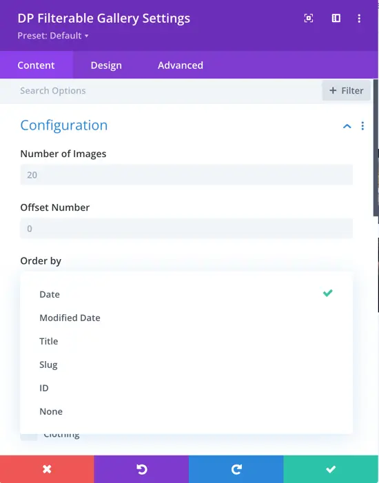
Order by
In this setting, you can choose the order type for your images. The available options are date, modified date, title, slug, ID, and none.
Order
In this section, you can select the order in which the images will be displayed. You can choose either ascending or descending order based on the order type you previously selected.
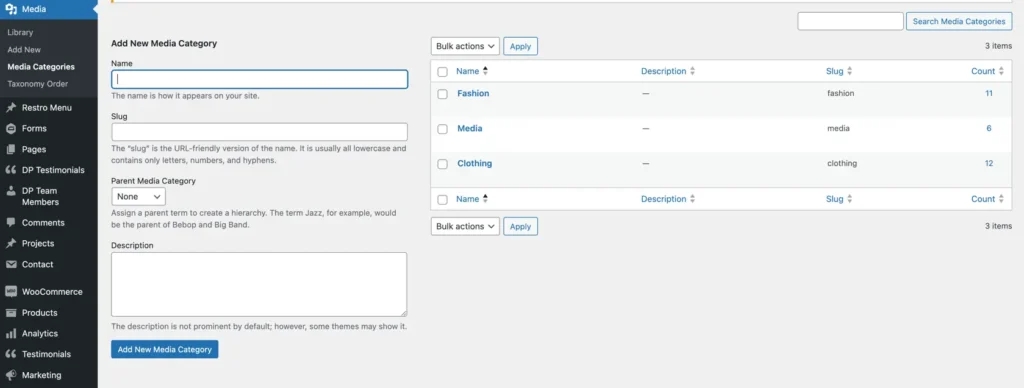
Upon enabling the DP Filterable Gallery module, you will gain access to the “Media Categories” setting within your WordPress admin panel. Within this setting, you can create and manage different categories for your media items.
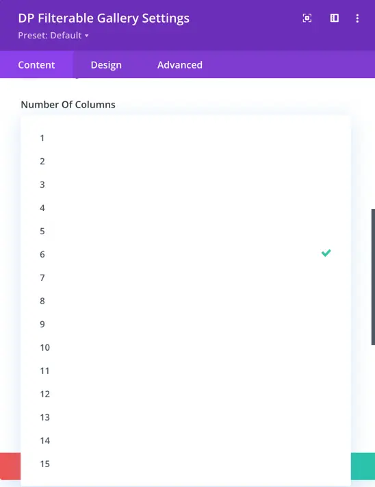
Number Of Columns
Here, you have control over the number of columns you’d like to display. You can customize the number of columns up to a maximum of 15.
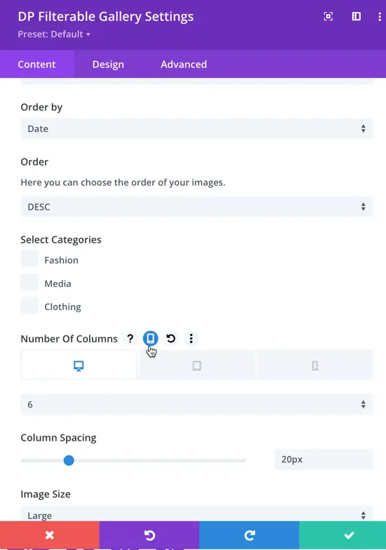
In the “Number of Columns” option, you can also select responsive settings. This means you can specify the number of images to be displayed on mobile, tablet, and desktop devices separately.
Select Categories
The categories you’ve created in the backend can be selected here in the module. Choose the categories for which you would like to display images. If you don’t select anything, images from all categories will be displayed.
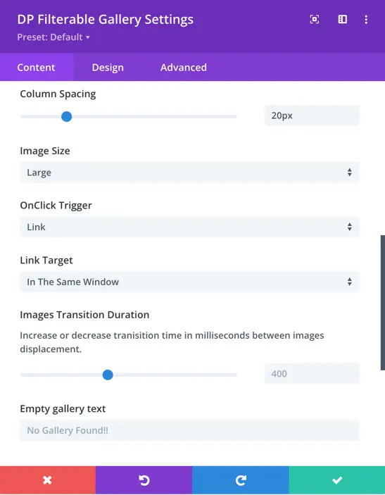
Column Spacing
Using this option, you can adjust the spacing between columns by increasing or decreasing the gap as needed.
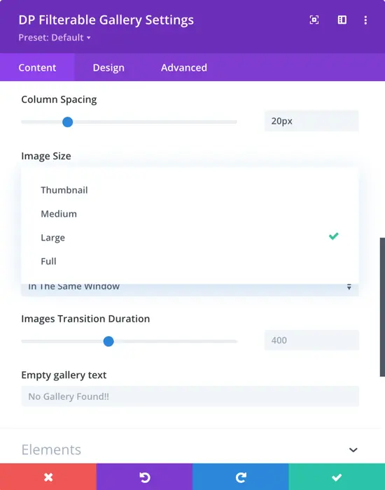
Image Size
In this setting, you can choose the size of the images displayed in the gallery. The available options are Thumbnail, Medium, Large and Full.
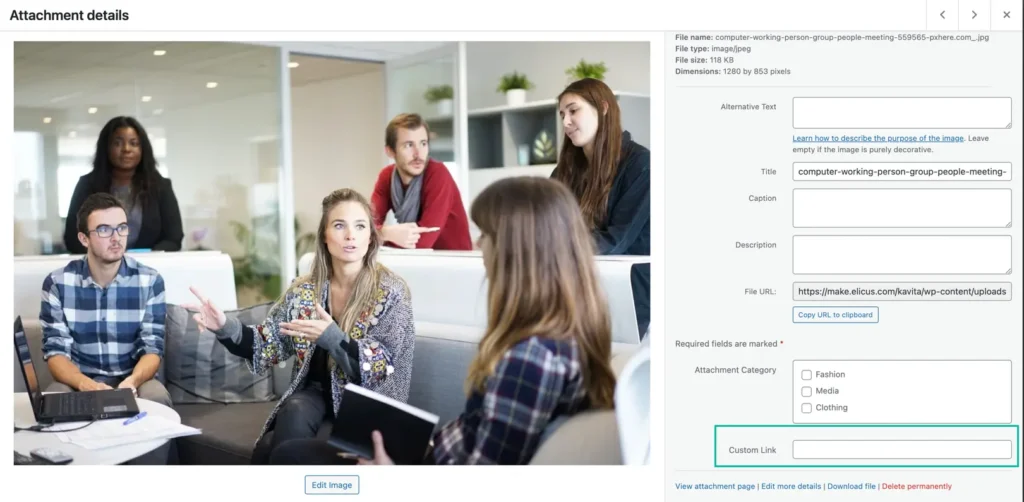
When you activate the module you will have the option to add a custom link in the image. This link will be triggered when you choose the “Link” option as the onclick trigger in the module setting.
To add a custom link, navigate to the WordPress admin panel, edit the image, and there you will find the option to select a category and add a custom link. This allows you to associate the image with a category and provide a specific link.
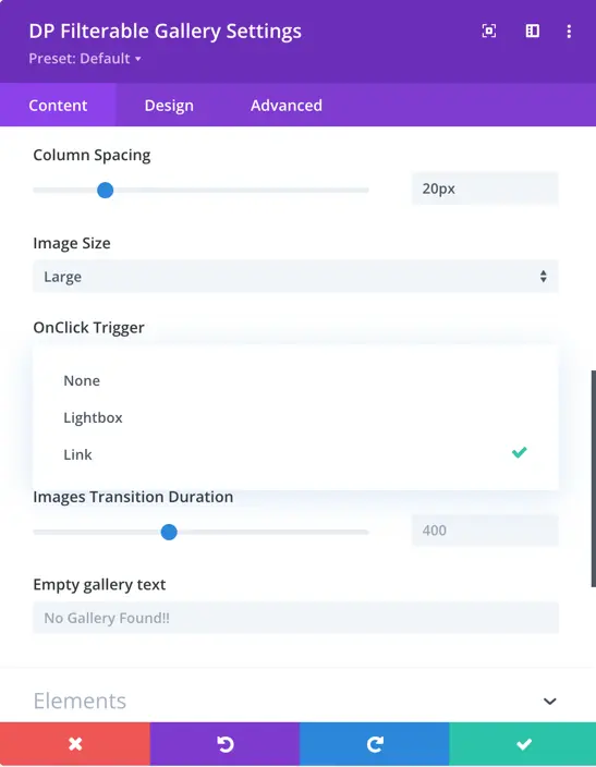
OnClick Trigger
Select the action that will be triggered when an image is clicked: None, Lightbox, or Link.
- None: No action will occur when clicking on the image.
- Lightbox: The image will open in a lightbox.
- Link: Clicking the image will open the custom link you’ve assigned, as described in the previous step.
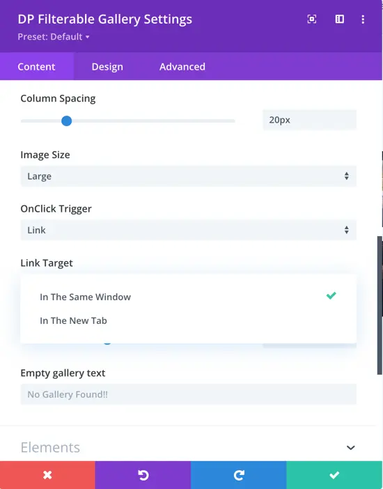
With the “Link” option, you will have additional choices to determine how the link opens:
- In The Same Window: The link will open in the same browser window or tab.
- In The New Tab: The link will open in a new browser window or tab.
Images Transition Duration
Adjust the time in milliseconds for the transition between the displacement of images. You can increase or decrease this duration to control the speed of the image transition effect.
Empty gallery text
This text will provide context and information to users when there are no images to display in the gallery.
Elements
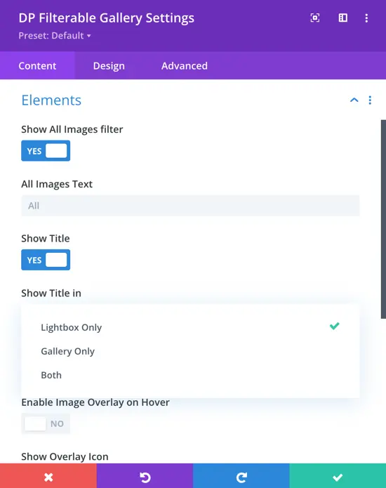
Show All Images filter
Choose whether to display the “All Images” filter option. This option allows users to view all images in the gallery without applying any specific category filter.
All Images Text
In this setting, you can write the customized text that will be displayed for the “All Images” filter option.
Show Title
Set this option to “Yes” if you want to display the title of each image in the gallery.
Show Title in
Here, you have three options to choose from – “Lightbox Only,” “Gallery Only,” and “Both.” This determines where you want to display the title of each image: in the lightbox, in the gallery, or in both.
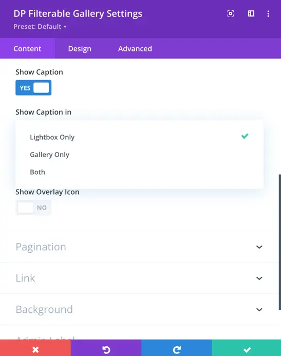
Show Caption
Similar to the title, you also have control over displaying captions for images.
Show Caption in
You can choose where to display captions for images: in the lightbox only, gallery only, or both.
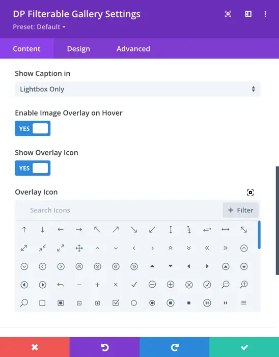
Enable Image Overlay on Hover
This setting allows you to enable or disable the image overlay effect that appears when hovering over an image. When enabled, a semi-transparent layer appears on top of the image.
Show Overlay Icon
This option enables or disables the display of an icon on the image overlay when hovering over an image. When enabled, an icon can be displayed on top of the image to provide a visual indicator or representation associated with the image.
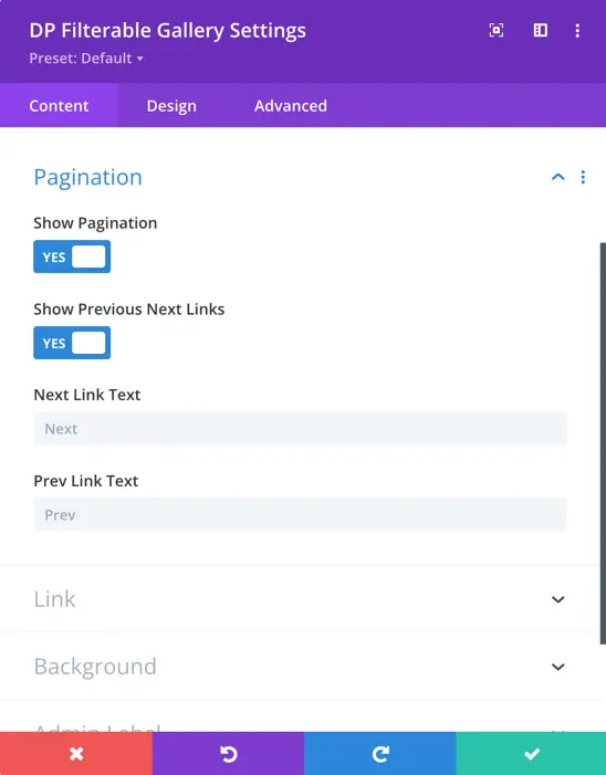
Pagination
Show Paginaiton
Enable or disable pagination links for navigating through multiple pages of images.
Show Previous Next Links
Enable or disable the previous and next navigation links for browsing images.
Next Link Text
Customize the text for the “Next” navigation link.
Prev Link Text
ustomize the text for the “Previous” navigation link.
Design
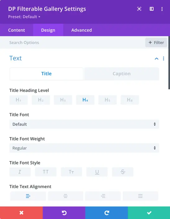
Text
Title Heading Level
Here you will get the option for title and caption text. Here you can set the heading level, font, font weight, font style, and alignment.
Category
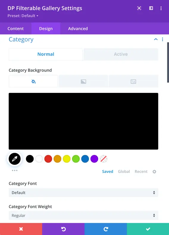
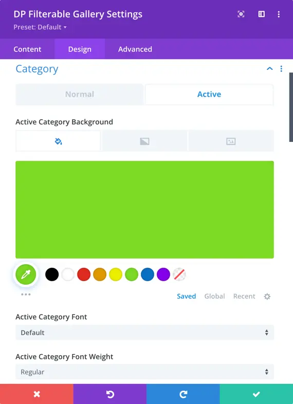
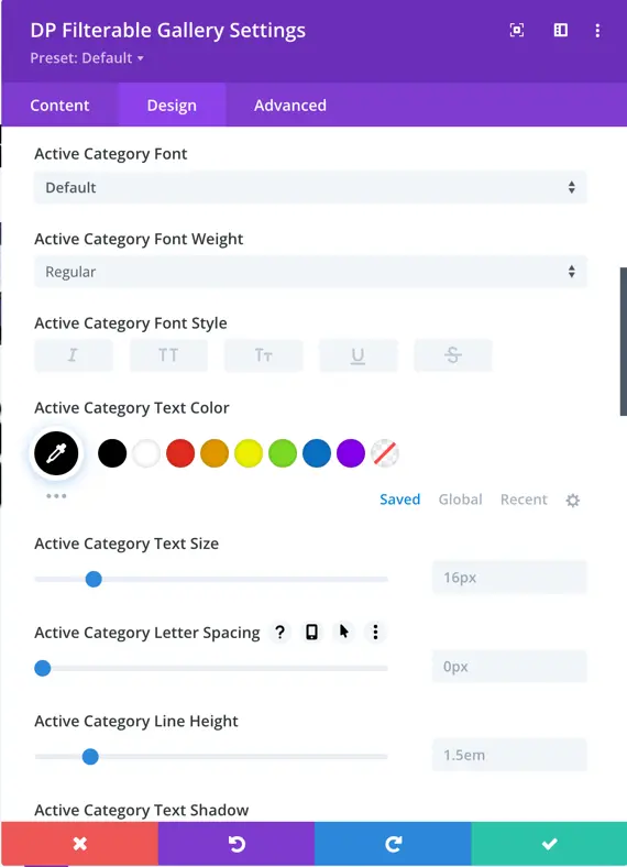
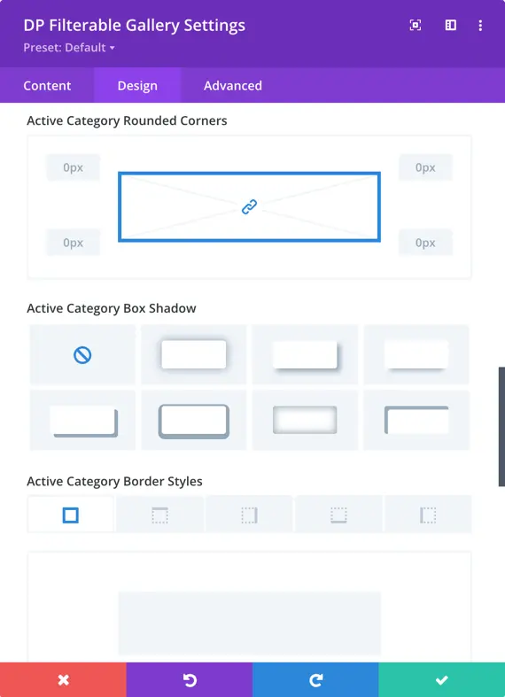
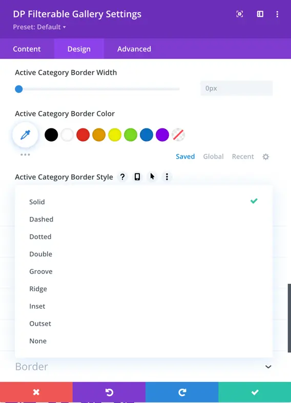
In this area, you can customize the appearance of both the active category term and normal category terms. You have the ability to modify attributes such as background color, category font, font weight, font style, text color, text size, letter spacing, line height, text shadow, rounded corners, box-shadow, border width, border styles, and border color.
Overlay
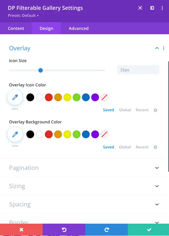
In the “Overlay” section, you can configure the overlay icon’s size, icon color, and overlay background color.
Pagination
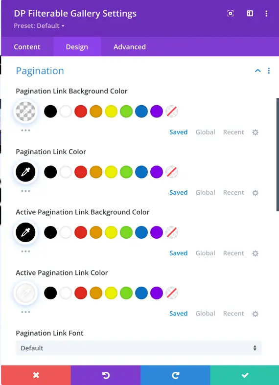
Pagination Link Background Color
Choose the background color for the pagination links.
Pagination Link Color
Set the color for the pagination links.
Active Pagination Link Background Color
Define the background color for the active pagination link.
Active Pagination Link Color
Specify the color for the active pagination link.
Pagination Link Font
Select the font for the pagination links.
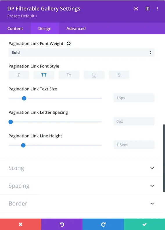
Pagination Link Font Weight
Set the font weight for the pagination links.
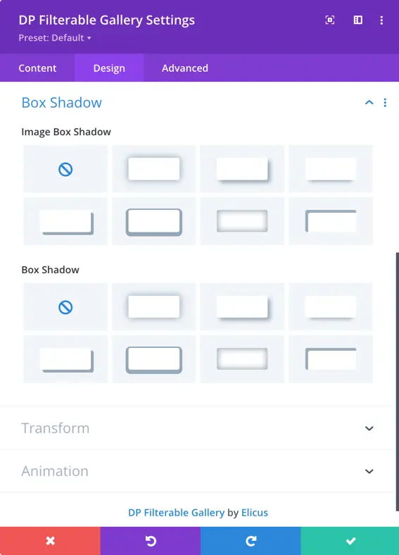
Box Shadow
Image Box Shadow
Image Box Shadow allows you to apply a shadow effect to the images in the gallery.
