
Search Divi Plus Documentation
Search for answers or browse our knowledge base.
Explore Divi Plus's Live Demo
Advanced Tooltip
The Tooltip Divi Module allows you to display helpful information when users hover over or interact with elements like buttons, text, images, or icons enhancing user experience with clean, customizable popups.
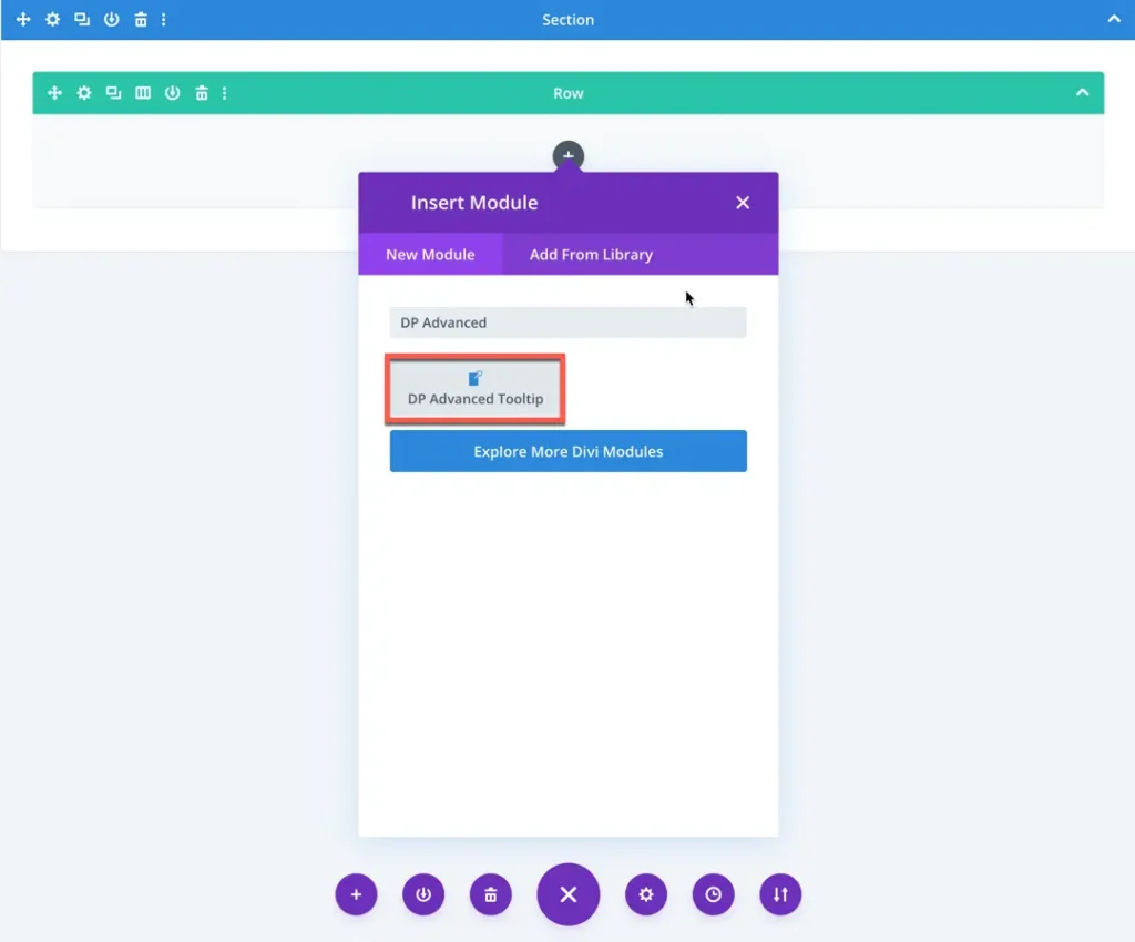
How to add module on page
Once Divi Plus is activated, it adds several modules to the Divi builder. To add a module on the page, use the following steps:
- Create/Edit a Page/Post that uses Divi builder.
- Create/Edit a row.
- Click on Add New Module option; choose the DP Advanced Tooltip module.
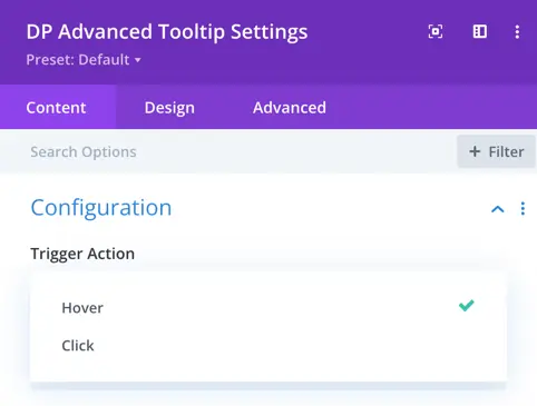
Configuration setting
The Advanced Tooltip module lets you display helpful tooltips using various triggers, content types, and design styles.
Trigger action
Choose how the tooltip is activated:
- Hover – Tooltip appears when the user hovers over the trigger.
- Click – Tooltip appears when the user clicks on the trigger.
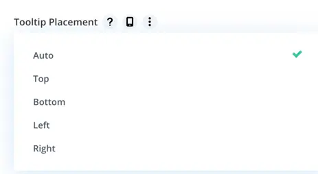
Tooltip placement
This setting controls where the tooltip will appear in relation to the element it is attached to. You can choose from the following options:
- Auto – Automatically decides the best placement based on available space around the element.
- Top – Displays the tooltip above the element.
- Bottom – Displays the tooltip below the element.
- Left – Displays the tooltip to the left side of the element.
- Right – Displays the tooltip to the right side of the element.
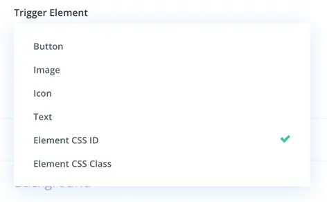
Trigger element
Select what element will show the tooltip:
- Button – A styled button will trigger the tooltip.
- Image – An image will act as the tooltip trigger.
- Icon – You can use an icon as the trigger.
- Text – Plain or styled text triggers the tooltip.
- Element by ID/Class – Add tooltip to any custom element using its CSS ID or class.
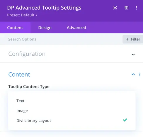
Tooltip content type
Decide what content will be shown inside the tooltip:
- Text – Simple text-based tooltips.
- Image – Display an image inside the tooltip.
- Divi Library Layout – Load a saved Divi layout inside the tooltip.
Desing options
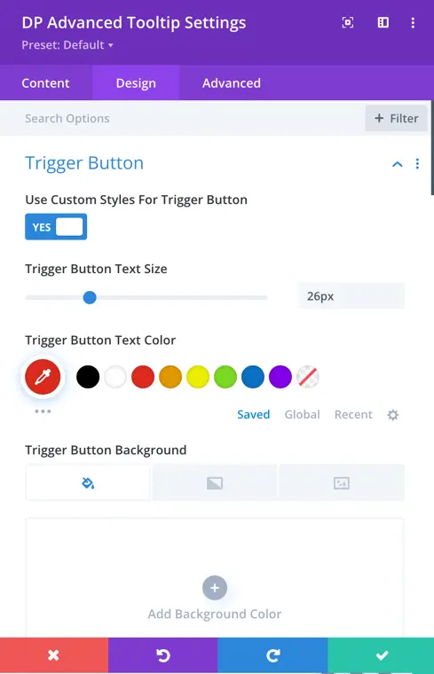
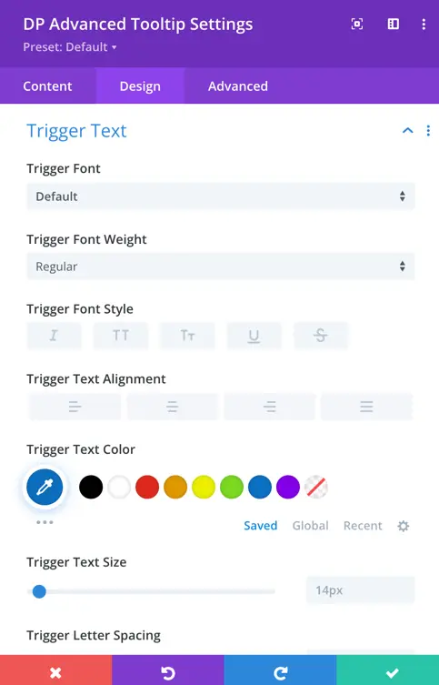
Trigger element
The design options available in this section depend on the type of trigger you have selected to open the tooltip. Based on the chosen trigger element Button, Image, Icon, or Text you’ll see different customization options:
- Button: If you choose a button as the trigger, you can style its text by adjusting the font size and color. You can also customize the button’s background color to match your design.
- Image: When an image is selected as the trigger, you’ll have options to set its alignment (left, center, right) and control the width for precise placement.
- Icon: Selecting an icon as the trigger gives you settings to modify its size, alignment, and color.
- Text: If plain text is used as the trigger, you get full text styling options including font family, size, color, alignment, and letter spacing.
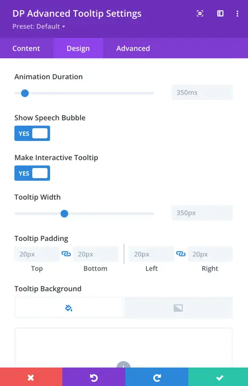
Tooltip appearance settings
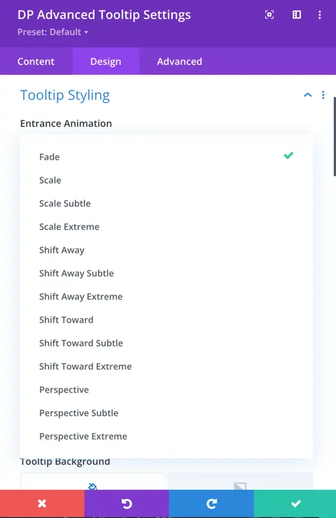
These settings let you fine-tune how the tooltip looks and behaves when it appears on the page. You can control everything from animation effects to interaction and layout:
- Entrance Animation: Decide how the tooltip should appear when triggered. Options like Fade, Scale, or Slide add a smooth animated effect, enhancing the user experience.
- Animation Duration: Control how fast or slow the entrance animation plays. This helps you match the tooltip’s appearance speed with the overall feel of your design.
- Speech Bubble: Enable this option if you want your tooltip to look like a classic speech bubble, with a small pointer (tail) pointing toward the trigger element. You can disable it for a cleaner, box-style tooltip.
- Interactive Tooltip: When this is enabled, users can interact with the content inside the tooltip, such as clicking buttons, links, or filling out forms. It turns the tooltip into more than just a label it becomes a mini content container.
- Tooltip Width & Padding: Set the overall size of the tooltip using width, and define spacing inside the tooltip using padding. This ensures your content looks balanced and is easy to read.
- Tooltip Background: Choose a background color or even an image to match the tooltip with your site’s design. It helps the tooltip stand out or blend in based on your styling needs.
Tooltip text styling
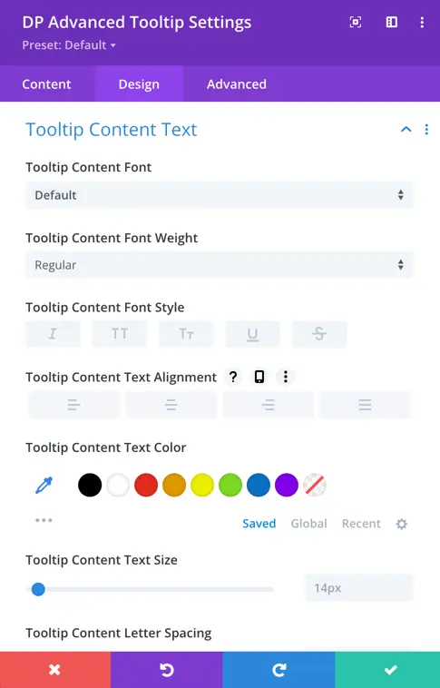
This setting allows you to control the overall appearance of the text inside the tooltip. You can choose the font style (like normal, italic) and adjust the font weight (such as light, regular, or bold) to match your design preference. The text alignment can be set to left, center, or right depending on how you want the content to appear.
Additionally, you can customize the font size and letter spacing for better readability. You also have full control over the text color and the background color of the tooltip, ensuring it stands out or blends well with your site’s design.