Search Divi Plus Documentation
Search for answers or browse our knowledge base.
Explore Divi Plus's Live Demo
Accordion Slider
The Accordion Slider module allows you to showcase content in an engaging, interactive horizontal slider where each slide expands on hover or click to reveal detailed information. With dedicated options for images, titles, descriptions, icons, and buttons, this module offers a visually dynamic way to present categories, locations, services, features, or any type of structured content.

How to add module on page
Once Divi Plus is activated, it adds several modules to the Divi builder. To add a module on the page, use the following steps:
- Create/Edit a Page/Post that uses Divi builder.
- Create/Edit a row.
- Click on Add New Module option; choose the DP Accordion Slider module.
Content
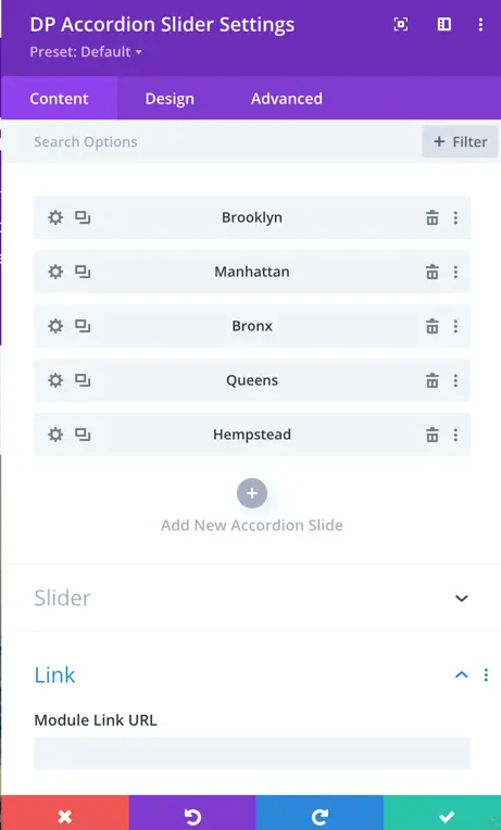
Accordion Slides
You can add multiple slides to the accordion slider using the Add New Accordion Slide option.
Each slide includes the following content settings:
- Slide Image – Upload an image to display on the accordion panel.
- Title – Add the main heading for the slide.
- Description – Insert descriptive text that appears within the slide.
- Show Icon – Toggle to enable or disable an icon for the slide.
- Show Button – Toggle to display a call‑to‑action button.
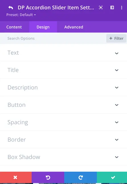
Design
The Design tab provides styling options for each element inside an accordion slide.
Text
Styling settings for text content, including typography and color.
Title
Customize the slide title with typography, color, spacing, and other design controls.
Description
Adjust font size, weight, color, and spacing for the description text.
Button
Controls the appearance of the slide button, including colors, typography, hover settings, borders, and padding.
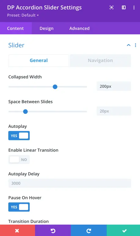
Slider
This section includes settings that affect the behavior and appearance of the entire slider.
- Collapsed Width – Defines the width of each collapsed accordion slide. Example: 200px
- Space Between Slides – Controls spacing between accordion items. Example: 20px
- Autoplay: Toggle the autoplay feature to make the carousel automatically scroll.
- Enable Linear Transition: Set as yes to enable linear transition.
- Autoplay Delay: Customize the delay in milliseconds between each card transition during autoplay.
- Pause On Hover: When enabled, the carousel will pause scrolling when a visitor hovers over it.
- Transition Duration: Define the speed at which card transitions occur.
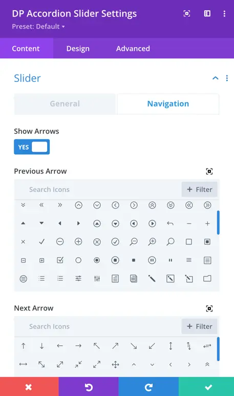
Navigation
Navigation settings provide control over how to display arrows, customize their appearance and behavior, use dots for pagination, and choose from various styles to match your design.
- Show Arrows: This toggle enables or disables the display of navigation arrows, allowing users to manually navigate through the carousel using left and right arrows.
- Arrow On Hover: When enabled, the navigation arrows are hidden by default and appear when the user hovers the cursor over the carousel.
- Show Dots Pagination: Enabling this option adds dot-style pagination indicators that correspond to each slide in the carousel.
- Dots Pagination Style: You can choose the style of the dot pagination, customizing its appearance to match your overall design. You can select from a range of styles for the dot pagination indicators, including Solid Dot, Transparent Dot, Stretched Dot, Line, Rounded Line, Squared Dot, and Number Dot.
- Enable Dynamic Dots: Dynamic dots automatically adjust in size and spacing to indicate which slide is currently active.