
Whether you want less items on the header of the site or make it look modern, the Divi hamburger menu on the desktop is always the favorable choice for designers to do it. And in this tutorial, we’re going to see how you can do it easily without spending much time. Plus, we’ll also look at some prebuilt Divi hamburger menu headers available online that can help you transform your Divi headers in the way you want.
But first, let’s see how we can create a Divi hamburger menu for your desktop website.
Preview
Step 1: Open Divi Theme Builder & Create a Header Template
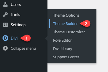
To create a Divi hamburger menu on the desktop, we’ll create a global header using the Divi Theme Builder. Go to Divi (on your WordPress Dashboard) → click Theme Builder.
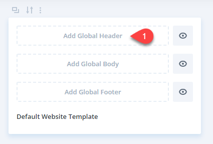
Then, click Add Global Header to create our header with a hamburger menu. (If you need to create the header for some specific page, you can also do that by clicking the Add New Template button and following further options.)
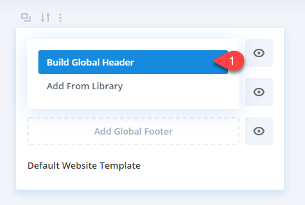
After selecting the Global header option, it will ask you how you want to build your header— Select Build Global Header from the given options.
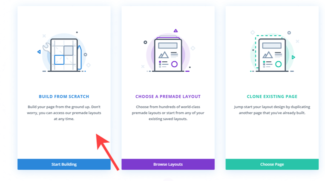
Then, further, it will ask you how you want to build your Divi header layout; simply select BUILD FROM SCRATCH and move to the next step.
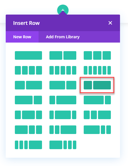
Step 2: Insert a Row With Dual Columns & Apply Customizations
Once selected the Build From Scratch option, insert a new row with two columns (left one shorter than the right) that we would use to place our menu items.
a) Row Customizations
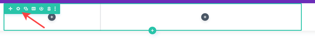
Now before we place our menu items, first, we need to apply customizations to the row and its columns. So, go to the (⚙) Gear icon and click it to open row settings.
Then go to the Design → Sizing → and apply customizations as follows,
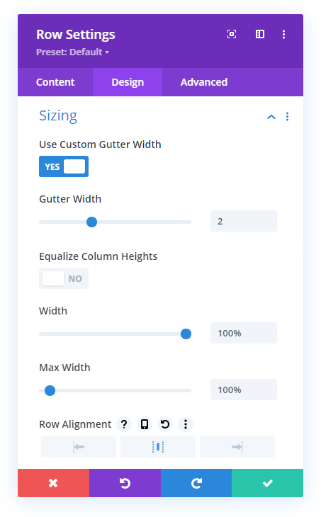
- Use Custom Gutter Width: YES
- Gutter Width: 2
- Width: 100%
- Max Width: 100%
- Row Alignment: Center
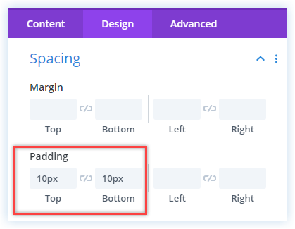
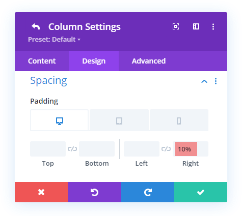
Now move to the Spacing menu, and set Top and Bottom Padding at 10px.
After this, go to the Advanced tab → open Scroll Effects, and apply customizations as follows,
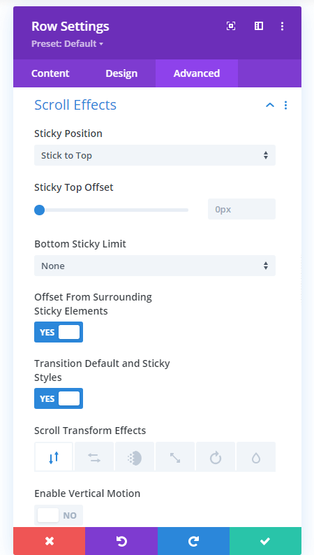
- Sticky Position: Stick to Top
- Offset From Surrounding Sticky Elements: YES
- Transition Default and Sticky Styles: YES
- Scroll Transform Effects: View Screenshot
b) Column Customizations
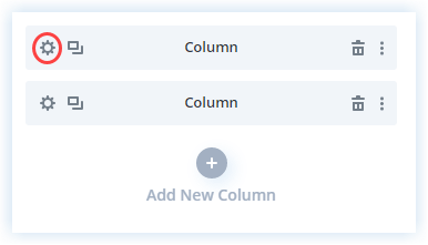
After customizing our Divi hamburger menu row, we need to apply a few customizations to the columns we’ve added. Go to the Content tab of the Row, then click (⚙) Gear Icon next the column option.
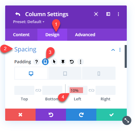
Apply Customization for the 1st Column
Go to the Design tab → Spacing → Desktop and set Left Padding to 10%. For Tablet and Mobile, set padding to 5%.
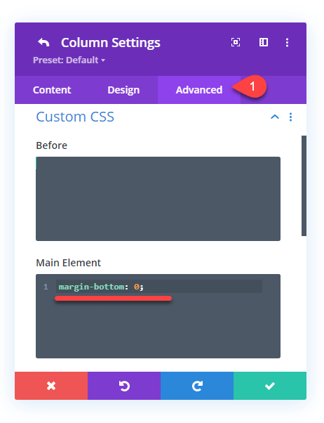
Once you set the padding, move to the Advanced tab → Custom CSS → Main Element → set margin bottom to 0. Use the following CSS to do that.
margin-bottom: 0;This will remove excessive space under the column.
Apply Customization for the 2nd Column
Follow the same steps to open settings of the 2nd column, then go to the Design tab → Spacing → Desktop and set Right Padding to 10%. For Tablet and Mobile phone, set Right Padding to 5%.
That’s it, we’ve done first half to create our Divi hamburger menu. Let’s head towards the next and place our menu items.
Step 3: Place Divi Hamburger Menu Items & Apply Customizations
Menu items are the main components of the Divi hamburger menu. Therefore, the following steps will help you place them nicely on the header. Plus, to make them look completely in sync with each other, all of the items go through some customization. So, make sure you apply each customization carefully and completely. Let’s first add our Logo.
a) Adding Logo on Hamburger Menu for Desktop
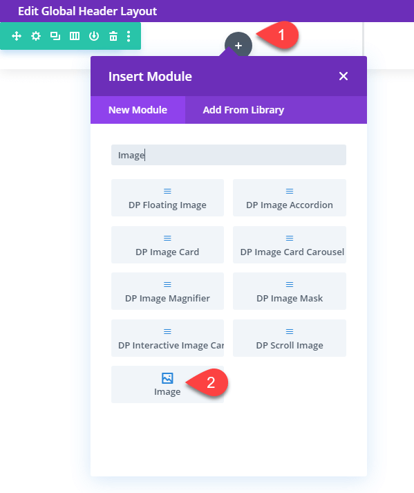
To a logo to the hambuger menu, head over to the left column and insert the Image module.
Then insert your logo in the Image settings. After that, move to the Link settings and in the Image Link URL assign Homepage Link through dynamic options.
b) Adding Other Divi Hamburger Menu Items
After placing the logo on the menu, it’s time we add other hamburger items to it. To do that, follow the below steps,
• Placing Email Menu Item
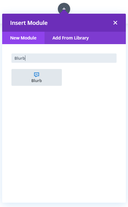
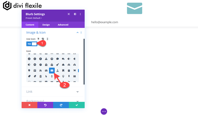
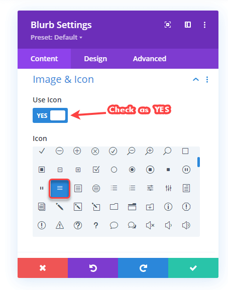
Go to the 2nd column and insert a Blurb module. We’ll use this blurb module to show the email address on the menu.
Content Customizations
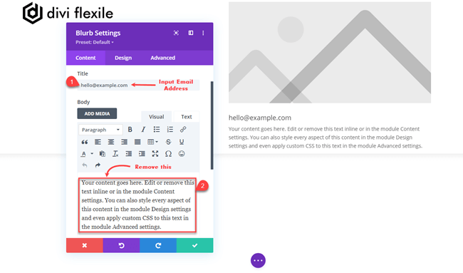
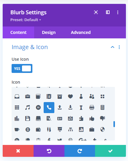
As soon as the Blurb module gets inserted on the page, the settings window will appear. Here, you need to enter the email address in the Title input field and remove the placeholder text.
After this, go to the Image & Icon settings, enable Use Icon, then select the icon shown in the below screenshot.
Furthermore, to enable our email menu item open the user’s mail option in his/her system upon clicking it. We need to add a linking query in the link settings. Therefore, go to the Link settings, then paste the following code in the Title Link URL.
mailto:[email protected]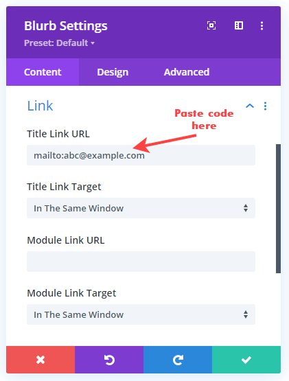
Design Customizations
Once done with the Content settings, move to the Design tab to further apply some appearance tweaks. In the Design tab, first, go to the Image & Icon, and apply the following customizations.
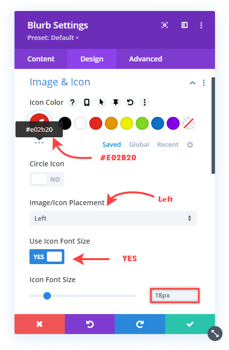
- Icon Color: #E02b20
- Image/Icon Place: Left
- Use Icon Font Size: YES
- Icon Font Size: 18px
Now after Image & Icon customizations, move to the Title Text settings, and apply tweaks as follows,
- Title Heading Level: H4
- Title Font: Poppins
- Text Color: #383838
- And Title Text Size: 16px
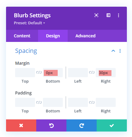
Further, go to the Spacing settings and set Right Margin to 30px, and Bottom Margin to 0px.
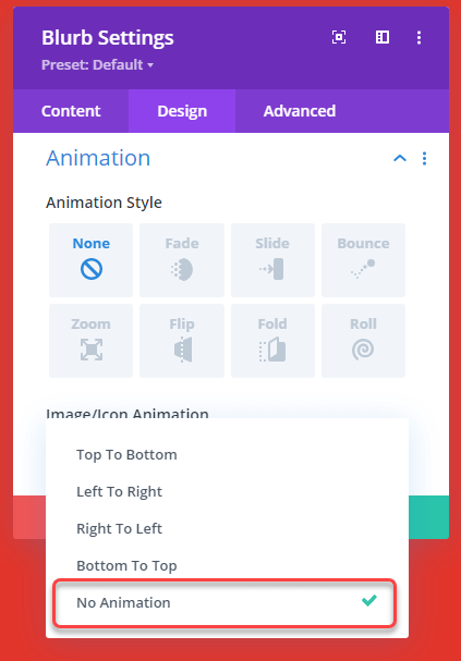
Once done with the Spacing, go to the Animation settings → Image/Icon Animation → select No Animation.
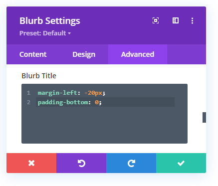
Advanced Customizations
After disabling the animation effect for the icon of the email menu item, move to the Advanced tab, then open Custom CSS settings, and paste the below code in Blurb Title.
margin-left: -20px;
padding-bottom: 0;
It will bring our email menu item’s text near to the icon and clear exssesive space.
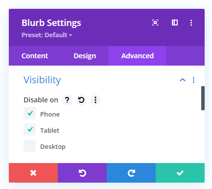
With the email menu item, we’re not done yet. It still needs to be defined on what devices it should get displayed. Therefore, we have to tweak its visibility. So, to do that, go to the Visibility settings, and check Disable on for Phone and Tablet.
Here, we’re done with our Email menu item for the Divi hamburger menu on desktop, let’s place another item.
• Placing Phone Menu Item
To add a phone menu item to the Divi hamburger menu on the desktop, follow the same step as we did in the case of the Email menu item. Use the same customizations and codes to synchronize the look and feel. However, choose the below icon in the Image & Icon settings of the Content tab.
Plus, use the following link URL in the Title Link URL input field of the Link settings to open the phone application when the user clicks on the Phone menu item.
tel:000-000-0000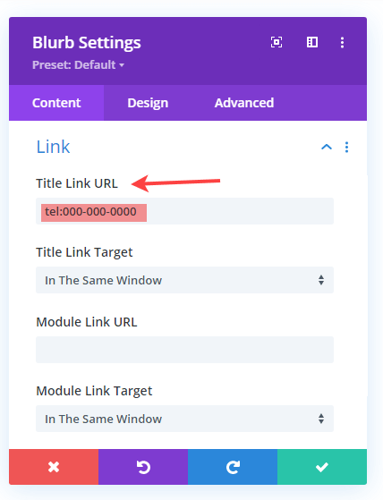
Once done with this, save and move to the next step in which we’ll place a Book Now CTA.
• Placing CTA on the Divi Hamburger Menu for Desktop
Insert the Button module right under the phone menu item. To do it easily, you can change the builder view to classic, just like the below screenshot.
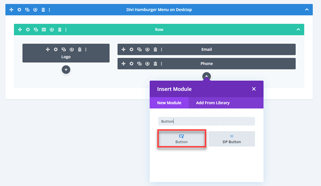
After it’s on the builder, the Content tab will appear. Input CTA’s text in the Text settings, and paste the targeted URL in the Link settings.
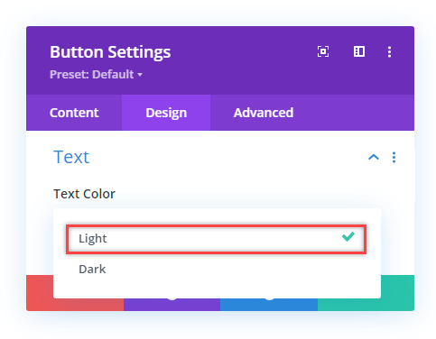
CTA Design Customizations
Now, after completing Content customizations, move to the Design tab → Text → Text Color → select Light.
After this, go to the Button settings, and apply customizations as follows,
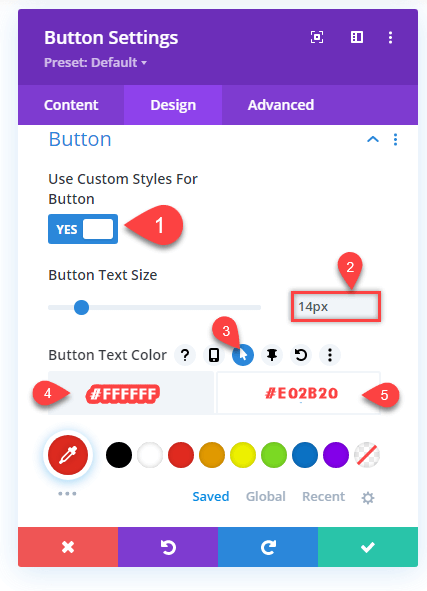
- Use Custom Styles for Button: YES
- Button Text Size: 14px
- Click Hover Buttton, then apply Button Text Color
- Desktop: #FFFFFF
- On Hover: #E02B20
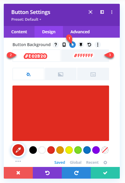
- Cilck hover button and apply Button Background color as,
- Desktop: #E02B20
- On Hover: #FFFFFF
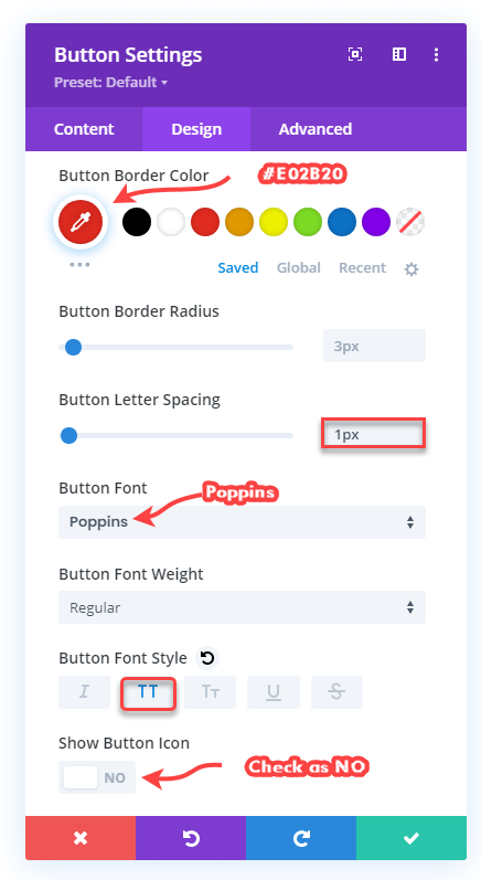
- Button Border Color: #E02B20
- Button Letter Spacing: 1px
- Select Poppins as Button Font
- Button Font Style: TT
- Show Button Icon: NO
The last thing you need to do in the Design tab after the Button setting is to go to the Spacing and set Margin – Padding values.
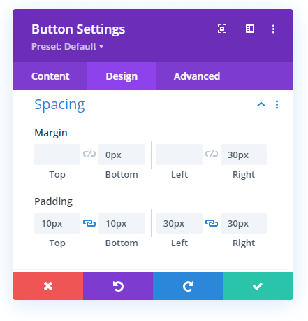
- Top Margin: –
- Bottom Margin:
- Left Margin: –
- Top and Bottom Padding: 10px
- Left and Right Padding: 30px
We’re done with CTA’s design customization; let’s move to the advanced tab and perform some visibility actions.
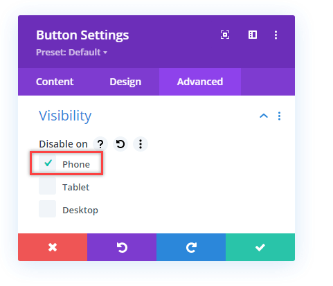
CTA’s Advanced Customizations
Nothing much needed to do in the Advanced tab of the CTA; all you need to do is go to the Visibility settings and check Disable on → Phone. And save the setting.
That’s it; we’re done with our Divi hamburger menu’s CTA. Let’s add our hamburger icon and apply some customizations.
• Placing Hamburger Icon
Insert the Blurb module under the CTA. As soon as you insert it, the Content tab will open with the Text settings. Nothing needs to be done here, so move to the Image & Icon settings choose the hamburger icon.
Once chosen the icon, move to the Design tab to apply appearance tweaks on it. For that, we need to open the Design tab.
Hamburger Design Customizations
In the Design tab, first, go to the Image & Icon settings, and apply tweaks the same as mentioned below,
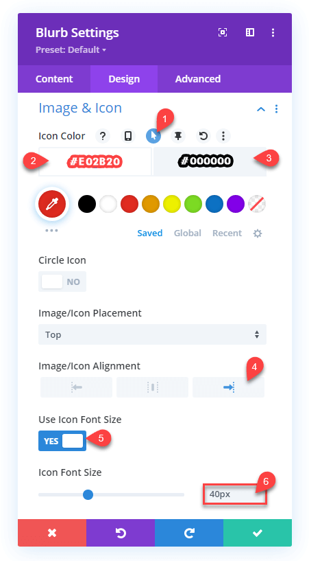
- Click hover button for Icon Color and apply color as follows,
- Desktop: #E02B20
- On hover: #000000
- Image/Icon Alignment: Left
- Use Icon Font Size: YES
- Icon Font Size: 40px
Then, head over to the Spacing settings and set Margin – Padding as follows,
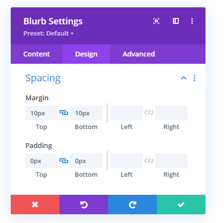
- Top and Bottom Margin: 10px
- Top and Bottom Padding: 0px
After this, go to the Animation settings and chose the No Animation option. That’s it; we’ve placed all of the Divi hamburger menu items for desktop. And this is how they look.

Not great, right? Some are up, and others are down, not vertically aligned. But our job isn’t done yet. Therefore, to make them vertically aligned and look good, we need to add some code to our column and the row. So, first, go to the Advanced tab of the Row, then Custom CSS, and in the Main Element, paste the following code.
display: flex;
align-items: center;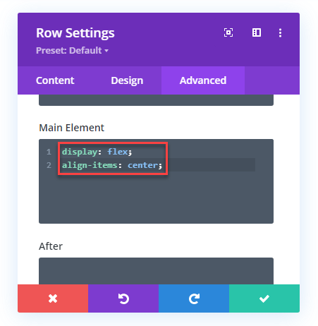
Now, go to the Advanced tab of the 2nd Column in which we’ve placed our menu items. Then open Custom CSS, and in the Main Element, paste the following code,
display: flex;
align-items: center;
justify-content: flex-end;
Once added the code, our menu items will start to look like the below screenshot.

Step 4: Add a New Row for Slide-in Off Canvas Menu of the Divi Hamburger Menu on Desktop
Simply add another Row with single column under the first one.
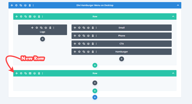
Now, go to the Row settings, and apply customizations to each tab one by one mentioned in the subsequent steps.
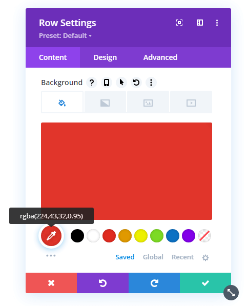
a) Content Customization of the 2nd Row
For Row’s Content tab customizations, all we need to do is change its background color. So, go to the Background settings, and set the Background color to rgba(224,43,32,0.95).
b) Design Customization of the 2nd Row
Then, go to the Design tab → Sizing, and apply sizing values the same as below,
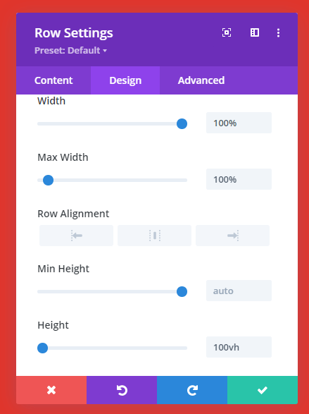
- Width: 100%
- Max Width: 100%
- Height: 100vh
As soon as you apply these values, the whole canvas will turn red. But, don’t worry, we’ll handle that part later. However, after applying Sizing values, go to the Spacing settings, and set Top and Bottom Padding to 0px.
c) Advanced Customization of the 2nd Row
Once applied value to the Spacing, head over to the Advanced tab → Position → Position → select Fixed. And set Z Index to 9999999999. This will cover the entire area of the page as an off-canvas just like the below screenshot.

The menu items are behind it. And on this area, we’ll add our close icon and the off-canvas menu items. So, let’s do that.
Step 5: Place Close Icon for Divi Hamburger Menu on Desktop
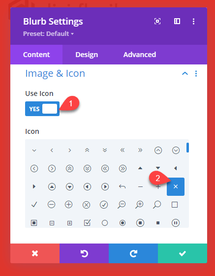
On the red canvas area, insert a new Blurb module that would be used as the Close icon. Once inserted the module, go to the Image & Icon settings, check Use Icon as YES, and select the below icon.
The close icon for the off-canvas menu has been selected. Let’s tweak its customization in the Design tab.
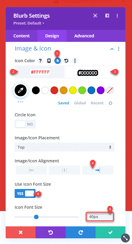
Close Icon’s Design Customizations
In the Design tab, first, go to the Image & Icon settings, then tweak its appearance the same as below,
- Click hover button for Icon Color, then set Desktop color to #FFFFFF and On Hover color to #000000.
- Image/Icon Alignment: Left
- Use Icon Font Size: YES
- Icon Font Size: 40px
Now, go to the Spacing settings, and set the Top–Bottom Margin to 0px and Top–Bottom Padding to 10px. After this, go to the Animation settings → Image/Icon Animation → No Animation.
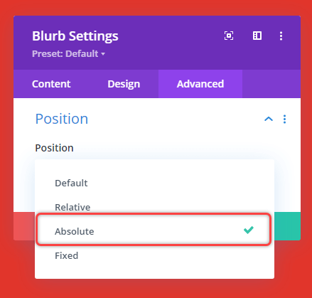
This is it for close icon in the Design tab. Let’s move to the Advanced tab → Then Position → Position → Absolute.
More optoins will appear. So, add the following values to options,
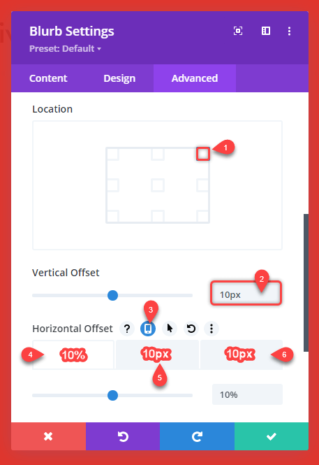
- Location: See in the screenshot.
- Vertical Offset: 10px
- Click Device button for Horizontal Offset.
- Desktop Horizontal Offset: 10%
- Tablet Horizontal Offset: 10px
- Mobile Horizontal Offset: 10px
Our close icon for Divi hamburger menu on desktop is set. Let’s bring our menu to the off canvas.
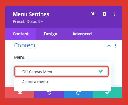
Step 6: Insert Off Canvas Menu on Divi Hamburger Desktop Menu
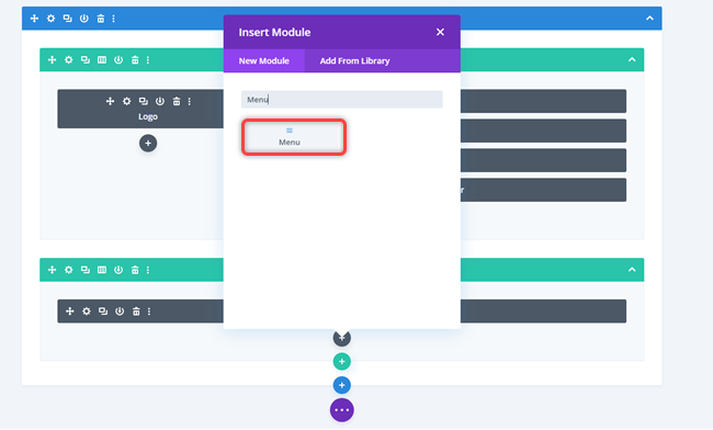
To display a menu on to the off-canvas when the user clicks on the Hamburger icon, we need to insert a Menu module right under the Close icon.
Then, once the module is added, we need to select which menu we display on the off-canvas. So, to do that, go to the Content tab → Content → Menu → select the menu you want to display.
The moment you select a menu, it will appear on the canvas with a white background. As shown in the below screenshot.
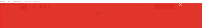
But we don’t need a background for our off-canvas menu. Therefore, to remove it, go to the Background settings of the Content tab, and set the background color to rgba(0,0,0,0).
Off Canvas Menu’s Design Customizations
After making menu background color transparent, head over to the Design tab → Menu Text → apply text customization as follows,
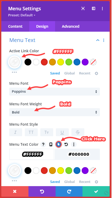
- Active Link Color: #FFFFFF
- Menu Font: Poppins
- Menu Font Weight: Bold
- Click hover button for Menu Text Color, and text color Desktop to #FFFFFF, and On Hover to #000000.
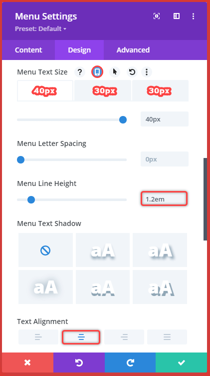
- Click device button for Menu Text Size.
- Desktop Menu Text Size: 40px
- Tablet Menu Text Size: 30px
- Mobile Menu Text Size: 30px
- Menu Line Height: 1.2em
- Text Alignment: Center
Then further go to the Dropdown Menu settings, and apply customizations as follows,
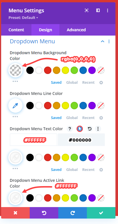
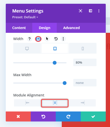
Once done with the Dropdown menu, open Sizing settings and Width for the tablet to 80%. Plus, also select center as the Module Alignment.
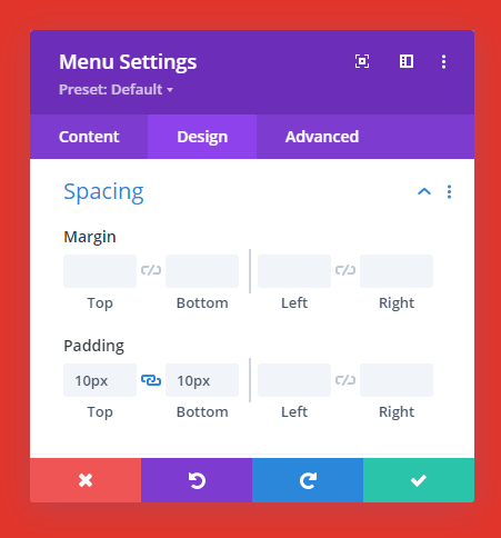
Furthemore, open Spacing settings and set Top–Bottom Padding to 10px.
That’s the last step. All our menu items and the off-canvas menu has been created successfully. However, the Divi hamburger menu on the desktop is still not ready to work. And to make it work, we need a little help from JavaScript and Custom CSS. Therefore, the next will help you add a dedicated JavaScript, plus custom CSS, to enable our Divi hamburger menu.
Step 7: Add JavaScrip for Divi Hamburger Menu on Desktop
To add JavaScript to our hamburger menu, we’re going to use the Code module. Insert it in the 1st Row to the 1st Column in which our Logo is placed.
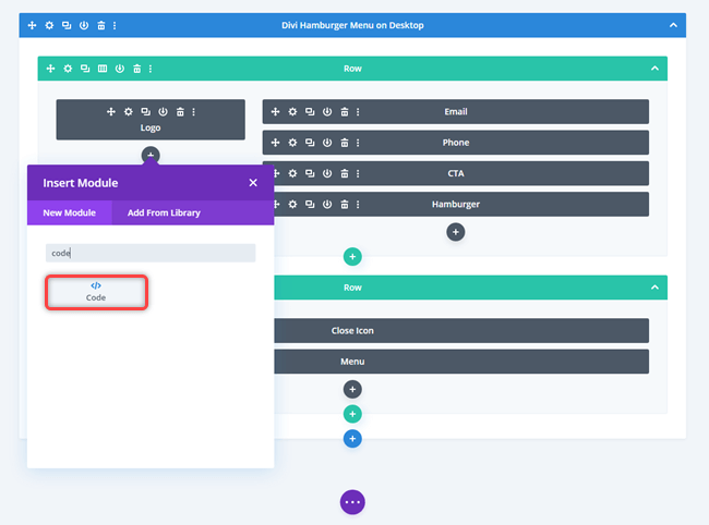
Once added the module, paste the following JavaScript in to the Code field.
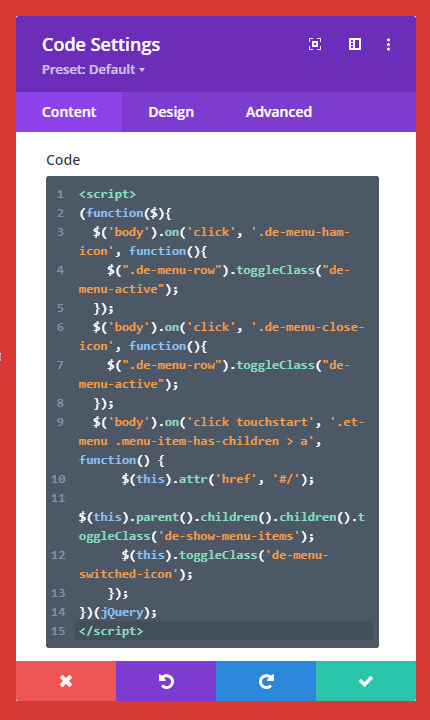
Then go to the Admin settings and give the Code module a label, for example, JS. So, you can later easily recognize what module you’ve used for. After that, Save changes.
Step 8: Add Custom CSS for Divi Hamburger Menu
The JavaScript will do its work. But to make our Divi Hamburger menu fully working, we need to add a Custom CSS. Therefore, insert another Code module in the 1st Row, right under the JS module. Then, in the Code field, paste the following Custom CSS,
This is it; we’ve done our 90% task to create the Divi hamburger menu on the desktop. However, to reflect these Custom CSS and JavaScrit’s functionality, we need to assign Class names to our modules, row, and columns. The Next step will help you do that effectively.
Step 9: Assign Class Name to Modules, Row, and the Columns
- First, go to the Advanced tab of the Hamburger icon (blurb), then open CSS ID & Classes, and paste the following class name in to the CSS Class.
de-menu-ham-icon- Then, go to the Advanced tab of the 2nd Row, and paste the following Class name in to the CSS Class.
de-menu-row- After row, assign Close Icon the following class name in the CSS ID & Classes settings.
de-menu-close-icon- And finally, use the following class name for the Menu.
de-menuAnd that’s it; we’ve successfully designed our Divi Hamburger menu for desktop. This is how it looks and works.
Wrapping
By following the above steps, you’d be able to create your own Divi hamburger menu on a desktop, which is modern and functional. But if you need to create different headers, then building a custom header could be time taking. Therefore, to save you time, the Divi Flexile Headers Pack has got over 50 ready to go Divi headers that also include different hamburger menu for Divi desktop just like the below examples,
Each header included is highly customizable, modern, and flexible that can easily fit the Divi website of any design and industry. Moreover, the Divi Flexile Headers pack comes with regular updates. So, each new update will provide you with lots of different headers to make the most out of your Divi menu on both small and large devices.
Get it today, and provide your website visitors easy navigation throughout your site.


My close icon don’t work help pls
Is this supposed to be a fixed header? other than the 2nd column (overlay) everything seems relatively positioned, but it stays as a fixed header for me. Anyway to change this? Thanks – love the set up of this.
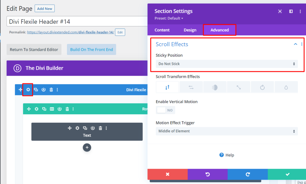
Mark, If you want to disable the sticky menu so that the menu does not stay at the top of the scroll, here are the steps.
1. Edit the Layout
2. Go to Section Settings
3. Go to the Advanced tab
4. Go to the Scroll Effects section
5. Select Do Not Stick
Visual of the process: https://diviextended.com/documentation/wp-content/uploads/2021/03/disable-sticky-menu-in-divi-1024×615.png
Good aftenoon.
How can I make a parent menu clickable?
I want my user to be able to the parent page of the subcategories in the menu; for example
Breds of dogs: -> be able to enter to this page too not only be a dropdown
– Husky
– Golden
– Chihuahua
Kind regards
Andres, refer to this KB for a solution on your issue.
The process is working fine, except that the menu does not show on the canvas on the live site. It looks perfect in the builder. I have disable all plugins, but that has no effect. I am using chrome. Thanks in advance.
This is a great tutorial!
The only thing I’ve run into is that the closing “X” isn’t as far to the right as I would like it. Is there any way to fix that?
https://jcraftstudios.com/
You could change the horizontal and vertical offset of the icon blurb module according to your requirement.
This solution is just what I need, thank you. Works great when my menu has primary items only. Should it work for secondary menu items too? In my case the plus symbol turns into 1-3 random ascii characters, and the primary item becomes the dropdown action and is no longer an active link. Thank you for any input.
You can try disabling dynamic icons from the theme builder.
… The reason was the JS Minify of the Plug in W3 Total Cache. Can you recommend a JS Minify instead that will work with this code? Thanks and best regards
This solution has been tested in different scenarios and worked perfectly fine. If there is any conflict issue with a specific plugin, you could contact the plugin’s author about the same.
Great Work. Thanks. But unfortunately it is only working in Firefox. Chrome and Safari do not want to show up the Menu. Any hints in the js? Thanks a lot.
I have a scroll id on the front page when I click the menu item it goes to the id but the menu stays over it. How do I add a hide menu when I click the menu item
Good point, Daniel! I think many would want similar functionality. Therefore, I’ve updated the JavaScript (Step 7) in the post. Please replace your existing code with the latest one.
I got to #8 and the custom css isnt visible.
Thanks for pointing it out, Daniel. I got it up now.
What is the custom CSS in step 8? I dont see it unfortunately. Am I looking in the wrong spot?