
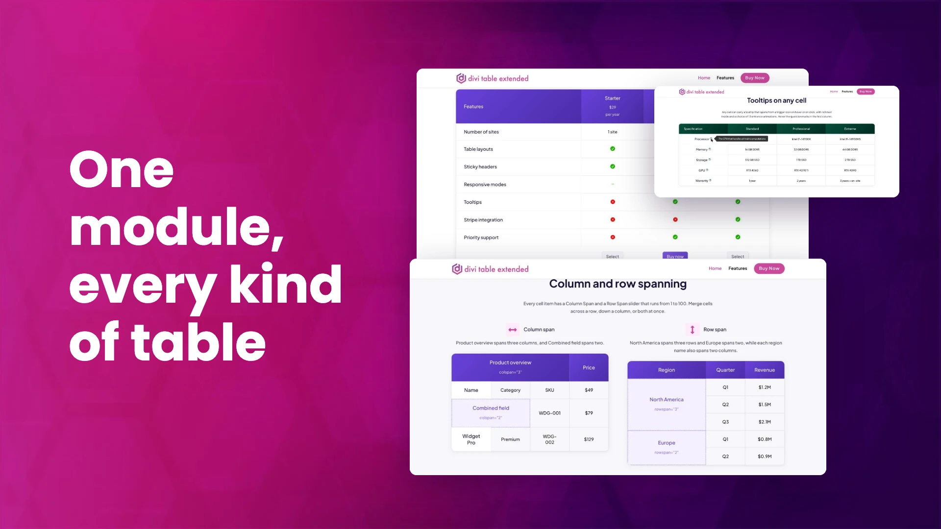
Divi ships without a table module. The usual workarounds all cost you something: pasting HTML into a Code module gives up visual editing and falls apart on phones, faking a table out of rows and columns breaks the moment you need a merged cell, and a generic table plugin puts you in a separate editing screen with its own idea of what a table should look like.
Divi Table Extended adds a real table to the Divi 5 builder instead. This post is a practical walk through building one: how the two modules fit together, how to set up headers and footers, how to merge cells, what you can put in a cell, and what happens to the whole thing on a phone.
Two modules: the table and the cell
Everything comes from two modules, both prefixed DTX in the builder:
- Advanced Table is the parent. It holds the table-wide settings: how many columns, how many of them are headers, the footer, sticky headers, stripes and the responsive behaviour.
- Advanced Table Item is the child, and there is one per cell. You add items and drag them into order, and they flow into the grid the parent defines.
One cell, one module is the thing to get used to. It sounds like more work than typing into a grid, and for a ten by ten data dump it would be. What you get back is that every cell is a full Divi module, so any single cell can have its own background, spacing, border, typography, icon, image or button without touching the rest of the table.
There is no separate table editor and no shortcode. You build the table on the page, in the Divi 5 visual builder, and watch it take shape.
Set up the structure first
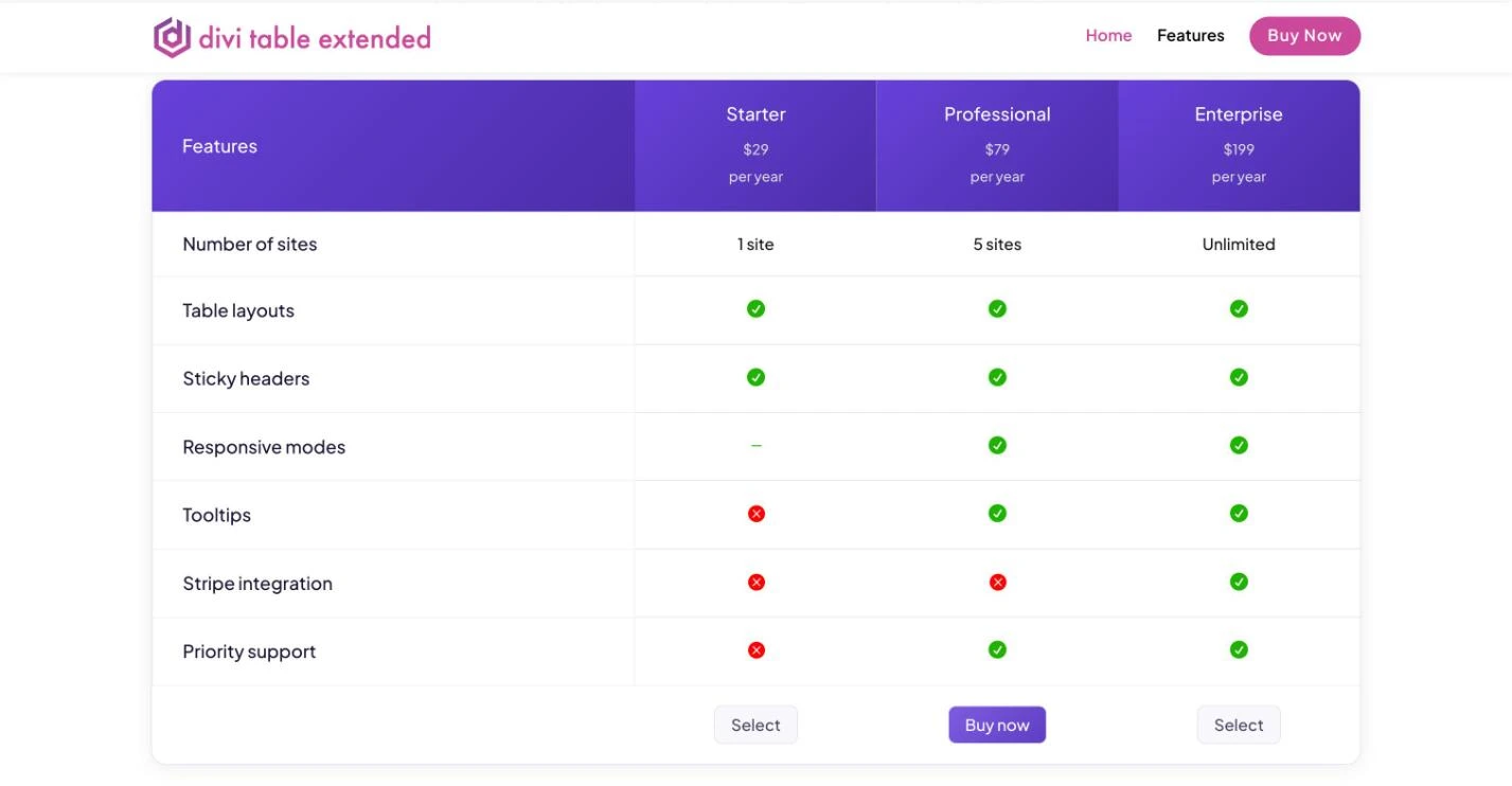
On the Advanced Table module you set the number of columns, which can go up to 100, and then decide how much of the table is structural:
- Header rows and header columns: how many rows across the top and columns down the side act as headers. Both default to none, so you turn on the ones your table needs.
- Footer rows: the rows at the bottom, which is where a pricing table usually puts its buttons.
This matters more than it looks. Header rows, header columns, footer rows and ordinary cells each get their own background, spacing, width and typography on the parent module, so you style four groups once instead of styling forty cells. It is also what produces the markup underneath, which the accessibility section below gets to.
In the pricing table above, the plan names and prices are a header row, the feature names down the left are a header column, and the buttons sit in a footer row.
Merge cells across columns and rows
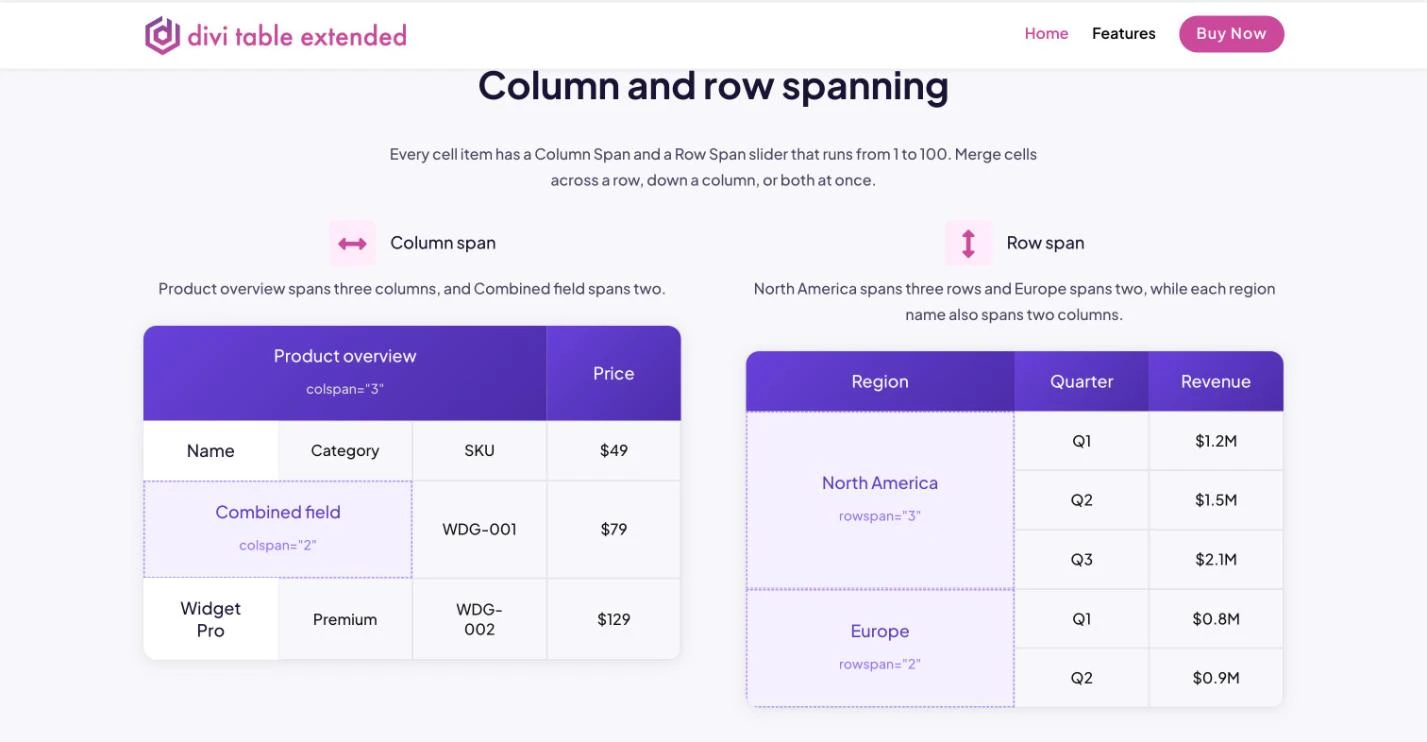
Every cell has a Column Span and a Row Span setting, each running from 1 to 100, and each can take a different value per device. That covers the layouts that break a faked table: a group heading sitting across three columns, a region label covering the three quarters beneath it, or a note that runs the full width of the table.
Because the spans are responsive, a cell that spans three columns on desktop can span one on a phone, which is often what you want before the table restructures itself entirely.
What a cell can hold
A cell is not limited to text. Each Advanced Table Item can carry a title, rich text, an icon, an image with its own alt text, and a button, each styled with Divi’s own controls.
That is what lets a pricing column header hold a plan name, the price and a line about who the plan is for, all inside one cell, instead of being a single line of bold text with the rest wedged in somewhere else.
Tooltips on any cell
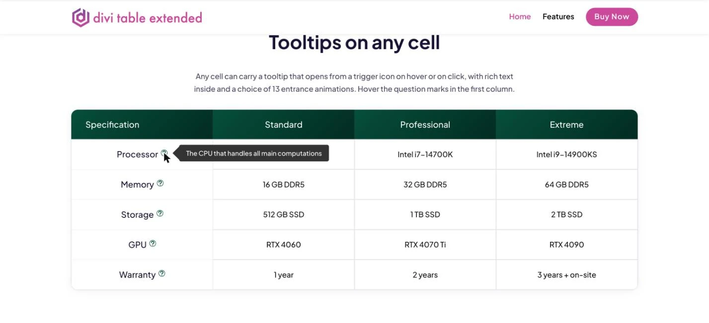
Any cell can carry a tooltip that opens from a trigger icon. You choose whether it opens on hover or on click, where it sits, how wide it is, which icon triggers it and which entrance animation it uses. Tooltips can also be made interactive, so a visitor can select the text inside or click a link in it.
This is the setting that keeps a spec table short. Instead of a cell reading “Processor: the CPU that handles all main computations”, the cell says “Processor” and the explanation waits behind a question mark for the people who need it.
Keep headers in view on long tables
Turn on sticky headers and choose whether the column headers or the row headers stay put while the visitor scrolls. With sticky column headers you can also cap the table at a maximum height so it scrolls inside its own frame rather than down the page, and a separate switch decides whether sticky headers run on smaller screens at all.
There is one more option worth knowing: when you stick the row headers, a separate Top Left Header Sticky setting keeps the corner where the header row and header column meet anchored while both axes scroll.
Alternating stripes for long data tables
Stripes can run horizontally or vertically, and the odd and even cells each take their own background colour, gradient or image. You can also decide separately whether the striping applies to header rows, header columns and the footer, which stops the stripe pattern fighting the header styling you already set.
What happens on a phone
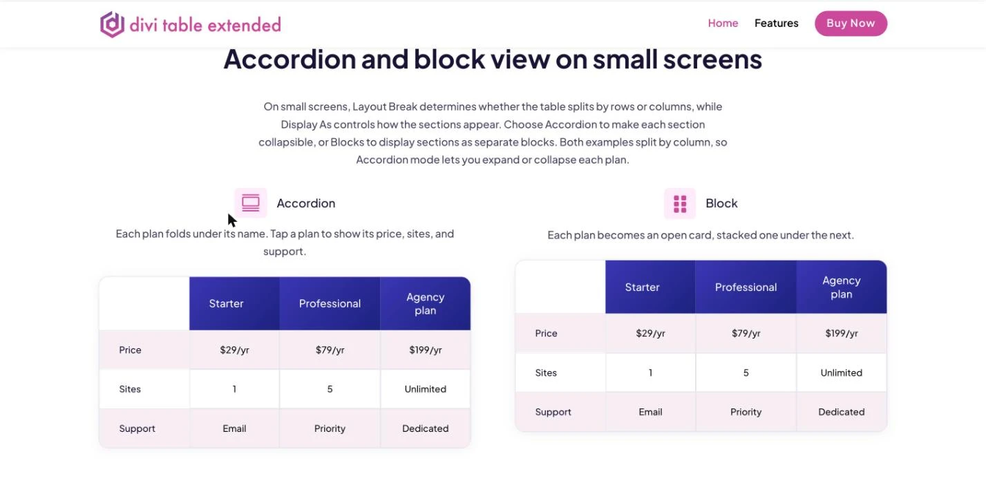
This is the part most table solutions get wrong, because shrinking a six column table to 375px wide does not produce a readable table, it produces six unreadable columns.
The responsive option is off by default, and it only appears once the table has at least one header row or header column. Turn it on and two settings decide what happens:
- Layout Break: whether the table splits by columns (needs header rows) or by rows (needs header columns). On a pricing table you usually split by column, so each plan becomes its own section.
- Display As: whether those sections show as stacked blocks, one open card under the next, or as an accordion the visitor taps to open, with a toggle icon you can style.
A three plan pricing table becomes three tappable plans. A class timetable becomes one day at a time. The reading order is the one you chose, not whatever the browser does with an overflowing table.
Leave the responsive option off and the table keeps its grid, which is the right choice for a narrow table that already fits.
Take a payment from inside the table
A button in a cell can be a Stripe payment button, which sends the visitor straight to Stripe Checkout from the pricing table itself. No cart, no WooCommerce, no separate checkout page to build.
You connect Stripe once in the plugin settings, with a test key and a live key kept separately, and pick your payment currency from more than 30 options. Each button then carries its own product name, price and quantity, and its own test or live mode, so you can leave one button in test while the rest are live.
It suits anyone selling a handful of fixed price things: a plugin licence, a course, a membership tier, a service package. If you already run WooCommerce for the same products, keep using it. This is for the case where a full store is more than you need.
The markup underneath
Because you told the parent module which rows and columns are headers, the output carries ARIA table roles: cells in a header row are marked as column headers and cells in a header column as row headers.
In practice that means a screen reader can tell a visitor which column and which row the value they just landed on belongs to, rather than reading a flat run of numbers. The cell text is also real text on the page, so search engines read it as content.
You get this by setting up the structure properly, which you were going to do anyway to style it.
View counts
Each table counts its own views and shows the number in the module settings in the builder. It is a small thing, but it answers a question that is otherwise awkward to answer: is anyone actually reaching the pricing table, or are they leaving above it?
Four tables worth building
- A pricing table. Plans as a header row with the name, price and a line of context in each cell, features as a header column, a footer row of buttons, and the recommended plan’s column styled to stand out. Split by column on phones.
- A comparison table. Your product against the alternatives, with sticky column headers so the names stay visible down a long feature list, and tooltips on the terms that need defining.
- A spec sheet. Row headers down the side, stripes so the eye tracks across, tooltips on the jargon, and a maximum height so a long sheet scrolls in its own frame.
- A schedule. Days as columns, times as rows, merged cells for the sessions that run long, and an accordion on phones so a visitor reads one day at a time.
You can try the pricing and comparison tables, plus spans, tooltips, sticky headers, stripes and the phone layout, on the Divi Table Extended demo before you build anything.
What you need, and how to get it
Divi Table Extended is built for Divi 5. The Advanced Table and Advanced Table Item modules register with the Divi 5 module library and load in the visual builder as native modules, so you need Divi 5 active to use them.
It is $29 a year or $99 for a lifetime licence, both for unlimited sites, on the Divi Table Extended product page. It is also part of the Divi Extended membership, so if you hold one it is already in your account, ready to download.
We keep this post current as new versions ship, so it stays the one page that covers what the plugin does rather than a trail of separate update posts.
FAQ
Does Divi Table Extended work with Divi 4?
No. The modules are built for the Divi 5 module library and visual builder, so Divi 5 needs to be active.
Do I add a module for every cell?
Yes. One Advanced Table Item per cell, dragged into order inside the Advanced Table. That is what lets any single cell be styled on its own and hold an icon, image, button or tooltip.
Can cells span more than one row or column?
Yes. Every cell has a column span and a row span setting from 1 to 100, and both take different values per device.
What do the tables do on phones?
Whatever you choose. With the responsive option on, the table breaks by rows or by columns and shows as stacked blocks or as a tap to open accordion. With it off, the table keeps its grid, and sticky headers can still be switched on separately for small screens.
Can I sell something straight from a table?
Yes. Any cell button can be a Stripe payment button that opens Stripe Checkout. Add your test and live Stripe keys in the plugin settings, choose a currency, and set the product, price and quantity on each button.
Are the tables accessible?
The output uses ARIA table roles, marking header row cells as column headers and header column cells as row headers, so assistive technology can announce which row and column a value belongs to.












0 Comments