
From recognizing a brand to navigate the website with ease, a visitor’s journey starts from the website header. And it continues up to an indefinite time whenever he visits the site — to either explore, get the services, or read the blog and whatnot.
The header of a website is one of the essential parts that complete a site regardless of its niche.
And in this blog post, we’re going to put a light on it. What it is, how you can design it to get the most out of it. What some crucial principles you should keep in mind and some examples to help you inspire.
Therefore, if you plan to design your next website header. Or edit the existing one; you can do it with perfection. Making it engaging, new-age and easily digestible to the eyes. So, visitors can explore different areas of your website like a fluid.
Without further ado, let’s get started!
Table of Contents
What Is a Website Header?
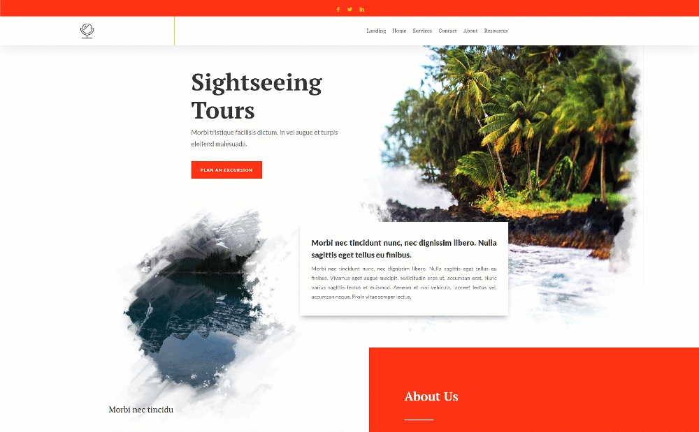
A website header is the very top section of the website, made from combining multiple different elements. It allows website visitors to identify the brand or organization. Navigate different pages on the site. And initiate an action to get a particular service or register themselves on the platform. Most of the time, you’d find headers aligned horizontally to the page similar to the following example.

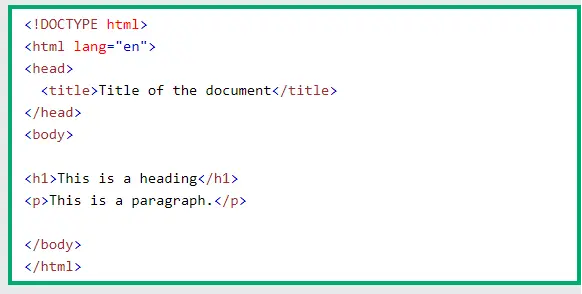
Nevertheless, many website designers, place headers vertically to bring novelty to the site. Well, there are multiple types of headers that we’ll discuss later. Now, what’s important to mention here is that, when you talk about headers, don’t confuse yourself with a page head. A page header and a page head appear to be a similar things, but they’re not. As discussed above, the page header helps people see and interact with different elements to explore the site. On the other hand, the page head is mainly part of the page’s HTML. It helps different scripts and services understand the page’s purpose.
The page head uses the <head> and </head> tags in the code and between these tags store the information to help third party services recognize the page. And <head> tag itself situated between the <html> and the <body> tag.
Apart from this, there’s another notion that could confuse you. It’s that many designers call above the fold as header. It’s totally fine, you can call that, but it depends on which community of design you’re in. For example, users of the Divi community call above the fold section as Hero Section. Similarly, users of Brizy Builder find hero and header two different things. Therefore, it completely depends on which community of website designing you belong to. But, mainly, a website header is what we discussed above.
Elements of a Website Header
To say, you can include multiple elements in a header, but mainly there are only 8 elements you’d need.
- Logo
- Links
- CTA
- Search Bar
- eCommerce Elements
- Social Icons
- Language Selector
- Country Selector

And from these 8, most of the time, you’d find the last two missing from the header of a website. As some websites offer a single version for global use. Moreover, even the remaining 6 elements are required only based on the particular situation. Let’s look at these elements in detail.
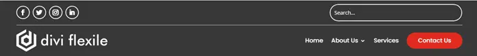
Logo
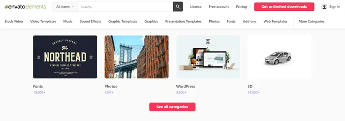
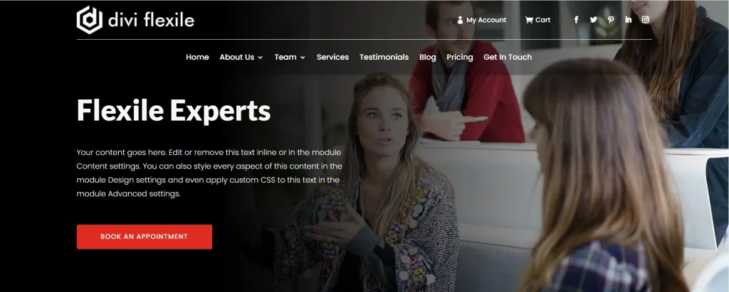
Call it an image, a trademark or a brand identifier. A logo in the website header is something that helps people remember your site for a longer run. It’s the first thing on a website a visitor sees and according to that makes his perception about your site. If it’s designed rough, you could guess visitors will probably offer bad remarks. Whereas, if you’ve done great work on it, then they’d surely continue on your website with admiration.
For instance, in the above header of Envato Elements, the logo is designed well and sits perfectly at the location. Every element has clear space and makes it highly visible. Thus easily remembered by the users. For your website’s header, you can also use text as the logo. It’s not a rule of thumb, but web developers use an image as the logo most of the time. Because it gives their brand recognition and with text, it’s not possible.
Links or Navigation Links
Another purpose of a header is to help website visitors explore the different areas of the site with ease. And you can achieve this by adding links or navigation links (the Main menu) if said precisely. From homepage to services, and services to pricing. Navigation links are the element on a website that users interact most to reach certain pages. You cannot miss them, and if you do so, you’ll put your visitors in an ocean or the desert. Confused and unable to proceed in a particular direction.
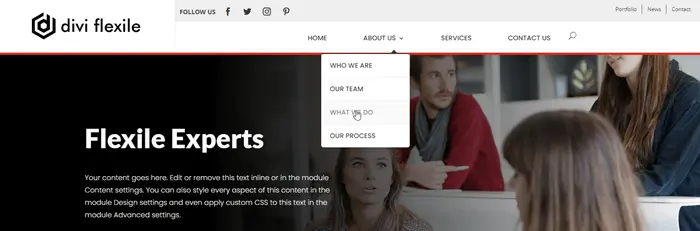
The interesting thing about navigation links is that you can categorize or divide them into levels based on their importance. Almost every designer follow this approach and showcases primary pages links first on the header. And inside them, adds the sub-menu or secondary links.
Thus, it helps businesses drive their traffic through significant pages first. And if visitors like to go deep, they can open the sub-menu links.
CTA (Call to Action)
Perhaps you’ve added a stylish logo and, with that, an organized main menu. However, in the event of missing CTA in the header, you won’t be able to convert users toward a particular goal in the way you should be.
The purpose of a CTA in the header is to help users take the goal-oriented action when they can’t find one on the page. It’s easier to reach the top menu than scrolling the page back to the CTA they’ve seen.
When you add the CTA in the header, make sure you give it ample space to be seen vividly. Similar to the above header example. Plus, place it at the right side of the header so our eyes can easily assimilate. Because human eyes are more compatible to understand things online when they scan from left to right. The exception is only when you use an RTL header.
Search Bar or Icon
If you don’t want to let your website visitors wander around looking for specific information or page, you might want to consider adding a search bar to the header. It not only helps your users but also make the website more accessible.
The best way to do this is to add a search bar that clearly explains its purpose. You could also use an icon if you’ve got more elements in the website header. If you’re using the Divi theme, our Ajax Search module of Divi Plus can help you add a search bar easily. Ajax search is an advanced search option that showcases results on the same page. And even when the user types the query, similar to the following visual.
eCommerce Elements
The eCommerce elements are the next thing to consider in the header of a website after CTA if you’re offering subscriptions or paid products. Now, what are eCommerce elements? Well, eCommerce elements are those elements that make an eCommerce site more accessible and functional. They allow users to log into their accounts. Register on the platform. List down favorite products and order what they’ve already thought of.
There are mainly five types of eCommerce elements —
- Log in/Sign in — It’s most of the time text based.
- Account — It appears when user logged in to site replacing the log in element. The persona icon.
- Sign up — Helps users to register on the platform.
- Wishlist — The heart or list icon, to allow users list down favorite items.
- Cart — It enables users to view what they’ve added in the cart. And helps them open the cart page.
For eCommerce and membership websites, the above elements in the header are a must. To get an idea of how to place them nicely, look at the above header example.
Social Icons
Marketers and many business experts widely consider the social network presence of an online business or portfolio. It gives you the opportunity to share your ideas and business solutions with many potential users and customers. Drive a significant amount of traffic and convert potential leads into business.
Plus, it also helps you understand what’s working for the business and what’s not. And if you want to increase that for your website, then the header is an excellent place to start with. It provides you to easily showcase your social media presence, especially the trending ones. And if visitors or customers have their account at one of those networks, they’ll be more likely to follow you.
You can try the above header design approach for a better way to display social media follow icons on your website’s header. It clearly exhibits its presence and also doesn’t overload the header.
Language Selector
If your website offers multiple versions based on language. Or you want to showcase a single version of the site to users of different languages, then showcasing a language selector in the header is worth all your efforts. It helps language-specific users easily explore the site as well as allow you to cover more people from diverse locations and perspectives. Though, you also need to integrate the language conversion for your website to do it effectively.

Langmobile’s header showcases the language selector with adequate space, enabling users to choose their language easily. Moreover, when you add a language selector, go for the icon instead of text because users of different languages might not understand the menu text. However, with an icon, they can easily recognize it.
Country Selector
Like the language selector, a country selector will help you showcase different versions of your website based on users countries. And it is needed when you’ve got some services specific to a region and doesn’t want to create location conflicts.
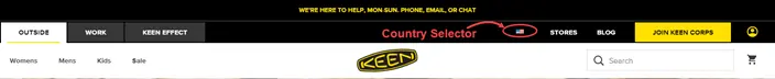
When users see a country selector in the header, they’ll go for their region. It helps both users/customers/website visitors and website owners provide and receive the correct information.
Types of Headers
The online world is ever-evolving, and nothing lasts forever. And the same is true for header designs. However, generally in the case of header design, there’s nothing old or new. You can find different websites following different header designing approaches, and most of them are as follows,
- Standard Header (Logo, Menu, and CTA)
- Hamburger Menu Header
- Mega Menu Headers
- Vertical & Rotated Headers
- Header With Top Secondary Menu
- Header With Notification Bar
- RTL Headers
- Drop-Down Headers
- Headers With a Background Image
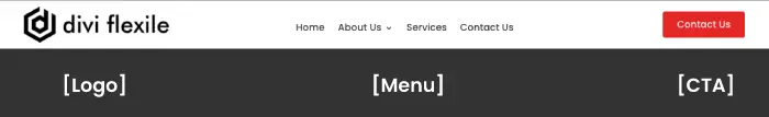
Standard Header (Logo, Menu, and CTA)
A clean and straightforward header with three elements – Logo, menu links and a CTA.

You can find this type of header design on many new and old websites. The purpose of designing a standard header is to save the user from getting confused or overwhelmed by the multiple options.
Hamburger Menu Header
Web designers often prefer a header design that showcases primary menu items by default and keeps secondary elements hidden.
They use the header with a hamburger that also adjusts the header on mobile and tablet. So, if there are many secondary items, they wouldn’t appear as a long list when the user interacts with the header in the mobile.
Mainly the hamburger header web developers use very often are slide-in headers. The header that showcases primary or secondary elements by sliding a tab into the browser area when the user clicks the hamburger icon. However, there are many types of hamburger menu header as you can see in the following header examples,
Slide-In Hamburger Menu Header
Cover Slide-In Hamburger Menu Header
Zoom-In Hamburger Menu Header
Mega Menu Header
When there are many navigation links in the primary menu, and even the sub-menu also includes navigation links, then it’s of no use to display them ordinarily. Therefore, designers go with the mega menu headers option.
Under mega menu header design, each primary item consists of multiple elements and those elements include further options, but in a bold and clear manner. So, users can easily view them and navigate from one area to the other on the website effortlessly.
An excellent example of mega menu headers is the GoodFirms.co. It lets users and website visitors easily explore all the options and further continue their search under the sub-menu.
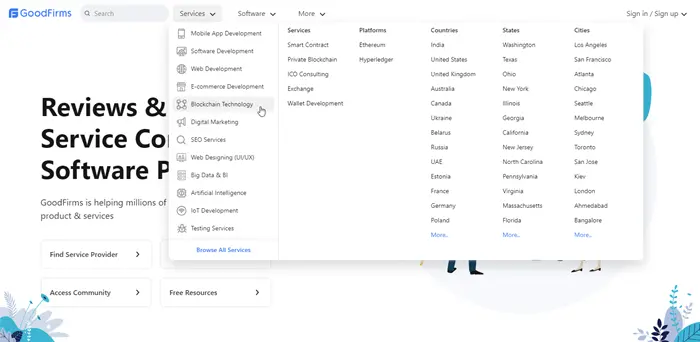
The primary reason for using a mega menu is to provide users with more options without overwhelming them at the same time.
Vertical & Rotated Headers
To form a website’s top a little different than many other sites, using vertical and rotated headers are mostly preferred. They give uniqueness and also make websites look modern.
You’ll find portfolio and freelancers’ websites occupied with vertical and rotated headers. The main reason behind using vertical and rotated headers other than novelty is that they hold great attention as well as are perfect to showcase a fewer number of elements.
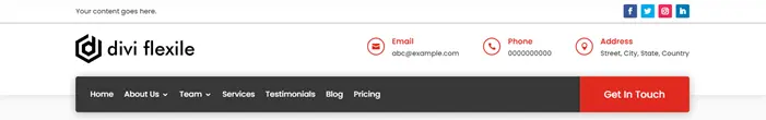
Header With Top Secondary Menu
If your website header contains additional elements other than the sub-menu, you can use the header with a top secondary menu.
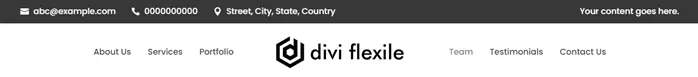
There, you can display contact information, address, social icons, and other elements that you think would do good if not included in the primary header area.
Header With Notification Bar
Whether you’re running an event on your website or want to share something important, the header is a perfect place to do that after the main content area and sidebars. Even promotional messages on the header are more likely to be seen and heard than others.
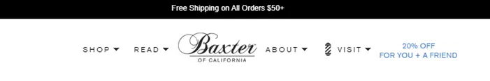
For this, you can use the header design that includes a notification bar. Here, you can add the details you want to share and let users know what’s exciting happening on the site.
RTL Headers
To help website visitors of nations speaking RTL languages, you can use the RTL headers. Or, if you’re providing services in those nations, then it’s essential to use RTL headers to benefit the business.
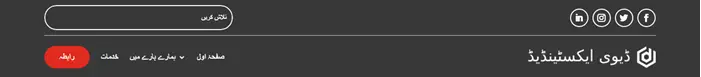
RTL headers could be created using other types of headers but what separates them is that they’re aligned right to left. All the elements that lie left to right in regular headers, get placed right to left in the RTL headers. Furthermore, there are many aspects you should keep in mind when creating RTL headers like language, sub-menu direction, and more that you can find in this blog post on the RTL header.
Drop-Down Headers
The drop-down header is another way to showcase secondary menu items other than hamburgers, mega menus, or even simply standard headers. The following header example first showcases a thin/compact header menu with an arrow icon. When the user clicks on the arrow icon, it further brings other navigation links.
It simply saves the space on the site and exhibits only the most prominent options first. Allowing users to explore the primary areas which help the website bring leads from necessary products or services.
Headers With a Background Image
Any header design can behave like a header with a background image. However, the key thing to notice here is that you should use the background image per your website’s design specifics and color scheme. So, nothing would look out-of-the-box when it’s all about in-the-box.
7 Best Website Header Design Practices
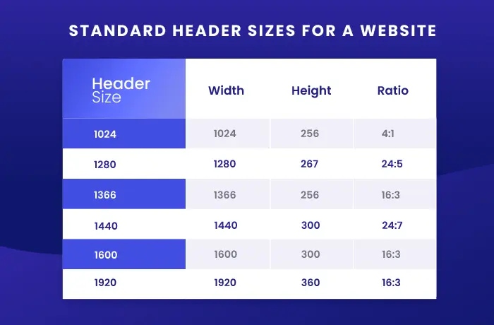
1. Header Size — Neither Too Much, Nor Too Less
There are no right or wrong header sizes but it’s always best to keep in mind that your design shouldn’t overwhelm as well as bore the users. Also, when there are many different screen sizes devices available it’s nearly impossible to guess what size of header will work the best.
Therefore, when designing a website header, you need to use your intellect. And according to that come out with a header size that doesn’t look too small on your screen, and not too big on others.
For best practices, what you can do is, build your header on a standard screen size — the one that could be found among most users. For example, 1280 x 720 and 1920 x 1080. Additionally, you can try the following table and design a fantastic header for your website fitting all screens right.
2. Organized Hierarchy
Hierarchy means that things should be placed in a sequential manner. And for the website header, it’s Logo, Menu and CTA. If you try to change the place, you will find that people will be less likely to be attached to the design.
Because our eyes are accustomed to the LTR view and it will help users if they view brand recognizing elements first. The same is true with the RTL view. If you provide them with a CTA instead, they’ll find it hard to accept.
Therefore, when designing your header, you should keep Logo first for your LTR designs and CTA for your RTL. In addition to this, in a study, it’s found that website visitors keep a particular brand in mind for longer when their website’s header includes the logo on the left in comparison to the center or the right part of the site.
And it’s for the same reason we’ve discussed in the above paragraphs.
3. Fixed or Non-Sticky Header?
The sticky header gets the most light compared to the non-sticky one. It helps users head over to different pages whenever they want. Or click the CTA when they find it’s the right time to do it.
On the other hand, if you use a non-sticky header, you’ll see that most of the pages would have high exit rates. Because users have to go all the way up to find the navigation link. Once or twice is fine, but nobody would like to repeat it if the pages on the site are long.
Therefore, it’s in one’s best interest to use a fix or sticky header whenever possible. For example, websites like marketing, blogs, eCommerce or service should use a fixed header. And personal sites or portfolios that are not too big can go with either a fix or non-sticky one.
Now, how to create a working fixed header.
- Use fewer animations.
- The background color of the header should be different from the body. It helps users view both the header and the rest of the site as two. For example, if the content has a #FFFFFF color background, use #000000 for header background or any other dark color that your website’s color scheme suits.
- If you’re not using a separate color, then you can add a bottom shadow to make the header look like a single entity.
- If you want to replace the current header with another when the user scrolls, then use animation and keep the header appearance after above the fold area.
- Another approach you can try if you don’t want to display a fixed header all the time is to use the scroll-up header. It gets hidden when users scroll down and appears back when they scroll up.
4. Use of Fonts – Clear & Readable
Well, there’s no doubt about it. If you use fonts that are harder to recognize, then there’s no use for them. Also, applying them to the header will negatively affect your website visitors’ minds right the moment they enter your website.

Therefore, it’s always in the best interest to use simple and easy-to-use fonts for header’s navigation links and other text elements. You can look at the above header example that uses the font Poppins for navigation links.
5. With Outstanding Hero Images, Use Transparent Header
Transparent headers are famous among headers with a background image. But the question that arises here is, when is the best time to use them? Well, when you have impressive images on the website and especially at the hero section right after where the header ends. Because only it will bring the header’s transparency to the light. Or I’d say highlight.
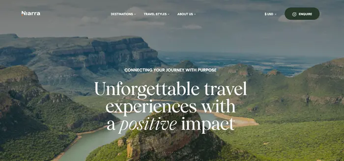
The header of Niarra Travel is transparent with a vivid and outstanding hero image. That’s what makes its header look so beautiful. Even though, if your website’s hero section doesn’t offer an image, you should consider using a dark background with a light color on the header. And vice versa.
Moreover, keep the entire website’s color scheme and design specifics in mind. Don’t go totally different from what you’ve got in the content area of the site.
6. Never Forget White Space
White spaces have a crucial role in web designing, and the website header isn’t untouched by them. Because they provide enough air for each element on the header to breathe. It further helps website visitors and customers to easily switch their attention from one element to another. Nothing congested helps users to find their needed piece of information or the area they want to visit.

For example, if you look at the above header example of Caleño Drinks, you’d find all the elements in an ideal space. None of the elements is mixing with one another. And that’s what makes a website header, good header.
In the above example, our eyes easily fixate on the logo, then the shop navigation link following other essential links. After that, if you’ve scrolled through different pages and added something in the cart, you can view that directly through the mini cart icon. Finally, if impressed, then there are chances you’d like to visit their social presence as well.
All the elements are intimidating and motivate the user to explore the website throughout their session.
7. Always Optimize Your Website Header for Mobile
Never ever make a mistake not optimizing your header for mobiles or even tablets. It’s more than a fact and widely discussed around the web that online users are more active on mobile phones. Whether you ask a digital marketer or web designer like yourself. Everyone knows about this, so it shouldn’t be left out.
Now, how should you optimize the header of the website for mobile phones?
Well, the first thing to keep in mind is that your header’s mobile version shouldn’t exclude the elements that are on the desktop. But, you can change the way you display them. And in most cases, mobile headers always display two elements by default — Logo and Hamburger icon.
Furthermore, when users click on the hamburger icon, you can showcase the navigation links or other elements. However, in this case, make sure you display hidden elements off-canvas. Or, apply the foldable nested menu trick if you are required to display elements under the logo. Otherwise, the primary menu and its sub-menu items will create a long list that would annoy the user.
If you’re using the Divi theme, then you can follow this blog post to create a foldable nested menu in Divi.
Ending Thoughts
We’ve looked into the points that can help us create a working header for our website. We’ve seen all the types and elements we can use in a particular website header, either for mobile or desktop.
Despite all of this, sometimes it becomes confusing to select which header design we use and further continue to work on. In this case, what’s beneficial to know is that, for what we’re building a header. Most of the time, users struggle because they ignore their website’s audience and base users.
Therefore, when you set out to create a website header, first, emphasize the requirement. If it’s for agencies and eCommerce, it’s good to go with a fixed header of any type except the vertical ones as they’re good for portfolios or working professionals’ resumes.
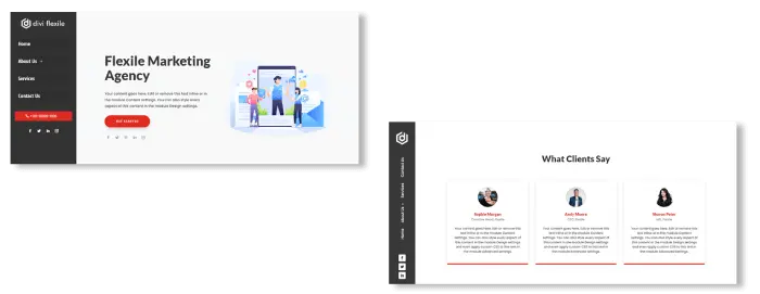
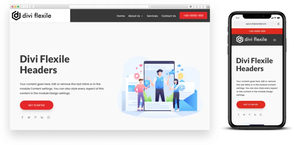
In addition, if you’re using the Divi theme and want to try a quick solution, use the Divi Flexile Headers pack. It includes over 60 modern header layouts for Divi that also contain RTL headers and more.
After giving it a try, let us know what your experience was. If you’ve got any thoughts about this post, we’re happy to hear that as well.


0 Comments