
More online users these days search for their queries on mobile devices. Hence, it’s essential that your business or profession’s website look & perform well on mobile devices including tablets. And it’s a widely known factor, so everyone creates a responsive or mobile-friendly website.
However, despite their efforts, they inevitably miss one of the crucial aspects of a website’s design appearance, i.e., how their website’s menu looks on the smaller screen devices. And when they miss, their site gets an overwhelming top menu similar to the below screenshot.
Well, there’s nothing technically wrong in the above menu, but as more items would take part in it, it will become longer than suggested. Something that would annoy a user, and they would bounce back instead of finding something on your site.
Therefore, in this article, we’re going to take a look at an easy design technique called the mobile foldable nested menu for Divi. It would help us solve this problem and also provide us a nice top menu for mobile devices.
So, without any further due, let’s get started!
Step 1: Create a Menu before everything
Before we start creating our nested mobile menu for a Divi theme website, it’s a must we create a Primary Menu for sure. In case you haven’t, then the below steps can help you create one.
First, go to the WordPress Dashboard, then Appearance, and then choose Menus. If you’ve already created a primary menu, then you can select it. Or, you can create a new one by clicking the create a new menu link.
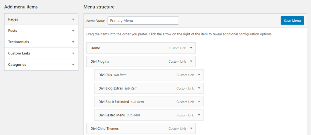
It will provide you fresh menu interface, where you can input new menu’s name and add items into it.
Step 2: Enable “CSS Classes” option
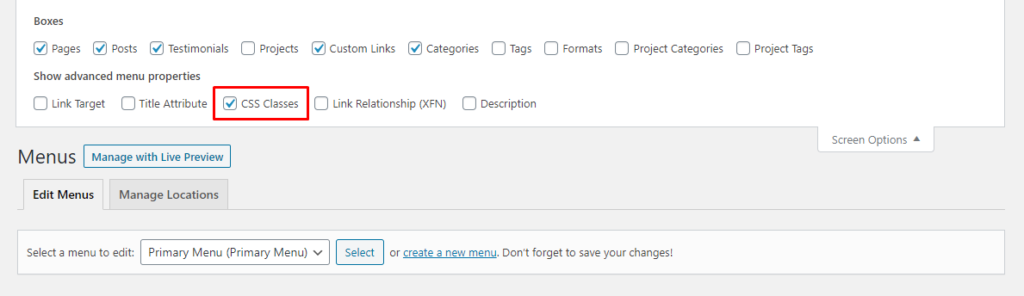
Once you’ve created your primary menu and added items into it, then to create a mobile foldable nested menu, you have to enable the CSS Classes option.
Click Screen Options, situated below to the WordPress admin bar. It will drag screen options with multiple options.

From the list of multiple screen options, tick the checkbox CSS Classes, under Show advanced menu properties.
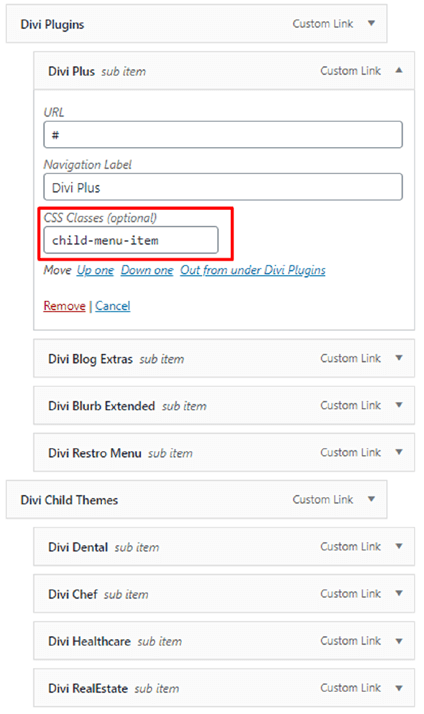
Step 3: Add the CSS class in the menu’s parent items
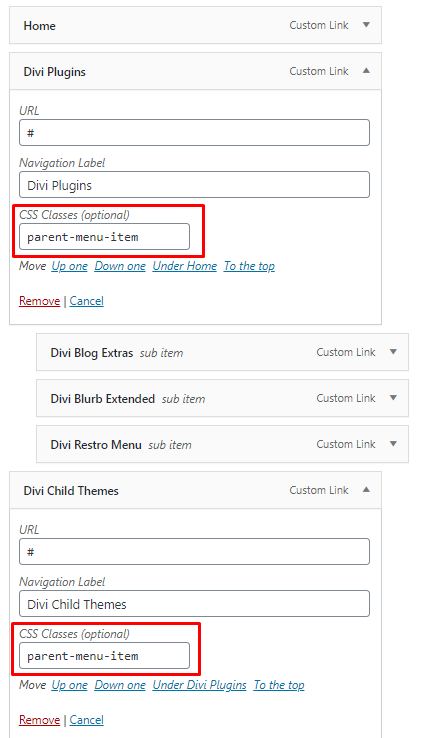
As you have enabled the CSS Classes option, now what you have to do is that you add parent-menu-item class in the CSS Classes field of the parent menu items.
But before that, make sure you’ve added parent menu items if you haven’t, then first create them. And after creating your parent menu items, just click the down arrow at the top right corner of the menus item. It will drag more fields, like URL, Navigation Label, and CSS Classes.
And in the CSS Classes field, input the CSS class mentioned above, just like shown in the below screenshot.
Step 4: Add the CSS class in the menu’s child items
After adding the CSS class in the parent menu items, we also need to add another CSS class in the parent menu items’ item — child item.
Follow the same step as we did in the parent menu item to add the CSS class, except the Screen Options’ step. Click the down arrow, and insert child-menu-item class in the CSS Classes field.
And you have to do it for every child item.
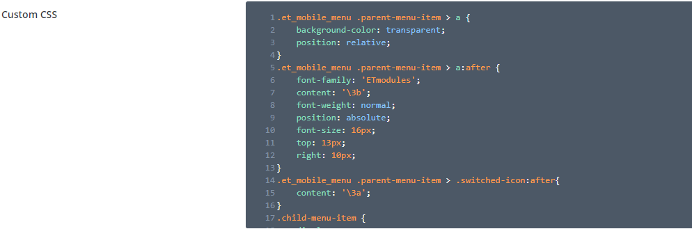
Step 5: Add the following CSS in Divi’s Theme Options
We have added CSS class in the menu items. Now, to reflect changes in them, we’re required to add CSS in Divi’s Theme Options.
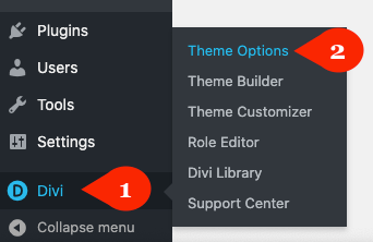
To do that, on your WordPress Dashboard, go to Divi >> Theme Options.
Then in the General tab, scroll a bit, and in the Custom CSS area, add the below CSS in the same manner.
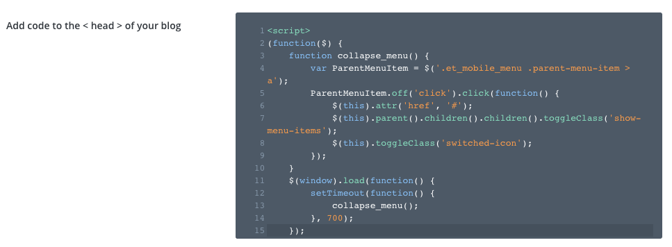
Step 6: Add the following jQuery to finally achieve nested mobile menu
We’re almost done creating our mobile foldable nested menu for the Divi theme website. However, there’s one more thing that we need to do to achieve our good looking mobile menu. And that is adding jQuery for the same purpose.
For that, you have to go to the Integration tab of the Divi Theme Options.
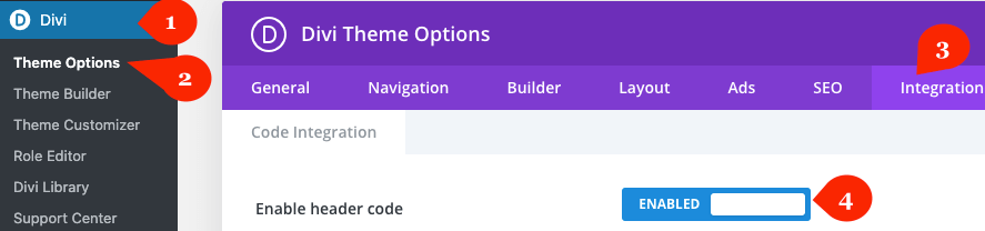
Once you’re in the Integration tab, activate the Enable header code, and then in the Add code to the < head > of your blog field, add the following jQuery.
After adding the jQuery, make sure you click the button Save Changes.
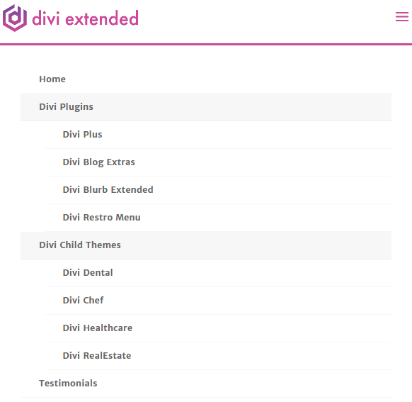
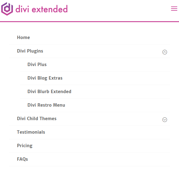
After all this, your Divi mobile menu would look great
Once, we’re done adding custom CSS and jQuery at the respective locations, our Divi mobile menu is good to go.
We’ve successfully created our mobile foldable nested menu. If it’s working and you find this tutorial useful, then share it with fellow Divi users.
Or, if you’re still unable to create a beautiful looking mobile menu, then let me know in the comments.


It collapses the sub menu but it just closes the whole mobile menu. Any ideas?
This worked, well, I have a query for how can this be done if there is sub-sub-menu to the already created menu and sub menu. Please help me with this.
Hello, thanks for the code 🙂
If you want to make it scrollable you can try this:
https://gist.github.com/hbaker
Hello, great fix thanks! Do you ahve a way to make it scrollable for longer mobile menus?
The parent-menu-item is not clickable! How to fix it?
Err… suddenly parent links can’t be pressed, just toggle menu
You are awesome! I tried three other walk-thoughs before this one solved my issue in Divi 4.4.3
Hi Karan,
Thanks for this – I have got it working on my English language version – but for some reason it doesn’t full through to my French language site.
I use Polylang and Divi – but for some reason the French menu doesn’t have the nested format.
Any clues?
The site is http://www.manoir-beaulieu.com
Thanks,
James