
Rules make things clear. What to do and what’s not to. Whether life or website development, rules help a lot. Website design rules/principles allow a designer to reach a particular website without confusing himself and overwhelming the visitors. Furthermore, web design is not only about beauty. Rather, how website visitors perceive your brand to interact and agree with it. You can say it’s the art of marketing through good design practices for improved conversion.
In this blog post, we will look at 33 web design basics divided into the following 7 website design rules groups.
- Structure Rules.
- Psychological Rules.
- Content Rules.
- Accessibility Rules.
- Usability Rules.
- General Web Development Rules.
- Post Design Rules.
These can help you achieve greater beauty as well as the functionality of a website. Let’s take a look at these in detail.
Website Structure Rules
Structure comes before everything. Without structure, humans cannot move. Buildings cannot stand. And the economy cannot thrive. The same is with website design. Without a particular structure, professionals can’t start & reach the end of a website. Thus, it’s not only a rule but an essential part of the website in every part of the design. You could say in a structure, all the elements of the website enjoy their time.
Furthermore, as per the web design principles, there are several segments to design a unique website structure.
1. Simplicity
When you’re designing a website, the key thing to keep in mind is that your website’s structure should follow simplicity. Without having a clear and simple to explore design, you could overwhelm users, and they might leave the website within seconds.
A simple website enables users to focus easily on a particular area or element without getting distracted. Moreover, the design allows them to navigate from page to page seamlessly, exploring all the features on the website. Though, when you try to build a simple website, don’t opt for a complete simplistic approach. Instead, focus on utilizing the design with a minimalist approach — keeping necessary elements with the latest web design methodology.
2. Golden Ratio
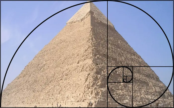
A Golden Ratio is a mathematical expression found in natural objects, which make designs aesthetically pleasing. Pyramids of Giza and Da Vinci’s Monalisa are some of the artistic examples that use this ratio to become complete and pleasing to the eye.
The golden ratio is equal to the value of the Greek letter phi (Φ), which is 1.618…, or you can say Φ represents the golden ratio. To understand it mathematically, look at the below illustration,
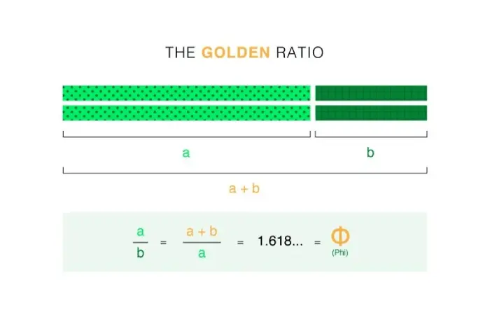
It states that a line, when divided into two parts — not equal but different, one smaller (b) and another longer (a) have equal value (1.618) when a is divided by b, and the sum of a+b is divided by a.
a/b = a+b/a = 1.618… = Φ
But that’s all mathematical. What we need is how to use it in our web design. For that, you could process it using the following points,
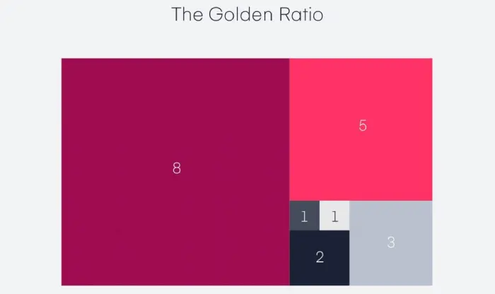
- 1. Divide your layout’s dimension as per the golden ratio — If the complete dimension has 1280 pixels, parts will be 791.1 px and 488.9 px.
- 2. Then use the golden ratio diagram to add spacing.
- 3. Once done with spacing, trace the golden ration lines over your design for slight perfection (;
- 4. Keep elements in a circular layout the same as Google’s logo and other elements based on the golden ratio rule.
- 5. You can apply the golden ratio to images, typography and even logos. Despite all the mathematical and technical terms, what you need to keep in mind is that the height of an element should be .6, than the complete length. Or,
Length a = Complete height, and the element should fit in a rectangle, making the length a, a part of square.
From invision
- 6. And if you want to utilize the golden ratio in your website design at best, follow Canva’s guide on the golden ratio. It’s one of the best tutorials to help you with GR.
3. Visual Hierarchy
Visual hierarchy simply states how you would place a particular element with what priority. For example, essential elements in the start and less significant web elements in the later stage. This is simply done to catch users attention and evoke certain emotions to motivate them to take particular actions.
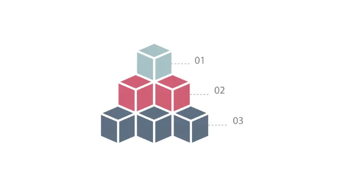
For instance, most user-friendly websites practice the web design method of keeping CTAs, contact forms and logo sliders to motivate them to take any action or build trust. So, they can continue exploring the websites with interest. There’s no usual sense in keeping the bottom menu or the latest blog posts at the top.
Because these elements will provide more options at the start, and users would eventually get lost in the web of multiple links. Which further deludes them from their purpose.
4. Grid-Based Layout
The best practice is to use a grid-based layout to help your website adapt a flow of organized structure when it gets seen on different devices. What basically can be done on paper could be utilized on the web. And that’s what grid-based layout does. To provide a working framework and easily blend margins, spaces, and columns, it divides a layout into vertical and horizontal guidelines.
So, the content could be organized in a flowing structure and represent itself at the best level — whether you view it on a computer or mobile phone.
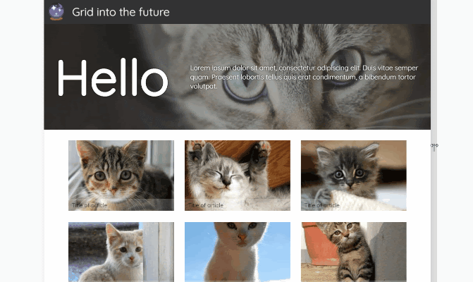
GIF credit Jo Franchetti.
There are multiple types of grid that you can utilize in your website design, such as,
- Baseline grid.
- Manuscript grid.
- Column grid.
- Modular grind.
- Find more about grid layouts at Flux Academy.
5. F & Inverse F Pattern
To boost lead gathering or conversion rates, web designers practice the F Pattern design principle. It’s a highly practiced web design rule that places elements on a webpage in almost F shape. But why F shape?
Because it’s the way our eyes move while interacting with an online piece. In most western, European, African and Asian countries, users explore web content first by scanning the top of the page for essential information like headlines.
Then move towards the left side of the page to view additional texts, points or bullets. Then again, scan towards the right and down to the bottom left for actionable elements like CTAs or contact information. To draw attention to the essential aspects, designers implement this into their web design.
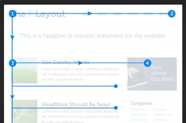
Well, it’s a robust design approach when we’re talking about the LTR reading languages, but for RTL, this won’t help. Therefore, you need to change the F pattern slightly and transform it into an inverse F pattern. So, users speaking RTL languages like Hebrew, Urdu, and Arabic can benefit from your design.
If you’re designing an RTL website on Divi, you could follow this tutorial to approach a profound skill.
6. Z & Inverse Z Pattern
Another pattern that our eyes follow when reading online content from left to right and top to bottom is Z Pattern. Likewise, the F pattern also leaves a great emphasis on leads and conversion. Therefore, many popular websites implement this design principle to draw attention to their essential elements.
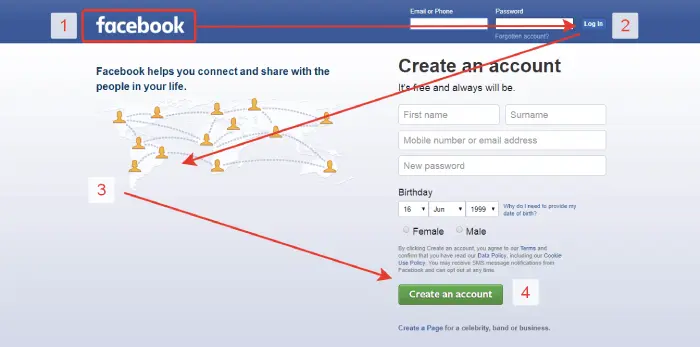
By Nick Babich
A popular example of Z pattern design is the earlier homepage of Facebook. First, it represented the logo, then drew users attention towards the login options. Further, it displayed the website’s purpose and, if they were new, then hooked with the create an account button. However, in the case of RTL language, you cannot proceed with the simple Z pattern design; you must transform it as an Inverse Z pattern.
7. White Space
A crucial aspect of web designing rules — Whitespaces. Without them, a web page with the latest or outdated design trends would overwhelm the user. Plus, they won’t be able to focus. And therefore, you’d lose a significant amount of web traffic. Or maybe you won’t be able to bring leads in it.
So, having whitespaces on a website is necessary, and you should apply them with balance—neither too much nor too less.
Website Psychological Rules
After structure, what comes in web designing are the psychological rules. A set of real environment rules based on the human brain and its behaviors. They tell you how humans interact with objects in different situations. These rules have great significance in web design to influence website visitors’ actions and lead them to our end goal. You make the website look good when talking about the geometrical aspects.
Likewise, structural design rules, it also has some rules that are as follows.
8. Hick’s Law
Less is more, ignorance is bliss, simplicity is the best sophistication, and thousands of quotes remind people how good you can do with little. And that’s what Hick’s law states. A time and reaction-based law named after duo psychologists (William Edmund Hick and Ray Hyman) from Britain and America. They experimented to determine the relationship between the number of choices available and the reaction time taken by an individual for a particular option.
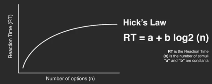
From Interaction Design
What they concluded is that the more options available, the more time a person would take to reach a decision. Adding more and more options, products, or services will not excite your customers. Instead, they’ll confuse them, and your website design will eventually fall.
Hick’s law makes it clear that more choices increase the time to reach a final decision. So, it’s better to go with less but quality options.
9. Fitts’s Law
Create a circle A and inside it, create another circle (c) a little bit smaller than A. Now, next to A, create another circle B, and inside it, create another circle (d) a lot smaller than B. For help, look at the illustration below.
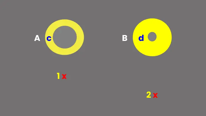
Once you’ve created the circles, move down from circle A with a low distance and mark a cross (1). Likewise, do the same for B, but keep its mark (2) at a longer distance. Now, from 1, try to tick the circle c. And after that, do the same for d from 2. You’d find ticking the d harder and more time-consuming. You’d say it’s because of the size and distance the circle has. Yes, you’re right, and that’s what Fitt’s law states.
The longer the distance from the source and the smaller the target’s size, the longer it takes a person to interact with it. Therefore, when creating web elements, make sure they’re not too small and placed far from the actual area of attention and action.
10. Rule of Thirds
Rule of thirds is derived from grid layouts and particularly for images. It states that to make graphics look aesthetically pleasing, they should be divided into nine equal parts using a pair of equally spaced horizontal lines and equally-spaced vertical lines. Then you should place elements along these lines or at their intersections.
11. Gestalt Design Laws
When we look at an object, we see it whole. We don’t give our complete attention to its parts. After that, we perceive its components. For an effective web design, you can implement Gestalt law to draw attention towards essential elements. There are eight gestalt design laws that enable us to determine how someone will perceive the object. Or an element we’ve used in the website. Here are those eight rules that can easily relate to Gestalt law.
(i) Law of Proximity —
It states that humans group things that are close to each other, creating a single perceived object. Therefore, place similar function elements together to form an object. For example, a menu bar whose elements like menu items, logo and CTAs completes.
(ii) Law of Similarity —
Group things together with similarities in shape, size, and color.
(iii) The Figure/Ground Law —
To leverage from the site’s background, we can apply this law. It states that when shapes and ground (background) lie together, we see multiple faces like the below Image.

You’d either see a vase in the center or faces in profile (the dark figures.) It brings interest to the site and excites users to explore more.
(iv) The Prägnanz law —
It states that human eyes simplify complex shapes into simple shapes. So, if you keep elements and variations in other designs simple, it would benefit you more.
(v) Law of Closure —
Everything has a shape, and when we see an object that’s not entirely representing a shape, we try to complete it, which makes it interesting for our mind to interact with it. Using the same principle, we can design different elements in the website.
(vi) Law of Uniform Connectedness —
Group elements that possess similar functionality. For example, related links or buttons, log in or signup sections. The law of Unified / Uniform Connectedness states that components connected to each other using colors, lines, frames, or other shapes are perceived as a single unit. So, it is for users to focus on individual elements available on the page.
(vii) Law of Continuation —
Use both negative and positive spaces to form a continuation in lines, curves, and a sequence of shapes that allow the viewer to determine a relationship between design elements of similar functionality.
(viii) The Law of Common Fate —
To draw attention towards a group of elements, use them in the same direction.
12. Occam’s Razor
What option would you choose? The one that makes you take the fewest assumptions and provide good results? Or the one that required more assumptions and effort to reach the same solution? I believe you’d choose the first one. And that’s what Occam’s Razor law suggests.
“The simplest solution to a problem is profoundly the best.”
You should complete the design when there’s nothing you think cannot be removed. Simply put, eliminate unnecessary elements on the page.
Website Content Rules
Content helps brands get seen and heard in different regions from different audiences. Especially those they are targeting. In web design, it’s the core to market, and establish connections between users. So, there’s no point in leaving it behind.
Similarly to structure & psychological design rules. It also has different segments to help you better your website’s design. Moreover, it’s not only about the text — for sure.
13. Purposeful Content
According to good website design rules, you might think the content should look good and bring sales to the business. However, that’s not entirely right for content placement and its use. Instead, what it should be doing is reflecting ideas and solutions regarding your business audience.
What value your content can provide to the users, and in the long term, it drives profit to your business. That’s what content should be used for. Moreover, content is the only thing that presents your business products and services to the users in the best possible way.
So, you need to keep it in a way that it could represent the purpose of the site most clearly and simply without confusing the users and putting all the essential parts in front of them. The best way to use the content on your website is to chop it down into pieces rather than big chunks.
Implement the inverse pyramid content creation process and use more user-friendly language that could be understood by most users regardless of their academic levels.
14. Typography Simplicity
3 maximum font families on a website is the best practice found around in the digital world. However, most developers keep the number minimum to either two or one throughout the design. Because it helps build uniformity, and viewers won’t have to guess which one they should focus on and which don’t.
When you use more than 3 different font families, it makes a website look unstructured, and each font family will fight to grab attention. As a result, none will be able to.
Therefore, keep typography to a minimum and something that users can easily ingest. Fancy fonts will not grab attention as general and easy to read can do. The best practice for typography is to use different font families for headings. Then, another one for body texts, and if you want to use one more, do it for italics.
15. Color Psychology
When you choose a color palette for your website design, you should go for colors based on color psychology. And something that can reflect your brand. Other than these, it will only distract your users, and you won’t get any help from your website’s color scheme. It can help build up your brand, motivate users to perform desired actions for sales and drive better conversion.
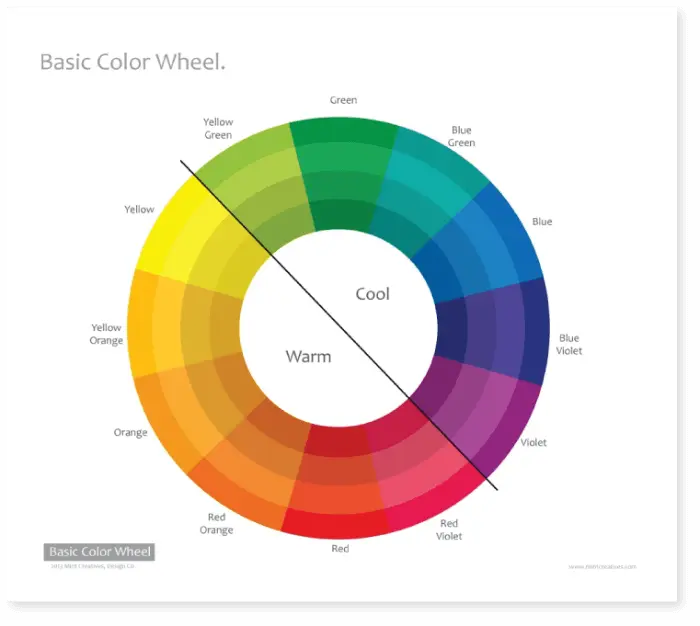
Each color has its unique psychology and can affect your business or brand. A study found that 90% of decisions made online regarding a product, whether the customer likes the product or not, are based on the color that too in 90 seconds or less. Another research discusses that color can help a business increase brand recognition by 80%.
Therefore, it’s wise to use colors based on their psychology and how they affect the user’s mind.
16. Graphics Use
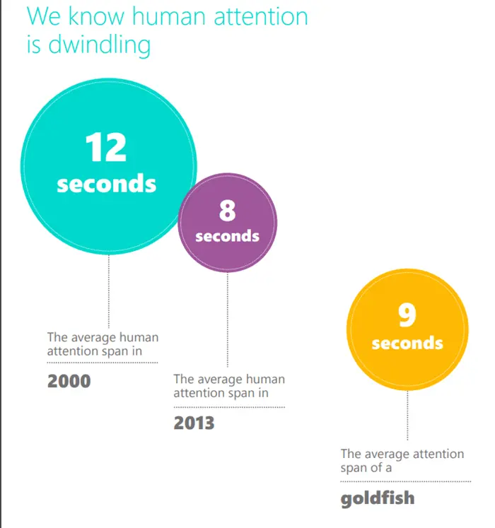
According to a study by Microsoft, the attention span of an average human has dropped from 12 seconds to 8 seconds from 2000 to 2013. And might have dropped more since then due to popular social media apps on mobile phones.
On a website, it’s challenging to hold users attention and alone with text; you cannot go too far. But with graphics, you can do a lot better job with your content. Apart from grabbing users’ attention through compelling graphics, you can also communicate with your audience in a more connected way—Whilst representing your brand and its purpose to the fullest.
Moreover, with imagery SEO, you can boost your website’s ranking in search engine results that bring new organic visitors, which might convert into customers.
But you cannot add images however you like. To hold attention, you need to follow good website design rules for using graphics, and some of them are as follows,
- Use images that reflect the meaning of your website’s purpose.
- Limit stock images to a minimum.
- Use graphic icons for better usability.
- Hold user attention through graphics and text in it.
- And optimize images for load time and visuality.
Website Design Usability Rules
Usability makes a website perform different tasks without confusing users. Website visitors can understand the purpose of an element and get the most out of it. Such design principles help you keep your website stout and deliver results in every need.
17. Link Color Change
To prevent users from mistakenly clicking the same link again and improve the website’s design usability, you could apply the color change on opened links. This will help users find out which links they have already visited and avoid opening them again. A much-preferred web design principle that helps users save time and get annoyed by seeing the same thing repeatedly.
18. Internal Links in the Same Window
It’s a fact the website and its pages would eventually contain internal and external links. But what’s the best practice to open them? Generally, external links get open in a new tab. Making it straightforward for users to identify that this particular page isn’t from your site and whatever happens here, you’re not responsible for that.
However, if you’re opening internal links in a new window, you would confuse them because users expect different actions from external and internal links. So, it’s crucial to open all internal links in the same window, allowing users to use the “back” button to get back to the original page if they like what they’ve previously interacted with.
19. Navigation
Most user-friendly websites include navigation that allows users to reach their end goal with minimum effort. To achieve a good website design, website navigation should be user-friendly and include elements that make it easy for users to find their required piece of content, such as breadcrumbs, page hierarchy, consistency and easy-to-clickable buttons.
One thing here you need to avoid when designing your website’s navigation is the misconception of the 3-click rule. Many website designers follow this approach that suggests that users should find their data in a minimum of three clicks.
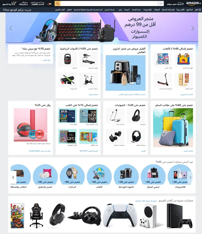
It’s a myth, and you should keep your design away from it. Because if we look at most modern eCommerce or personal websites, they take more than three clicks to find what we’re looking for. For example, Amazon, Microsoft Store and Apple.
According to a study with verifiable evidence, the Nielsen Norman Group states the 3-click rule for navigation as false. You can find more about it here.
20. Consistency
If we stack books in a straight pile, they look good and are easy to distinguish. However, if we take a different approach and stack them randomly without caring about their dimension, then it’s sure the pile won’t last for longer.
The same is with website designing. If it’s not consistent and follows an uneven designing approach throughout different pages, then your users will be not able to skim it easily.
Plus, they’d lose interest in exploring the site even further and, in a moment, will either close the tab or hit the back button. Therefore, under the web design principle, your website must be consistent and follow a uniform layout for all or most of the pages.
Website Design Accessibility Rules
To help you create a website that would allow more and more users to benefit from it, Design Accessibility Rules take place. Plus, you would design the website so that all types of users can access it. However, they’ll purchase the product/ service or not.
21. Responsiveness
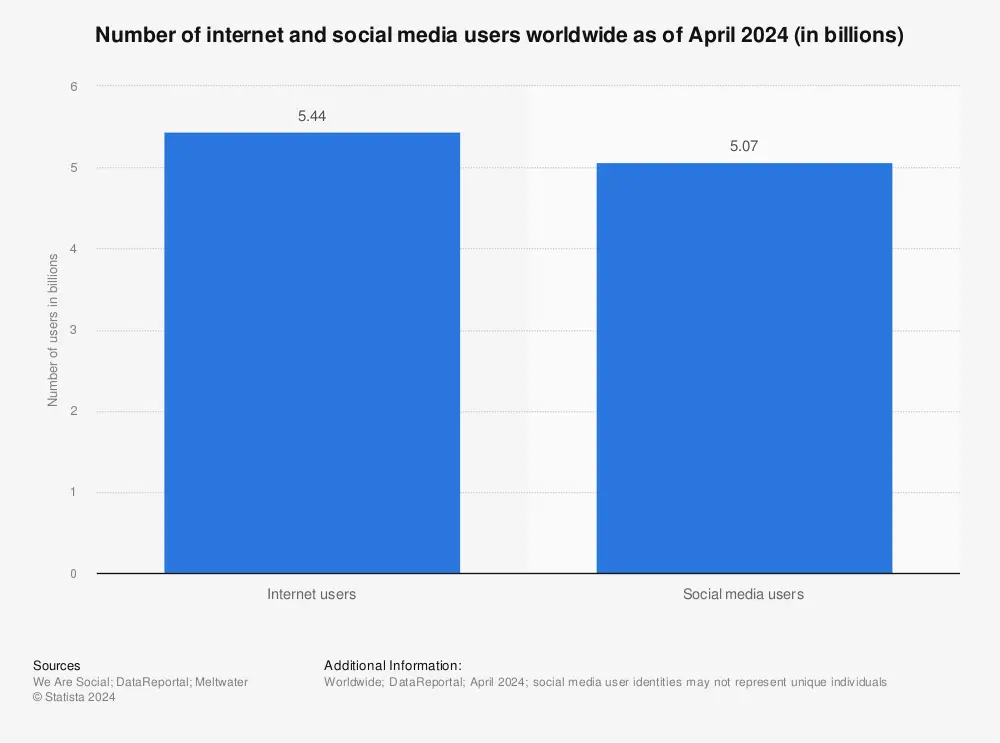
Online users are surfing the internet on their smartphones more than PC or tablets. If we look at the data, there are around 4.32 billion users worldwide, over 90% of the global internet population.
So, having a website created only to support large screens devices won’t do great for your business. Plus, it’s not a good design practice. Keeping this thing in mind, when you approach a particular website design, make it work seamlessly for both large and small screen devices.
22. Load Time
With responsiveness, loading speed is another crucial aspect of designing a beautiful website. A 2017 study by Google states that if a website takes more than 3s to open and become responsive, then the probability of bounce increases more than 32%. This clearly states that by following website design rules, you should build a website that would be lightweight and blazing fast.
Additionally, what you can do to make your website fast is choosing a high performing hosting provider. Serving images in the next-gen format and use a content delivery network. If you’re using the Divi WordPress theme, you can apply these tips to speed up your Divi website.
23. User Support
Accessibility options enabled in a well-designed website allow users suffering from underlying disabilities to make the most out of it without facing any problem. Enable your website to perform as super-user friendly and benefit from it as much you can.
24. Search Function
Search is the guiding north star of a website. A web design containing a search function helps users find their required information and increases website user sessions. Thus, lowering bounce rate and achieving a good SEO score.
It makes it easy for users to find the needed data, product or service without going through multiple sets of pages. Numerous pages and processes can confuse users, and they might end up leaving your website in the middle. However, a search ability eliminates this scenario.
For a professional website design approach, you could add a search function at the top. Or at the bottom. Or you could create a new page and add a search function there. In a Divi theme-based website, you could use our Ajax Live Search module, which delivers needed results quickly and elegantly.
Some General Web Development Rules
Basic rules but important ones. Without them, you might not be able to serve your clients or customers stress-free. General web development rules keep your website professional and provide your users with services and information as no spammers.
25. Elements Labelling
If you’re going to use a button to allow users to submit a form, then it should be labeled in that manner. For example, input ‘Submit’ as a button label. Labeling elements significant to their purpose enables users to become clear about them. And do not interact with the one that might not result in their favor.
As simple as it sounds, it’s a crucial part of designing a good website that clears the intention behind using a particular element. And doesn’t take users to a website’s area which they don’t want to visit.
26. Test
To prevent or decrease the number of errors on a site post completion of website design. What you need to do is run numerous tests on it. With different devices, browsers, locations and internet networks.
What can work on your system might not work as usual on other devices. It can be problematic for your business when you go live with different types of errors on it. Because if users find issues exploring your website, they might not choose your services.
So, better safe than sorry.
27. No Early Popups
If you put curtain too early on the show, how would your audience build interest in the play? The same is with websites. If you display a popup very early, users won’t react to it pleasingly. Instead, they’d see it as an interruption in their expedition and will close it as soon as they’d seen it. Your popup’s purpose and appearance will go in no use.
Therefore, according to professional website design practices, give time to your website visitors. And once they have either visited the bottom or viewed multiple pages, show them what you’ve got.
28. No Too Many Ads
Spam or annoying, that’s what comes in a user’s mind when he interacts with a website full of ads. Bloggers and online publications, most of the time, earn from their content practice implementing ads. But in the chase of making extra money, they complicate the website’s structure with too many ads and compromise user experience.
To provide users with a pleasing web experience, you need to keep the number of your ads to a minimum. Plus, place them in a way that won’t distract and annoy users while exploring your content.
29. Avoid Blinks & Flashes
Many website owners, either by themselves or through a web designer, highlight essential web elements. And to do that, what approach they prefer is adding some custom CSS to make them either blink or flash. It’s another red flag for users to consider that part as spam. Or some users with sensitivity to flashes and blinks couldn’t tolerate them.
Therefore, the best scenario is to avoid them. And to highlight elements, what you can do is try using italics, bold text, or use a different font family. In this way, users will have more attention, and they’d like to interact with it.
Post Design Rules
After completing your website following the rules mentioned earlier, it doesn’t mean your job has finished. To keep customers happy and your website running, you need to keep meeting the Post Web Designing Principles checklist. Nevertheless, these particular web design rules come in the end, but they are the most required rules to keep a business website working for a non-definite time.
30. Check for Dead Links
Links and content might look foreign to the design rules. But these post design ideas are the one that makes a design work. Therefore, checking dead links on a website is a crucial part. It helps you keep running different aspects of the site without compromising performance while spreading shine through an attractive design.
Perhaps, you’ve got a nice and beautifully designed website, but if it contains dead links, your website won’t be able to give the impression it should. Also, dead links affect the website’s SEO score very severely, resulting in a low number of leads and conversion.
So, keep checking deadlinks whether you’ve got a tremendous website or a small one.
31. Typos
Typos annoy people more than anything, and if they find them on a really good looking website, they’d doubt whether the design was original or pilfered. Not a general scenario, but typos can bring down the intensity of the impression which a website – good designed – can make.
Therefore, regularly keep looking for typos and correct them as soon as you see them — for both user experience and website’s credibility.
32. Update Information
If a website contains outdated information, then the user’s full attention will shift towards content only. Leaving a good website design unnoticed. Moreover, users won’t explore the different areas of the site, and your hard work will go to no use. Thus, keeping the information updated is another crucial part of good web designing principles.
33. Regular Maintenance
Once you’re done designing a website, the next thing regularly needs to be carried out is performing maintenance checks. They allow your website to serve its customers without any technical issues and itself being crashed. Regular maintenance checkups you can perform are such as making layouts compatible with the latest design trends & techniques; Updating back-end tools, clearing cache and other performance practices.


0 Comments