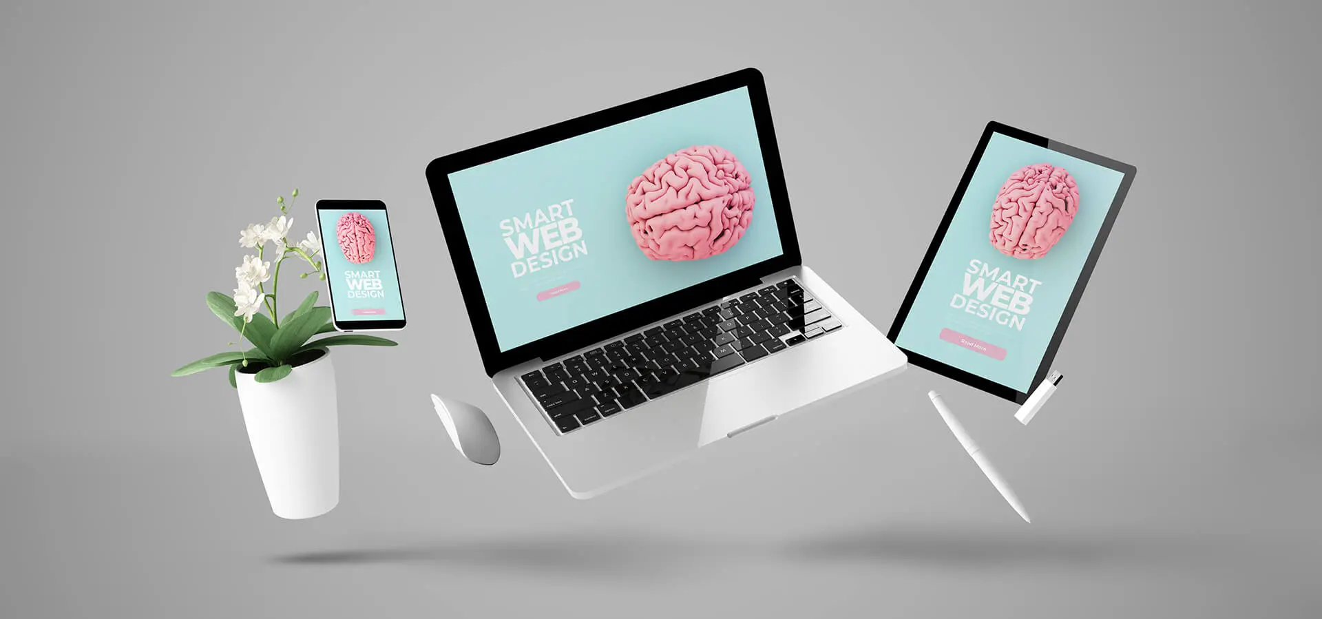
The future of web designing is not certain. What’s trending today might not work tomorrow, and what will work tomorrow might not work the day after that. As long as new technology would evolve, prominent web design trends will see their patterns drawn in many shapes. However, what’s most suitable for a website designer is to go for what’s trending on the internet in the present moment — not tomorrow or the day after that.
And to help web designers bring the best to the table, we’re going to take a look at the top new 24 web design trends doing their magic in 2021. If you’re thinking of creating something out-of-the-box. Or want to change what you’ve already got, then these 24 points will help you make the most out of your innovative web designing.
This is what we’re going to check out in this entire blog post. 👇🏻
Contents
- Dark Mode
- Color Psychology
- Design With Multi Images.
- Modern Minimal Design.
- Gaussian Blur.
- Black & White Design.
- Introduction to Neomorphism.
- Shapes and Patterns.
- Retro Fonts.
- Cumulative layout Shift.
- Illustrations.
- Muted Colors.
- Sticky Features.
- 3D Graphics.
- Motion, Animation, and Effects.
- White Space.
- Load Time.
- Accessibility.
- Scroll Storytelling.
- Elements Journey.
- Chatbots.
- One-Click Login/Signup.
- Content for Humans.
- Industry Friendly Design.
(1) Go to Dark Mode Illuminated
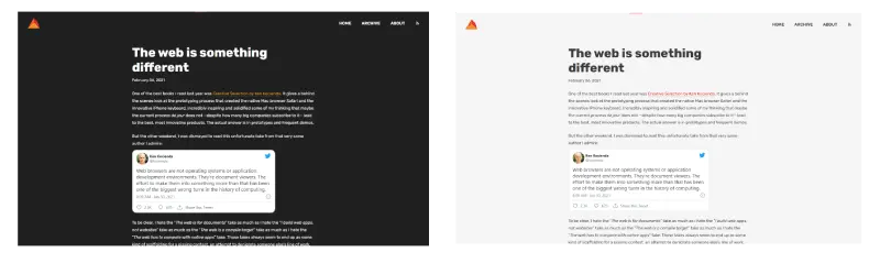
For remaining in the dark almost 30 years behind light UI, the dark mode made its comeback in 2010. The monochrome monitors used to be the first dark side of the UI. Then after 2010, in 2020, almost ten years wait, Google fully rolled out dark mode in its Android OS and opened new ways for it.
After that, the dark mode has taken the online world with a stride. Even Facebook, with its new interface, gave users the option to turn their profile into the darker mode.
The dark mode UI is #1 on the list of web design trends. Developers like it, users love to see any website in it, and more organizations switching to it. What makes it preferable is the reason that it’s available in the smartphone operating system. And as there are more mobile phone users, you’d find more dark mode users. If your website isn’t adaptable to the user’s browser and that user is browsing his/her phone in the dark mode, then it’s a sure sign he/she won’t like what you have on your web.
Therefore, having a dark mode enabled website is something you should follow from the web design trends. And the best example for it is daverupert.com. When you’re browsing light UI, it presents its content in the light UI. Nonetheless, if you choose dark, it will automatically turn itself into dark mode.
For a better dark mode website design, you can try our recommendations.
Recommendations for Dark Mode Websites
- Having a dark mode website isn’t mean that it should be in all black. Instead, it should be compatible with the user’s browser.
- When you design your dark mode website, make sure you don’t pick too bright colors for the elements. This might hurt the user’s eye in the dark web.
- When you add graphics, make sure they have shadows and glow around them. And they should be clear and large in size, easy to spot. For example, you can visit Apple.com. Though Apple doesn’t have a true dark mode enabled website, but its product pages could inspire.
- If you want to learn more about the dark mode, you can check out CSS Tricks’ dark mode guide.
(2) Colors With Color Psychology
Psychology is involved everywhere. When we eat, when we talk, and even when we choose colors for our website. Therefore, to walk hand in hand with the web design trends of 2021, it’s essential that you should take care of color psychology.
Because different colors generate different moods and emotions and affect whether the user would buy the products or not, if your website’s color scheme isn’t aligned with your business’s nature, you might see a slight decrease in the traffic as well as conversions.
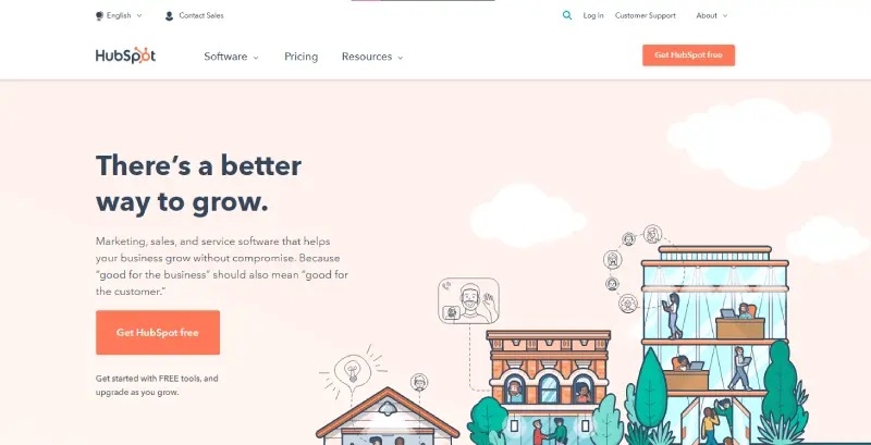
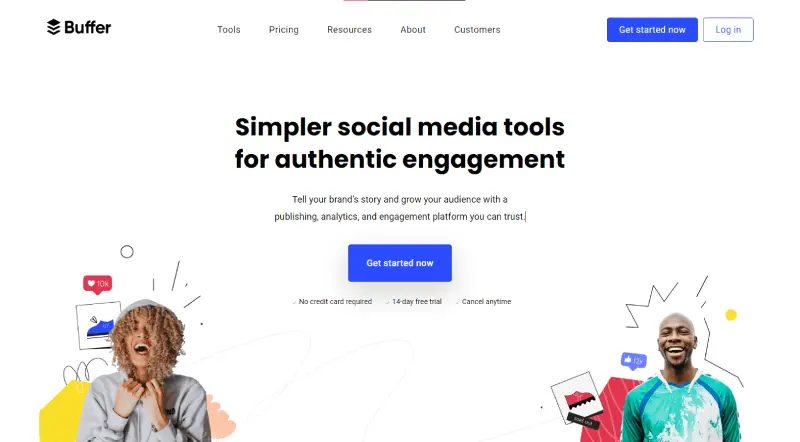
Yes, it’s true that business’s nature call for a specific color scheme. For example, if you’re in a creative or innovative domain, then the most suitable colors you’d find are Pale Orange, Light Blue, and Green with the combination of White and Grey backgrounds– all these colors show creativity, sustainability, trustworthiness, simplicity, and innocence. The best examples when it comes to color psychology and creative businesses are HubSpot and Buffer.
(3) Design Blocks With Multi Images
There are two ways of creating sections on a website with multiple images.
First, the way Apple does with its product pages. As you can see in the below illustration, when we scroll the page, it might appear that we’re seeing a video or some other kind of visual is taking place. However, in truth, it’s multiple images’ work that appears and disappears in accordance with the scroll location.
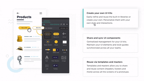
Second, the way the most web designer follows. They use content to display a group of multiple images. In this way, the designer tries to explain the business or some features of a product. For example, in the below illustration, you can see when we click on a particular content at JUSTINMIND a group of images appears to describe the purpose.
(4) There’s Still a Place for Modern Minimal Design
If you’re thinking having fewer elements, not including animations, images, and mouse effects, it implies minimal web design. No, that’s not what minimal web design is. Instead, having balance, alignment, and contrast on a website are the fundamentals of minimalistic design.
Yes, the motto of minimal design is less is more but that doesn’t mean you keep less unnecessary things. Rather, you keep necessary things and took out everything that’s not required. To have a better idea of what’s minimalism check out the below image by Maarten P. Kappert.
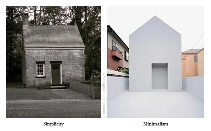
It simply explains that a minimalistic house doesn’t require loads of doors, windows, or even different colors, but does require uniqueness and similarity in each element of the house. Not just like a simple house with ordinary color and design. That too could be applied to a website, you don’t need more CTAs, heavy graphics, or animations. To find inspiration for a minimalistic web design, then you should have a look at Heartcore and Thegardensociety. Both the sites have necessary elements, doesn’t bother a user while exploring them, and fulfills what Maarten suggests,
Minimalism is defined as the concept of minimizing distractions from what’s truly valuable or essential.
From understandingminimalism
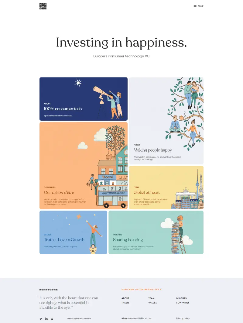
Minimalistic web design by Heartcore.
Recommendations for Minimal Website Design
- While attempting minimalistic web design, don’t think of simple, clean web design; rather, approach it as an essential elements’ web design.
- Don’t overload the website with lots of lots CTAs, graphics, and animation effects.
- Try keeping the website color under a combination of 2 or 3 colors. Not more than that.
- If you want to know more about minimalistic web design, try Sitepoint’s minimalism web designing guide.
(5) Say Hi to Gaussian Blur
To increase focus on a particular section of the website in an intriguing way, what web designers are practicing is a creative skill that blurs images and gradients in the background while bringing content on the front with strong colors.
A kind of filter to the images with a touch of gradients. Or you could say according to the current trend as a blur to the gradients only. However, many designers mistake it by comparing it with blurs on images till they are hard to guess what they’re containing. But it is not. In the below screenshot, Greenpeace uses a pinch of gradient on the corner of the footer, creating symmetrical flow.
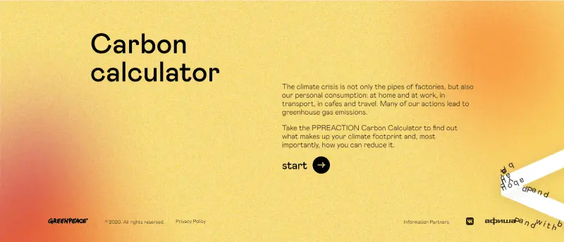
Moreover, while scrolling the site it contains a smudge of the gradient in the center of the page in multiple blocks that increases focus on a particular section.
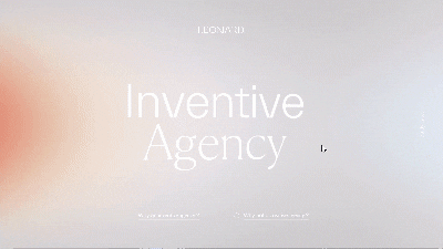
Leonard Inventive Agency, follows the same idea of displaying gaussian blur at its hero space of the landing page, but it includes moving gradient blur, which in some ways increases focus on the brand name and display the site with a modern look.
(6) Common Place for Black & White
The dark mode was a different layer of designing a website. There’s a scope of different colors that might look good on both the light and dark UI. Whereas, having a black & white website is specifically limited to White, Grey, and Black.
It’s almost near to design a minimalist website but keeping everything limited to these colors. You can find many popular brands following this trait to create their best website. Such as Creativepark, theSum, and M-Building.
And if you want your web design to follow the latest web design trends, then the black and white website’s approach you can try in 2021.
Recommendations for Black and White Website Design
- Use big fonts so they could be spotted easily.
- Try extra space between webpage elements.
- For CTAs reverse this process, keep buttons background black and the text white.
- Have space in the header menu items; for example, see Pixar.
(7) Introduction to Neumorphism
The idea of Neumorphism is to make web elements look real. If you add a button, it should look real to the user, and when they interact with it, it should behave like a real one. And it’s not limited to the buttons, but everything you add on the site.
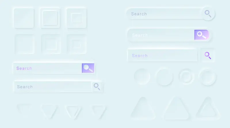
The use of neumorphism design is still in its early phase, but you can try this web design trend on your website to remain ahead. If you’re looking for inspiration to design a neumorphism active website, then try Dribble; you’ll find much great design based on this trait.
Recommendation for Neumorphism Web Design
- The website should have regularity in designing neumorphistic web elements.
- The graphics you’d use should be out from Skeuomorphism.
- Just like a minimalistic web design trend, less is more in neumorphism.
(8) Get Better Shapes & Patterns
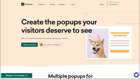
Squares, rectangles, circles, triangles, and many different shapes on a webpage have a significant effect on the site. They build symmetry as well as eye flow from bottom to top and left to right. But shapes & patterns are getting in use since 2016. What’s trending in the present time is the more natural way of shapes and objects. You can take this idea as the different shapes of a fluid. For example, you can look at the placement of shapes on Sleeknote’s landing page.
The shapes used on the site are helpful at navigation as they intuitively guide users to essential elements of the site such as CTAs.
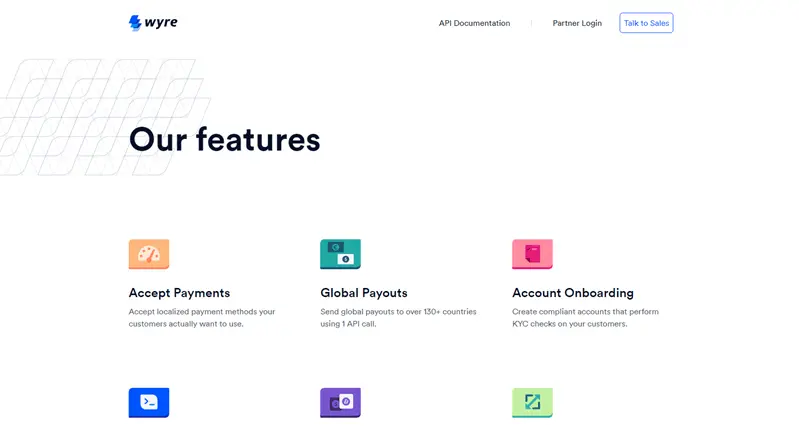
Wyre is another fine example of patterns and shapes. Each element that inclined a geometrical shape intended to highlight content such as text, images, or videos. The main reason to use shapes & patterns is to smoothen navigation on the site, increases focus around different contents, and bring out an appealing design.
(9) Dive Deep With Retro Fonts
Old is gold, and you can try this idiom on your website’s font. The notion of trying retro fonts is to give an essence of newness. As most web users are either Gen Z or Millennials having an old font used in the 80s, 90s, or in the old books, provide them a sense of something novel.
Moreover, retro fonts are derived from arts and culture, and these domains always intrigue creative minds and web design is nothing less than being creative.
(10) Take Care of CLS (Cumulative layout Shift)
Introduced back in mid-2020 as a health factor of the site, the Cumulative layout shift (CLS) has nothing to do with the website’s beauty, but it plays a vital role in the technicality.
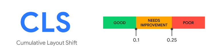
CLS is a method that Google uses to find out whether a website after being loaded fully shifts its vertical layout from the actual place or not. Now, you’d ask who’d want to do that?
And the answer is Bad reputed websites. Many scams, threats containing websites, or businesses that use bad practices to leverage their income. What they do is that, they deliberately shifts the layout, and when users tap to scroll the page they mistakenly click something the website owner has hidden on the web and wants them to click. (Mostly it happens to mobile websites.)
And this is what Google wants to prevent its user from. If your website is shifting more than 0.30ms, then it could penalize you.
Now, you’d say you don’t have any such kind of behavior happening on your website, but CLS can happen on your site whether you deliberately want it or not. To find out it’s happening on your site or not, try PageSpeed Insights, and to overcome it, use our recommendations.
Recommendations to Lower CLS
- Don’t use animation on the mobile web.
- Use low-size images.
- Provide images explicit width and height. For more information, visit Google’s guide on CLS.
- Try to keep fonts theme-based or page builder; if you’re using custom fonts then they may cause a rise in CLS.
(11) Choose Better Illustrations
Illustrations are part of web designing for a while now and will continue to be in 2021 even though 3D graphics and neumorphism have started their presence. This particular web designing trait will continue to be on most creative websites. If you’re a little out on the concept of neumorphism or 3D graphics then illustrations can better support your business idea and its web design.
The concept behind using illustrations is simple yet subtle. It backs the content of the page as well as also provides a personal touch to the user. A single illustrated character popping every now and then at different segments of the page makes the user feel like they’re on that journey of using a particular service that a business website is trying to present.
Moreover, what tops the cherry on the cream is the introduction of Lottie animation — giving a particular illustration a more personal touch and a sense of being alive. Not just plain cartoons randomly trying to present an idea or business. If you’re looking for quality cartoon illustration, then unDraw has got the coolest stuff, and try LottieFiles for moving illustrations.
(12) Have Conversation With Muted Colors
Having too bright colors only can give a website visitor a hard feeling or strain in the eyes. So, what can you do when you’re required to use strong colors on the site? You use muted colors.
A perfect blend of dark and light color palettes on both the background area and fonts. Furthermore, not just single colors but various strong and light color combinations on both big and small blocks appearing on scroll.
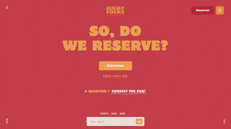
To get a perfect idea of how do muted colors look like? You can visit Luckyfolks. It perfectly represents the notion of muted colors and how best you can use them by keeping the right balance of light and dark colors as well as web elements.
(13) Yes to Sticky Features
Using sticky features is one of the great web designing tricks to increase interactions on CTAs, subscribers form, and other essential elements of the site. If you want to leverage your site for good, then using sticky features is something you can do to follow the web design trends.
However, using sticky features doesn’t mean that you stick some elements on the site for a prolonged time on a particular section. Instead, you make elements sticky from one section to another and replace them with another from time to time manner.
Though there’s a catch in this approach as well, which is, don’t bring the rain of appearing and disappearing of sticky elements. As this will without a shadow of a doubt, irritate the user and you’d get no benefit.
If you’re using WordPress as your website’s CMS, then having Divi installed on it will be useful because Divi includes one of the best sticky features that you can find on the internet.
(14) Get 3D Graphics
Use neumorphism to display elements as real and get 3D graphics on the website to describe real-world objects (nouns) in deep. Moreover, you can also use 3D graphics to represent your website’s business, and users can easily connect with it if it displays some real-world scenario. Mercurymarine has got the 3D graphics to explain more about its product; you can have a look to know more.
(15) Motion, Animation, and Effects
Motion, Animation, and Effects are part of the web designing world for a very long time. They are used to increase interaction, excitement and provide a sense of novelty to the user when surfing the webpage. For instance, Lassepedersen, usage a horizontal scroll on its articles where images appear from the right side in small size, then gets enlarge in the middle and again shrinks to the left when another image pops in. A new kind of scroll motion gives users a sense of newness.
An eye in the circle at the place of the cursor at Nahelmoussi brings excitement and curiosity. Perfect to increase interaction and engagement with the content. Something similar you could try for your web design project and give users new from the latest web design trends.
(16) Importance of White Spaces
When designing a webpage, never think of it as a wall to paint different art. Instead, consider it as a space in the real world where different objects in the space stand out and show their identity. A fish market never appeals to someone for a prolonged stay. If you want to increase user sessions and your essential content would catch the user’s eye, you need to focus on using proper white spaces.
It’s a great web designing skill that can bring balance between the design element & content of the page. With proper use of white spaces, your website will have the following benefits,
- It increases content readability.
- Better interaction with different elements of the site.
- Highlights CTAs profoundly.
- A clean and no mess place pleases everyone. To know more about it, read Power of Context.
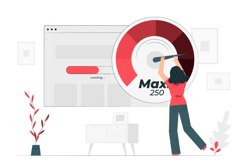
(17) Load Time Still a Thing
Yup, it is, and as the world moving towards 5G, this would be the prominent concern of the web designer when it comes to an elegant web design. The current number to wait for a site being loaded is 3s, and as the internet speed is increasing, this might go down.
While designing the website in accordance with the latest trend in web development, you shouldn’t go too far and overboard everything. Remember less is more and essential is best. Try to make the site as useful as you can, not as attractive as you can. So, what can you do to maintain a good website loading speed? Everything that you’ve always told to.
Recommendations for a Better Website Loading Speed
- Optimize image size.
- Go for the lightweight elements and plugins if you’re using WordPress.
- Choose a better hosting plan.
- Try CDN in case you’re on a shared plan.
- If you’re users mainly deals on computer and took everything superfluous from mobile web.
(18) Remember Accessibility
For every 4 people, there’s 1 person is suffering from partial difficulty to use a website alone in the United States are. And if you’re missing out on this point, then you’d probably lose a significant amount of internet users. Because by accessibility means, making a website accessible to all.
So, what you can do to make your website accessible in multiple ways. For truth, there are many ways, but essential things you can do are —
- Design a keyboard-friendly website.
- Content is easily readable and accessible.
- Include ALT text in the images.
- Choose the right colors.
- To know more about how to make a website accessible, try Dreamhost’s accessibility guide.
(19) Design Elegant With Scroll Storytelling
Scroll Storytelling or Scorytelling, is a scroll-based website design trend that explains the business process on the site when a user scrolls through it, either horizontal or vertical.
You add certain animations, mouse effects, and graphics that appear sequentially with the content when the user scrolls the site. And by scorytelling, it doesn’t mean that only words pop up with cool effects, rather you can also add sound to your scorytelling.
One of the best example of scorytelling is Tripinthedark,
It provides you multiple options to view its process with the option to see them all in with background audio. When you scroll back and forth, elements appear in their order with the accompanied VoiceOver.
This is what you can definitely try from these web design trends.
(20) Include Element’s Journey
This is somewhat similar to the Scroll storytelling, but using the element’s journey to explain process of business or product focuses on a single element. Mainly it happens on the landing or homepage of the site.
An element first appears at its base location, then moves from there to another when the user scrolls the page. It changes place, shape, orientation, and even its notion what it was first used to explain on the site.
There’s no limitation that you can only use a single element, but you can interchangeably use multiple. For example, you can look at the homepage of Zenefits,
Here, what’s happening is that the header image first changes its shape and move to multiple locations, then for a limited time frame it remains there and other elements move. Once the other elements part is done, the header moves again, until it was taken over by a whole different element.
A design like Zenefits is hard to achieve, but if you want to have something in 2021, then elements’ journey is something you can give a try.
(21) Bring Chatbots Just For Old Time Sake
Chatbots are still effectively capable of bringing value to the business and add a plus point to your modern, vintage, retro web design or whatsoever. You can still count them as an essential part of the web design trend in 2021 and shouldn’t miss having one.
What Can Chatbots Do for Your Business?
- Improved customer service – Provides customers or website visitors a direct way to raise queries.
- Increased customer engagement – Bring leads to your business.
- Monitoring consumer data & gaining Insights.
- A better-sorted tickets’ system.
- Cost savings.
- And much more.
Looking for a Simplified Chatbots Integration System? Try One of the Followings
(22) Make Websites More Accessible One-Click Login Enabled
If the website you’re designing requires users to signup and get the services, then having a simplified solution to let them signup is beneficial. To do that, you can make your website accessible to One-click Login. So, users won’t have to type in the details and fillup long forms. Rather, choose their favorite way to board on your website.
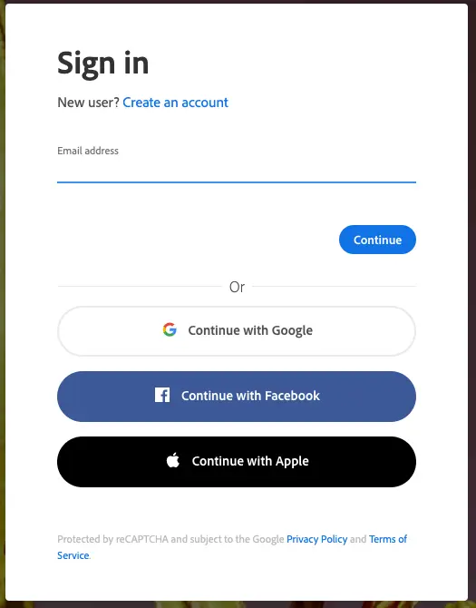
You can include Google’s one-click login; Facebook’s login is also pretty much famous around the internet. And what is seeing a rise in the one-click login is the integration of Apple’s iCloud. So, you can include that as well. But the question is, how’d you do it?
In WordPress, if you want your website only Google one-click login enabled, then you can try this tutorial. Else, you can try the Social Login plugin. For CMS other than WordPress, you can give try to the Memberspace integration.
(23) Add Content for Humans
We’re talking about web design trends, then how we can forget about content on a website, no right? But after looking at many websites, it feels many web designers have forgotten the essence of why content first being came into use.
The approach of adding content on a webpage nowadays forced to focus on performing better at SEO, but that’s not going to help your site or product remain sticky in your user’s mind. To make them sticky, you need to write them for people and bots, too.
Content is King and it will remain the king if you apply it with the right thing in mind. Yes, optimizing for search engines is better and beneficial. One more thing you need to keep in mind when adding content to your site is that it resonants with your business domain as well as have a proper flow and structure such as,
- Uniform fonts.
- Uniform letter casing.
- The right match for your color scheme.
- If possible, try to follow the KISS principle. Keep It Short & Simple.
And never ever consider the text as your only content type because video, images, and other creative work count as content.
(24) Always Try Industry Friendly Design
Have you ever seen a hospital’s interior or exterior designed as a bar or casino? Or have you ever seen a bar look like a hospital? If you have, do you believe that works? No, for most users, unless trendsetters start something cool.
That being said, a mix of another domain into a different one won’t work, and the same is true for website design. If you’re designing a restaurant site, keep its elements in accordance with the industry’s nature. That way only, you’d be able to create a website that works not only in 2021; instead in many coming years.
Try Combination of These & Get an Innovative Website
The best way to keep your website following the latest web design trends is to follow trial and error method of problem-solving. More importantly, not including every point, because if you try to get everything on a single plate, it will become heavy and turns your innovative website into a hard to navigate website.
Therefore, keep space for essentials, design what your business will get the most benefit from, and never ever stop looking for ideas & inspiration to create something out-of-the-box.


0 Comments