Note: In this blog post, we’ll look at the features of Divi Before and After slider module of the Divi Plus plugin. We’ll also look at some examples created using this module.
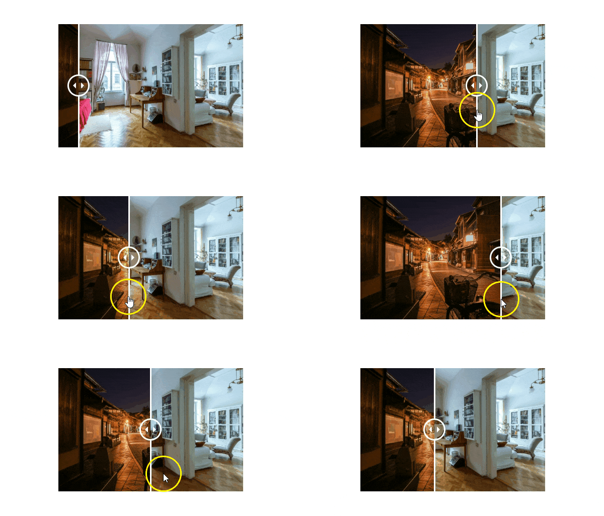
Divi Before and After slider comes with the Divi Plus plugin. It’s an excellent tool that allows users to compare alternate versions of an image with a moving slider. Plus, it also provides users extra control to use it even more efficiently. Moreover, it’s an easy to use module, and using this you can quickly display two versions of an image with no extra effort.
Now, let’s see how it works.
Add Divi Before and After Slider module
Once you’ve purchased the Divi Plus plugin, and installed it in your WordPress site, it will add multiple modules to the Divi page builder. Such as Divi Breadcrumbs, Fancy Headings, Fancy Text, Separator, and Before and After Slider.
To use it, create a new or edit an existing one, and add this module to the page. You’ll find it as DP Before After Slider.
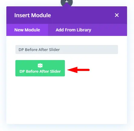
Upon adding this module it will open up it’s settings, which include multiple customization options. We’ll look at each in the subsequent sections of this article.
Content Tab
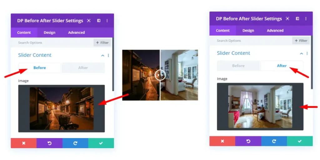
Content tab of this module contains Slider Content settings, where you can add images for before and after use.
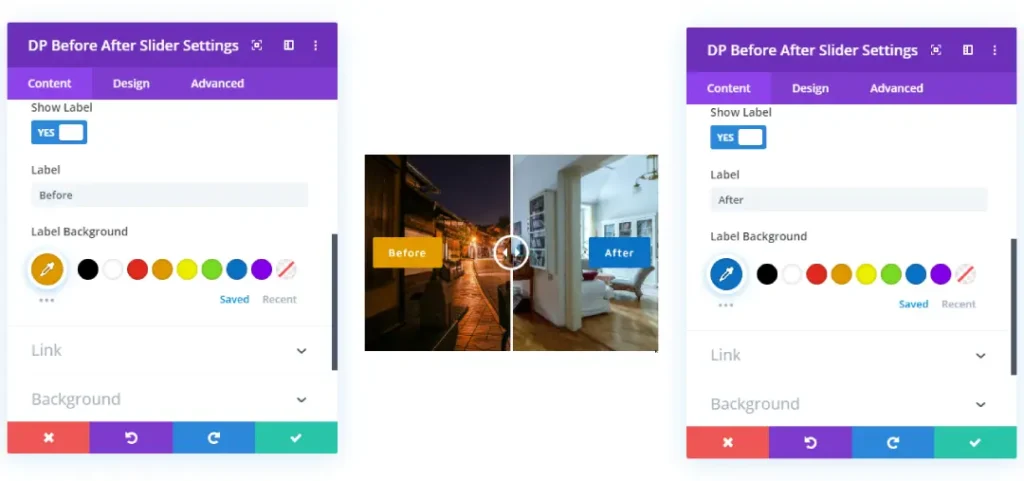
Show Label
An additional option whether to show label on the slider or not. Plus, helps you to change the background color of the label text. In addition to these, it includes default Divi builder content settings such as Link, Background and Admin Label.
Design Tab
Design tab of the Before After Slider module, gives user multiple options to change the look and feel of the slider. Plus, all the default design settings to make the image slider even more effective and appealing.
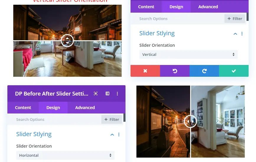
Slider Styling
This gives users ability to change the orientation of the slider. Plus, multiple micro customization options to bring some change in the behavior of the slider.
Handle Offset
It allows you to set position of the slider when it’s get loaded.

Move On Hover
By enabling this option, you’ll make the slider move through mouse hover on the images.
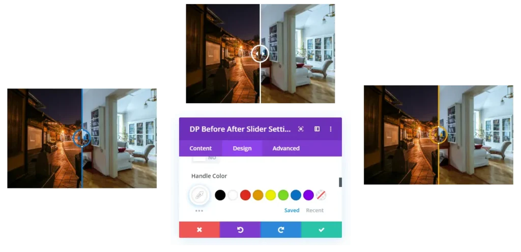
Handle Color
Allows you to choose different colors for the slider handle.
On Hover Overlay
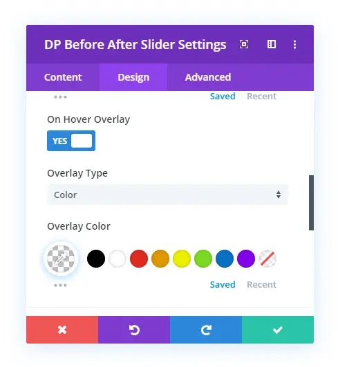
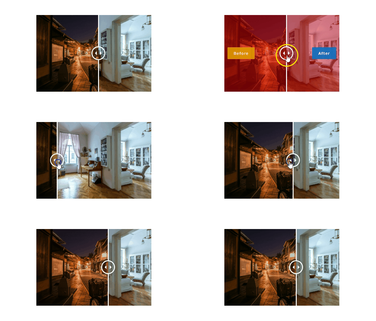
Adds functionality to the before and after slider to display an overlay color or gradient when mouse hovered.
Label Text Setting
This provides you the option to customize the color, fonts, alignment, size and much more for the slider label text.
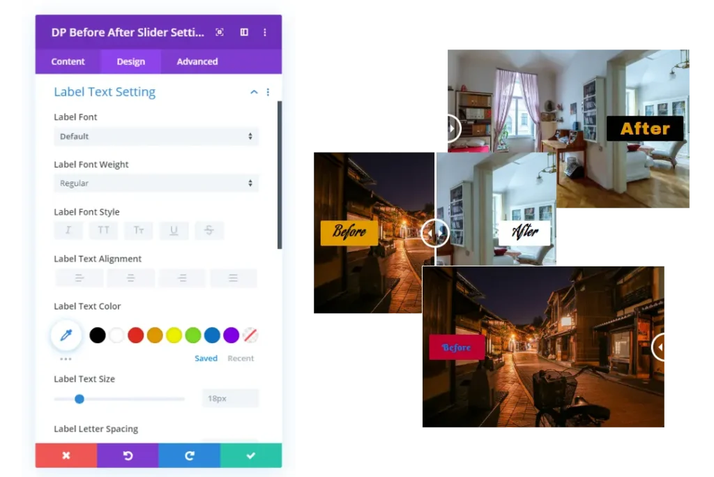
Take a look at some Divi Before After slider examples
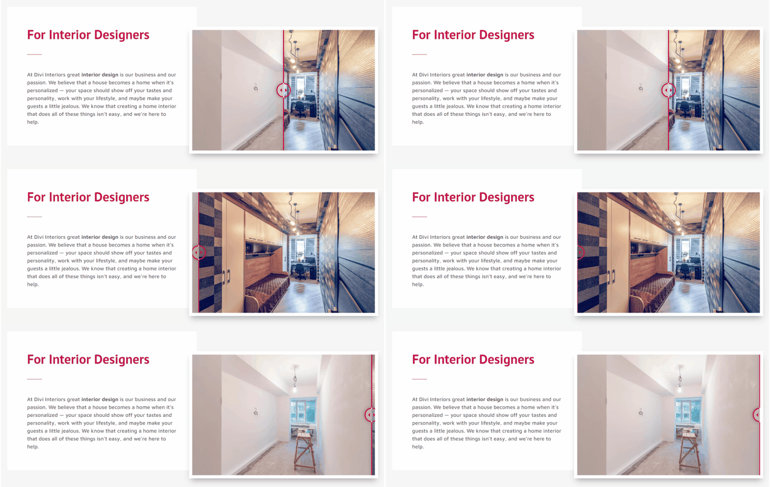

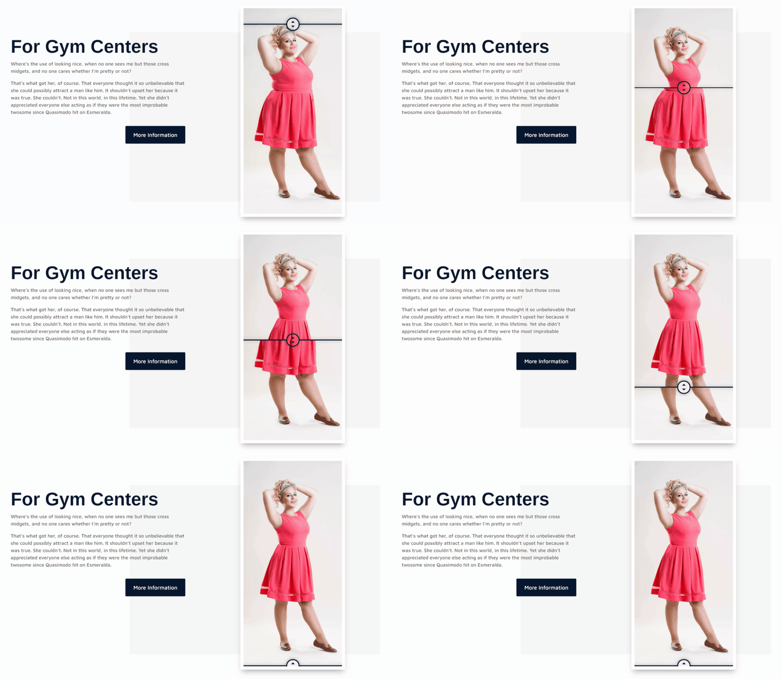

Summary
Above, we’ve discussed the working of Divi Plus Before After Slider module and shown you its exclusive features. We’ve also shown you some examples of image comparison keeping different industries in mind. Now, if you want to create before after image comparison slider for your site and business, then go and get the Divi Plus plugin.
Before you go, we want to know your thoughts about this blog post. And if you’ve already used this module, then how it was like using it. Please share your views in the comment section, and we’ll love to read them.





So, is there no option to upload different sizes of images for different breakpoints, Desktop, Tablet, and Mobile views?