By default, tabs in the Divi theme are placed at the top. There is no hidden option inside the tabs module settings that allows a user to make changes in the position of the Divi tabs. And if you’re looking to make Divi tabs vertical using the native module, then the only way is to add some custom CSS.
Therefore, in this blog post, we’re going to look at how you can create Divi vertical tabs in both the left and right positions using custom CSS.
In addition, we’ll also look at the option to create vertical tabs in Divi using a plugin. So, if you’re a beginner user or need to build vertical tabs quickly, then you could go for this solution as well. Moreover, with the plugin, you’ll also get additional options to enhance the functionality and look of your vertical tabs.
Creating Divi Vertical Tabs Using CSS
Before we see how we can create Divi vertical tabs using custom CSS, let’s first check out how they look. The following examples are created using the vertical tabs CSS.
Divi Vertical Tabs Layout 1

Divi is one of the best and accessible WordPress themes that allows users to create unique and extraordinary websites without spending extra time and money. And many other customization options that stand it out from the norm.

Looking for a theme to help you engage readers on your newly planned magazine or news website, then choose Elegant Themes’ Extra WordPress theme to do more than just engaging your readers and site visitors.

Want to increase numbers in your email list, then choose Bloom plugin to do it more creatively. Plus, many other useful features that make it one of the best opt-in plugin ever available.

Let your readers share your blog posts and other useful content available at your website across the multiple platforms using The Best Social Media Sharing Plugin For WordPress—Monarch Social Sharing plugin.

Create even more beautiful websites with the Divi Page Builder that takes Divi customization and website designing to the next level. And many more advanced features that makes web development super easy and fun.
Divi Vertical Tabs Layout 2
A place where you can learn and discuss more about the WordPress features, options, and functionality from the fellow users, developers, and the whole community.
A place where you can see what’s new happening in the WordPress community and keep track of your website’s functionality, traffic, and much more.
It helps you showcase your default profile picture across multiple platforms based on the WordPress while you write a blog post, reply, or ask help.
It helps you keep your personal or small business site backed up and spam-free with the most affordable solution to get started—the security essentials for every WordPress site.
Divi Vertical Tabs Layout 3
Divi Blog Extras plugin helps you create stylish blog pages inside the Divi theme without taking much time. It comes with 6 beautifully designed blog layouts that are unique and attractive to see when applied. And many other awesome features that make this plugin #1 choice when it comes to creating elegant blog pages.
Using the Divi Blurb Extended plugin, you can easily create interactive and appealing blurbs with multiple features. Such as read more button, hover effects, image and icon options, flip box, and different animation effects.
Divi Plus is a powerful and multipurpose Divi plugin with various modules that allow users to create Divi Breadcrumbs, Fancy headings, custom text with color and background clipping, attractive separators, before-after image slider, and many more cool features.
With Divi Restro Menu plugin, you’ll be able to create beautiful and delicious restaurant food menus on your Divi theme restaurant website. It includes multiple food menu layouts and options that make creating food menus real fun.
Divi Vertical Tabs Layout 4

Divi is one of the best and accessible WordPress themes that allows users to create unique and extraordinary websites without spending extra time and money. And many other customization options that stand it out from the norm.

Looking for a theme to help you engage readers on your newly planned magazine or news website, then choose Elegant Themes’ Extra WordPress theme to do more than just engaging your readers and site visitors.

Want to increase numbers in your email list, then choose Bloom plugin to do it more creatively. Plus, many other useful features that make it one of the best opt-in plugin ever available.

Let your readers share your blog posts and other useful content available at your website across the multiple platforms using The Best Social Media Sharing Plugin For WordPress—Monarch Social Sharing plugin.

Create even more beautiful websites with the Divi Page Builder that takes Divi customization and website designing to the next level. And many more advanced features that makes web development super easy and fun.
Divi Vertical Tabs Layout 5
A place where you can learn and discuss more about the WordPress features, options, and functionality from the fellow users, developers, and the whole community.
A place where you can see what’s new happening in the WordPress community and keep track of your website’s functionality, traffic, and much more.
It helps you showcase your default profile picture across multiple platforms based on the WordPress while you write a blog post, reply, or ask help.
It helps you keep your personal or small business site backed up and spam-free with the most affordable solution to get started—the security essentials for every WordPress site.
Divi Vertical Tabs Layout 6
Divi Blog Extras plugin helps you create stylish blog pages inside the Divi theme without taking much time. It comes with 6 beautifully designed blog layouts that are unique and attractive to see when applied. And many other awesome features that make this plugin #1 choice when it comes to creating elegant blog pages.
Using the Divi Blurb Extended plugin, you can easily create interactive and appealing blurbs with multiple features. Such as read more button, hover effects, image and icon options, flip box, and different animation effects.
Divi Plus is a powerful and multipurpose Divi plugin with various modules that allow users to create Divi Breadcrumbs, Fancy headings, custom text with color and background clipping, attractive separators, before-after image slider, and many more cool features.
With Divi Restro Menu plugin, you’ll be able to create beautiful and delicious restaurant food menus on your Divi theme restaurant website. It includes multiple food menu layouts and options that make creating food menus real fun.
How to Create the Above Divi Vertical Tabs Layouts
It’s very simple. Once you add the Divi tabs module on a page, go to its Advanced Tab, then inside CSS ID & Classes settings, add CSS Class from given code below. For example, you choose layout one; then, its CSS Class would be vertical-tabs1.
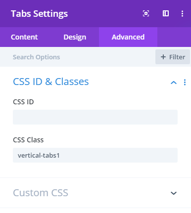
Note: When you copy the class, please make sure you do it right. As there’s no gap or space in between there characters. For example, vertical-tabs1 is not vertical – tabs 1.
Now, to finally achieve the above layout, there are 2 methods, which you can follow in different scenarios.
(a) When you want to use these layout on a single page: In this case, first copy the complete CSS of a particular vertical tabs layout, such as layout 1, from the given code below. And then, go to Page’s Advanced Setting, and paste the CSS inside the Custom CSS tab.
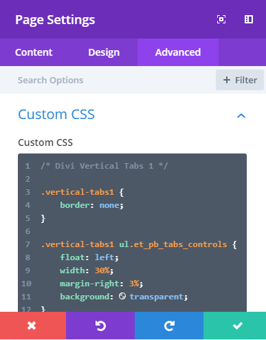
(b) When you want to create vertical tabs on more than a single page: Go to Divi Theme Options and paste the layout’s CSS inside the Custom CSS section of the general settings. And don’t forget to add layout’s Class name to the tabs module, whenever you want to create a vertical Divi tab on a page.

Thus, you’ve successfully created vertical tabs in the Divi theme.
Divi Vertical Tabs’ CSS
.vertical-tabs1 {
border: none;
}
.vertical-tabs1 ul.et_pb_tabs_controls {
float: left;
width: 30%;
margin-right: 3%;
background: transparent;
}
.vertical-tabs1 ul.et_pb_tabs_controls:after {
content: none;
}
.vertical-tabs1 .et_pb_tabs_controls li {
width: 100%;
border-right: none !important;
border-left: 5px solid transparent;
background: #f4f4f4;
}
.vertical-tabs1 .et_pb_tabs_controls li.et_pb_tab_active {
border-left: 5px solid #14C05D !important;
background: #ffffff;
}
.vertical-tabs1 .et_pb_tabs_controls li a {
padding: 40px;
}
.vertical-tabs1 .et_pb_tabs_controls li.et_pb_tab_active a {
color: #14C05D !important;
}
.vertical-tabs1 .et_pb_tab {
padding: 0;
}
.vertical-tabs1 .et_pb_tab_content {
display: flex;
flex-wrap: wrap;
}
@media(max-width:767px) {
.vertical-tabs1 ul.et_pb_tabs_controls {
width: 100%;
margin-bottom: 30px;
margin-right: 0;
}
.vertical-tabs1 .et_pb_tabs_controls li {
border-bottom: none;
}
.vertical-tabs1 .et_pb_tab {
padding: 0;
}
.vertical-tabs1 .et_pb_tab_content {
display: block;
}
}
/* Divi Vertical Tabs 2 */
.vertical-tabs2 {
border: none;
}
.vertical-tabs2 ul.et_pb_tabs_controls {
float: left;
width: 30%;
margin-right: 3%;
background: transparent;
}
.vertical-tabs2 ul.et_pb_tabs_controls:after {
content: none;
}
.vertical-tabs2 .et_pb_tabs_controls li {
width: 100%;
border-right: none;
border: 2px solid transparent;
background: #f4f4f4;
}
.vertical-tabs2 .et_pb_tabs_controls li.et_pb_tab_active {
border: 2px solid #FF5733;
background: #FF5733;
}
.vertical-tabs2 .et_pb_tabs_controls li.et_pb_tab_active:after {
top: 50%;
right: -42px;
border: solid transparent;
content: ” “;
position: absolute;
border-color: transparent;
border-left-color: #FF5733;
border-width: 20px;
margin-top: -20px;
}
.vertical-tabs2 .et_pb_tabs_controls li a {
padding: 24px;
}
.vertical-tabs2 .et_pb_tabs_controls li.et_pb_tab_active a {
color: #ffffff !important;
}
.vertical-tabs2 .et_pb_tab {
padding: 0;
}
.vertical-tabs2 .et_pb_tab_content {
display: flex;
flex-wrap: wrap;
}
@media(max-width:767px) {
.vertical-tabs2 ul.et_pb_tabs_controls {
width: 100%;
margin-bottom: 30px;
margin-right: 0;
}
.vertical-tabs2 .et_pb_tabs_controls li {
border-bottom: none;
}
.vertical-tabs2 .et_pb_tab {
padding: 0;
}
.vertical-tabs2 .et_pb_tab_content {
display: block;
}
}
/* Divi Vertical Tabs 3 */
.vertical-tabs3 {
border: none;
}
.vertical-tabs3 ul.et_pb_tabs_controls {
float: left;
width: 30%;
margin-right: 3%;
background: transparent;
}
.vertical-tabs3 ul.et_pb_tabs_controls:after {
content: none;
}
.vertical-tabs3 .et_pb_tabs_controls li {
width: 100%;
border-right: none;
background: rgba(244, 244, 244, 0.5);
margin-bottom: 10px;
}
.vertical-tabs3 .et_pb_tabs_controls li.et_pb_tab_active {
background: #ececec;
}
.vertical-tabs3 .et_pb_tabs_controls li a {
padding: 10px;
}
.vertical-tabs3 .et_pb_tabs_controls li.et_pb_tab_active a {
color: #3339ff !important;
}
.vertical-tabs3 .et_pb_tabs_controls li a:before {
font-family: ETmodules;
padding-right: 5px;
}
.vertical-tabs3 .et_pb_tabs_controls li:nth-child(1) a:before {
content: ‘\e104’;
}
.vertical-tabs3 .et_pb_tabs_controls li:nth-child(2) a:before {
content: ‘\e0e9’;
}
.vertical-tabs3 .et_pb_tabs_controls li:nth-child(3) a:before {
content: ‘\e109’;
}
.vertical-tabs3 .et_pb_tabs_controls li:nth-child(4) a:before {
content: ‘\e0ec’;
}
.vertical-tabs3 .et_pb_tab {
padding: 0;
}
.vertical-tabs3 .et_pb_tab_content {
background: #ececec;
display: flex;
flex-wrap: wrap;
padding: 20px;
}
@media(max-width:767px) {
.vertical-tabs3 ul.et_pb_tabs_controls {
width: 100%;
margin-bottom: 30px;
margin-right: 0;
}
.vertical-tabs3 .et_pb_tabs_controls li {
border-bottom: none;
}
.vertical-tabs3 .et_pb_tab {
padding: 0;
}
}
/* Divi Vertical Tabs 4 */
.vertical-tabs4 {
border: none;
}
.vertical-tabs4 ul.et_pb_tabs_controls {
float: right;
width: 30%;
margin-left: 3%;
background: transparent;
}
.vertical-tabs4 ul.et_pb_tabs_controls:after {
content: none;
}
.vertical-tabs4 .et_pb_tabs_controls li {
width: 100%;
border-right: none !important;
border-right: 5px solid transparent;
background: #f4f4f4;
}
.vertical-tabs4 .et_pb_tabs_controls li.et_pb_tab_active {
border-right: 5px solid #14C05D !important;
background: #ffffff;
}
.vertical-tabs4 .et_pb_tabs_controls li a {
padding: 40px;
}
.vertical-tabs4 .et_pb_tabs_controls li.et_pb_tab_active a {
color: #14C05D !important;
}
.vertical-tabs4 .et_pb_tab {
padding: 0;
}
.vertical-tabs4 .et_pb_tab_content {
display: flex;
flex-wrap: wrap;
}
@media(max-width:767px) {
.vertical-tabs4 ul.et_pb_tabs_controls {
width: 100%;
margin-bottom: 30px;
margin-right: 0;
}
.vertical-tabs4 .et_pb_tabs_controls li {
border-bottom: none;
}
.vertical-tabs4 .et_pb_tab {
padding: 0;
}
.vertical-tabs4 .et_pb_tab_content {
display: block;
}
}
/* Divi Vertical Tabs 5 */
.vertical-tabs5 {
border: none;
}
.vertical-tabs5 ul.et_pb_tabs_controls {
float: right;
width: 30%;
margin-left: 3%;
background: transparent;
}
.vertical-tabs5 ul.et_pb_tabs_controls:after {
content: none;
}
.vertical-tabs5 .et_pb_tabs_controls li {
width: 100%;
border-right: none;
border: 2px solid transparent;
background: #f4f4f4;
}
.vertical-tabs5 .et_pb_tabs_controls li.et_pb_tab_active {
border: 2px solid #FF5733;
background: #FF5733;
}
.vertical-tabs5 .et_pb_tabs_controls li.et_pb_tab_active:before {
top: 50%;
left: -42px;
border: solid transparent;
content: ” “;
position: absolute;
border-color: transparent;
border-right-color: #FF5733;
border-width: 20px;
margin-top: -20px;
}
.vertical-tabs5 .et_pb_tabs_controls li a {
padding: 24px;
}
.vertical-tabs5 .et_pb_tabs_controls li.et_pb_tab_active a {
color: #ffffff !important;
}
.vertical-tabs5 .et_pb_tab {
padding: 0;
}
.vertical-tabs5 .et_pb_tab_content {
display: flex;
flex-wrap: wrap;
}
@media(max-width:767px) {
.vertical-tabs5 ul.et_pb_tabs_controls {
width: 100%;
margin-bottom: 30px;
margin-right: 0;
}
.vertical-tabs5 .et_pb_tabs_controls li {
border-bottom: none;
}
.vertical-tabs5 .et_pb_tab {
padding: 0;
}
.vertical-tabs5 .et_pb_tab_content {
display: block;
}
}
/* Divi Vertical Tabs 6 */
.vertical-tabs6 {
border: none;
}
.vertical-tabs6 ul.et_pb_tabs_controls {
float: right;
width: 30%;
margin-left: 3%;
background: transparent;
}
.vertical-tabs6 ul.et_pb_tabs_controls:after {
content: none;
}
.vertical-tabs6 .et_pb_tabs_controls li {
width: 100%;
border-right: none;
background: rgba(244, 244, 244, 0.5);
margin-bottom: 10px;
}
.vertical-tabs6 .et_pb_tabs_controls li.et_pb_tab_active {
background: #ececec;
}
.vertical-tabs6 .et_pb_tabs_controls li a {
padding: 10px;
}
.vertical-tabs6 .et_pb_tabs_controls li.et_pb_tab_active a {
color: #3339ff !important;
}
.vertical-tabs6 .et_pb_tabs_controls li a:before {
font-family: ETmodules;
padding-right: 5px;
}
.vertical-tabs6 .et_pb_tabs_controls li:nth-child(1) a:before {
content: ‘\e104’;
}
.vertical-tabs6 .et_pb_tabs_controls li:nth-child(2) a:before {
content: ‘\e0e9’;
}
.vertical-tabs6 .et_pb_tabs_controls li:nth-child(3) a:before {
content: ‘\e109’;
}
.vertical-tabs6 .et_pb_tabs_controls li:nth-child(4) a:before {
content: ‘\e0ec’;
}
.vertical-tabs6 .et_pb_tab {
padding: 0;
}
.vertical-tabs6 .et_pb_tab_content {
background: #ececec;
display: flex;
flex-wrap: wrap;
padding: 20px;
}
@media(max-width:767px) {
.vertical-tabs6 ul.et_pb_tabs_controls {
width: 100%;
margin-bottom: 30px;
margin-right: 0;
}
.vertical-tabs6 .et_pb_tabs_controls li {
border-bottom: none;
}
.vertical-tabs6 .et_pb_tab {
padding: 0;
}
}
Creating Divi Vertical Tabs Using Plugin
To create vertical tabs in Divi using a plugin, we’re going to use Divi Plus. It’s a multipurpose premium Divi plugin that includes over 50+ modules containing our Vertical Tabs module as well. Apart from that, the plugin comes with 04 powerful Divi Extensions, multiple free Divi child themes, over 50+ templates and more than 200 design blocks. So, you can easily build your website in no time without evening using Divi Plus from scratch.
After installing Divi Plus plugin successfully, you need to activate the module. And then, follow the below steps to create vertical tabs using Divi Plus and its Vertical Tabs module.
Step 1 – Insert the Module
To design vertical tabs using Divi Plus, first, we need to insert the module. To do that, create a new page or edit an existing one. Then, insert a new Row, and in that, insert the DP Tabs module.
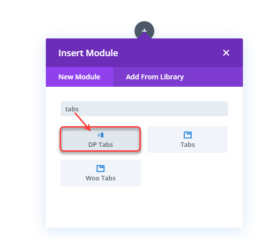
As soon as the module gets inserted on the page, it will display the tab primary settings.
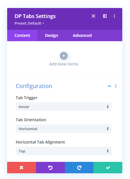
By using the above options, we’ll be able to create Divi vertical tabs. And for that, we need to add items for the tabs. The subsequent step will guide you on how to insert the tab items. But before that, we’ll change the default tabs orientation to vertical.
Step 2 – Tabs Orientation Change to Vertical
By default, the Divi Plus Vertical Tabs module creates tabs in the horizontal layout. Therefore, we need to change that and to do that, go to the Configuration→ Tab Orientation → Vertical.
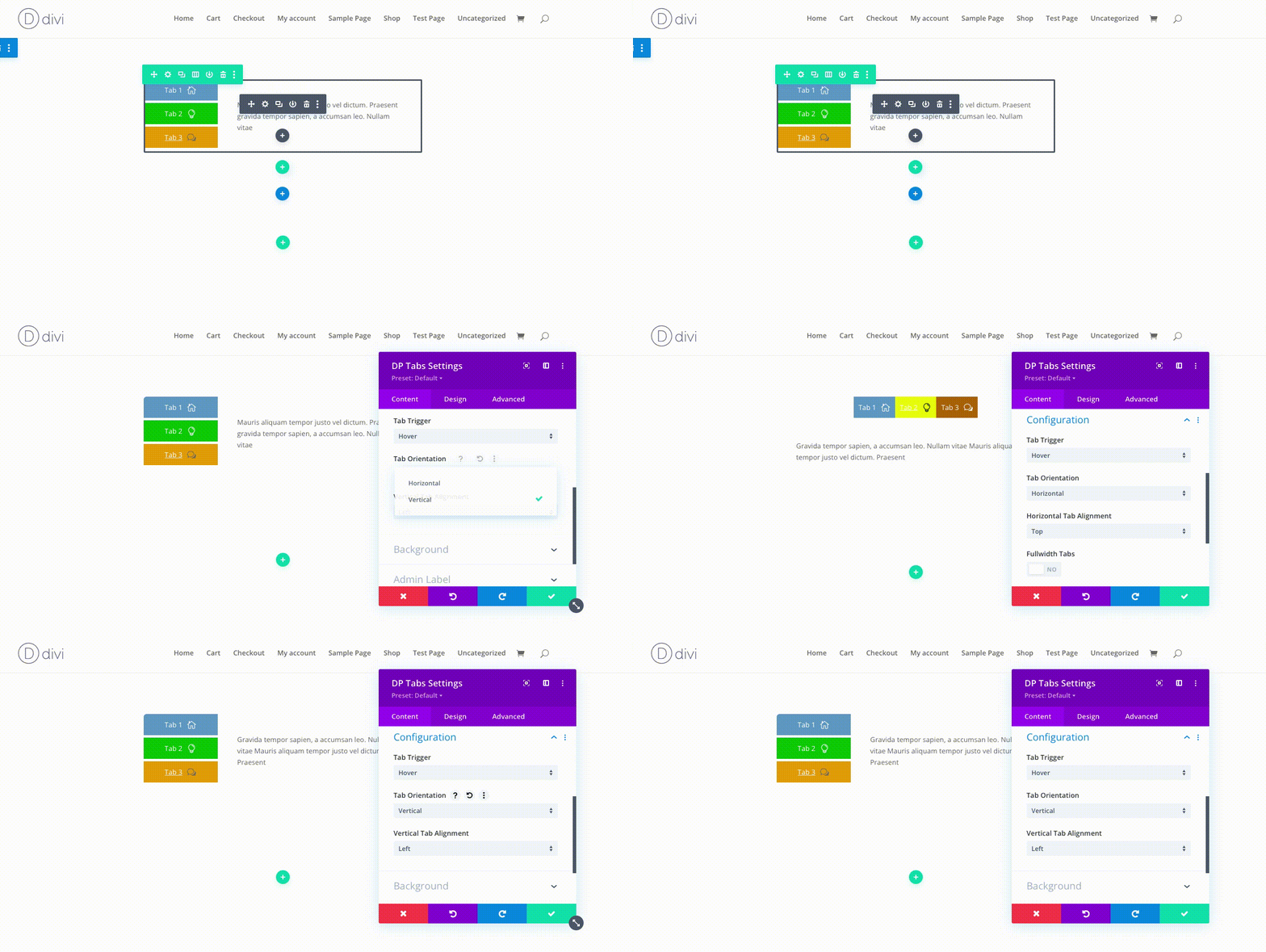
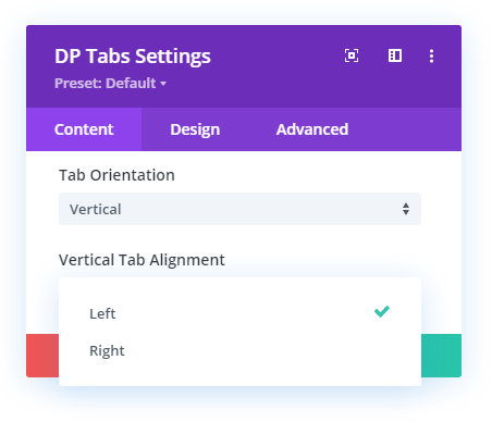
After changing the tabs orientation, you get an additional option to define where you want to align the vertical tabs. The available option allows you to change vertical tabs alignment to the Left and Right.
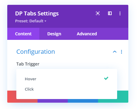
Furthermore, the module also includes the option to open tabs on different triggers. To define your tabs trigger type, you need to open the drop down menu Tab Trigger → select either Hover or Click.
In this way, you’ll be able to configure your vertical tabs in Divi more appropriately. And once you’ve configured it completely, add items to it.
Step 3 – Add Tab Items
After configuring our tabs module, to add items to it, you need to go to the Add New Items and click it.
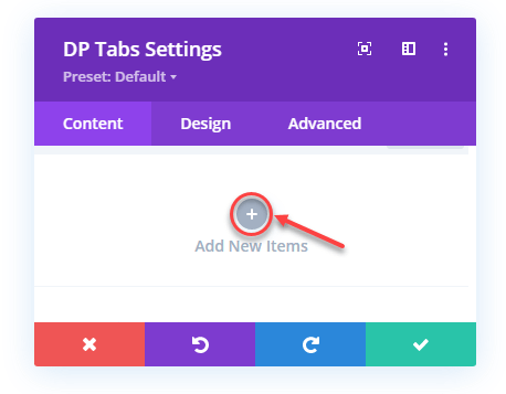
This will add an individual item to the tab with further settings opened for customizing it.
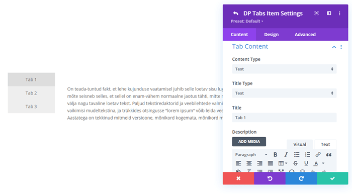
The settings available in the Content tab of the individual items are as follows,
Tab Content
The Tab Content settings available in the Content tab provides you with the options to define how and what kind of content you want to display in the tabs. It includes further options as follows,
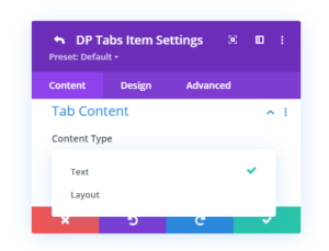
- Content Type – Whether you want to display Text or Layout in the tabs.
- Text Type – Here, you can select how you want to showcase tabs titles. It provides you with up to 5 options to do that. The options are Text, Text with Icon, Only Icon, Text with Image, and Only Image.
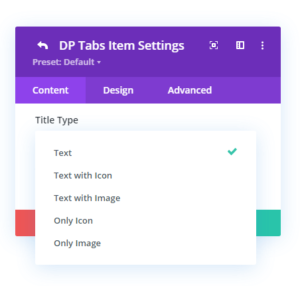
Upon your selection choice, it further opens the options to help you select the layout, define text, image and icon.
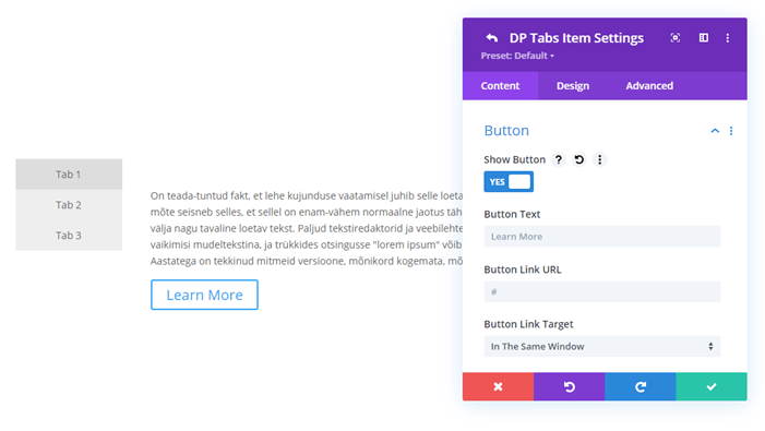
Button
After Tab Content settings, you get Button settings in the Content tab of the individual tab items settings. It allows you to display a CTA on your tabs under both Text and Layout content types.
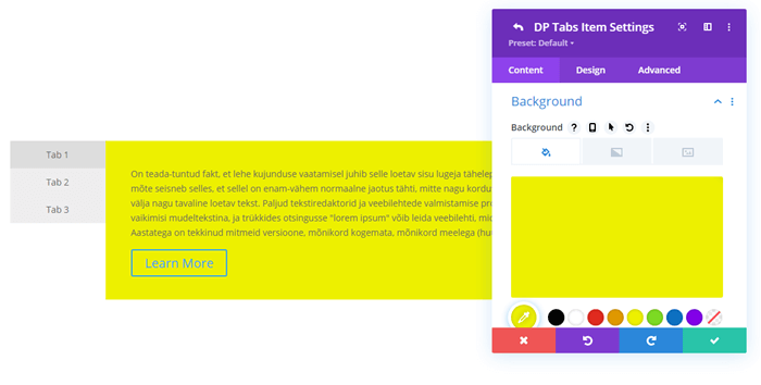
Background
The last setting available in the Content tab of an individual tab item is Background. Here, you can change the background of the tab’s content area with Color, Gradient and Image.
Step 4 – Individual Tab Items Design Customization
Above were the options to define tabs content type their functionality. But, in addition to that, you can optimize the look of your tabs using the Design tab. It includes multiple different options to enhance tabs appearance from different angles. The options are as follows,
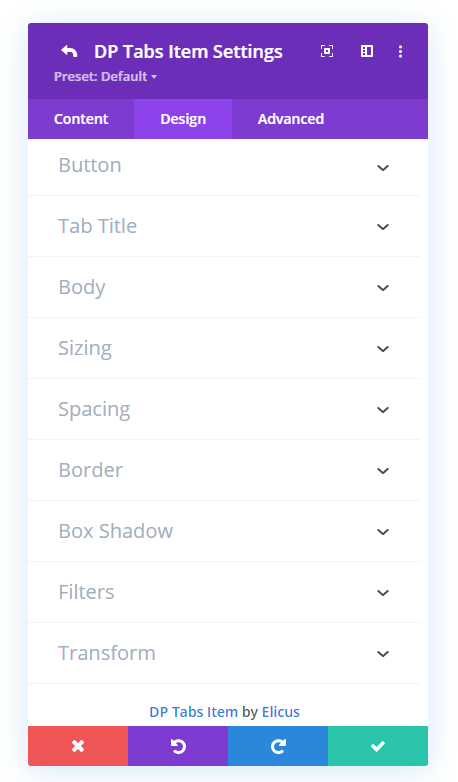
Using the above options, you can customize the look of almost every element of the tabs. You can apply custom button style, apply different text customizations to the tab title and body. Define spacing, size, border styles and much more.
Once you’re done customizing the look of your Divi tabs individual item, save changes, and it will bring you to the primary settings. Similarly, you can add more items to it. That’s it, you’ve successfully created vertical tabs in Divi.
If you want to explore the Vertical Tabs module in detail, then visit this post. And to inspire your vertical tabs design in Divi, check out the below examples.
Divi Vertical Tabs Example Created Using Divi Plus
Mauris aliquam tempor justo vel dictum. Praesent gravida tempor sapien, a accumsan leo. Nullam vitae porta sem. Cras vel condimentum massa. Quisque gravida, tellus non porta rutrum, mi lorem fermentum nunc, et auctor nisl tellus in lectus. Morbi scelerisque ex nulla, vel condimentum nisi tempor in. In odio nisl, dictum eget lectus ac, pellentesque scelerisque justo.
Aliquam morbi scelerisque ex nulla, vel condimentum nisi tempor in. Mauris aliquam tempor justo vel dictum. Praesent gravida tempor sapien, a accumsan leo. Nullam vitae porta sem. Cras vel condimentum massa. Quisque gravida, tellus non porta rutrum, mi lorem fermentum nunc, et auctor nisl tellus in lectus. Morbi scelerisque ex nulla, vel condimentum nisi tempor in. In odio nisl, dictum eget lectus ac, pellentesque scelerisque justo.
Praesent ut euismod quam. Mauris aliquam tempor justo vel dictum. Praesent gravida tempor sapien, a accumsan leo. Nullam vitae porta sem. Cras vel condimentum massa. Quisque gravida, tellus non porta rutrum, mi lorem fermentum nunc, et auctor nisl tellus in lectus. Morbi scelerisque ex nulla, vel condimentum nisi tempor in. In odio nisl, dictum eget lectus ac, pellentesque scelerisque justo.
Vel condimentum nisi tempor in. Mauris aliquam tempor justo vel dictum. Praesent gravida tempor sapien, a accumsan leo. Nullam vitae porta sem. Cras vel condimentum massa. Quisque gravida, tellus non porta rutrum, mi lorem fermentum nunc, et auctor nisl tellus in lectus. Morbi scelerisque ex nulla, vel condimentum nisi tempor in. In odio nisl, dictum eget lectus ac, pellentesque scelerisque justo.
Mauris aliquam tempor justo vel dictum. Praesent gravida tempor sapien, a accumsan leo. Nullam vitae porta sem. Cras vel condimentum massa. Quisque gravida, tellus non porta rutrum, mi lorem fermentum nunc, et auctor nisl tellus in lectus. Morbi scelerisque ex nulla, vel condimentum nisi tempor in. In odio nisl, dictum eget lectus ac, pellentesque scelerisque justo. Aliquam sagittis blandit nulla, vel venenatis lectus pellentesque at. Aliquam viverra lacus quis sapien sagittis posuere.
Aliquam morbi scelerisque ex nulla, vel condimentum nisi tempor in. Mauris aliquam tempor justo vel dictum. Praesent gravida tempor sapien, a accumsan leo. Nullam vitae porta sem. Cras vel condimentum massa. Quisque gravida, tellus non porta rutrum, mi lorem fermentum nunc, et auctor nisl tellus in lectus. Morbi scelerisque ex nulla, vel condimentum nisi tempor in. In odio nisl, dictum eget lectus ac, pellentesque scelerisque justo. Aliquam sagittis blandit nulla, vel venenatis lectus pellentesque at. Aliquam viverra.
Praesent ut euismod quam. Mauris aliquam tempor justo vel dictum. Praesent gravida tempor sapien, a accumsan leo. Nullam vitae porta sem. Cras vel condimentum massa. Quisque gravida, tellus non porta rutrum, mi lorem fermentum nunc, et auctor nisl tellus in lectus. Morbi scelerisque ex nulla, vel condimentum nisi tempor in. In odio nisl, dictum eget lectus ac, pellentesque scelerisque justo. Aliquam sagittis blandit nulla, vel venenatis lectus pellentesque at. Aliquam viverra lacus quis sapien sagittis posuere.
Vel condimentum nisi tempor in. Mauris aliquam tempor justo vel dictum. Praesent gravida tempor sapien, a accumsan leo. Nullam vitae porta sem. Cras vel condimentum massa. Quisque gravida, tellus non porta rutrum, mi lorem fermentum nunc, et auctor nisl tellus in lectus. Morbi scelerisque ex nulla, vel condimentum nisi tempor in. In odio nisl, dictum eget lectus ac, pellentesque scelerisque justo. Aliquam sagittis blandit nulla, vel venenatis lectus pellentesque at. Aliquam viverra lacus quis sapien sagittis posuere.
Ending Thoughts
In this blog post, we’ve shown you how to create vertical Divi tabs positioning both right and left sides using the tabs module and applying some custom CSS.
In addition to that, we’ve also looked at the way that allows us to create vertical tabs using the Vertical Tabs module of the Divi Plus plugin. And not just simple vertical tabs but advanced one.
So, if you want to create vertical tabs that should possess some advanced functionality, it’s good to get Divi Plus. Moreover, with the vertical tabs module, you’ll also get other modules and benefits that would allow you to power your Divi website even better.
If you liked this blog post and find it useful, then share it to help other fellow users who want to create Divi vertical tabs.




When I add the code for vertical tabs, I can no longer set an ID and link to individual tabs. Custom CSS is there but not CSS ID & Classes.
Any workaround so I can link to individual tabs?
Thanks
Hi Karan, I’m having the same issue with the text. It is displayed wrong, can you help me? thank you!
Is there a way to make the content appear on tab hover instead of on click?
Hi,
Yes, the content could appear on tab hover with the Divi Plus tabs module. For more info please visit https://diviplus.io/divi-vertical-tabs/
Thanks.
Thanks for the option without plug-in. It works great without any issues straight away. I wonder if there is a way to make the vertical tabs, say vertical-tabs3 version with tabs on left, sticky, but have the tab content on right be able to scroll down and as you scroll down the tabs on left stick in place so you can still select a different tab even though you moved further down the page. I know tabs don’t usually have lots of content but in my case, some do.
Hi Karan,
Nice code! This setup works great.
I have one thing that I would like to be able to use. I would like to give each tab a CSS ID, so I can use anchors on pages and within tabs to jump to another tab. How can I jump to another tab within this tab block?
Hope to hear from you soon, thank you.
Hello,
is it possible to change background color in active tabs? e.g. first tab background color is red, second tab has blue background color.
Thank you.
This is excellent! Thank you, I’ve been looking for this solution. I was a little thrown when I saw the content below the tabs but realized that it is only like that in the visual builder. Once you exit, everything looks great. THANK YOU!
Hi Karan,
Do you have any suggestions on how to make a specific tab Active? For instance how can I designate tab 2 as the default open tab? I know there are tricks to do this for accordions but I’m not aware of anything for tabs.
Thanks
Tim
Thank you for this CSS code! How can the inactive tab font color be changed?
Hi Kenneth,
You could change the inactive tab color from the module’s “Tab Text” setting in the design tab.
Thanks.
The formatting of my text is acting weird when I have tabs vertically. New lines are often appearing “up and to the right” rather than as normal. Any ideas what is causing this problem?
Hi Dallas,
Need the URL to find the actual issue.
Thanks.
The content in the tabs are all top-aligned, rather than aligned next to the tab. How do we correct that?
Hi John,
It’s not possible only through CSS.
Thanks.
How do you create the fancy titles to posts you have in the tabs?
Hi Todd,
The headings are created using the Fancy Heading module of Divi Plus. More about the module can be seen here: https://diviplus.io/divi-fancy-heading/
Hello,
Thanks for the examples, do you have an example of vertical tabs panel contains (nested )horizontal tabs and with accordion style. so that it can be easily link to menu bar.
your help would be appreciated in advance.
Hello, I am using Divi vertical tabs layout 3 as shown in your examples here and it is working great! Thank you so much for taking the time to share the examples here.
I have a question… How can I add additional text above the tab ‘buttons’ just on the left hand side and push the tabs down below this text.
I have been trying jQuery ‘prepend’ but it does not seem to be working. Any guidance or support you could give me on this would be greatly appreciated. Let me know.
Thanks!
Hi, its so helpfull for mi, i using vertical-tabs3. I have a problem, i put there many tabs with some iframe that have an url who call some reports in another server. The problem is that all de reports upload simultanealy and the charge speed of de page take about 40”. Is there any way to call one by one when de user click in the tab? The site is in develope state.
These worked great! I have one question – I am using iframes to display other pages from the same domain. I am having the issue of content being cut off at the end. Does anybody know how to fix this?
And sorry, that’s now how the tabs works in mobile, either. That said, is there any way to show the content right under the tab on mobile and not all the way at the end of the tab list?
Hi – love it! However, it is hard for the user on mobile as the content comes AFTER all of the tabs content. Anyway for the content to low under each tab on mobile? So, essentially, it works like the regular horizontal tabs module on mobile?
This is fantastic. Thank you.
I have one issue, though. I’ve used vertical-tabs2 and I feel it doesn’t work very well on mobile as the tabs take up most of the height and it’s difficult to see the info below. What work around would be appropriate for that?
Cheer, Alex
Thanks Karan,
I can see that the problem happens when I am in the visual builder. When I exit the visual builder everything is allright. You know what could be the reason?
Thank you
Best regards
Hi Ignacio,
Please clear your cache or try page reload.
Thanks,
Karan
Hello Karan,
thank you very much for your CSS. I am having same issue as others, I am having the content of the tab on the bottom of the tabs and not in the side centered:
https://malina.es/?page_id=229907&et_fb=1&PageSpeed=off
Thank you
Best regards
Hi Ignacio,
I can see the content is on the sides not on the bottom, Please recheck.
Thanks,
Karan
I think I resolved, in the builder, it is below but in the live page it looks ok.
I have the same problem, the text it is showed below instead of on the side.
Hello, I saw this is an older post but wondering how the issue where the “text at the bottom of tabs and not on side” was fixed?
I am also having the same problem and have run out of ideas to fix it :- (
My website isn’t live yet but I can send a screenshot of the table/tabs if needed?
Hi Caitlin, need the URL to find the actual issue.
Thanks so much for this.
I’m using vertical-tabs2 and it works perfectly. I have managed to change colors and everything works perfectly the way I want it.
The only thing I’d like to ask is how do you let the content of a specific tab point directly to the arrow when clicked. As it is now, all the content stays at the top but for-example, if you have 5 tabs, how to do let the content of the tab5 point directly to the content of the 5th tab.
Thank you and any help would be appreciated
I’m having same problem with text at the bottom of tabs and not on side
Hi Drew,
Could you please share the URL where you have issues?
Thanks so much for this.
I just want to change the background colors of active and inactive tabs on vertical tabs 2. I tried to change them but i always getting the red and light gray.
what can i do?
Hi Leonel,
The background colors of the tabs controlled with CSS.
Please replace your Color code in the below-given CSS.
.vertical-tabs2 .et_pb_tabs_controls li {
width: 100%;
border-right: none;
border: 2px solid transparent;
background: #f4f4f4;
}
.vertical-tabs2 .et_pb_tabs_controls li.et_pb_tab_active {
border: 2px solid #FF5733;
background: #FF5733;
}
Hi Karan, I’m having the same issue. The text is displayed below the tabs rather than along side them. Can you help? Thanks!
Hi Adam,
Could you please share the URL where you have issues?
Hi Karan,
This has worked great for me, im using vertical-tabs3. I haveone issue i hope you can help me with?
Im looking at using some custom icons instead of the ETA icon fonts. Which i did by doing this to the CSS code
.vertical-tabs3 .et_pb_tabs_controls li:nth-child(4) a:before {
content: url(‘https://golfpricecompare.com/wp-content/uploads/2020/07/Golf-Club-Icon-e1595245896984.jpg’)
}
This did the job, but im struggling to get the new custom icon and the text to remain middle aligned. The icon is bigger than the text but this is how i want it.
A link to the site is here https://golfpricecompare.com
Click the menu item “Golf Products”
Any help with this would be greatly appreciated. Thanks
Hi Ben,
Add below CSS snippet.
.vertical-tabs3 .et_pb_tabs_controls li a {
display: flex;
align-items: center;
}
Thanks for sharing Karen. I have the same issue with the content of each tab going below instead of the side.
Could you please share the URL?
Hi, thanks for this. I’m having issues with the text as it goes below the tabs (not beside it). Can you recommend a way to fix this? Cheers 🙂
Hi Aithne,
Could you please share the URL where you have issues?
It doesn’t works. It is copied, pasted, and nothing happens. It seems to me that something is not finished explaining because what appears in the screenshot CSS Id Classes (vertical-tabs 1) is not what appears to that screen when you copy the code (/ * Divi Vertical Tabs 1 * / .vertical-tabs1 {bord …)
You have mentioned (vertical-tabs 1). Did you use that space before the number 1 in the CSS class name? If yes, it will be vertical-tabs1 (without space between tabs and 1).
You could refer to this image https://diviextended.com/wp-content/uploads/2020/04/vertical-tabs-layout-css-e1585901284356.png
Hello Karan and thanks A LOT for this !! Love it !
I’m testing it on a site right now, but I encountered a problem and can’t figured out a solution.
Whenever I write some text (or copy paste it) in the Divi tabs settings visual editor, I can’t create line breaks between sentences.
If you can take a look here : https://150910demo.ovh/spells-2/ (password: jdr). You can see the problem in the first tab titled “tab test”.)
I tried some basic horizontal tabs (without the CSS you so gently share) and it works fine (you can see it in the vertical tab just below the first one)
So I’m wondering what in the CSS can cause something like this ? Maybe I did something wrong by touching it a little to look like I wanted…
I’m so sorry to bother you with that but I’m stuck. :/
Have a great day !
Claire
If you’re using the custom CSS mentioned above, then make sure you use the HTML tags properly. As there is no problem with the CSS. I hope this would work.