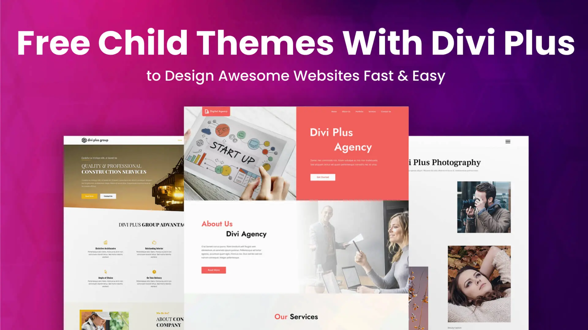
With Divi Plus Starter Templates, Divi designers are already creating awesome landing pages for their personal and client’s websites. And now, with Divi Plus free divi child themes, they can get the best out of the best.
The latest design addition to the Divi Plus plugin will allow you to easily create Divi websites with predesigned pages having Divi modules powered by the Divi Plus plugin. There is no need for you to manually add Divi Plus modules to the page and customize them to get your desired Divi portfolio layout, blog layout, and much more. Child themes by Divi Plus will take care of everything without having you spend too much time.
If you’re new to Divi designing and don’t know what’s Divi Plus, then let’s find out that first.
What’s Divi Plus & How It Can Help You Design Better Divi Websites?
Divi Plus is a premium multipurpose Divi plugin. It includes multiple modules and design options to help you build websites with enhanced functionality and performance compared to Divi’s native modules and other options. Using this plugin and its modules and Divi design options, you can build simple websites to complex ones in no time.
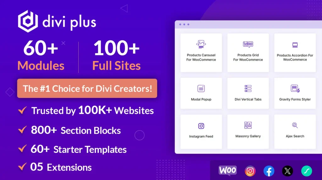
It includes over 50+ Divi modules, 04 Extensions, around 40+ starter templates and 200+ pre-built Divi sections. That an advanced user or a beginner one can easily use to bring the best web design combination using the Divi theme. Each module and extension comes with many different options and features that you can customize and bring something new. More important, each module & extension has been coded in a way that doesn’t load many scripts when they are getting in use. So, there will be no bloating or affecting your web page load time. Plus, modules and extensions only call for the script when they are on the page.
Starter templates and pre-built Divi sections focus on different business niches and web design areas that come in day to day use. So, you can quickly and efficiently prepare the site, whether in times of high demand or not.
This is what Divi Plus was previously providing to its existing users. But now it has taken a new step to make Divi designing better and efficient. Now, along with these features and design options, you’ll also get Divi Plus Divi Child Themes when you get Divi Plus.
What are they? Let’s find out.
What Are Divi Plus Child Themes?
Divi Plus child themes are Divi child themes made for different industries with modules of Divi Plus. Meaning, now you don’t even have to manually add Divi Plus modules on a page to create a custom design out of them. Instead, you can use these Divi Plus child themes based on your business domain, and simply enable the associated modules.
And voila, your website is ready to go live from a one-page website to multiple pages Divi Plus powered website — just don’t forget to add your content. 😉

With these pre-built Divi Plus themes, you don’t have to go for different-different Divi 3rd party plugins and child themes to bring together a single business website. Divi Plus has everything you need to create a business website or different business websites.
Let’s Take a Look at Each Divi Plus Child Themes
Currently, Divi Plus has 7 child themes designed for different industries; let’s have a quick look at each of them.
(1) Divi Plus Agency Child Theme
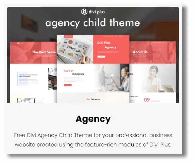
It’s a 5 pages Divi child theme with other portfolio and services pages created using Divi Plus. Modules used to create those pages are advanced button, logo slider, testimonial grid and more on the home page. A spacious child theme with elegant room for fonts, images and different Divi design sections. The header is divided into two separate parts. One with logo and the other with menu items per the 50-50 hero space. Moreover, when scrolling the page, it gets sticky and becomes whole.
Each page starts with a vast hero space having text on it and an image in the background with a light color overlay. Plus, the About us page contains a beautiful wide section to add agency info after the inner page header. Furthermore, it also includes number counter and other content sections to show the agency’s history & mission.
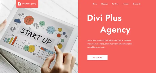
In addition to that, it also comes with a team slider module to display staff members. And the headings were created using the dual-colour heading option.
The Portfolio page showcases projects with a filterable bar, and the Services page allows you to display services in a zigzag manner with content & images. Contact us page includes a beautiful contact form with all the fields and other contact information such as email, contact number, address and social icons. Furthermore, the footer of the Divi Plus Agency child theme is vivid and nicely showcases all the elements. It consists of social icons, agency logos and more useful elements.
(2) Divi Plus Construction Child Theme
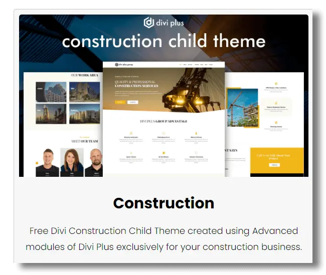
Divi Plus Construction child theme is a 7 primary page child theme with other services page created using Divi Plus modules. It includes a non-sticky header with all the menu items nicely placed. The Homepage starts with a wide hero space having dual CTAs. Then comes the features section with blurbs in multiple columns and color overlay. You can display different projects images, clients logo on a logo carousel with number counters.
Underneath that, add work areas with images and text having slide and zoom out effects. Show staff members on a team slider.
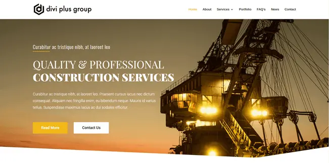
The About us page starts with a short page header, and the content section has fancy heading effects. It includes a team slider, a world map with hotspots, and a timeline to show how your company became a thing.
The primary Services page includes an image in the center with surroundings occupied by blurbs. Secondary services pages start just like the about us page; they have a short inner page header with breadcrumbs, a content section, blurbs with hover effect, round number counters and a team slider. And the Portfolio page includes a masonry gallery and images being opened in a lightbox.
Divi Plus Construction child theme also includes FAQ page, News page as blog area and a contact page. Moreover, the footer consists of testimonial sliders, CTAs, logo and menu items.
(3) Divi Plus Photography Child Theme
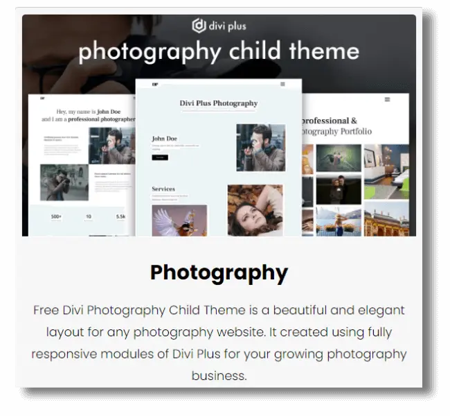
The Divi Plus Photography child theme is a 5 primary-page child theme with menu items appearing as a cover overlay when clicking the hamburger icon. The design is minimalist with all the essential elements. Content and images on the homepage slide upward when scrolling. It includes multiple CTAs and an image accordion at the bottom of the page to display different photography examples.
The About us page includes big headings, images and content areas with CTA and team slider. On the Portfolio page, you can display images in a Divi masonry gallery. Furthermore, the Services page uses a flip box to show different services. In addition to these, the Contact Us page includes an excellent contact form with a black and white combination with a background image in the section.
The footer menu is in the three-row and three-column format with logo, contact info, social icon and copyright text.
(4) Divi Plus Restaurant Child Theme
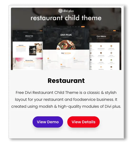
An exquisite Divi theme to set up your restaurant’s online presence with Divi Plus modules quickly and effortlessly. Divi Plus Restaurant child theme is a ready-to-go 6 pages modern Divi theme with a beautiful sticky header and a CTA on it linking to the reservation page. It allows guests to book a table at your restaurant efficiently using the booking form containing fields to receive all the essential details of the guest like Name, No. of Guests, Time Slot and more.
More Details
The Homepage starts with a wide hero space giving extra clear room to showcase your brand and its beautiful ambience. After that, you can display your services using icon and content together. Then you could show your menus that are made using the Divi Plus Pricing module that allows you to display food thumbnail with title, price, ingredients and more. It also includes sections to display gallery images, team members (Chef, Cooks, and more) on a slider, business hours and guests testimonials created using the Testimonial Slider module.
The About Us page has a slick start with a wide inner page header that perfectly suit the transparent header. It includes different content sections to share your restaurant’s story with beautiful images and number counters. The Menu page includes multiple menu items already placed nicely to help you get started quickly.
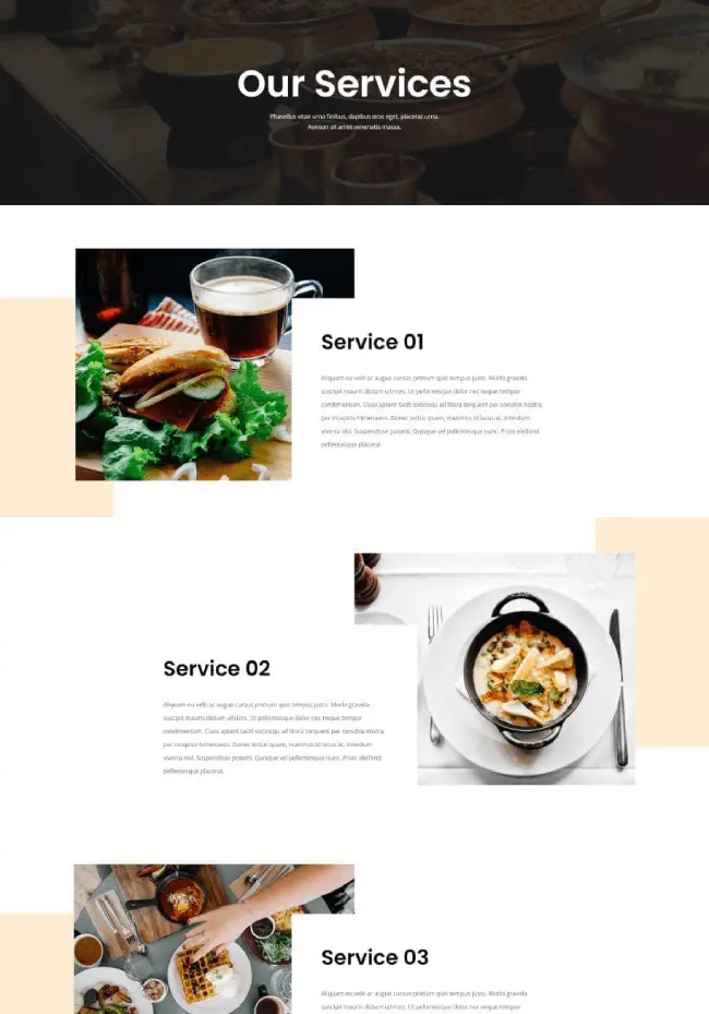
With the Services page, you can beautifully display all the services available at the restaurant with images, big fonts and content to explain them better. The Contact Us page includes a helpful contact form with essential fields, social icons and blocks to add more information about the restaurant like Phone number, address, email, and more.
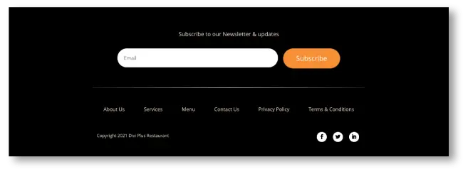
In addition to these, the footer area is wide, just like the hero space providing adequate space to feature a subscribers form, menu times, copyright text and social icons to make the most out of your bottom area of the Divi restaurant website.
(5) Divi Plus Gaming Child Theme
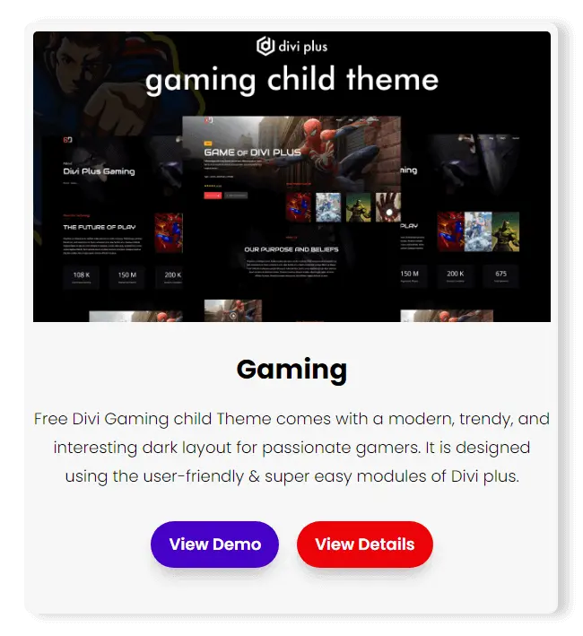
The era of today’s time for sports has seen a drastic change. Today, playing games and having fun isn’t merely limited to the real world. But it has grown its wings to the virtual world. Or I’d say more than the real world. And in this era of virtual gaming, if you run a business that provides game lovers with their favorite virtual world. Then Divi Plus Gaming child theme is the perfect choice to create a gaming website with a dark user interface.
More Details
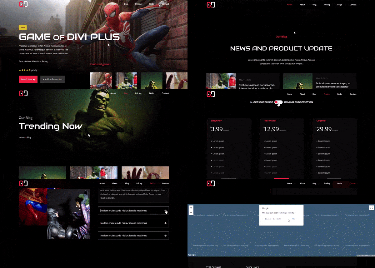
The Divi Plus Gaming child theme allows you to do a lot with its 6 pre-built modern pages. Its Homepage features a wide hero space that fills the details about different new games available with dual CTAs and an image accordion. With that, it also includes different content sections to feature games and share the latest news about them with a blog section.
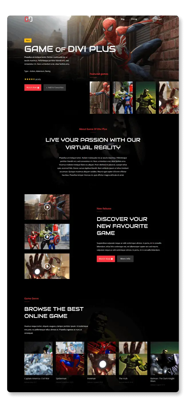
The About page starts with a custom inner page header with an image background and breadcrumbs on it. Then different content sections and image accordions follow it with number counters, video block, logo, and team slider created using Divi Plus Logo Slider and Team Slider module. The blog page has the same inner page start with blog posts spread across the page in 3 column grid formation displaying title and meta description.
The Pricing page available in this Divi child theme provides you with an interactive pricing table to support your vision of a subscription-based gaming website. It’s created using the Divi Content Toggle module that allows you to create different content sections with a Divi switch. In addition to these, the pricing page also includes price lists with various game’s thumbnail and their details.
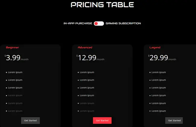
Once you create the website, people will likely reach out to you with different queries. Therefore, this Divi child theme also includes an FAQ page with faqs placed in a zigzag manner to provide users with all the answers beforehand. Plus, a Contact page nicely designed with all the essential contact elements and a contact form. Using these areas, you could easily help your customers and website visitors without any extra effort.

Last but not least, the header and footer layout allow the website visitor to navigate the site easily. Each element: links, menu items, and subscribers field are nicely placed, which doesn’t create any design non-uniformity. The header is transparent, whereas the footer follows the child theme’s dark UX footprint with a solid dark background.
(6) Divi Plus Medical Child Theme
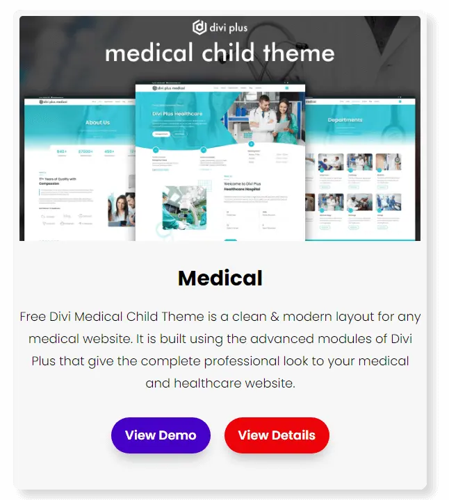
Another free Divi child theme available with the Divi Plus plugin is a medical child theme. Using this particular free child theme, you could create a comprehensive website for different departments, for example, clinics and hospitals with different specialities. It’s a primary six-page and multiple sub page medical child theme available for free created using 13 modules of Divi Plus with all the necessary elements to help you get started quickly with your medical website.
Homepage
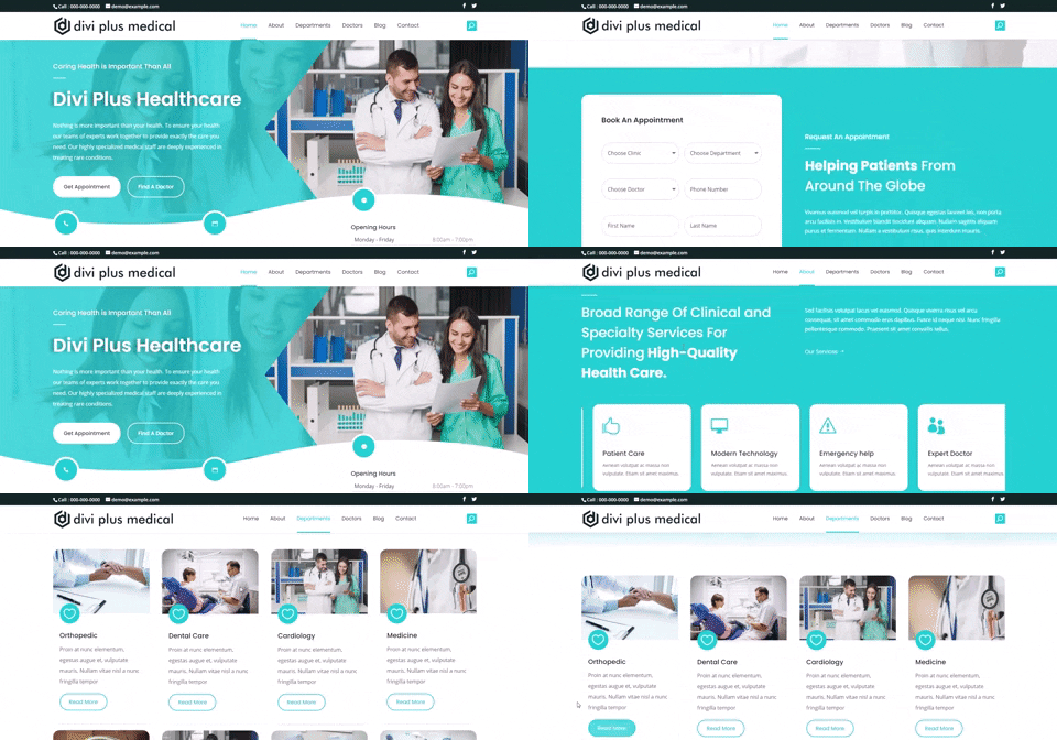
Having an attractive & distraction-free homepage is a crucial part of the website. And the same is applied to a medical website, or you could say simplicity plus usability has more value over design & creativity in medical websites. Therefore, keeping this thing in mind, the Homepage of Divi Plus Medical free child theme is designed to catch visitors attention by providing them elements to open necessary areas with no effort.
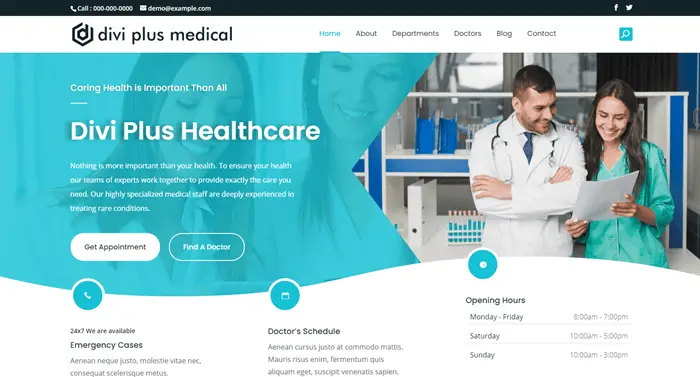
For instance, the Hero space contains dual CTAs created using the Advanced Button module to book an appointment and look for a doctor. Plus, Business hours and other contact details to let the patient know when the facility is open and how they can reach there. Following those, it includes number counters to show expertise. It also got the sections to display specialities, practices and doctors staff on blurbs, carousel and team slider.
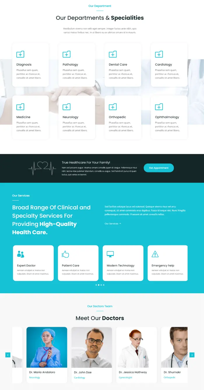
To build trust, the lower part of the homepage includes a testimonial slider with star rating schema enabled. To help the users easily book an appointment, it includes a highly functional contact form. And to increase user session, the bottom before footer area includes post sliders.
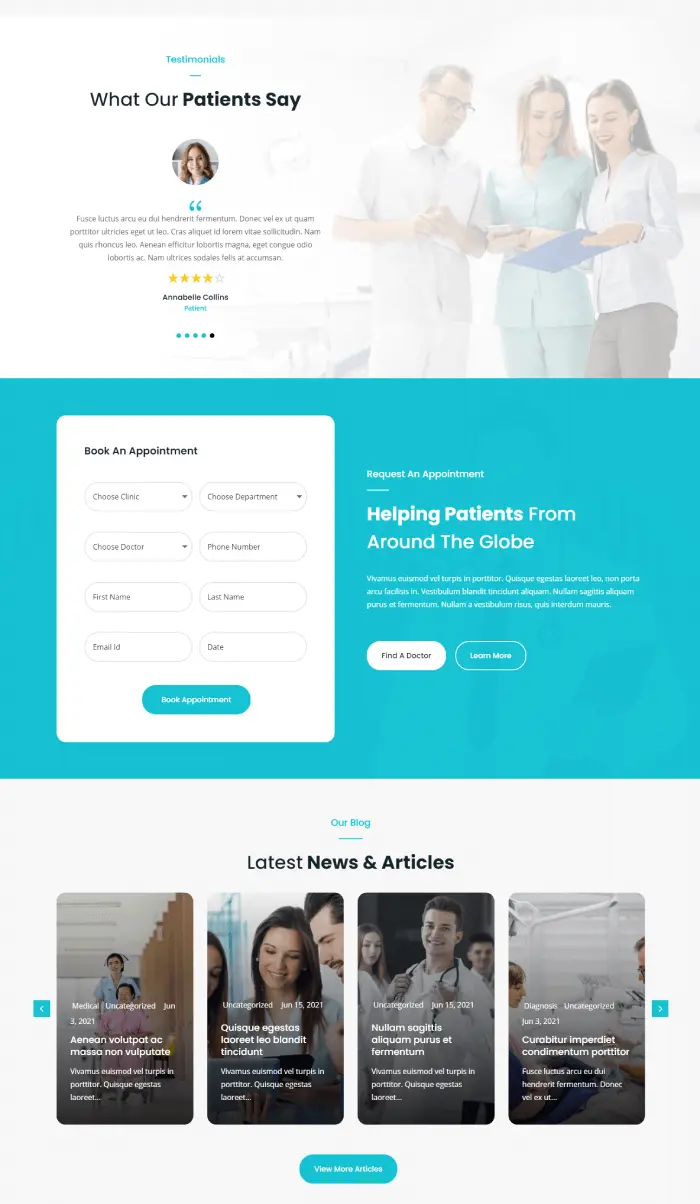
About Page
The About page includes everything to clearly showcase how your medical institute got in shape. It starts with a subtle inner page header containing title, description, breadcrumbs, and years of experience and other crucial details in numbers. Then, you’ve got different content sections with images and CTAs. Image slider, team slider and testimonial slider to put impression, show expertise and build trust.
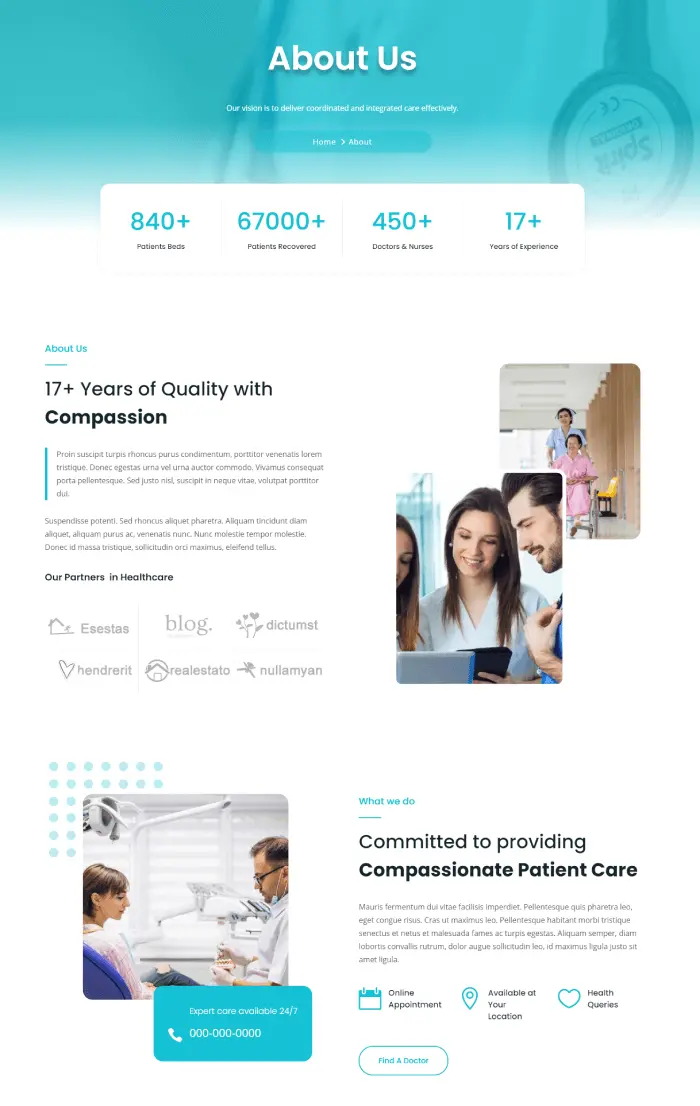
Departments and Doctors Page
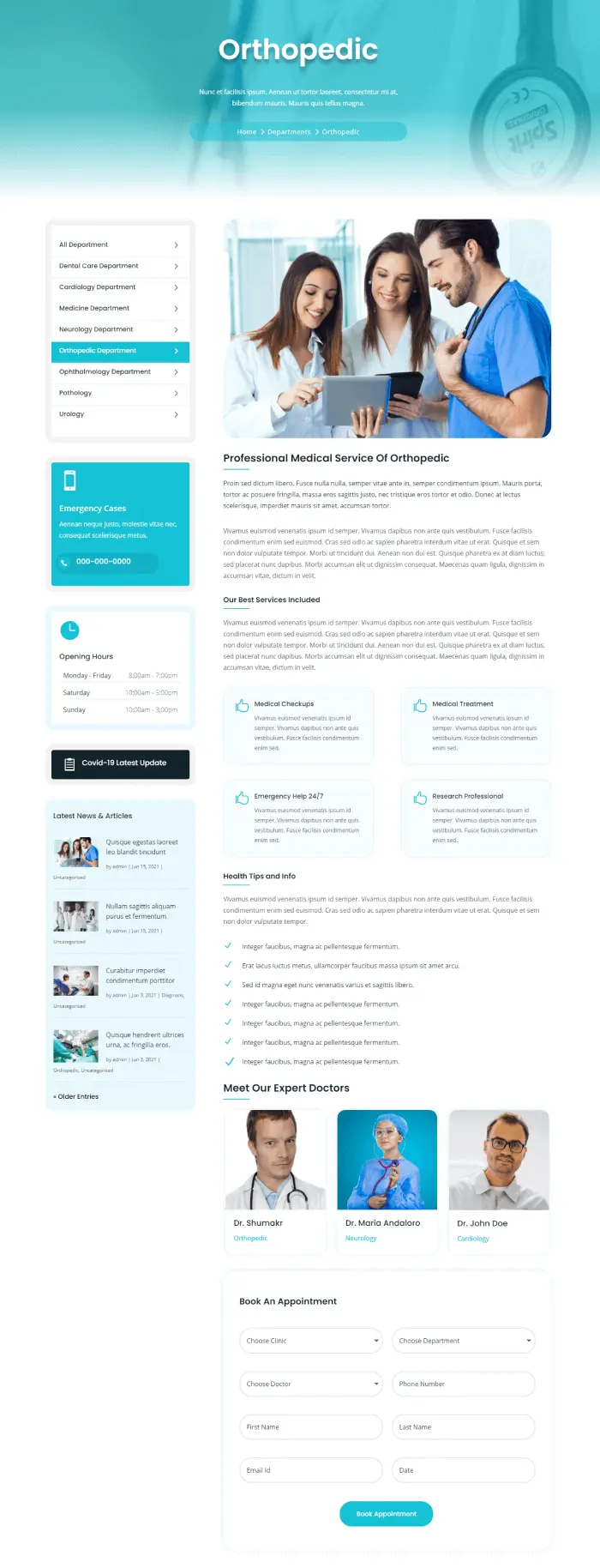
Departments and doctors page starts the same as About but doesn’t include numbers section at the inner page header. The department’s page includes blurbs with icon and image together to display different departments. Plus, a read more button to open a particular department page. The single department page includes a sidebar with other departments’ links, contact information, opening hours and a small area to add a badge for important updates, for example, COVID-19 related health updates. The content area has blurbs, a team slider and an appointment form.
The Doctors page include all the doctors in a grid format with thumbnails, title, designation, and a read more link. When you open the single doctor page, you’ll see a sophisticated doctor’s profile in the sidebar with an image, designation, contact info, CTA, and availability. The primary content area display more about the doctor, such as speciality, education, degrees and more with text and progress bar for skills.

Blog, Contact, Header and Footers
The Blog page has the same start as the department page, and all the blog posts are lying in a 3 column grid formation with title, meta description, excerpt and featured image.

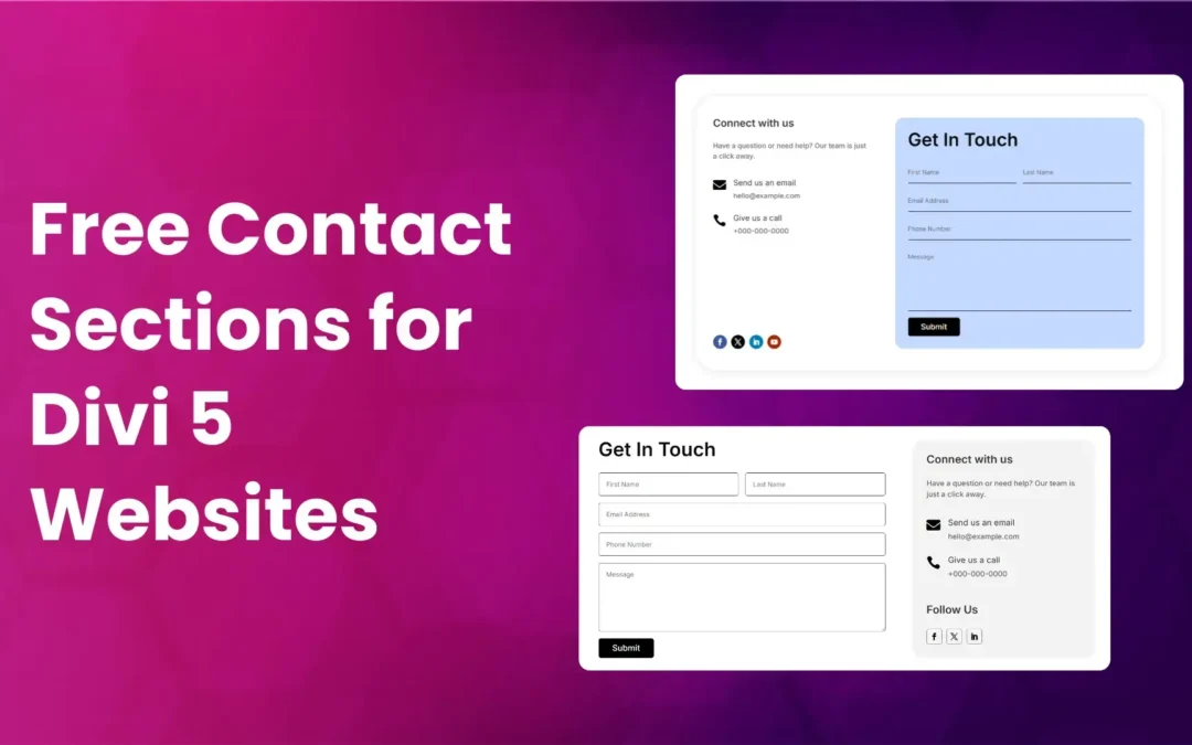
The final primary page in this free Divi child theme is the Contact that also starts the same as other pages except for the homepage. It includes a contact form with fields in the left and contact information in the right having social icons at the bottom of the information and a nice image at the top.
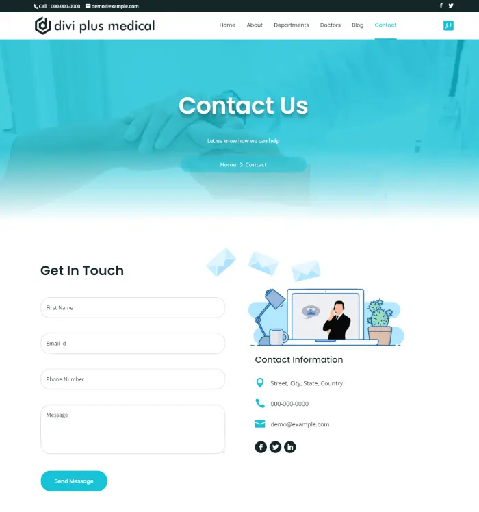
In addition to all of the above, it also includes a nicely created header with all the elements organized well. It includes a search icon and tops with a secondary header containing telephone numbers, emails and social media icons. Furthermore, to match the theme look and feel and effortlessly fit all the useful quick links and other elements at the bottom, it comes with a well-designed Footer. Logo and subscribers form in the left and contact information with social icons in the tight. In addition to these, it also includes copyright text and links to T&C and privacy policy pages.
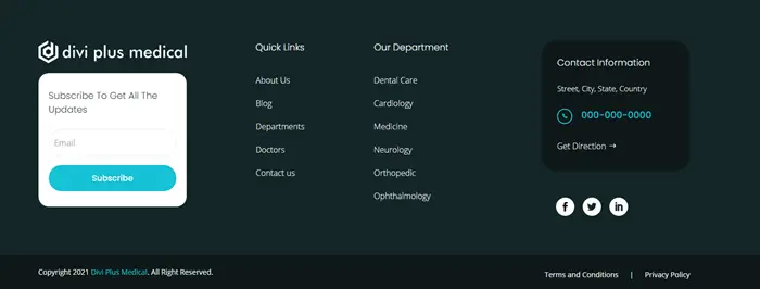
Overall, the Divi Plus Medical child theme is a complete free Divi child theme with necessary pages and elements to cover entire areas of a medical website.
(7) Divi Plus Lifecoach Child Theme
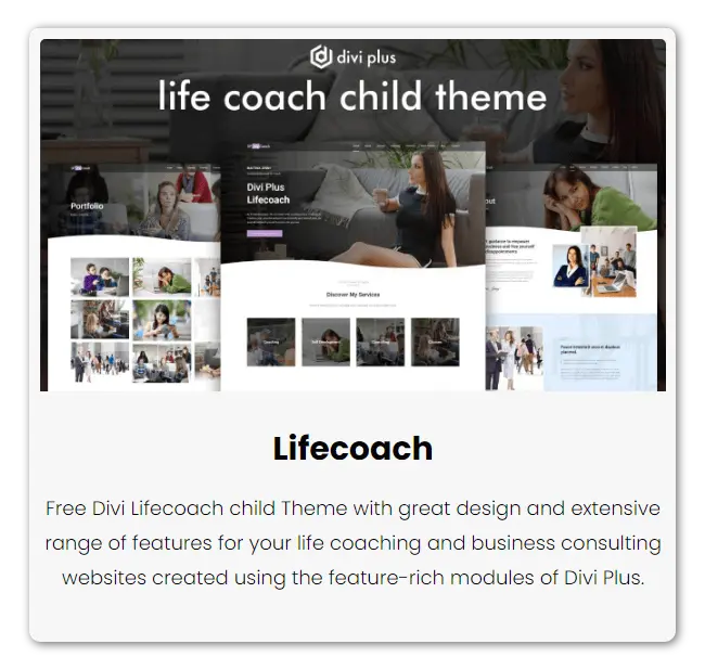
For Divi Plus users, another free Divi child theme that they can utilize in their projects is Lifecoach. If you’re a lifecoach or building a website for someone in the coaching business, you can hassle-free go for this child theme. It’s an 8 page Divi child theme that consists of all the required web elements one can easily optimize for their self-development coaching site. Elements like organized CTAs, number counters, testimonials, blog post sliders and more.
Homepage
The homepage of the lifecoach child theme luxuriously starts with a wide hero space enabling you to either highlight your brand identity or showcase yourself in the best possible way. Plus, to quickly let people jump into your services, it also includes a nice eye-catching CTA. The hero space consists of bottom curves to match the latest design trends — even it gives an extra touch to the site.
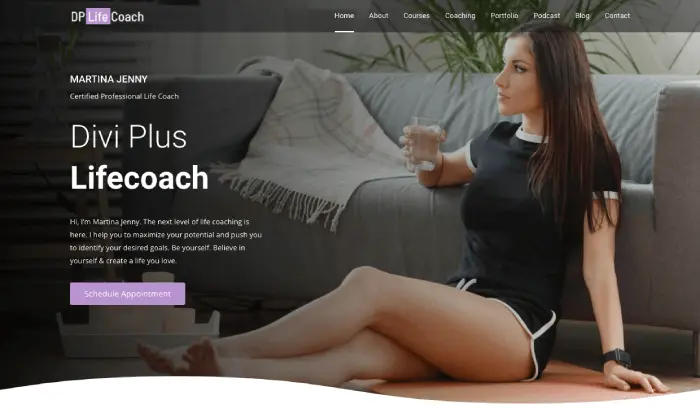
On moving downwards on the homepage, you get a services section consisting of beautiful blurbs that you can use to highlight your coaching services. When users hover on them, each blurb displays an appointment booking button and more information about the service. Thus, it makes it easy for customers to differentiate and select the required one. After this, you get the section to highlight your experience; if you’re offering coaching services individually, all you need to do is replace the content with yours. The section allows you to add text, a number—for years of experience, and a nice photo of yourself.

If you’re going to offer individual courses, then the homepage allows you to highlight that part as well. You can list your courses that look similar to a blog post listing with title, read more button, featured image and a CTA to open the complete directory of courses. After this, you get another section to explain to users more about your services with a video and a vertical timeline which you can use to highlight the key features.
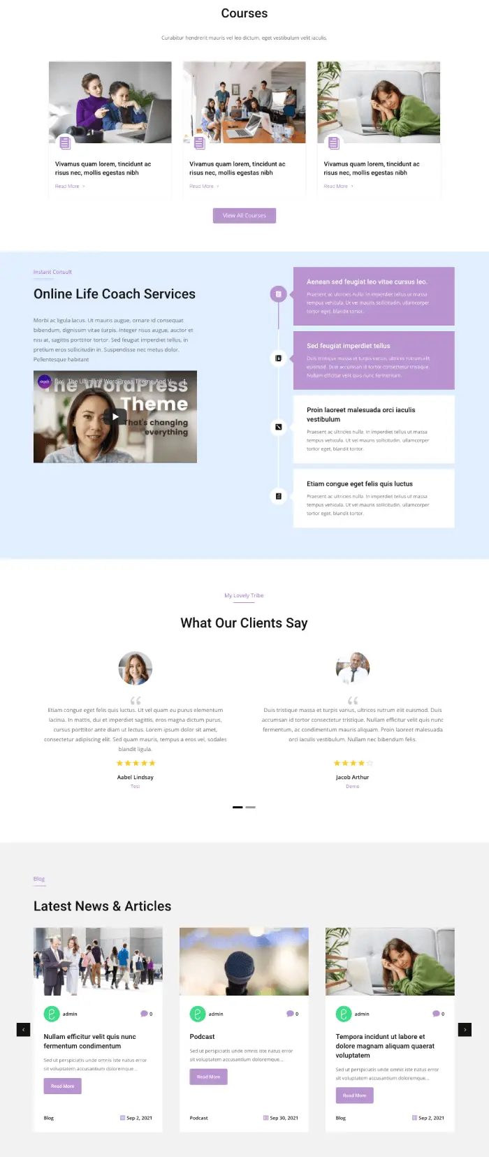
But that’s not it. The homepage of Lifecoach Divi child theme enables you to showcase client testimonials and blog posts on a slider as well. Thus making the homepage complete with elegant styles and powerful features.
About & Courses
It might be possible that you wouldn’t be able to share everything on the homepage. Therefore, the Lifecoach free Divi child theme consists of the About and Courses page. One will allow you to go into details about your profession, and another will make it possible to add all the courses in a single place.

To keep a similar look and feel to the homepage, the About page also starts with a wide inner page header with a background image and breadcrumbs. So, individual pages could list on the server in the proper manner. You get content areas, floating image placeholders, and number counters to explain your profession better.
Coaching & Portfolio
Spread extra light on your coaching services with the Coaching page that allows you to present coaching’s critical features on interactive blurbs created using the advanced flip box module. You can also let users schedule an appointment easily with a single highly visible CTA. Plus, if you’ve got different packages for your coaching service, you can also bring them here. In addition to these, to help users answer their queries easily, add FAQs created using the FAQPage Schema module that creates faqs optimized for the schema.
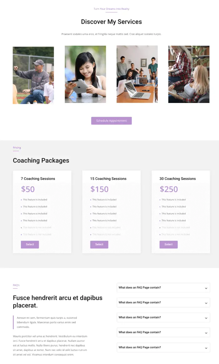
After this, if you’ve got amazing photographers taken during one of your coaching sessions, you can use the Portfolio to showcase them here. Let people know how great others feel around your company.
Podcast, Blog and Contact
Podcasts are on the rise, and for a lifecoach, it’s more than an opportunity to coach people with their voice without even appearing at a live event. The Lifecoach Divi Plus theme allows you to add videos and audio with descriptions. Along with podcasts, you can also share blog posts easily and list them beautifully on the Blog Page. It’s a straightforward archive page that also consists of podcasts and text posts. The blog page also allows users to search, find recent posts and look at your brief info.
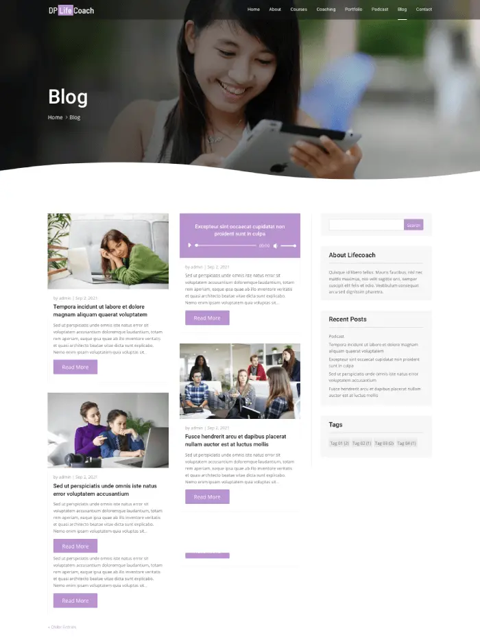
The Contact page is also straightforward, with a similar inner page header style as other additional pages. It includes a subtle contact form and areas to add details about your business and location.
Header and Footer
Both header and footer of the Lifecoach free Divi child theme are designed very elegantly. The transparent header boosts the beauty of the hero space, and on scrolling, the shrinking of the logo gives the smooth scrolling.

The footer of the theme holds all the elements neatly in the proper manner. Color-combination suits the website’s overall theme. Here, you can allow visitors to subscribe, open essential links without going deep into the website structure. Find out where your office is located and easily follow your social media presence with the help of nicely placed social media icons.
(8) Divi Plus Architecture Child Theme
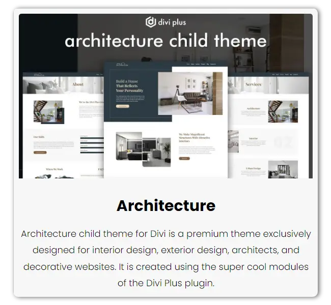
For an architect who’s behind providing people with perfection to their dream house, office, or any other place, the Divi Plus Architecture child theme is what that can help them build their online presence with perfection. It’s a 6-page free Divi child theme that could be used to build modern websites for an architect in no time. It uses the powerful Divi Plus modules like Floating Images, Interactive Image Cards, Modal Popup, Logo Slider, and more to lay a robust foundation and beyond for the website, just like the profession.
Homepage
The homepage of the Divi Plus Architecture child theme has a very luxurious and elegant start with a modern 50-50 herospace. One side allows you to add your compelling marketing copy; then the other enables you to showcase an engaging image of an interior, exterior, or whatever works best with the copy. It also includes an advanced button that completes the words you’ve added to attract visitors.
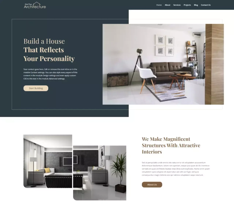
When you move down from the herospace, you’ll find multiple images floating up & down adjacent to a paragraph. Here, you can write about yourself or the company. The images that float are created using the Floating Images module. It includes different intuitive options that make pictures float in multiple directions. The way images are floating gives the website a beautiful and noble look that captures user attention instantly.
After the about section, you get the services part created using the Interactive Image Card module. Here, you can describe what type of architect services you provide. When you hover on the cards, they zoom in and out with an interactive border line showcasing the content. Then you get Video space built using the Modal Popup module. It displays the video in the modal window.
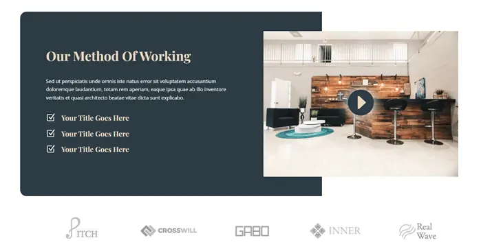
Another exciting thing about this free Divi child theme is that you can display the client’s logo on a Logo Slider, plus different projects in a beautiful masonry gallery. What else the homepage contains is a testimonial slider, then number counters, and finally, a blog post slider.
About Page
The About page has a delicate start, with the inner page header having an image in the background highlighting the page header name. Further, it includes an extended content area and then several bar counters to help you showcase skills.
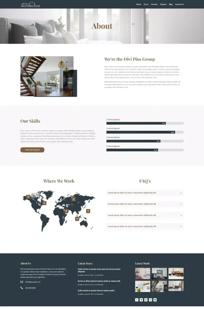
It also includes a map created using the Image Hotspot module. So, if you’ve got multiple offices or locations, you can easily mark them on the map with the beautiful pulse effect. In addition, there’s an FAQ section adjacent to the image. If you’re providing frequently asked questions on the about page, you can utilize this section very well.
Services and Projects
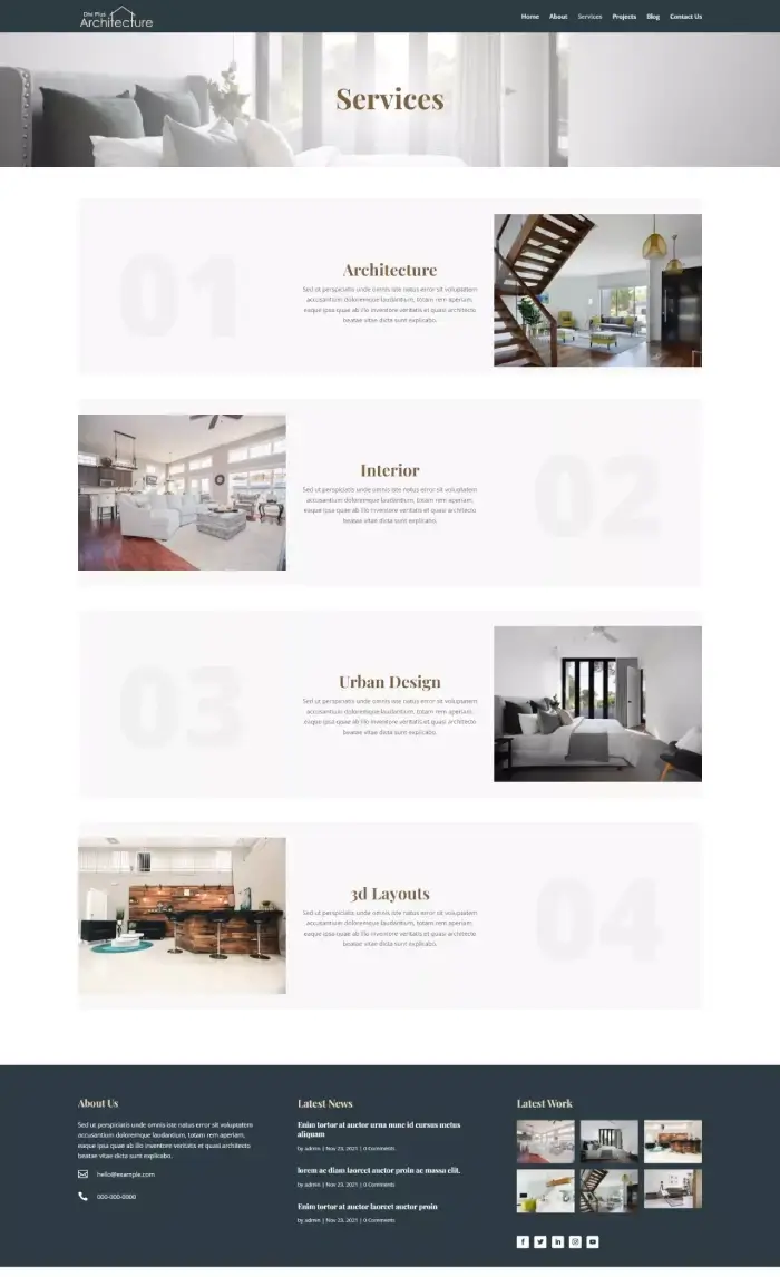
Both Services and Projects pages start the same as About with an engaging inner page header. However, the Services page has various content sections representing services as magazine sections. You get numbers on the left, then content, and further image placement. However, the following section changes places for all the content elements. So, whatever was on the left, comes to the right, and right goes to the left—a beautiful left and right combination.
On the Projects page, there’s a masonry gallery added. You can easily add all the projects you’ve worked on, and the gallery will display them vividly in the lightbox.
Blog, Contact, Header, and Footer
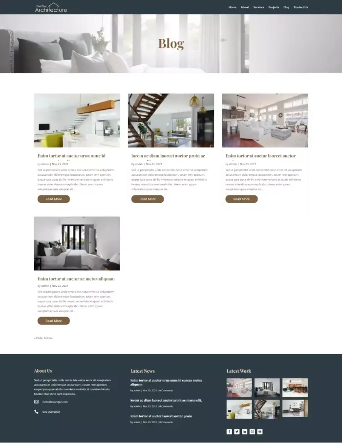
Promote your architectural skills proficiency using the Blog page available inside the child theme. It has a premium look, with all the posts placed at an adequate spacing among each other. Also, they use similar color combinations per the website’s look and feel. The posts contain elements such as Thumbnail, Title, Meta, Excerpt, and Read More buttons with a hover effect.
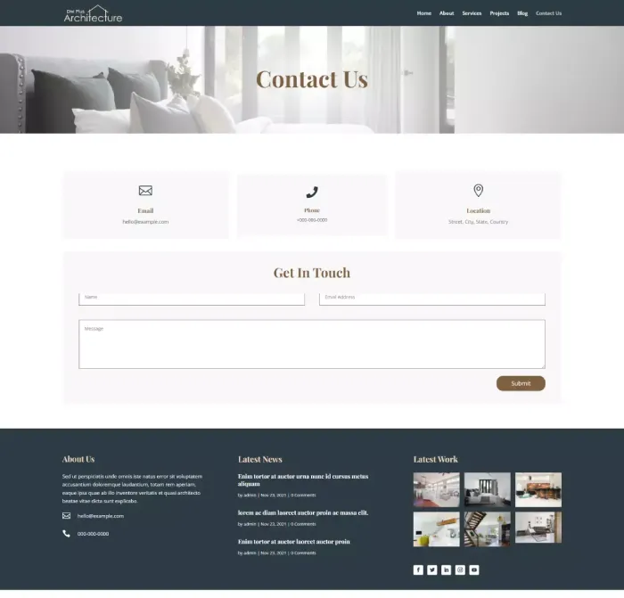
The Contact Us page is as simple as it could to help visitors easily find the contact information and the form. You can mention your email, phone number, and address. Plus, the form allows you to receive a client’s message with their email and name.
Apart from the Contact Us page and Blog, the Header and Footer of this free child theme are straightforward and help users easily navigate from one page to another. With the navigation links, the Header features logo shrink on scroll. Footer includes short info, links to posts, a gallery to feature the latest work, and icons for social media networks.

From top to bottom, the website is organized in a highly profound way, making it easier to access different areas without getting lost.
(9) Divi Plus Digital Agency Child Theme
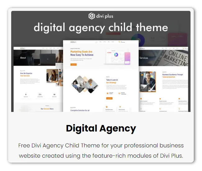
Whether providing marketing services or other digital services as an online agency, you need a solid website to make a longer-lasting impression. Using the Divi Plus Digital Agency free child theme, it’s more than possible and easy. It’s a 5-page free Divi child theme that combines the latest designing methods optimizing the powerful Divi Plus modules. For instance, Fancy Heading, Bar Counter, Modal Popup, and more.
Homepage
For a goal-oriented company, the child theme’s start is captivating with marketing text and above-the-fold CTA. It also includes an image space to showcase the company’s culture or whatever you like. The heading text uses the Fancy Heading module to paint the strength of the agency’s ideas creatively. In addition to these, there are several content sections with clear & highly engaging typography combinations.
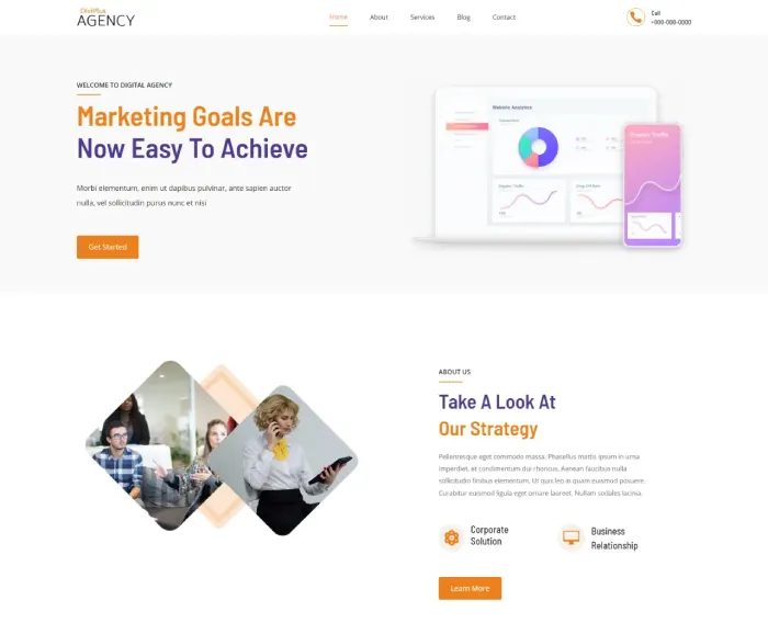
You can also display the agency’s experience & client satisfaction rate through animated progress bars. It’s created using the Progress Bar module of Divi Plus. Further, you get testimonial and blog posts sliders to build trust & increase user sessions.
About & Services Page
The About page of this free Divi child theme starts with a wide inner page header containing a background image. Then, it’s followed by a content area, including floating images. After that, you can display the agency’s achievement through number counters. As well as share its story in a video lightbox created using the Modal Popup module. The About page also allows you to display team members on an interactive Team Member slider.

Likewise the About page, the Services page also starts similarly. Then, followed by multiple content sections, including images & blurb areas to showcase your agency’s services.
Blog & Contact Page
A distraction-free & straightforward archive page allows website visitors to easily find the topic of their choice. The same is true for the Contact page that includes clear & easy to notice fields & contact details. The highly visible elements enable your customers to reach out to you effortlessly.
Header & Footer
The child theme’s Header comprises a straightforward look with elements spreading in three columns. Also, it’s sticky, so you can keep visitors coming to various pages regardless of their situation. Apart from brand logo, and navigation, you can also add phone numbers to help users easily contact you.

Similarly, the Footer also has a straightforward design. It comprises two rows containing four and two columns. You can use the bottom area to display the subscriber’s form, quick links to posts and pages, contact info, copyright text, terms, and privacy policy.

(10) Divi Plus eCommerce Child Theme
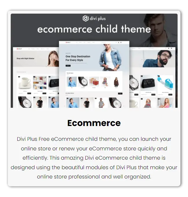
Add more power to your Divi eCommerce store using the free Divi child theme Divi Plus eCommerce. A 7-page child theme for Divi that enables you to complete web stores of any kind. In addition to the pre-built pages, there are several layouts to customize your product, shop, and category pages.
Homepage
The homepage of Divi Plus eCommerce child theme has a clean start with a large hero space. It allows you to feature your promising products with unique headlines, sub-headings & CTA to open the product page or link it to shop.
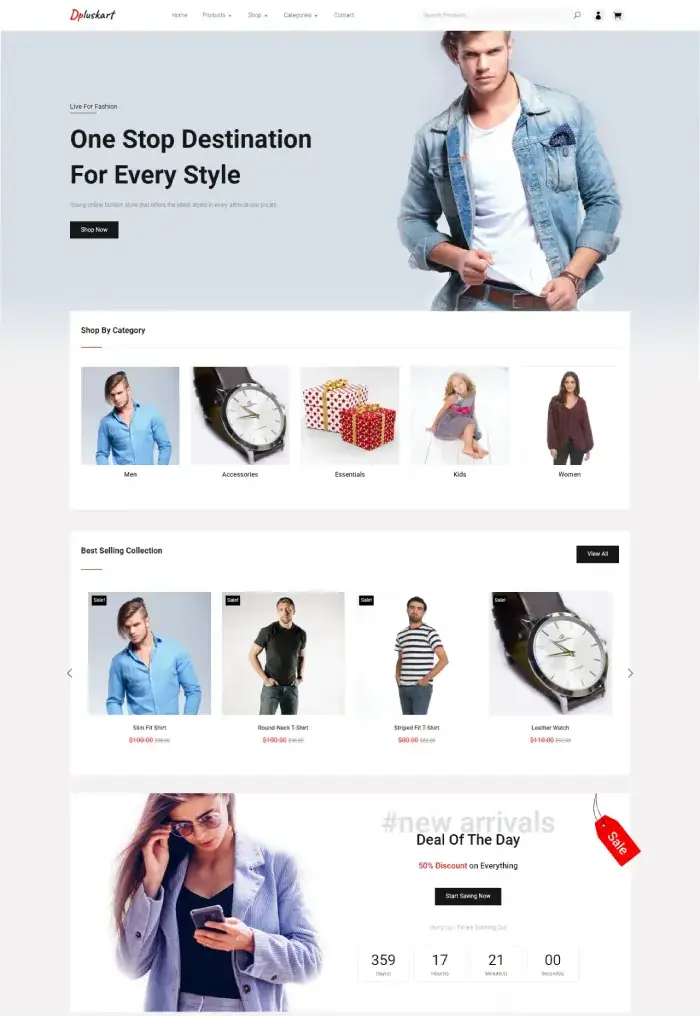
This free Divi child theme sets your Divi shop in the right direction with a shop category featurette after the above-the-fold. Then, after that, showcase more products on a slider. It’s built using the new WooCommerce slider module available with Divi Plus. To capture customers’ attention, it also includes a banner section with a countdown timer. So, if you’re running any offer, this is the right place to promote that.
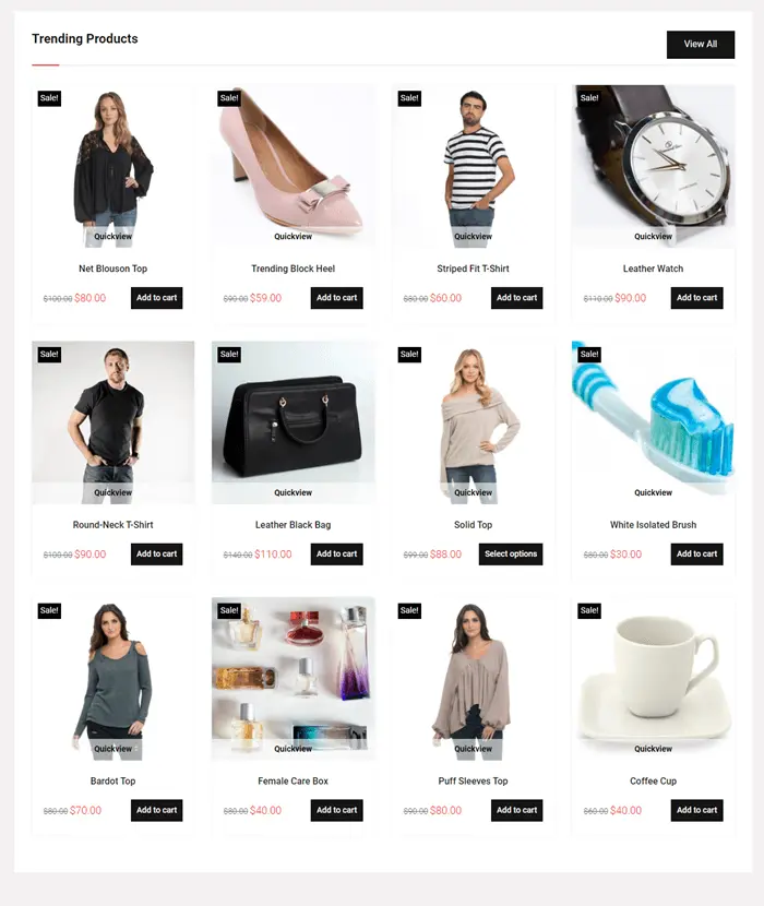
Then, further down, it includes a trending products section followed by tilt images showcasing different offers. Once you pass that, there’s another product slider that customers need to slide manually to see the products.
Products, Shop & Categories
The default look of the product page showcases products in a grid formation with an add to cart button already there. However, the Grid layout displays the button when customers hover on them. It uses the WooCommerce Products module of the plugin.
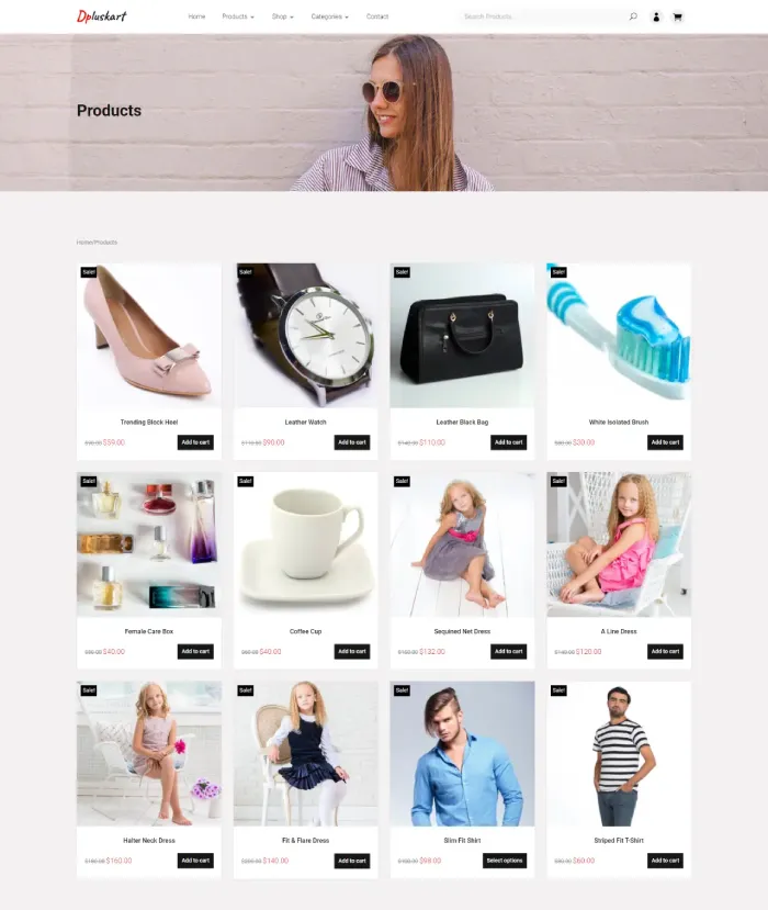
Another layout of the product page enables you to display products in masonry formation. The elements displayed on the products are title, rate, and star rating. However, what makes these product pages more promising is the pagination animation to display products.
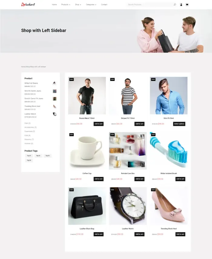
The Shop page has a detailed look showcasing products in a grid formation. It has two layouts; one displays a sidebar on the right and another on the left. Although both layouts’ sidebar showcase average rating, related products, categories, and tags.
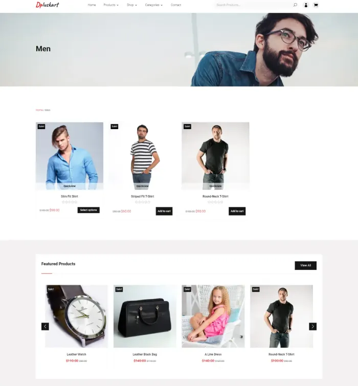
Using the category pages, you can separately display products for men, women, kids, and more. Nevertheless, you can use these pages for any particular category. All you have to do is simply assign. The category pages include featured products, sliders, sidebars, and more to help you create a fully-functional Divi shop.
Contact, Cart, My Account, Blog & FAQ
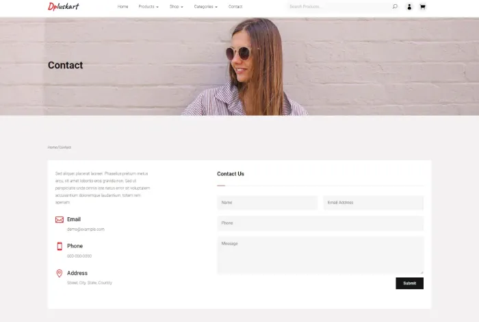
Divi Plus eCommerce child theme offers a sleek & noticeable contact page. It includes a multi-field contact form with other content sections to add contact details—for instance, email, phone, and address.
The same sleekness you could find in the My Account and Cart page that allows you to easily manage the orders & other account information.
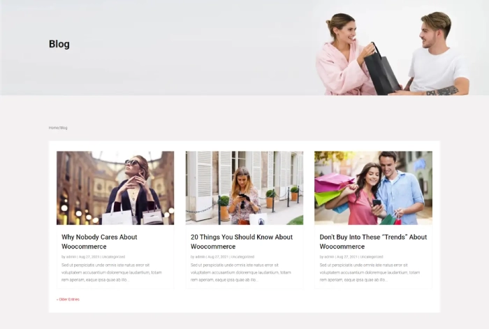
In addition to the clear and straightforward WooCommerce pages, the child theme also includes a Blog & FAQ page. Using these, you can share a lot about your new products, promotions, deals and answer some frequently asked questions.
Header & Footer
For a functional web store, it’s essential that it provides its users with search functionality. And the header of this Divi child theme does the same by creating a space for Woo Ajax Search module. A live search bar that showcases results while users type the query. Further, the My Account & Cart page icons are clearly visible, enabling users to access the necessary areas without spending much time.
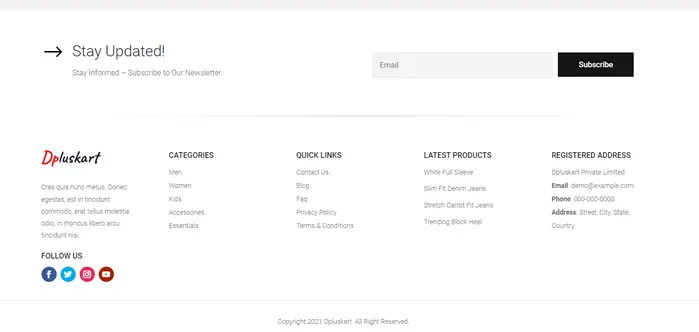
With the Footer of Divi Plus eCommerce child theme, you can easily build a subscribers list. Plus, provide customers with a simplified bottom navigation link to open different pages. You can direct them to Categories, Quick Links, and Products. Moreover, you can share contact details and add small store info.
(11) Divi Plus University Child Theme
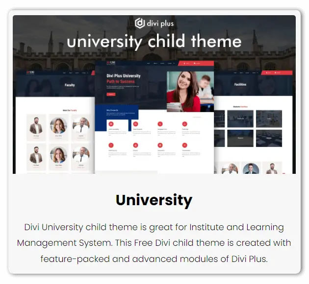
Whether you want to create a new website for an educational institute or give a stylish look to the old one, the Divi Plus University child theme is what you need. Using this professionally built standard child theme, you can have a fully functional educational website for Schools, Colleges, or institutes. It’s an 8-page Divi child theme powered with premium Divi Plus modules, making it even more beautiful & functional.
Homepage
The homepage of this child theme is built using different modules of Divi Plus. If we discuss specifically, then from hero space to the bottom, the heading and subheading were created using the Dual Heading & Fancy Heading module. The hero space also uses the Advanced Button module to build the animated CTA.
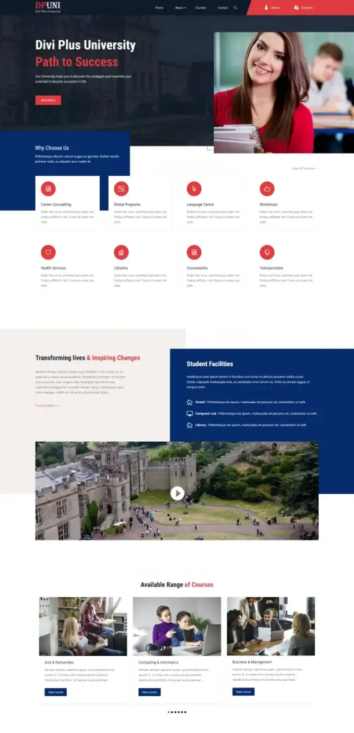
Then, on moving downwards, there are different content sections & blurbs to showcase services. Further, using the Modal Popup, you can display videos related to your institute. It also includes different sliders to showcase blog posts, faculties, courses, and testimonials. In addition to these, the overall color combination & design styles are adopted from the latest trends. So, when you create an educational site using this free Divi child theme, the homepage will do its magic profoundly.
About
To match the homepage style, an optimized inner page header is created at the start of the About page. It’s followed by a content section & dual images created using the Floating Image module. Then, you get another content section featuring images, text, and blurbs to add more info.
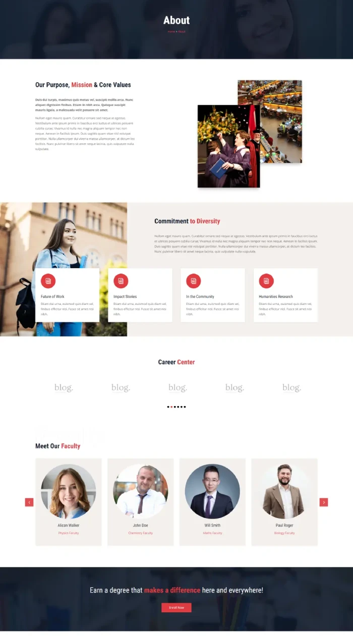
After this, the About page allows you to showcase different facilities, centers, and more on the sliders.
Faculty & Facilities
Both Faculty & Facilities pages have a similar start like the About page: an inner page header with breadcrumbs. The Faculty page showcases different faculty members in a grid formation.
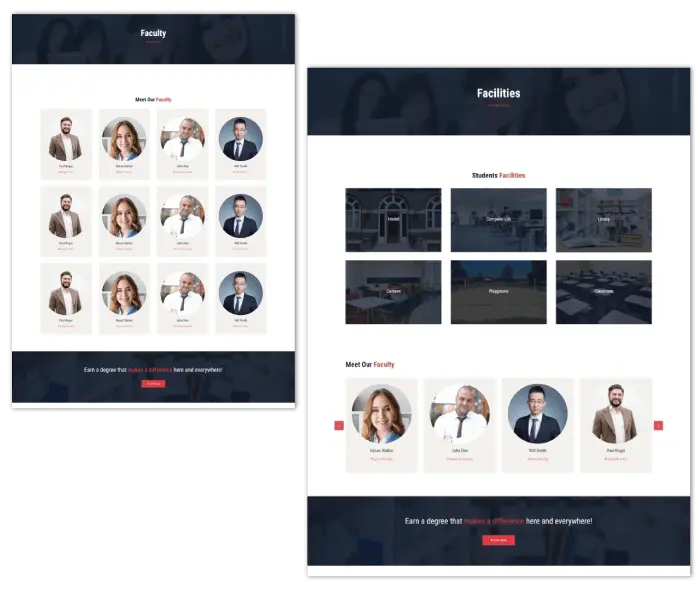
Likewise, the Facilities page showcases numerous facilities on interactive images that display more info on hover.
Courses
Using the Courses page of the child theme, you can easily display what departments’ courses your institute offers. The courses shown on the page are created using the Image Card module.
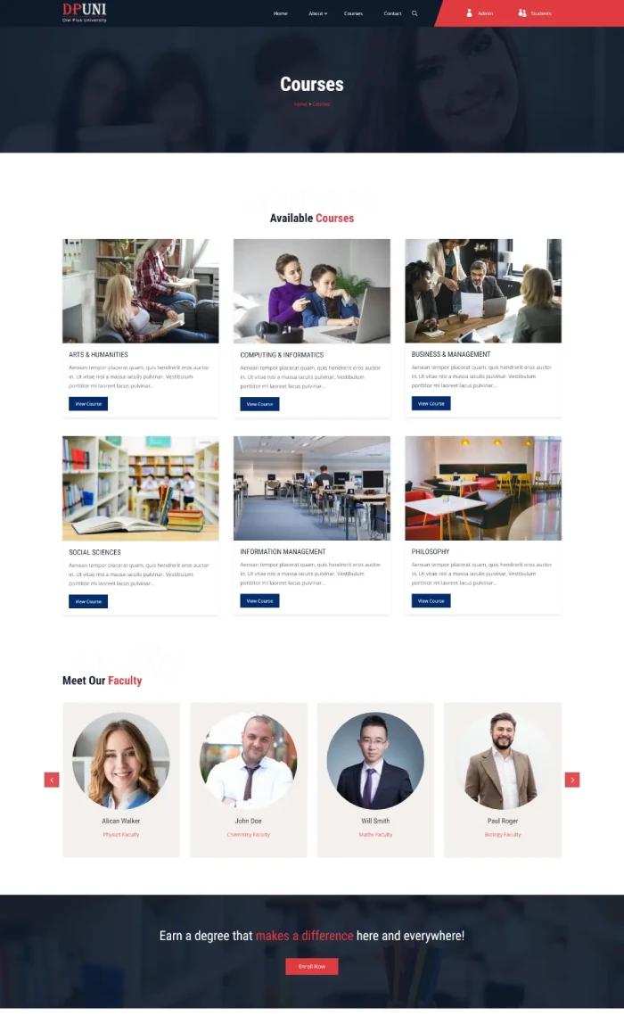
It allows you to customize images, text, and even read more buttons. So, you could have an elegant page dedicated to the courses matching the website’s theme.
Contact, Blog & FAQ
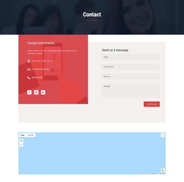
Among other essential pages, the ones that help you reach a wider audience & provide support to the users are Blog, Contact & FAQ. And in this free Divi child theme of Divi Plus, you get that as well. The Contact page reflects the site’s overall color, with the form having a bright color on the contact area. Further, it includes the Google Map to display the institute’s location.
Like the Courses page, the Blog showcases posts in a clear & highly readable manner. The same clarity you can find on the FAQ page as well. It includes multiple pre-built sections with high customization to display answers to the highly asked questions.
Header & Footer
The theme’s reflection of modern style is clearly seen on the footer, which comprises the subscriber’s form, contact details, links, social icons, and the copyright text. Its color combination matches the theme’s scheme, making the site complete.
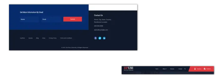
You can find the same new-age looks on the Header that effectively contains all the elements. Further, icons & text representing Student & Faculty login buttons make it easy for you to utilize them for the same purpose.
(12) Divi Plus Salon Child Theme
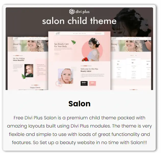
An elegant Divi child theme for an elegant work. The Divi Plus Salon is the only child theme to help you build a smooth, malleable & refreshing website for your beauty parlor. Or perhaps you need a unique theme to complete your web designing project. If you’re using Divi and boosting it with Divi Plus modules, then this theme is more than you need. A fully designed Divi child theme, ready-to-use with 6 pre-built pages to almost complete all your requirements.
Homepage
This free Divi child theme can entice users with the classic & elegant looks for your salon website. From start to end, not a single time users would take their eyes from it. Smooth design with a soft color combination, you can have a parlor website representing its work. The hero space of the homepage features styled headings, content & CTA. You can also have an image to engage users when they arrive on the site.
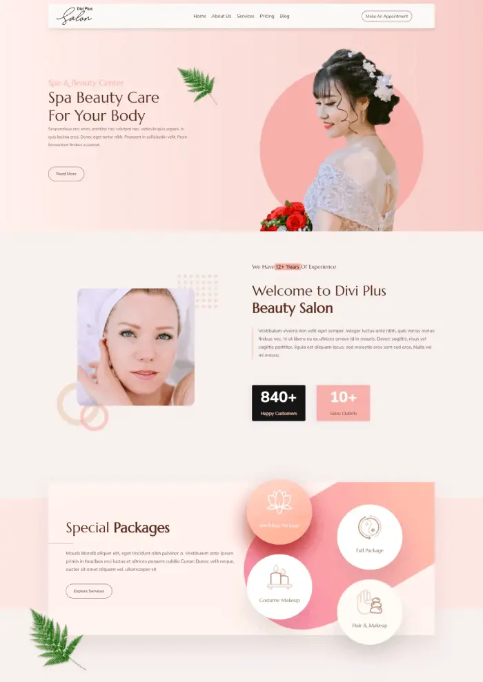
Then with the short about section containing dual-color headings and number counters, show your expertise. And not only expertise but also the highly professional salon services you provide. The homepage includes different content sections containing floating images to add more info about your salon. Further, it includes a pricing list built using the Pricing module with the latest design trends. Whatever services you’ve or want to feature on the homepage, bring them here. And if you offer services on membership, then the child theme’s homepage also has the pricing table. Well optimized and modern looks, as you can see in the following screenshot.
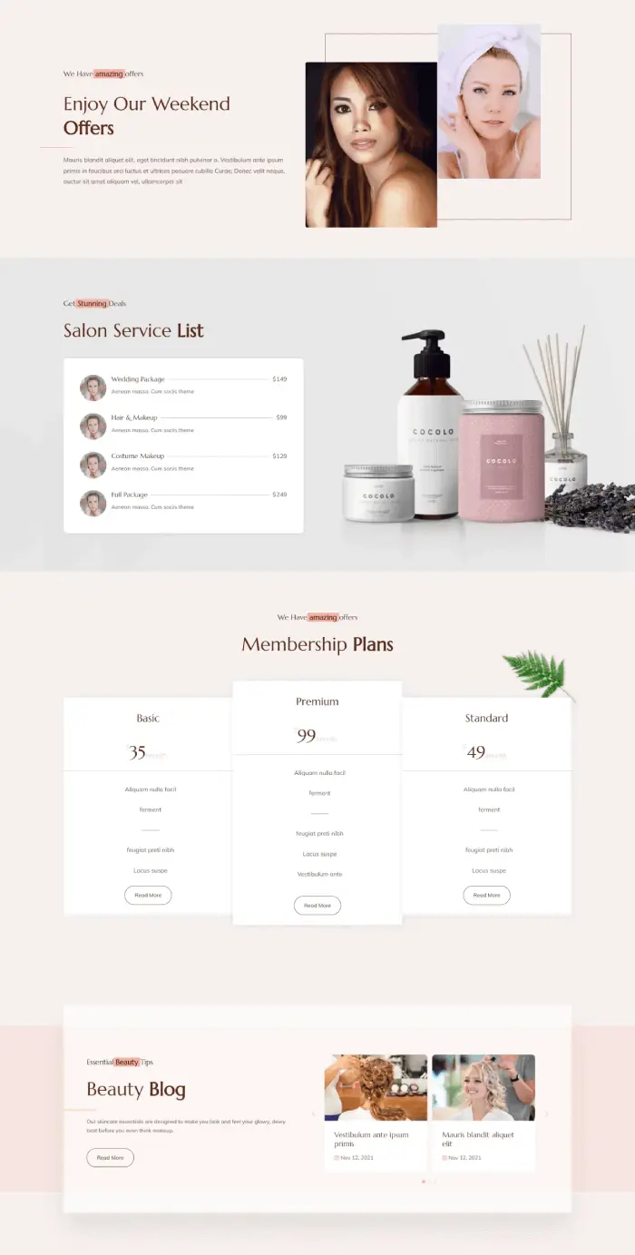
After the pricing table, the child theme utilizes the Blog Slider, Testimonial Slider, and Form Styler module. So, you can effectively engage users from all the angles like user sessions, building trust, and capturing leads.
About Us
To make an effective impression through your story, the Divi Plus Salon child theme provides you with a beautiful About Us page. It starts with a wide inner page header containing breadcrumbs & a background image. Further, it expands its presence with optimized content sections using Dual Heading, Floating Images & Animated CTA.
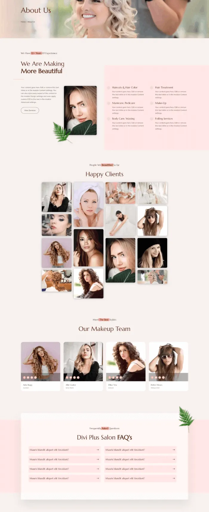
Plus, if you’ve done great jobs in your profession, you can share them in a beautiful masonry gallery. And not only that, but you can also beautifully display salon staff with their image, social profiles, and more. In addition, the About Us page also includes an FAQ section. Here, you can list all the essential questions with answers that people would have in their minds. It’s built using the FAQPage Schema module so that FAQs can appear in the search as rich snippets.
Services & Pricing
Boldly & elegantly showcase your salon services using the Services page. It utilizes the Floating Image & Fancy Heading module to explain the services profoundly. Moreover, the elements are placed so well that users can easily scan and share the information.
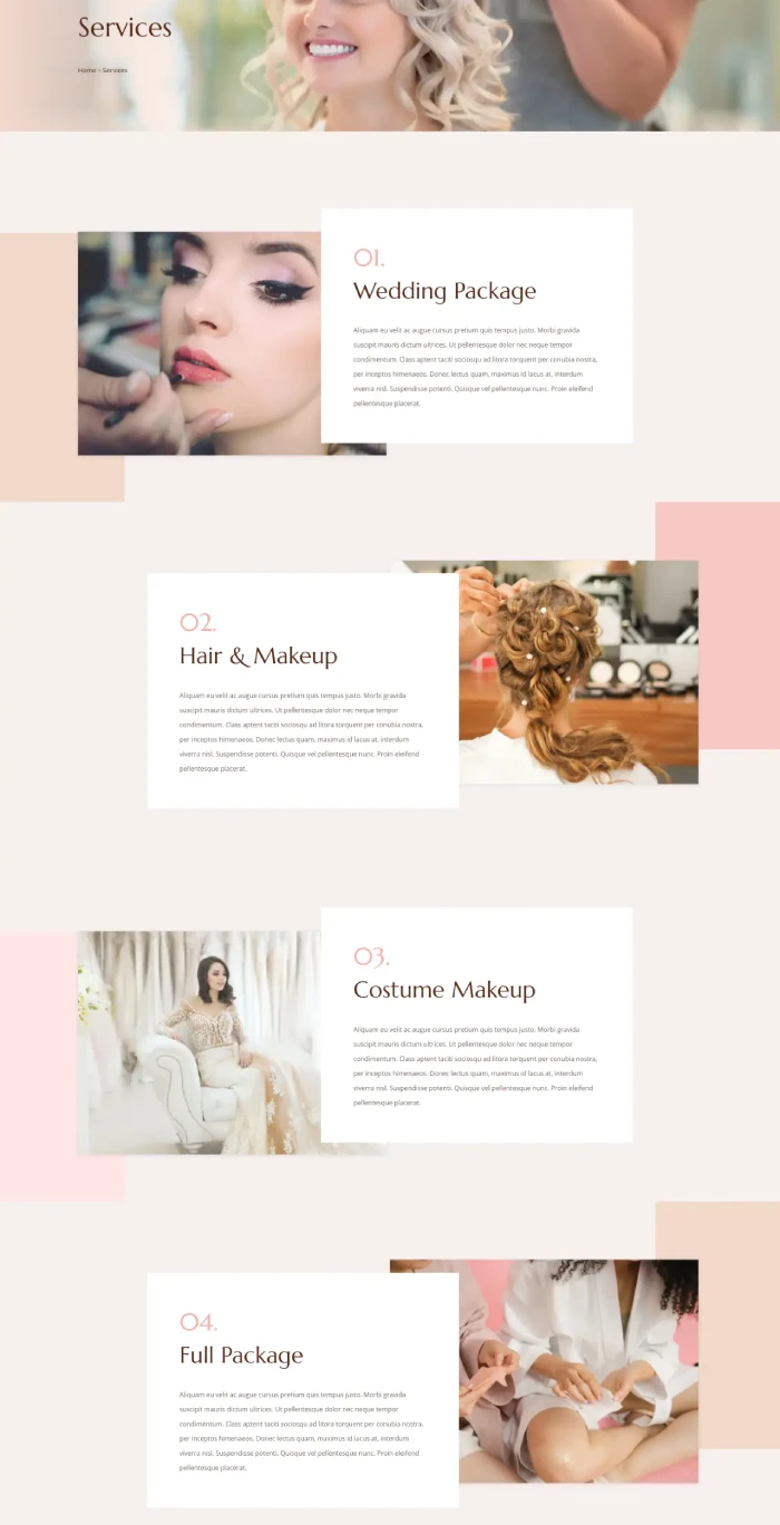
Likewise, the Pricing page will help you vividly & elegantly display your salon’s membership prices. It’s created using the Content Toggle module, which allows you to add a switch button to the pricing tables. Using the switch button, users can easily check multiple membership plans for annual & month.
Blog & Contact
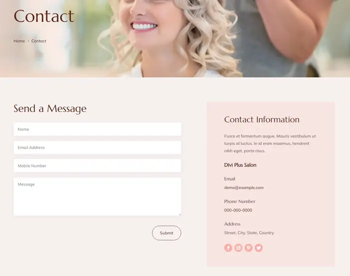
The way other pages of this child theme instigate users with elegance, similarly Blog & Contact page helps people find more information & reach out. The Blog page effectively allows you to showcase all the posts you’ve got around your salon website’s subjects. Likewise, the Contact page with a clear contact form & details allows customers to book an appointment.
Header & Footer
The smoothness this child theme proudly outshine is getting from the beautiful header at the top: smooth edges, effective element placement & stickiness throughout the whole scroll. For a salon website, no header could have beautiful styling like the one this child theme contains. Plus, what makes it even more exciting is the animated CTA allowing users to book an appointment.
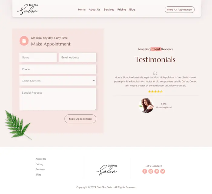
With smoothness & delicacy, you can find simplicity at the bottom in the Footer to make this child theme’s entire design & color combination impactful. Using the footer of this Divi child theme, you can direct users to the pages and social networks. Furthermore, leave a longer-lasting impression with the brand logo.
(13) Divi Plus Yoga Child Theme
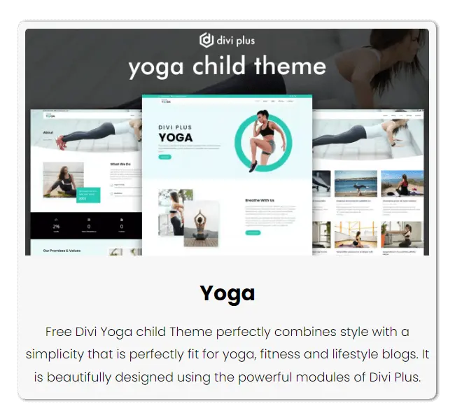
Being a Yoga guru is a prevalent profession that can help you earn well while keeping profound health. And for this popular profession, it’s a must to have an online presence. Using the Divi Plus Yoga child theme, you’d be able to do that effectively. It’s a 5-page Divi child theme that focuses on delivering the right message to the people for joining the yoga sessions. No distraction, no congested elements, only clear, elegant & modern design.
Homepage
With a wide and clear hero space, you get several content sections to add your enticing web copy. The sections also include floating images, blurbs, and other image elements to make the text alluring. In addition, the homepage includes number counters; team slider, testimonials, and video popup.
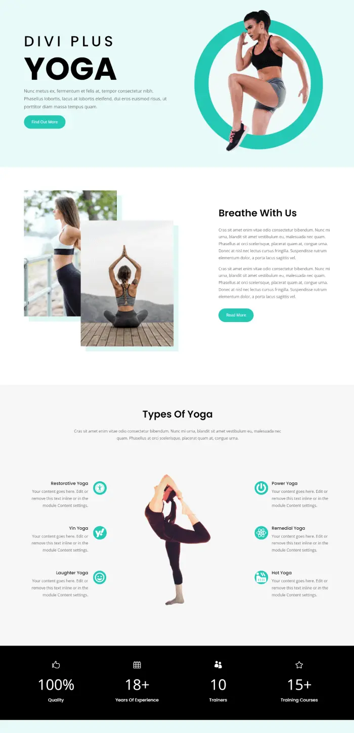
Apart from these, what’s more useful for a yoga teacher is to display yoga schedules. Therefore, to create that easily, this child contains a custom schedule calendar. It’s built using the Vertical Tabs module to customize tabs’ content easily. Lastly, it features a blog slider to display posts from your yoga website’s blog.
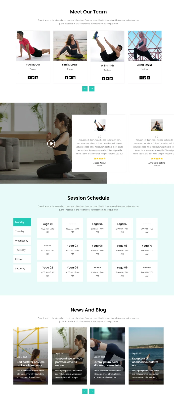
About
Divi Plus Yoga child theme’s About page starts with a gradient enabled inner page header. It also has an image in the background with breadcrumbs on it. Plus, the style has a curved bottom providing a natural flow.
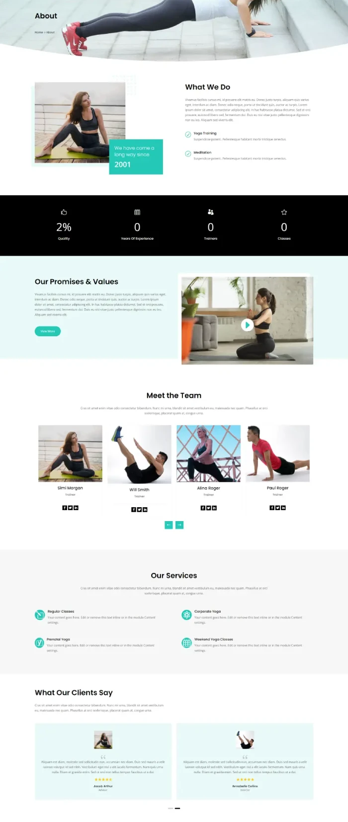
After that, you get numerous content sections to tell users about your yoga practice & its journey. And to make that impressive, you get the images, number counters, and a video popup. Further, let customers know about your services, team, and past learners’ experiences.
Pricing
A simple and effective Divi pricing page that lets your customers know about your membership plans effectively.
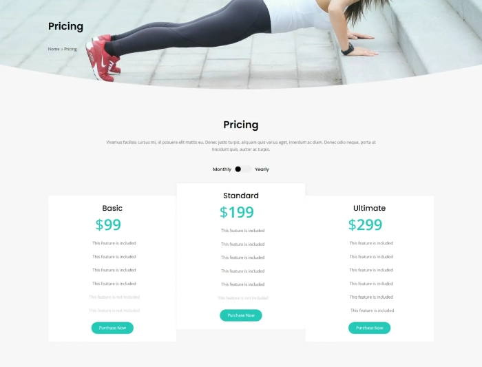
It’s created using the Content Toggle module that allows users to switch between multiple content types. And in the case of pricing, it’s the Annual and Month pricing plans.
Blog, Contact, Header & Footer
Likewise the pricing page, the Blog, is also simple and clearly allows users to go through different posts. All the elements of the post tiles are highly visible and readable, too. So, users won’t have any trouble finding the needed article. Divi Plus Yoga child theme focuses on simplicity with usefulness. So, based on that, you get a functional contact page. It has highly readable form fields with a transparent contact details section. Here, you can share your yoga studio’s address, plus the number and social profiles.
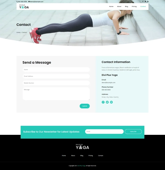
You can find the same simplicity and ease of use on this Divi child theme’s Header. It allows you to provide visitors with navigation links whether they’re on the bottom of the page or top because of its sticky behavior. Moreover, it can be used to share yoga studios’ other details, the same as the contact page. With an effective header, you get an effective footer possessing all the navigation attributes of its counterpart. Plus, a vivid subscribers form and copyright text.
(14) Divi Plus Freelancer Child Theme
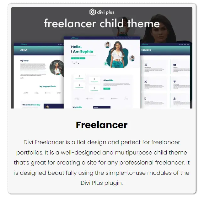
Show the best to your clients using the Divi Plus Freelancer child theme providing 7 pre-built pages. For freelancers, this child theme can help them build an amazing website regardless of their profession. Whether services or portfolio, you can find a lot of design elements that capture talent-hiring managers’ eyes in the first moment.
Homepage
This free Divi child theme for freelancers has a beautiful homepage start. It allows you to add your picture, plus utilize the modal popup to display a video of introduction or anything that supports your freelancing career. Moreover, the hero space features dual button layouts as well as social media icons. So, with high conversion, you can also have social media following build-up.
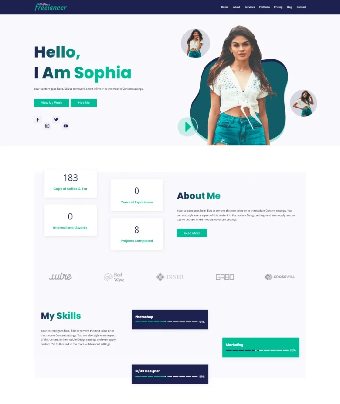
On moving downwards in this Divi freelancer child theme, you can add experience using number counters and beautiful dual gradient heading. That same section provides you with the space to share a bit or two about yourself as a freelance professional. The homepage consists of a logo slider which you can utilize to showcase whom you’ve worked for. And to enhance the representation, you optimize the progress bar to show your skills.
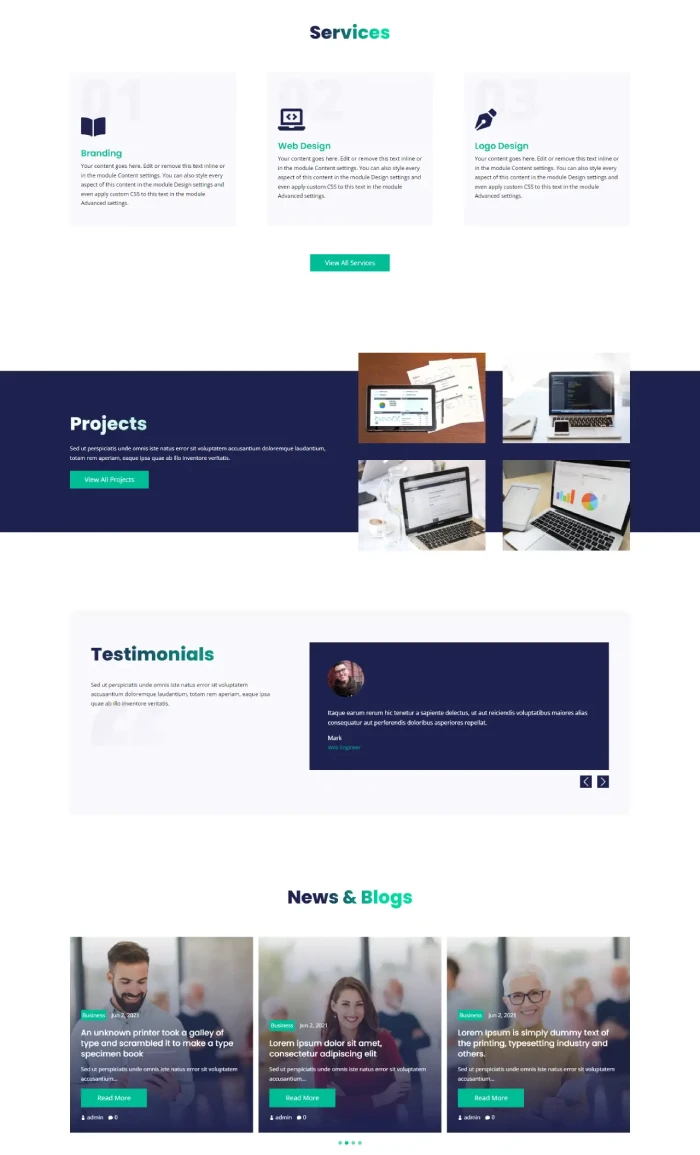
Further, you get services, projects, testimonials sections to impress and convince the clients to hire you with trust. Moreover, the page ends with a blog slider and pricing tables. Using the posts slider, you can show your knowledge in your particular domain. And with the table, let them know how reasonable you charge for that knowledge mixed skills.
About Us, Services & Portfolio
A creatively designed About Us page to leave a longer-lasting impression on your clients. Optimized headings, readable text, and animating images allure clients to work with you. Similarly, the Services & Portfolio page capture’s the clients’ attention to choose your service and get amazing work done like the examples shown in the portfolio.
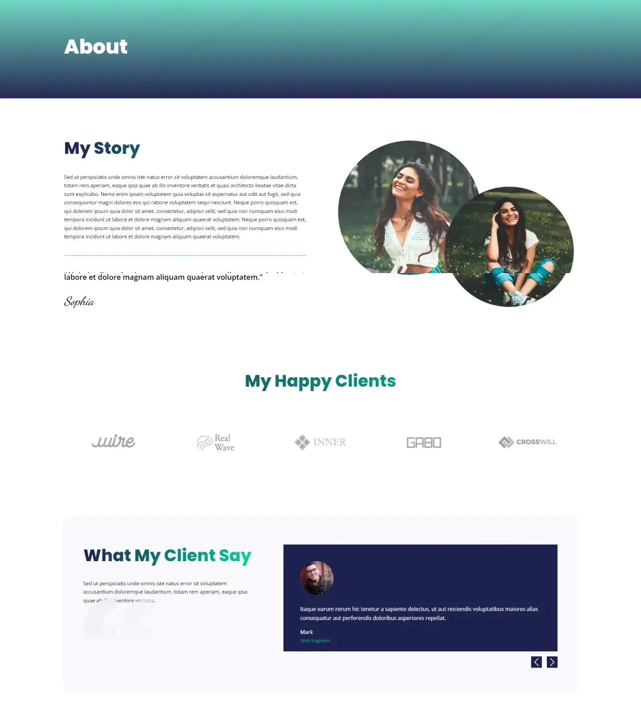
Pricing, Blog, and Contact
You can find the same attractiveness in the pricing page, blog, and contact that creatively shows their respective elements. Pricing tables with bold typography and logo slider convince the client to work with you. Or your client for whom you’re designing the Divi website.
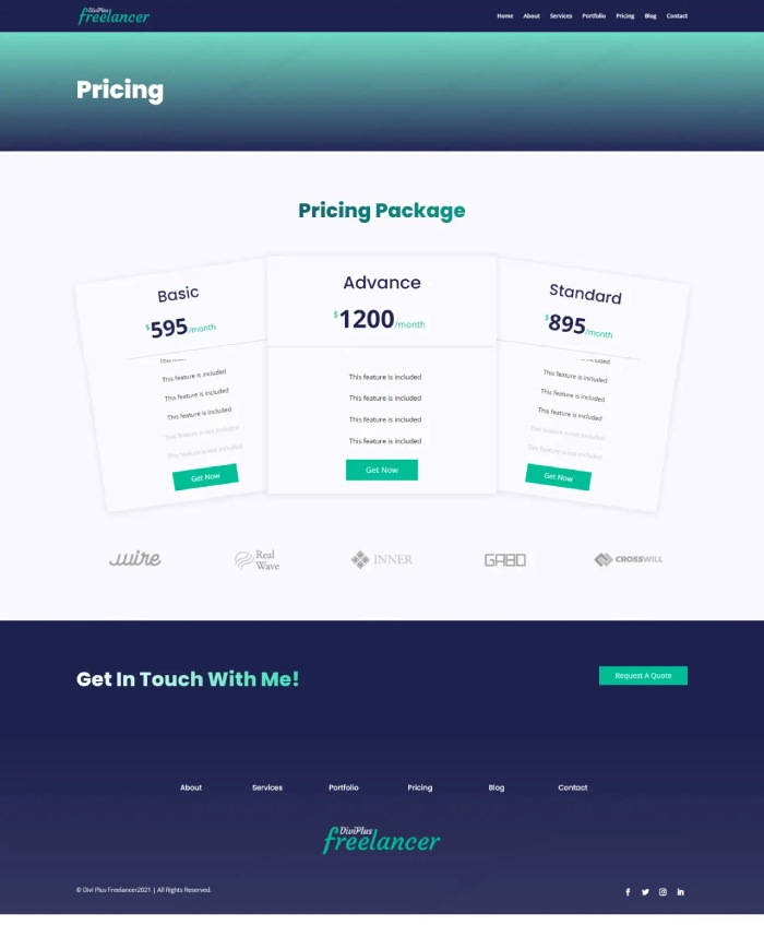
With the Blog page, you or they can effectively make every post stand out with clear and elegant post tiles placed in a masonry format. And finally, the Contact page makes it easy and exciting to reach out to you. It includes an image element, contact details sections, and an optimized form.
Header & Footer
Both Header & Footer of this Divi child theme for freelancers allows users to easily navigate the site. Plus, the footer provides you with a significant logo element and copyright text to amplify your brand name elegantly. And that’s not it; the footer also has an area to add different social media profile links.
(15) Divi Plus Home Buyers Child Theme
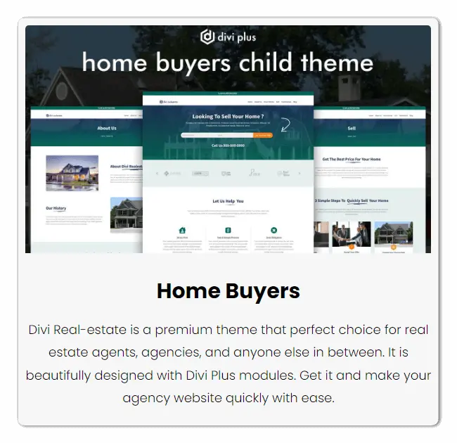
An 8-page free Divi child theme for real estate business professionals. Using Divi Plus Home Buyers, you could easily capture tons of leads that help in effective conversion. Plus, establish a brand name and reach a wider audience through testimonials & blog posts. This Divi real estate theme effortlessly allows you to convince residents to sell their houses to your organization. It’s one of the best Divi child themes you can get to discuss all the great realtor services of your company.
Homepage
With the Homepage of Divi Plus Home Buyers child theme, you could represent your company as a professional real estate business organization as it could. From the page’s starting, it reflects its outstanding design to capture potential leads with an optimized form. Also, providing residents with contact numbers to connect with the company’s support group.
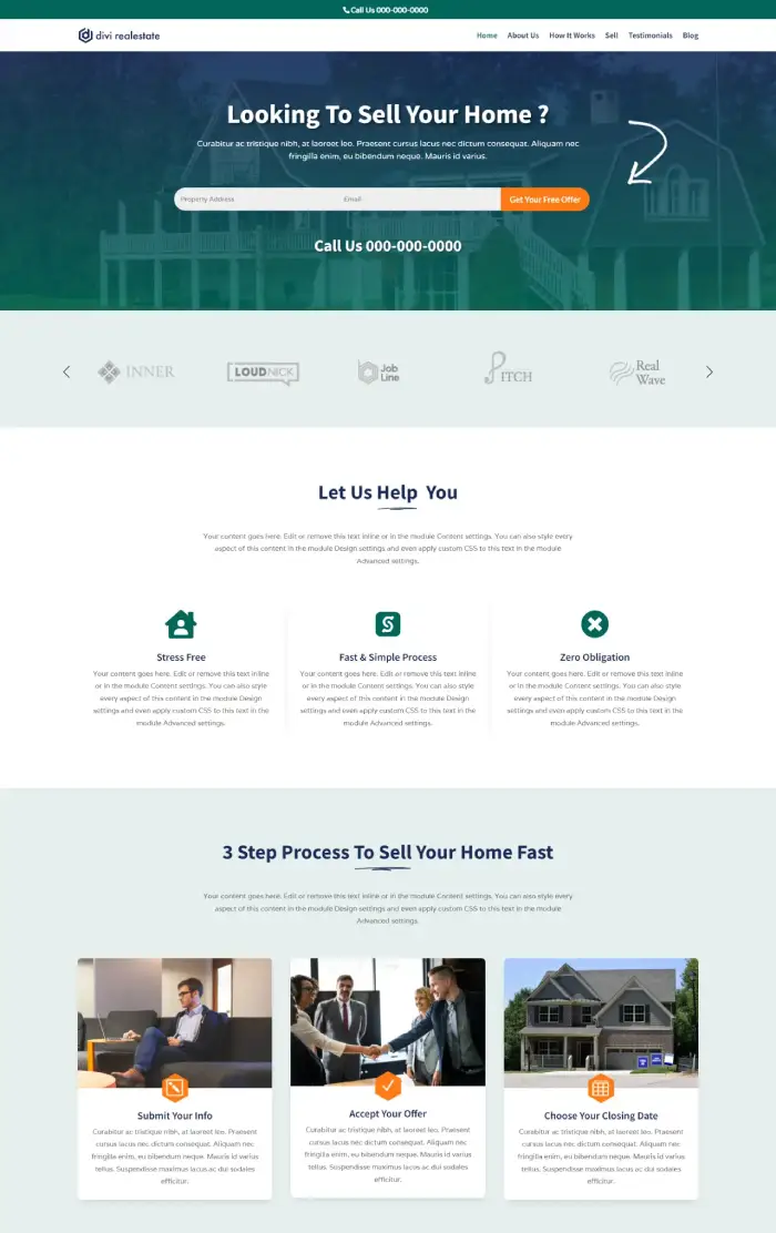
Then, you get the logo slider which you can use to showcase where your company has been featured. Or, list down all the big names you partner with. In this way, you’d be able to build trust among your website visitors for your real estate business. After those profound lead capturing & trust-building sections, you get multiple attractive design elements to add web copy. These allow you to share your process and the benefits of working with you. After that, you can again motivate users to contact you or leave their details using the Get Your Free Offer form.
Further, this Divi real estate child theme’s homepage consists of tables & vertical tabs to share more information about the business. The tables allow you to showcase all your benefits. On the other hand, vertical tabs provide you with the option to list more in a much more compact and beautiful way.
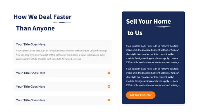
Then, on moving downwards, you can creatively add FAQs plus testimonials on an interactive slider. With all these design sections and elements, your Divi real estate website’s homepage would convert at a higher rate.
About us
To help you do good with your business, the Home Buyers child theme includes several content sections on the About Us. And, it’s optimized with text highlighter, floating images, breadcrumbs on the inner page header, and more.
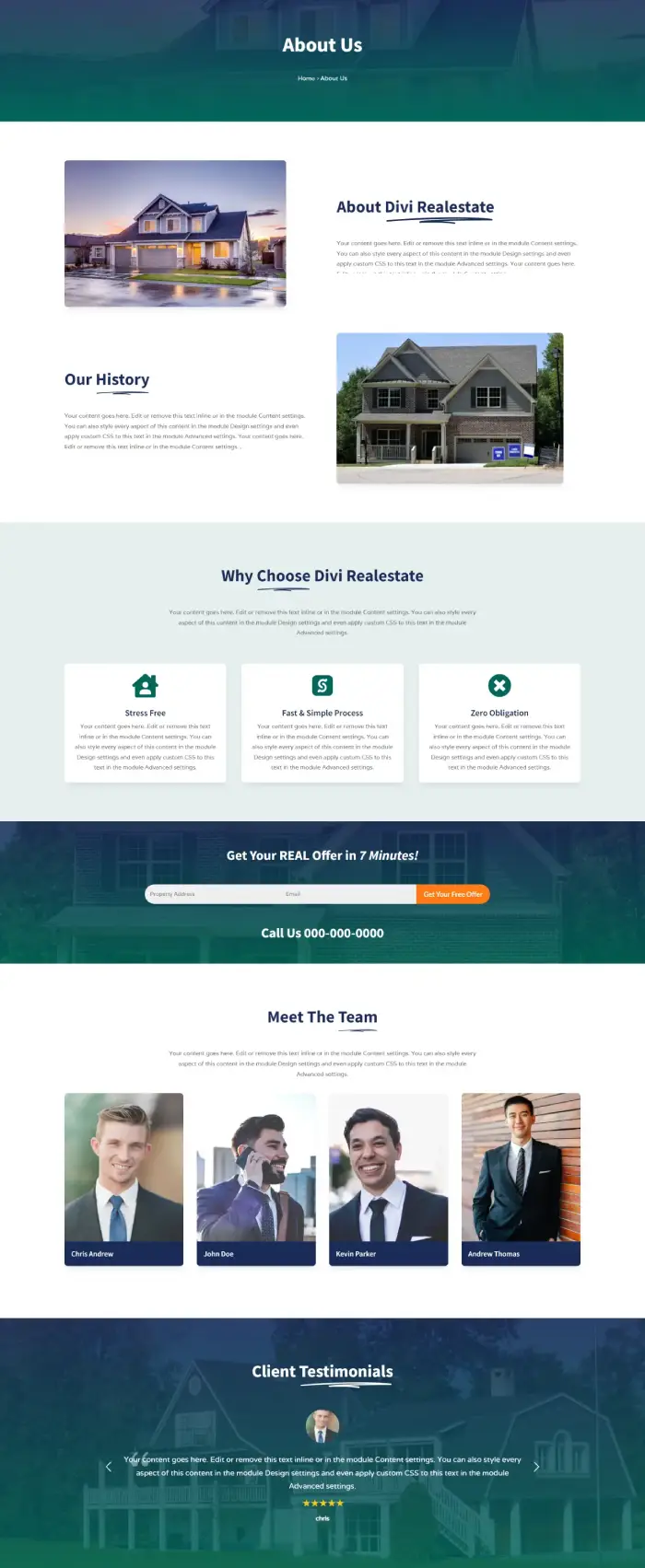
Not only content elements but also team members and testimonials to keep up the trust-building process.
How It Works & Sell
Like the About us, the How It Works (HIW) and Sell page includes several content sections optimized with floating images and more. Using the HIW page, you can explain the process of how your company helps residents sell their houses. Plus, to make it simpler, you can add a video popup.
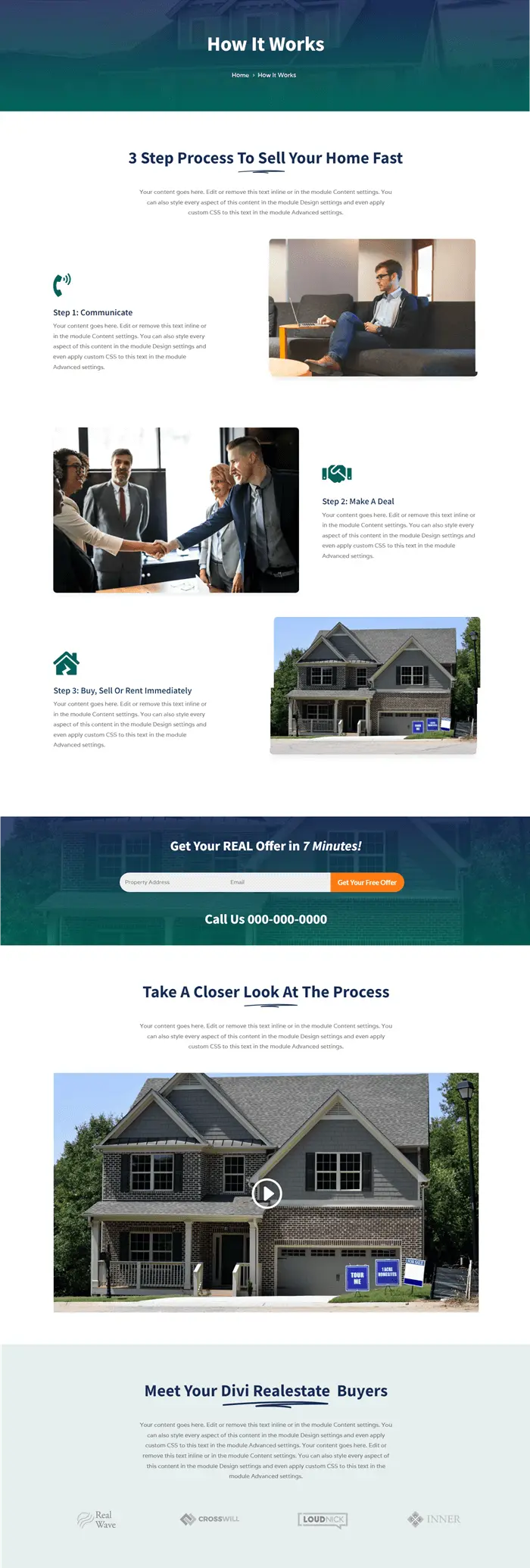
Further, the Sell page helps you initiate the HIW process by detailing the benefits. It utilizes modules like image card, table, testimonials, and more.
Testimonials, Blog, FAQ, and Contact Us
Using the Testimonials page, list down all the best reviews your customers have left in an elegant grid layout. It uses the Testimonial Grid module, which means you can customize them further per your liking.
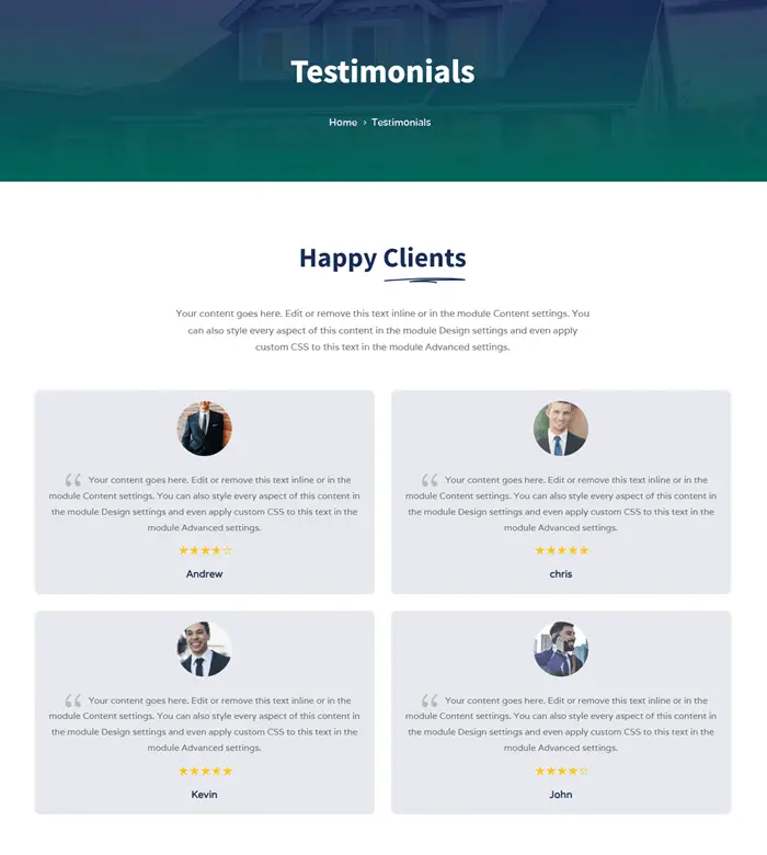
Similarly, the Blog page allows you to list all your posts with high readability. And then, using the FAQ page, answer customers’ questions upfront. Even if that won’t work for them, let them reach out to you using the Contact page. It consists of email, phone, and address elements with a contact form and Hotspot image’s world map.
Header & Footer
The Header of Divi Plus Home Buyers theme vividly displays the brand logo with navigation links placed well organized. It also includes a top sub-header containing contact numbers.
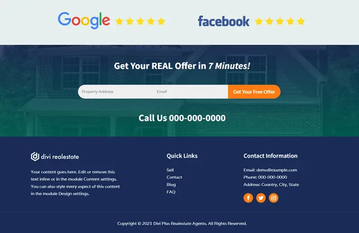
Furthermore, the Footer provides extra value to allow the website to perform at its best from top to bottom. It consists of short info text, quick links, contact info, social media icons, and copyright text. So, users can easily explore the site without wasting any time.
Get Them Today & Design Outstanding Divi Websites 🎨
Bookmark this post and keep coming back to it. Because with time Divi Plus will include more and more highly functional and robust themes to its package. So, if you haven’t got your copy of Divi Plus yet, then it’s the best time to do it. As of right now, it’s available at $59 for a single site and $149 for unlimited sites. You can also get it on Divi Marketplace at a price of $79/year.
Divi Plus is a complete solution for Divi designing needs to either build a huge site or a small one. It can help you do it quickly and very effectively. Get it now, and let us know how it helped you do magic in the online world.


0 Comments