
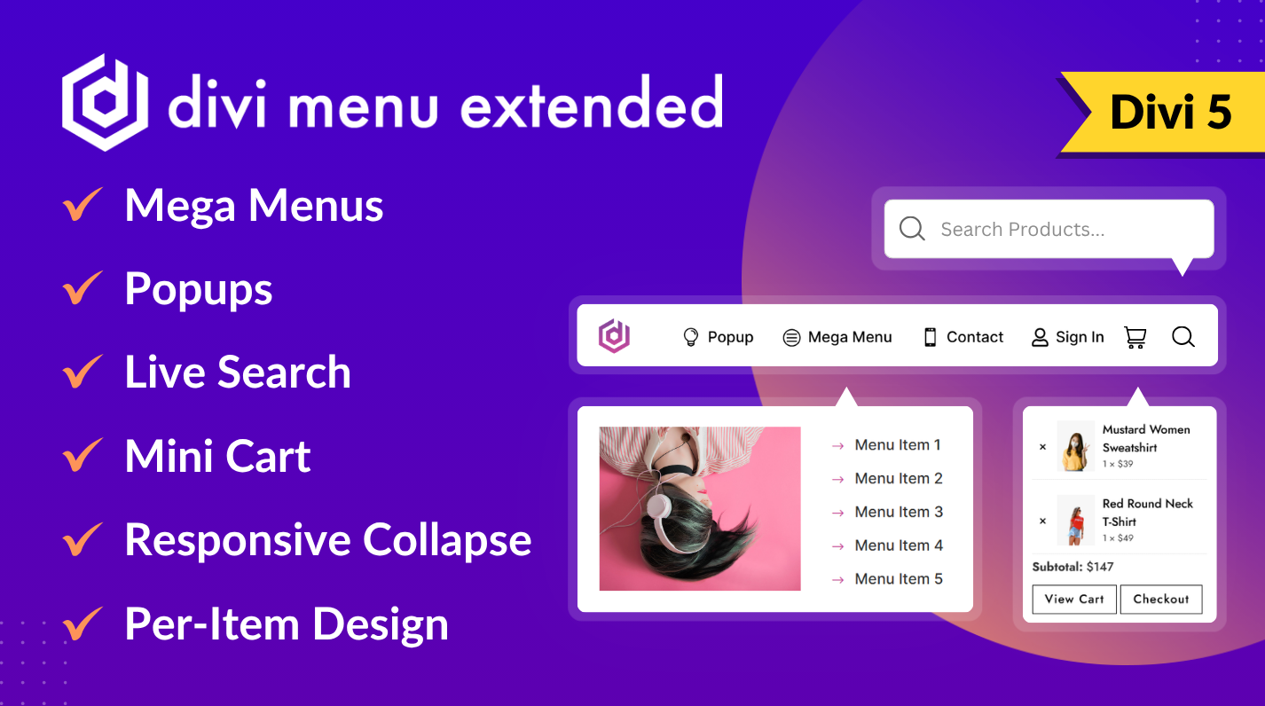
Fully Compatible with Divi 5
One module for the bar, one item per link
The Menu module holds the items and decides how they sit: Divi’s Layout group sets the direction, alignment and the gap between items, so a horizontal bar and a vertical sidebar menu are the same module. Each Menu Item has a Content Type (Text, Icon, Image, Icon with Text, Image with Text or Logo), a Position for the icon or image (Before Text, After Text, Above Text or Below Text) and a Link Type that decides what a click does.
Design settings you make on the Menu, such as the item font, icon size and image height, apply to every item, and any item can override them. On top of the plugin’s own groups, both modules carry Divi’s standard options: Background, Sizing, Spacing, Border, Box Shadow, Position, Z Index, Transform, Filters, Animation, Sticky, Scroll Effects, Interactions and Display Conditions.
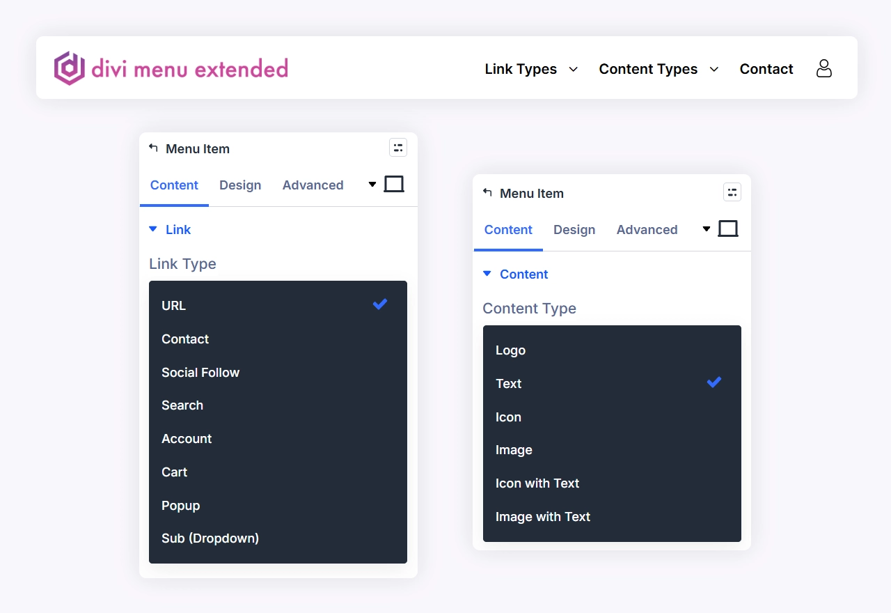
Eight link types on a Menu Item
- URL: a normal link, with Divi’s open-in-new-tab switch.
- Contact: starts a call, an email, an SMS or a WhatsApp message. Email takes a subject, and email, SMS and WhatsApp can carry a message you pre-fill.
- Social Follow: links to a profile on one of 50 networks, from Facebook, Instagram, X and YouTube to Mastodon, Discord and Last.fm, and sets the network’s icon for you.
- Search: a search box in the header, as an icon that opens it or as a box that stays open.
- Account: a sign-in link that turns into an account link once the visitor is signed in.
- Cart: the WooCommerce cart with an item count and a mini cart.
- Popup: opens a Divi Canvas over the page.
- Sub (Dropdown): a dropdown from one of your menus under Appearance > Menus, or a mega menu from a Divi Canvas.
The sections below cover what the richer types can do.
Divi mega menu built on a Canvas
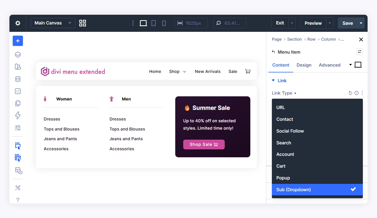
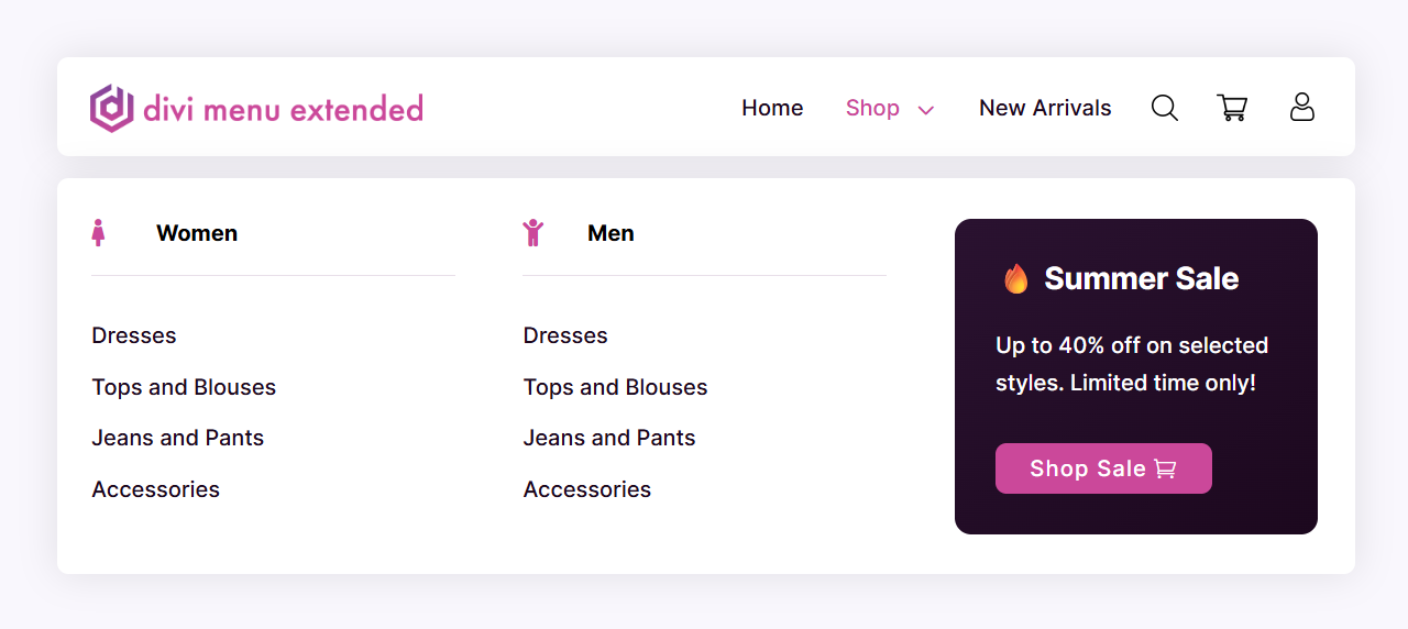
Set Dropdown Content to Canvas and pick a Canvas Portal on your layout. Whatever you build on that canvas, columns of links, images, a product grid, a form, a call to action, becomes the mega menu, and you style it with the modules’ own settings rather than a menu-specific editor. The panel opens under the bar on hover on a desktop and on tap on a touch screen, sits where the plugin measures the bar to be, so it stays in place under a sticky header, and stretches to the width of the Menu module unless you give the canvas a width of its own. A tall canvas scrolls inside the panel instead of running off the screen.
The Mega Menu design group styles the panel’s border and box shadow and the close button that appears once the menu has collapsed: its color, background, corner radius, size, padding and which side it sits on. A reduced-motion setting in the visitor’s system switches the open and close transition off.
Dropdowns from the menus you already have
Set Dropdown Content to a menu from Appearance > Menus and the item shows it as a dropdown, nested levels included, each one flying out beside its parent. It opens on hover on a desktop and on tap on a touch screen, and you style it with three groups: Dropdown Panel (background, border, box shadow, sizing, spacing), Dropdown Links (font, background, border, spacing) and Dropdown Toggle, the icon that opens a nested level once the dropdown has become an accordion inside the hamburger panel or on a touch screen.
Divi 5 child modules cannot nest, so this is how deeper levels work: the top level is built from Menu Items, and anything below it comes from a menu you manage in WordPress or from a Canvas. Links inside the dropdown that point at the current page take the Active Menu Item color, and the item that opens them lights up too.
Popups that open from a menu item
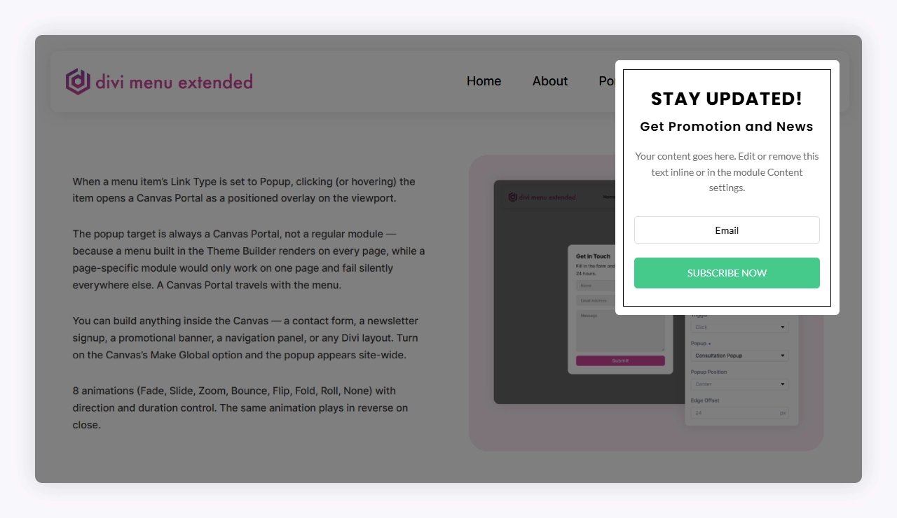
A Popup item opens a Canvas Portal over the page, using Divi’s own Interactions, on Click or on Hover. Popup Position has nine anchors, Center for a dialog and each edge and corner for a cart preview or a notice. Set the Width, the Edge Offset that keeps the popup clear of the screen edge on every side, and a Backdrop Color that dims the page; make it transparent and the popup floats over the page with the dimming off.
Animation has seven styles, Fade, Slide, Zoom, Bounce, Flip, Fold and Roll, or None, with a direction taken from the position or set by hand and a duration of your own. The same animation plays in reverse on close. Visitors close a popup by clicking the backdrop, where on a desktop the mouse cursor itself becomes a close cross in the color, size and shape you set, with the close button inside it on a touch screen, or with the Escape key.
Live search in the header
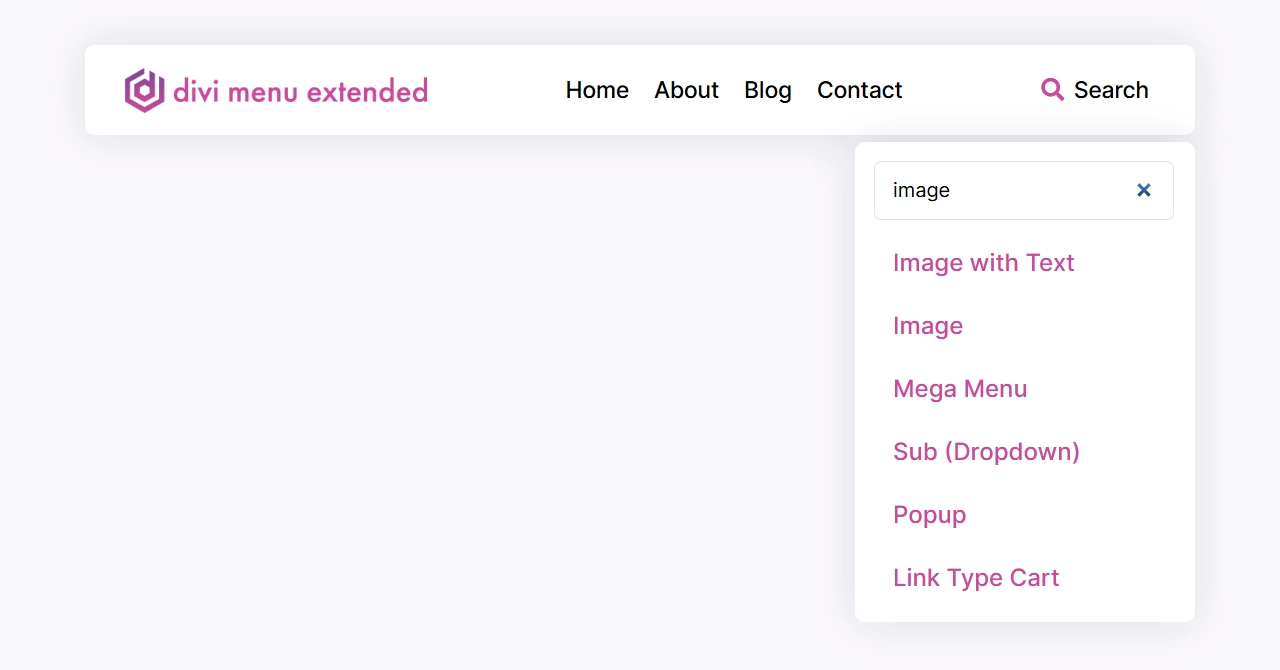
A Search item shows a magnifier that opens a search box, or, with Display set to Inline Box, a box that stays open in the bar and collapses back to the icon below the tablet or phone width you choose. As the visitor types, Live Results lists matching posts, pages, products and other public content without leaving the page, with arrow keys to move through the list, Enter to open a result and a No results found line when nothing matches. Turn Live Results off and the box is a plain search form that submits to your site’s search page, which is also what a visitor without JavaScript gets.
Four design groups cover the Search Box, the Search Field, the Search Results and the Search No Results text.
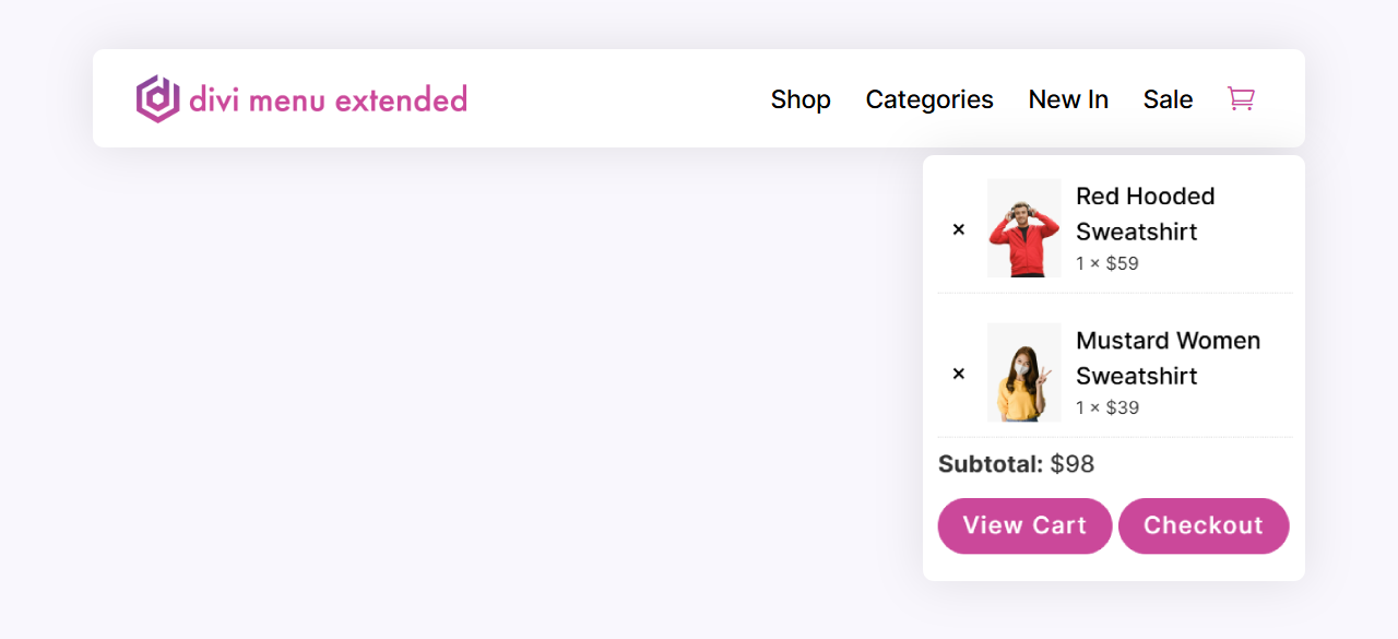
Cart icon and mini cart for WooCommerce stores on Divi
A Cart item links to the WooCommerce cart and shows a badge with the item count. Live Count fetches the number from WooCommerce’s Store API as the page opens and updates it when a product is added or removed, so the count is right on a page served from a cache, with the classic cart and with the block-based cart. Hide Count When Empty keeps the badge out of the way until there is something in the cart.
Mini Cart opens a panel under the icon with each product’s thumbnail, name, quantity and price, a subtotal, and View Cart and Checkout buttons. With Allow Editing on, visitors change quantities and remove items from the panel, and the badge, subtotal and list update together. Five design groups style the Cart Badge, the Mini Cart Panel, each Mini Cart Item, the Mini Cart Button and the Mini Cart Subtotal.
Account, contact and social items
An Account item shows Label (Signed Out), Sign In by default, to visitors who are not logged in and Label (Signed In), My Account by default, once they are; write %%display_name%% into that label to greet the customer by name. It links to the WooCommerce My Account page when the store has one, and to the WordPress login and profile pages when it does not.
Contact items hand off to the device: Phone opens the dialer, SMS the messaging app, Email the mail app with an optional subject and message, and WhatsApp opens wa.me in a new tab with the message pre-filled; spaces, brackets and dashes in the number are stripped before the link is built. Social Follow items take a Profile URL, open it in a new tab by default and carry the network’s own icon, which you can swap for any icon in the picker.
A logo item that follows your site logo
Set a Menu Item’s Content Type to Logo and Logo Source to Site Logo, and it shows the logo already set in Site Identity or in Divi’s Theme Options, so changing it there changes every menu. Custom Upload uses an image chosen for this item alone. Logo Height sets the height and keeps the proportions, with a separate value on the Sticky tab for a smaller logo once the header sticks, and Sticky Logo swaps in a second image, a single-color or compact version for example, when the header becomes sticky. Both images are in the page from the start, so the swap happens without a flash.
Divi mobile menu: hamburger, slide-in panel or fullscreen
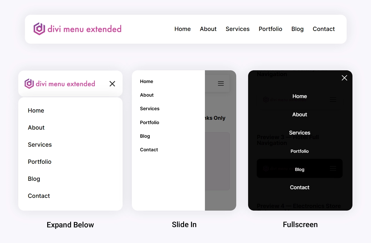
Collapse Into Hamburger decides when the items fold away: Never, Below 980px (Tablet), Below 767px (Phone) or Always, which is how you build a menu that lives behind a hamburger on every screen size. Panel Style decides how the folded menu opens. Expand Below opens the items in place under the bar and pushes the page down. Slide In covers one side of the screen, from the Right or the Left, at the Slide In Width you set, and dims the page behind a Backdrop Color that closes the panel when clicked. Fullscreen covers the whole screen and fades the items in one after another.
Each Menu Item has its own When Collapsed setting: Move Into Panel, Stay Visible or Hide. The usual header keeps the logo, cart and search in the bar and moves the links into the panel. The hamburger itself is drawn, so it needs no icon font and animates into a cross, or you pick an icon of your own, and the Collapsed Menu Panel group styles the hamburger color and size (with hover and sticky states), the panel background and padding, and the close button’s color, background, corner radius, size, padding and position. Without JavaScript, visitors get the full menu rather than an empty hamburger.
Highlight the page the visitor is on
Active Menu Item on the Menu module sets an Active Text Color and an Active Icon Color for the item whose link matches the page being viewed, including parents of the current page, so a Shop item stays lit on a product page. Inside a dropdown from Appearance > Menus, the current page and its ancestors take the same text color, and the item that opens that dropdown lights up with them. Leave both colors empty and no active styling is written at all.
Who it is for
- Site owners on Divi 5 who want the header built on the page with the same settings as everything else, instead of a separate menu plugin with its own interface.
- Store owners who need a cart badge that stays right on cached pages, a mini cart that lets shoppers edit from the header, a sign-in link that greets customers, and product-led mega menus.
- Agencies and freelancers building client headers in the Theme Builder, with Display Conditions on any item and presets for a header style reused across the site.
- Sites with deep navigation that need nested dropdowns from Appearance > Menus on desktop and an accordion inside the hamburger panel on phones.
Specs
FAQs
Do I need Divi 5?
Can I use a menu I already built under Appearance - Menus?
How is a mega menu different from a dropdown here?
Does the cart count work with caching plugins?
Do I need WooCommerce?
Is this a restaurant menu plugin?
Can I show or hide a menu item for some visitors?
Build the header where you build the page
Add the Menu module, drop in a Menu Item for each link, logo, search box or cart, choose where it folds into a hamburger, and style it with the settings you already know from Divi.
Reviews