Whether the ancient world or the new we live in was and is surrounded by words. Words that gave us meaning and a way to communicate with each other to accomplish many great things like initiating war or settling a peace treaty. Whether to send a proposal or fire someone from a job, words played a huge role, and over time they evolved themselves, too.
Now the words we see, no matter how and where, were part of an entity known as Typography. It was the thing in words and paraphrase that helped you either like a product or reject it the moment you saw that. Why? Because it’s the way that makes us believe what we see is true or not.
And in this blog post, we’ll look at this method – Typography – what it is, the importance of typography, how it’s formed, and the best way to use it on a website.
So, without any further due, let’s get started!
What is Typography?
Everything has art to represent itself, whether it’s painting or sewing designer clothes. Just like that, the art that represents words to evoke certain emotions in people is known as Typography. Moreover, it helps arrange letters and text to make them look decipherable, clear, and visually appealing.
It includes different components such as fonts and typefaces that convey specific messages to the point and helps you – the reader – understand what it has to say both emotionally and logically.

Typography has its roots back in ancient civilizations that used hieroglyphs or pictograms, a form of images, to represent ideas. Later, as culture evolved, these images also became alphabets and phonographic writing, leading to various typographic systems. The first standard typography type – movable type – was invented during the eleventh-century of the Song dynasty in China by Bi Sheng (990–1051). Later, it became a revolution in the entire world by Johannes Gutenberg.
The word “Typography” is made up of two Greek words: Typos, meaning “form” or “impression,” and Graphein, which means “to write.” The concept of printing has traces of origins to the seals and currency of ancient times created using the first punches and dies of the world.
According to Printmag, typography has an illustrious history that makes it essential for typeface designers to know it, to bring ancient touch to their modern typography design. Moreover, typography had has different eras that are as follows,
- Ancient Era – Convey messages with images and illustrations—no words involved.
- The Middle Ages – It included handwritten text and well-illustrated manuscripts.
- Gutenberg and Modern Typography – Introduction to movable type and printing presses to print practical and decorative typefaces used in signs, posters, newspapers, periodicals, and advertisements.
- Current Typography – Use of different typefaces ancient and new with the help of various tools and technology.
Components of Typography?
Just like ancient typography, the one we use – modern typography – in today’s world has different components to make it look clear and readable. However, now it’s found in both print and digital platforms. But, it is turned chiefly as digital typography to be used in both of the writing worlds. Graphic designers use digital products to give birth to new typography and use it somewhere.
Therefore, whether you’re a freelance web designer or employee at an organization, to make websites with good typography, it’s essential that you know all of the different elements of typography, which are as follows,
Typeface vs. Font
People, designers, and developers often confuse themselves by considering typeface and fonts the same, and because of that, they often find wrong font choices for their website. However, the below explanation will help you cast out all of your fonts and typefaces doubts.
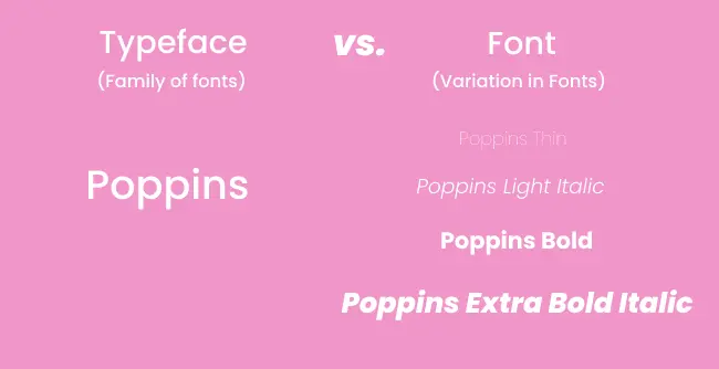
What is Typeface?
A typeface is basically the collection of related fonts known as the family of fonts, such as Times New Roman, Arial, Tahoma, and Devanagari. Plus, it also includes variations of a family font, for example, Times Roman and Times New Roman.
Some of the popular typeface used around the digital and print world are:
- Helvetica
- Baskerville
- Arial
- Roboto
- Times
- Futura
- Georgia
- Garamond
- Myriad
- Verdana
- Montserrat
- Nunito
- and Muli.
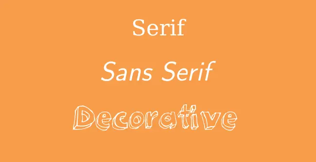
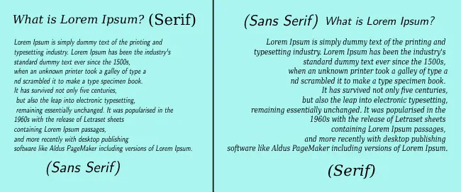
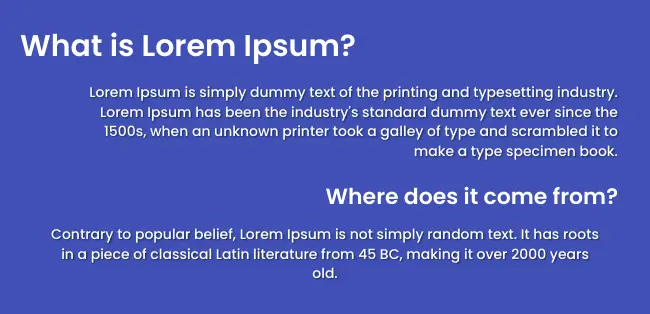
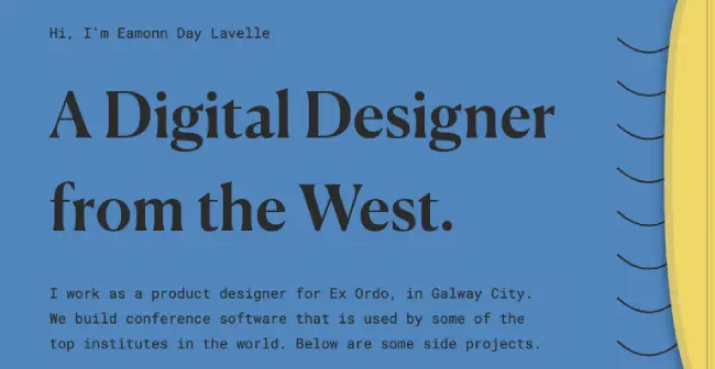
There are primarily three kinds of typeface that graphic designers use mainly: Serif, Sans-serif, and decorative. And to keep a copy or website design easy to read and scan, they use less decorative typefaces. Furthermore, the Serif and Sans-serif typefaces get in use interchangeably at the main heading and the body the same as the below screenshot,
What is Font?
A font, on the other hand, is the artistic representation of text characters. It’s a typeface variation that deals with a particular typeface’s weights, widths, and styles such as bold, italics, underlined, and more.
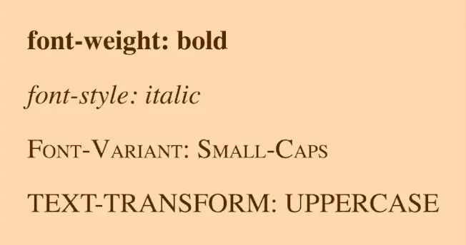
Moreover, you can consider a font as an adverb for the typeface describing and highlighting a particular text more profoundly. For example, bold and underline font showcases the importance of a text or word.
Hierarchy (Title, Heading, Subheading, and Body/Paragraphs)
To define a particular content on a website, it’s important that you keep its hierarchy in mind because it keeps primary content separate from the less significant one. It makes it easier for the readers to scan through the entire text and get attentive to their desired topic. Therefore, typography combines different elements of text structure: Title, Heading, Subheading, and Body or Paragraph.
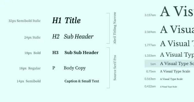
Image Source: tradecraft
And to make a copy more legible, it’s recommended that you include a single title with body text encapsulated in different headings and subheading. Though, keep the title and heading (including sub-heading) of the same typeface and body different.
Color
Most appealing fonts won’t do any good if their colors aren’t aligned with the page’s background. Colors are another essential component of typography, and if they aren’t selected wisely, you could lose a significant amount of users. Famously, the color which designers mainly prefer is Black (#000000) with the background combination of White (#FFFFFF).
Contrast
The principles of typography are to represent a particular message or idea most clearly and understandably. Something that catches people’s eye and drives certain emotions in their mind and body. And this can be done by using Contrast in your typography and its fonts and typefaces. You could try various typefaces, colors, styles, and sizes to make an impression and make the page worth a bookmark.
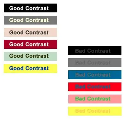
Image Source: sitepoint
The above image illustrates how the combination of different font colors and background make and break the typography. If you want to create good typography websites, stick with Black font color and white background. Or dark on the light.
White Space
Whether people or words, nothing likes to stand in a tight place; they need space to breathe and get noticed. White space is another essential element of the typography to ensure that the written content is uncluttered and readable. Moreover, it can also increase engagement and attention to the text by providing an overall aesthetically pleasing experience.
You can include white spaces in your copy by defining proper values to margins and paddings. Or by leaving blank areas with double enter hits or using some graphics.
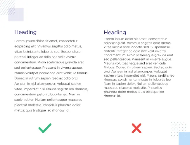
Alignment
Left, Right, Center, or Justified; alignment plays a considerable role in making typography easier to read. If you don’t follow the proper alignment basics, you could make your copy look unprofessional and messy. For example, you keep an uneven flow of text on a webpage, such as Headings in the right alignment, body in the left, and other text elements in the center, just like the below image.
Does it look good? No, right? Therefore, following consistency in your typography’s alignment is important and makes a written piece alive and highly valued.
Reasons Why Typography on Web Design Is Important
Content is king; it’s a well-known fact, and typography is an integral part of it. Eye-catching fonts and a perfect combination of other elements help you bring the best web page on the internet. But it’s more vital to know why you should create websites with good typography. And the following points will help you do that.
Typography Allows You to Communicate & Deliver the Message
The first purpose of adding content to the site is to communicate with the audience and deliver your message. A purposeful message that discusses the users’ problem and shows them how you can solve it. With appealing typography having beautiful fonts and variations, you can present this message in a profound way and make it stand out.

It further opens up the way to connect with the audience and make them believe that your solution can help them. And that’s what every business wants to do. If it’s done right, then you could profit more than you’ve thought.
With Right Typography, You Can Build Buzz Around the Brand
Stretching reach and building brand recognition is another goal of creating a website and bringing potential clients to the conversion page. With the right typography on the sales or other web pages, you can fulfill this goal very efficiently.
Plus, it makes it easier for visitors to remember the site for a more extended period because clear and concise typography vividly presents the brand. So, whether they stay on your website for a longer period or short, they’ll be going to remember it and share it with others as well.
An Awesome Way to Attract Users
To grow an online business, it’s crucial that users get attached to content in a few seconds and continue their journey down to the bottom. And with good typography, you can attract users at the first visit in a few moments and motivate them to navigate through different areas of the site for better user interaction and lead generation.
With Attraction Comes the Attention
Okay, you’ve attracted the user with your website’s typography combination, but it cannot guarantee that they’ll be attentive to what you’ve written. And they could leave your website due to non-attentive typography. Therefore, using typography that’s both attractive and attentive. And to make the typography observant, you could follow proper font variations, for example, white spaces, alignment, and color selection.
Typography With Hierarchy Explains Significance
If you don’t use the proper typography and don’t care about its components, especially Hierarchy, it’s pretty sure that you’d end up with a messy webpage. Users won’t be able to distinguish what piece of content is more vital than the other. So, to hold their attention and present them a clear copy. From which they can easily extract the required information, it’s necessary you use the typography. And with that respect, its components such as Hierarchy.
Typography Helps You Motivate Users to Take Actions
Whether it’s an illustration or a video, everything present on the web page serves to motivate users to take a particular action. With good typography, this purpose becomes easier for you to accomplish. Right words with the right combination of typography at the right location enable users to understand the message clearly. According to that, they take action to fulfill both their and your purpose.
Websites With Emotional Typography Performs Better
If you’re behind eliciting emotions in your readers’ minds, typography could be your solution because different typography evokes different emotions. Moreover, a website that focuses on people’s feelings performs better than who isn’t. Therefore, it’s a significant reason why you should focus on improving your website’s typography.
How To Choose the Right Typography for Your Website?
As we’ve discussed all the crucial points of typography, what it is, how important it is. Now, let’s take a look at how you can choose your perfect website typography.
Consider Fonts Psychology
When you choose particular typography for your website, you must take care of Font Psychology. It’s the study of how different fonts impact thoughts, feelings, and behaviors in a person’s mind which further leads him/her to take a particular action on your website.
Different people have very different thoughts, feelings, and associations with varying types of font. For instance, if you choose Sans Andreas on a website, it will evoke a very distinct nervous response in your visitor’s mind than using Arial, Roboto, or Montserrat. Recognizing those different impressions and how you can use them for your benefit, called font psychology.
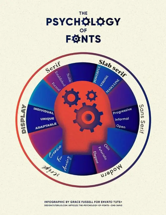
If you want to take advantage of font psychology on your website, you can take help from the above font psychology chart. To know more about font psychology, read Envato Elements’ article on The Psychology of Fonts.
Consider Brand or Business Domain’s Spirit
If your website comes from the business domain of the medical industry and it uses decorative typefaces, then you’re mixing different things that don’t meet the standards. Because serious or you can say critical websites like Medical, Law, University and more don’t provide value to the users if they present themselves light-hearted or funny. Whereas artistic websites always welcome creativity and decorative typefaces. Therefore, whenever you create your website and choose its typography, keep your business domain’s spirit in mind.
Try Different Font Combinations
At first, when you’ll design your websites, you won’t be able to find your perfect typography combination for the entire components. Sometimes, the heading will match with the body, or sometime’s it doesn’t. So, to bring the best font types on your site, keep testing different font combinations. And one that’ll win your eyes (keep your audience’s experience also in mind) add it to the site.
Consider Your Mesasage’s Tone
Just like your website’s business domain spirit, your tone of the message matters a lot. If your message is serious and you use fancy typefaces, then it won’t impact readers’ minds the way it should. Therefore, when you add copies, it’s important that you follow your message’s tone and, according to that, use particular typography.
With Appealing Fonts Add Clear Copies
The way it’s vital for the typography to be clear and concise, it’s essential that you add simple yet powerful words on your website. Text that resonates with its design. Without robust and moving words, there’s no use of appealing fonts and typography. Therefore, when you design your website, always try to impact your web copies. Try to talk more about users’ problems and how your services can resolve them. Then, and only then, web page copies would look amazing with the perfect typography.
The Best Way To Bring Your Desired Typography to the Site
When you create a website using a particular CMS, whether WordPress, Squarespace, or Wix, you already get a way that allows you to add different typography to your website. However, many different ways also enable you to bring the desired typography and its font types. But when to use them and when to not makes a lot of difference; the below points will help you hold off with the most suitable one.
Use System Fonts
By default, all the CMS include different typefaces. And if you’re not looking into some custom ones, then going with them is the perfect solution. Plus, for the website’s best speed scenario, using them would be beneficial for you. Because if you’re on a lite hosting plan, custom fonts will take time to load, and users may find them disturbing.
Try Google Fonts
For custom fonts, the number one favorite choice of web designers is Google Fonts. They are rich and load faster on your website. Moreover, most of the CMS by default include in their systems. So, you don’t have to write some codes or scripts to bring them to your website. In the case of WordPress, if the theme doesn’t include Google Fonts, then you can use one of these 5 best Google font plugins for WordPress to import them on your website.
Take Help From Adobe Fonts
After Google Fonts, the custom web fonts provider that is most used and preferred is Adobe Fonts. Google Fonts are rich, but sometimes it doesn’t include modern digital fonts, which you can alternatively find on Adobe Fonts. To use Adobe Fonts, you have to code a bit, but it’s not so complex. By following this on how to use Adobe Fonts on your website, you can easily import them. However, the one downside of AF is that they don’t come for free compared to Google Fonts. But, if you have a Creative Clouds subscription already, then you get Adobe Fonts for free.
Examples of Web Typography Combination
So, that’s our take on typography and why it’s essential for your website. With that, we’ve also discussed how you can add appropriate fonts reflecting your brand and business. By following each point carefully, you can bring the right typography to your website. However, if you need inspiration, then the following typography combinations can help you,
Futura PT, Hatton and Pangram
Formular and Spoof

Assistant, PT Serif Caption, and Work Sans
Merriweather and Futura PT
Roboto Mono and Canela


0 Comments