If you’re offering products and/or services on a website, then without pricing tables, it’s hard to sell. Actually, it becomes impossible and the reason isn’t hidden somewhere in a closet. It’s vividly seen that visitors can’t see how much you’re charging for what you are offering. Okay, you’ve shown the price of the products and services, but again, it’s not effective if you have multiple products or services.
Because on individual pages, it becomes harder to compare one product/service to another. And a pricing table, in addition to making comparison easier, provides many benefits.
Therefore, we have created this post to help you uncover the essentials of pricing tables as well as to find some inspiration to design your own pricing plan tables with ease. Psst! We have a surprise as well. So, don’t forget to reach the end of the post. Else, you’ll miss it.
(1) Pricing Table Structure
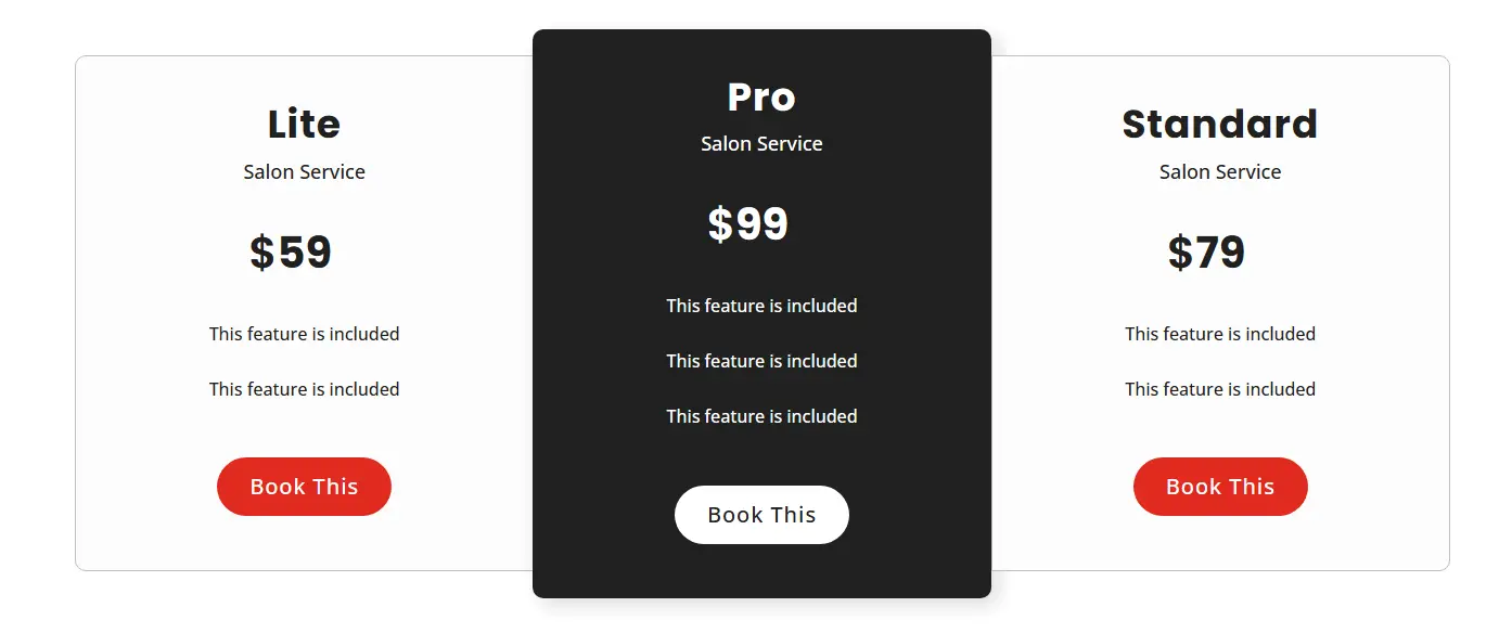
By structure means the layout/orientation of the table. Generally, the most used layouts for tables with price details are Vertical and Horizontal. In a vertical table, you have the plans and their details stacked one by one. You look at one option and details related to it are mentioned below, just like the following pricing table example,
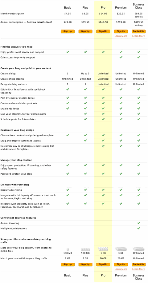
In a horizontal pricing table, the plans and their details are added based on the different segments that are listed on the left side. By looking at the following table, you can get an idea of what a horizontal table looks like. The features are stacked one by one in a single column on the left, and the plans columns describe whether the particular feature is available or not.
Now, which one should you go with? Technically speaking, we, as humans who read languages that are Left to Right, tend to absorb the info in the same manner. By using a horizontal table, it can become hard for the visitors to understand the differences. Why? Because even though the features are on the left, the human reading behavior will be Right to Left. Website visitors first look at the features, then their availability and again at the features, then there will be a comparison, which overall makes the pricing table confusing. There will be many head rotations, which will definitely tire the customer.
On the other hand, in a vertical table, the user will first look at the plan, then features, and left to right movement for the other plan variation. Secondly, there will be fewer number of head rotations, too. Therefore, it will be easier for them to soak in the details. Thus, choosing vertical tables with price info would be appropriate in many cases.
(2) Keep Minimum Plan Variations
Less is more and it’s purely applicable to pricing tables. Because the more plan options/variations you’d provide your customers, the more it will confuse them. According to a study, it’s found that “too much choice will lead to indecision and lower sales.” It’s a choice paradox that puts the user in confusion, and they are not able to buy anything. Therefore, when you create an effective pricing table, limit the number of plans to either 2, 3 or 4.
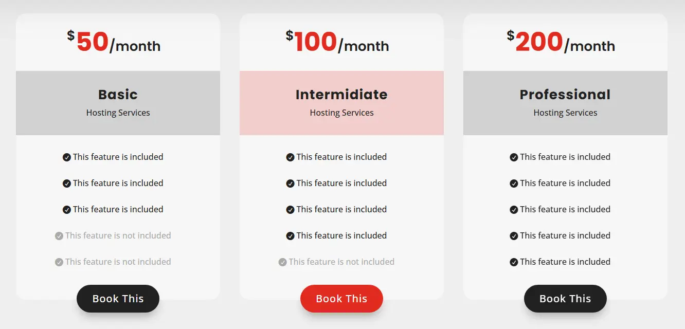
The above pricing table example is a perfect example of how you can present your best pricing to visitors without overwhelming them.
(3) Design Elements to Minimum
The way more options create the situation of indecision, and in the same way, more design elements distract the user from the main point. Rather than focusing on the info, your customers or visitors will look at the design, which is unnecessary.
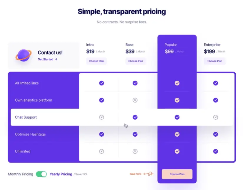
If you look at the above pricing table, you’ll find that the focus is divided. The colors, the checkmarks, the getting started link, the discount, and finally, the toggle, which will hardly be interacted with because it’s not in the right place.
Therefore, it’s better to avoid many creative ideas and stick to a minimum. Furthermore, you have to be consistent with your design. It shouldn’t go outside the entire look and feel of your website. The colors, typography, and animations (if any) match the parent design specifications.
(4) Use Toggle Effectively
In the previous pricing table example, you could clearly see where it went wrong, especially in the case of Switch/Toggle. So, if placing the switch at the corner isn’t appropriate, then where?
Well, apart from left to right focus, human eyes go for center as well. If something’s in middle, we will rarely miss it. Hence, using toggle at the center of the pricing table, will provide you with more benefits.
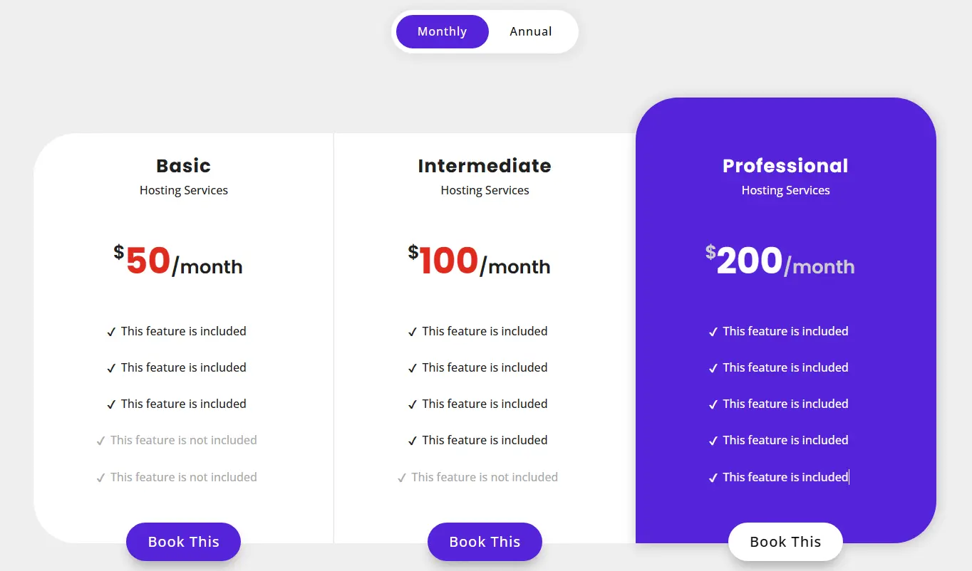
Furthermore, the reason you should use a toggle is to present pricing comparison table without being cluster. In many cases, there will be annual and monthly pricing, so rather than putting everything together making things indecisive, it’s better to use a toggle.
(5) Add Adequate Information
Another mistake website owners make when they add pricing on websites is that in the pursuit of convincing the customers or visitors, they add lots of lots of information in the tables. Now, there’s a saying that, if you can’t convey in less, more isn’t enough.
If simply put, adding a huge amount of details about a particular plan will do the same as many options and design elements: it will confuse the customer and overwhelm them. They will be unable to decide which plan or product they should choose and which they shouldn’t.
Therefore, when you add pricing tables on your website, ensure they have limited info, which is necessary for the customers and enough to convince them.
(6) Compare Differences More and Similarities Less
Once you’ve tackled the extensive information problem, the next thing you need to do when you create a pricing table is what information you need to keep and showcase more. If you look at the following pricing table, you will find the information below isn’t convincing enough. And the reason is that the table only discusses similarities in the available plans.
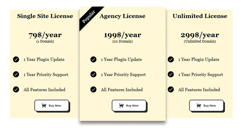
Now, that’s not what will help the user decide among multiple choices. If you’re providing multiple options, it means there have to be some differences between them. That’s why there are multiple options. So, for an effective pricing table, focus on differences rather than similarities. In this way, you’ll put more factors in front of the customers and motivate them to take the desired action.
Having differences will only make each pricing plan worth trying and opting for.
(7) Highly Optimized, Non-intrusive CTAs
You can’t build a best pricing table if it does not include CTAs. CTAs are the final destination that makes your products or services convertible. And you won’t deny using them. Generally, not a single business owner will say no to CTAs. However, when you add CTAs, there are some crucial things to keep in mind that are,
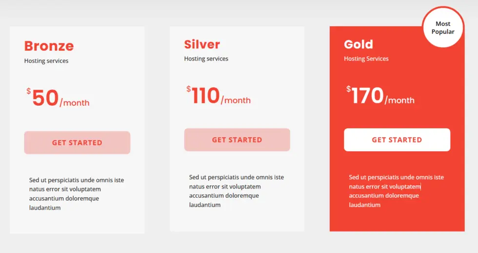
- It shouldn’t blend with the content. Keep it unique.
- The CTA colors should stand out from the rest of the text on your site.
- The CTA text should be short and convincing.
- Use a supporting text, after/before CTA.
- It shouldn’t disrupt the user’s view.
With all these points checked, your website will have a high-converting pricing table.
The Surprise at the End
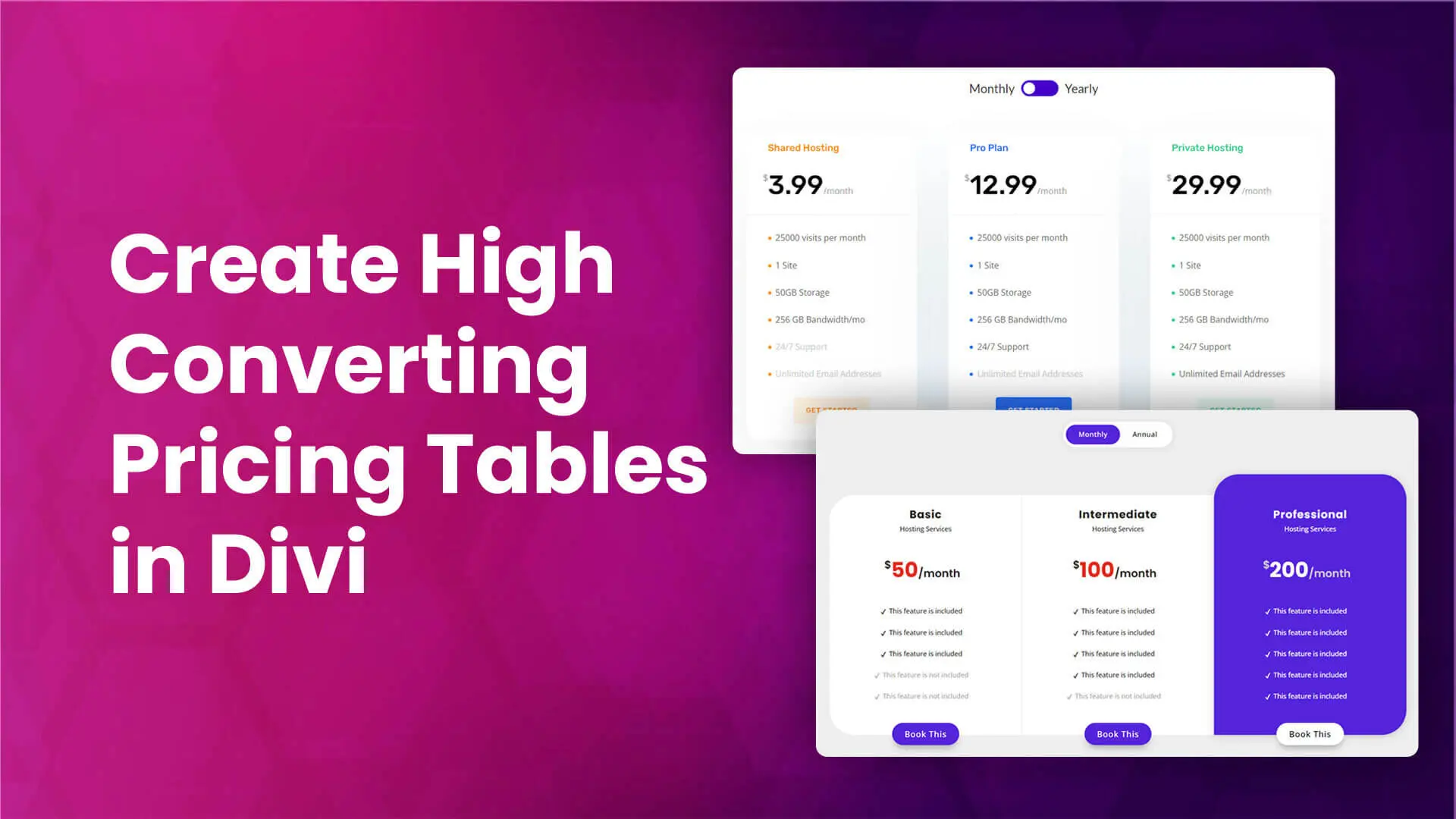
The above best practices will surely help you add a pricing table you can confidently show to your customers. However, building a custom pricing table can take some time, and if you’re new to web designing, covering all points won’t be easy. Therefore, we have built a new product that brings a total of 80 pricing table layouts, which can be easily used on a Divi website.
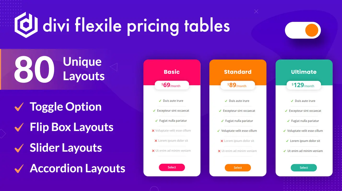
The Divi Flexile Pricing Tables Layout pack consists of templates with the latest design trends, which easily attracts users. Furthermore, you can find tables with,
- Switch/Toggle.
- CTAs with sleek animation.
- Thumbnails.
- On-hover effect.
- Unique and attractive design elements.
- Background images.
- 2 to 4 columns tables.
- Vertical and Horizontal layout.
And that’s not all. The pack comes with frequent updates, which simply means you’ll get more layouts in the future. Thus, if you want to level up your Divi pricing table, this pack is just what you’re looking for.
Try it today, and let’s know your experience in the comments.



The only vertical pricing table in this pack isn’t correctly aligned, just like most free pricing tables.
Sad, I would have bought it if it didn’t have this problem.