In this tutorial, we’ll take a look at the new tabs module of the Divi Plus plugin that has been introduced in the Divi Plus 1.9.0 update. It allows users to easily create Divi vertical tabs without using any custom CSS. In addition, you can also use this module to create horizontal tabs. And not only basic but advanced tabs. It provides you with different easy-to-use options that let you display premade layouts in tabs. Use the icon at the place of the tabs’ title. And a lot more to utilize vertical & horizontal tabs at their best.
Let’s quickly check out all the features of the Divi Plus Tabs module and how they work.
Things Required
To create vertical and horizontal tabs with premade layouts and customization, we need to install the Divi Plus plugin. It’s a multipurpose Divi plugin that provides you with over 50+ Divi modules.
Moreover, it also comes with multiple Divi extensions, free child themes, starter templates, and design blocks. So, you can easily utilize the plugin’s feature without spending too much time. It’s available at Divi Extended as well as Divi Marketplace. According to your convenience, you can get it from where you like. Find more details about Divi Plus here.
After Installing Divi Plus
Once you’ve successfully installed and activated the Divi Plus plugin, you need to enable the Tabs module. To do that, first, go to the Settings → Divi Plus. Then select the checkbox near Tabs. And hit the Save Changes button.
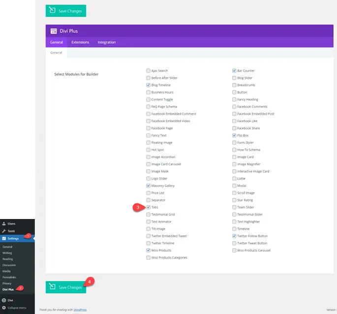
That’s it; you’ve successfully enabled the module. Now, let’s see how it works and how you can create advanced vertical & horizontal tabs.
Exploring Advanced Tabs Module of Divi Plus
The following sections will help you explore the new tabs module of the Divi Plus plugin better. Check out each step one by one and create outstanding vertical or horizontal tabs in Divi with layout & icon support.
Insert Tabs Items
Create a new page or edit an existing one where you want to display an advanced tab. Deploy Divi Builder, and then insert a new row with the DP Tabs module.
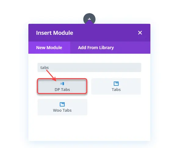
As soon as you insert the module on the page, it will open the content tab with further configuration settings.
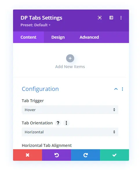
Here, first, we will add new items for the tab and then follow the step to customize the look of the newly added items. Following that, we’ll select the orientation of the tab and further perform customizations to improve the tabs’ appearance. To add items for the tab, simply click Add New Items. And it will open individual settings for the added item.
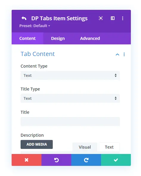
○ Tab Content Settings
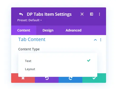
The first setting available in the tabs item settings is Tab Content. It includes options to select Content Type, which provides you with choices to select Text or Layout as tabs content.
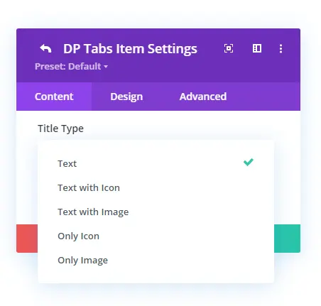
Then comes the option to select tabs Title Type, which includes over 5 options to display tabs title as Text, Only Icon, Text with Icon, Only Image, and Text with Image.
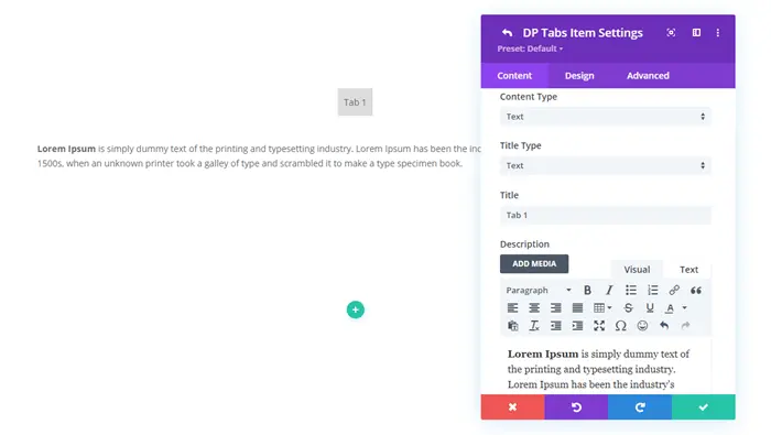
If you select Text as Content Type, it provides you with the Description text area with the rich editor.
Or, if you select Layout, it provides you with a Select Layout field to choose your premade layout saved in the Divi Library.
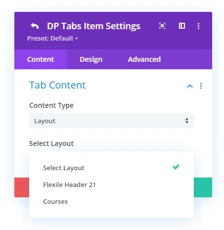
In the Title field, you can input the tab’s title as per requirement. For this tutorial, I’ve selected the Text as the Content Type. However, you could use Layout or a combination of both in different tabs. For instance, in one tab you want to display text, and in another, layout. The Divi Plus Tabs module supports both variations without having any issues. After working out with the Tab Content settings, move to the Button settings.
○ Tabs Button Settings
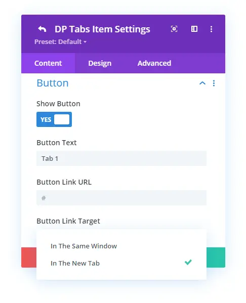
When you select the tab content type as text, it further allows you to display the button under the content area. However, you need to enable it to appear in the tab’s content area. To do that, you need to go to the Button settings in the Content tab of the individual tab item’s settings. Then, check the Show Button as Yes. And your tab will start to display a button.
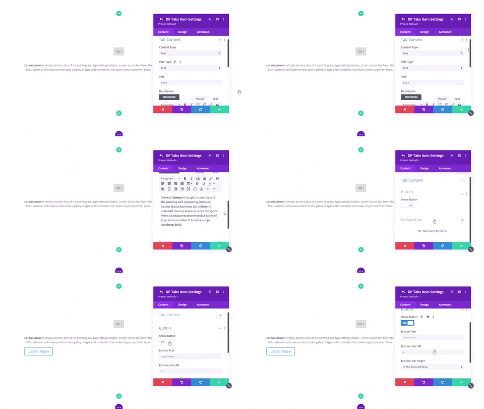
Further, you can define button text, URL, and open link in the same window or new tab using the button content settings.
○ Tabs Item Background Settings
If you want to apply background customization to your tabs content area, you could easily do that using the Background settings. It allows you to change the tab’s content area background using Color, Gradient, and Image.
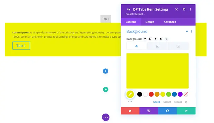
We could also perform background customizations using the primary settings, which we’ll discuss later in this tutorial. For now, move to the Design tab to apply appearance tweaks to the tab’s item (s).
Tab’s Item Design Customizations
The Design Tab of an individual tab item contains the following settings to improve the tab and its content appearance.
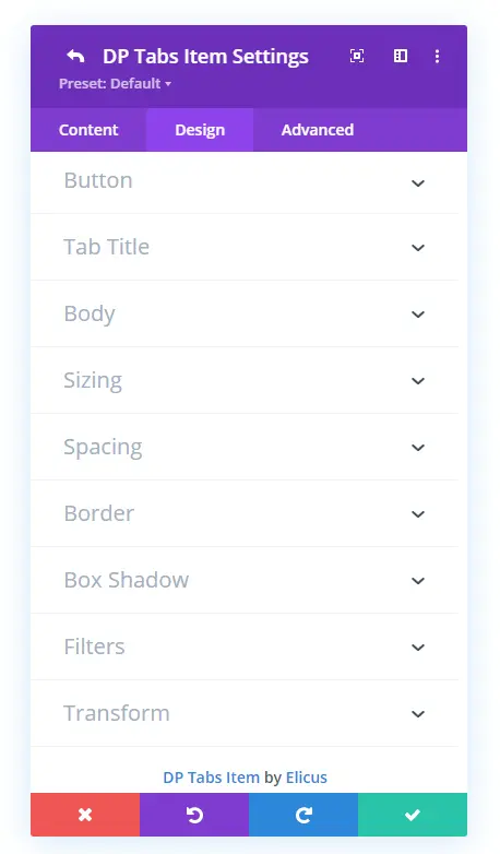
Let’s explore each design setting one by one.
○ Button
Under the Button design settings of the tab’s individual item, you can apply custom styles for the button. It further allows you to change the button’s font type, style, size, and color. Plus, you can also change the button background.
There are more options that you can perform on your tab’s button. Like, button border radius, color, button icon, icon color, and placement. Moreover, it also provides you with the option to easily change the button’s alignment in the tab at left, right and center.
The last thing you can do with the button design settings is set the custom Margin and Padding values. So, as per the tab’s dimension or content length, it could fit perfectly right without breaking the tab’s appearance.
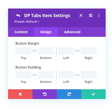
○ Tab Title
Using the Tab Title design settings, you can customize the appearance of the tab’s title text with background for both the Active and Regular tabs. Useful feature users have been waiting to create Divi tabs that can change their text and background color while switching between tabs.
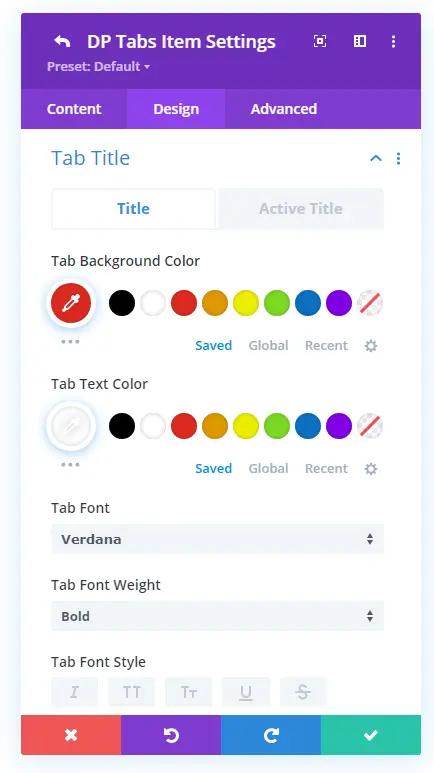
It provides you with all the essential text customization options that, after applying, your tab’s title would look like the below visual. To understand the working of tabs title, I have added another tab. So, when switching between one to another, you can easily distinguish the active and non-active tab’s difference.
○ Body
If you’re using text as the content type for your tab, then using the Body design settings, you can customize the complete appearance of body text. The tabs module includes all the text customization options you could apply to the body easily.
For example, you can easily customize a normal text as well as links, buttlets, numbers, and quotes, just as we do in the default Divi text module.
○ Sizing
If you’ve selected the tab’s Title Type as Text with Image, then using this particular setting, you can change the image’s width. As you can see in the below screenshots, I have changed the image width for the tab’s title text.

Tab’s Title Text with Image no width customizations.
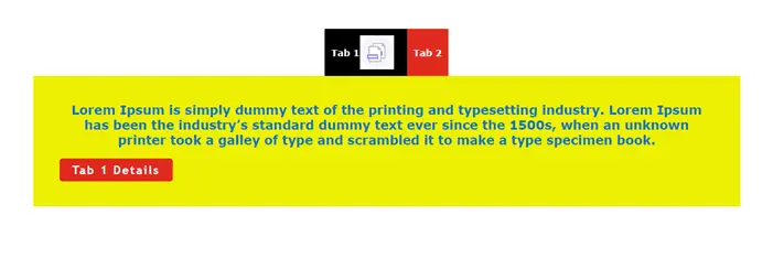
Tab’s Title Text with Image having customized width.
○ Spacing
The Spacing design setting enables you to easily change Margin and Padding for the tab’s title. Allowing to create enough space between text and other tab items for better usability and user experience.
○ Border
The Border design settings available in the individual tab settings allow you to add rounded corners to individual tab items.
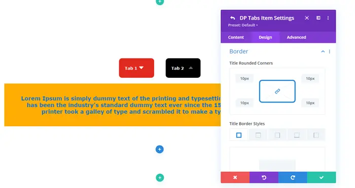
○ Box Shadow
The Box Shadow design setting of the tab simply allows you to apply different shadows to the tab items. It provides all the necessary options to make the box-shadow look appropriate and easy to blend.
○ Icon/Image
You’ll get this particular setting in the individual tab’s item when you choose Text With Image, Text With Icon, Only Icon, and Only Image as Title Type.
Here, what you can do is, define the alignment location for the title Icon and Image. Furthermore, what else you can also do is, customize the color of the icon for both active and non-active tabs. Plus, change its size according to the requirement, as you can see in the above illustration.
We’ve explored all the design settings of individual tab items. Now, let’s shift our focus to the primary ones.
Tabs Configuration
Once you’ve added 2 to 3 tab items in your tabs, you’re good to go and customize the primary settings of the tabs module. In the Content tab of the module, we’ve already explored the Add New Items function. Now, head over to the Configuration settings.
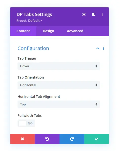
It provides you with the options to change Tab Trigger type, Orientation, and Alignment with Fullwidth Tabs support. Let’s check them out in detail.
○ Tab Trigger
This particular option in the Configuration setting makes it possible to open tabs on different interactions. The first tab trigger type is Hover, and another one is Click.
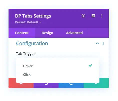
If you choose hover, then users will be able to open tabs by hovering on them. And if you go for the click, then users can open the tab by clicking on them. The following visuals depict how Divi horizontal tabs allow users to open tabs with different trigger types,
Divi horizontal tabs with hover trigger type.
Divi horizontal tabs with click trigger type.
○ Tab Orientation & Item Alignment
By default, the Divi Tabs module creates horizontal tabs. However, using the Tab Orientation feature, you can turn them into vertical ones. So, from now on, you don’t have to use any Divi vertical tab CSS. Using the Divi Plus Tabs module, it’s easily achievable.
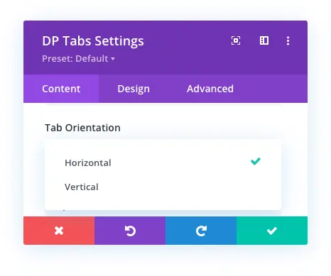
Moreover, upon choosing a particular orientation, you get the option to change the alignment of tab items. For horizontal tabs, you get tab alignment as Top and Bottom.
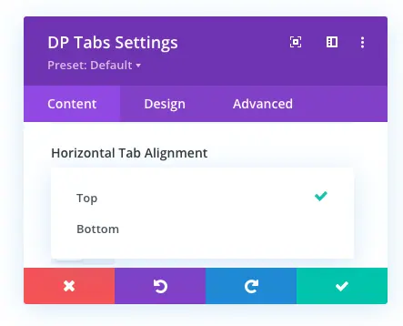
This is how the horizontal tabs look in both the alignment variations.
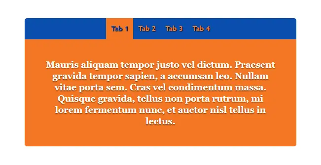
Top aligned horizontal tabs.
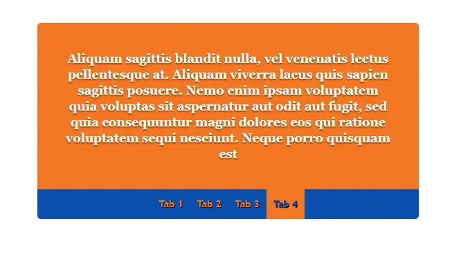
Bottom aligned horizontal tabs.
Even you can choose to turn the horizontal tab’s item fullwidth using the Fullwidth Tabs option. It will make the tab items cover the entire width of the horizontal tab, just like the below screenshot.

With vertical tab orientation, you get tab alignment as Left and Right — making it possible for you to create vertical and horizontal tabs for different requirements.
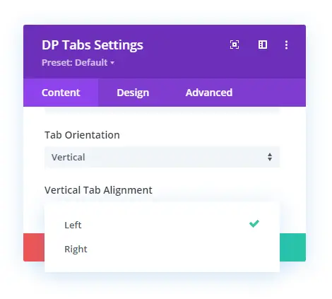
This is how the Divi vertical tabs look with different alignments.
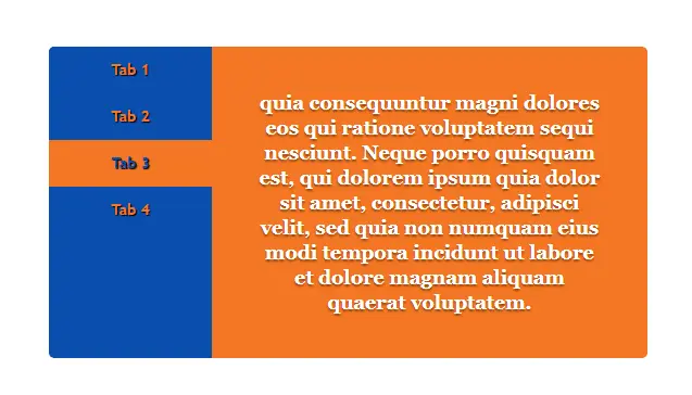
Divi vertical tabs aligned left.
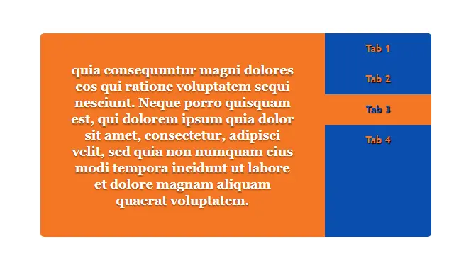
Divi vertical tabs alignment right.
Background Customizations of Tabs
The Background settings available in the Content tab of Divi Plus Tabs provide you with the option to customize the background of Navigation and Content.
You can use color, image, and gradient to customize the background of the above stated. If you haven’t applied content color in the individual settings, which we discussed earlier, you could use this option to assign the same color for all the tab’s content areas.
Design Customizations of Tabs
The following are the settings available in the Design tab of the Divi Plus Tabs module. Using these options, you can tweak all the tab item’s appearance in one go.
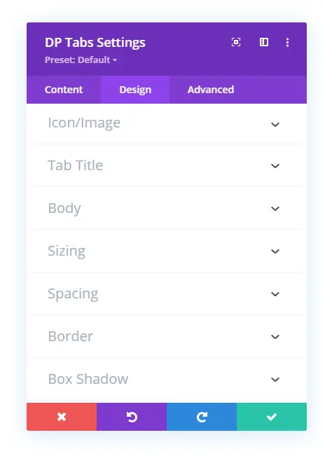
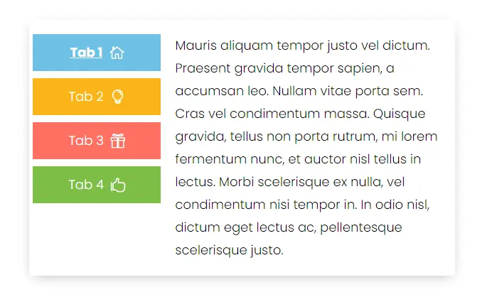
You don’t have to open each item one by one. However, under these settings, your tab items will have the same appearance as the other items. But if you have customized their appearance individually then, applying changes here won’t work. For example, similar to the screenshot below, if you want to create a tab like that, you have to customize their appearance individually.
Apart from this, the Border and Box Shadow will allow you to apply rounded corners and box-shadow to the entire Divi tabs box. Furthermore, you could also apply Transform and Animation settings to optimize the tab’s working as well as entrance.
Examples of Divi Vertical & Horizontal Tabs
So, that’s our look at the new Tabs module of Divi Plus. We’ve explored all the options and how you can utilize them in your web design. For many Divi designers, designing vertical tabs was crucial, and with this new module, they could easily achieve that. Moreover, some users needed to design tabs that can change their background for both title and content whenever users switch from one to another. Now, using this module, they could easily achieve that as well.
If you’ve already used the new Divi Plus Tabs module, we want to hear from you. How was your experience using it, and how it helped you overcome designing advanced tabs for your website? In addition, if you got some thoughts about this module, we’re happy to hear that as well, let us know in the comments.
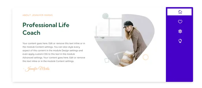
Before you go and try this new module, let’s check out some beautifully designed Divi vertical and horizontal tabs.




0 Comments