Divi Scroll Effects are a great way to turn a simple Divi website into a modern one. And not only modern but highly interactive with enhanced engagement for different areas of the site. You could highlight CTAs, content sections and hook users to the purpose you’ve used them on the site.
In this blog post, we’ll take a deeper insight into those scroll effects and also see how you can use them creatively on your site with examples. So, whenever you’d plan to utilize them for your projects, you could start with solid ground and an amazing inspiration. But, first, if you’re new to the Divi Extended blog and want to learn more about Divi, subscribe to our free newsletter. You’ll receive free tips & tricks regarding Divi with amazing deals on our premium products that you can use to take your Divi website to the next level.
Enough with the intro, and let’s dive into amazing Divi scroll effects!
What Are Divi Scroll Effects?
As you can see in the below video, different elements at different scrolls showcase a beautiful animation effect. Some go sideways, so other fades, blur out and slide. All these effects happen when you scroll the page, up and down. And are created using the Divi Scroll Effects available in the Divi Builder.
Compared to the regular animation effects that work when the user interacts with them, the scroll animation behaves based on the browser’s scroll movement. When you scroll down, they’ll start their intended behaviour, and when you scroll up, they will reverse the process. Plus, how and in which direction a particular scroll effect would take effect is also based on the speed of the user’s scrolling. In addition to these, the animation timeline is a browser viewport based on where a particular element lies or placed.
With these scroll effects available in the Divi theme, you can add an additional point to your web design practice. It enables you to build something exceptional and out-of-the-box that catches users attention more than anything. And if you’re wondering, How do I use scroll effects in Divi? Then don’t, because applying these effects is simple and easy as well.
To apply Divi Scroll Effects, you need to open Settings of your row, column, section, or module. Then go to the Advanced tab → Scroll Effects → Scroll Transformed Effects, → select the available effect and enable the respective effect by clicking the switch.
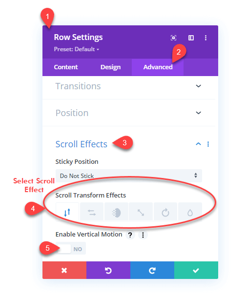
Once you enable the scroll effect, more settings would open based on the scroll effect you’ve enabled.
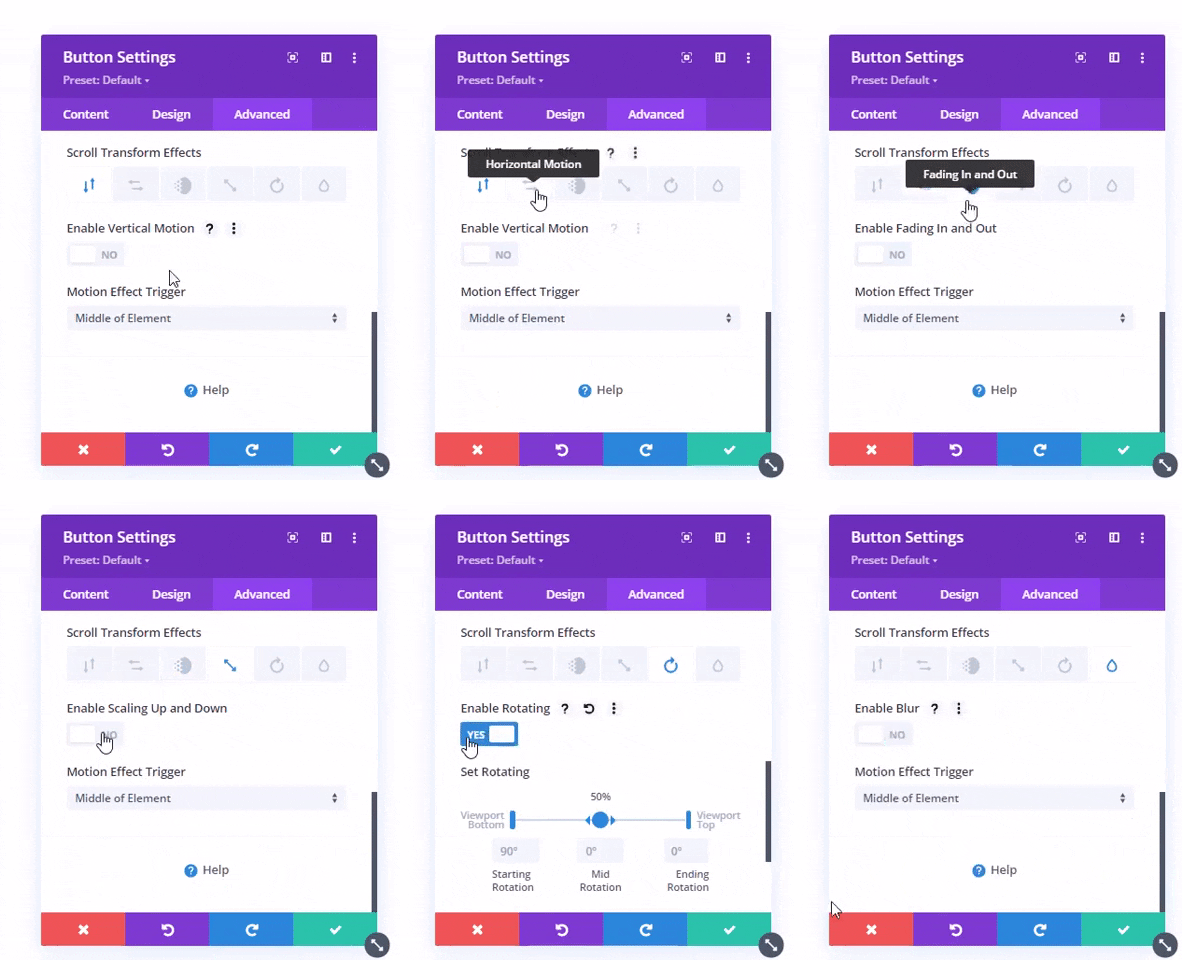
As you can see in the above illustration, each scroll effect has its own set of options. Let’s discuss each effect in-depth separately.
How Many Scroll Effects Available in the Divi Theme?
Currently, there are 6 scroll effects available in the Divi theme. And each effect includes additional options to utilize them further. The available scroll effects are,
- Vertical
- Horizontal
- Fading In and Out
- Scaling Up and Down
- Rotating
- And Blur.
Vertical
Using the Vertical scroll effect, you can enable a particular Divi element to move up and down based on the user’s scrolling. It’s somewhat, or you could say, equal to the parallax effect. Like the below illustration, where the content section and button scroll up and down based on the scroll movement.

Horizontal
In the Vertical scroll effect, where elements move up and down. The Horizontal scroll effects make them move right and left sides based on the scroll speed and direction. You can apply this effect to certain elements to enhance their presence and catch visitor’s attention. For instance, like the below illustration, you could apply this effect on subscribers/contact forms to improve email lists or leads’ chances.
Fading In and Out
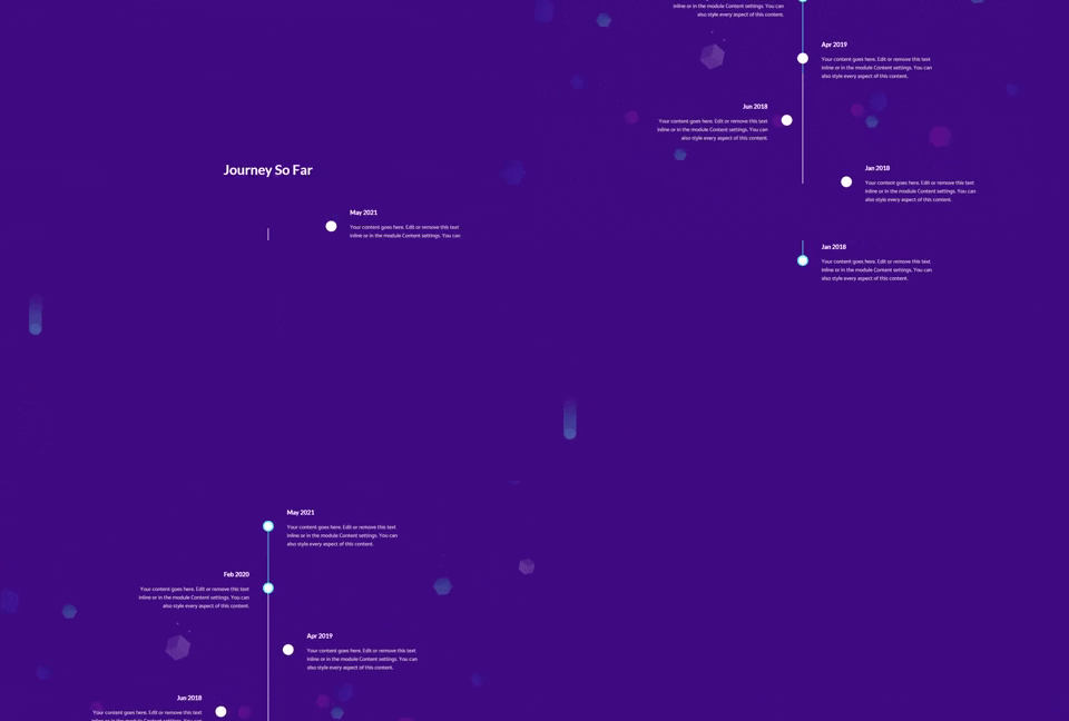
Using the Fading In and Out scroll effect, you could create elements that would appear and disappear on the page based on the user’s scroll direction and speed. This particular scroll effect is really good when you want to entice users with different segments of the page. For example, you want to show a particular timeline and its event, then this scroll effect in Divi could help you achieve that easily.

Scaling Up and Down
Want to leave a long-lasting impression on website visitor’s minds? Then using Scaling Up and Down, you could achieve that easily. Based on the scroll movement and speed, the effect will showcase the particular element with increased focus. When the user scrolls down, the element will appear scaling on the page. As the user scrolls up, the element will disappear, scaling down on the page.

Rotating
If you want to rotate a particular element on the site, then using the Rotating scrolling effect, it’s easy to achieve. The rotating effect available in the Divi scroll effects enables an element to rotate from left to right or right to left when combined with the Horizontal effect.

Blur
Based on the user’s scroll speed and direction, you could blur different site sections using the Blur scroll effect. It brings elements’ in and out of focus as the visitor scrolls the page.

Moreover, using the additional option available with each effect, you can easily bring elements into focus in front of the visitor’s eyes whenever necessary. The same you can do with the Blur scroll effect. We’ll discuss additional options available in the Divi scroll effects up next. So, you could utilize them at best.
Controls in Divi Scroll Effects
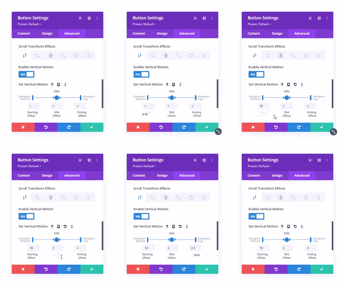
With additional options available with scroll effects, you could improvise their use. You could easily decide when and for how long a particular element should react based on the scroll movement within the browser’s viewport. The available additional scroll effects’ options available in each are,
- Viewport Bottom — Using this additional option, you can control when the animation should start. To delay a particular element’s scroll effect, simply increase the value of the Viewport Bottom.
- Viewport Middle — The Middle Viewport is not textually visible. However, it’s in the shape of a circle. Using this, you can increase or decrease the timeline of both the viewport’s bottom and top.
- Viewport Top — Using this option, you can define when a particular scroll effect should end as well as start its reverse condition when the user scrolls up the page. To increase the reverse scroll effect’s delay and stop the animation early, simply decrease its value by dragging Viewport Top in the left direction.
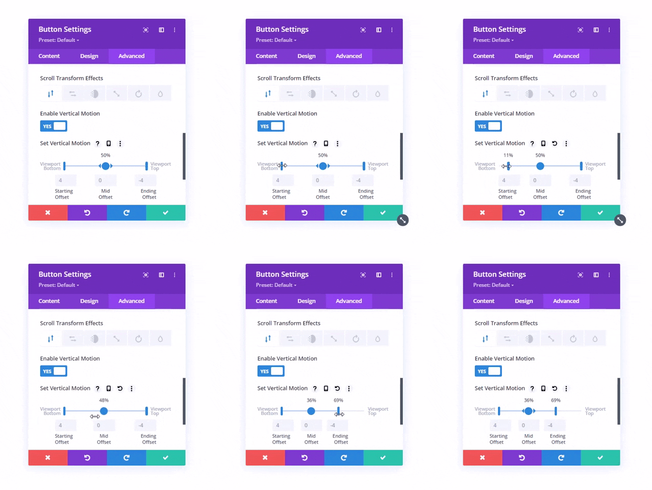
- Starting Offset — It allows you to define what should be the state of the element, enabled with a particular scroll effect when it enters the bottom of the browser viewport.
- Mid Offset — Using this option, you can define how much the element should get offset when it reaches the middle of the viewport.
- Ending Offset — Whether the element should get completely visible or become completely disappeared when the element leaves the browser viewport at the top of the screen, you could define that using this option.
We’ve discussed each scroll effect available in the Divi theme. Let’s check out how we can use them creatively.
How to Use Them Creatively?
Use Proper Spacing
Spacing is essential in every part of web development. It keeps users undistracted and engaged with the webpage content. Therefore, when you add scrolling effects to your Divi website, make sure you add proper spacing between elements enabled with scrolling effects. And not only elements enabled with scrolling effects but also those non-scrolling effects enabled elements present on the page with other significance.
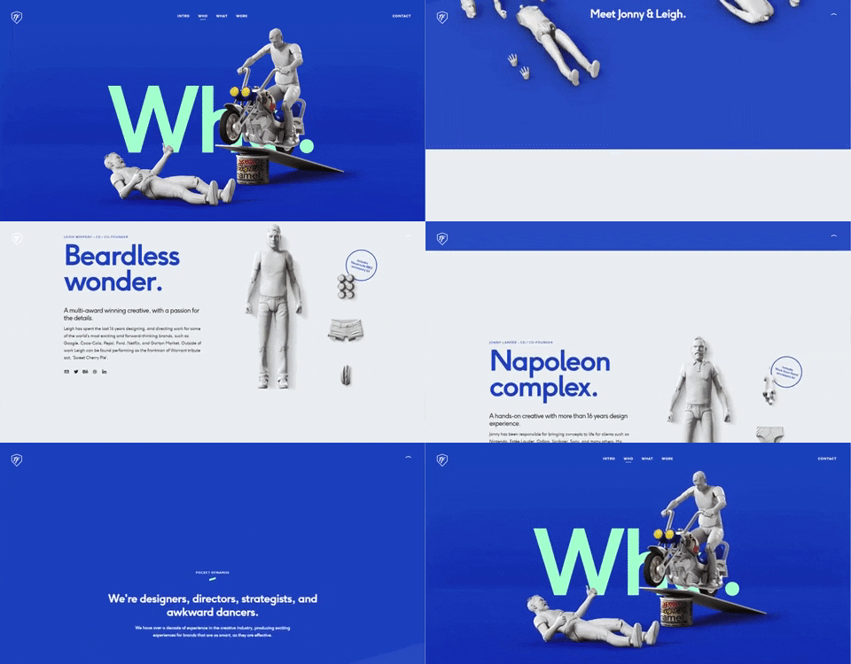
If you want to see a website with scrolling effects and proper spacing, then ToyFight’s Who page could be your inspiration to utilize scroll effects in Divi.
Mix Multiple Scroll Effects
Divi is capable of applying multiple scroll effects on a single element. You could improvise your elements by mixing multiple scroll effects. And as Nick Roach says, “Combining fade, blur and scale can create some really sophisticated animations that add an extra “it” factor to your designs.”
Therefore, using multiple scroll effects on the page, whether on a single element or multiple, can help you really bring an interesting animation to the site for a better user experience, just like the illustration below.
Apply Scroll Effects on Elements That Have Greater Significance
It’s crucial what element you use on your site to apply Divi scroll effects. Each element has its own impact on users’ minds, but the most significant that motivates users to take action more than anything are CTAs, Forms, Images and Links.
So, it’s beneficial if you keep your focus on applying scroll effects to these to make the most out of your scroll effects enabled web development. Why? Because if you use scroll effects on those elements that have less significance, then users might see them and enjoy seeing them on the page, but those elements won’t bring any result because they won’t evoke emotions to act.
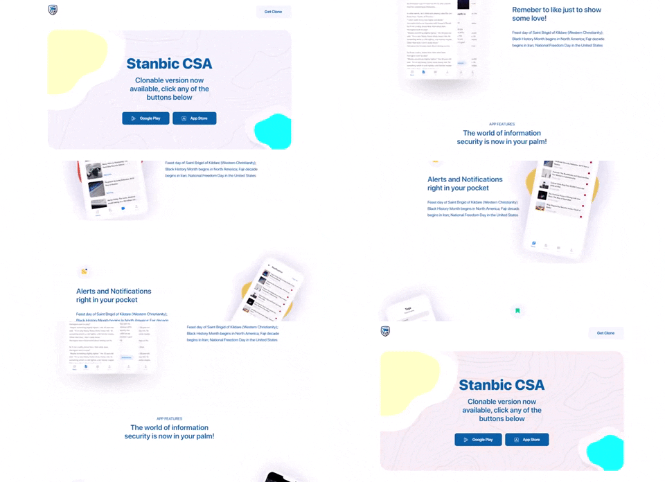
Instead, if you apply those effects on CTAs or forms, it’s evident in users’ heads why these elements are added here in the first place —for them to take some action. So, they simply do that, rather than enjoying and ignoring them.
Don’t Add Too Much
Whether it’s life or web development, less is more, and the same applies to the scroll effects in Divi. If you fill your website with lots of lots of scroll effects and keep no space for your eyes to rest, it won’t help you. Website visitors might get bored, frustrated and leave the site within a few moments.
Moreover, another downside of using too many scroll effects on a site also decreases load time. Plus, users may also find scrolling a bit hard. Therefore, avoid using many elements with scroll effects enabled—both for usability and the website’s performance in terms of speed and interaction.
Keep Brand Identity in Mind
The website’s brand seriousness matters a lot when you add scroll effects on a page. If you’re selling medicine and practice scroll effects with funky elements on the site, it will disturb your customers or website viewer. On the other hand, if you’re running an online creative design business, then funky scroll effects might help you a lot.
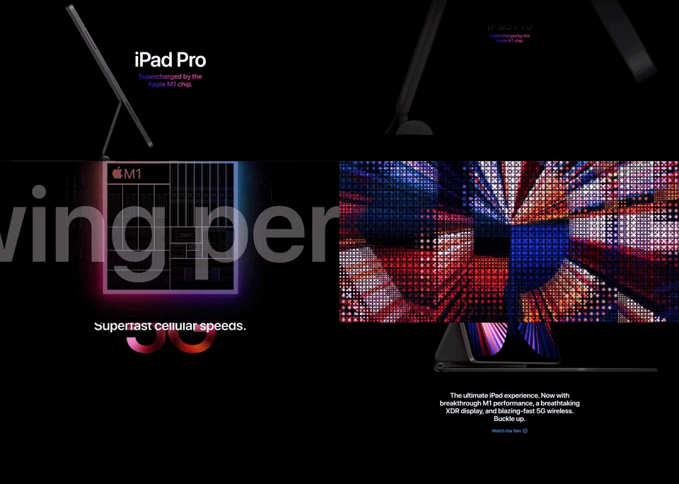
So, when creating a web page with scroll effects enabled, keep in mind what your brand is and what kind of elements and effects would help it deliver its message to the audience properly. For instance, you could take Apple’s iPad Pro as an inspiration to create web pages with brand identity in mind.
Wrapping Up
Divi scroll effects are by far the best scroll effects available for a WordPress website. Not only they allow you to enable elements with different scroll effects, plus you also get the option to improvise them with additional features. Whether it’s a personal website or a client’s, you could generally level up its user interaction using these scroll effects. Moreover, applying them is intuitive as well as easy. So, whether you’re a beginner or an advanced user, you could make the most out of your scroll effects and the website you’re using them on.
That’s it! We’ve explored and tried the Divi scroll effects. Now, it’s your turn to utilize them on your website. And if you find yourself struggling with these options, let us know in the comments. We’d be more than happy to assist you in applying scroll effects amazingly on your Divi website.
If you need a premium design solution and take the website’s level up, check out our bestselling Divi Plus plugin.



0 Comments