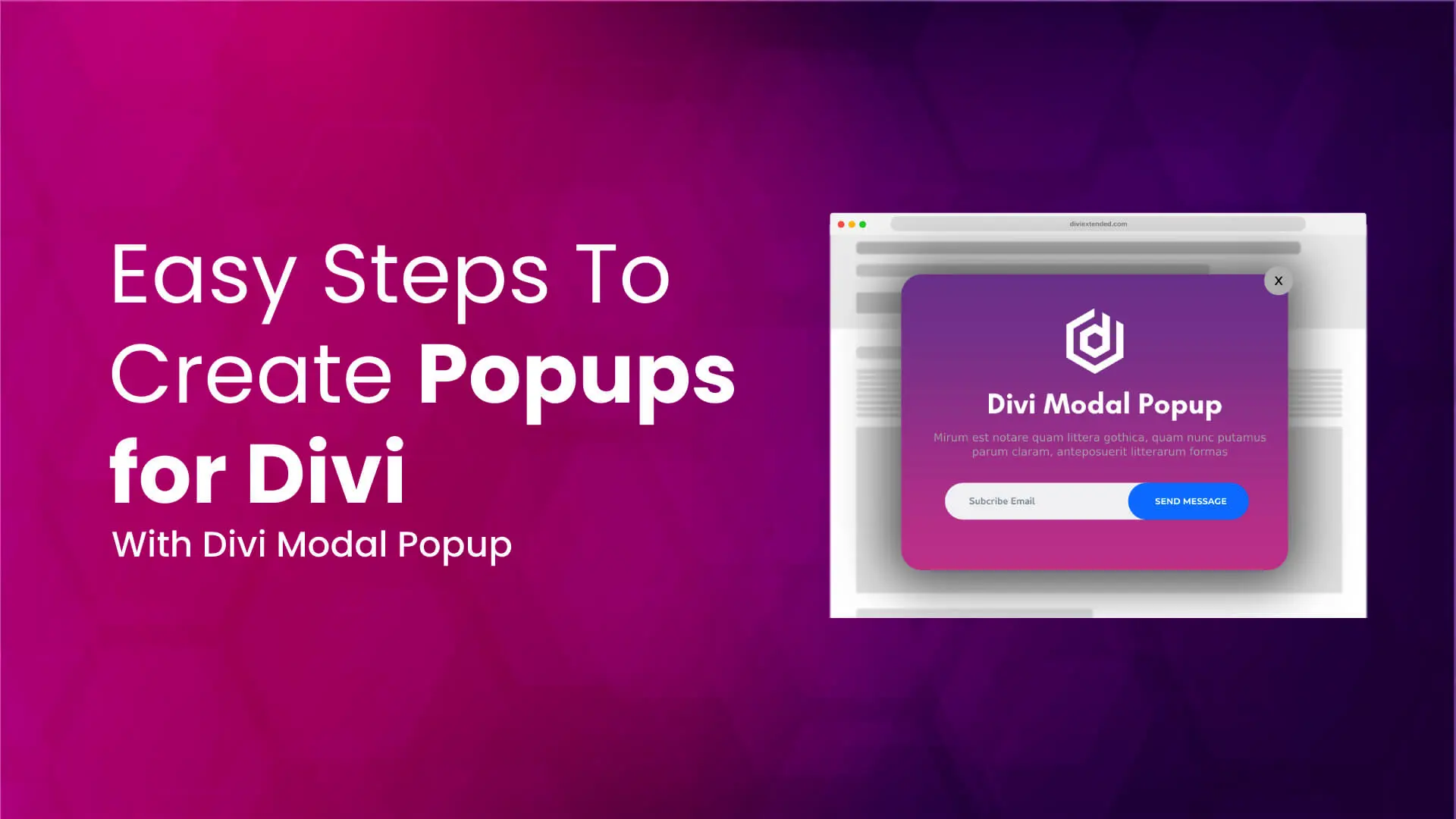
Popups can help you do many beneficial things on your site. For example, showing discount coupons, sales, announcements and much more. With them, you could easily boost interaction on your site and turn more leads into conversion. You can also create a Divi video lightbox to explain products or services on your website in a creative way. Therefore, if you’re looking for a way to create Divi popups on your site, then in this tutorial, you’ll learn to do that easily.
We’ll use the highly popular and bestselling Divi popup builder plugin available at the Divi Marketplace — Divi Modal Popup. Using this plugin, you’ll not only create popups for Divi but even enhance their working to suit your multiple requirements.
So, without any delay let’s get started.
Step 1 — Get & Install Divi Modal Popup Plugin
Before we start building our popups for Divi, we must get the Divi Modal Plugin from Divi Marketplace. It’s the #1 popup builder plugin for Divi that enables you to create different types of popups such as Divi video lightbox, opt-ins, exit-intent and more.
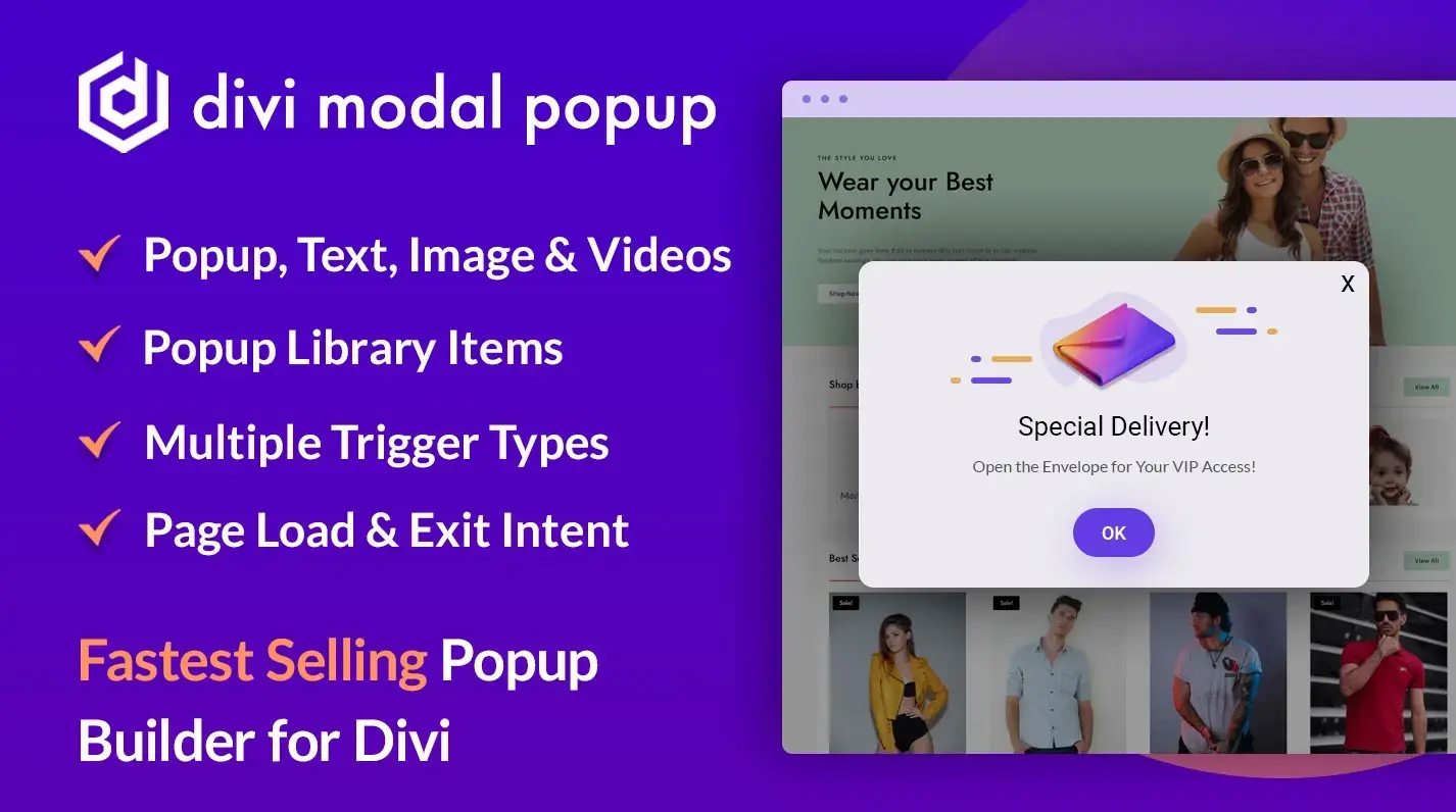
You could use buttons, images, videos, and Divi library layout to enhance popups working and utilize them to the fullest. So, you can benefit from their use and turn a significant amount of users to your products or services. To install the Divi modal popup plugin, you could follow the subsequent steps.
- From your account, download the Divi Modal Popup file.
- Then, go to the WordPress Dashboard → Plugins → and click Add New.
- Head over to the Upload Plugin → click Choose File, and browse the modal popup zip file.
- Once located the file, please select it and then click Install Now.
- After installing the plugin, click Activate Plugin on the next window.
And that’s it; you’ve successfully installed the plugin. Now, let’s see how to use this plugin and its different features to build awesome Divi popups.
Step 1.1 — Insert Divi Modal Popup Module on a Page
Create a new page or edit an existing one. You could also use the Divi Theme Builder and use the Header or Footer templates to display a popup to the entire site. However, for this tutorial, we’re only going to use an individual page. So, once deployed the Divi builder on the page, insert the Divi Modal Popup module.
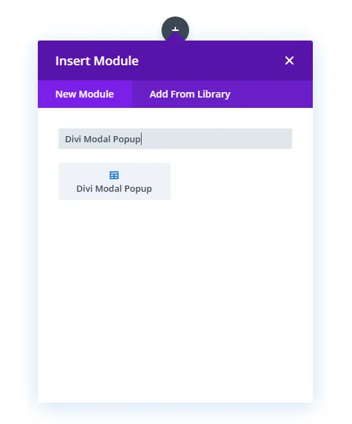
As soon as you insert the module, it will provide you with Divi Modal Popup Settings with Configuration settings opened.
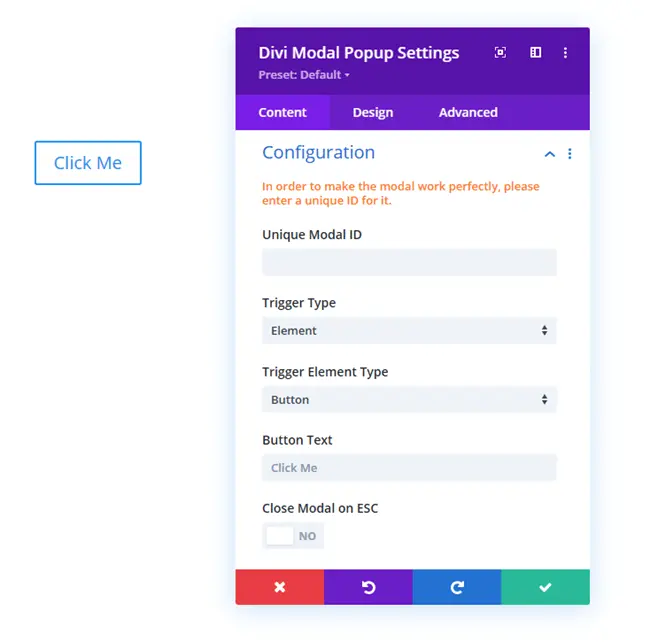
Here, you could select Triggers, Triggers Types and much more. But we’ll check all those in the next steps. Therefore, move to the next and learn how to use this plugin effectively.
Step 2 — Configure Divi Modal Popup
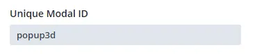
The first option available in the Configuration setting is the Unique Modal ID field. Using this field, you can assign a particular Modal popup a unique ID that helps it work perfectly without any rendering issues. Therefore, input a unique ID in this field, such as popup3d, just like the screenshot below.
After assigning the unique id, move to the Trigger Type option.
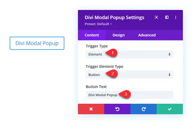
Step 2.1 — Assigning Modal Trigger Type
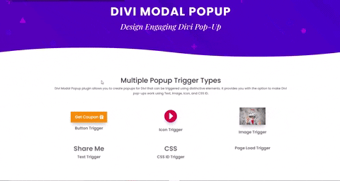
The Divi Modal Popup includes multiple trigger options enabling you to make popups active under various conditions. The different trigger types are,
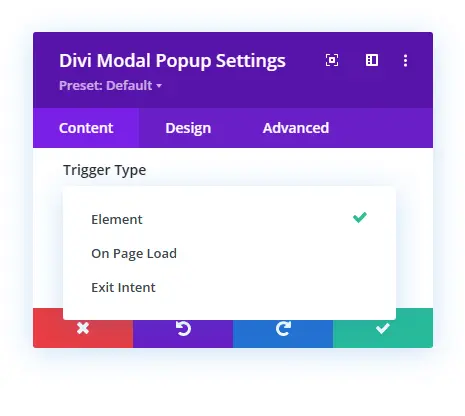
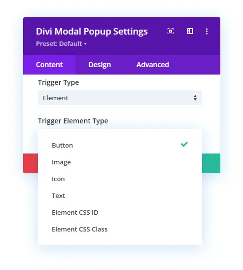
Element – It’s a manual click trigger that allows you to trigger a popup with Button, Image, Icon, Text, Element CSS ID and Element CSS Class.
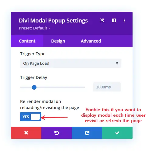
On Page Load — It’s an automatic popup trigger that displays popup upon complete page load based on the Trigger Delay option. Moreover, it also allows you to enable re-rendering of the modal. So, if you want to display a popup each time users revisit or refresh the page, you can enable the Re-render modal on reloading/revisiting the page.
Exit Intent — It’s the third and popup trigger type available in the Divi Modal Popup plugin, which is also an automatic popup trigger. It displays a popup when the user tries to leave the current page based on his mouse movement. For this tutorial, we will use the Element trigger type with Button as Trigger Element Type. Once selected button as the trigger element type, it provides you with a new field, Button Text, where you can input the button’s title. Simply add that.
Step 2.2 — Enable Divi Popup Close on ESC Key
After defining button text, move further in the Configuration setting, and check Close Modal on ESC as YES.
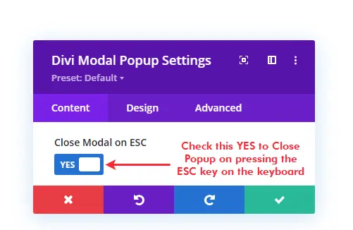
It will allow users to click the Divi modal popup using the Escape key in the keyword. Thus, making our Divi popup more flexible and obedient to the users’ user interface.
Step 3 — Define Modal Title
By default, the Divi Modal Popup plugin includes a header in the modal window where you could show a modal title and a close icon. However, you want to disable the header title and close icon; you could do that by going to the Modal Header → Show Header → NO.
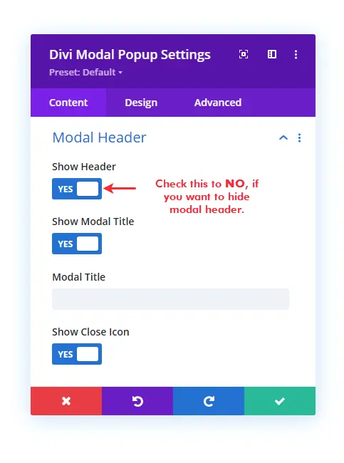
However, for this tutorial, we’re going to enable the modal header. So, we can display Close Icon as well as the modal title. Therefore, keep it enabled and in the Modal Title field, input the popup’s title. Once done that, move to the next step.
Step 4 — Choose Divi Popup’s Body Element and
It’s the crucial step when it comes to building Divi popups using the Divi Modal Popup plugin. To display in the body area of your popup, you need to open the Modal Body settings. It further provides you with the Modal Content Type option, which also includes different body content options.
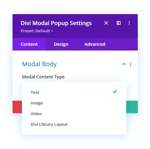
Text – It allows you to add content in the modal body using a rich text editor.
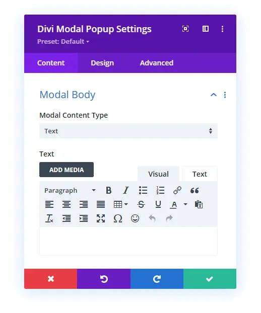
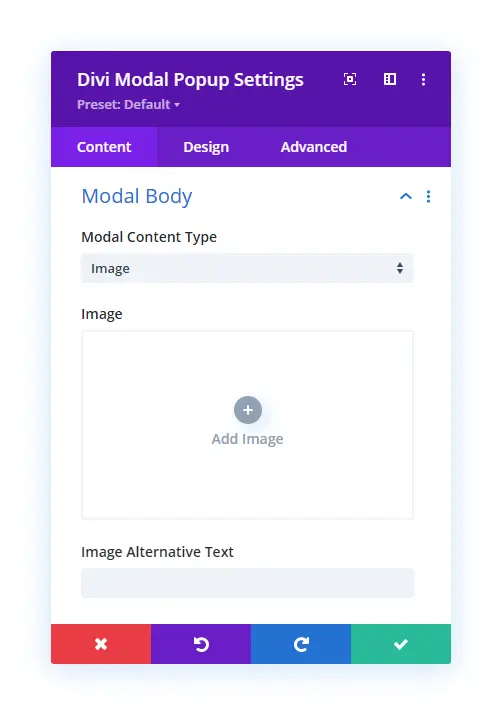
Image – If you want to display an image in the modal body as its content, then using Image Modal Content Type would help you do that effectively. It provides you with an Add Image box and Image Alternative Text input field.
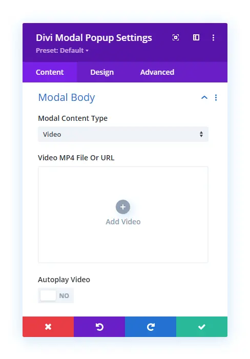
Video – To add video in the modal body, you could select the video option. It will open add video dialog with an Autoplay Video feature. Using this, you can easily create a Divi video lightbox.
Divi Library Layout – It’s the last option available in the Media Content Type which interesting than all. Using this feature, you could easily display your saved Divi library layout in the modal window. For example, pricing table, Contact Forms, Subscribe Forms, Shopping Cart Overlays and much more. To use the library layout, you need to simply select the saved layout in the Divi Library Layout option.
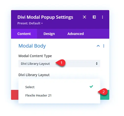
For this tutorial, I’ve selected the Divi library layout option. However, you could select body content as per your requirements. Once done with the body content, move to the next step.
Step 5 — Show Close Button at the Modal Window’s Footer
In addition to the Close Icon at the modal header, the Divi Modal Popup plugin also includes the option to display a close button at the modal’s footer area. To enable that option, you need to open the Modal Footer → Show Footer → YES.
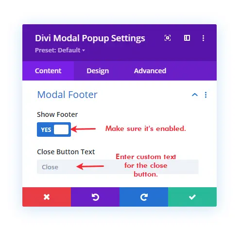
However, by default, it’s enabled, but if in the case you’ve disabled it earlier, then it’s the way to re-enable it. Once the modal footer is active, you get the option to input a custom text for the close button. Enter your text in the Close Button Text field to reflect it on the button.
Step 6 — Configure Scroll Settings & Customize Divi Modal Popup’s Background
When you add the Divi Modal Popup on a page, it creates a popup that doesn’t allow users to scroll the browser. Meaning users must have to close the popup to further interact with the page content. However, if you want to allow users to scroll the page while they’re seeing a popup, then you need to open Scroll Settings → Disable Website Scroll → NO.
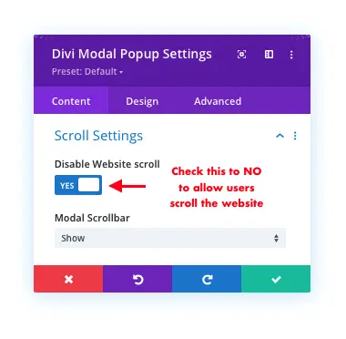
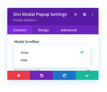
And this will allow users to scroll the website while they’re seeing a popup. Another option you get in the Scroll Settings is the ability to display a scrollbar in the modal window. By default, it’s also enabled, but if you don’t want to display it, simply click open the drop-down Modal Scrollbar menu and select Hide.
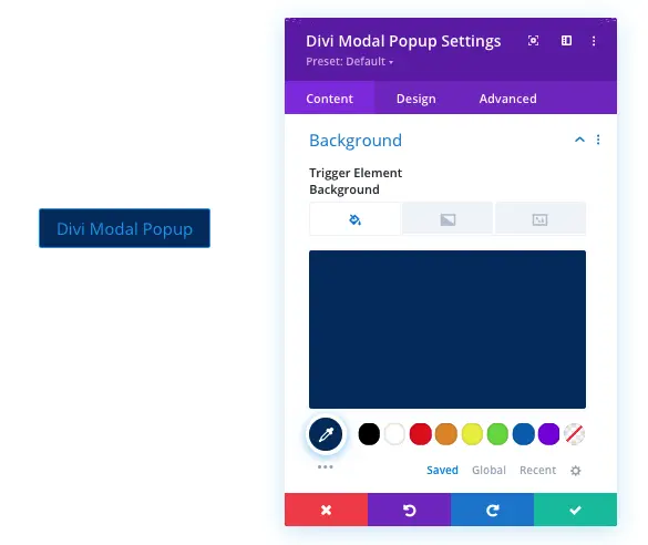
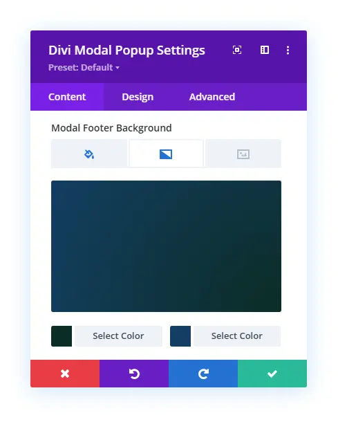
Background Settings
Once configured the scrollbar for popups, open the Background setting to apply different customizations to the modal popup. The Background setting provides you with the following options,
Trigger Element Background – It will allow you to customize the background of the trigger element with Color, Gradient and Image.
Modal Background Overlay – Using this particular background setting, you could apply an overlay to the entire screen behind the modal popup.
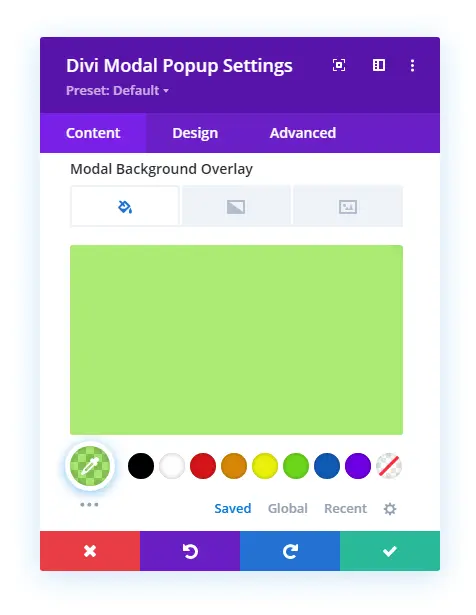
This is how the modal background overlay look when users trigger the popup.
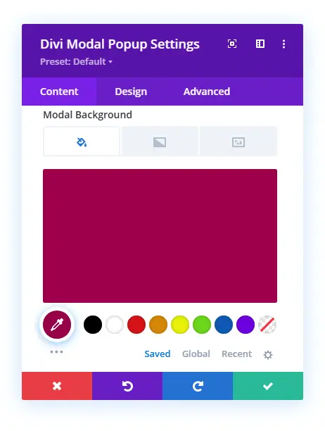
Modal Background – This will change the background of the Divi popup.
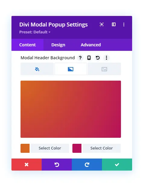
Header Background – If you want to apply a different color, gradient or image to the popup header’s background, then Modal Header Background is the option you need to use.
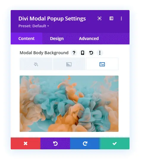
Body Background – Just like the header background, the same you could do with the modal body.
Footer Background – Similarly to the previous options, you could apply background customization to the modal’s footer with color, image and gradient.
This is how the Divi popup looks after applying background customizations to each element.
Now, apply customizations according to your requirement. Once done customizing the background of the modal’s different areas, move to the Design tab, where we’ll enhance the modal popup’s look even more. Follow the next step to utilize the Design tab’s settings.
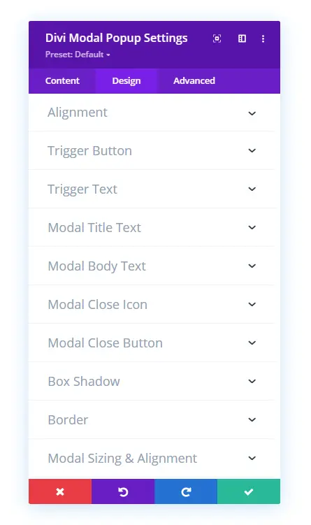
Step 7 — Enhance Divi Popup Look in the Design Tab
The Divi Modal Popup provides you with the following additional settings in the Design tab to enhance the popup’s look. We’ll explore each one of them one by one. So, you’d learn about them in a better way. Plus, the native Design settings of the Divi builder also include some additional settings to improve the popup’s functioning. We’ll explore them as well.
The above settings screenshot don’t show some settings that appear on choosing trigger element different than the button. If you choose, Icon Trigger Element, then you also get the following additional setting,
And when you select Image Trigger Element, you get the following additional setting,
Now, let’s explore each additional setting and see how they turn Divi popup into something engaging and beautiful.
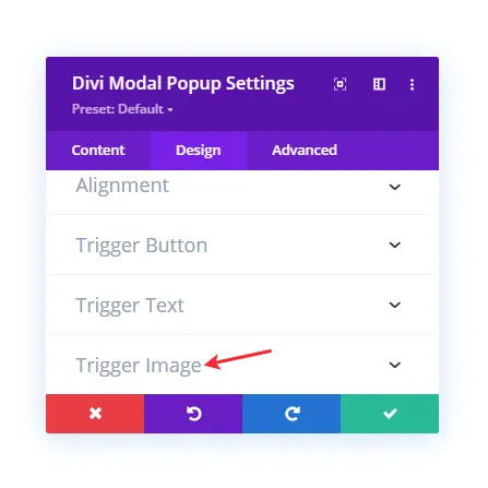
Alignment
Using the Alignment setting of the Divi Modal Popup plugin, you could easily change the placement of the trigger element.
It allows you to place the trigger at the Center, Left and Right. Plus, it also features the option to utilize alignment settings for different devices. To use that, simply click the Device icon, and it will open the options.
Trigger Button
Using the Trigger Button setting of the Design tab, you can apply custom styles to the button trigger element.
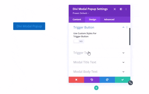
It provides you with all the button customization options to enhance the look of the trigger button. To use custom styles for button trigger, you need to check Use Custom Styles for Trigger Button as YES. And it will open the button customization options.
Trigger Text
The Trigger Text setting of the Divi Modal Popup plugin allows you to apply text styles to the Text Element Trigger. It includes all the text customization options to enhance the look of your popup text trigger.
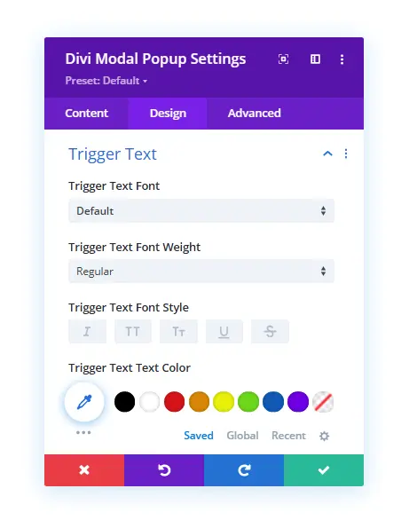
Just like the native Divi Text module and its settings, you could use these settings on your text element trigger.
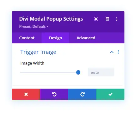
Trigger Image
When you select the Image Trigger Element in the Configuration settings, you get the Trigger Image setting in the Design tab. It enables you to control the width of the image. Plus, you can assign different image sizes for different devices.
Trigger Icon
This particular setting available in the Design tab provides you with the option to change Trigger Icon’s size and color. Simply move the slider or enter the value in the Trigger Icon Font Size to change icon size. And in the Trigger Icon Color, select any color that suits your website’s theme.
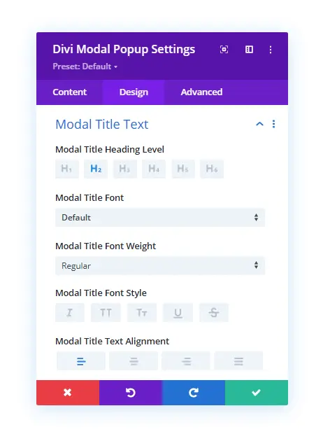
Modal Title Text
Using this particular setting in the Divi Modal Popup Design tab, you can apply text customizations to the modal header title. It provides you with all the text options to make the most out of your header title.
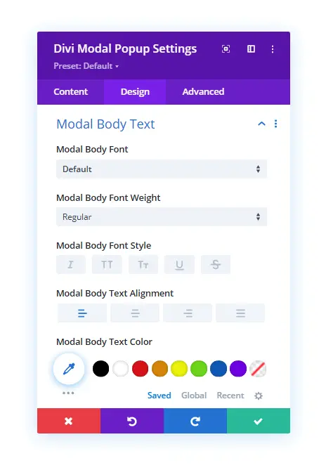
Modal Body Text
Using this particular setting, you can customize the text style of your modal body content text. It includes all the text options except the heading level.
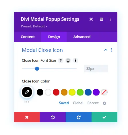
Modal Close Icon
If you have selected to display the close icon in the modal header, then using this setting, you could customize its look. In this particular setting, you get the option to change icon size and color.
Modal Close Button
To make the modal window close button look good and match with other elements, the Divi Modal Popup plugin includes this setting. Here, you could change the alignment of the button. Plus, you can also apply custom styles to it, just like the button trigger.
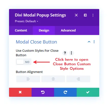
To apply the custom styles, all you need to do is check the Use Custom Styles for Close Button as YES. And it will open all the required button customization options.
Box Shadow
If you want to apply shadow to Divi popups or other elements, then you can achieve this particular requirement using the Box Shadow setting. It allows you to apply box-shadow to the Trigger Element, Modal, Modal Header, and the Modal Footer.
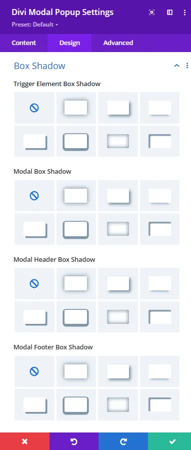
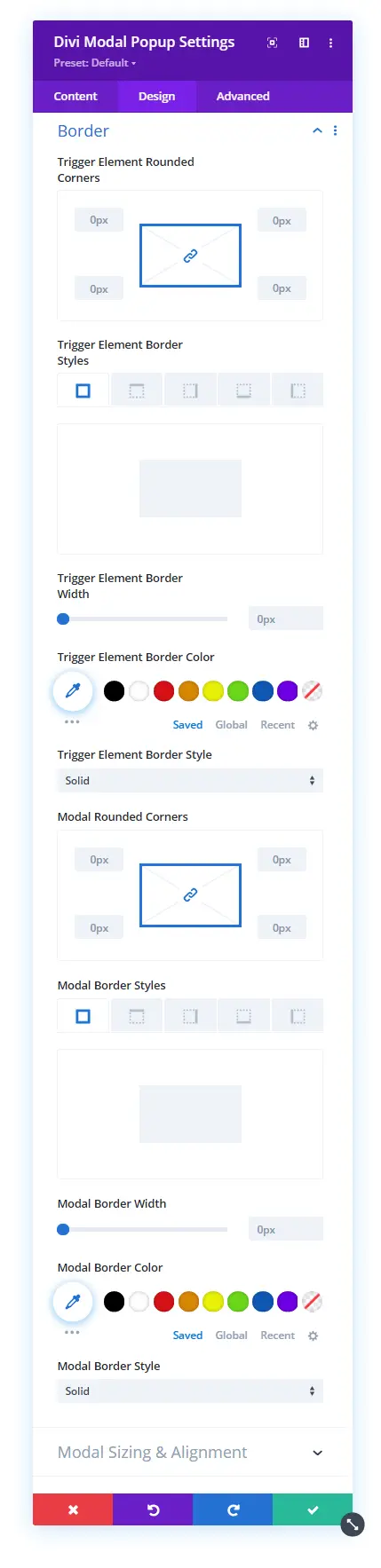
Border
With box-shadow, you could also apply rounded corners and border styles to different elements of the modal popup. Using the Border settings in the Design tab, you could apply border customizations to Trigger Element and Modal itself.
Modal Sizing & Alignment
This particular setting in the Design tab is an interesting one and could take your Divi popups to the next level. By default, the Divi Modal Popup displays the modal window in the center. However, using this setting and its options, you could place the modal window at different locations to make the most out of your Divi popups.
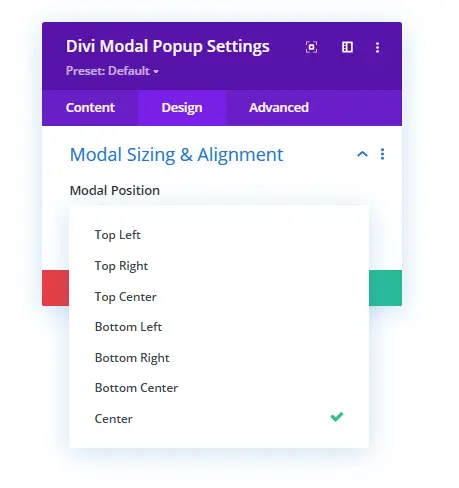
It allows you to place the modal window to around 8 different locations on the page – Top Left, Bottom Left, Top Right, Bottom Right, Top Center, Bottom Center, and Center.
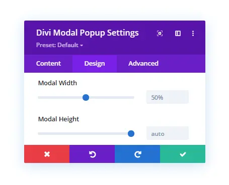
Plus, using the same setting, you also control the width and height of the modal window easily. All you have to do is move the sliders or input the values as required.
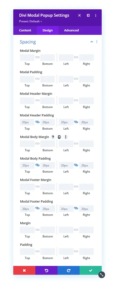
Spacing
Here, you could customize the margin and padding of the different elements of the Divi popups. Like the modal window, modal header, and modal body.
Animation
Just like the Model Sizing & Alignment settings, this particular setting is also interesting. Because it presents your Divi popups most excitingly and beautifully, you can apply different entrance animation effects to Divi popups using the Animation setting. Like Fade, Slide, Roll etc. Moreover, you can also control their duration, opacity and more using the following options.
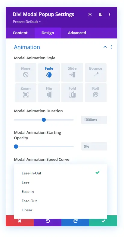
Divi popups with animation effects applied for works like the below illustration.
That’s it; we’ve explored all the content and design settings of the Divi Modal Popup plugin. However, there’s one more thing is still untouched, which Attributes in the Advanced tab. So, once you are done with your design customization, move to the Advanced tab and open Attributes settings. Here, you’ll get the option to apply different attributes to your trigger element as well as close button.
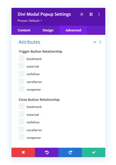
Attributes allow you to define the relationship of the Trigger Button and Close button with the modal window and the current document. This approach helps Google or other search engine crawler understand the purpose of the popup and links available on it.
Conclusion
So, that was the guide on Divi Modal Popup and how it works. We’ve explored each setting and utilized them to make Divi popups more coherent with our requirements. You could use and utilize each setting to fulfil your marketing, or other business needs to use a popup on the Divi website. As each setting and option is easy and intuitive, you’d have no issue building an outstanding popup for Divi.
However, still, you face any issue or find it hard to reach the desired outcome, let us know. We’ll be more than happy to assist you in designing better and functioning Divi popups. But first, go and get the plugin now.


0 Comments