A website should only use a maximum of three fonts for its content. Therefore, you ought to be careful about your font choice for readability. With a wide variety of fonts, you might get confused about the best to use. Luckily, there are some reliable online tools you can use to check website font use.
As a designer or website owner, you can come across amazing fonts you might want to utilize while browsing on social media, other websites, games, etc.
You will be able to make your website stand out after identifying the font and purchasing its license.
In this article, we will provide more information on how to check fonts on a website, the importance of using the right fonts on a website, rules about website font use, and why you need to check fonts on a website.
Methods to Check Fonts on a Website
If you are wondering how to check fonts online, here are some methods you can use:
1. Use Browser Extensions to Check Fonts Online
Whether you are using Google Chrome, Mozilla Firefox, Microsoft Edge, or Safari, you can utilize these reliable browser extensions to check fonts on a website.
i. WhatFont
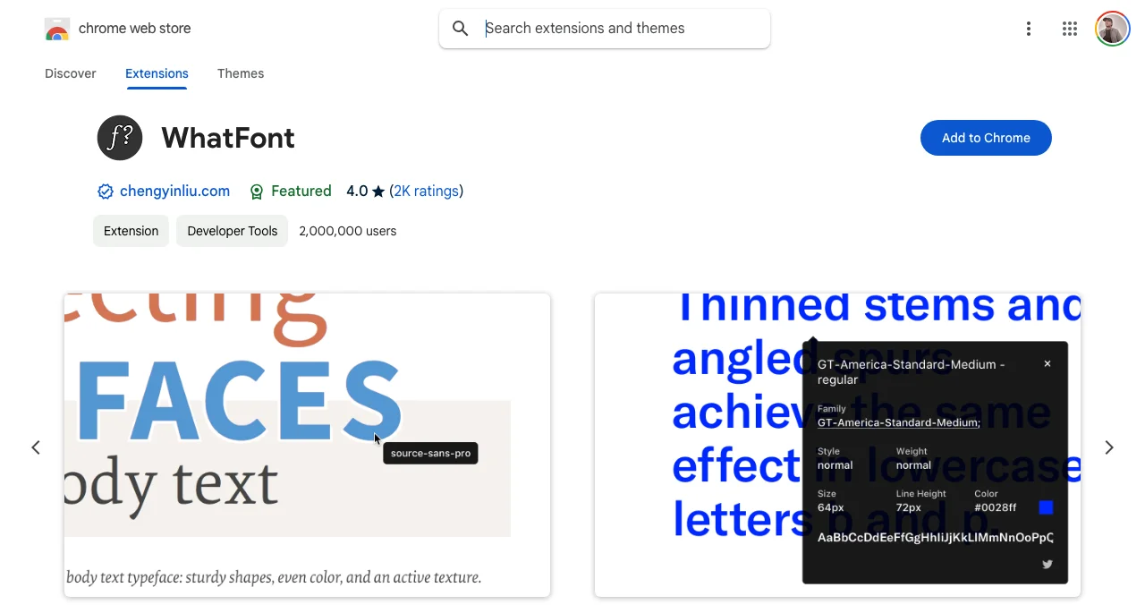
WhatFont is an efficient browser extension that can help you identify all fonts used on a website accurately in real-time.
You will identify the font family, size, weight, style, and color. Whether you are a web developer or website owner, it can help you understand website font use and font styles.
You just need to add the extension to your browser and highlight the text on a sample website to get accurate results.
ii. Font Finder
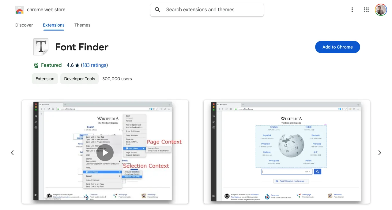
Font Finder is another browser extension that you can utilize to identify fonts used in a specific website.
It is a great tool for designers, developers, creatives, and typographers.
The tool will help you know the font color, background color, font family, font size, line height, font weight, text transform, etc.
All the font attributes will be well stipulated.
iii. Fontpair
Fontpair is another reliable browser extension that can help you understand the colors and fonts used on a website. Once you start using the Fontpair extension, you will get a screenshot of the webpage that you can download.
Also, you can copy the color identified on the web page for later use.
Indeed, your website font use knowledge will escalate. Once added to your browser as an extension, just click it to identify fonts used on specific web pages.
iv. Fontanello
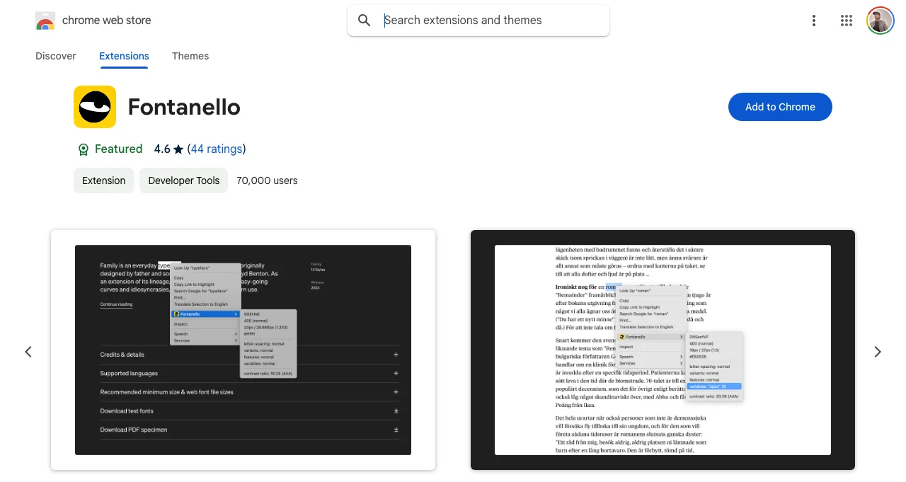
Fontanello browser extension can be used on Google Chrome, Mozilla Firefox, Microsoft Edge, and iOS to identify the fonts used on a web page.
Therefore, after you install the extension, whenever you right-click on a text, you will see the basic typographic style used, font weight, font size, color, and other properties.
v. Fonts Ninja
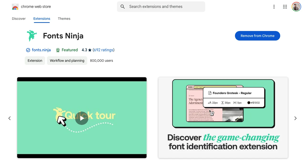
Fonts Ninja is a highly efficient browser extension that you can use to check the fonts used on a website. You will be able to identify fonts from any website that you can use elsewhere.
The algorithm analyses the font files well to get accurate results.
Indeed, you will get a summary of all fonts used on the website. You can even bookmark the identified fonts for later use and even share them with others, like your team members, to make the design process easier.
Fonts Ninja can be used on Google Chrome, Mozilla Firefox, and Safari.
You cannot only identify the fonts but also find out where you can purchase them.
2. Check Fonts Online Using the Inspect Element Tool
You can use the Inspect element tool on any browser. Just open the website you want to check, right-click any text on the screen and select “inspect”.
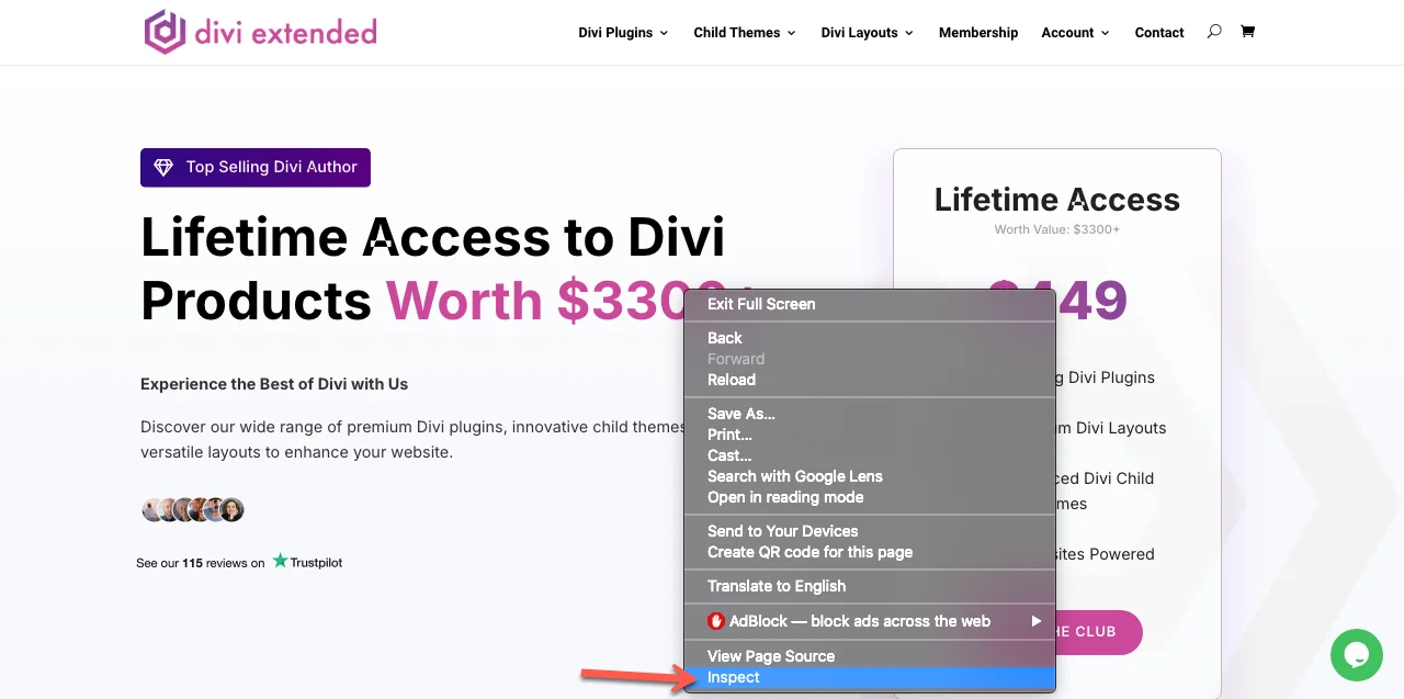
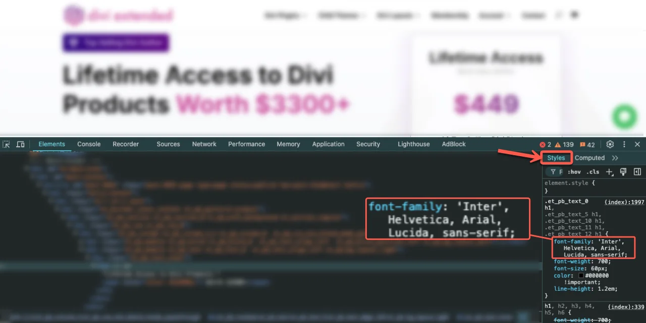
On the right side of the screen, a column will appear. Check under styles to see the font family used. You will also be able to see the font size, font weight, letter spacing, line height, padding, etc.
On Firefox, the inspector column will appear at the bottom of the screen to show different attributes.
3. Use Online Tools to Identify Fonts on an Image in Your Website
i. MyFonts
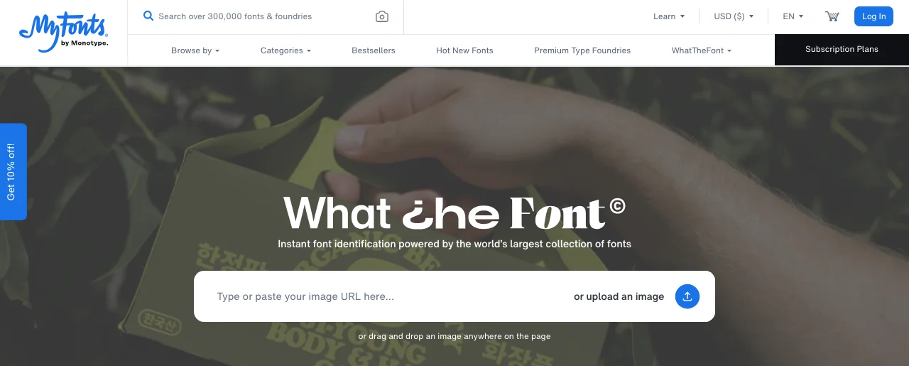
You may have seen an infographic or some image on a website and got curious about the font used to make it.
Therefore, you can use MyFonts to check the font used in the image.
You simply need to paste the image URL or upload the image. As easy as that! MyFonts uses deep learning to check through its database collection of over 133K font styles to provide the most accurate results.
However, the text needs to be horizontal to be easily identified.
ii. WhatFontIs.com
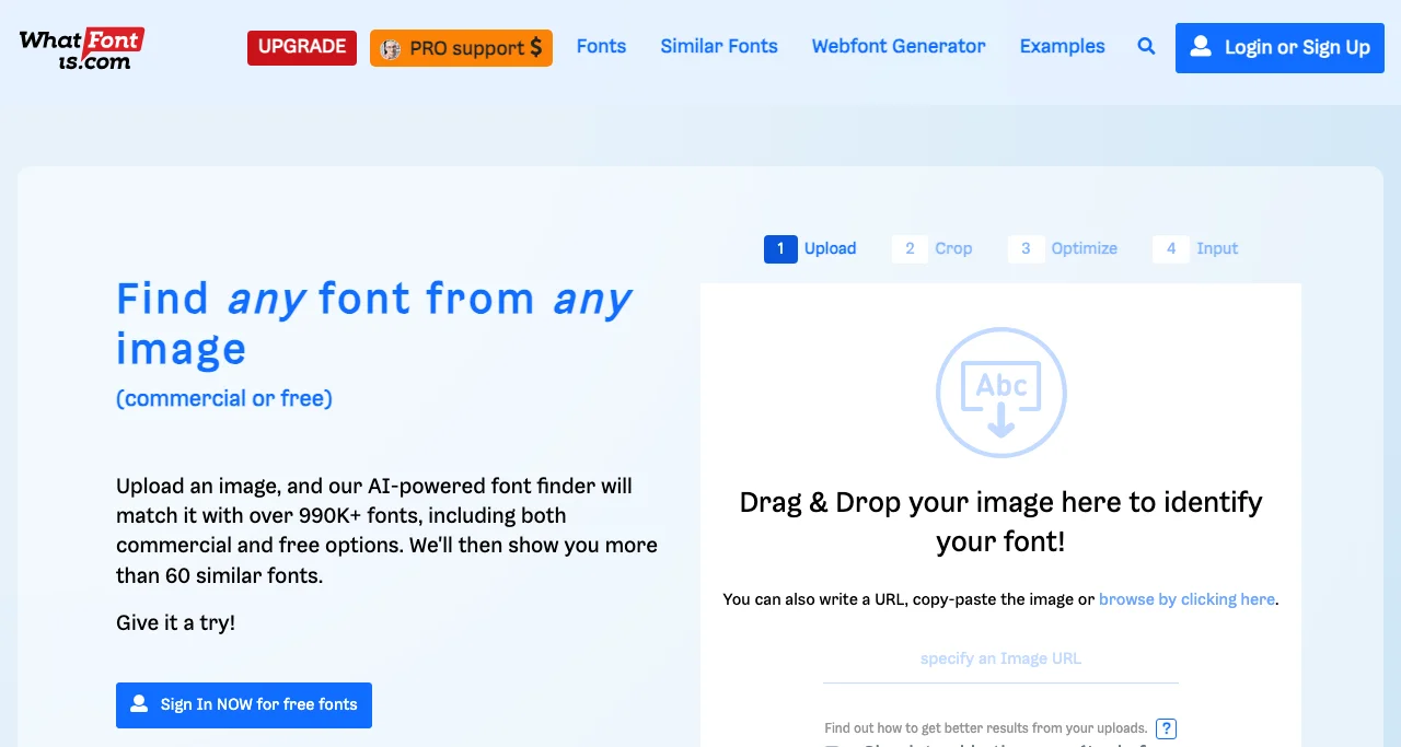
WhatFontis.com is another reliable platform that you can use to check the fonts used in a certain image.
You just need to upload or drag & drop the image to identify the fonts.
The AI-powered font finder will match the fonts with the collection of 990K fonts that both include commercial and free options. Indeed, you are guaranteed to get accurate results.
4. Use the WhatTheFont Mobile App to Check Fonts Used on a Website
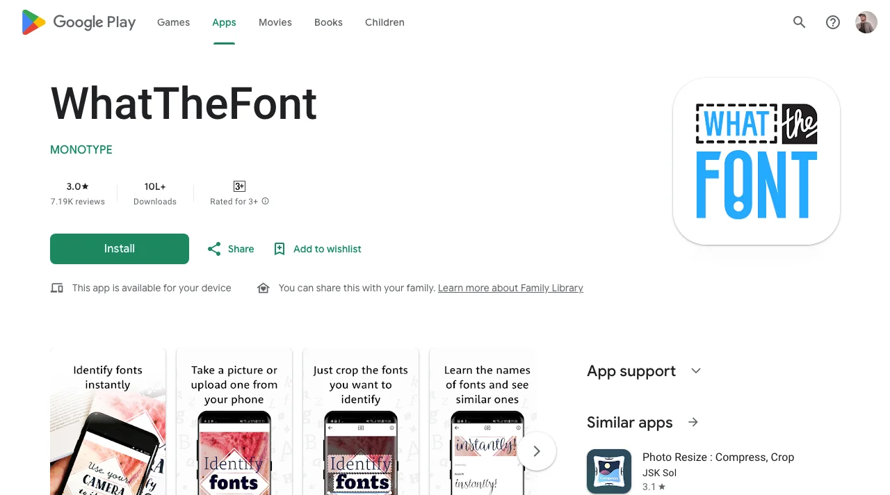
The WhatTheFont app can be used on both Android and iOS to check fonts on your phone. However, you need to upload an image to the app to determine the font used.
You will get accurate information about the font used. Ideally, WhatTheFont is a great app for designers, developers, crafters, and other creatives.
You can also get font inspirations and learn about new fonts that you can use. You can also check similar fonts to the ones in your image.
The app is AI-powered, and you will enjoy using it. Whatever site you will be accessing, it will be easy to check fonts on your phone.
Why Is It Important to Know Fonts Used on a Website?
Now that you know how to check fonts online, it is also crucial to know their importance. If you weren’t sure, these reasons should change your mind.
1. Increase Creativity
It is important to know the fonts on a website and, as a developer, to be more equipped with the fonts that rhyme together. You shouldn’t exceed the use of three fonts on a webpage or website to ensure they are uniform.
When researching, you can check how other professionals utilize fonts, which will help you in your professional growth.
It will be easy to know which fonts rhyme well with some themes or types of brands. Additionally, as a developer, you will be able to know unique fonts such as those used in the New York Times.

It makes it stand out, right? Well, learning about different fonts will help you grow professionally. Also, remember to check the font size of the different websites you visit to be more enlightened.
2. Easily Make Suggestions
Additionally, by seeing fonts used practically, you can know how they are used and even be more creative with them.
Also, as a website owner, you can know what to suggest to your developer to utilize certain unique fonts, and they can advise you whether they rhyme at all. When researching, check the font size, weight & style used to see what aligns best.
3. Improve User Experience and Readability
By knowing the fonts used on a website, you can know the ones to use on your projects or website to boost user experience and readability. It wouldn’t be fair to use stylish text that will be illegible to read. Also, it will help you know how to align your call-to-action buttons by ensuring the text is readable.
Importance of Using the Right Fonts on Your Website
You need to ensure the fonts used on your website clearly define & differentiate the headings, content paragraphs, links, navigation, side column content, buttons, and much more based on style, weight, typeface, size, color, etc.
1. Define the Hierarchy of Your Website Content
Using the right fonts on your website is important because it will easily define the hierarchy of your website content. Therefore, you should have varying font sizes based on the importance of the message, such as the heading.
This will ignite the curiosity of the audience and even make them want to read what follows. That’s why you need to use easily readable fonts. They will make it easy for you to read on the phone, tablet, or computer.
You can check other websites to see which font has been given more priority than the others based on readability.
According to Hubspot, WCAG also recommends that you use fonts with an x-height of at least 1.5 times the font size to ensure the visually impaired can easily read.
2. Differentiate Messages
If you check the fonts used on a website, you will be able to see the font used on the main, secondary, and navigation content. Different fonts are used to distinguish the message being passed and differ to ensure that the audience focuses on what’s most important.
So, by checking other sites, you can be more enlightened on what works and where.
Therefore, if anyone visits your website, they need to distinguish the different types of content. You can even use different font colors based on the message.
3. Maintain Consistency
When you use the right fonts on all your website pages, they will ensure a certain form of consistency, and the audience won’t feel confused about the content they are consuming.
You can also maintain the headings to a certain size and color, so the audience will keep up with your content, unlike if you used many fonts on different web pages, unless it is an image or another unique media.
Otherwise, your audience can assume it is an advertisement. Your audience will easily understand the content and structure, to navigate easily.
Also, you can consider using stylized fonts with standard fonts to create a beautiful design for your content.
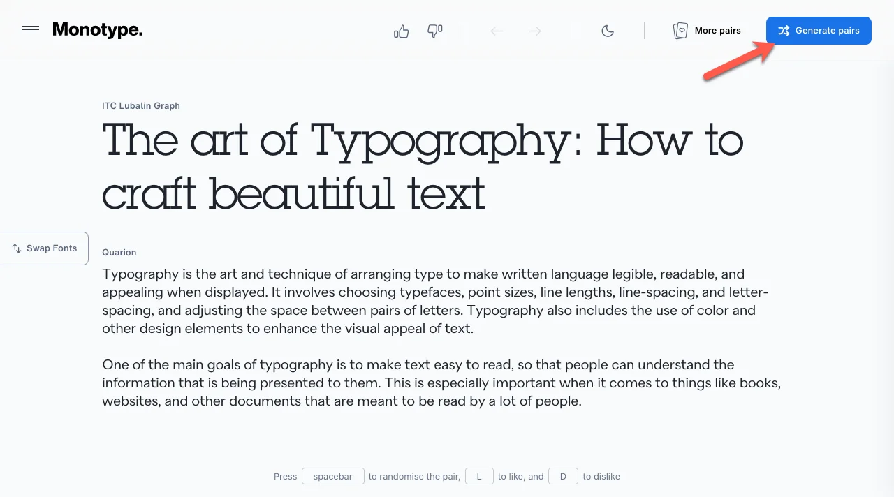
You can even use a font pairing tool like Monotype to check font compatibility.
4. Communicate Easily
Fonts are ideal as they help communicate your brand’s personality. It will convey your brand and create an awesome perception of it.
You will be able to deliver your brand message easily, and when visitors come and see organized fonts, they will know that your brand is as organized as that.
Your fonts should also look good on your website and also on print media. The font should also be readable on the different screen sizes.
Therefore, research well on the different font styles to know which suits your website best.
5. Creates a Good First Impression
When you use the right fonts on your website, it helps create a good first impression of your brand.
Your audience will be happy about how organized you are. The font you choose can convey a message of professionalism, creativity, or approachability.
A poorly chosen font can make your site look very unprofessional. Also, the font you choose can easily affect the website’s performance since the fonts can increase page load times when not implemented well.
Therefore, you need to choose a font that will strike a balance between functionality and being visually appealing. With the many font styles, you can’t miss one that creates a good first impression on your audience.
Rules on the Use of Fonts on Websites
You need to adhere to web typography rules to ensure your website meets the right requirements.
The font typography will increase website readability, accessibility, and communication. Here is a summary of some rules you should adhere to:
- Know how to use the different font types: web fonts, system fonts, and variable fonts.
- Use relative measurements to create a typography scale for proportionality on all screens. (Measured in ems, rems, or per cent)
- Use an easily readable base font.
- Avoid too many images of text.
- Use Web Content Accessibility Guidelines to choose the best font styles.
- Use headings and subheadings for hierarchy.
- The typeface should have a consistent x-height.
- A good starting point for line height is 1.5x the font size.
- For smaller or narrower fonts, add more space.
- The text should also have good spacing from other elements of the webpage.
- The text should be appropriately sized to other surrounding elements.
- Break the text well for easy readability.
- Provide sufficient space between lines.
- Use colors intentionally.
FAQs – Frequently Asked Questions
1. What are web-safe fonts?
Web-safe fonts are the kind that can adapt to any browser, unlike in the past, when you didn’t have a font installed in your browser, it would show you a generic font. Some of the best web-safe fonts include Helvetica, Arial, Verdana, Tahoma, Open Sans, etc.
2. Which are the most common font styles?
The most common font styles include primary font, which is best for the main headings; secondary font, which is mostly used for the website content’s body; and tertiary font, which is great for specific purposes such as CTA, navigation menu, etc.
For forms, you can use the Arial, Helvetica, Calibri, and Verdana fonts.
3. What are the rules about the use of color in website content?
· Reduce the use of many colors for text emphasis; instead, use a bold font.
· Maintain the right contrast for the text and background.
· Choose a uniform color for the text.
· Avoid using blue as the default text color since it is used for hyperlinks.
· Reduce the use of red and green.
4. Which are the worst color combinations to use on websites?
They include yellow + green, brown + orange, red + green, purple + yellow, red + purple, and black + navy.
Conclusion
Learning about fonts makes you more creative during the design process.
You can consider checking projects similar to yours to identify fonts used that can be essential in your project too. However, ensure the font you use aligns with your brand identity, and be careful when choosing the main font before choosing the font for the other text.
Ultimately, the fonts for the different sectors should align.
Also, ensure the font is easily readable and not too complicated, and do not make your audience unable to understand. Additionally, the size, font, and background color need to align.
The fonts on the website need to be properly created to create a good impression and boost your brand.





Hey, Vishvendra. Amazing list. I always use the Font Finder extension. But I think, myfonts.com website is a good option to find fonts from any image.