Multiple times when adding content on the site, we require to add that in columns. The part that gets complicated when the text doesn’t contain equal words and create a non uniformity in the structure of the content appearance. You can take a look at the below blurbs, how bad they are looking with disproportioned content.
Examples of Uneven Column Heights
Columns without Button
Column 1
This is sample content to display unequal column heights due to large and short content length.
Column 2
Column 3
Columns with Button
See how odd these two examples look with uneven column heights. So, how can we overcome this situation in the Divi theme? Well, there are two methods. One uses the in-built option available in the row settings, and another method is to use a custom CSS for columns.
Let’s check out how we can overcome this issue using both options.
Equalize Column Heights by using Divi’s in-built option
Before we use the in-built option of the Divi theme to equalize column heights, first, go to the modules’ settings and remove the background color if you have set that already. In the above examples, I have given background color to the modules. So, let’s first remove that.
Go to module’s settings → Background → click the Delete icon / reset background.
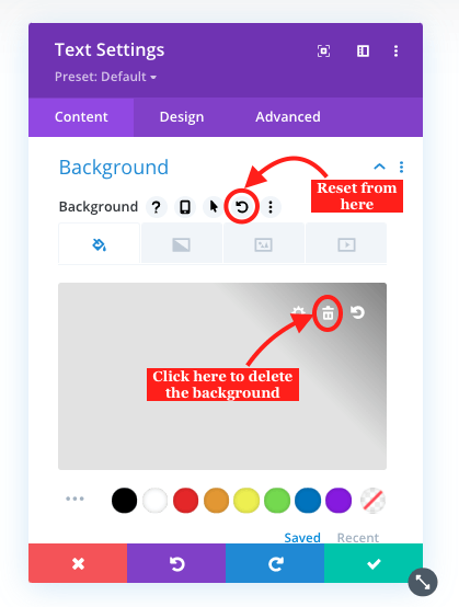
Do the same for the rest of the modules.
Step 2: Apply background to the columns
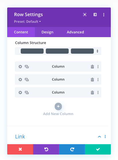
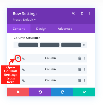
After removing color from the modules’ background, we need to customize the background of the columns. So, to do that, go to row settings, and then individually apply color to the columns, one by one.
This is how you’d apply the background to the columns,
1. Open Row Settings,
2. Then open Column Settings,
3. In the Content Tab, go to the Background settings, and customize column background with Color, Gradient, Image, or Video.
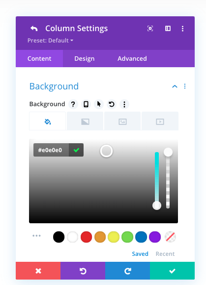
After following the above steps for each of the columns, you’d get the following results.
Columns without Button
Columns with Button
Though the above outcomes look the same as examples, but we have done the trick that would help us in the following steps to equalize column heights.
Step 3: Equalize Column Heights
After applying background customization to each column, go to the Row Settings → Design tab → Sizing → , Equalize column heights → YES.
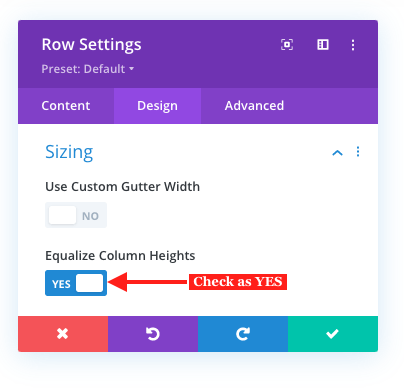 Once you do that, the magic would happen, and you’ll get the following outcomes with equalized column heights.
Columns without Button
Columns with Button
That’s it; we’ve equalized the column heights using the in-built Divi options. Now, let’s see how we can equalize column heights using a custom CSS.
Equalize Column Heights using Custom CSS
Step 1: Assign class name
Before we use the custom CSS to equalize column heights, we need to assign the class name to the row. For that, open the Row Settings → Advanced tab → CSS ID & Classes → CSS Class → input the class name, “el-flex-row,” without the quotation marks, just like the below screenshot.
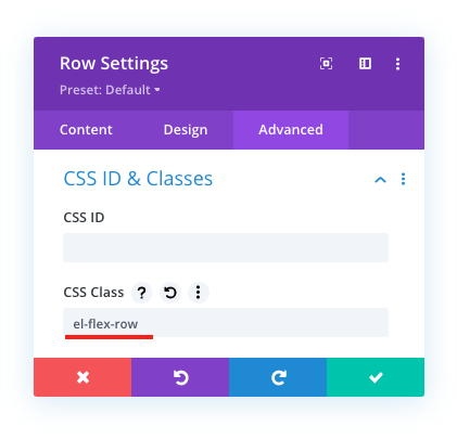
Step 2: Add custom CSS
Once given the class name to the row, we need to add the custom CSS inside the theme files for the class to reflect changes. To add the CSS, on your WordPress Dashboard, go to Divi → Theme Options → General → scroll a bit, and in the Custom CSS field, paste the below custom CSS.

.el-flex-row {
display: flex;
flex-wrap: wrap;
}
.el-flex-row .et_pb_column {
display: flex;
flex-direction: column;
justify-content: space-between;
}
This is how your columns would appear with equalized column heights after applying the above custom CSS.
Conlcusion
That’s it; we’ve successfully equalized our column heights using Divi’s in-built option as well as with a custom CSS. Both options are easy to implement and provide complete satisfaction when making columns height equal. I hope you’d find this tutorial useful and overcome your problem of uneven column heights in a few clicks. Share it with other Divi designers, and if you still find it hard or a bit confusing, let me know in the comments. I’ll be more than happy to assist you.
Plus, if you want to keep updated with the latest Divi tutorials and exciting offers on our premium Divi products, then go and subscribe to our free newsletter now!






thanks. but with the button, my titles+paragraphs are also coming down while equalizing. any idea? thanks again.
Thank you so much!
THANK YOU OMGGGG you were the only one who explain step by step how to equalize these fricking column I am so relieved !!! (None of the other website explained the step where you had to use the background of the column directly and not the text boxes) 😭