Users love Divi because it comprises features that can be used on any website regardless of its niche. Even the number of modules it includes in the builder can fulfill every need a particular project might require. And if you’re creating an eCommerce website, then Divi WooCommerce modules are of great use.
The best way to create a digital store on WordPress is to use the popular plugin WooCommerce. And Divi, by providing specific modules for WooCommerce, enhances the functionality.
Today, through this tutorial, we will look at each module Divi has for WooCommerce.
Previously, Divi had 17 modules; however, in the update of 22nd November, it launched 8 more modules for WooCommerce. Now, there are a total of 25 Divi WooCommerce modules that enable you to customize the entire user experience of your Divi shop.
These new, and every old WooCommerce module in Divi, open extreme possibilities to build a robust digital store. And we’re going to find out how.
An Extensive Look at New Divi WooCommerce Modules
The following Divi modules for WooCommerce allow you to create a customized cart and checkout pages. So, you can keep the user’s attention captured throughout the online store’s journey.
1. Woo Cart Products
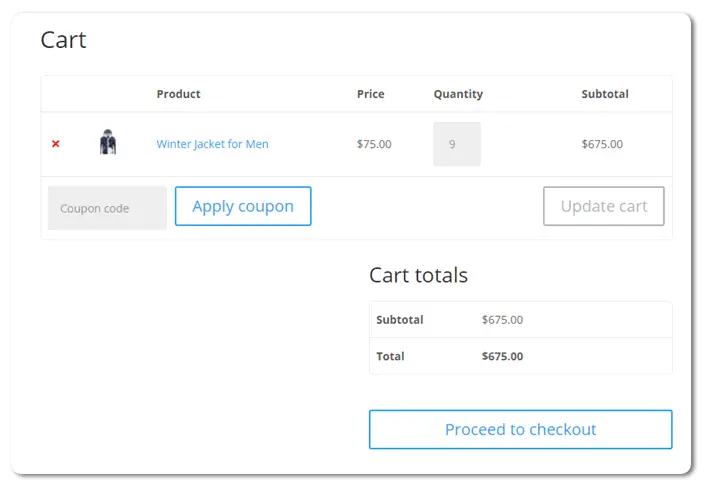
The default cart page we get is simple when we create an eCommerce store using the WooCommerce plugin. I believe you’re familiar with the cart page layout shown in the below screenshot.
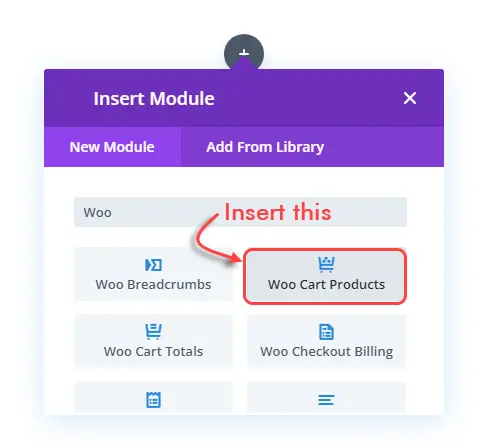
However, by using the new Woo Cart Products module, we can improve this significantly. All you need to do is, first, edit the cart page with Divi Builder. Then remove all the modules Divi inserts automatically. And, lastly insert the Woo Cart Products module. You can also keep the auto-installed module and directly start customizing the cart page. But, for this tutorial, I’m focusing on single module. So, we can explore all the Divi modules for WooCommerce in detail one by one.
Once you insert the module, you get the following layout. It consist elements such as Remove Icon, Thumbnail, Title, Price, Quantity, Total, Coupon Code field, Apply Coupon & Update Cart button. It’s the same as default page except Cart totals, but we can customize it more and pretty easily.
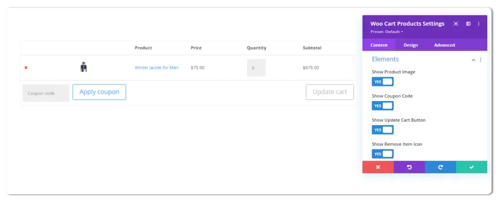
You can show or hide whatever element you want to display in the cart page’s product section. Change their font size, font family; color, background, and more to make it look unique. Using this Divi module for WooCommerce, it’s now possible to highly customize this particular area. After applying the appropriate changes, this is how the products section on the cart page look like.

2. Woo Cart Totals
The next module available in Divi for WooCommerce is the Woo Cart Totals.
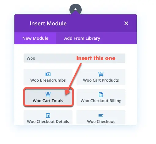
Using this particular module, you can enhance how the cart total would look on the cart’s page. The default layout we get is as simple as it could, and you can get the idea from the following screenshot.

But, this new module with the simple look also include options to customize it altogether. Using the Design tab of this module, the following settings allow you to tweak different elements of the Cart totals.
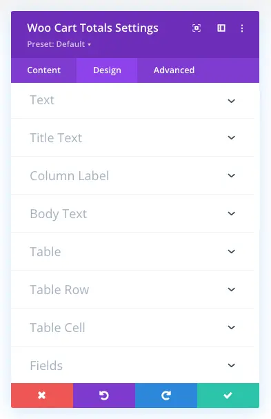
The Text settings, enable you to change Cart totals text alignment. Plus, you can apply text shadow on them.
Using Title Text settings, you can apply text customizations to the main heading which is Cart totals. Similarly, Column Label and Body Text allows you to apply text customizations on Subtotal, Total and Prices.
Further, the Table settings provide you with the customizations to increase horizotal and vertical spacing between the Cart totals elements. You need to slide Vertical Gutters and Horizontal Gutters to utilize this option.
However, if you don’t want to apply this, simply check Collapse Table Gutters and Borders as YES. Further, it provides you with the options to apply background color on table row and cell, fields placeholder, and button. By utilizing each setting, you can have your cart page with cart totals as the following.
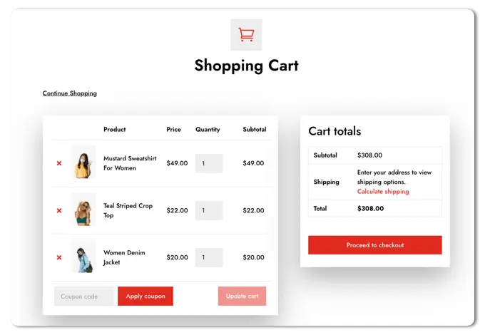
Cart Page with Cart totals from WooCommerce Layouts for Divi
3. Woo Cart Cross Sells
To make the most out of your cart page, Divi offers another excellent module for WooCommerce, which is Woo Cart Cross Sells.
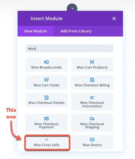
Using this module, you can display related products on the cart page. Doing so, can help you boost sales of other products and get more from your business. It allows you to apply text customisations on products’ names, pricing and more.
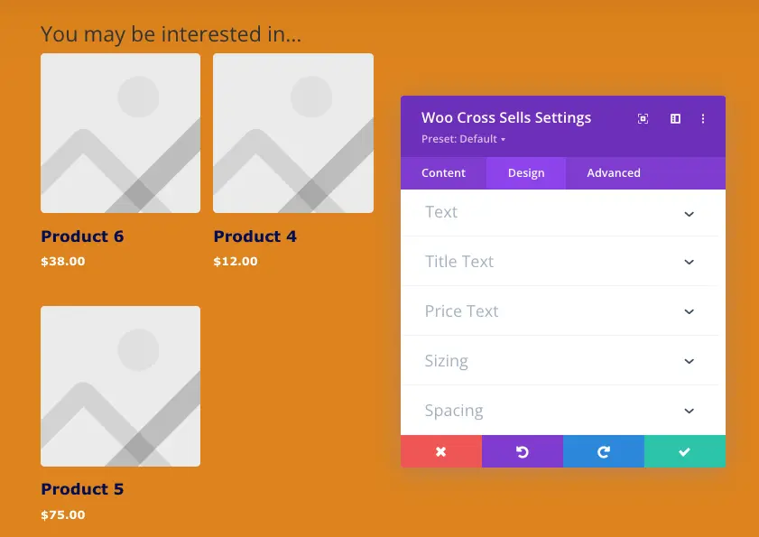
Once you apply the customization, you can have your cross sells product like the following example.
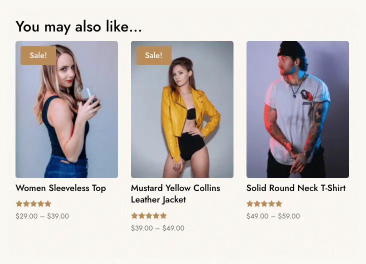
Cross Sells from WooCommerce Layouts for Divi
4. Woo Checkout Billing
After the page, the next new Divi WooCommerce modules are for the checkout page. And the first among them, is the Woo Checkout Billing.
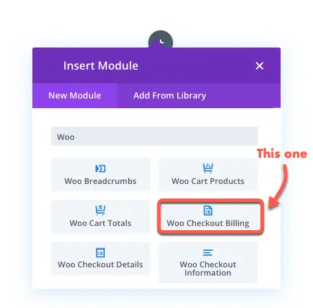
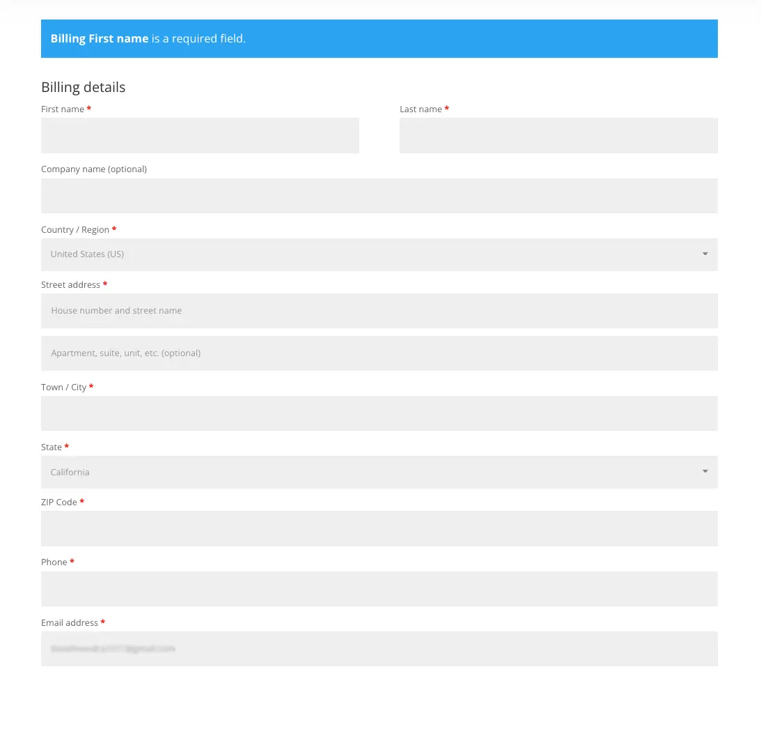
As soon as you insert the module, you get the following fields for the billing details on the checkout page.
And to customize the billing area, the following settings available in the Design tab. Now you can customize and change Woocommerce checkout fields in billing area the way you want.
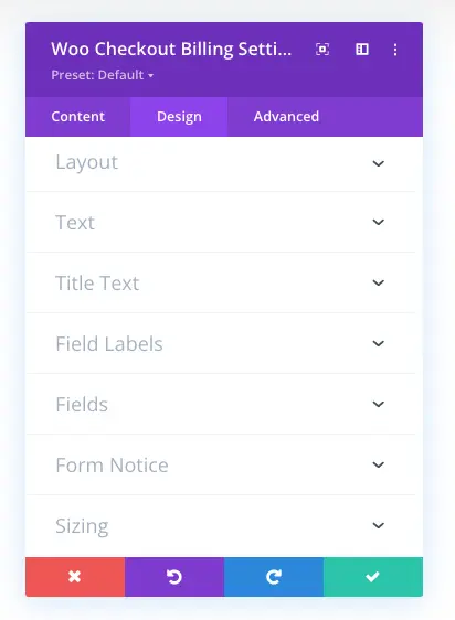
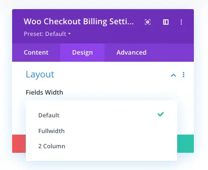
The Layout settings, provide you with the option to change WooCommerce checkout field’s width. It includes three options: Default, Fullwidth, and 2 Column.
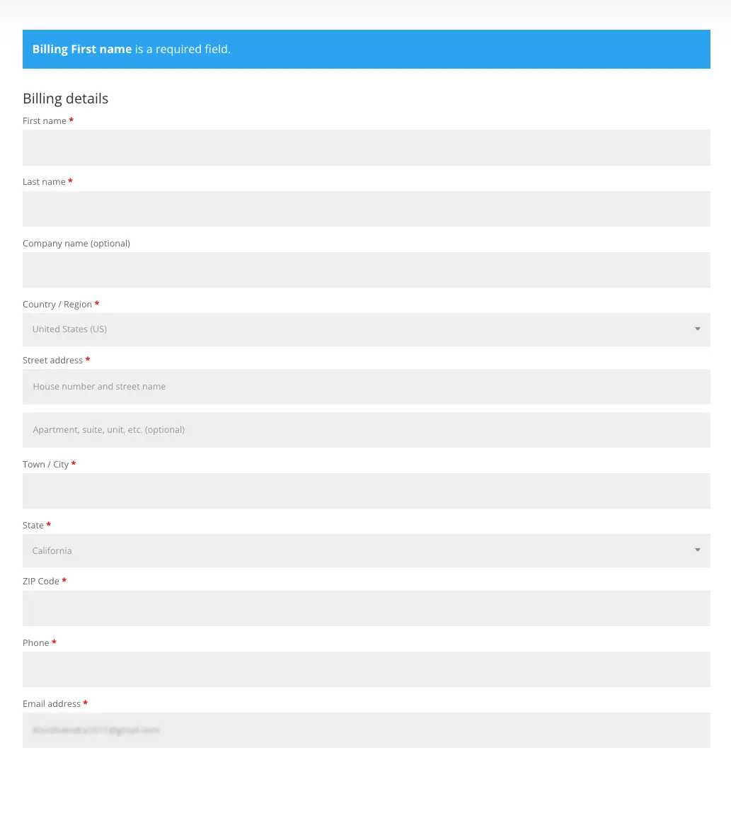
When you select Fullwidth, the billing fields stretch all the way to the margin as you can see in the following image.
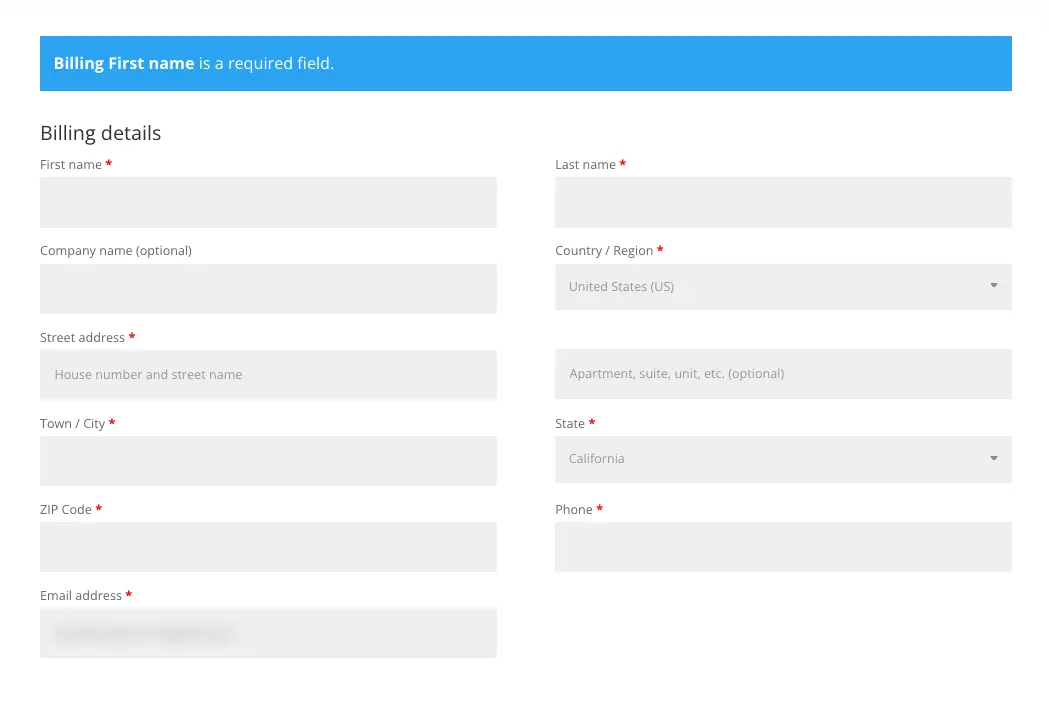
And when you select 2 Column, all the fields get placed in two different columns the same as following screenshot.
After the layouts, you get text customisations to apply on the checkout billing fields. The text customisations are Text, Title Text, and Field Label. Using these particular settings, you change checkout billings’ heading appearance, alignment and color. The same could be done for Field labels.
After title and fields label, you get the Fields setting allowing you to customize placeholder text and change the WooCommerce checkout field’s appearance. For instance, using this you can apply different color, rounded corners, shadow and more.
Once you customize the fields, you can tweak the appearance of billing notice area using the Form Notice settings.
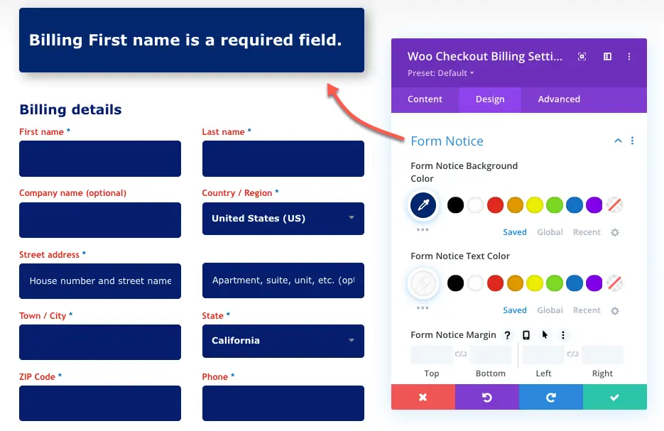
This particular setting, allows you to change text color, font size, and font family for the font notice text. Plus, you also apply other customization on the section, such as, background, round corners, shadow and more.
You can also use the Checkout Manager for WooCommerce to customize the checkout page of your store.
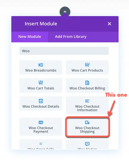
5. Woo Checkout Shipping
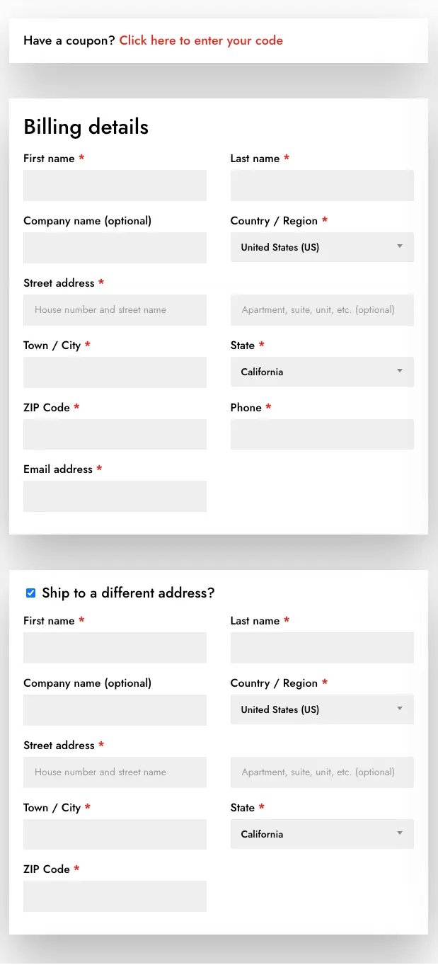
The customisations you can apply on WooCommerce checkout billing fields in Divi, could be applied to shipping fields using the Woo Checkout Shipping Divi module.
The same customization options are available in this module for shipping fields. And by utilising them, you could have an elegant checkout page with vivid shipping fields like the following example.
6. Woo Checkout Information
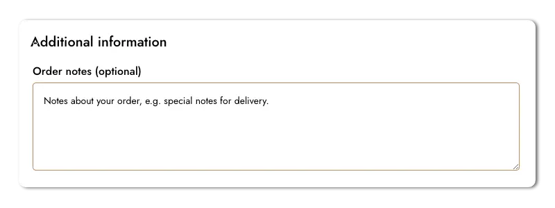
If you want to allow your customers leave a note with their purchase, then using the Woo Checkout Information module you can do that.
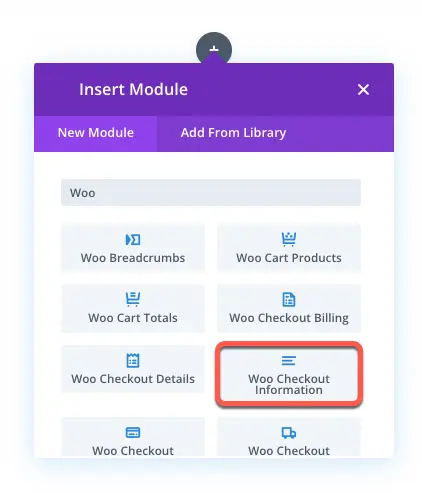
It provides you with options and features to add a text area on the checkout page like the below screenshot.
7. Woo Checkout Details
Help your customers make the order with confidence by showing them what they’re buying on the checkout page using Woo Checkout Details module.
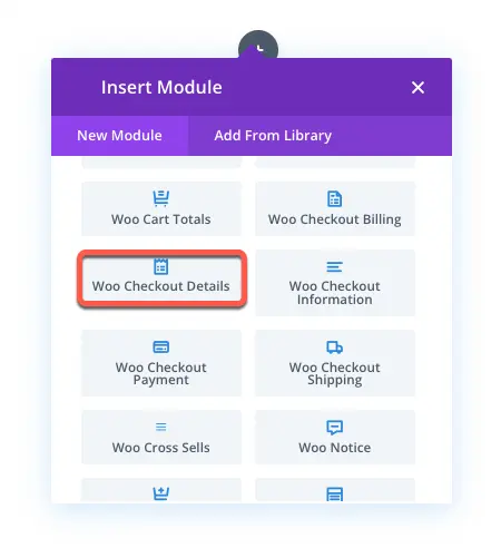
It showcases all the products name with quantity, price and subtotal. So, with all these details, when they place order, they know they’re paying for the right item. Similar to the Cart Totals module, it provides you with the different text and appearance customization options to enhance the checkout details.
8. Woo Checkout Payment
The new Divi modules for WooCommerce also include module to enhance the look of payment methods area on the checkout page. You need to insert the Woo Checkout Payment module to access those features.
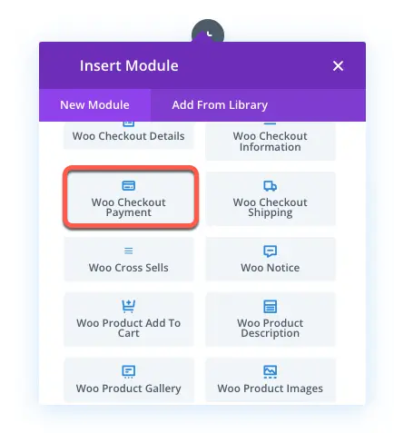
It allows you to change background and text color for the selected and non-selected payment methods. Choose different font family, size and other text customisations for both payment methods and body text. If no payment method available, then you can also apply design customization to the notice text.
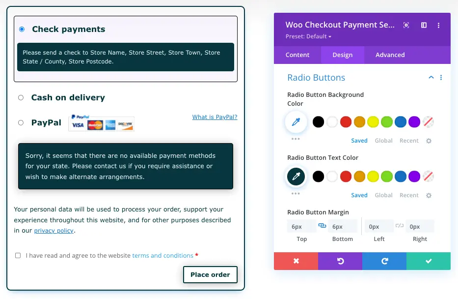
By utilising each option profoundly, you can design something like the above example.
Quick Look at the Old Divi Modules for WooCommerce
Above, we’ve looked at all the new WooCommerce modules available in Divi for cart and checkout page. Now, the following are those which Divi had previously before the recent big update for WooCommerce. Moreover, the modules we’re going to look at, most of them, works on product page with dynamic controls. So, you can have a better control on your Divi WooCommerce store. Therefore, according to that, use them creatively per your requirement.
9. Woo Breadcrumbs
Allow search engine crawlers to list your Divi WooCommerce store’s products at the server in an organized way using the Woo Breadcrumbs modules.
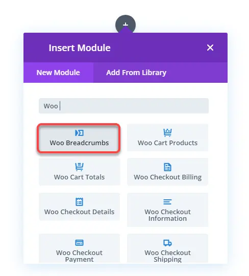
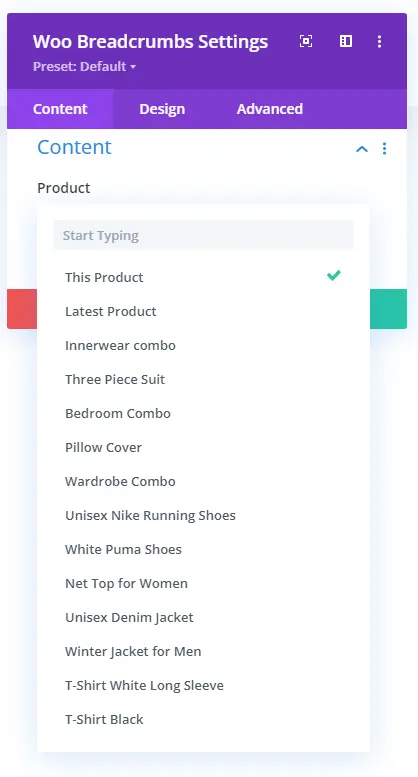
This module enables you to show breadcrumbs on product pages in 3 levels: home, category & product. And if you’re using it on a product template for specific products, then, using the Product option in the Content tab, you can select that particular product. However, you can directly use the This Product option to fetch the current product’s name.
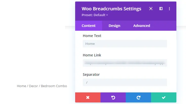
Plus, on the same Content tab, you get the option to change Home Text with dynamic options. Define unique home link and separator symbol.
The Design tab of this module provides you with the option to apply text customizations and other Divi’s native design customizations for the product’s breadcrumb.
10. Woo Notice
By default, WooCommerce shows a notice on products’ pages when adding them to the cart. You can get an idea, what I am talking about from the following screenshot.

And the same happens when you reach the cart & checkout page and make any customizations there. So, to display this notice beautifully, Divi provides you with the Woo Notice module.
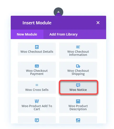
Using this particular Divi module for WooCommerce, you can enhance the look and feel of the notice on the products, cart, and checkout page. When you insert the module, it provides you with the Product Type option in the Content tab. Here, you can select either Product Page, Cart Page or Checkout Page.
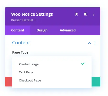
If you’re using it on a product, select Product Page; otherwise, you can choose the alternative options. Each option will display a different message, plus other elements.

Product page WooCommerce notice in Divi.

Cart page notice.
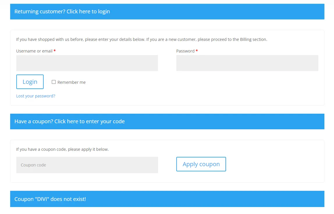
Checkout page notices.
And with these, you get different options to apply customizations.
11. Woo Product Add to Cart
When you edit the products’ page with Divi Builder, you’ll see the Add to Cart button there. However, you can insert it as well using the Woo Product Add to Cart module.
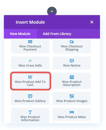
This simple module is crucial to help you complete your store and allow customers to buy the products. Moreover, show customers whether the product is in stock or not using the Elements settings in the Content tab. And it also allows you to hide/show the product’s quantity field next to the button.
Using the settings available in the Design tab, apply custom styles on the button. Change how the stock labels look and match the store’s theme.
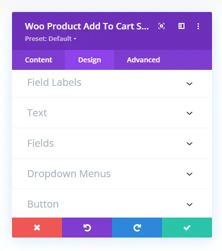
You can also utilize the sticky option if you like on the Add to cart button.
12. Woo Product Description
Customize how the long and short descriptions look on the product page using the Woo Product Description module.
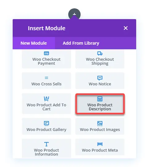
This module in Divi for WooCommerce, simply allows you to add a Long or Short Description for the product. Even from others. When you insert the module, it opens the Content tab to select the product and its description type.
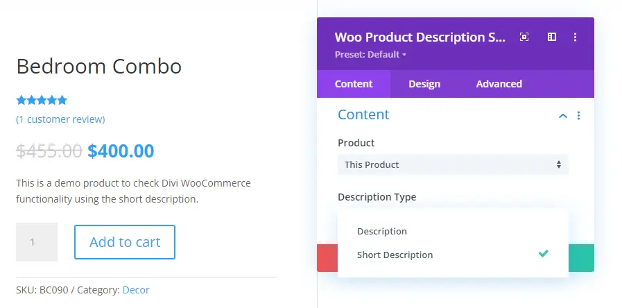
Then using the Design tab, you can apply the text customizations to the description text.
13. Woo Product Images
A WooCommerce product looks great when it comprises its image with other information. And using the Woo Product Images, you can fetch the product image.
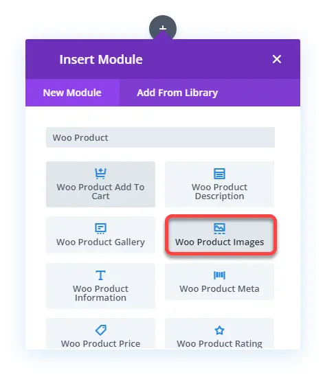
And not only image but also gallery and sale badge using the Elements settings in the Content tab.
However, to display the gallery, make sure you add the product’s multiple images in the WordPress editor when creating the product. Otherwise, you cannot display the gallery.
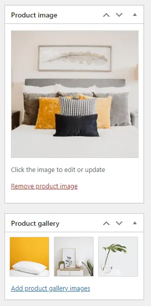
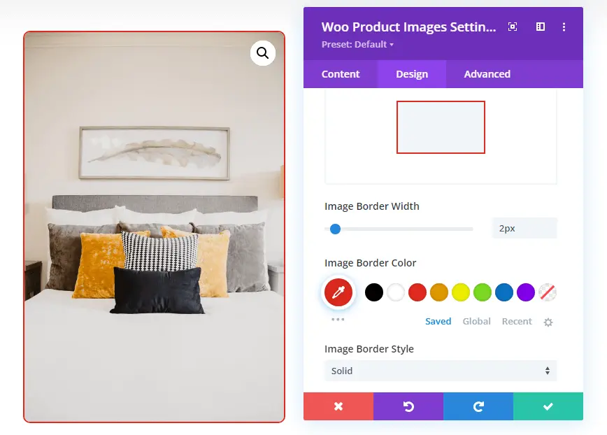
Then, in the Design tab, you get the following settings to improve the product’s images appearance.
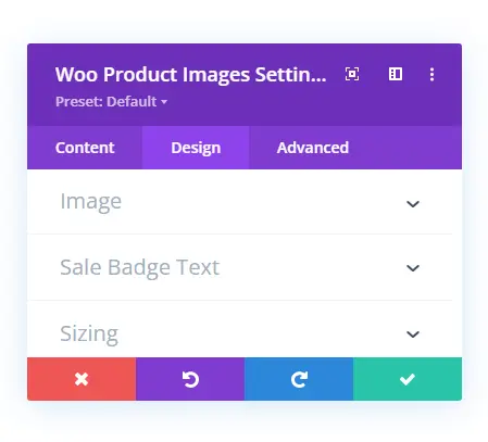
The Image settings enable you to make the image full-width. Apply rounded corners, border styles, and more.
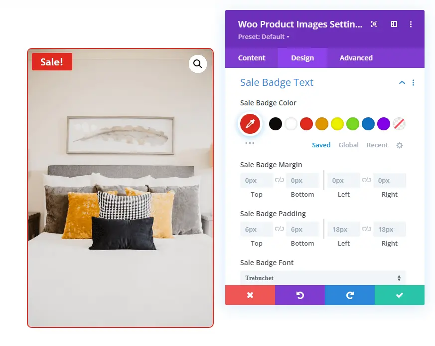
Using the Sale Badge Text settings, you can apply text customizations to the sale badge.
14. Woo Product Gallery
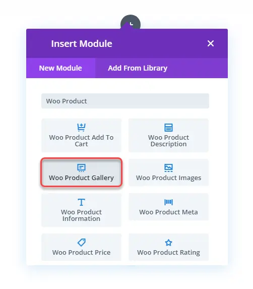
A Divi WooCommerce product page looks more informative and engaging when multiple images are available. Yes, using the Woo Product Images, you can display different images. However, they only have a simple look. But using the Woo Product Gallery module, you can show them in a much better way.
And, using the Design tab, you can enhance the gallery’s look even more. Settings like Layout provide you with the option to change gallery-style.
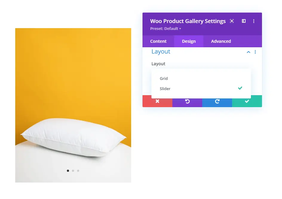
There are two layout variations available for the product’s gallery: Slider and Grid.
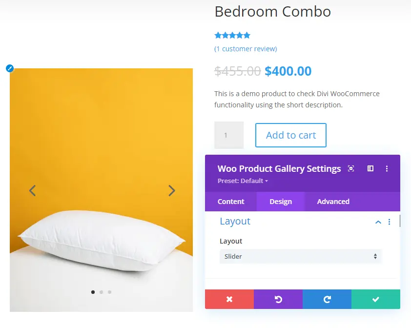
Slider Divi WooCommerce Product Image Gallery
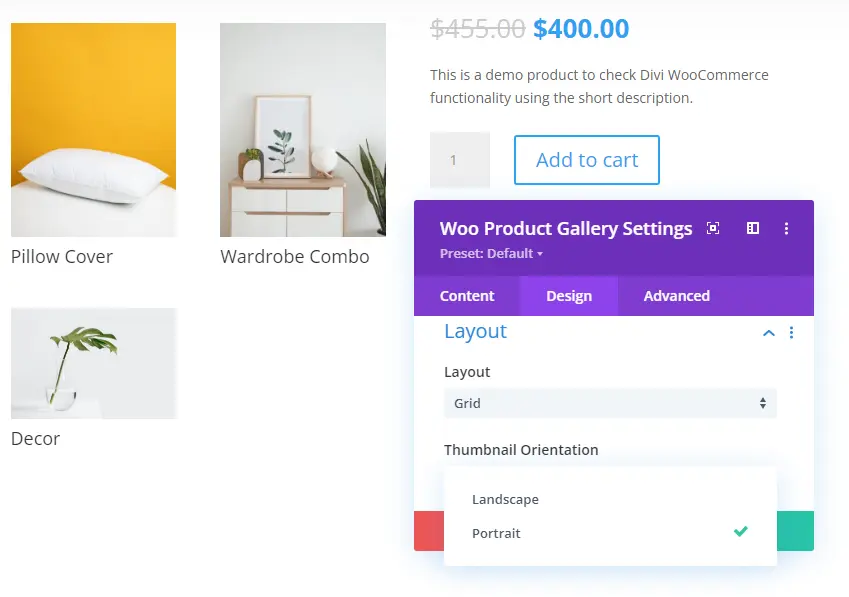
Grid Portrait Divi WooCommerce Product Image Gallery
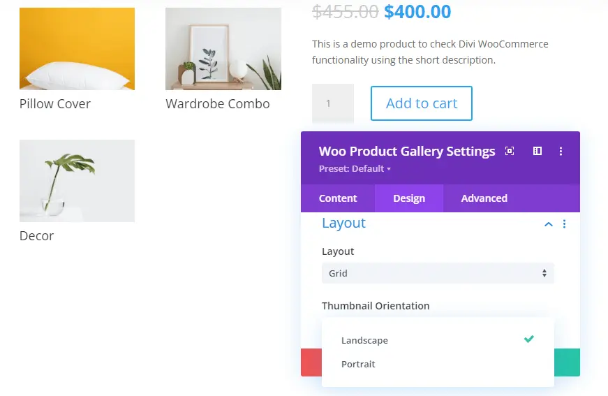
Grid Landscape Divi WooCommerce Product Image Gallery
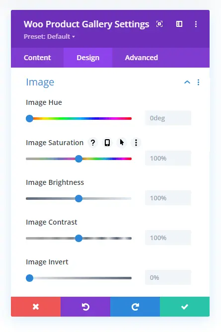
But that’s not all; it also includes Image settings to tweak gallery images’ color aspects. Like Hue, Saturation, Brightness, Contrast, and more.
Then, you get text customizations for the image’s Caption and Pagination Text. So, overall there are different options to make the product gallery look outstanding.
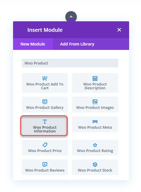
15. Woo Product Information
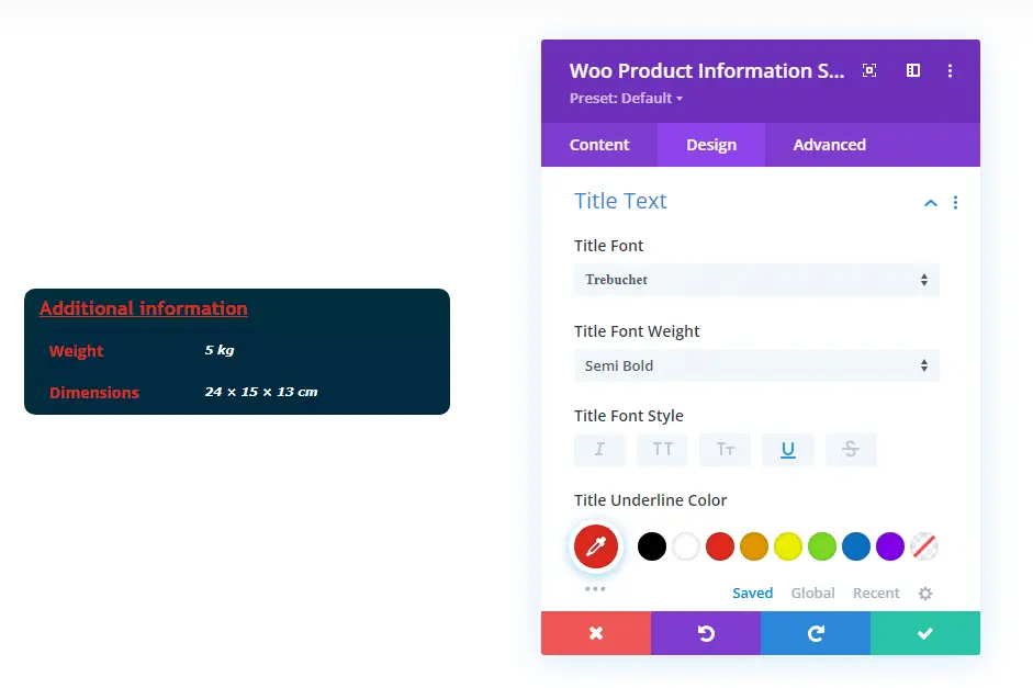
If you don’t want to display the product’s additional information like weight, color, and size in tabs, you can use the Woo Product Information module.
It provides you with the option to display additional information about the product in a much-simplified way. You can change font family, size, weight, apply a background color, and more.
16. Woo Product Meta
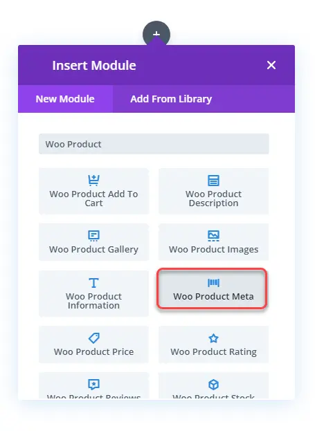
To display the product’s category, SKUID, and tags on the product page in Divi, you can use the Woo Product Meta.
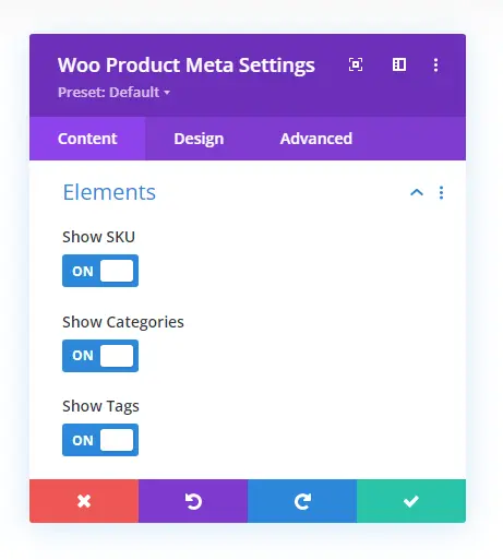
It provides the intuitive options to show and hide particular product meta using the Elements settings.
Then, the Design tab’s Layout settings enable you to place them Inline and Stacked.
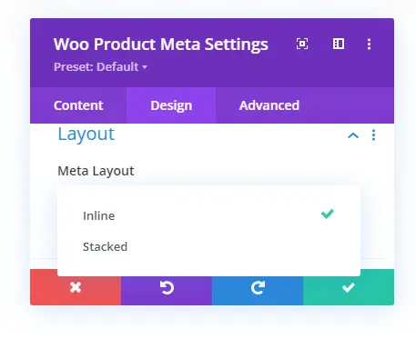
This is how the product meta looks in different layouts.
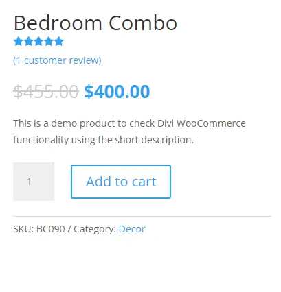
Inline product meta
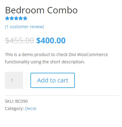
Stacked product meta
Further, you can use the additional settings of the Design tab to improve the meta’s appearance.
17. Woo Product Price
Display the product’s price and customize its look using the Woo Product Price Divi WooCommerce module.
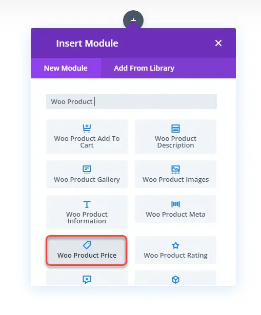
Then, by using the text settings available in the Design tab, change the look for both regular and sale prices.
As you can see in the above visual, editing the product’s price is simple and easy.
18. Woo Product Rating
Build trust among your customers by showcasing star ratings using the Woo Product Rating module.
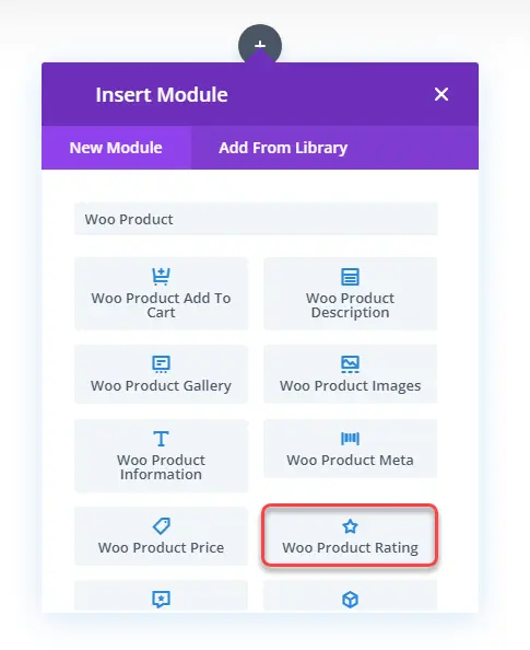
Plus, decide what elements you want to display in the ratings, whether no. of ratings or only star ratings. To do that, you need to open the Elements settings in the Content tab and select your option.
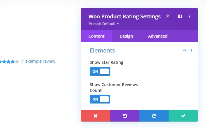
The available options are Show Star Rating and Show Customer Reviews Count. Per your requirements, select the elements. Then, head over to the Design tab to improve their look.
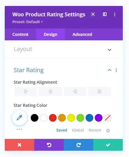
Change star rating layouts as Inline or Stacked. Place them in different locations; use different colors and sizes using the Star Rating settings. And a lot more options to make the product rating look attractive.
19. Woo Product Reviews
In addition to ratings, build trust in your customers’ hearts even more by showing reviews using the Woo Product Reviews module.
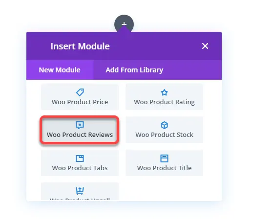
Plus, it also allows new customers to leave their nice words. The module includes the options to display Author images, Comment count, reviews meta, and ratings.
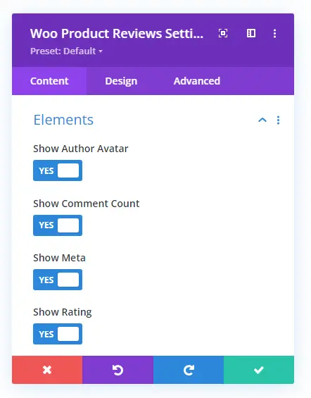
If you’re not showing the reviews in the product tab, you can utilize this module. And with design customizations, it’s easier to enhance the appearance. Like, rounding the author’s image, changing star rating color and size. Text customization on the review and other texts.
20. Woo Product Stock
Simply display whether the product is in stock or not in a beautiful way using the Woo Product Stock module.
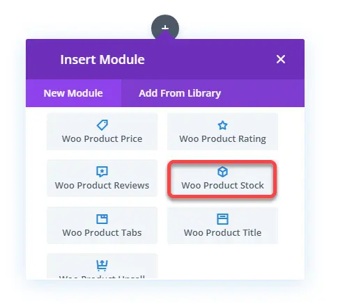
And then, utilize the Design tab options to enhance it further.
21. Woo Product Tabs
Save product space and display product information like description, additional information, and reviews compactly with the Woo Product Tabs module.
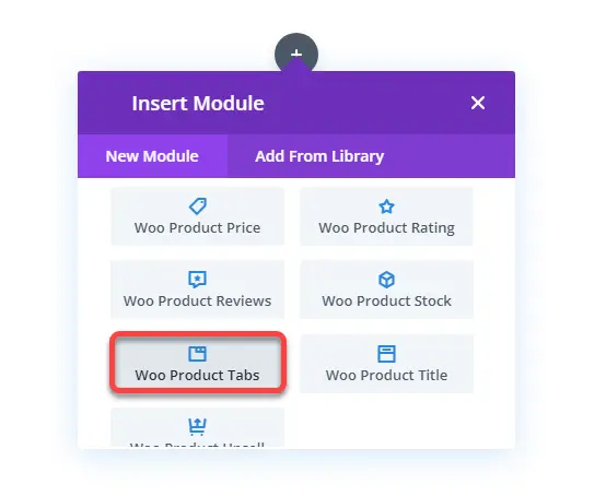
Even if you don’t want to show specific information, you can simply use the Content settings in the Content tab to hide that.
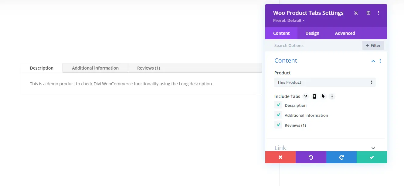
The Design tab includes the options to improve text appearance and apply other tweaks.
22. Woo Product Title
Turn your product’s title according to the store look using the Woo Product Title module.
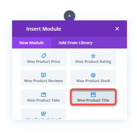
It provides all the necessary text customization options to tweak the product title—for instance, Title heading level, font family, color, size, and more.
23. Woo Product Upsell
If you’ve linked the product with upsell products and want to display them using the Divi Builder, then Woo Product Upsell module is what you need.
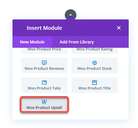
It provides you with different Content options to define what to display and how to display on the upsell location.
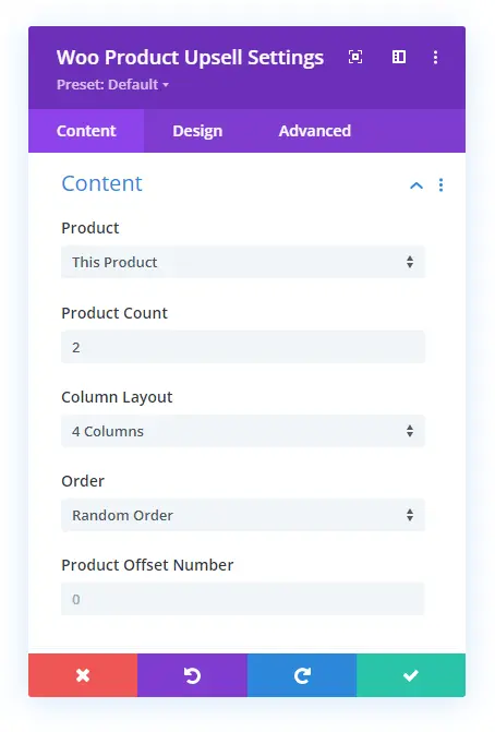
For example, Product Count enables you to control how many products you want to display. Then, Column Layout can place products in up to 6 columns. Plus, you can use the Elements settings to hide and show particular elements on the upsell products.
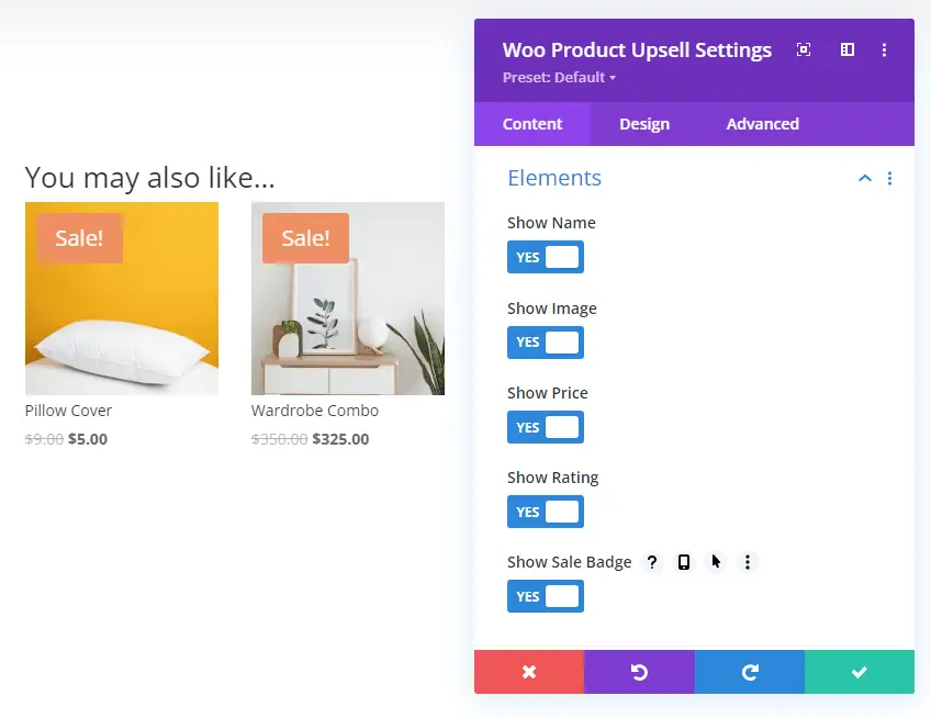
Further, when you head over to the Design tab, you get additional options to enhance the look of your upsell products.
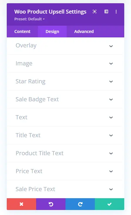
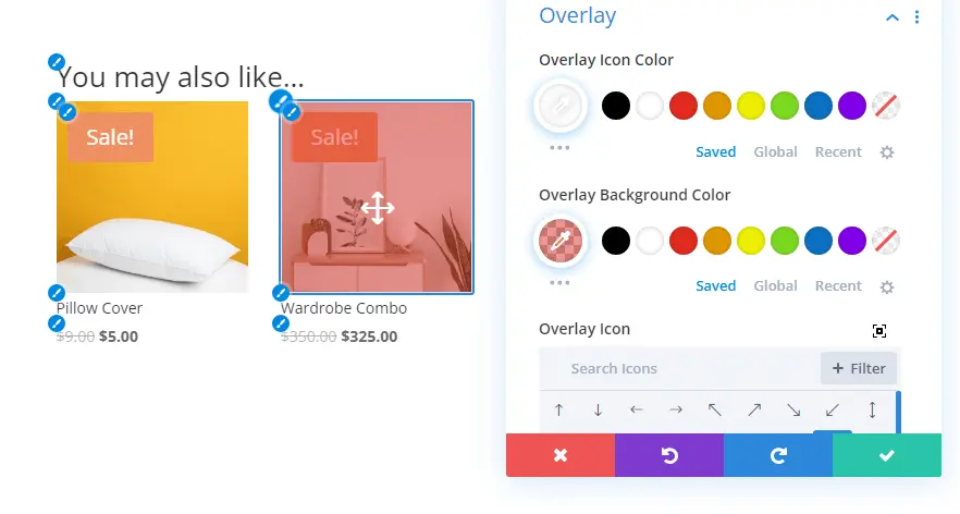
The Overlay settings let you display different overlay colors and icons on the products when you hover over the product.
If the products received a rating, then you can control that as well using the Star Rating settings. Using this, you can change rating alignment, color, size, and more.
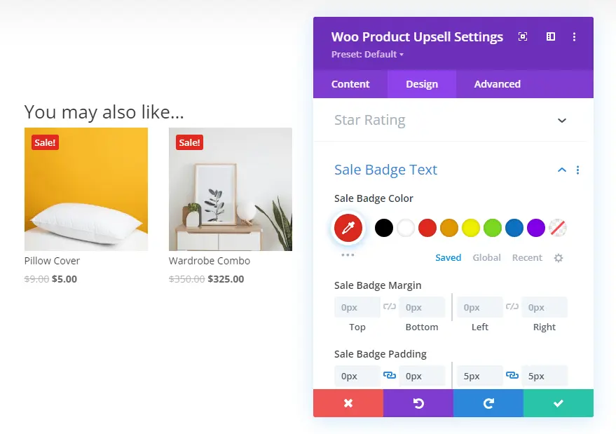
More controls are available to apply on Sale Badge Text, Upsell section title, product title, etc.
24. Woo Products
Whether you want to create the latest products Divi woocommerce shop page or a shop based on a product category, the only Divi module you need to use is Woo Products.
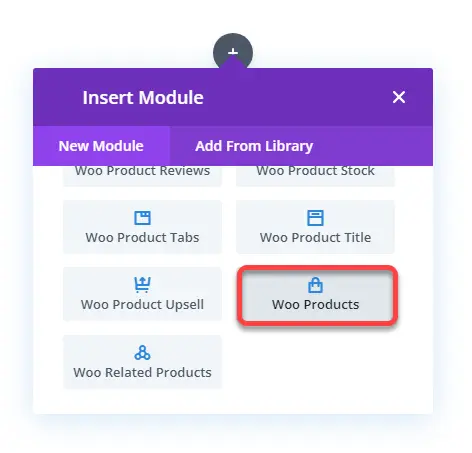
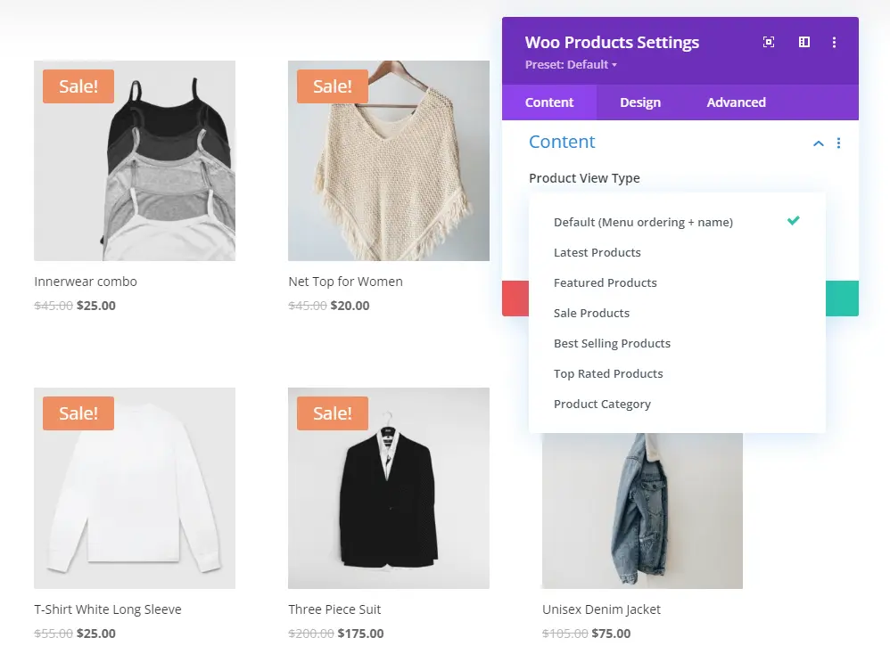
It’s a comprehensive Divi WooCommerce module that lets you create digital shops of any kind. When you insert the module, it displays all the products from the default product view type. However, you can change that to the latest, featured and even category using the Product View Type option.
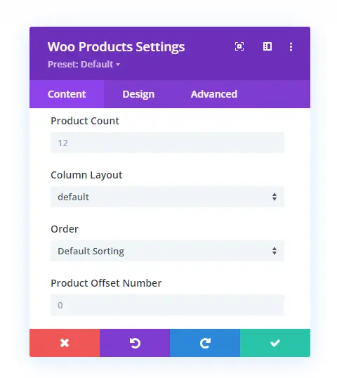
Then, using the same content settings, you can change product count, column layout, order, and offset number.
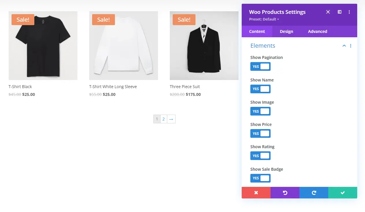
In addition to these, the Elements settings of the Content tab provide you with the options to hide and show different elements on the products. Like, Pagination, Name, Image, Price, Ratings, and Sale Badge.
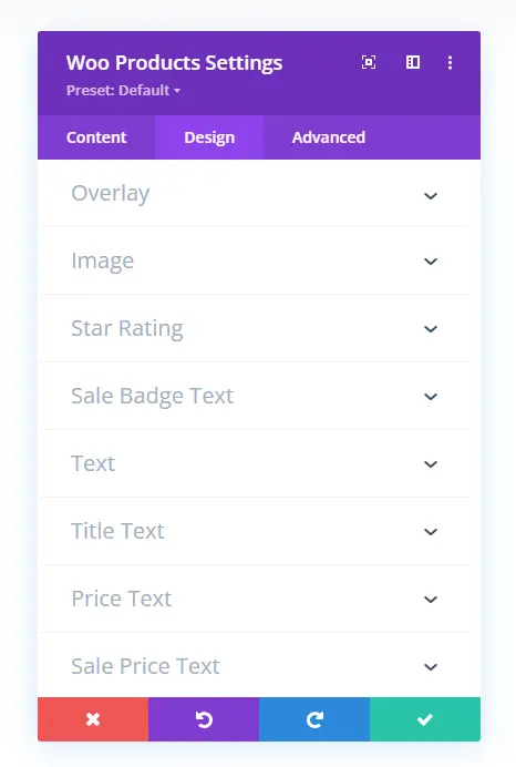
Once you’re done with Elements, head over to the Design tab, and utilize the following settings to improve the shop’s look.
25. Woo Related Products
The Woo Related Products module showcases different products as related products on a particular product page.
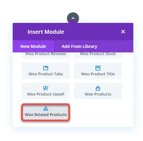
Like the Upsell products module, you can control what products you want to display, how many of them to display, and in up to what columns. You need to open the Content settings in the Content tab to access these options.
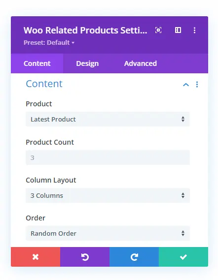
However, unlike the upsell products module, this related products module also allows you to select products based on category with offset capability.
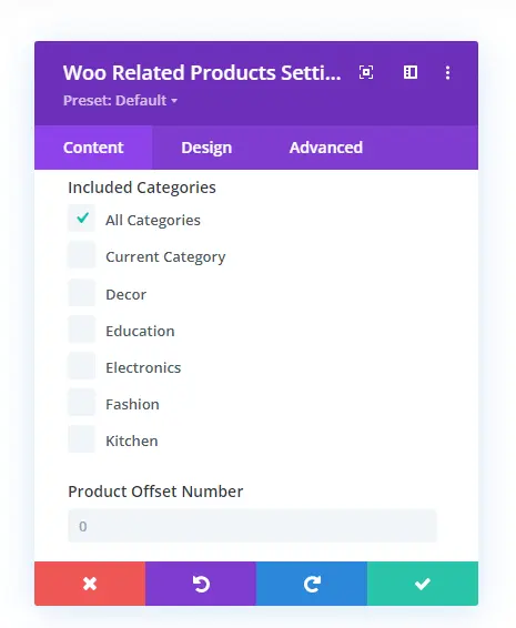
Other than these, it includes the same options like upsell products module to improve functionality and design. Like Elements settings to hide and show different product elements. In the Design tab, you get Overlay, Image, Star Rating, Sale Badge Text, and more settings the same as upsell products module.
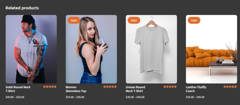
From Divi Layouts for WooCommerce
Wrapping Up
So, above, we’ve looked at all the Divi modules available for WooCommerce. I hope this article helped you know which module you need to use for a particular purpose.
If you want to take your online shop powered with Divi and WooCommerce, then try the Divi WooCommerce Extended plugin. It includes many different & powerful Divi and WooCommerce options to make an online store highly functional and beautiful. Using the modules of this plugin, you can create WooCommerce product carousel, custom shop page, and even a mini cart icon.
Apart from these, if you’ve got any about Divi WooCommerce modules or views about this article, then let me know in the comments.




0 Comments