Want to display video, images, and more in a lightbox on your Divi theme website? And finding it hard to achieve? Then, in this article, we’re going to see how we can create Divi lightbox for videos, images, text, and more using Divi Plus Modal.
So, without any further due, let’s get started!
Preview 1
Interested in the above Divi lightbox for video and want to see it working first? Then, click here.
Things required
To start creating a lightbox for video and other media in Divi, we need Divi Modal. For that, we need to purchase Divi Plus, which we can do from here.
Once purchased, download the plugin, then install and activate it.
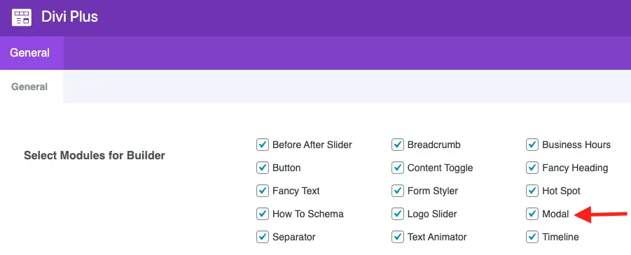
After activating the plugin, make sure that Modal is active in the Divi Plus panel. Settings > Divi Plus on your WordPress dashboard.
Layout used
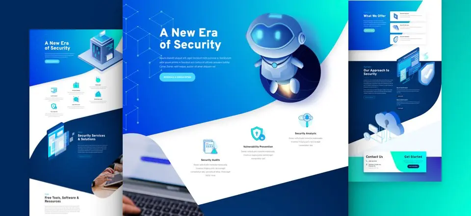
In this tutorial, I have used the Divi’s premade Cyber Security layout to create the above modal. If you want the same design and style, you can also use that.
Insert Divi Modal on the page
After successfully activating the plugin and Modal, it’s time to create Divi lightbox.
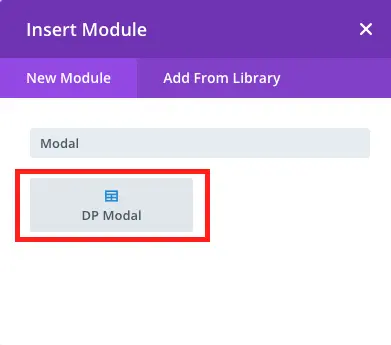
To do that, first, create a page or edit an existing one, where you want to show video in the modal. Then, load the Divi page builder and insert the DP Modal.
Modal content customization for Divi lightbox
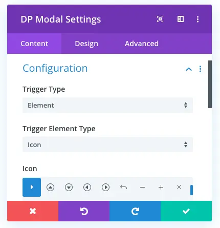
After inserting the module on the page, you get the content setting window for customizing the video lightbox. It combines many options that can help you to make your video modal window’s content promising. The following are the options available in the content tab.
Configure Modal Trigger
As soon as you add the module to the page, you get the following Divi modal window. It allows you to customize the modal’s content and what you want to display on it and what’s not.
Do configuration as follows,
- Trigger Type: Element
- Trigger Element Type: Icon
- Icon: See the screenshot
Other modal trigger type & elements
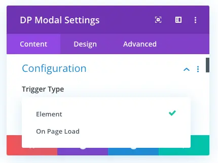
In addition to the Element trigger type, with Modal, you also get Page Load trigger type.
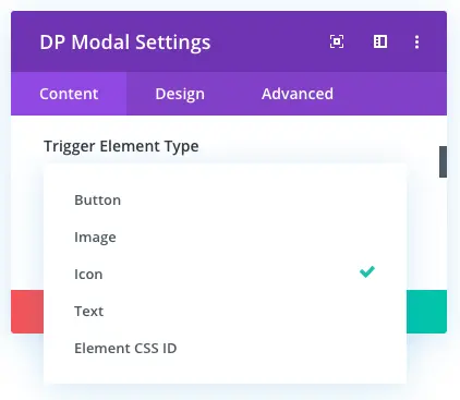
Plus, for elements, you get more options in addition to the icon trigger element type. All the elements trigger types are Button, Image, Icon, Text, and Element CSS ID.
Modal Header
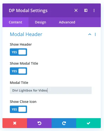
Using this Divi modal setting, you can choose whether or not your Divi modal window display header, title, and close icon. Under this setting, you can also set the title of the modal.
Modal Body
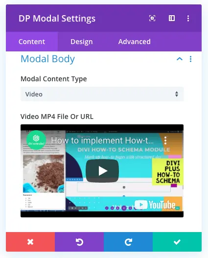
This setting of the Divi Plus Modal, allows you to select the content of your modal. It provides support for Video, Image, Text, and Divi Library Layouts to display in the lightbox.
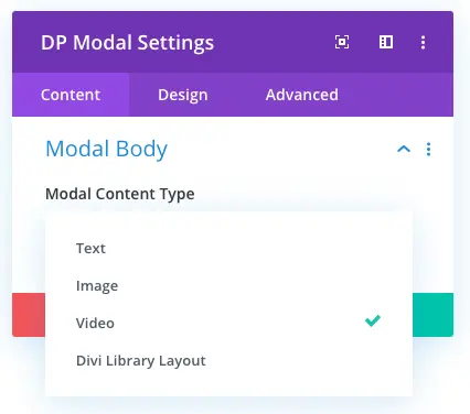
For video lightbox, choose video and upload the corresponding file you want to display in the video popup.
Modal Footer
Using this setting of the Divi Plus Modal, you’d be able to choose whether or not your video lightbox would display footer. Plus, you can also use this setting to input text for the close button.
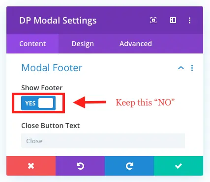
However, for this tutorial, we will keep the modal footer option disable. So, if you’re following this tutorial, then don’t forget to check Show Footer as “No.”
Background
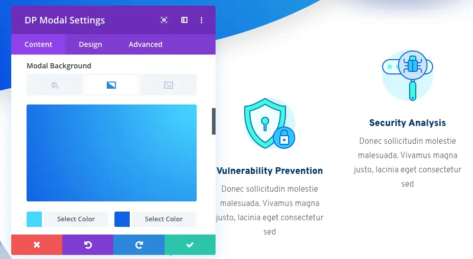
Here, you’d be able to customize the background style of modal’s elements. It’s a complete settings panel for each and every element of the modal for background customization. Apply changes as follows,
Trigger Element Background: None
Modal Background:
Gradient 1: #47D7FF
Gradient 2: #0F61E2
Type: Radial
Radial Direction: Top Right, and leave other settings as they are.
Modal Header Background: None
Body Background: None
Modal Footer Background: None
Modal design customization for Divi lightbox
Using the Content tab of the Divi Plus Modal, we’ve customized the content of our Divi video lightbox. Now, using the option available in its Design tab, we’re going to make it look attractive and engaging. The options available in the Design tab for creating impressive video popup for Divi are,
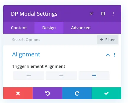
Alignment
This first setting of Modal’s Design tab allows you to make changes in the trigger element’s placement location. Using this setting, you’d be able to place your trigger element on the left, right, and center.
Trigger Icon
Using this particular setting, you can make changes in the size and color of the Divi lightbox trigger element.
![]()
Trigger Icon Font Size: 100px
Trigger Icon Color: #FFFFFF
Modal Title Text
It allows you to customize the appearance of modal title. This Divi modal setting provides you with all the necessary parameters to make a text look more engaging and attractive.
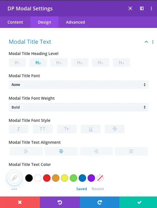
Modal Title Heading Level: H2 (This is best practice. Whenever, you create a Divi pop up keep heading level H2.)
Title Font: Acme
Font Weight: Bold
Title Alignment: See screenshot
Title Font Color: #FFFFFF
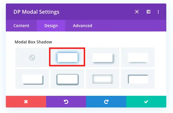
Box Shadow
In addition to the title text setting, the Box Shadow setting of the module provides you with the option to add a box-shadow on each modal element. However, for this tutorial, we’re only going to add a shadow on the modal. Therefore, keep other elements’ box-shadow unchecked, and for modal, look in the screenshot.
Border
Just like the Box Shadow setting, this setting of Divi Modal allows you to add and customize the border of the trigger element and pop up modal.
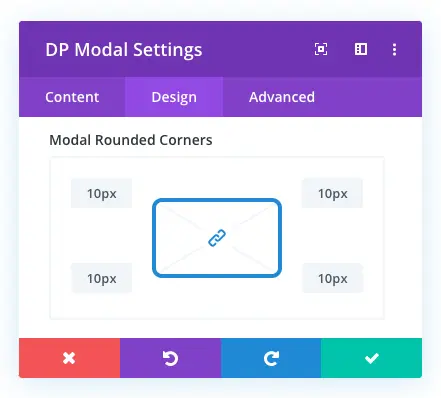
Modal Rounded Corners: 10px for each corner.
Modal Sizing and Alignment
Using Modal Sizing and Alignment, you can make changes in the position of the popup Divi modal. Plus, it also provides you with the option to make changes in the modal width and height.
Keep Modal Alignment & Sizing as default.
Spacing
Here, you’d be able to make changes in the margin and padding of the module and its elements as well as module too. Keep spacing as default.
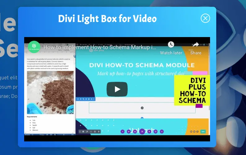
Once these settings applied on the modal, it will appear like the below image.
Animation
This setting would allow you to add animation on the entrance of Divi pop up for video in the modal. Apply customization as follows,
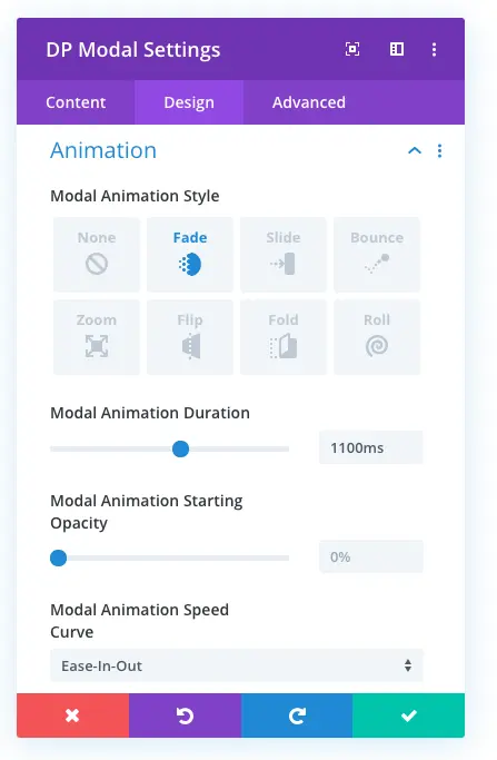
Modal Animation Style: Fade
Animation Duration: 1100ms
Modal Animation Starting Opacity: Default 0%
Modal Animation Speed Curve: Ease-In-Out
CSS used for pulse animation
Following the above steps, we have almost created the lightbox layout shown in this blog post. However, to add pulse animation, we need to add a custom CSS. For that, go to the module’s Advanced tab and add el-icon as CSS Class.
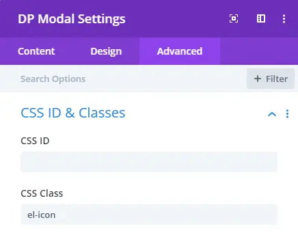
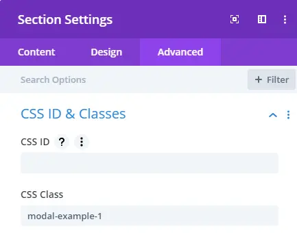
After giving the class name to the module, go to the Advanced tab of the Section Settings and input CSS Class as modal-example-1.
Once added class name for the section, finally, go to the Advanced tab of Page Settings and add pulse animation custom CSS in the same manner shown in the below screenshot.
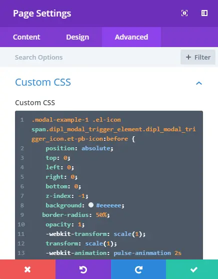
Add below custom CSS in the above setting appropriately.
Examples of Divi lightbox for video, images and more
Below are some examples of Divi video lightbox and other body content, created using Divi modal of the Divi Plus plugin.
A New Era of Security
Mauris blandit aliquet elit, eget tincidunt nibh pulvinar a. Vestibulum ante ipsum primis in faucibus orci luctus et ultrices posuere cubilia Curae; Donec velit neque, auctor sit amet aliquam vel

Design Your Home
Click the image to see the image in the lightbox.
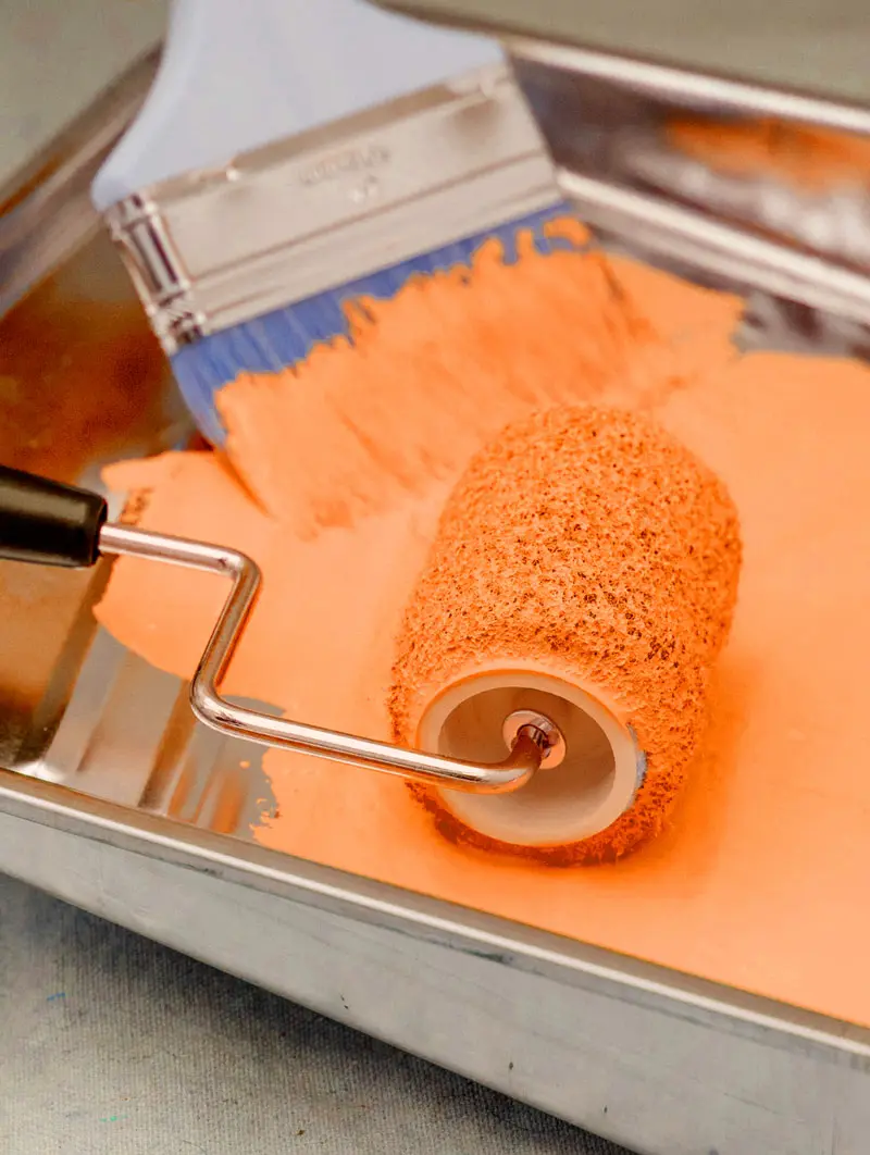
Design Your Home
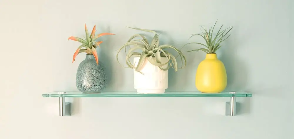
Organic Tea Shop
Tea For Two
Divi Plus Image Hotspot
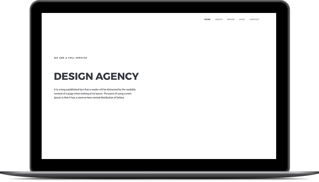
Divi How To SChema Module
Hello, I’m Jane
A Conceptual Copywriter
Hello, I'm Jane
Click anywhere to see the Divi Layout as lightbox
Welcome to Divi ElementaryLorem ipsum dolor sit amet, consectetur adipiscing elit, sed do eiusmod tempor incididunt ut labore et dolore magna aliqua. Lorem ipsum dolor sit amet, consectetur adipiscing elit, sed do eiusmod tempor incididunt.



0 Comments