One of the biggest sale events is only a few weeks away, and if you’re planning to make the most out of it on your eCommerce website, then it’s crucial you utilize your Black Friday homepage with the essential elements.
Some elements are highly beneficial to attract users and motivate them to participate in your Black Friday sale event. So, some elements make it possible for you to reach out to your potential customers when you begin the sale. Therefore, to maximize your efforts and their results, power up your homepage or the dedicated sale page with elements we are going to discuss in this post.
These elements don’t require extra effort, and if you want to use them without spending more time, you can try the products and tools mentioned.
#1 – Secondary Top Menu for Announcement
When you’re running the sale, or it’s about to begin, your whole website should have a secondary menu with the event’s text, not just the Black Friday homepage/dedicated landing page. Because people can arrive on your website from different mediums, for example, blog or service page and if you’re only focusing on the Black Friday page, then you’re not going to attract potential buyers.

Hence, add a secondary menu on top of the main menu with the event’s text that attracts the user to explore what you’re offering. The menu is the first thing people see on a website. Therefore, you can effectively utilize it when the sale is live or about to start.
For your Divi website, if you need a quick solution to this, you can try the header layouts from the Headers for Divi pack that includes over 200 outstanding Divi headers, which also contain headers with a secondary menu.
#2 – Persuasive Hero Section
After exploring or interacting with the header, the user’s eyes fall on the hero section of the website. For your Black Friday event, you must take special care of this area because if it’s not attention-grabbing, you’ll lose potential customers in seconds.
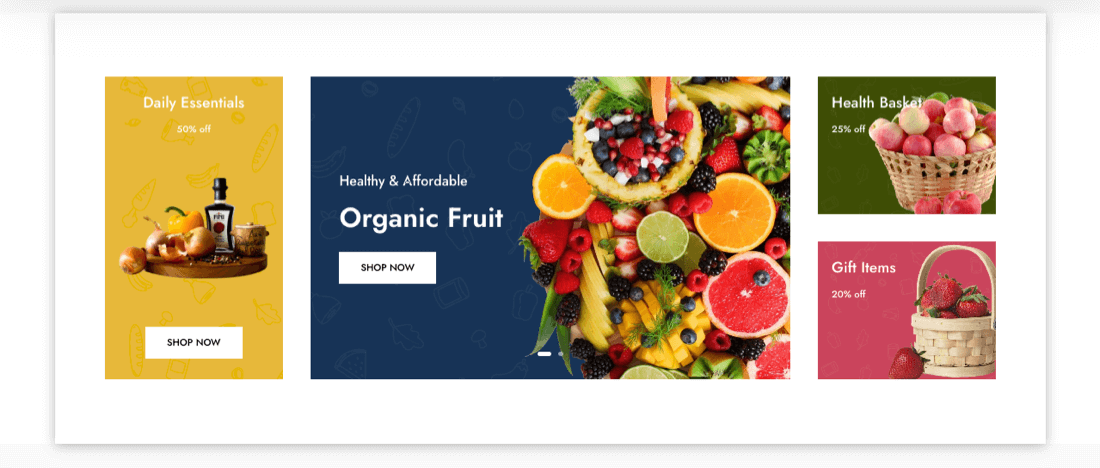
It should include a clear but creative copy. Minimum but essential elements, for example, a CTA, offer details using a sale banner and perhaps an opt-in form if the sale isn’t live. This is all you need to make the hero section according to the sale and showcase to customers the path to explore further on the sale landing page.
To quickly get done with the hero section of your Divi website for the Black Friday sale, you can try the layouts of the Hero Sections for the Divi pack. It includes over 60 hero section layouts that have impressive designs and elements that you can utilize for the sale page. There are opt-in forms and content sections to add details about the sale, showcase your products and much more.
By using these layouts, you can make the sale landing page appropriate for the first impression that matters the most.
#3 – Optimize CTAs With Event Text
Having optimized CTAs is one of the effective elements for the sale landing page. However, keeping only engaging color and font family won’t let you maximize its effect on the users. They might understand the result of the action they will take but find no urge to do it.

Therefore, to add extra significance to your optimized CTAs, you can add sale offer text underneath the main title, creating the urge to grab the offer before it’s over.
You can use the Advanced Button module of the Divi Plus plugin to achieve this functionality on your Divi buttons. The module lets you add the extra text as well as customize it further. You can add dual buttons, apply on-hover animation effects, change design style and much more.
Overall, the buttons you add will reflect the purpose of your Black Friday homepage or dedicated landing page.
#4 – Attention-Grabbing Popups
It’s possible that after checking out your sales landing page, people want to explore other platforms for better possibilities. This can affect your marketing efforts as well as sales during the live event. But you can minimize this by displaying non-intrusive and highly engaging Divi popups.
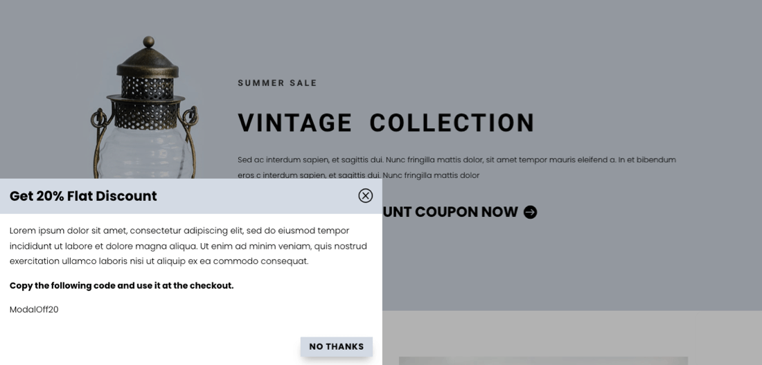
A modal popup can help you highlight your deals and offers based on the interactions visitors carry out on your platform. You can shoot popups with additional discounts if users leave. You can show them a subscription form if the sale isn’t live and later use their details to launch marketing campaigns. If they have reached the page end, ask them to participate in a contest using the page load popup.
And there are many ways you can utilize a popup to make your Black Friday page highly effective.
#5 – Create Urgency With Countdown Timers
If you don’t want your customers to take your sales event lightly, then use web page elements that create a sense of urgency, a fear of missing out.

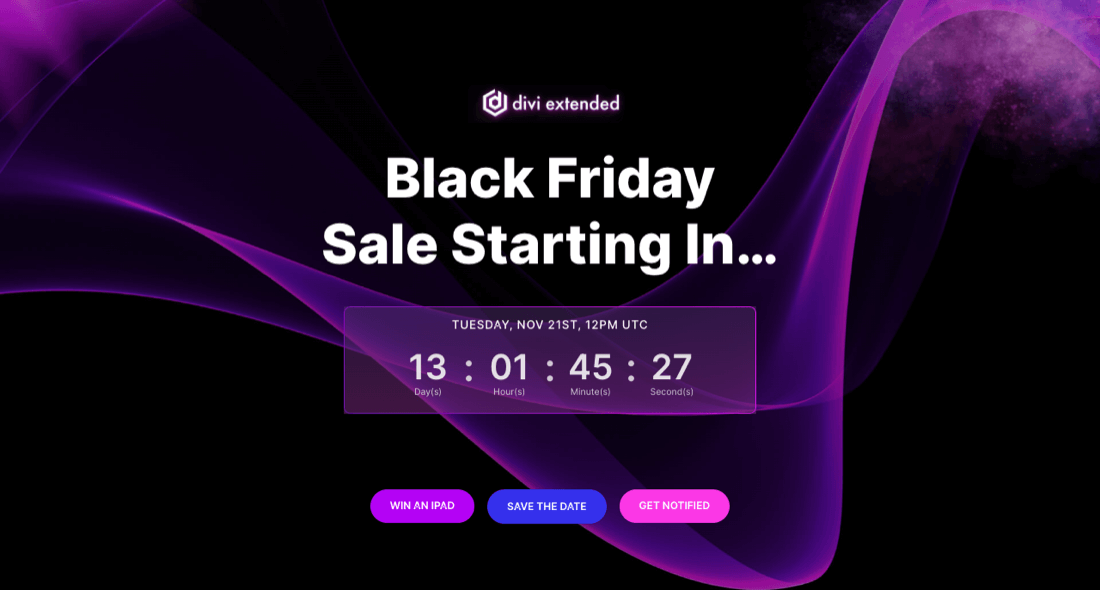
A timer is the best example of creating FOMO in a customer’s mind. If they see that in the mentioned time frame, the deal will be off and won’t come back, that they might lose effective products at affordable prices, they will purchase it because it’s the best thing to do. You can add a timer using countdown timer layouts available with the Divi Layouts Extended plugin.
You can also find a countdown timer in the hero section, so when the user arrives for the first time, they sense the urgency of your services or products before it gets late.
#6 – Subscription Forms With Event Text
If you have not started the sale, then you should keep working on building an email list. So, when the event goes live, you can bring potential buyers to the sale page and do a lot of business without running paid advertisements.
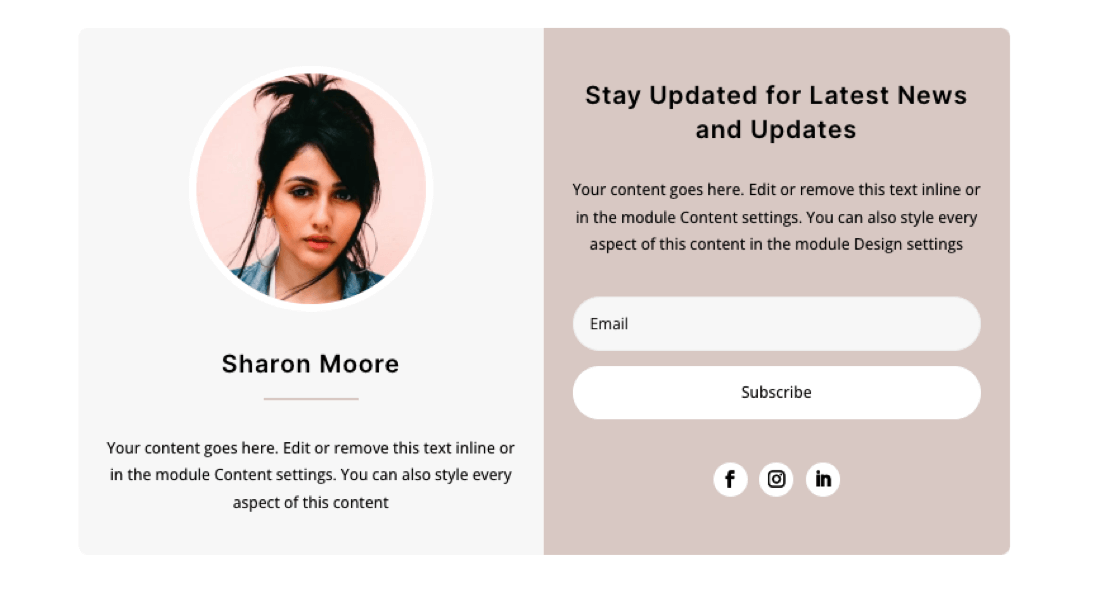
You can build an email list by adding a subscriber form at the bottom, in your blog posts, sidebar area and even in the popups. Email lists make the highest ROI during their sales events for businesses. Therefore, use subscription form(a) on your landing page for Black Friday to maximize its performance.
If you need pre-built subscribers from element, you can try the layouts available with Divi Layouts Extended. This single plugin offers you around a total of 50 email-opt-in forms that you can use without any additional customizations.
#7 – Quality Product Showcase With Sale Badge
If you’re selling products, ensure they are clearly visible to the customers and evoke the emotion of getting them before the sale ends. Each product should have a dedicated page with clear details about it. On your Divi website, you can level up your product showcase with the Divi Plus product carousel and grid layout, as well as use product page layouts to make them look even better.
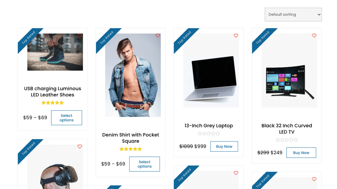
This will help you convince your potential buyers about your quality product, and they’ll most likely get it from you. As the Apple Marketing Philosophy by Mike Markkula says, “People DO judge a book by its cover.”
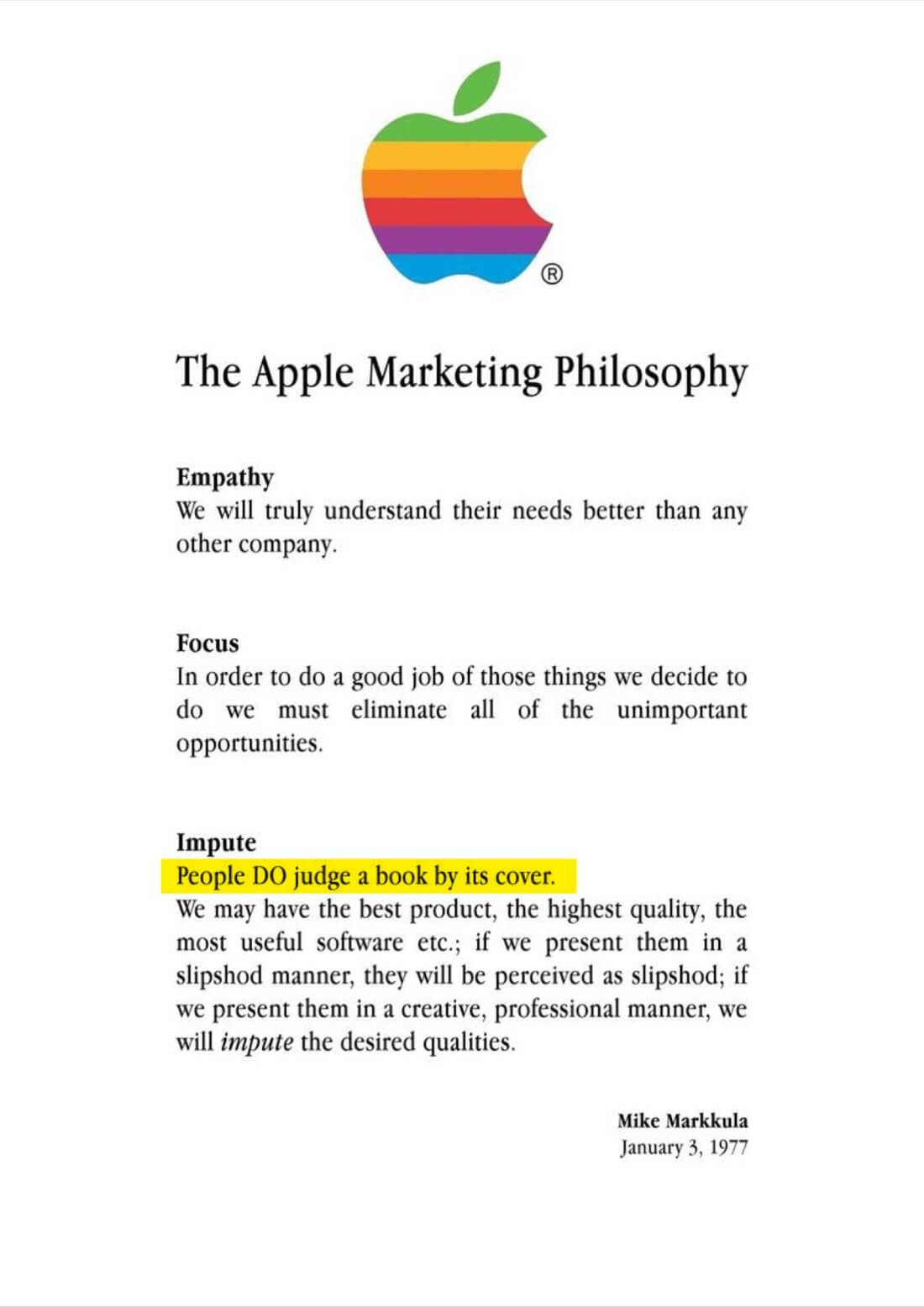
Therefore, while you lift the Black Friday page, ensure you present the products in the best possible way. Display their images and key features, and keep the add to cart button always ON so they can quickly decide and quickly make the purchase keeping the discount and quality of the product in mind.
The Bottom Line (No Coupons, But Schedule Marketing)
When running your Black Friday sale, ensure you keep discounts by default because remembering coupons and entering them during checkout make the process a bit lengthy. You need to simplify everything so users, without any extra effort, can make the most out of it. While you do that, keep your marketing efforts planned. Do not bombard users with heavy messages or emails; just keep things light and on time, and you’ll boost the effect impressively.
By using the above elements, your efforts will be on the spot and help you drive highly beneficial results. The only thing you need to practice is that you don’t overdo anything. Just keep what’s essential and highly supports your business domain.
Less is always more.
P.S. Our Black Friday Sale is about to go live in a few weeks, check it out and grab the chance to win an iPad – for free. No purchase is required.

0 Comments