Competing in today’s business landscape can feel like an impossible task. No matter how many calls you make, emails you send, or social media posts you submit, it will feel like companies with more resources than you are always a step or two ahead. When it comes to your website, though, you finally have the chance to take the initiative and beat the competition. A good website is like an employee who works 24/7 for you. A professionally designed website represents your business in front of the people where you can’t be every time.
Therefore, in this article, we’re going to see the tips for professional website design in today’s digital landscape.
Design and Style
The way your website looks will always impact the way how users respond to it. This makes the design and style of your website one of its crucial features, and you need to take the right steps to make sure that it looks beautiful.
1. A Cohesive Brand

The colors, fonts, and style elements you use across your site need to be consistent and cohesive. Reflecting your brand and making your logo feel at home. Websites like Coolors can help you find the right website color schemes that blend nicely with the brand. At the same time, tools like Google Fonts can make it easier to pair text styles together.
Moreover, apart from color palettes and Google Fonts for websites, it is important for a site to have content with readability. An ideal paragraph length is 5-6 sentences that are short and easy to read. Keep a check on word length and syllable counts to make the content more appealing to users when they read it.
2. Minimalist/Simple Website Design

Simplicity is key in the world of professional website design, and this is evident when you look at websites produced by large companies. Having a minimalist website with information in the right places will encourage your users to spend more time on it. However, you need to be careful to make sure that you include enough information in a rightful manner- neither short nor long- to satisfy them.
Use the most important thing on the homepage. But it doesn’t mean you should bring everything on the front page table. These days you might find websites that provide glimpse of their products or services on the homepage with a read more button. It’s a good approach, however, it would increase the page length and perhaps users won’t find their desired information.
So, in this situation what you can do? I’d recommend first limiting your homepage with 3 or 4 items. After that, create a single section for all the useful information. Like business information, what you do, how you do, your achievements, vision, mission and more. Then put them on an about us page with multiple sections. Or you can also create an individual page. In this way, you’d be able to display every crucial info of your business. Plus, keeping the structure of the website minimalist which look more professional.
3. Premium Assets and Quality Images

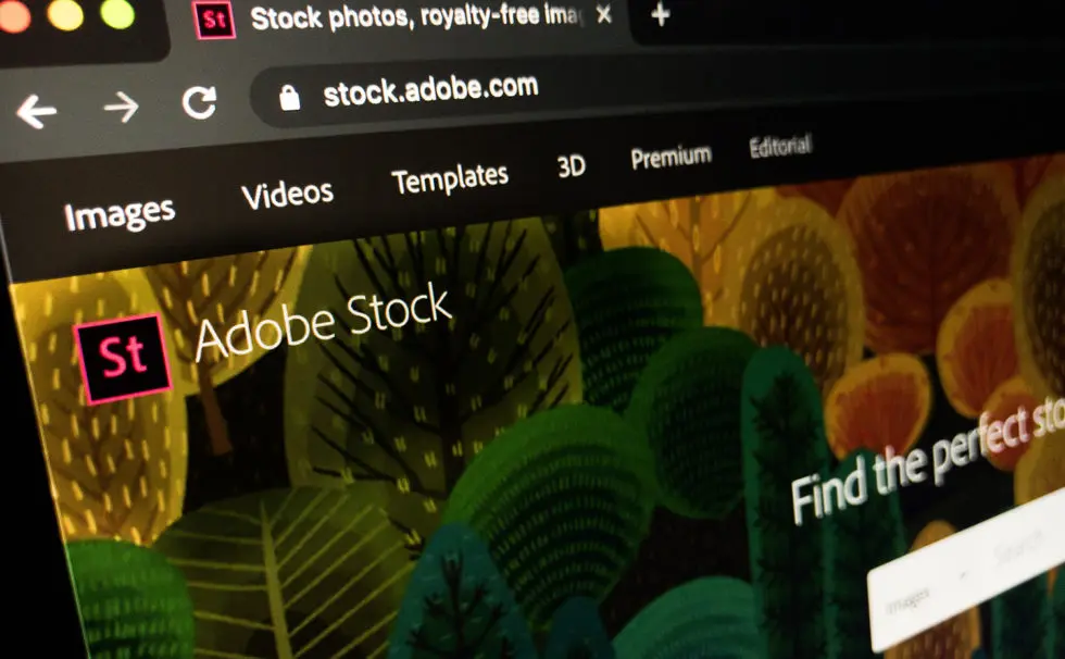
It’s common to find small companies using low-quality assets on their websites. Low-resolution images, poorly compressed fonts, and pixelated videos will all look very unprofessional. Websites like Adobe Stock offer free trials that can enable you to get your hands on enough premium assets to get started on your website without paying anything. You may give a try to Unsplash or Pexels for Royalty-free images. When you select an image for your website, it’s important that it fits well with the branding. Prioritize brand blend over favoritism.
Even if you liked the graphic too much, then adjust it according to the website color scheme. For instance, if the website has a light color scheme, then using an image of bright intensity won’t do much. It would look funkier and nothing under the professional website design realm. So, always keep your branding and its value in mind, whenever you select a graphic for the site.
Also, when you do website branding, do it with care. Don’t rush to use all your favorite colors as not all people like the same colors. Therefore, do your best research to find out the best color for the website. Check what’s trending in the market and what’s not. Don’t just relax on your couch after creating a red and black website for a clinic.
Moreover, avoid fancy makeup of the site altogether on many occasions. Like when Christmas is near, you added trees, Santa hats, and snowflakes all over the website. Avoid it as much as possible. Though, keeping a little touch of festive can do wonders. However, when it comes to selecting a graphic, always keep an eye on its size because having a file of larger size can increase the load time of the website. We’ll discuss it more in this article later.
4. Responsiveness

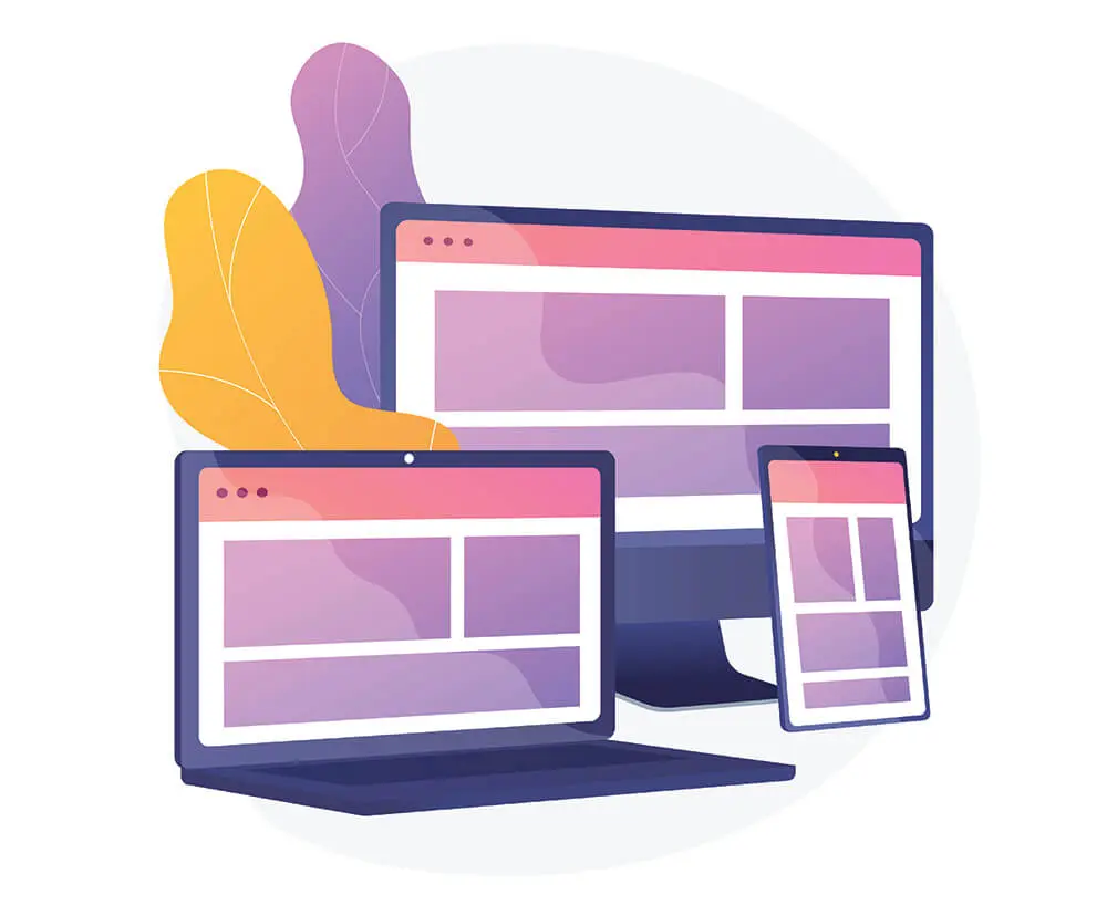
Few things will make a website look worse than poor responsive web design on mobile devices. As the research says, people are using their phones more and more to browse the web. And it simply means that it’s essential that your website should look & work well on gadgets like mobile phones and tablets. Therefore, tools like Responsinator can help you check the website responsiveness with ease. And in return, you’d be able to design a responsive and attractive professional website design for small resolution devices.
5. Animation

Creating a static website that conveys the right information isn’t too hard nowadays. Yet, this sort of site won’t catch people’s attention. And thus, it makes website animation crucial to modern web design. Even simple things like having a button’s background color transition on hover can make your site visitors feel like they’re on a far more professionally designed website.
Ease of Use And UX
Creating a website that is easy to use can be harder than you might expect. User experience is crucial in the modern age. And it’s not only limited to the online world. If you look at some of the companies that are at the peak of their industry are those who provide a better user experience. Therefore, it’s essential that you put huge amounts of work to make sure that your website is a delight to visit. And the following points can help you do that in a much better way.
6. Load Time

People quickly lose interest in websites when they load too slowly. And this is becoming a serious issue as mobile networks are becoming more popular. Thus, after finishing building a website, you can use a tool like GTMetrix to perform a website speed test. It will give you a solid idea of how your website is performing. In addition to that, it will also provide you with loads of handy tips to help you improve things.
Furthermore, when it comes to website speed, images are the one that causes slow page loading. But you can solve this by simply compressing your graphics and making sure that you’re using files that are of the right resolution. You can also use the WebP image format for lossy and lossless compression of your images. TinyPNG and SHORTPIXEL are some of the best image compression sites you can find online.
If you’re using WordPress, then for speed, I’d recommend you to lower your plugins number. Don’t use plugins every now and then. Keep as much as less plugins on your site as possible. And mostly the ones that are outdated and load in the front-end.
7. Easy Navigation

Just like having a website that loads slow put people off their mind. A navigation menu that doesn’t serve well would do the same. If people can’t find what they need on the menu, they bounce back as quickly as they’ve arrived. Your website’s menu design needs to be in a logical way that will make it easy for users to find what they’re looking for. Looking at the website navigation bar offered by other sites can help with this.
Internal page linking also plays a vital role in keeping users engaged on your website. From the about us page, you can send users to the portfolio page. And from a portfolio that may lead them to the contact page. Page connectivity will help the user to navigate through your website in a much simple & easy way.
8. Call To Action

Call to action buttons can include a variety of different things. In most cases, these will come in the form of “Call Now” and “Subscribe to our newsletter.” And they will be dotted around the site on convenient places for the user to find. A call to action not only makes a website look more professional, but it also helps your users to navigate your site without scrolling top to bottom all the time. Yet, multiple CTA on a page will make the page bulky. It will confuse the user which CTA to choose from, so avoid using various CTAs to make your page distraction-free.
9. Accessibility Options

Accessibility is crucial in the modern world. In today’s time, businesses are trying to serve and satisfy everyone they can. Therefore, it’s important that your website should have the option that can be accessible by impaired people. Like, colorblind options, text-to-speech tools, and adjustable font sizes. All these can give your users the chance to alter their experience with your website and make it better for them.
Functions & Tools
Modern websites can come with all sorts of interesting and useful tools. These sorts of features can often be a good way to distinguish yourself as a professional brand. It can cost quite a bit to add things like this to your website, but it will be worth it to make your customers happy.
10. Dynamic Feature
Changing your website’s content very often to keep it fresh can end up taking a huge amount of time. But there are multiple options that can let your website do it for itself. Dynamic social media feeds, product sliders, and other dynamic web content delivery methods that update themselves over time can make your life much easier. Moreover, it also makes your website look more professional whenever past visitors revisit.
11. Bugs, Glitches, And Feedback

Your users won’t be happy if they find bugs or glitches on your website. You need to make sure that your website is testing in a wide range of scenarios, including different types of devices. Bugs that make websites unusable look extremely unprofessional. But you can offset this somewhat by giving your users the chance to leave feedback about the site.
12. Complex Tools/Applications
In addition to the dynamic functions and content, you can also look for ways to offer complex tools and applications to your customers. For example, many financial companies offer special calculators that can work out the prices of loans for their clients. Features like this will cost a little bit of money to install, but you can usually do it with ease if you’re using a platform that allows plugins, like WordPress.
Accuracy And Professionalism
The information you provide to your visitors should be a direct reflection of your professionalism. Not only does it need to be accurate, but it also needs to be formatted and produced in the right manner, ensuring that your users can’t see through any cracks.
13. Grammar and Spelling

Grammar isn’t that important when you’re using instant messenger services or writing casual emails. However, this changes once you start to look at the content on your website. Tools like Grammarly & ProWritingAid, you can use to make sure that the content you produce is grammatically correct. Plus, it can also help you to have other people read your content before you post it. Doing so would help you to explore alternative sentence structures and writing techniques.
14. Up To Date Information

It’s all too common to find websites built in the past and haven’t been updated for a long time. If your business changes or starts new policies, it’s crucial that your website updates its content to reflect the change. Your customers will view you as very unprofessional if they read something on your website that is no longer true. And especially in the case where the information was last updated a very long time ago.
15. Authentic Information

Alongside up to date information, you also need to think about authenticity when you’re preparing content for your website. Everything you write for your pages should be accurate, with product details being on point, and any claims you make having sources to back them up. Not only will inaccurate information look unprofessional, but it could also get you into trouble, with sales laws being extremely strict across the globe.
Creating or designing a professional website can be harder than you might expect. Many small companies make the mistake of ignoring this side of their company and choosing to focus on other forms of marketing that can end up costing more for poor results. With the right time, effort, and tips behind you, you can create a professionally designed website without spending a fortune in the process.
The tips I have shared in this article can help you score better when building a professional website design. Go try them now, and let me know what you come up with; in the comment section. I hope you will do much better than I expect.


0 Comments