A page builder for web development helps the user to design a beautiful website in many ways. It provides multiple options, as well as many easy solutions to the problems that are hard to crack. The Divi Page Builder is one of the fine page builder examples. Its features, such as modules and pre-made layouts, help the user to create a website easily. As well as customize various areas of the site even further.
Using the same feature, a user can change the look and feel of the blog pages. This allows the user to apply different appearances for the various archive pages. It includes all category pages, author page, date, tags, and more. Having multiple appearances for your blog’s category pages helps you put a good impression on the visitors as well as an increase in the site’s domain authority and user interface.
Therefore, in this blog post, we’re going to look at some blog layouts from the Blogy – Divi Blog Layout Pack. All designs available in this pack are easy to apply using the Divi Theme Builder.
Drift blog page layout
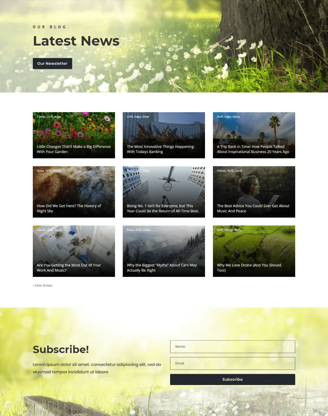
Drift is a full width blog page layout having posts sorted in a grid manner. Every post on this layout have title and categories by default, and on hover it reveals the post excerpt. Plus a CTA button that on scroll takes the user to the bottom where you’d find a nicely designed subscribers form.
Deux
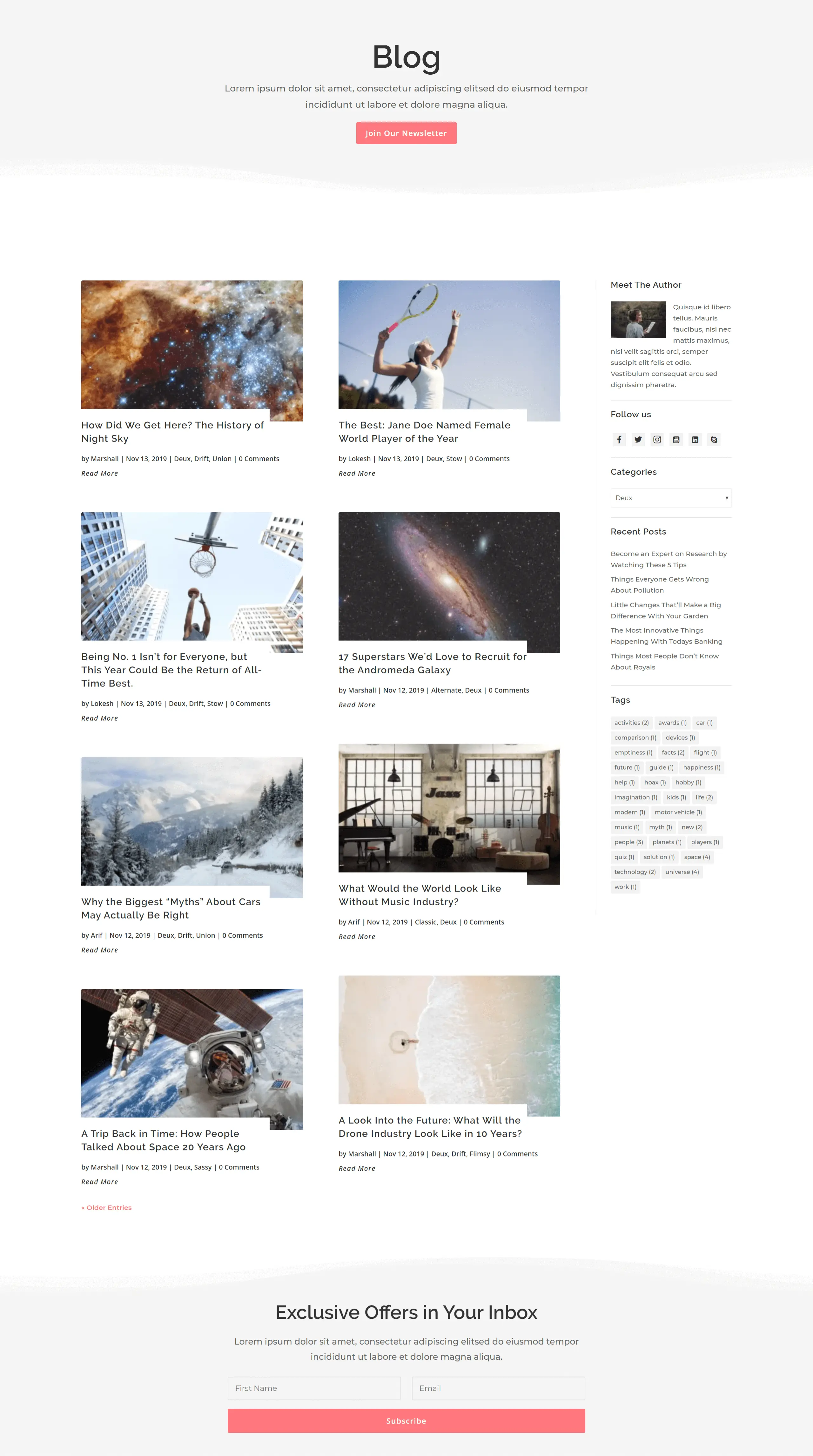
Duex blog layout comes with the support for user’s default sidebar. Its post tiles has title text along with meta description as well as read more link. Plus, a zoom out hover effect on the featured image. And just like Drift layout, it includes the top CTA and a well designed subscribers form.
Lucid
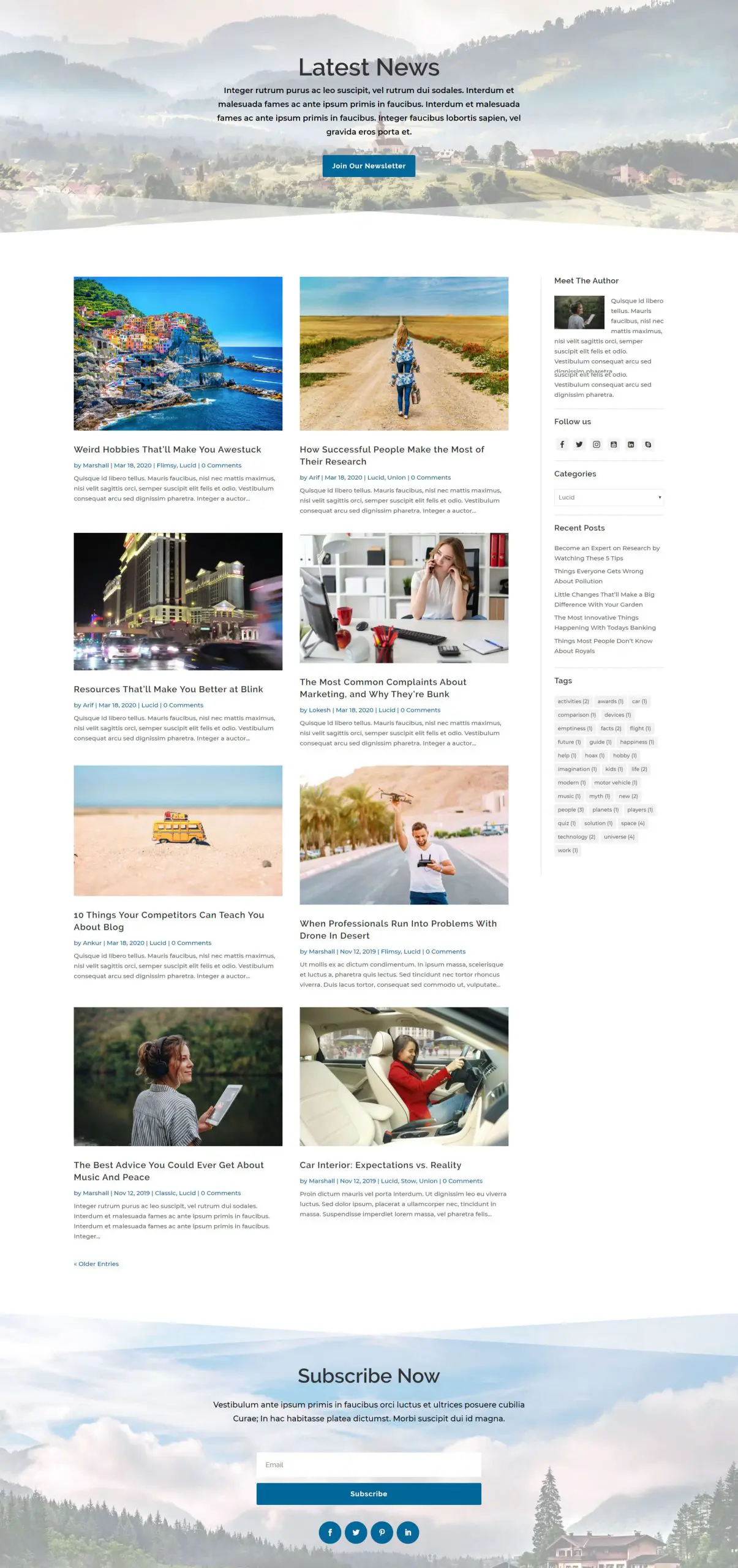
Lucid is another grid blog page template having posts in two columns and with the default sidebar. Its post tiles contains title text, colored meta description and post excerpt. Layout has proper space between posts and their content to improve clarity and readability. Along with these. it too has subscribers from at the bottom of the page with social icons.
Stow
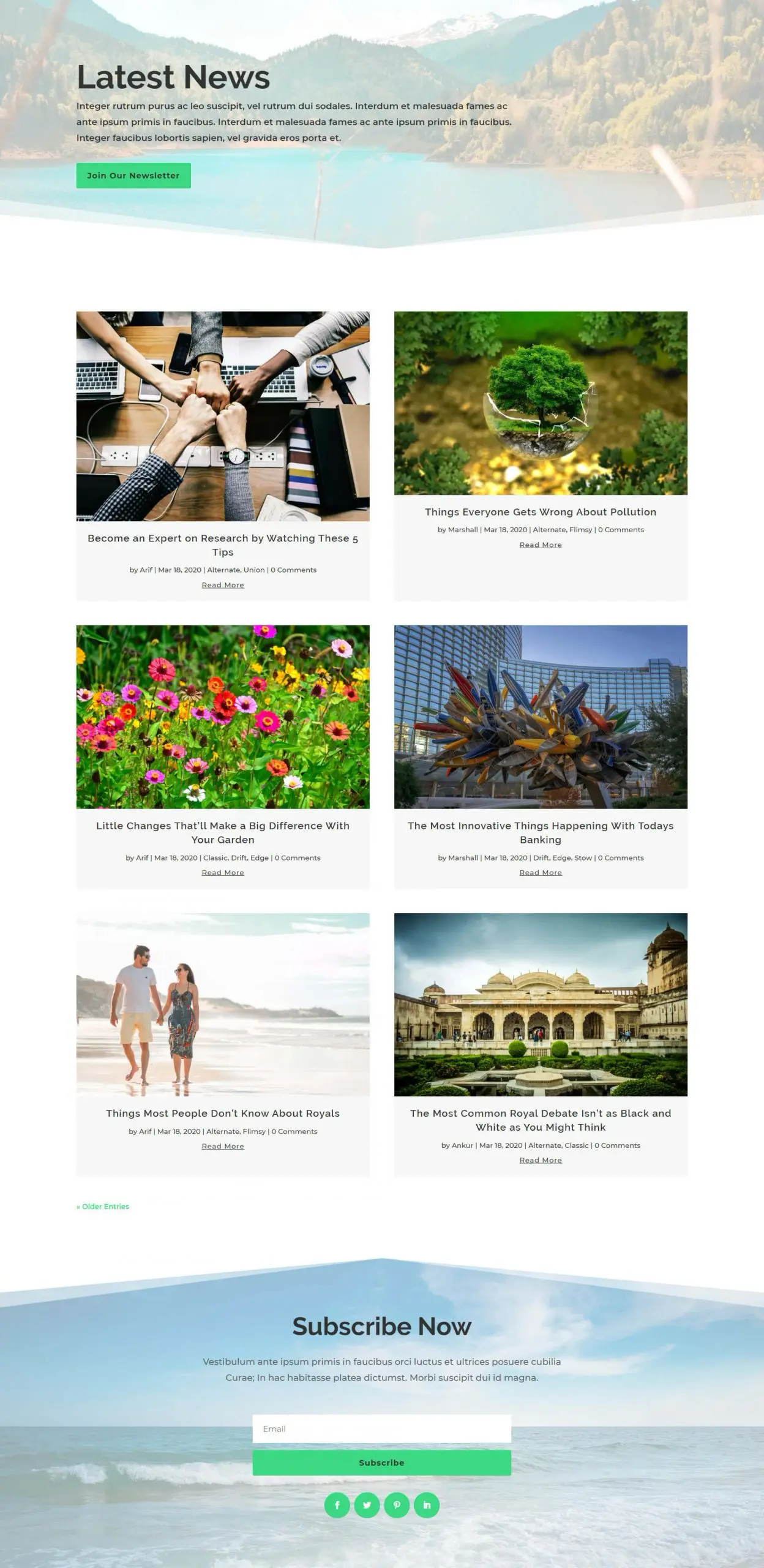
Stow layout, too, has a 2 column grid layout view, but it doesn’t contain the sidebar making it a slight distinctive from other designs. Its post title, meta description, and read more link is below the post tiles in a light background color frame. Plus, subscribers form with social icons, just like the Lucid layout.
Sassy
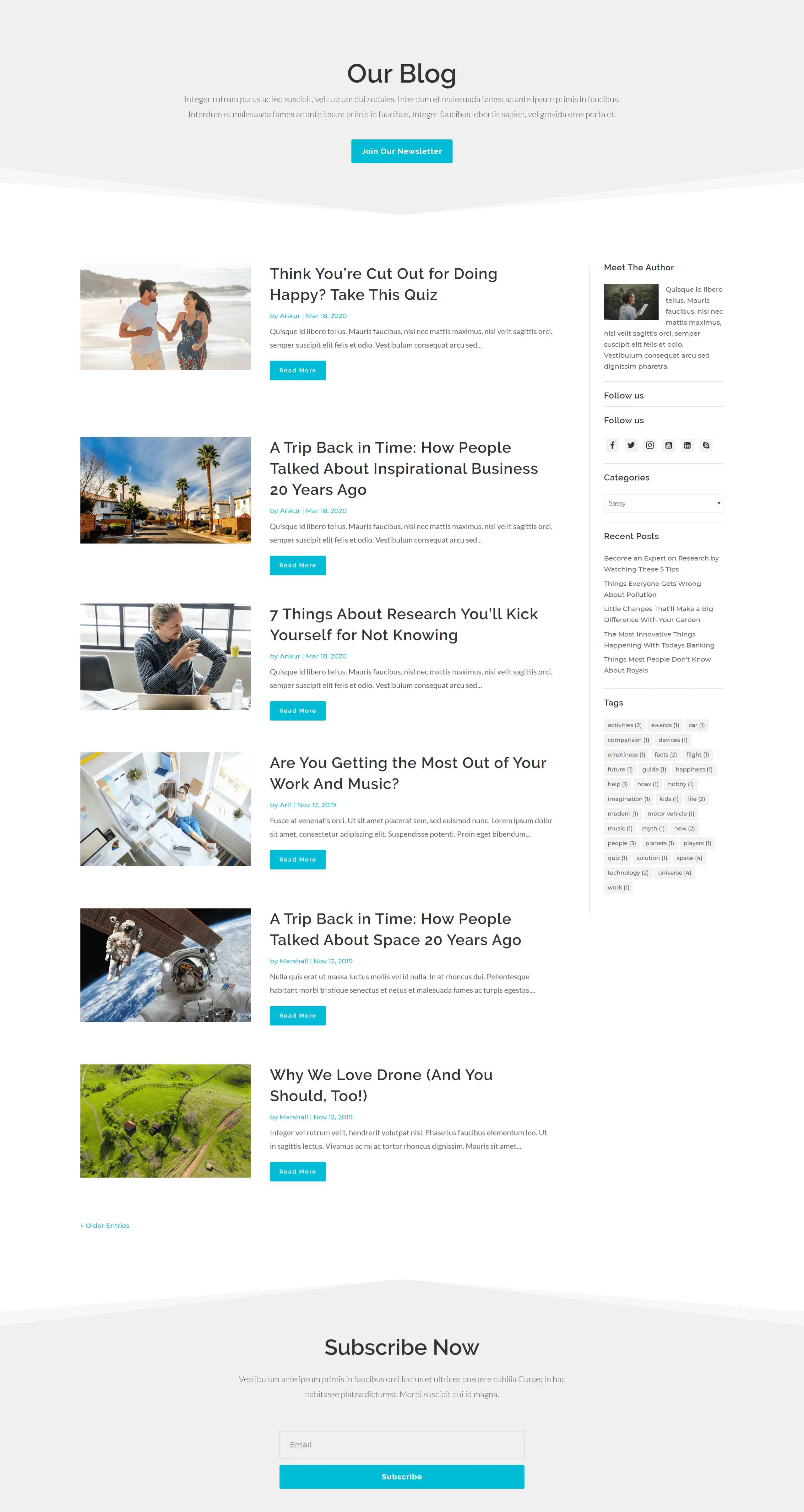
Sassy blog layout of Blogy pack has a unique archive view from all the other designs. It features a list posts display manner having featured images with the optimized post title, meta description, post excerpt, and customized read more button side by side. Along with these, it also has the user’s default sidebar support, as well as a simple subscriber form at the bottom.
Union

Using the Union Divi blog page template, you’ll be able to display your posts in an archive in a mixed manner. It comprises a standard classic layout view as well as a grid layout view. The standard post on this template has a post title, and its other element at the top of the featured image, whereas other posts’ titles contain their details below the featured image.
Alternate
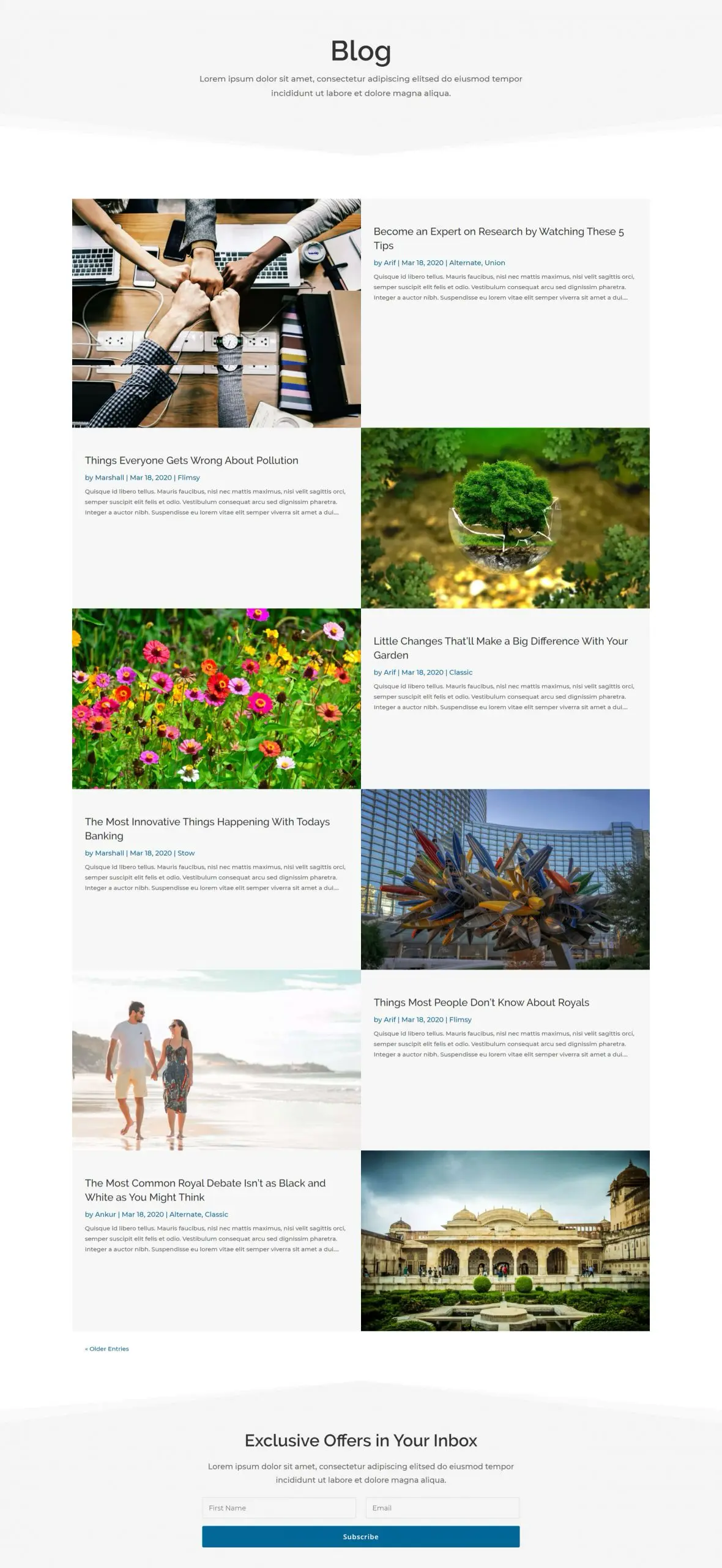
Alternate blog page layout is more of a list layout that has a bigger featured image and post description area side by side. Also, its succeeding posts unfold in an erratic manner creating a distinction in the archive view. This layout, too, has the subscribers form just like the others.
Flimsy
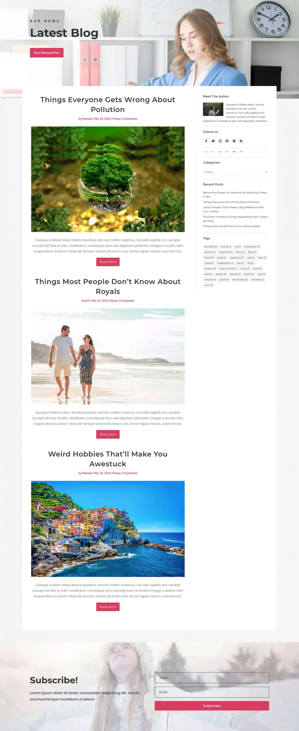
It’s a modest and straightforward layout with the user’s default sidebar. It features post title and meta description above the featured image. And post excerpt and customized read more button below it. Everything is optimized for better clarity, visibility and readability makes it a suitable blog page layout for any kind of blogging.
Edge

This layout is just like the Alternate blog page template. But it covers the full-width space of the page, and also has a customized read more button, whereas its twin layout doesn’t.
Classic

It’s a standard layout with post elements inside a container. Plus, featured images having landscape view. It contains the post title and meta description above the image, and other items below it. Other than these, it also includes the simplest subscribers form to get subscribers details inside the email list.
Summary
Above, we’ve shown you all the layouts available inside the Blogy – Divi Blog Layout Pack pack, with the specification. However, if you want to customize your blog page even further, then you should have a look at our Divi Blog Extras plugin. This plugin adds extraordinary features that every blog should have, such as,
- 10 Divi Blog Layouts
- Ajax page navigation
- Compatible with Divi 4 templates
- More than 40 customized blog layouts available
- Custom Post Type Support
- Estimate read time
- Category Color Support
- Advanced sidebar and widget
- Hover effects
- Trusted by more than 50,000 website
- You can read our post on “How to use Blogy” if you’re unfamiliar with how to use it.



0 Comments