To get better at online sales, you need to optimize eCommerce website of yours. Without optimizing it, it would be much, much harder to accomplish your business goals online. An engaging design for eCommerce websites is great, but that should be done thoughtfully. You can’t rely on a single factor; you need to cover all the crucial areas to make the digital store worth exploring.
Whether you want to optimize a website for SEO or speed, it comes down to a single point, which is what you’re willing to do to preserve the beauty of the entire store.
If you’re using Divi and WooCommerce together, then in this article, I’ll break down the essential tips for how to optimize ecommerce website that would allow you to improve your eCommerce site and increase eCommerce sales.
If you’re ready to learn all the best eCommerce optimization ways, continue till the end. But, for the quick show-off, this is what you’d find in this post.
Table of Contents
- Improve Product’s Image Gallery
- Highlight Price, Ratings and Sale Badges Effectively
- Present Product Information Vividly
- Ensure Design is Consistent
- Display Customer Feedback or Testimonials
- Suggest Popular Products on the Shop
- Mention Additional Details Like Shipping Rates
- Display Cross-sell Products
- Smoothen Checkout Process
- Add Engaging Discount or Event Sections
- Don’t Forget About Speed
- Do Local SEO for Effective Reach
12 Best Ways to Improve the eCommerce Website Made With Divi and WooCommerce
1) Improve Product’s Image Gallery
Without an image or images, a product page is nothing. It couldn’t tell people right on the moment they land on the page what they’ll get. And most customers with product descriptions look for illustrations to learn better about the product. So, having images is 100% essential, but is that enough?
Nope, adding images only won’t make any difference. You need to optimize them for size, speed and how they’re presented to the customers.
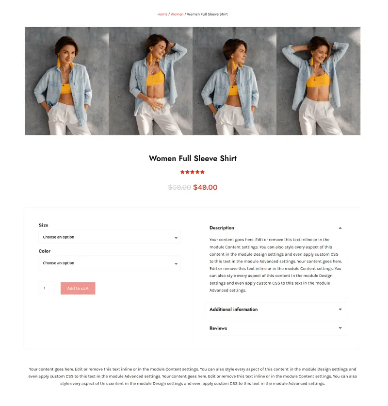
Product page layouts from WooCommerce Layouts for Divi are a great example of how you add images to the products. For instance, if we look at the layouts, we find some layouts have product images as the hero with the option to view them closely in a slider lightbox. So, some have the product gallery on one side and the main image on the other.
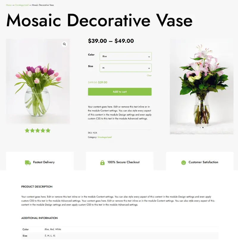
Likewise, there are other layouts that feature the slide effect on the product images. By implementing product images in this manner, you can engage users effectively and optimize the eCommerce website.
2) Highlight Price, Ratings and Sale Badges Effectively
With the “Amazon’s Choice” tag, Amazon has a great way of capturing users’ attention. If you’re using Divi and WooCommerce, you can, too, have the power to highlight user-interested facts about the product in the shop.

For instance, with shop layouts of WooCommerce Layouts for Divi, you can effectively display Sale badges, discount prices and ratings. By doing so, you quickly let the customer know which is the best suitable item for them and at what price. It’s one of the best ways to make an eCommerce site more informative to the customers.
3) Present Product Information Vividly
Images are great, but the description makes a product page complete. About 80% of customers read the description to learn more, and if you’re doing it right, then it can improve the eCommerce website and how users interact with it.
For starters, you can
- Use friendly fonts.
- Add copy that’s not in long paragraphs.
- Use descriptive images inside the content.
And you can also take help from pre-built layouts that allow you to add content in well-organized tabs. Plus, that also behaves per your product’s images.
Product description in layout 5 of the WooCommerce Layouts pack comes after once all the images are displayed. It also has a small description area to quickly tell people what the product is about. Similarly, layout 11 contains info in the accordion to keep the page looking less bulky from content.
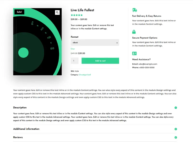
In this way, you provide customers with a clear way to read the content and learn more about the product, which directly optimizes your eCommerce website.
4) Ensure Design is Consistent
Product page design, check. Shop page design, check. And category page design, check. If you’ve worked seriously on those areas of the website, then why leave the cart and checkout page behind?
If you really want to enhance your eCommerce website design, then ensure you have a consistent design all over the place. Don’t practice this: you have styled the cart, but kept the checkout page as it is.
This is a bad design approach for eCommerce, discouraging your customers in the essential conversion journey.
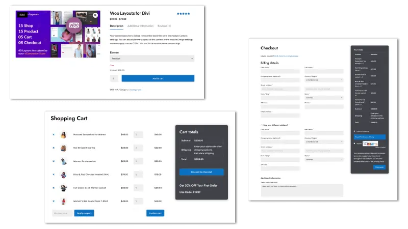
Ensure these pages match the default style of your website, whether fonts, color or CSS. As you can see in the above screenshot, cart and checkout layouts clearly match with product pages.
5) Display Customer Feedback or Testimonials
About 9 out of 10 customers make a purchase decision after reading something good about the product. And their trusted resource to fulfil this need is customer reviews who have already tried the product or service.
Hence, your design for eCommerce must include reviews/customer testimonials to improve eCommerce website design. And not only design but it also increases eCommerce sales. Now, the only question remains where to display reviews/customer testimonials.
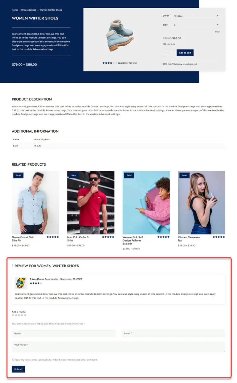
Well, displaying them on the top isn’t a good choice because it creates issues with the description. However, showing a rating on the top is the best approach. At the same time, you can keep the reviews after the description has been completed, just like the below product page layout example.
6) Suggest Popular Products on the Shop
The purpose of improving the digital store’s design is to increase eCommerce sales. So, to do that effectively, you can list the popular products in the sidebar of the shop page.

As you can see in the above screenshot, you can find popular products with ratings, prices, categories, and tags. Or, if you don’t want to interrupt users’ view, add an off-canvas menu with all those items just like the layouts 9, 11 and 14 of the WooCommerce Layouts for Divi.
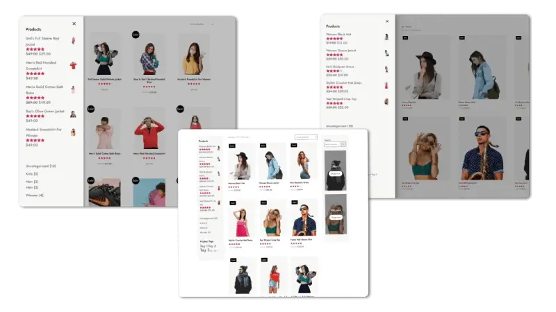
When people find related products, it increases the store’s user session, which eventually turns into more no. of sales.
7) Mention Additional Details Like Shipping Rates
Whether product page or checkout, it’s essential that you mention essential details of the product throughout the customer’s buying journey. This will help them learn more about the product where they are without wandering. As a result, they won’t abandon one stage to check out the information in the other.
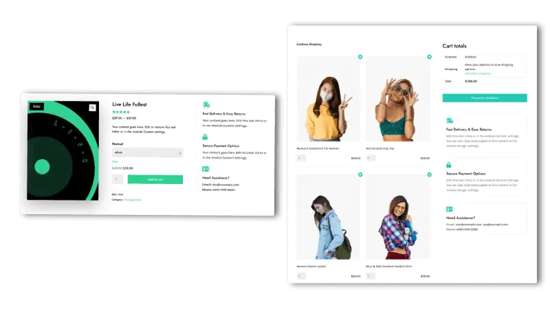
If you look at cart layout 4 and product layout 11 of WLD, you’d find that they’re clearly mentioning/including space to add essential details like shipping, payment options and customer support. By implementing this type of design, you improve user experience on the website.
8) Display Cross-sell Products
Showcasing related products throughout your eCommerce site could really make a difference. Research shows that it increases sales to nearly 43%, and 43% isn’t a small number. Now, what needed to think about is how and where you display your cross-sells.
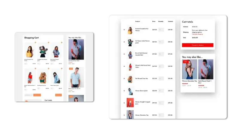
Well, the places are product pages, cart and shop. We have already covered the shop, and after the shop, people will definitely visit the remaining 2 locations if they’re interested in the product. Or if they’ve stepped into the purchasing cycle. And here, you could apply this approach.
- On product pages, add cross-sells products at the bottom like this 👇

9) Smoothen Checkout Process
Baymard’s research shows that a distraction-free checkout page performs better than others. If you have closely checked Amazon’s checkout page, you will find it clean and easy to interact with. Therefore, to optimize your eCommerce website, ensure you have a clean and light checkout page.
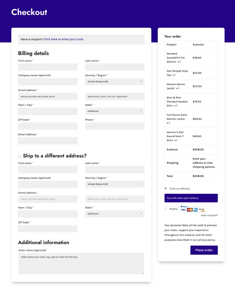
In addition, ensure the page has limited fields (only keep those required.) Plus, essential details about the shipping or payment are added, just like in the above example. Furthermore, you can display a security badge or text to entrust trust effectively into the users’ minds.
You can also use the Checkout Manager for WooCommerce to customize the checkout fields on your WooCommerce store.
10) Add Engaging Discount or Event Sections
Offers excite users more than anything. And what makes them effective is how you display them on your Divi WooCommerce store. The best approach is using big sections with the offer’s text and images; you can take an idea from below.

Additionally, you can create category sections and display discounts on them. This quickly grabs your customers’ attention and improves your eCommerce website design.
11) Don’t Forget About Speed
Website speed is getting more crucial than ever. One plus point you have is that you’re using the optimized WordPress theme, Divi. It already loads your web pages faster. Still, you can do more to optimize the website’s speed by
- Using optimized images.
- Installing minimal fronted script rendering plugins. Or choosing to install a single multi-purpose plugin.
- Applying CDN.
And there are more tips on speeding up your Divi eCommerce site.
12) Do Local SEO for Effective Reach
One of the challenges eCommerce website owners face is that their website isn’t optimized for SEO. And it’s essential to optimize websites for SEO because it’s what will help you get visible in the search. So, in order to do that, the first thing you need to do is set up your eCommerce store for local SEO.
You can do it by directly going to Google Local Properties. Or use an SEO plugin like Yoast or Rank Math.
PS: Make sure to check Elegant Theme’s blog post on the best WordPress WooCommerce SEO plugins if you’re still looking for a great SEO plugin for your e-commerce website.
Once you have optimized the website for SEO, you need to improve the copy. And to that, follow the below steps,
- Keyword research.
- Internal and external linking.
- Use media to explain the content better.
- Optimizing site map and permalink.
- Enabling rich snippet schemas.
- Updating old posts and pillar content.
And there are more SEO tips that can help you improve your website’s SEO.
Optimize Divi eCommerce Website Today
Building an eCommerce website isn’t enough. Instead, regularly working to improve its performance makes the business tick. Whether improvising the design, functionality or SEO, it takes a lot of effort to build and run the business despite many setbacks.
But, the above tips to optimize an eCommerce website can make things work out. And if you want an easy way to optimize your Divi WooCommerce store, then WooCommerce Layouts for Divi is worth giving a try.




0 Comments