
If you want to style Gravity Forms in Divi, you do not need custom CSS. The Gravity Forms Styler module lets you design every part of your form (fields, labels, buttons, and success or error messages) right inside the Divi Builder, with live preview as you work.
This tutorial walks through the full process in three steps: add the form to your page, set up the content options, and apply the design settings. The module used in this tutorial comes with Divi Plus, and you can also get it as the standalone Gravity Forms Styler for Divi plugin., so either product will follow along with this guide.
One assumption before we start: your form already exists in Gravity Forms. New to embedding forms? See every way to add Gravity Forms to a Divi page, including the shortcode and block methods.”
What You Need
To achieve the goals of this tutorial, we need the following plugins and the active installation of the Divi theme. If you haven’t already (which is rare), then activate your Divi theme.
#1 Gravity Forms – Yes, obviously, without it, we won’t be able to create our Divi Gravity Forms and then style them. So, it’s a bit awkward requirement which I believe you’re already aware of.
#2 Divi Plus – This will help us style our Gravity Forms in Divi.
So, these are all we need to continue our tutorial. However, before we do so, let’s take a look at what they are and what’s it that makes them so unique.
What is Gravity Forms?

Gravity Forms is a premium WordPress contact form plugin that enables you to add forms of different kinds to your website. It features a lot of options that make it the preferred choice of many developers to add forms to their website. It was first available in 2008, and since then, it’s served hundreds of thousands of customers. Plus, they’ve got customers like ESPN, NASA, UNICEF, and Airbnb, to name a few.
What is Divi Plus?

Divi Plus is a multipurpose plugin for Divi that provides you with multiple modules, templates, and other features to optimize any Divi website. It’s a premium plugin that you can have starting from $59. Divi Plus makes enhancing the look and performance of the site easy. And users, regardless of their Divi experience, can utilize it to the fullest in no time.
Create Your Gravity Form
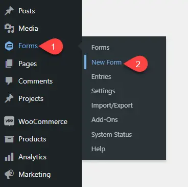
Still confused about “how to add gravity forms to divi theme”. Don’t worry. If you’ve already installed and activated your Gravity Forms plugin, then the next thing left to do is create a form. So, for that, on your WordPress Dashboard, go to Forms → New Form.
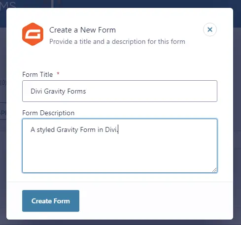
This will open a popup asking for details for the new form. Simply, provide the information and then click Create Form.
Once you’ll do that, you are inside the Gravity Forms’ builder. Here, simply drag and drop form fields from the right container. If you’re satisfied with your form fields and their settings, click Save Form.
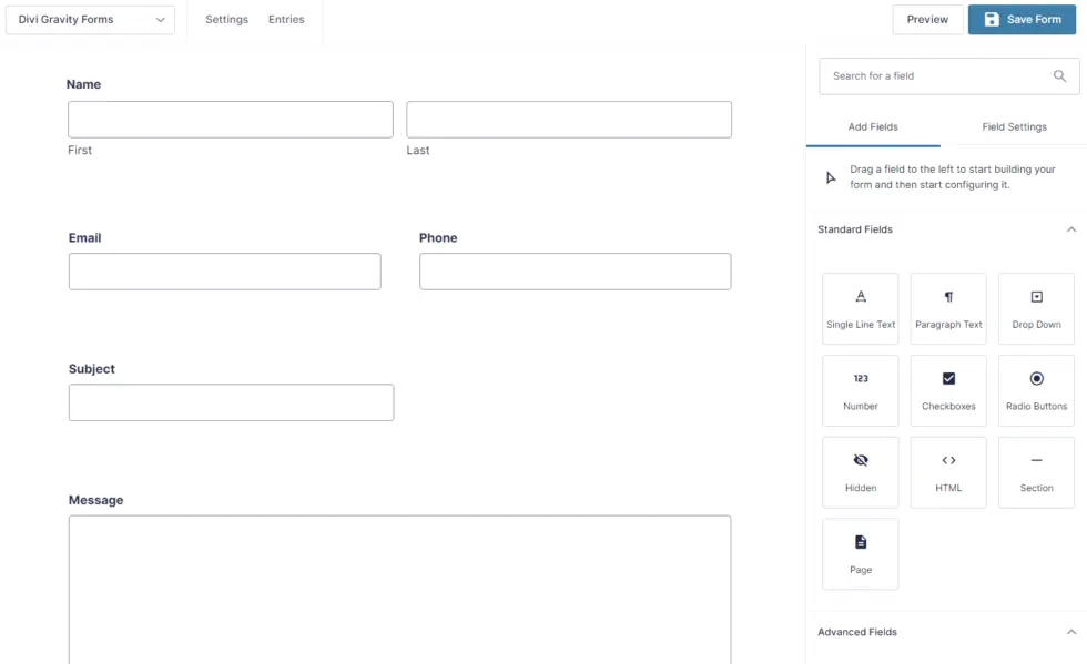
You’ve created the form; now it’s time to add it to the page and then style it. However, before that, ensure you’ve enabled the Divi Gravity Forms styler module. Don’t know how to do it? Let’s find out.
Enable the Gravity Forms Styler Module
To enable the required module, go to Settings → Divi Plus, tick the checkbox near Gravity Form Styler, and Save Changes.
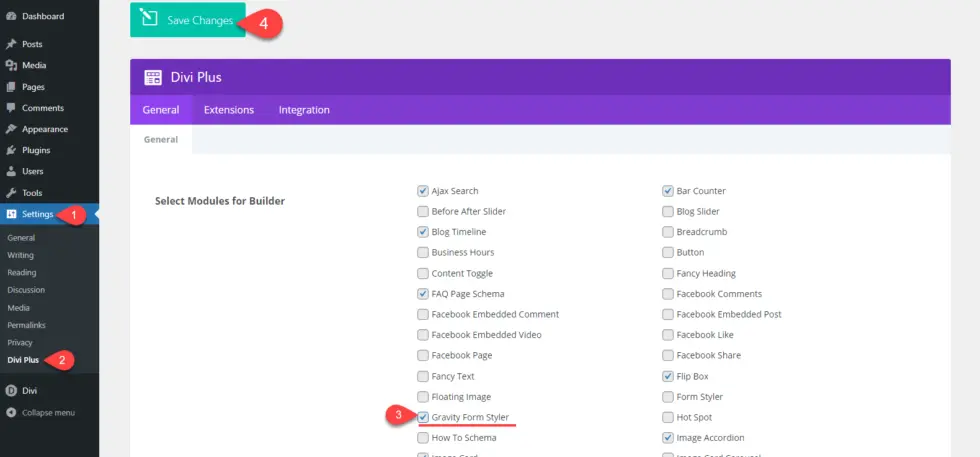
After enabling the module, you’re ready to style your Divi Gravity Form. Let’s see how we can do it.
Style Your Gravity Form in Divi
Create a new page or edit an existing one where you want to display your styled Gravity Form. Don’t forget to launch the Divi Builder, and once you’ve done that, follow the below steps one by one.
Step 1: Add the Gravity Form to Your Divi Page
To display a styled form on your Divi website, we need to first add it to the page. So, for that, add a new row, and in that row, insert the Gravity Form Styler module.
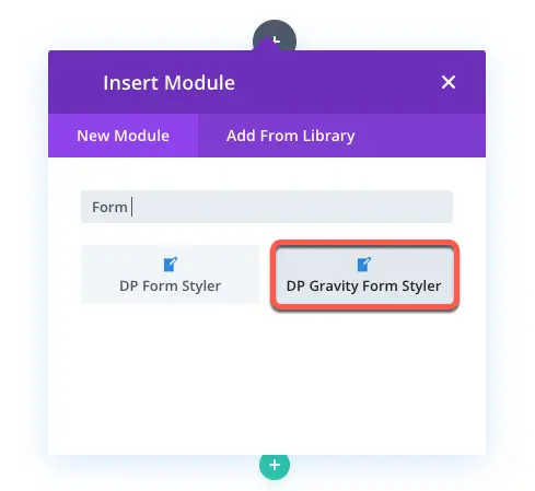
As soon as you insert the module, the settings would appear alongside the default module placeholder, “Oops! We could not locate your form.”
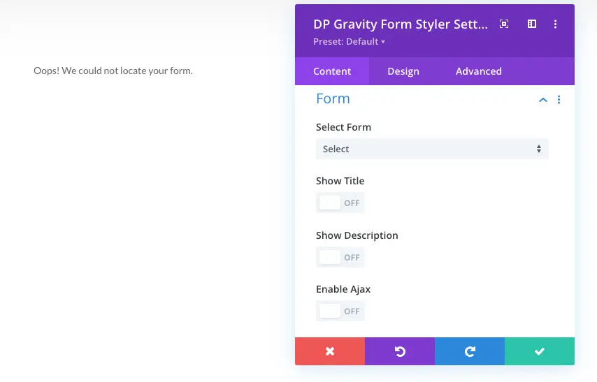
To add the form to the page, simply go to Form → Select Form → click on the form you want to display on the page. Upon your selection, you’ll have your Gravity Form in Divi in its default state like the following screenshot.
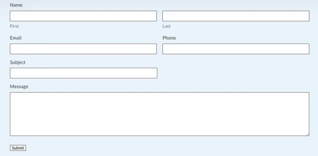
The default look of Gravity form in Divi
The following steps will guide you through customizing it further.
Step 2: Set Up the Content Options
Gravity Form Styler module’s content tab comprises the following additional settings – Form and Background.
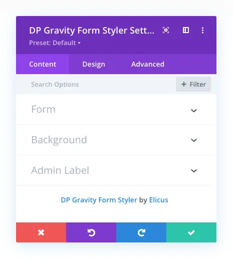
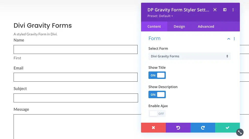
The Form settings allow you to select the form, display the form title and description. Plus, you can also enable Ajax on the form.
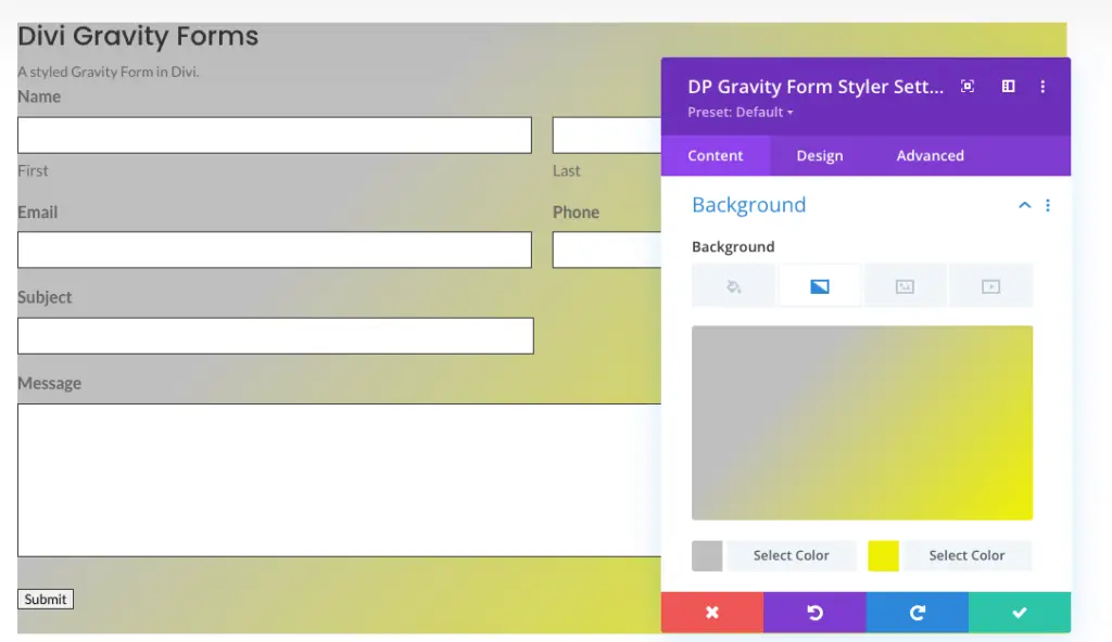
In the Background settings, you can customize the form’s background with color, gradient, image, and even video.
After customizing the content of your form, you can switch the tab to customize the form’s design.
Step 3: Apply the Design Settings
The design tab of the Gravity Forms Styler module comprises the following settings that you can utilize to improve your form’s look.
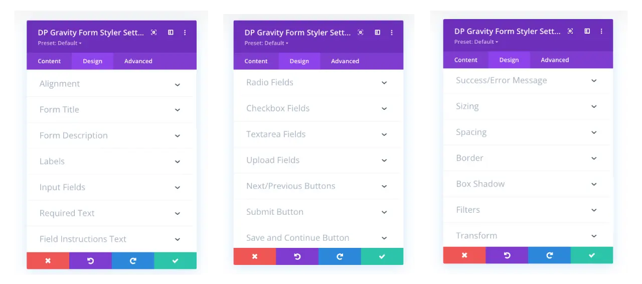
There’s a total of 15 additional settings included with native options of Divi for every element of the form in this Gravity Forms Styler module. Moreover, each setting mostly covers individual elements of the form. So, you could work on each area of your Gravity Forms in Divi. Let’s take a closer look at some of the module’s options.
Alignment
The Alignment settings of the Design tab allow you to change the form’s text alignment to Left, Right, Center and Justify.
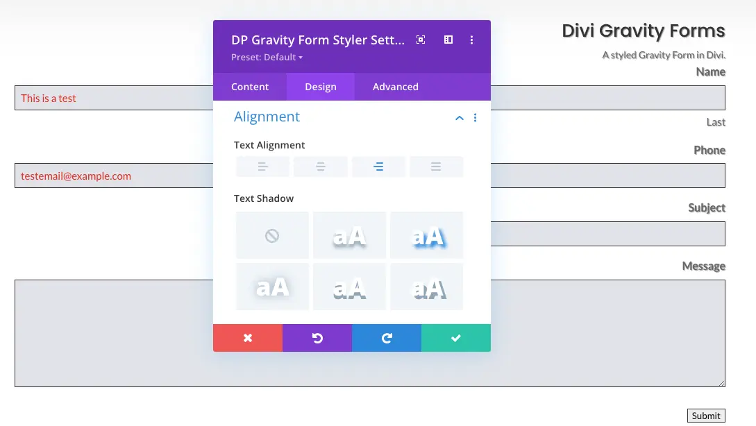
Further, you can also utilize this option to apply shadow on the text. A good option when your website uses shadow effect on multiple elements.
Form Title, Description & Labels
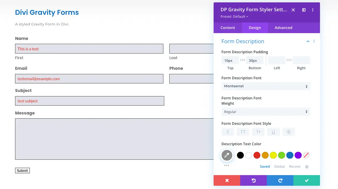
With Form Title, Description, and Labels settings, you can apply text styling to the form’s title, description, and fields labels. Moreover, the Form Description settings provide you with the option to manage space between form title and description itself by setting padding values.
Input Fields
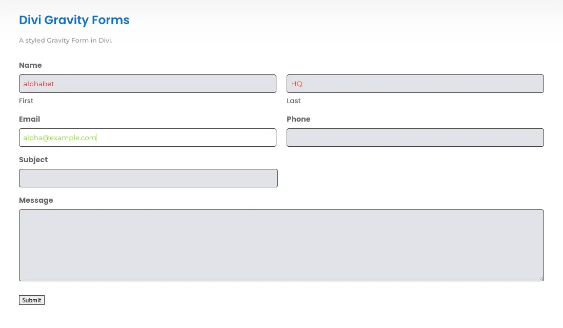
The Input Fields settings allow you to apply color on input fields, their text; placeholder text, and description. You can also utilize the settings to apply styling on the text of input fields, placeholder, and description.
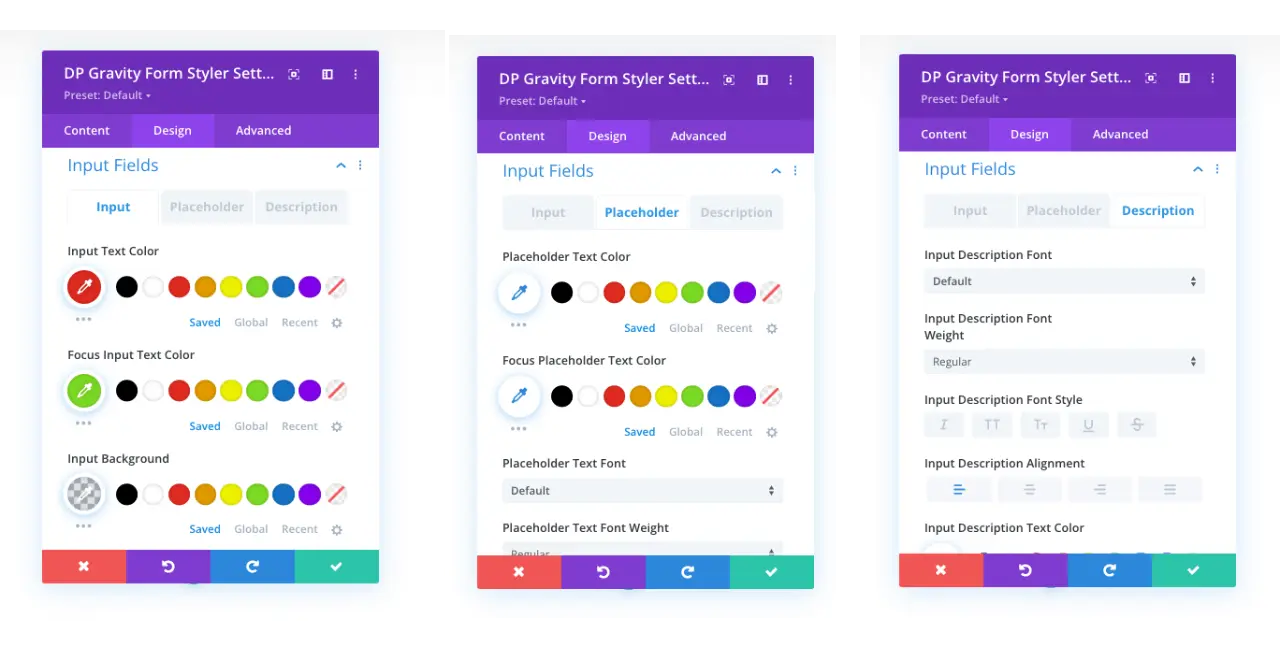
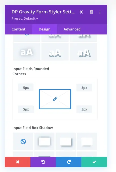
The same setting offers additional options to apply padding, border radius, and shadow to the fields. So, you can make the fields look similar to your website’s design and color schemes.
After applying the customizations, you could have your form’s input fields like the following screenshot.
Radio, Checkbox, Textarea and Upload Fields
If you’ve included Radio Buttons and Checkboxes in your form, the Gravity Forms Styler module also offers customization options for them.
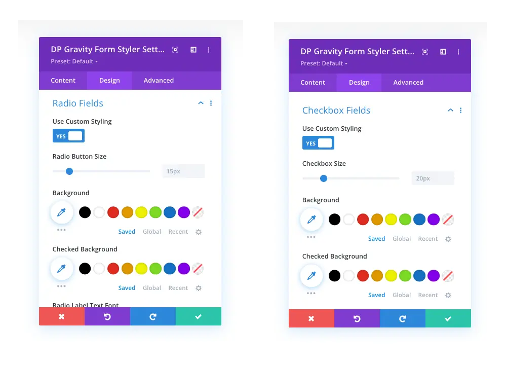
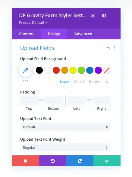
The settings allow you to apply custom styling to change buttons and checkbox size, color, label text, and more. Similarly, the Upload Fields settings will enable you to change the field’s background, padding, and text customizations.
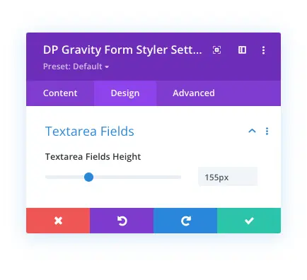
With Textarea Fields, you can increase or decrease its height per requirement.
Submit Button
The Submit Button settings comprise the options to change the button’s padding, apply background customizations, text styling, and more.
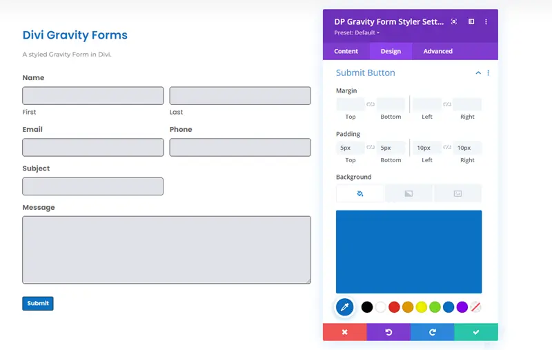
Using this particular setting, you can make your form’s submit button to match the styling of your website as well as the form’s fields.
Success/Error Message
The default appearance of the Gravity Form’s success or error message has no styling. It’s simple in a complete sense, as you can see in the following screenshot.

But, with the help of our Gravity Form Styler module, we can improve it as well. You need to open the Success/Error Message settings that provide text styling options for both Error and Success Message.
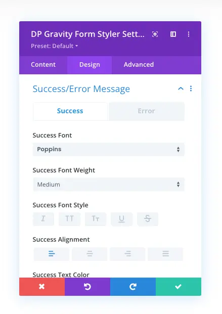
After applying the customizations, you can get your message to look like the following.

Styled Success Message for Gravity Forms in Divi
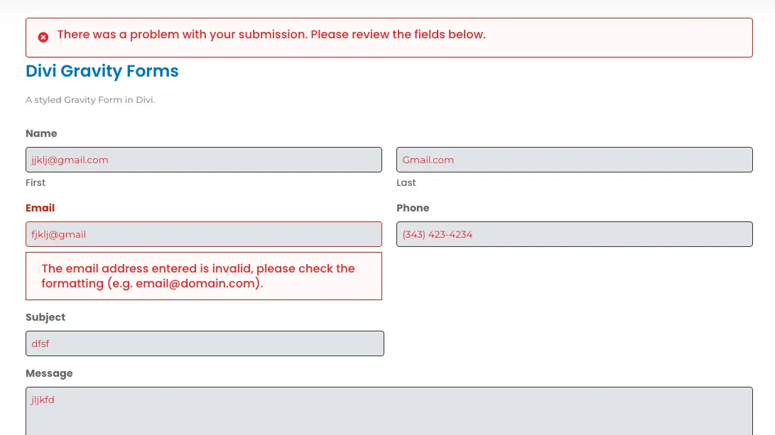
Styled Error Message for Gravity Forms in Divi
More Options
In addition to the above options, you get settings to customize Required and Field Instructions Text; Next/Previous Buttons and Save and Continue Button if you’ve created multi-steps form.
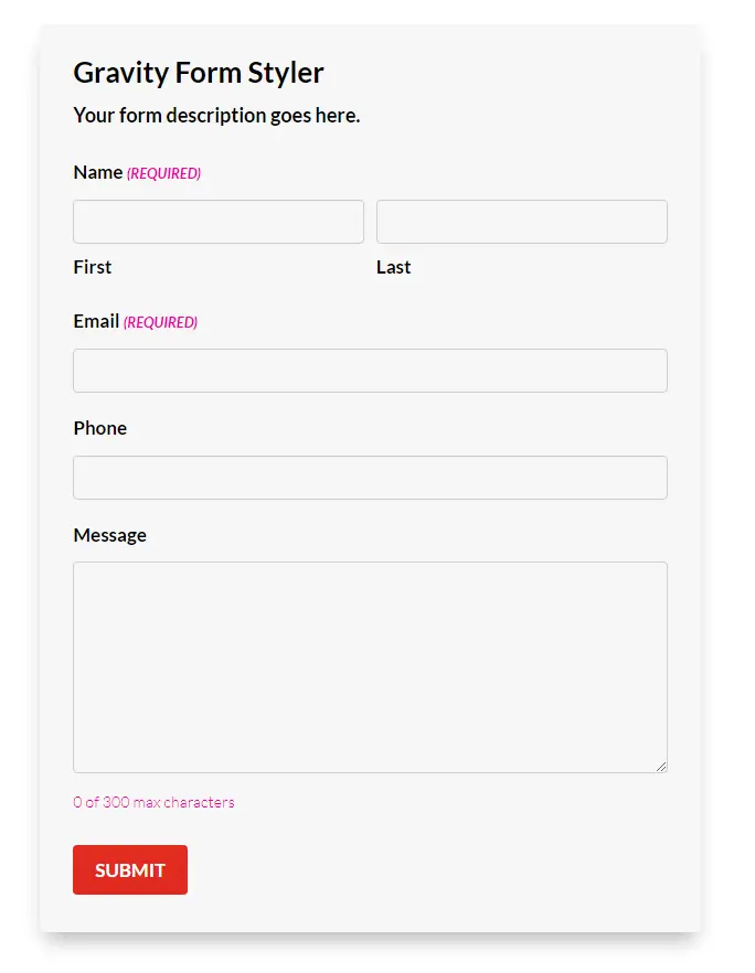
To take the form’s style to an even better level, you can utilize the native design options like Sizing, Spacing, Border, and Box Shadow to change the look of the Styler module’s area. And once you’re done with customizations, you can have a Gravity Form in Divi like the following example.
Wrapping Up
As you can see in the above steps, it’s seen how easy it is to style Gravity Forms in Divi. The Gravity Form Styler module offers all the essential options to take the form’s design to a new level.
For inspiration beyond the module settings, browse these Gravity Forms design tips that apply to any WordPress site.
The only question that remains is how you can get the module. Well, it’s no wonder; all you need to do is get your copy of Divi Plus. And it will provide you with the module as well as other exclusive features—for example, 25+ pre-built themes, 50+ modules, extensions, templates, and more.
I hope this tutorial helped you learn how you can style Gravity Forms in Divi. And by following the steps, you’d customize the form most excitingly.






Are we stuck with the default success/error messages or can we use a page redirect upon success?