Call them basic elements, major elements, or simply elements, some parts of a website are needed more than most. Unlike other website elements, such as Carousel, Particle Background, and Text Animator, that you can afford not to use, these elements (the essential ones) are required to grasp users’ attention. And not only attention, but these key elements make your website look that’s built on modern design trends.
What are essential website elements, and how can they help your site put a long-lasting impression?
Great question, as that’s what we are about to unfold. In this post, you’ll find 11 key website elements that allow you to make a simple website more functional and converting. Further, we’ll share quick tips on how best to use all of these web elements on your site.
And if you’re a Divi theme user, you’ll find resources to use these components more swiftly.
With no further delay, let’s get aboard.
11 Essential Website Design Elements to Leave a Positive Impression on Users Right Away
1. Landing Page – for High Conversion Rate
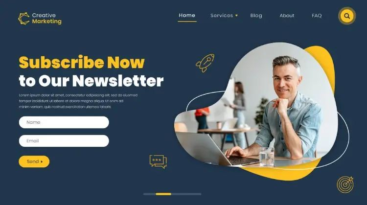
One of the modern web design elements that allow your website to perform at its best is a Landing page. Yes, that page that you use when you need more leads followed by conversion.
Although it doesn’t qualify as a standalone element as it’s a combination of many, it’s essential if you want to do good in the market.
Why?
Because a landing page allows you to highlight your message with context for different occasions. It lets you guide users to the goal in a more sophisticated way. And it can even let you see additional insights into your target audience.
But that’s not all; there are many benefits of a landing page. For example,
- It can help you grow your email subscriber list.
- Increase brand value.
- Test different versions for a single event.
However, to avail of these benefits, you must follow some basic practices to build and use a landing page.
Things to Remember When Using a Landing Page
- Don’t include navigation, as it will misguide the user from the goal.
- Make it responsive. The page must resemble its element properly on every device.
- Use a highly optimized and easily distinguishable CTA (Call to action).
- If possible, add the lead capturing form above the fold.
- Use benefit-focused and compelling headlines, and offer copy.
- Use images that are compressed and reflect the purpose of your landing page.
With these followed carefully, you’ll have a landing page that works for most reasons. And if you’re looking for a landing page for your Divi website, you can try our Divi Landing Page pack, which consists of over 30 pages.
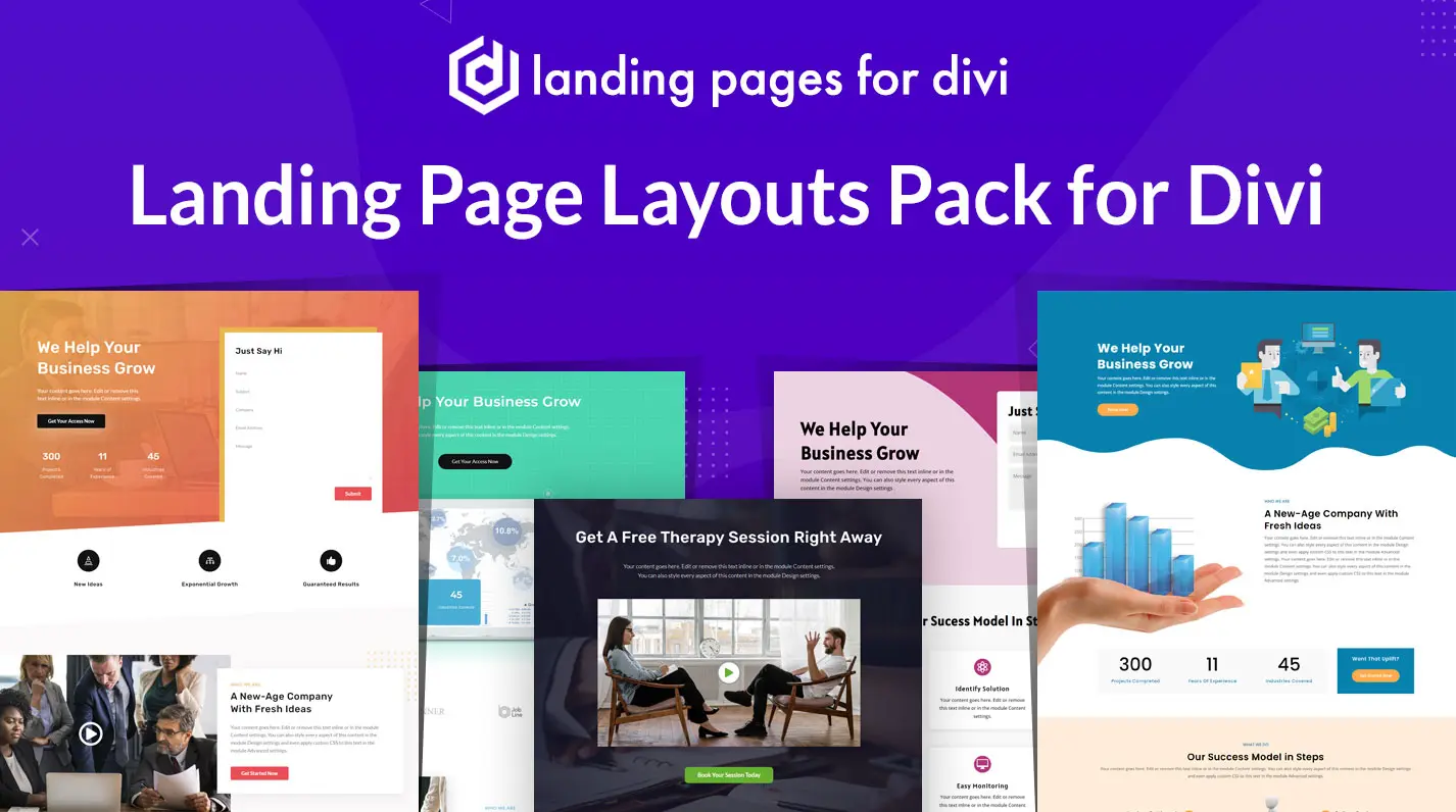
Each landing page is optimized to engage users and direct them to complete the goal. Furthermore, using them won’t take much time as they’re easy to import and customize.
2. Easily Accessible Menu or Header – the Website Navigator
A menu lets visitors explore the site in the easiest way possible. From homepage to services and services to contact, a menu lets the users get the best out of your website. However, if it’s not built keeping the user-friendliness in mind, you’d face withdrawal in users’ interest.
They might see the homepage from top to bottom but rarely interact with other stuff on the site. That’s why it’s an essential website component you shouldn’t ignore and keep it easy to navigate when you use it.
And to do that, what can you do? Well, you can try the following,
- Built it according to the Sitemap.
- If possible, use a 6 elements menu only.
- Don’t use it on a landing page.
- Use short menu titles.
- If possible, limit it to a single sub-menu.
- Use a CTA.
In this way, you’d have a functional menu or header that would allow users to visit different pages or sections of the website easily and quickly. One of the best ways to build a highly functional menu is to use pre-built layouts like our Divi Flexile Headers for the Divi theme.
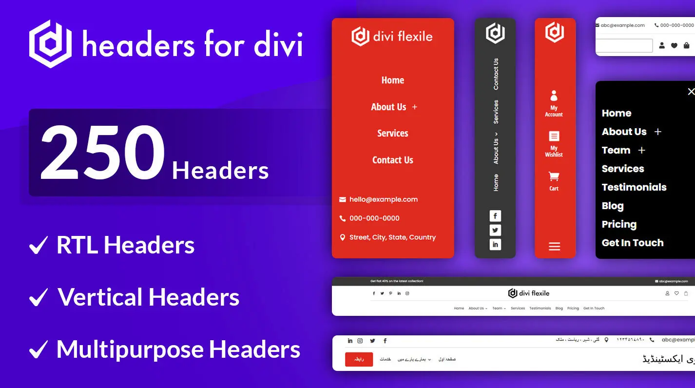
It has 100 header layouts that are customizable, responsive and easy to import. In addition, you’ll have headers for different occasions as well as use – for example; you’ll get,
- Off-canvas headers.
- Headers optimized for WooCommerce.
- RTL headers.
- Vertical headers.
- And more.
Even if you’re not a WordPress and Divi user, you will find many header layout packs compatible with your CMS. Just simply Google it.
3. Hero Sections or Images – one of the Attention-Catching Website Elements
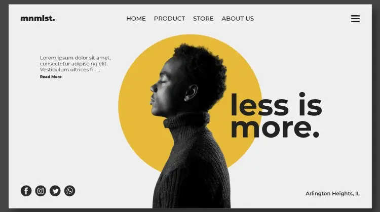
On a landing page, what captures visitors’ attention at the first moment? What is the top of a website called? Guess it is not that hard. Yes, it’s the Hero Section. Or we can say, the most significant of all the sections of a website.
So, if you’re building a site or redesigning an existing one, ensure you do your job amazingly on this element. Otherwise, people won’t even move below the fold, which in most cases, website owners want.
A hero section allows you to write the best message that would allow users to know what they’ll get when they use your services. It enables you to add all the essential elements like CTA or lead form that would help you generate potential leads and increase conversion. In addition, the hero section creates a flow that makes users interested in exploring the rest of the site.
If it’s not created interesting, they’ll not spend another second on your website, and you’d face a greater bounce rate. Which eventually decreases your SEO rankings.
Thus, when you add a hero section or create one, make sure,
- It’s relevant to your business.
- Fast in loading.
- The visuals are compressed but highly visual, not blurred.
- Responsive to different devices and screen sizes.
- Uses an optimized and easy-to-distinguishable CTA.
And for the Divi users, there’s always a solution available; you can try the Divi Flexile Hero Sections pack.
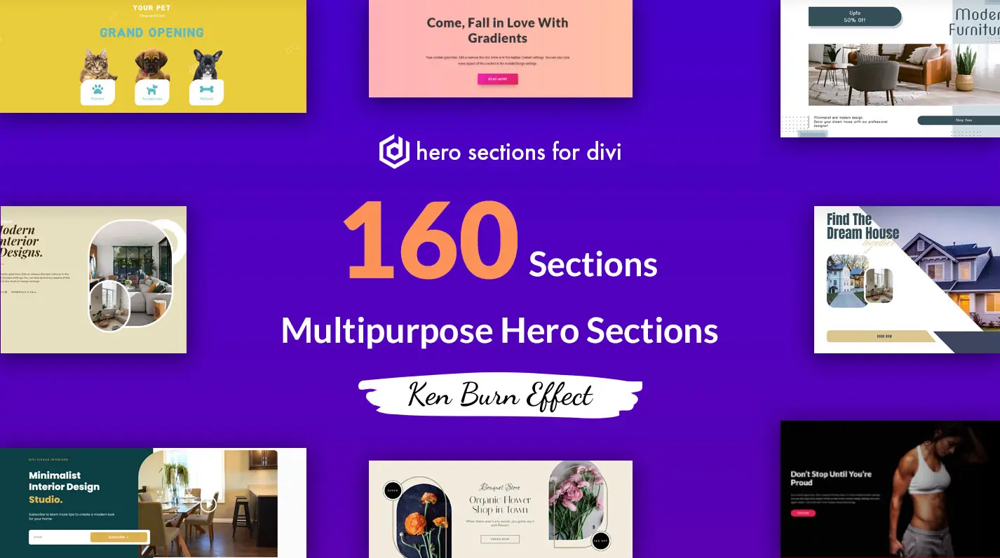
It’s a premium hero section pack that consists of 60 sections. These sections are responsive, flexible and easy to import. It means you can use them on websites of different niches without worrying about the user’s device. Plus, you’d get frequent updates that keep improving the design and provide you with new layouts.
4. Optimized CTA (Call-to-Action) – the Action Initiating Web Element
A CTA is one of those elements of an effective website without them, you can’t generate leads. And probably it’s the website element that makes a hero section more powerful. No matter your website’s domain or industry, it must use a call to action button.
It allows you to motivate users to initiate and complete an action for a targeted goal. It makes it easy for users to understand what they’re interacting with and what they’ll receive in return. Using a CTA, you make your website complete and fully functional.
And we’re sure you won’t ignore using a CTA no matter your beginner level. But, it’s possible that you’d miss some of the best practices to create a working CTA. Therefore, when you go after adding or creating your CTA, make sure you follow the best practices like,
- Using an action-oriented label.
- Color-scheme matching website’s.
- Send a positive message.
- An easy-to-recognize, visible CTA
- Optimized button shape.
By utilizing the above tips, you’d create an optimized CTA that will motivate users positively to opt for your services or products.
5. Search Bar and Page – the Guide to the Right Information
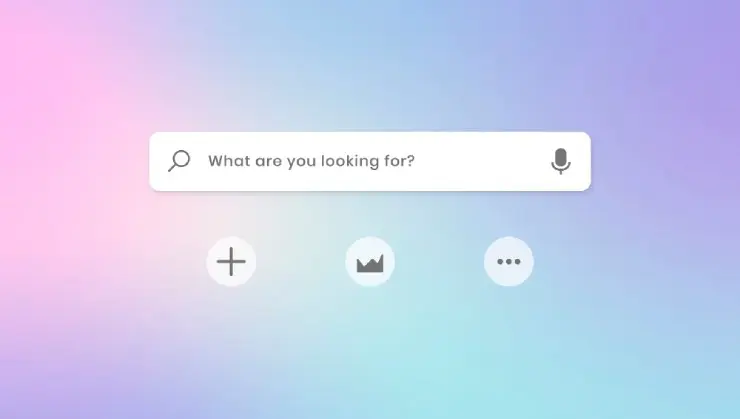
An optimized menu will surely help your website visitors to explore essential areas of the site. But what if they want to look for something custom. Something that’s not on your menu. So, in that case, a Search Bar helps.
Although it’s not necessary for every website, using it will improve your platform’s usability when you’re offering multiple products and services. Also, for a website offering posts, you can consider using the Search Bar to help users quickly find the solution they are looking for.
In addition to the Search Bar, make sure you use a custom search page. It will present the result in an organized way that would allow users to easily explore the site. They’ll find your website more user-friendly, and next time they need something, they’ll surely choose your platform before others.
6. Non-intrusive Pop-Ups – Another one of the Attention-Grabbing Website Element
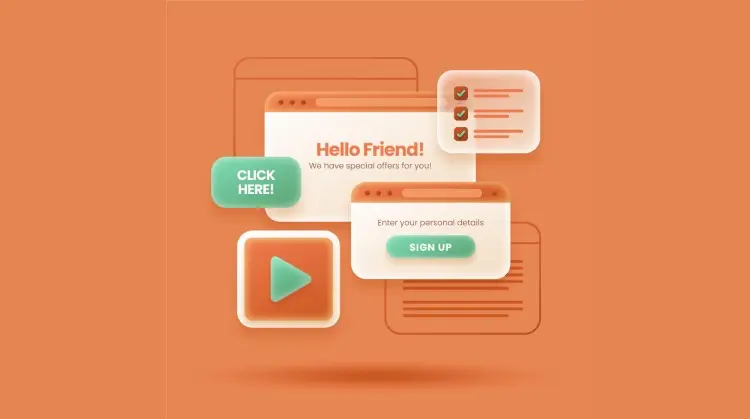
Among other website components, the one that can help you increase a promotional campaign’s success rate the most is a popup. It’s a major web element that’s highly useful during promotional events. For example, you’re running a sale on New Year, Black Friday, Halloween and more.
Using popups on the site, you can build an effective subscriber list, highlight product launches, notify users about offers, etc.
According to a recent study, it’s found that the average conversion rate of popups is around 11.09%. Thus, using a popup is essential even if you’re not running an event. Further, you don’t have to do much to display a popup. Simply install a popup builder like Divi Modal Popup that allows you to create popups of different types.
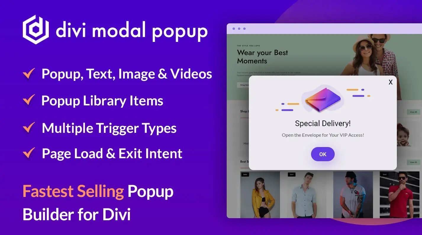
Using the plugin, display images, videos, text or layouts in the popups. Apply different rules such as On-page load, User exit, Click/hover trigger, etc.
7. Pricing Info – the Critical Web Element
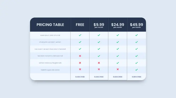
Unless your website serves a non-profit purpose, you definitely require this essential website element. Even so, non-profit websites, too, these days have a column for donations, aka pricing info. Thus, whether you’re selling products or services, it’s necessary to have pricing information on the site.
Why?
The answer is simple – users need to know how much you’re charging them.
If you want to join our membership club and we don’t show it to you, it will be harder for you to convince yourself to become our member. Or perhaps, it would take time to complete the process. You ask us the price, then we share the details, and you check them out. Then again, you ask for more details, and we will get back to you, and the process continues.
But with pricing info or table, it’s easy for you and your customers to finalize the transaction.
Therefore, ensure you don’t forget this essential element of a magical website design. You can consider the following tips to make it impressive.
- Highlight features that are more prominent.
- Keep prices and information correctly aligned.
- Make the pricing table and its info easy to scan/read.
- Use a CTA with a short label and distinctive design.
8. User-Friendly and Highly Readable Blogs (Archives and Posts)
You are making a mistake if you’re not considering blogs on your site even after you’ve got all the web elements. The reason is that blogs bring more traffic as compared to pages. Or it would be more appropriate if we mention that blogs are the ones that establish your company as a brand and niche expert.
Users who find your blogs useful would be more likely to try your services or products. Thus, before you shrug this idea of using blogs from your shoulder, consider this and the following statics,
- Blogs can increase traffic by as much as 434%.
- For food bloggers, the highest median monthly income is $9,169.
- Over 77% of internet users read blogs.
- Over 90% of B2B marketers use blogs as their content marketing strategy.
With blogs, you’ll invest less and earn more – that would be for the long term. If it’s harder for you to establish a blog on your site, you can try our Blogy pack, which includes 60 blog layouts.
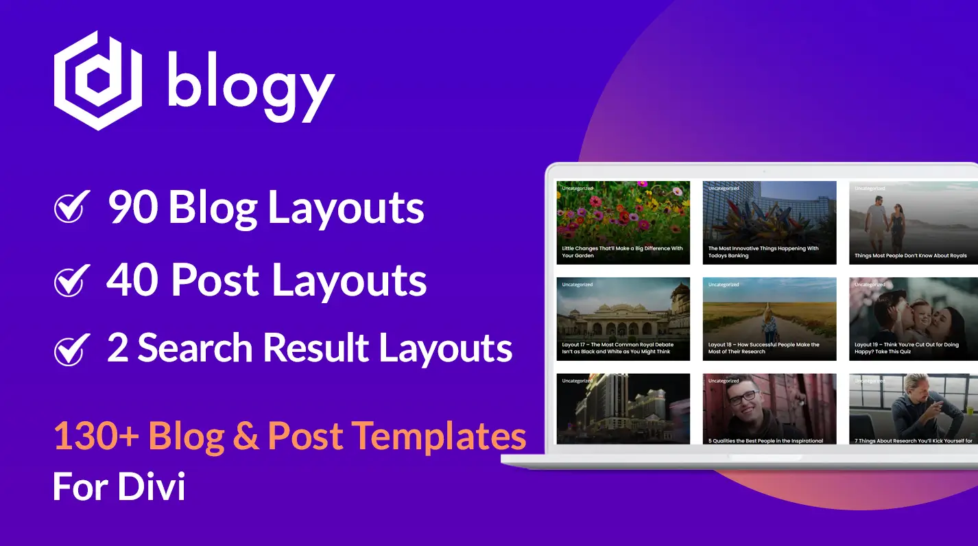
And with the archive templates, it also offers Post and Search Result page templates. Thus, making your solutions more readable, easy to find and worth spending time on.
9. Customer Reviews or Testimonials – the Trust Building Website Element
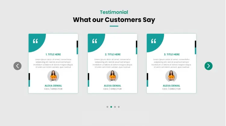
Other than traffic, what brings more conversion to your business is the Trust of your brand among users. And apart from customer reviews, there’s rarely an element that can help you build trust. Whatever best-in-class products or services you provide, they can only be backed by user reviews. And mostly the positive ones.
So, whether you’re behind a new project or revamping an existing one, don’t forget to highlight your users’ experiences.
And if you haven’t received some testimonials, make sure you add those to your website as soon as you do that. To accomplish that, you can either start from scratch. Or use pre-built templates or plugins like Divi Testimonial Extended.
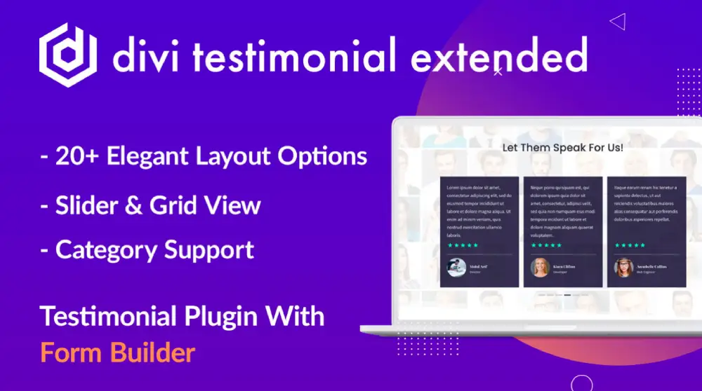
Using our plugin, you can show customer reviews on a slider with different layouts and animations. Apply masonry format. Show author images. Plus, get a top SEO ranking through the Star-rating schema.
10. Engaging and Distraction-Free Image Galleries – one of the Website Elements that Boost Look

Images on a website enhance the effect of the content you’ve written on different sections or areas. They allow users to maintain their focus and understand a particular subject more clearly. Further, they grab users’ attention more profoundly and increase the time they spend on a particular section.
Hence, you’d see lower bounce rates, and as a result, it will improve your SEO rankings.
Now, by using Image Galleries, you provide more to the users to explore and stay on the site. With galleries, you can present your products much better. For instance, you can showcase a particular electronic gadget from different angles.
And not only for products, but image galleries can also help you present your company culture to the users. You can showcase team members, varieties in the service, branch office, etc. Even though it’s not from unique design elements, it can help you present your site more diversely.
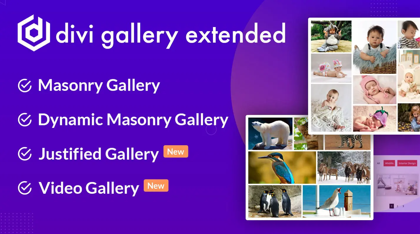
For Divi users, our Divi Gallery Extended plugin is the perfect tool to add attractive galleries to the site.
11. Simplified Footers – the Guide to Essential Pages
The header or the top menu of a website allows users to explore the primarily targeted areas. Whereas a footer or bottom menu lets them explore what’s essential other than the primary ones. For instance, the privacy policy, refund policy, quick links and copyright notice.
A footer can’t be ignored because it’s the main website element that completes the top-to-bottom structure. It allows both you and your customers to understand where the site ends. If you’re not using a footer, they might think the site is broken or not fully loaded.
Another reason why using the footer is essential is because it allows you to add additional elements of the site that cannot be added to the top. Plus, shifting them here would work better — for example, a subscribers form.
Therefore, when you’re working on your site, give extra time to the footer. Or you can try the Divi Flexile Footers pack, which provides over 100 high-quality footer layouts.
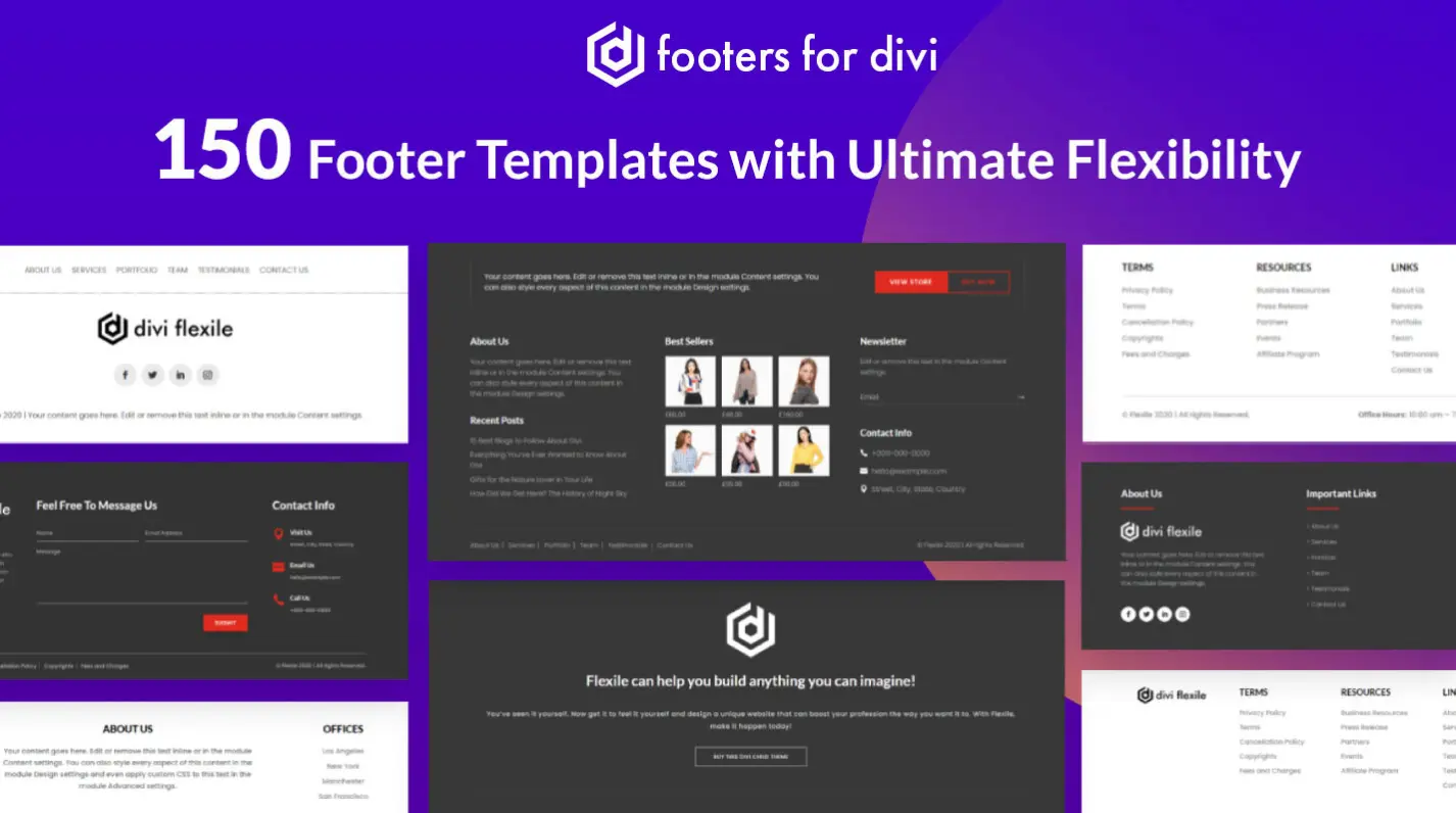
It’s a premium footer templates pack for Divi that includes different kinds of footers suitable for all websites. If you’re a web developer, it will be worth all your money. It will save you time, provide you with more design opportunities, and you’d find your site more unique and beautiful from all the way up to down.
Conclusion
So, these are our 11 key website elements that make a site more beautiful and functional. By implementing these on your website, you’d surely make it the online platform which will produce results per your requirements.
However, by implementation, it doesn’t mean you go after every single one of them every time – except for 3 or 4 elements. Plus, don’t overuse them; otherwise, rather than creating something impressive, you’d have something overwhelming or dull.
Therefore, when you go after these elements, try to follow the best practices and ensure you keep things to a minimum. Or perhaps, when they are required the most.



0 Comments