Earning from blogging seems terrific from outside. But in reality, it’s a job that requires a lot of patience to read long written informative articles and documents to do comprehensive research. Then, bring thoughts to write a new piece. And if you ask a content creator like me, then what you get to listen to is that that it’s not enough.
However, it’s essential, but with that, how you present your resourceful piece is also important. To achieve that, there are post-template options available, which allow users to showcase their articles beautifully as well as engage readers more profoundly on a website running on the Divi theme.
Therefore, in this blog post, we’re going to look at the Divi blog post templates of the Blogy – Divi Blog Layout Pack. It includes multiple Divi article layouts that you can apply using the Divi Theme Builder.
Stellar Post Layout: Desktop

Stellar is a single post layout part of the Blogy post layout pack for a website built using the Divi theme. It’s a simple post template with a wide featured image visibility. Moreover, its post title and post content have proper character spacing and line height to improve text readability. It also includes pre-next post navigation, tags, author short info, and a comment section.
Prime Post Layout: Desktop

Just as the Stellar, Prime post layout is also a simple yet modern Divi blog post template with full-width image and author info at the top. Plus, improved title, post content, and other elements for distraction free visual.
Classic Post Layout: Desktop
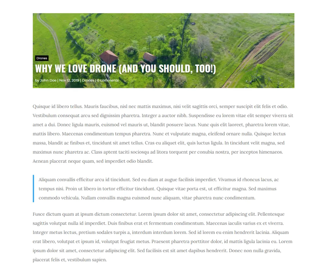
Classic article layout has content and featured images of the same width reflecting symmetry. Moreover, unlike Stellar and Prime layout, its post title, meta description, and category are shown above the image giving it an appealing look and feel. It also comprises post navigation with article titles, tags, author short info, and a comment section to make your Divi theme-built website information rich.
Gleam Post Layout: Desktop
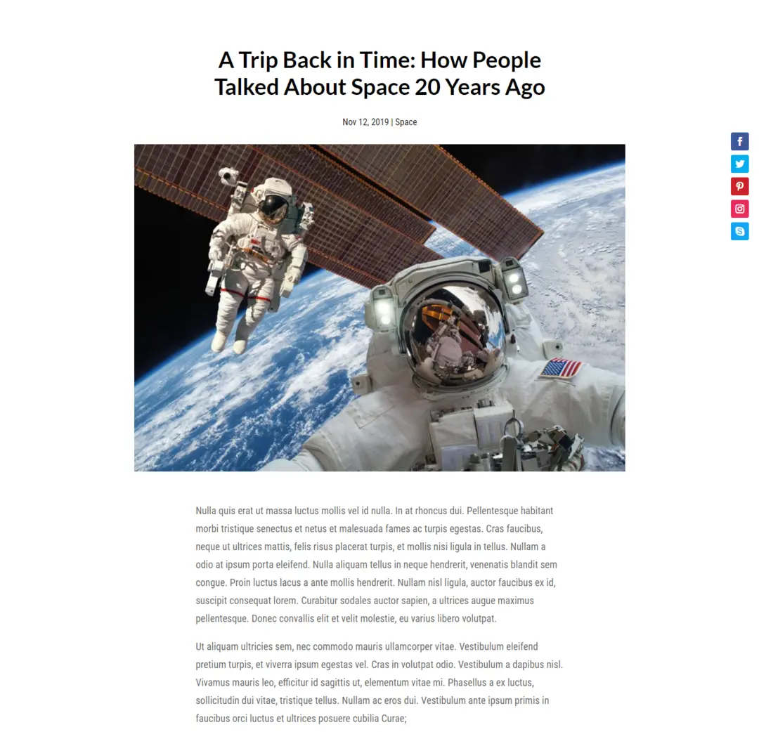
With a title at the top of the spacious featured image makes Gleam the favorable choice of the users who want to present their writing in a different style. In addition to this, the Gleam Divi blog post template includes social icons made from Divi’s social module to increase your following across multiple platforms, post navigation with titles, author box, and comment section to interact with the community.
Spur Post Layout: Desktop
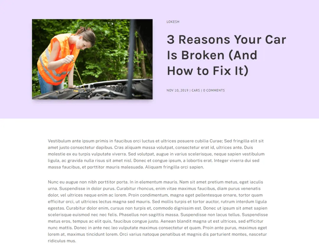
Spur Divi single post layout with its design not only engage the reader’s in a much promising way as well as it inspires them to share the article. Moreover, its optimized post title and post content make the user remain on the post for longer than usual.
Zest Post Layout: Desktop

Zest is another Divi blog post layout, which you can use with the help of Divi Theme Builder. Just like the Prime layout, it too has full-width above the fold area. It consists of readability optimized title, meta description, and author image. The best use of this layout would be when you want to highlight some individual sections of the article. Moreover, it has comment block, author bio at the bottom, tags, and recent post navigation.
Summary
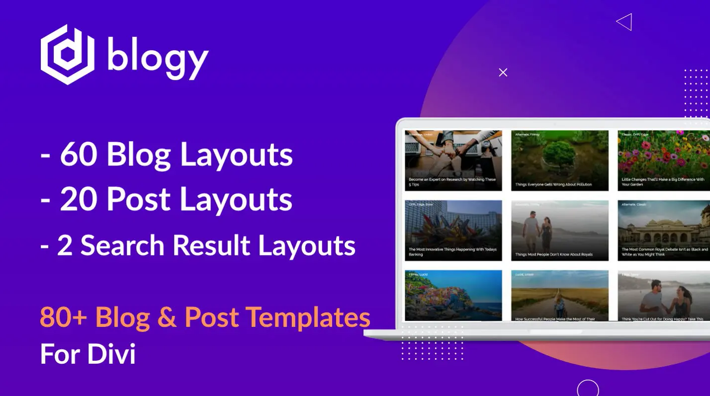
In this blog post, we’ve shown you the single post layouts of the Blogy- Divi Blog Layout Pack created by the Elicus Technologies for the Divi Theme Builder. If you want to present your writing with some beauty, then these Divi article layouts can be useful. The layout pack includes over 80 Divi blog layouts consisting 60 blog layouts, 20 post layouts and 2 search layouts. Thus, allowing you modify your blog altogether with beauty and delicacy.
Before you go, we want to know your views about this article and the information shared in it. If you got any, then share them in the comment section.




0 Comments