The Divi theme testimonial module allows you to add client reviews on the website. However, those customer testimonials on the website don’t slide. And to make them slide, a user has to take help from custom CSS. But it can be tricky for users who have just started and don’t know anything about custom codes. For them, one thing might work, but another doesn’t.
Therefore, in this article, we’re going to see how we can create Divi theme testimonial slider without any custom CSS.
So, without any further due, let’s get started.
Preview

For Desktops

For Mobiles
Things Required
So, to create a Divi testimonial slider in Divi theme based website, first, we need to get Divi Testimonial Slider plugin. After that, upload it to your website, then install and activate it. Once activated, it will add 2 Divi testimonial modules in the library.
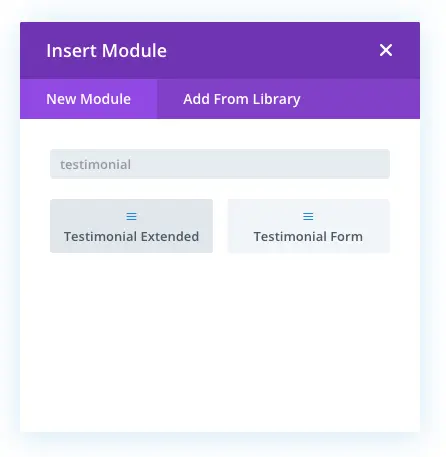
One for to create Divi testimonial slider, and another for to receive client reviews from the front-end. As we have already installed and activated our testimonial slider plugin, let’s get started creating our testimonial sliders.
Step 1: Add Testimonials
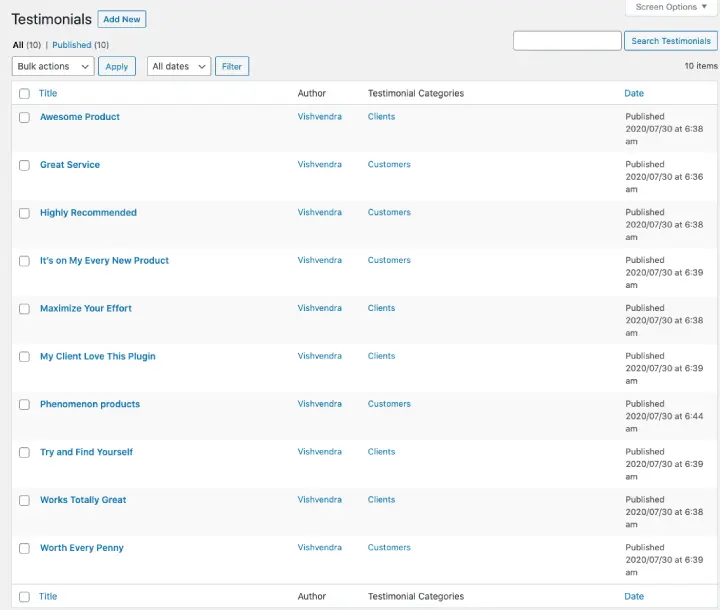
Before we start creating Divi testimonial carousel, first, we need to add testimonial in the back-end of WordPress. Similar to the installation and activation of the plugin, this process is simple as that. Moreover, after the plugin installed, it also adds a custom post type in WordPress for the testimonial.

Here, you can add testimonials, edit, modify, and delete them. Plus, you can also define their categories, if any. For this tutorial, I have created 10 testimonials and provided them appropriate categories. Furthermore, after adding the testimonials, the custom post type window would appear like the below screenshot.
Step 2: Add Divi Testimonial Slider Module
We have added customer testimonials to our WordPress back-end, now we can move on to the next step.
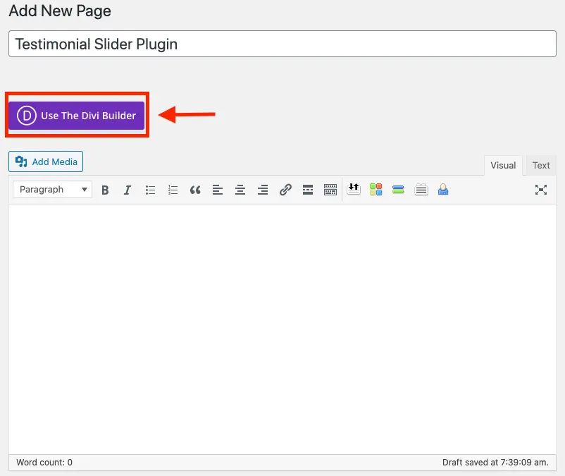
First, go to the page or create a new one where you want to display client reviews. For instance, you choose to create a new testimonial page on the website. Once created a new page, click Use The Divi Builder, it will launch the builder.
Once your page opens up in the Divi Builder, choose to Build On The Front End, and then select Build From Scratch. It would deploy the Divi builder on the visual end. So, you can see live changes while you add and design your review sliders using the module of the Divi testimonial slider plugin.
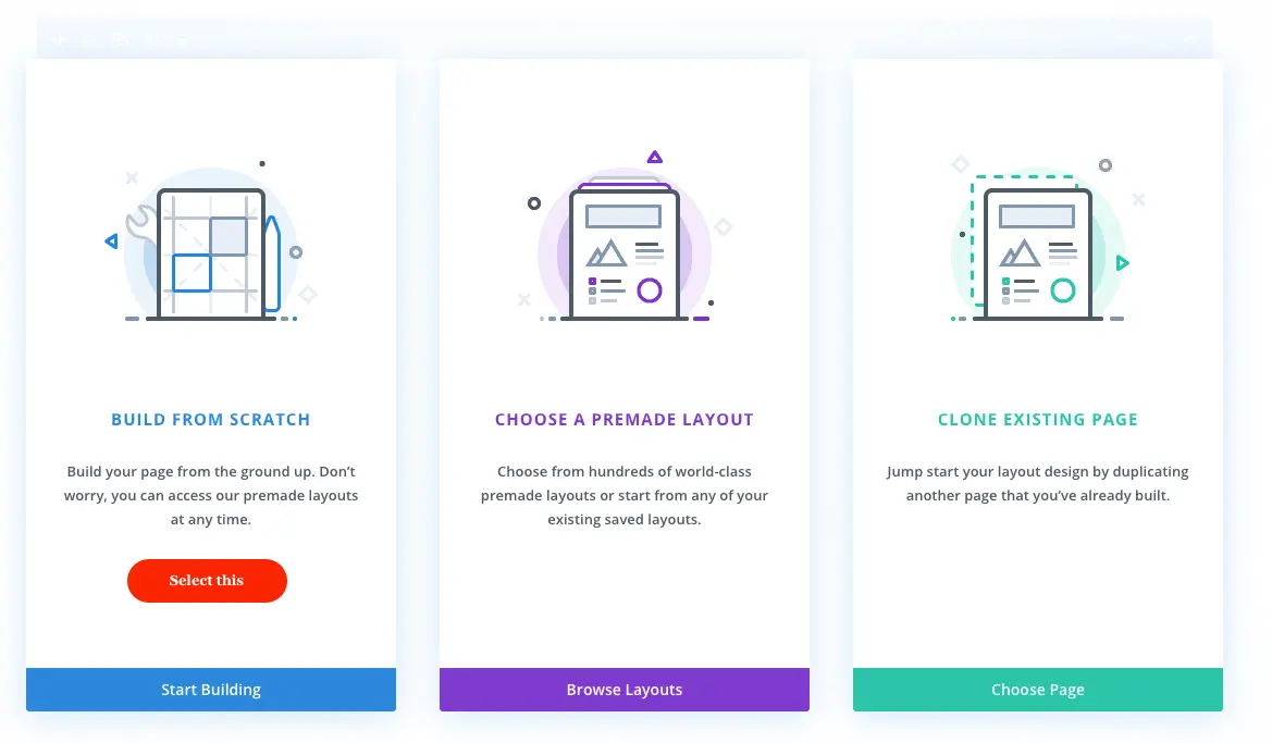
It’s Divi Builder, so it won’t take much time to load itself on the front-end. As soon as the visual builder appears, add the Testimonial Extended module. It’s the module that would help us create Divi theme testimonial sliders.
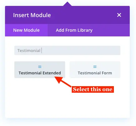
The module is on the page, we’re ready to create our Divi testimonial sliders.
Step 3: Create Testimonial Sliders & Content Customizations
Once the module inserted on the page, the content settings would appear. Here, you can select how many testimonials you want to display on the slider. If you input 0 or keep the Number of Testimonials field empty, it would display all the reviews. Moreover, it also allows you to set testimonials appearance in Descending and Ascending order by Date & Random manner.
If you have defined categories for the testimonials, then you can also choose which category testimonials you want to display or which not.
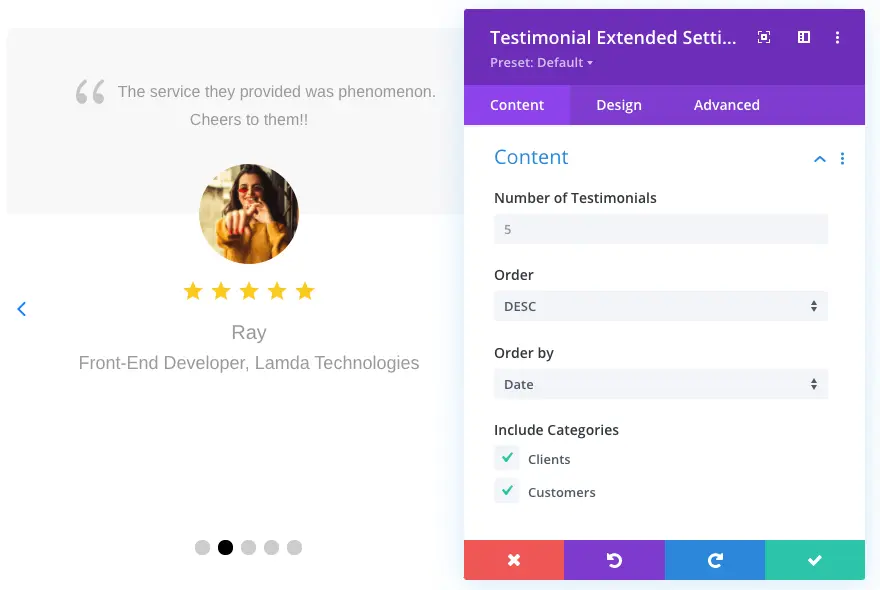
For this tutorial I have made content customizations as follows,
Number of Testimonials: 5
Order: Desc
Order by: Date
Include Categories: I have selected both the categories, however, if you keep them unchecked, then it will include all the categories by default.
Step 3A: Divi Testimonial Layouts’ Selection & Tweaks
From a total of 6 testimonial slider layouts, I settled with layout 1. The author’s information with star ratings below the review fascinated me enough than the other layouts. Though, you can make your peace with any testimonial layout of your choice.
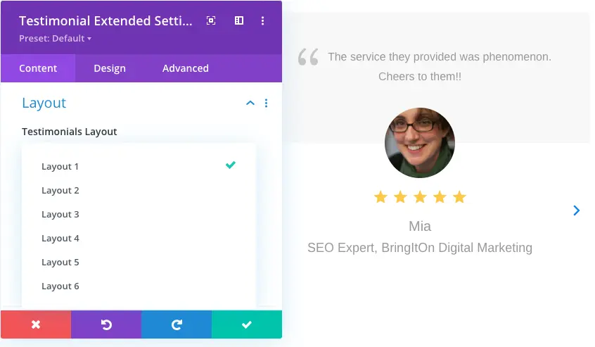
Furthermore, we get the option to select the slide effects. But if you don’t enable this option then your client reviews would display in a grid formation.

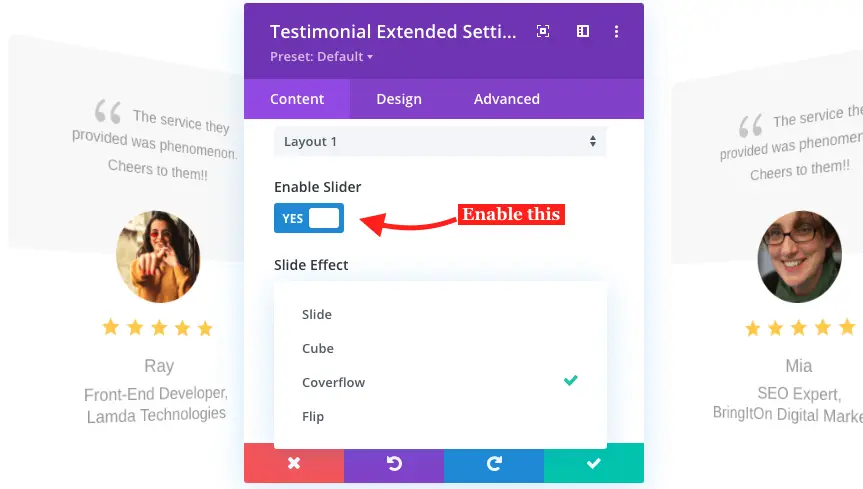
Therefore, check Enable Slider as YES, and you’d get the Slide Effects, and associate settings.
However, if you keep slider disable, then this Divi testimonial module offers an interesting feature under which you can display reviews in masonry format. For instance, look at the below screenshot to see how client testimonials would display in a masonry grid formation.

Well, to create sliding Divi testimonials, we have to enable the slider effects. Therefore, I have selected the Coverflow slide effect and kept the following settings as they are. But if you enable Slide Shadow, then layouts would have a shade of color on the nonfocused testimonials. Similar to the below image.

But for this tutorial, we’re not going to apply this effect. Therefore, apply layout customization on the testimonial slider as follows,
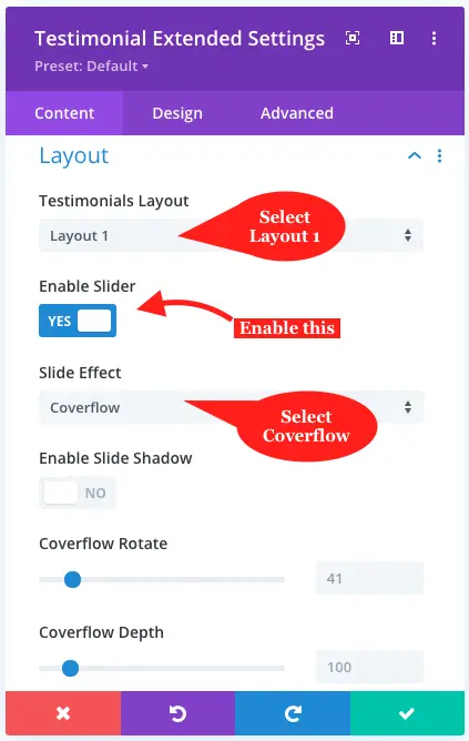
Testimonial Layout: Layout 1
Enable Slider: Check as YES
Slide Effect: Coverflow
Enable Slide Shadow: Keep as default (NO)
Coverflow Rotate: Keep as default (41)
Coverflow Depth: Keep as default (100)
Step 3B: Testimonial Slider Display Settings
Some users left long versed reviews, so some tend to write adverbs like Great, Awesome, Wonderful, Highly Recommended, etc. However, this can cause a very uneven display of our testimonials on the slider. You can look at that scenario in the below image.

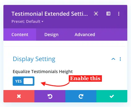
Did you notice that some reviews were long in the height than others? Therefore, to avoid this situation, the Divi Testimonial Extended module offers, Equalize Testimonials Height option in the display settings. It would set all the testimonials at the same height.
Well, it’s not a thing that a user doesn’t need entirely because there are multiple instances when you might want your testimonials in this way. And because of that, this plugin gives you a choice to equalize the height of the testimonials or not. Because if all the other reviews are short, then it would make them look like the below image.

See, how annoying it is. But it’s nobody’s fault. Sometimes clients are more generous than we think of. Therefore, it’s essential to have this feature and give users/designers the choice to select whether they want to equalize testimonials height or not. And to do that, all you have to do is toggle the equalize testimonials height as “Yes.”
In addition to the equalize testimonials height, this setting of the slider module also provides other tweaks. Such as show author image or not, choose author image layout from round & square. Plus, if your review authors have an image on their gravatar account, then this plugin can also reflect the image from there. And last using this particular content tab’s settings, you can also select to display author designation and company name.
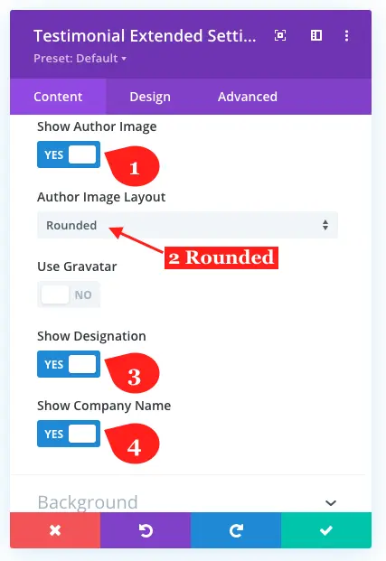
Apply tweaks in the testimonial slider’s display settings as follows,
Equalize Testimonials Height: YES
Show Author Image: Yes
Author Image Layout: From Rounded & Square option, for this tutorial I’ve selected rounded.
Use Gravatar: As there are no testimonials associated with the Gravatar account, I left it as it is. Though, you can check the toggle as YES if your client reviews contain accounts associated with Gravatar.
Show Designation: YES
Show Company Name: YES
Step 4: Testimonial Slider Design Customizations
We’ve added our client reviews to the website using the Divi testimonial slider plugin offered by Divi Extended. Now, it’s time to run our hands on their visual appearance. And to do that, switch yourself from the Content tab to the Design of the testimonial extended module. Here, you’d find various options to customize the look & feel of the testimonial slider.
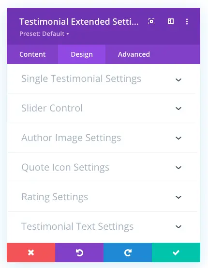
The very first setting of this tab, allows us to add Background Color & Image at the top section of the testimonial. And background color for the bottom section of the testimonial layouts.
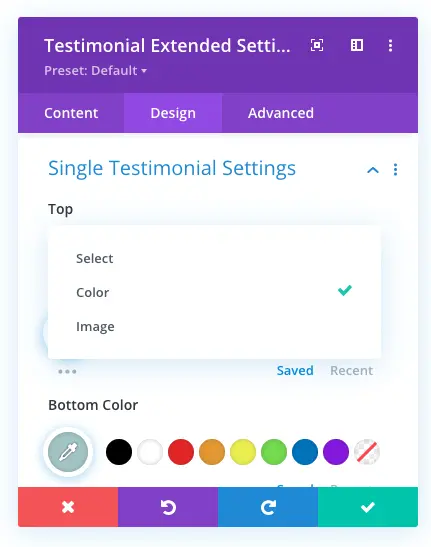
Moreover, using this particular setting, you can also add borders and apply rounded corners to the testimonial layout. Yet, for this tutorial, I have only applied color to the top and bottom area of the single testimonial layouts.

Apply single testimonial design tweaks as follows,
Top: Choose Color from available options Image & Color.
Top Color: #1A4F72
Bottom Color: #A4C4C3
And leave other settings as they are.
Step 4A: Slider Control Customizations
Till now, most of the screenshots or almost every screenshot in this tutorial don’t have slider arrows on them. But using the slider content settings, you can bring them in. For example, look at the below image.

And when you choose to display slider arrows on the review slider, you get many options to make them look impressive and highly interactive. The available options are Show Arrow On Hover, multiple Arrow Styles, change Arrow Font Size, and apply Arrow Font Color.
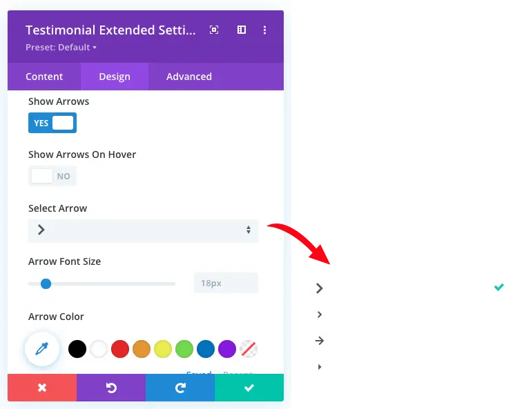
In addition to that, you can also apply paginations on your testimonial sliders. But what’s interesting with paginations is that they come in with 6 different styles. You get Solid Dot, Transparent Dot, Stretched Dot, Line, Rounded Line, and Squared Dot. Furthermore, you can also apply separate colors for Active & Inactive paginations.
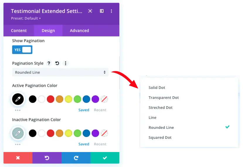
I’ve added reviews slider without arrows. And for pagination, I chose the rounded line pagination style. Plus, for active and inactive colors, I kept them a little similar to the top and bottom colors of the single testimonial layouts.

Apply testimonial slider control’s tweak as follows,
Show Arrows: Check as NO
Show Pagination: Check as YES
Pagination Style: Select Rounded Line
Active Pagination Color: #004472
Inactive Pagination Color: #A4C4C3
Step 4B: Customize Testimonial Author Image (Skip this)
This particular setting of the Divi testimonial slider plugin provides you with the option to add rounded corners around author image. However, if you have already chosen the author image layout as Rounded then there’s no extra benefit of adding rounded corners. But under this you can add borders over to the author image.
For this tutorial, I have already selected the rounded layout for the author’s image in Step3B. Therefore, I am not going to add borders, we can skip this and move on to the next settings of the design tab.
Step 4C: Quote Icon Customizations
Here, you can add Quote Icon at the start and end of the author review text. Plus, you can also customize their appearance with further quote icon settings available. Like you can change icon style, color, size, and position. Thus, it gives you complete control over how you want to display your quote icon.

Apply Quote Icon customization as follows,
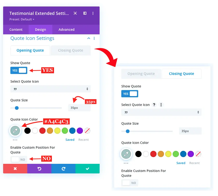
Show Quote: Yes
Select Quote Icon: Look in the screenshot above
Quote Size: 35px
Quote Icon Color: #A4C4C3
Enable Custom Position For Quote: Keep as default (NO)
Apply the same for closing quote icon.
Step 4D: Testimonial Slider’s Rating Settings
The best part of client reviews is their ratings. And with the Divi Testimonial Extended module, you can display them in a much better way. It provides you with the options using which you can customize rating size and apply different colors for rated and unrated stars.
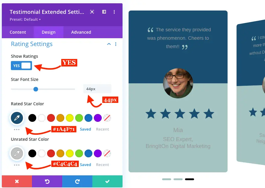
For testimonial carousel star rating customizations apply tweaks as follows,
Show Rating: YES
Star Font Size: 44px
Rated Star Color: #1A4F71
Unrated Star Color: #C4C4C4
Step 4E: Testimonial Text Customizations
This provides you with the options to improve the appearance of the text on the testimonials, which include Review, Author Name, and Metas. From text font to color, and from color to text-shadow, under this option, you can do anything to make testimonial text appearance engaging and attractive. See how I did on my testimonial layout.

Apply Testimonial Body Text Customizations as follows,
Body Font: amita
Font Weight: Bold
Body Text Color: #FFFFFF
Text Size: 18px
Apply Text Customization for Author Name as follows,
Author Font: Aladin
Font Weight: Bold
Text Color: #FFFFF
Text Size: 34px
Author Letter Spacing: 3.7px
Line Height: 1.3em
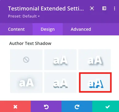
Author Text Shadow: Look in the screenshot
Author Text Shadow Color: #1A4F72
Apply Text Customizations for Author Meta as follows,
Author Meta Font: amita
Font Weight: Regular
Text Color: #1A4F72
Letter Spacing: 0.8px
Line Height: 1.6em
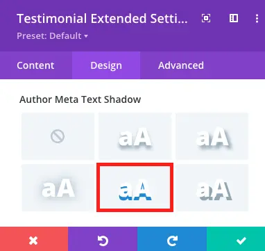
Author Meta Text Shadow: Look in the screenshot
Author Meta Text Shadow Color: #000000
Step 4F: Testimonial Slider Animation Effects
Well, we’ve almost created our testimonial slider. However, the only thing remaining is that we apply some animation on it. There are a handful of options available in the Animation setting of the design tab you can apply to the layout. But, for this tutorial apply animation as follows,
Enable Loop: Check as YES
Animation Style: Fade
Animation Speed Curve: Ease
Other than these, keep them as default.
That’s it, we’ve successfully created our beautiful Divi testimonial slider.
Final Look
For Desktops

For Mobiles

Ending Thoughts
The steps were pretty easy and anyone with or without any prior knowledge of designing can add engaging client reviews. Moreover, the controls of the Divi testimonial slider plugin provided by Divi Extended are intuitive. So, nobody gets confused about what to use and what’s not.
So, what do you think about this tutorial and the plugin I used. If you got anything to share, then I’m waiting for your views in the comment section.


0 Comments