
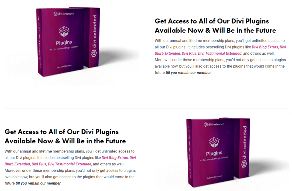
If a page on your Divi theme based website contains content in a random manner, i.e., Image-Text in the first column, and Text-Image in the 2nd column, there will be some design issue with the mobile view. It would look great on the desktop screens, but on mobile, your content will be displayed as a straight Image, Text, Text, Image just like the below picture, which is disturbing in many ways.
Now, the problem

However, this isn’t a permanent problem because Divi always provides an easy solution to create a better website. And it’s the same in this case, too. Follow the below steps to achieve a perfect design view for any resolution devices.
Let’s get started!
Reverse Stacking of Columns’ Order in the Divi Theme for Mobile Devices
Reversing column on mobile in Divi can be done easily. If you want to reverse order of 2 columns, here are the steps with the required CSS
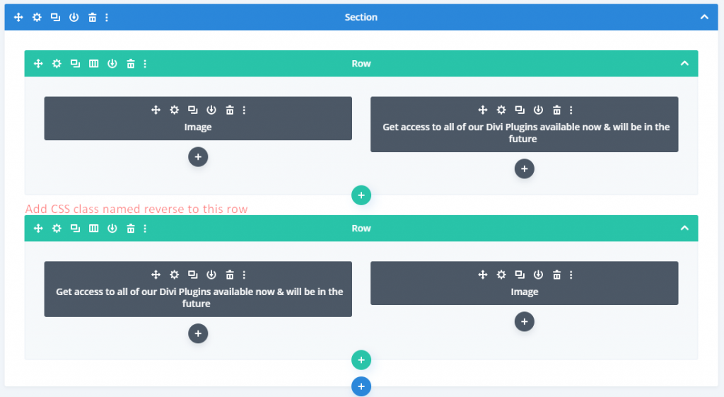
- Go to advanced settings of your Row, whose content you want to see reversed on mobile devices.
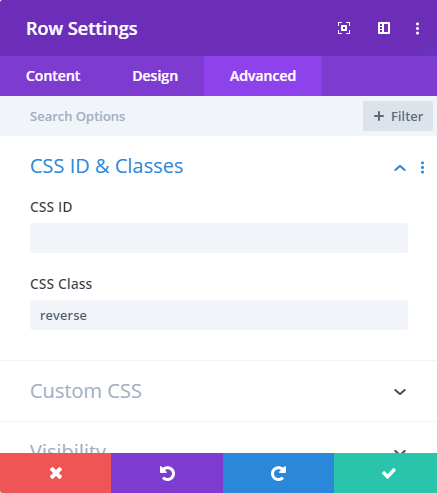
- Then in the CSS Class input field of CSS ID & Classes setting, enter the class name reverse.
- After this on your WordPress dashboard, go to Divi >> scroll to the Custom CSS section, and add the below custom CSS.
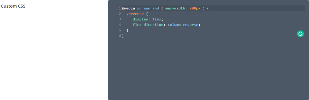
@media screen and ( max-width: 980px ) {
    .reverse {
        display: flex;
        flex-direction: column-reverse;
    }
}
You can also make your Divi columns reverse on mobile by adding this custom CSS in your style.css file. However, when you add custom CSS in style.css, we recommend that you add that in the child theme file. If somehow, after applying this custom CSS, your columns haven’t reversed or alternated the content view, then make sure you have added the correct class name inside both the row and style.css.
Result:

Do you want to add 80 new modules to your Divi Theme?
Hope you find this article helpful. Before you go, we would like to introduce you to Divi Plus, our multipurpose plugin that comes with some great features you might like.


I know this is a year later, but I still had to thank you for leaving that comment. You saved me from wasting even more time trying to figure out wtf was going on with the special section
Thanks so much. Great
I don’t know why in the special sections it doesn’t work 🙁
Wow!!! A really great solution. No more duplicate row and hide it on mobile… haha
Thank you for this article! This is exactly what I am looking for. It helps solving my concern on my website. Thanks again!